Basic Tools for Process Improvement
Basic Tools for Process Improvement
Basic Tools for Process Improvement
Create successful ePaper yourself
Turn your PDF publications into a flip-book with our unique Google optimized e-Paper software.
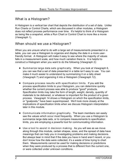
What is a Histogram?<br />
<strong>Basic</strong> <strong>Tools</strong> <strong>for</strong> <strong>Process</strong> <strong>Improvement</strong><br />
A Histogram is a vertical bar chart that depicts the distribution of a set of data. Unlike<br />
Run Charts or Control Charts, which are discussed in other modules, a Histogram<br />
does not reflect process per<strong>for</strong>mance over time. It's helpful to think of a Histogram<br />
as being like a snapshot, while a Run Chart or Control Chart is more like a movie<br />
(Viewgraph 1).<br />
When should we use a Histogram?<br />
When you are unsure what to do with a large set of measurements presented in a<br />
table, you can use a Histogram to organize and display the data in a more userfriendly<br />
<strong>for</strong>mat. A Histogram will make it easy to see where the majority of values<br />
falls in a measurement scale, and how much variation there is. It is helpful to<br />
construct a Histogram when you want to do the following (Viewgraph 2):<br />
! Summarize large data sets graphically. When you look at Viewgraph 6,<br />
you can see that a set of data presented in a table isn’t easy to use. You can<br />
make it much easier to understand by summarizing it on a tally sheet<br />
(Viewgraph 7) and organizing it into a Histogram (Viewgraph 12).<br />
! Compare process results with specification limits. If you add the<br />
process specification limits to your Histogram, you can determine quickly<br />
whether the current process was able to produce "good" products.<br />
Specification limits may take the <strong>for</strong>m of length, weight, density, quantity of<br />
materials to be delivered, or whatever is important <strong>for</strong> the product of a given<br />
process. Viewgraph 14 shows a Histogram on which the specification limits,<br />
or "goalposts," have been superimposed. We’ll look more closely at the<br />
implications of specification limits when we discuss Histogram interpretation<br />
later in this module.<br />
! Communicate in<strong>for</strong>mation graphically. The team members can easily<br />
see the values which occur most frequently. When you use a Histogram to<br />
summarize large data sets, or to compare measurements to specification<br />
limits, you are employing a powerful tool <strong>for</strong> communicating in<strong>for</strong>mation.<br />
! Use a tool to assist in decision making. As you will see as we move<br />
along through this module, certain shapes, sizes, and the spread of data have<br />
meanings that can help you in investigating problems and making decisions.<br />
But always bear in mind that if the data you have in hand aren’t recent, or you<br />
don’t know how the data were collected, it’s a waste of time trying to chart<br />
them. Measurements cannot be used <strong>for</strong> making decisions or predictions<br />
when they were produced by a process that is different from the current one,<br />
or were collected under unknown conditions.<br />
2 HISTOGRAM


