user interface design by applying theories of aesthetics - Theseus
user interface design by applying theories of aesthetics - Theseus
user interface design by applying theories of aesthetics - Theseus

You also want an ePaper? Increase the reach of your titles
YUMPU automatically turns print PDFs into web optimized ePapers that Google loves.
25<br />
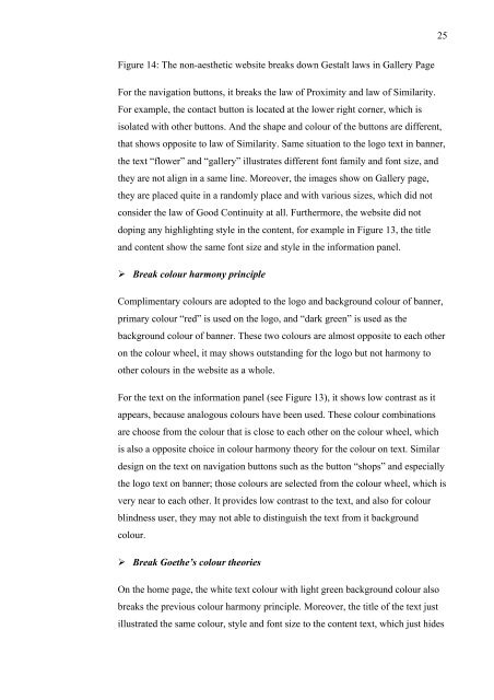
Figure 14: The non-aesthetic website breaks down Gestalt laws in Gallery Page<br />
For the navigation buttons, it breaks the law <strong>of</strong> Proximity and law <strong>of</strong> Similarity.<br />
For example, the contact button is located at the lower right corner, which is<br />
isolated with other buttons. And the shape and colour <strong>of</strong> the buttons are different,<br />
that shows opposite to law <strong>of</strong> Similarity. Same situation to the logo text in banner,<br />
the text “flower” and “gallery” illustrates different font family and font size, and<br />
they are not align in a same line. Moreover, the images show on Gallery page,<br />
they are placed quite in a randomly place and with various sizes, which did not<br />
consider the law <strong>of</strong> Good Continuity at all. Furthermore, the website did not<br />
doping any highlighting style in the content, for example in Figure 13, the title<br />
and content show the same font size and style in the information panel.<br />
Break colour harmony principle<br />
Complimentary colours are adopted to the logo and background colour <strong>of</strong> banner,<br />
primary colour “red” is used on the logo, and “dark green” is used as the<br />
background colour <strong>of</strong> banner. These two colours are almost opposite to each other<br />
on the colour wheel, it may shows outstanding for the logo but not harmony to<br />
other colours in the website as a whole.<br />
For the text on the information panel (see Figure 13), it shows low contrast as it<br />
appears, because analogous colours have been used. These colour combinations<br />
are choose from the colour that is close to each other on the colour wheel, which<br />
is also a opposite choice in colour harmony theory for the colour on text. Similar<br />
<strong>design</strong> on the text on navigation buttons such as the button “shops” and especially<br />
the logo text on banner; those colours are selected from the colour wheel, which is<br />
very near to each other. It provides low contrast to the text, and also for colour<br />
blindness <strong>user</strong>, they may not able to distinguish the text from it background<br />
colour.<br />
Break Goethe’s colour <strong>theories</strong><br />
On the home page, the white text colour with light green background colour also<br />
breaks the previous colour harmony principle. Moreover, the title <strong>of</strong> the text just<br />
illustrated the same colour, style and font size to the content text, which just hides