user interface design by applying theories of aesthetics - Theseus
user interface design by applying theories of aesthetics - Theseus
user interface design by applying theories of aesthetics - Theseus
Create successful ePaper yourself
Turn your PDF publications into a flip-book with our unique Google optimized e-Paper software.
29<br />
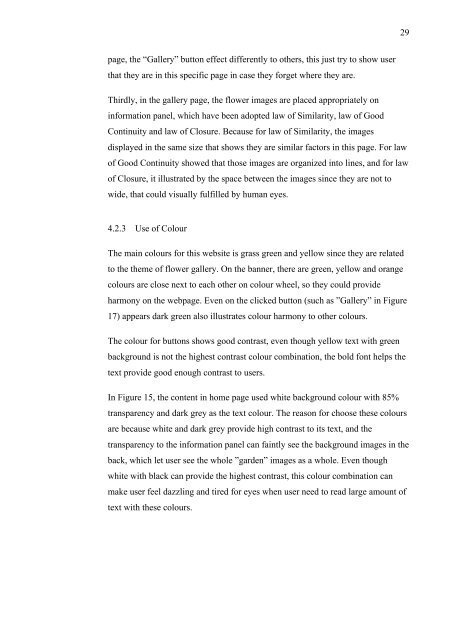
page, the “Gallery” button effect differently to others, this just try to show <strong>user</strong><br />
that they are in this specific page in case they forget where they are.<br />
Thirdly, in the gallery page, the flower images are placed appropriately on<br />
information panel, which have been adopted law <strong>of</strong> Similarity, law <strong>of</strong> Good<br />
Continuity and law <strong>of</strong> Closure. Because for law <strong>of</strong> Similarity, the images<br />
displayed in the same size that shows they are similar factors in this page. For law<br />
<strong>of</strong> Good Continuity showed that those images are organized into lines, and for law<br />
<strong>of</strong> Closure, it illustrated <strong>by</strong> the space between the images since they are not to<br />
wide, that could visually fulfilled <strong>by</strong> human eyes.<br />
4.2.3 Use <strong>of</strong> Colour<br />
The main colours for this website is grass green and yellow since they are related<br />
to the theme <strong>of</strong> flower gallery. On the banner, there are green, yellow and orange<br />
colours are close next to each other on colour wheel, so they could provide<br />
harmony on the webpage. Even on the clicked button (such as ”Gallery” in Figure<br />
17) appears dark green also illustrates colour harmony to other colours.<br />
The colour for buttons shows good contrast, even though yellow text with green<br />
background is not the highest contrast colour combination, the bold font helps the<br />
text provide good enough contrast to <strong>user</strong>s.<br />
In Figure 15, the content in home page used white background colour with 85%<br />
transparency and dark grey as the text colour. The reason for choose these colours<br />
are because white and dark grey provide high contrast to its text, and the<br />
transparency to the information panel can faintly see the background images in the<br />
back, which let <strong>user</strong> see the whole ”garden” images as a whole. Even though<br />
white with black can provide the highest contrast, this colour combination can<br />
make <strong>user</strong> feel dazzling and tired for eyes when <strong>user</strong> need to read large amount <strong>of</strong><br />
text with these colours.


