purcc 2012 - University of the Pacific
purcc 2012 - University of the Pacific
purcc 2012 - University of the Pacific

Create successful ePaper yourself
Turn your PDF publications into a flip-book with our unique Google optimized e-Paper software.
Senior Art & Design Show – Artist Statements<br />
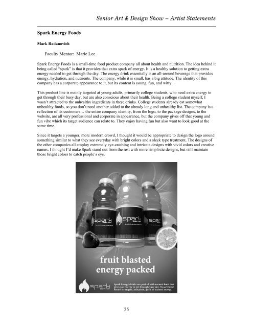
Spark Energy Foods<br />
Mark Radanovich<br />
Faculty Mentor: Marie Lee<br />
Spark Energy Foods is a small-time food product company all about health and nutrition. The idea behind it<br />
being called “spark” is that it provides that extra spark <strong>of</strong> energy. It is a healthy solution to getting extra<br />
energy needed to get through <strong>the</strong> day. The energy drink essentially is an all-around beverage that provides<br />
energy, hydration, and nutrients. The company, while it is small, has a big attitude. The identity <strong>of</strong> this<br />
company has a corporate appearance to it, but its content is young, fun, and witty.<br />
This product line is mainly targeted at young adults, primarily college students, who need extra energy to<br />
get through <strong>the</strong>ir busy day, but are also conscious about <strong>the</strong>ir health. Being a college student myself, I<br />
wasn’t attracted to <strong>the</strong> unhealthy ingredients in <strong>the</strong>se drinks. College students already eat somewhat<br />
unhealthy foods, so you don’t need ano<strong>the</strong>r added to <strong>the</strong> already long and unhealthy list. The company is a<br />
reflection <strong>of</strong> its customers… <strong>the</strong> entire company identity, from <strong>the</strong> logo, to <strong>the</strong> package designs, to <strong>the</strong><br />
website, are all very pr<strong>of</strong>essional and corporate in appearance, but <strong>the</strong> company gives <strong>of</strong>f that young and<br />
fun vibe which its target audience can relate to. They enjoy having fun but also want to look good at <strong>the</strong><br />
same time.<br />
Since it targets a younger, more modern crowd, I thought it would be appropriate to design <strong>the</strong> logo around<br />
something similar to what <strong>the</strong>y see everyday with bright colors and a sleek type treatment. The designs <strong>of</strong><br />
<strong>the</strong> o<strong>the</strong>r companies all employ extremely eye-catching and intricate designs with vivid colors and creative<br />
names. I thought I’d make Spark stand out from <strong>the</strong> rest with more simplistic designs, but still maintain<br />
those bright colors to catch people’s eye.<br />
25