

Eric lippert - Amazon Web Services
Eric lippert - Amazon Web Services
Eric lippert - Amazon Web Services

You also want an ePaper? Increase the reach of your titles
YUMPU automatically turns print PDFs into web optimized ePapers that Google loves.
- We take our basic css from above (and probably defined in<br />
Index.cshtml) and put it in a style sheet in the Styles folder.<br />
We call it media-browser-hd.css.<br />
- Next we add a reference to it in our cshtml’s section<br />
<br />
The imageColumns no longer has a margin as its set to 0 as<br />
opposed to 10 for the desktop style sheet.<br />
.mediaImage {<br />
max-width: 85%;<br />
max-height: 100px;<br />
}<br />
As we can see, the media attribute is providing a query that<br />
implies when the width of the browser is 1025 pixels or more,<br />
use the media-browser-hd.css style sheet.<br />
So if we were to reduce the size of our browser to less than<br />
1025 pixels, there would be no CSS applied again (because there<br />
are no other style sheets defined for other resolutions).<br />
For the Image itself, we’ve reduced the max-height to match the<br />
height from the mediaDiv style.<br />
h3 {<br />
font-family: ‘Segoe UI’;<br />
font-size: 0.6em;<br />
}<br />
Styling for Mobile Devices<br />
Well let’s fix that for the Mobile browser first. We add another<br />
style sheet in the Styles folder and call it<br />
media-browser-mobile.css. We keep the names of the classes<br />
same but slightly tweak the width and height of the mediaDiv<br />
.mediaDiv {<br />
float: left;<br />
width: 156px;<br />
margin: 1px;<br />
height: 100px;<br />
border: 1px solid #7ba9ca;<br />
display: table-cell;<br />
vertical-align: middle;<br />
text-align: center;<br />
}<br />
Finally the heading size is reduced from 0.8em to 0.6em to<br />
reduce the text size for the input box and button on top of the<br />
page. The CSS is now all setup. We hook it up in the Index.cshtml<br />
as follows:<br />
<br />
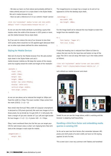
Let’s refresh our mobile browser and check<br />
As we can see above, we’ve reduced the height to 100px and<br />
fixed the width to 156px. The exact number 156px comes from<br />
the math (320/2) - 2 x (1 + 1)!<br />
Now what’s that formula Well, width of a ‘popular smartphone’<br />
is declared as 320 pixels (portrait). We want two images to fit in<br />
those pixels. So we divide by 2 to get (320 /2 =) 160 pixels. We<br />
have a margin of 1px and a border of 1 px. Left and right border<br />
for two images = 2 x (1 + 1) = 4 pixels. 160 – 4 = 156px.<br />
Okay, I went overboard there, but the fact you can target your<br />
CSS for well-known sizes, is what I am implying here. Now let’s<br />
look at the changes in each style for mobile.<br />
.imageColumns {<br />
margin: 0px;<br />
}<br />
Sweet! As we can see the image above, width is working and the<br />
browser is adapting itself beautifully.<br />
Handling a third form factor and embedding media<br />
queries in existing CSS<br />
So far we’ve seen two form-factors. But remember between 481<br />
pixels and 1024 pixels of screen-width, we have no CSS styling<br />
applied. So let’s fix that.<br />
This screen size is now very common with Tablets and handheld<br />
54 | DNCmagazine www.dotnetcurry.com


 Change language