

Design for Accessibility: A Cultural Administrator's Handbook
Design for Accessibility: A Cultural Administrator's Handbook
Design for Accessibility: A Cultural Administrator's Handbook

You also want an ePaper? Increase the reach of your titles
YUMPU automatically turns print PDFs into web optimized ePapers that Google loves.
Architectural Access 75<br />
Signage<br />
Signs that designate permanent rooms and spaces such as restrooms,<br />
conference or meeting rooms and offices must be accessible. In general,<br />
accessible signs have raised letters and numerals, use sans serif type and<br />
braille. Typeface must be clear, with maximum contrasting colors. The surface<br />
of the sign should be well lit and have a matte or other non-glossy finish.<br />
Signage is a much overlooked accessibility asset. It<br />
should be used to give people in<strong>for</strong>mation and direct<br />
them to accessible routes and entrances, telephones,<br />
restrooms and emergency exits (especially when not<br />
all are accessible). Most people, including those who<br />
cannot read or do not know English, can understand<br />
pictographs and international symbols.<br />
Warning Signals<br />
Emergency warning systems should produce signals<br />
that can be perceived by people who are blind or have<br />
low vision and those who are deaf or hard-of-hearing.<br />
Signals that are exclusively bells, buzzers, flashing<br />
lights or visual warning signs are useless to people<br />
who cannot hear or see them.<br />
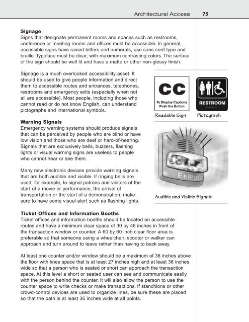
To Display Captions<br />
Push the Button<br />
Readable Sign<br />
Pictograph<br />
Many new electronic devices provide warning signals<br />
that are both audible and visible. If ringing bells are<br />
used, <strong>for</strong> example, to signal patrons and visitors of the<br />
start of a movie or per<strong>for</strong>mance, the arrival of<br />
transportation or the start of a demonstration, make<br />
sure to have some visual alert such as flashing lights.<br />
Audible and Visible Signals<br />
Ticket Offices and In<strong>for</strong>mation Booths<br />
Ticket offices and in<strong>for</strong>mation booths should be located on accessible<br />
routes and have a minimum clear space of 30 by 48 inches in front of<br />
the transaction window or counter. A 60 by 60 inch clear floor area is<br />
preferable so that someone using a wheelchair, scooter or walker can<br />
approach and turn around to leave rather than having to back away.<br />
At least one counter and/or window should be a maximum of 36 inches above<br />
the floor with knee space that is at least 27 inches high and at least 36 inches<br />
wide so that a person who is seated or short can approach the transaction<br />
space. At this level a short or seated user can see and communicate easily<br />
with the person behind the counter. It will also allow the person to use the<br />
counter space to write checks or make transactions. If stanchions or other<br />
crowd-control devices are used to organize lines, be sure these are placed<br />
so that the path is at least 36 inches wide at all points.