ImagineFX_Issue_148_June_2017

You also want an ePaper? Increase the reach of your titles
YUMPU automatically turns print PDFs into web optimized ePapers that Google loves.
free!<br />
over 4 hours of exclusive pro video traininG<br />
take the<br />
virtual leap<br />
How virtual reality<br />
is changing art<br />
plus!<br />
38<br />
inspiring<br />
sketches<br />
to get you<br />
drawing!<br />
inside<br />
tribute to legend<br />
bernie wrightson<br />
learn wet-on-wet<br />
techniques in oils<br />
annie stegg on life<br />
as a freelancer<br />
ipad art<br />
make your<br />
image pop<br />
Jana Schirmer shares<br />
her cover art secrets<br />
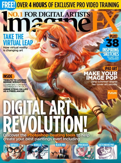
digital art<br />
revolution!<br />
Discover the photoshop-beating tools to help<br />
create your best paintings ever! Including…<br />
artrage<br />
rebelle black ink procreate<br />
sketchbook pro
Editor’s letter<br />
Welcome to…<br />
Three of my top<br />
EDITOR’s ChOICE picks this month…<br />
18<br />
Here in the UK, spring has<br />
finally sprung (hooray!) and it’s<br />
already brought warmer weather<br />
and lighter evenings to our<br />
bijou isle. I seem to relax a little<br />
more when I’m not having to<br />
scurry from place to place to<br />
avoid the biting cold, and I love<br />
not having to close the curtains<br />
on the world at 4.30pm because it’s dark outside.<br />
Spring has so much optimism to it. There’s a whole<br />
year ahead to look forward to.<br />
Right now, digital art is definitely having its<br />
spring moment. There are so many technological<br />
innovations just about to blossom, it feels as<br />
though we’re on the cusp of something truly<br />
transformative. Creative tech companies like Savage<br />
Interactive and Ambient Design are making great<br />
leaps with brilliantly packaged, affordable art<br />
software such as ArtRage and Procreate – and all<br />
without a subscription-based price tag to match. See<br />
our round-up of the best offerings on page 38.<br />
Technology is an ever-evolving concept, but so<br />
many exciting changes are happening right now. We<br />
take a look another revolution in digital art – virtual<br />
reality painting – on page 18. There’s so much<br />
going on, so leap into the issue…<br />
Virtual insanity<br />
We speak with the makers of the latest VR art tools that<br />
are changing the way artists approach their work.<br />
68<br />
Artrageous ArtRage 5<br />
Fed up with subscription-based software models,<br />
Nick Harris became an expert on the alternative tools.<br />
106<br />
Claire Howlett, Editor<br />
claire@imaginefx.com<br />
Alla Prima<br />
Talented traditional artist Rob Rey gives us an insight<br />
into how he creates textured works of art in oils.<br />
mail@imaginefx.com<br />
@imaginefx<br />
facebook.com/imaginefx<br />
@imaginefxmagazine<br />
imaginefx.creativebloq.com<br />
5 issues<br />
for £5!<br />
Subscribe to <strong>ImagineFX</strong><br />
today and get five<br />
issues for just £5!<br />
See page 36 for<br />
more details…<br />
<strong>June</strong> <strong>2017</strong><br />
3
Money-saving subscription offer!<br />
Try five issues for just £5 See page 36<br />
Contents<br />
Five<br />
issues for<br />
£5!<br />
Your art<br />
8 FXPosé<br />
You send in your art – we showcase it!<br />
News and events<br />
18 Is it time you explored<br />
painting in virtual reality?<br />
Artists reveal what it takes to make<br />
the leap from 2D to VR illustration.<br />
24 Artist in Residence<br />
Find out why Rodney Matthews is just as<br />
handy with a drumstick as with a brush…<br />
Your questions<br />
28 Artist Q&A<br />
Advice on depicting a squinting character,<br />
shadows, foreshortening and more!<br />
Features<br />
38 Digital Art Revolution!<br />
We present some of the best affordable,<br />
fully featured painting programs around,<br />
including Procreate, Rebelle and ArtRage.<br />
48 Sketchbook: Cosmin Podar<br />
Romanian urban and rural life mingle<br />
with fantasy in this artist’s sketchbook.<br />
54 Sketchbook: Gareth Davies<br />
The architecture graduate turned concept<br />
artist loves doing a few armour studies…<br />
Reviews<br />
94 Books<br />
99 Training<br />
Regulars<br />
3 Editor’s letter<br />
6 Resources<br />
26 Letters<br />
27 Back issues<br />
34 Digital subscriptions<br />
36 Subscriptions<br />
80 Next month<br />
38<br />
28 18<br />
Q&A: Illustrate smoke<br />
digital art<br />
revolution!<br />
Discover the tools to help you paint<br />
great art without breaking the bank<br />
Is it time you went virtual?<br />
4 <strong>June</strong> <strong>2017</strong>
<strong>Issue</strong> <strong>148</strong> <strong>June</strong> <strong>2017</strong><br />
68 88<br />
Workshops<br />
60 Make colours and lighting pop<br />
Jana Schirmer gets plenty of bang for her<br />
buck with the low-cost app Procreate.<br />
66 Core skills: Rebelle<br />
Discover ways to keep your edges clean<br />
in Rebelle, with Martin Hanschild.<br />
Get more from ArtRage 5 From sketch to final creation<br />
82<br />
68 How to get more from<br />
ArtRage 5<br />
Illustrator Nick Harris taps into the power<br />
of the budget painting program.<br />
74 Create a scene in Black Ink<br />
Using the low-cost painting program,<br />
Ayan Nag develops a fantasy environment.<br />
82 How to paint your dragon<br />
Concept artist Trent Kaniuga adds vibrant<br />
colour in SketchBook Pro.<br />
88 From sketch to final creation<br />
Manuel Castañón reveals how he came up<br />
with the idea of a diminutive dentist.<br />
60<br />
Colours and lighting<br />
How to paint your dragon<br />
54<br />
106<br />
Sketchbook: Gareth Davies<br />
Alla prima oils<br />
Traditional Artist<br />
102 FXPosé<br />
The best art created using traditional<br />
methods, sent in by you.<br />
106 Get planning for alla prima oils<br />
The wet-into-wet oil painting technique<br />
yields great results if done correctly. See<br />
how Rob Rey achieves this look in his art.<br />
112 Core skills: prepare the canvas<br />
This month, Howard Lyon show how to<br />
stretch your own canvas and more.<br />
114 First Impressions<br />
Annie Stegg explores hidden worlds.<br />
<strong>June</strong> <strong>2017</strong><br />
5
Resources<br />
Resources<br />
Getting hold of all of this issue’s videos and custom<br />
brushes is quick and easy. Just visit our dedicated<br />
web page at http://ifxm.ag/digi<strong>148</strong>rev<br />
cover art video<br />
Make colours<br />
and light pop<br />
Jana Schirmer uses Procreate to paint<br />
and light up this issue’s striking cover<br />
illustration. See how on page 60.<br />
oVEr<br />
4 Hours<br />
of video tutorials<br />
from pro artists<br />
to watch and<br />
learn from!<br />
Get your<br />
resources<br />
You’re three steps away from<br />
this issue’s resource files…<br />
Go to the website<br />
1Type this into your browser’s<br />
address bar (not the search bar):<br />
http://ifxm.ag/digi<strong>148</strong>rev<br />
Find the files you want<br />
2Search through the list of<br />
resources to watch or download.<br />
Download what you need<br />
3You can download all of the<br />
files at once, or individually.<br />
EDitorial<br />
ClairE HowlEtt ediTor<br />
claire.howlett@futurenet.com<br />
DaniEl VinCEnt ArT ediTor<br />
daniel.vincent@futurenet.com<br />
CliFF HopE oPerATioNS ediTor<br />
clifford.hope@futurenet.com<br />
Contributions<br />
dominic Carter, Manuel Castañón, ian dean, Tom<br />
Foster, Tony Foti, ruth Hamilton, Martin Hanschild,<br />
Nick Harris, richard Hill, Trent Kaniuga, Howard Lyon,<br />
Tom May, Ayan Nag, Beren Neale, rob rey, Jana<br />
Schirmer, Tan Hui Tian<br />
amy HEnnEssEy editor-in-chief, creative & design<br />
will sHum senior art editor, creative & design<br />
pHotoGrapHy Future photography studio<br />
aDVErtisinG<br />
ClarE DoVE commercial sales director,<br />
clare.dove@futurenet.com<br />
+44 (0) 1225 68 7226<br />
CHris mitCHEll account executive<br />
chris.mitchell@futurenet.com<br />
+44 (0) 1225 687832<br />
matt Downs director of agency sales<br />
matt.downs@futurenet.com<br />
+44 (0) 20 7042 4166<br />
ClarE Jonik head of strategic partnerships<br />
clare.jonik@futurenet.com<br />
+44 (0) 20 7042 4108<br />
markEtinG<br />
CHarlottE JolliFFE campaign manager<br />
print & proDuCtion<br />
ViViEnnE CalVErt production controller<br />
mark ConstanCE head of production UK & US<br />
nola CokEly ad production manager<br />
natHan DrEwEtt ad production co-ordinator<br />
liCEnsinG<br />
matt Ellis licensing & syndication manager<br />
FuturE publisHinG limitED<br />
ross anDrEws art & design director<br />
aaron asaDi creative director, magazines<br />
ZillaH bynG-tHornE chief executive<br />
nExt issuE on salE<br />
FriDay 19 may <strong>2017</strong> – sEE paGE 80!<br />
imagineFX is the registered trademark of<br />
Future Publishing Ltd. All rights reserved.<br />
ContaCt us<br />
pHonE +44 (0) 1225 442244<br />
Email mail@imaginefx.com<br />
art submissions fxpose@imaginefx.com<br />
wEbsitE http://imaginefx.creativebloq.com<br />
twittEr @imaginefx<br />
instaGram @imaginefxmagazine<br />
FaCEbook www.facebook.com/imaginefx<br />
post imagineFX, Future Publishing Ltd, Quay<br />
House, The Ambury, Bath, BA1 1UA, UK<br />
print subsCriptions<br />
uk pHonE o844 848 2852<br />
outsiDE oF uk +44 (0) 1604 251045<br />
Email contact@myfavouritemagazines.co.uk<br />
wEb www.myfavouritemagazines.co.uk<br />
DiGital subsCriptions<br />
applE DEViCEs http://ifxm.ag/apple-ifx<br />
anDroiD, pC or maC www.bit.ly/r938Ln<br />
GooGlE play http://ifxm.ag/google-halfprice<br />
barnEs & noblE nook<br />
http://ifxm.ag/1FlnypM<br />
amaZon kinDlE http://ifxm.ag/kindle-ifx<br />
printErs<br />
Text and cover by William Gibbons & Sons Ltd,<br />
distributed by Marketforce +44 (0) 20 378 79001<br />
2nd Floor, 5 Churchill Place, Canary Wharf, London, e14 5HU<br />
© <strong>2017</strong> Future Publishing Limited. All rights reserved. No part of this magazine<br />
6 <strong>June</strong> <strong>2017</strong>
<strong>Issue</strong> <strong>148</strong> <strong>June</strong> <strong>2017</strong><br />
ExclusivE vidEo tuition!<br />
Watch our videos to gain a unique insight into how our artists create their stunning art<br />
workshop videos<br />
Paint a dragon<br />
Learn how you can unlock the power of<br />
SketchBook Pro on page 82, with video<br />
tuition from Trent Kaniuga.<br />
q&a videos<br />
create a scene in Black ink<br />
Take your first steps with the innovative,<br />
low-cost painting program Black Ink, with<br />
Ayan Nag as your guide, over on page 74.<br />
traditional art – alla prima<br />
Watch how Rob Rey captures the wet-intowet<br />
oils look in his art over on beforehand.<br />
See the workshop on page 106.<br />
Painting chrome<br />
Follow Tom Foster’s video to find out the<br />
secrets to painting chrome. See his step-bystep<br />
tutorial on page 33.<br />
training<br />
dramatic cast shadows<br />
Cast shadows can be tricky to get right first<br />
time – watch Tom Foster in action and<br />
follow his step-by-step on page 31.<br />
squinting advice<br />
Tony Foti shows how to portray a squinting<br />
person. Watch the video and see his stepby-step<br />
on page 35.<br />
Gnomon training sample<br />
You’ll pick up plenty of animation-friendly<br />
modelling tips from Ben Erdt’s video. Read<br />
our review on page 99.<br />
<strong>June</strong> <strong>2017</strong><br />
7
the place to share your DIGItal art<br />
1<br />
Dang My Linh<br />
Location: US MEDia: Photoshop WEb: www.facebook.com/dangmylinhART<br />
Recently, Vietnamese concept artist Linh has been refining her<br />
portrait style. “I focus on observing people around me, the way<br />
light hits their face and changes colour,” she says.<br />
1 bravE<br />
“I really like Princess<br />
Merida from the film Brave,<br />
and painted her with a<br />
different makeup look.<br />
I spent most of the time on<br />
her hair, and tried to make it<br />
detailed and natural looking.”<br />
2 PurPLE<br />
“I wanted to paint a<br />
modern-looking male soldier,<br />
but still keep things realistic.”<br />
8 <strong>June</strong> <strong>2017</strong><br />
Email your submissions to fxpose@imaginefx.com
2<br />
3<br />
4<br />
3 GoLD<br />
“I didn’t think too much when I painted<br />
this portrait – it was just a flow of emotion<br />
while I listened to music. I kept things simple,<br />
so the focus remained on the girl’s eyes.”<br />
4bLuE anD Pink<br />
“These two figures were painted at the<br />
same time because I wanted to create a series<br />
of portraits. I was keen to use a new style that<br />
was different from what I’d done before.”<br />
Email your submissions to fxpose@imaginefx.com <strong>June</strong> <strong>2017</strong><br />
9
Rita Fei<br />
Location: Canada MEDia: Photoshop WEb: www.ritafei.com<br />
Rita is a freelance concept artist and illustrator based in<br />
Vancouver, British Columbia. She uses her art to bring to<br />
life the worlds and characters she creates in her mind.<br />
1 aErys<br />
“During my grad year.<br />
I explored how to keep<br />
the looseness of my pencil<br />
sketches, and countered<br />
my dislike of colour by trying<br />
out different overlays.”<br />
1<br />
10 <strong>June</strong> <strong>2017</strong><br />
Email your submissions to fxpose@imaginefx.com
2 3<br />
2kEEPEr thorn<br />
“This illustration depicts<br />
a friend’s D&D character, a<br />
dragon-born warrior, in all his<br />
brutality and ferocity. I tried<br />
to keep the background<br />
simple, but still dynamic.”<br />
4<br />
3 GLaDiator<br />
“I wanted to develop a<br />
character that was bolder<br />
and brighter than I usually do,<br />
as well as practise being<br />
cleaner with the overall<br />
rendering. I learned quite a<br />
bit in the process.”<br />
4caPtain of thE<br />
british aEriaL corPs<br />
“This character was inspired<br />
by the Temeraire books by<br />
Naomi Novik, which is a<br />
fantastic fantasy/alternatehistory<br />
series. I imagine her<br />
to exist in the same universe,<br />
but much later in time.”<br />
Email your submissions to fxpose@imaginefx.com<br />
<strong>June</strong> <strong>2017</strong><br />
11
Markus Stadlober<br />
Location: Austria MEDia: Photoshop WEb: www.markusstadlober.com<br />
Freelance illustrator Markus gets his inspiration from<br />
RPG sessions. “A funny situation, or one not going<br />
as planned, can spawn a plethora of ideas," he says.<br />
2<br />
1<br />
12 <strong>June</strong> <strong>2017</strong><br />
Email your submissions to fxpose@imaginefx.com
3<br />
4<br />
1castErLy rock 1985<br />
“Here’s Game of Thrones<br />
set in an alternate reality,<br />
where each house is a heavy<br />
metal band from the 80s.<br />
Casterly Rock was a nobrainer<br />
as the Lannisters’<br />
band name.”<br />
2LifE stEaL<br />
“A cursed being, sucking<br />
the life out of its victim to<br />
regain human form. As<br />
there’s lots of foreshortening,<br />
I modelled the two figures in<br />
3D to use as a template.”<br />
3shaDoW PossEssion<br />
“A shadow-being<br />
possessing a victim. I used a<br />
Painter Particle brush to<br />
create the shadowy veil<br />
around the possession cord.”<br />
4thE GuarDian<br />
“This started as a doodle<br />
of a wild elf. I liked the sketch,<br />
so I started to develop a<br />
story around her. What could<br />
she be looking at?”<br />
Email your submissions to fxpose@imaginefx.com <strong>June</strong> <strong>2017</strong><br />
13
Inna Hansen<br />
Location: Norway MEDia: Photoshop WEb: www.innaha.com<br />
Inna is a freelance illustrator and concept artist who hopes to<br />
launch a game studio of her own. “I try to grab anything around<br />
me that makes me excited, then put it into my own universe.”<br />
2<br />
1<br />
1baLLEt DEity<br />
“This was inspired by the<br />
interesting history of<br />
ballerinas in the 17th century.<br />
I felt like it was appropriate to<br />
show a god-like manifestation<br />
of the dancers.”<br />
2DroWnED<br />
“This remake of one of<br />
my oldest pieces shows the<br />
moment after the struggle.<br />
I used to be more into<br />
surrealist horror and it was<br />
amazing to dive back into my<br />
younger mindset.”<br />
14 <strong>June</strong> <strong>2017</strong> Email your submissions to fxpose@imaginefx.com
3roguE<br />
“This was done for a challenge on the theme Rogue.<br />
I wanted to paint something that would fit into a classic<br />
fantasy story. Something epic, something big.”<br />
3<br />
4<br />
4unDErWatEr<br />
“Things are so<br />
mysterious under the ocean<br />
surface. So little is discovered<br />
that the imagination runs<br />
wild. It might be unsafe to<br />
dive in this particular part<br />
of the ocean bed.”<br />
Email your submissions to fxpose@imaginefx.com<br />
<strong>June</strong> <strong>2017</strong><br />
15
1<br />
16 <strong>June</strong> <strong>2017</strong> Email your submissions to fxpose@imaginefx.com
Lamin Martin<br />
Location: Canada MEDia: Photoshop WEb: www.laminmartin.com<br />
Lamin is a concept designer who’s created artwork for video<br />
games, feature films, TV, and even dipped into augmented<br />
reality. Lamin’s also written and illustrated several art books.<br />
2<br />
1 charon<br />
“In Greek mythology,<br />
Charon is the ferryman<br />
of Hades, who carries the<br />
souls of the deceased into<br />
the world of the dead.<br />
I decided to make Charon<br />
the boat itself.”<br />
2MoDErnity District<br />
“I wanted my Blade<br />
Runner-inspired city to feel<br />
futuristic, ominous and<br />
dark. The cityscape is a<br />
combination of two of the<br />
most densely populated<br />
cities in the world: New York<br />
and Tokyo.”<br />
3a QuartEr Past<br />
“This gentleman assassin<br />
uses a steam-powered sniper<br />
rifle to take out his targets,<br />
but in his free time enjoys his<br />
pipe and a good Scotch as he<br />
mulls over his position in life.”<br />
3<br />
Do you want to see your art on these pages? Then email five pieces of your work and a short explanation<br />
about each artwork, along with a photo and a few details about yourself, to fxpose@imaginefx.com<br />
Email your submissions to fxpose@imaginefx.com<br />
<strong>June</strong> <strong>2017</strong><br />
17
ArtIst news, softwAre<br />
events<br />
At the core of the DIgItAl Art communItY<br />
Dear Angelica was art directed by<br />
Wesley Allsbrook at Oculus Story<br />
Studio, to showcase Quill’s<br />
animation tools.<br />
Is it time you<br />
went virtual?<br />
In-depth art The Oculus Story Studio artists talk to<br />
Ian Dean on moving from 2D art into VR illustration<br />
Don’t be afraid of virtual reality.<br />
That’s the message we hear from<br />
artists – 2D and 3D – who have made<br />
the leap from illustration into VR. As<br />
the technology develops, so has the<br />
accessibility of VR. The big leap came<br />
earlier this year, when artists were<br />
able to create directly inside VR. So is<br />
it time you went virtual?<br />
Tools such as Tilt Brush for HTC Vive<br />
and 3D sculpting app Medium for<br />
Oculus Touch are beginning to change<br />
how artists create content for video<br />
games and film. But one of the<br />
standouts is Oculus’ Quill, a 2D<br />
animation and drawing app that gives<br />
you a palette of tools to paint and<br />
draw with in a virtual space.<br />
Oculus Story Studio’s Goro Fujita<br />
co-developed Quill, which was then<br />
used on the award-winning VR<br />
animated film Dear Angelica, about a<br />
girl reconnecting with her dead actress<br />
mother by watching her old films on a<br />
VCR. Watching it in VR, we’re right<br />
there with the girl on her journey.<br />
“The idea was to tell a story entirely<br />
through illustrations in VR,” says Goro,<br />
who explains several<br />
techniques, including<br />
360-degree illustrations<br />
and line art mapped on a<br />
3D environments, were<br />
tried and subsequently benched.<br />
“None of those tests were<br />
convincing,” Goro reveals, “because<br />
the art needed to look like it came<br />
straight from the artist without<br />
showing any technical gimmicks. So<br />
ideally we want the artists to directly<br />
illustrate in VR.<br />
“That’s when Iñigo Quilez happened.<br />
In a two-day hackathon the visual<br />
effects supervisor came up with a<br />
prototype for a VR illustration tool that<br />
later became Quill. Iñigo and I went<br />
Screenshot from<br />
Climax Studios’ Lola<br />
and the Giant VR game,<br />
which Anna Hollinrake<br />
worked on.<br />
It’s like being inside your<br />
brain. You can experience the<br />
world that you’re creating<br />
back and forth on ideas, and I’m lucky<br />
enough to say that I’m the first artist<br />
ever to have painted in Quill.”<br />
thinking in volumes<br />
The leap from 2D to VR painting didn’t<br />
phase Goro. “Working in Quill is a<br />
dream come true. When I paint in 2D<br />
I naturally think in volumes, even if you<br />
only paint with one perspective. Now<br />
with Quill, you can paint volume and<br />
rotate your painting, which is an<br />
incredible experience.<br />
“It’s like being inside your brain<br />
where you can literally experience the<br />
18 <strong>June</strong> <strong>2017</strong>
ip Bernie<br />
wrightson<br />
We pay tribute to the<br />
celebrated, supremely<br />
talented comic artist,<br />
whose stunning line art<br />
brought Swamp Thing<br />
and Frankenstein’s<br />
monster to life.<br />
Page 23<br />
drumming<br />
up Business<br />
Rodney Matthews’<br />
home studio contains<br />
a set of custom drums,<br />
based on those that<br />
have appeared in his<br />
art. We’d have asked<br />
for a life-sized dragon…<br />
Page 24<br />
smoke gets<br />
in your eyes<br />
Tan Hui Tian reveals<br />
how to paint smoke<br />
and then, like all our<br />
Q&A artists, goes<br />
above and beyond by<br />
creating a smokebased<br />
fantasy beast.<br />
Page 28<br />
Industry InsIght<br />
AnnA<br />
HollinrAke<br />
The video game concept artist<br />
talks about VR’s possibilities<br />
“I like painting traditionally so I’m used to<br />
manipulating colour as a substance. It’s<br />
great to find that feeling in VR,” says Carlos.<br />
As a concept artist, do you<br />
need to work differently<br />
when developing for VR?<br />
You’ve always got to be more<br />
conscious of how your asset or<br />
scene is going to be viewed –<br />
everything gets scrutinised from<br />
all angles and viewpoints! But<br />
that’s very much the case for<br />
working with games as a whole.<br />
Have you used apps like<br />
Oculus Quill to concept VR<br />
games and entertainment?<br />
I haven’t commercially but in the<br />
time I have spent in them I see<br />
enormous potential for creativity<br />
with tangible 3D space. There’s an<br />
element of fluidity and dance that<br />
I see transferring over to gestures<br />
within the medium, not to<br />
mention the benefits of not being<br />
sat down all the time!<br />
What opportunities does VR<br />
hold for digital artists?<br />
VR is at the forefront of new<br />
technology, and that’s always an<br />
exciting place to be. Everyone is<br />
figuring out the best approaches<br />
together, not to mention problem<br />
solving new challenges.<br />
world that you’re creating. It took me a<br />
few days to fully understand and utilise<br />
the third dimension, but now it’s<br />
difficult for me to go back to a<br />
standard 2D canvas.”<br />
When you first start painting in VR<br />
there’s a learning curve. Goro says<br />
that the biggest challenge is to learn<br />
the third dimension, and understand<br />
where your hands are, because the<br />
Ric tells us how he got<br />
started: “Oculus Story<br />
Studio commissioned<br />
me to do an illustration<br />
for them and I wouldn’t<br />
let them stop letting me<br />
use Quill since.”<br />
Oculus Touch controllers enable you<br />
to manipulate objects in the VR<br />
space. “A lot of people, including me,<br />
had trouble with that in the beginning<br />
but it doesn’t take long for people to<br />
get used to it,” he says.<br />
“The tool itself is intuitive and easy<br />
to understand, but having basic<br />
understanding of shape and volume is<br />
definitely a plus,” he continues.<br />
If you could offer one piece of<br />
advice to artists considering<br />
taking up developing for VR,<br />
what would it be?<br />
Spend time working out which<br />
platform appeals to you. Each one<br />
has different benefits, and there’s<br />
a considerable financial outlay<br />
depending on which headset you<br />
go for. Define your goals early so<br />
you don’t overwhelm yourself<br />
with new tech!<br />
Anna works at Climax Studios<br />
based in England. She’s also<br />
created concepts for short<br />
films and board games.<br />
www.annahollinrake.com<br />
<strong>June</strong> <strong>2017</strong><br />
19
ImagineNation News<br />
Ric Carrasquillo approached<br />
working in VR like a puzzle,<br />
using the third dimension to<br />
enhance his 2D drawings.<br />
Fellow Oculus Story<br />
Studio artist Carlos Felipe<br />
León Ortiz chips in: “I find it<br />
very enjoyable. I especially<br />
like the directness of the<br />
approach: it feels as though you’re<br />
really in contact with whatever you’re<br />
creating, while occupying the same<br />
space. I love the fact that colour feels<br />
dimensional, almost palpable.”<br />
In fact, Carlos says that the<br />
technology is the easy part. The real<br />
challenge for artists creating in VR is<br />
learning to understand and stay in<br />
control of shape, volume and colour<br />
inside a virtual space.<br />
“A deep knowledge of these basic<br />
artistic concepts is definitely very<br />
helpful, but I would also argue that<br />
Quill can be a tool that helps you learn<br />
and understand them at a fundamental<br />
level,” Carlos says.<br />
Likewise, Ric Carrasquillo says he<br />
found it a challenge at<br />
first to adjust to drawing<br />
in a 3D space, “but I<br />
approached it like a<br />
puzzle. Instead of treating<br />
3D like a constraint to composing a<br />
drawing, I looked for opportunities to<br />
enhance the original idea of the<br />
drawing. Very quickly, you start to<br />
think in 3D space and the whole<br />
process becomes more intuitive.”<br />
designing a space, not a frame<br />
All three artists agree that their art,<br />
painting style and workflows have<br />
changed since using Quill. For Goro,<br />
his concept of composition has<br />
changed since painting in VR. “The<br />
reason is that the audience becomes<br />
the camera and you can’t really frame<br />
Goro explains the VR<br />
experience: “One of the<br />
challenges is to<br />
understand the third<br />
dimension. All of a<br />
sudden you can move<br />
your hand in space<br />
along three axes.”<br />
“I’m not going to stop doing 2D<br />
illustrations, but I’m sure that I’ll<br />
spend more time in VR in the<br />
future,” says Goro.<br />
your paintings. The audience can<br />
freely move and look around in your<br />
paintings, so it’s more about designing<br />
a space instead of a single frame,<br />
which is much more challenging.”<br />
Carlos agrees: “VR illustration is a<br />
format that forces you to tackle<br />
creative decisions differently. Not<br />
being confined by a rectangular frame,<br />
the usual tools for image composition<br />
don’t work in the same way. Designing<br />
a space is harder than composing an<br />
20 <strong>June</strong> <strong>2017</strong>
Artist news, software & events<br />
Carlos describes his Quill workflow: “I make a line<br />
sketch in VR, to make sure characters are expressive<br />
and environments support the illustration. Staging,<br />
scale and space are my primary considerations.”<br />
not being confined by a rectangular<br />
frame, the usual tools for composition<br />
don’t work in the same way<br />
image, but it offers unexpected<br />
possibilities as well! It feels more akin<br />
to designing an installation space. This<br />
is the most significant way in which my<br />
working process has changed.”<br />
Some of the artists we spoke to like<br />
to paint directly into Quill. Goro, for<br />
example, does daily warm-up<br />
“Quillustrations” set against a time<br />
limit of 30 minutes to test his creativity.<br />
Carlos on the other hand takes a more<br />
measured approach, preferring to plan<br />
and sketch on paper before donning<br />
the VR headset and entering VR.<br />
These artists clearly find VR a<br />
creative space to work in, and one that<br />
doesn’t feel too dissimilar to their<br />
Goro’s Worlds in<br />
Worlds embraces<br />
Quill’s scope: “Quill has<br />
an infinite canvas and<br />
I wanted to put it to<br />
the test. It worked<br />
beautifully,” he says.<br />
traditional spaces. “Working in Quill is<br />
like having a personal art studio,” says<br />
Ric. “You shut the door, pull out your<br />
favourite brushes, start drawing and<br />
just focus. That place where you go to<br />
when you’re really into an idea and<br />
want to realise it. Quill is just like that<br />
space but even better, because you’re<br />
standing in the middle of that idea and<br />
there are no edges to the paper.”<br />
staying true to a concept<br />
Using apps like Quill can also speed up<br />
the artistic process, particularly as film,<br />
video games and animation begin to<br />
embrace a fuller 3D workflow. Being<br />
able to create complex 3D<br />
environments and characters as<br />
intuitively as drawing, in a 3D space,<br />
removes many of the development<br />
steps and ensures the final production<br />
drawing or model is closer to the<br />
artist’s original concept.<br />
Goro explains: “I believe that Quill<br />
will become a key element for VR<br />
productions. Early on we realised that<br />
if you design for VR then you have to<br />
design in VR. Quill enables the artists<br />
to do exactly that.”<br />
But will VR replace traditional ways<br />
of working? “I don’t think so, nor would<br />
I wish for it to replace other mediums,”<br />
argues Carlos. “But it’s definitely a tool<br />
that can complement them.”<br />
Goro agrees: “I don’t believe that<br />
Quill or VR painting tools in general will<br />
ever replace other mediums. In the end,<br />
it’s another tool for artists and it will<br />
co-exist among other creation tools.”<br />
Putting everything into context, Rico<br />
views VR as a new, infant tool from a<br />
creative standpoint. Artists, including<br />
those at the cutting edge of the<br />
technology, are still discovering how<br />
VR art and animation can be created.<br />
The rules of the game are still being set.<br />
“I’d say that VR is just the next<br />
stage in the evolution of animation,”<br />
says Rico. “VR won’t replace 3D just<br />
as 3D computer animation didn’t<br />
eradicate 2D. Animation is, I believe,<br />
the purest art form and VR will just<br />
help influence and further inspire all of<br />
the animation landscape.”<br />
<strong>June</strong> <strong>2017</strong><br />
21
get your<br />
binder today!<br />
Featuring<br />
artwork by<br />
wylie<br />
beckert<br />
This sturdy binder will store and protect 13 issues of <strong>ImagineFX</strong>.<br />
Prices start at £9.99, which includes delivery!<br />
order your binder at http://ifxm.ag/ifx-binder
Artist news, software & events<br />
Bernie Wrightson,<br />
pictured at the<br />
Austin Wizard World<br />
Comic Con in late<br />
October, 2012.<br />
Swamp Thing and<br />
Bernie’s illustrated<br />
version of Mary<br />
Shelley’s Frankenstein<br />
guarantee the artist<br />
a place in the annals<br />
of comic history.<br />
© Getty Images/Gary Miller/FilmMagic<br />
A tribute to artist<br />
Bernie Wrightson<br />
Modern Prometheus Fans mourn the loss of the Swamp Thing and<br />
Frankenstein artist, whose illustrations made the grotesque beautiful<br />
Bernie Wrightson, the master of the<br />
macabre adored by comic readers<br />
and horror aficionados for his deftly<br />
intricate illustrations for Swamp<br />
Thing and Frankenstein, passed away<br />
on 18 March, aged 68. The cause of<br />
death was brain cancer, which he’d<br />
been diagnosed with in 2014.<br />
Bernie began his career as an<br />
illustrator for The Baltimore Sun<br />
newspaper. But it was after meeting<br />
Frank Frazetta in 1967 that he decided<br />
to create his own stories. Two years<br />
later, his first illustrated comic book<br />
story, The Man Who Murdered Himself,<br />
appeared in House of Mystery no. 179<br />
under the name ‘Berni’.<br />
He then moved to New York and in<br />
1971 co-created with writer Len Wein<br />
his most famous character, Swamp<br />
Thing, for House of Secrets issue 92.<br />
Following the success of the first short<br />
Bernie was<br />
quite simply one<br />
of the finest men<br />
I’ve ever known<br />
in comics Colleen Doran<br />
story, Swamp Thing returned in his<br />
own series and gained a cult following.<br />
During this time, Bernie also worked<br />
on numerous horror-comic magazines<br />
and co-created Weird Mystery Tales<br />
with writer Marv Wolfman. It was<br />
around this point he also started work<br />
on his adaptation of Mary Shelley’s<br />
1818 Gothic horror novel, Frankenstein.<br />
Taking seven years to complete,<br />
Bernie’s Frankenstein was a labour of<br />
love that he created in between paid<br />
work. The adaptation, published in<br />
1983, is seen as Bernie’s masterpiece,<br />
Swamp Thing’s<br />
success in House<br />
of Secrets ensured<br />
the character would<br />
get his own series,<br />
launched in 1977.<br />
Bernie co-created<br />
Weird Mystery Tales<br />
with Marv Wolfman.<br />
The comic ran from<br />
1972 to 1975.<br />
cc-by-sa-2.0 - Gage Skidmore<br />
with the illustrations showcasing the<br />
magnificent line-work and negative<br />
space that made his name.<br />
Following the news of Bernie’s<br />
death, friends, artists and colleagues<br />
took to social media to share their<br />
thoughts. Neil Gaiman,<br />
who featured Bernie’s<br />
Destiny character in The<br />
Sandman, said on Twitter:<br />
“Bernie Wrightson was the<br />
first comics artist whose work I loved.<br />
Oddly, I don’t mourn the artist. I mourn<br />
the lovely man who told bad jokes.”<br />
“Bernie Wrightson was quite simply<br />
one of the finest men I’ve ever known<br />
in comics,” adds Colleen Doran, who<br />
also worked on The Sandman. “He was<br />
not only supremely<br />
talented, but also kind and<br />
giving. No other modern<br />
illustrator could match his<br />
incredible ink rendering,<br />
and we will never see better<br />
Frankenstein illustrations.”<br />
Film director Guillermo del Toro<br />
honoured Bernie’s memory by not<br />
posting on Twitter for 24<br />
hours, but before his<br />
silence he wrote, “As it<br />
comes to all of us, the end<br />
came for the greatest that<br />
ever lived: Bernie Wrightson. My North<br />
dark star of youth. A master.”<br />
Meanwhile, Stephen King, whose<br />
novel The Stand was illustrated by<br />
Bernie, was tellingly straightforward<br />
with his message: “RIP<br />
Bernie Wrightson, a good<br />
friend and a great<br />
collaborator.<br />
I will miss him.”<br />
<strong>June</strong> <strong>2017</strong><br />
23
ImagineNation News<br />
A piece of memorabilia from the early days. I was presented<br />
with this gold disc for my artwork on English rock band<br />
Magnum’s On a Storyteller’s Night album.<br />
A framed limited edition print of The<br />
Thief – an interpretation from Tolkien’s<br />
The Hobbit. I’ve done a whole series<br />
of Tolkien illustrations, but my best<br />
seller is Rivendell.<br />
Rodney<br />
Matthews<br />
New roots The English fantasy artist<br />
can be seen with a drumstick or two<br />
in hand just as much as a paintbrush…<br />
Together with Sarah,<br />
(my wife of four<br />
months!), we’ve moved<br />
from north Wales to<br />
the Cotswolds in<br />
England, and are living in a peaceful<br />
village, surrounded by wildlife.<br />
Our recent move has meant that our<br />
studio (an art room, music room and<br />
office), has not yet had the time to<br />
become the untidy work room for<br />
which I’ve become known. Sarah is also<br />
my agent and general spokesperson,<br />
and we enjoy working together on<br />
projects in the same part of our home.<br />
Some days we wander in the nearby<br />
woods, taking a little break from what<br />
has become a busy schedule.<br />
I’ve maintained the discipline that<br />
I picked up over 50 years ago – from<br />
my eight-year stint in an advertising<br />
agency, of starting work at around<br />
8am and pushing through until 6pm or<br />
later, depending upon the urgency of<br />
the job at hand. Right now, The Rolling<br />
Stones job I’m tackling is wanted<br />
yesterday, so I can be found in my<br />
studio some nights at 11pm. My<br />
working day is punctuated by several<br />
cups of tea, walks round the garden<br />
with our elderly cat and answering<br />
emails that Sarah has set aside for me.<br />
Before I pick up my paintbrush in the<br />
morning, and after a hearty bowl of<br />
porridge, I head to the studio and<br />
listen to the latest piece of music sent<br />
to me by “the band”. I’m currently<br />
working alongside US guitarist Jeff<br />
Scheetz on our own album of music<br />
This is Sarah’s work<br />
desk with laptop. Here<br />
she more or less runs<br />
the show – sending and<br />
answering business<br />
emails, brokering deals,<br />
interacting with<br />
customers, publishers<br />
and fans – leaving me<br />
free to fiddle with my<br />
fantasy art.<br />
During our recent<br />
move, I lost my old jam<br />
jar that I wash my<br />
brushes in. Any similar<br />
receptacle will do –<br />
I’m happy with the<br />
replacement and can<br />
recommend the<br />
cranberry sauce! Most<br />
of my illustrations are<br />
painted on artboard<br />
with the pigmented inks<br />
that can be seen hiding<br />
in the background.<br />
I occasionally use<br />
watercolours for<br />
children’s book art.<br />
based upon my images. The band,<br />
spread out across the world, includes<br />
musicians who have used my artwork<br />
on their albums: John Payne (Asia),<br />
Oliver Wakeman (Yes), Tony Clarkin<br />
(Magnum) and Rick Wakeman (Yes).<br />
At night, I move across to the<br />
musical part of the studio and take out<br />
the day’s frustrations on my drum kit.<br />
Rodney’s fantasy creations have come to life<br />
on posters and record covers, and in books,<br />
computer games and animation since the<br />
1970s. You can see more of his work at<br />
www.rodneymatthewsstudios.com.<br />
24 <strong>June</strong> <strong>2017</strong>
Artist news, software & events<br />
This is a partly completed album artwork. On the left is an earlier Rolling Stones<br />
vinyl, utilising my painting Another Time, Another Place previously published as<br />
a poster and later as a limited edition print. It’s there so that I can keep continuity.<br />
Here’s my most recent illustration job: the first of two<br />
album cover artworks for a vinyl package featuring early<br />
US live recordings of The Rolling Stones.<br />
Thomas, our 18-year-old kitten in the kitchen<br />
– the warmest room in the house – waits for<br />
me to make my regular cups of tea.<br />
I keep a few pieces on the walls. This<br />
is the original pencil drawing of the<br />
album cover from On a Storyteller’s<br />
Night by Magnum. Over the years, the<br />
band has used 21 of my images. To<br />
date my images have appeared on<br />
over 130 record sleeves.<br />
My self-designed custom fibreglass kit – there are two other drums not shown. It<br />
must have been some time in 1984 that I decided to have it constructed. Those<br />
familiar with my work will notice that it resembles some of the drums featured in<br />
my art (Drumboogie, Encore at the End of Time, Drumtower, for example).<br />
Since 1970 all my work has been done<br />
on this old ex-government office desk<br />
that I acquired from a closing-down<br />
sale in Bristol. The drawing board is<br />
even older, to the point that I can’t<br />
remember where I got it from.<br />
The compressor is new, replacing an<br />
old faithful beast that finally gave in<br />
after 40 years of use. It was always<br />
covered in a thick layer of dust and<br />
made a sound like a nearby helicopter,<br />
but it got the job done.<br />
Photos by The Schoolhouse Studio<br />
It’s spring, and the snowdrops are<br />
everywhere in the garden. Nature<br />
inspires me. A snowdrop was behind my<br />
conceptual design for wind turbines for<br />
the green energy company Ecotricity.<br />
Sir Squeakalot (left) and Sproggle (right), two of my<br />
stop-motion models from my children’s TV series Lavender<br />
Castle with the late Gerry Anderson. They watch over my dad’s<br />
home-made model of the Flying Scotsman, which believe it or<br />
not, influenced the artwork behind it: The Heavy Metal Hero.<br />
<strong>June</strong> <strong>2017</strong><br />
25
ImagineNation<br />
YOUr FeeDBack & OpINIONS<br />
contact the editor, claire howlett,<br />
on claire@imaginefx.com or write<br />
to <strong>ImagineFX</strong>, Future publishing,<br />
Quay house, the ambury,<br />
Bath, Ba1 1Ua, england<br />
Follow us on twitter:<br />
www.twitter.com/imaginefx<br />
tell us your thoughts on Facebook:<br />
www.facebook.com/imaginefx<br />
post your art or photos on Instagram:<br />
www.instagram.com/imaginefxmagazine<br />
Worth the money<br />
Every month I tell myself to save<br />
my cash and check it’s worth the<br />
cover price before buying it, and<br />
every month I check it, then go<br />
right ahead and buy it! What’s<br />
kept me reading <strong>ImagineFX</strong> are<br />
the tips, inspirational imagery or<br />
pieces of artistic wisdom.<br />
Even when there’s only one or two of<br />
these in an issue that really appeal to<br />
me, they prove so valuable that I’m<br />
always glad I chose to get the issue.<br />
These nuggets of educational gold have<br />
occasionally saved me days of struggle<br />
and rescued a piece or improved it far<br />
beyond what I’d have thought possible.<br />
Thanks for the years of good<br />
stewardship you’ve devoted to<br />
<strong>ImagineFX</strong>. I do get the digital version,<br />
but it would be great to buy one and get<br />
the other as well somehow, even if<br />
there were an increased price for this.<br />
Tom Myfield, via email<br />
Claire replies You’ve made our day,<br />
Tom! Our aim is to teach and inspire<br />
you to create, so it’s nice to know that<br />
we’re doing our jobs! As for a digital<br />
and print edition combined, we do<br />
have a subscription offer that combines<br />
both versions, but we don’t have this<br />
available for single editions. Sorry.<br />
Mischief, ArtRage and<br />
matte painting<br />
First off, where the heck has Made With<br />
Mischief disappeared to? It’s great for<br />
quick sketches and even detailed clean<br />
line drawing, but since being bought<br />
up by The Foundry it seems to have<br />
disappeared. No recent updates, no<br />
new versions, no news, nothing. The<br />
Tom Myfield has put his<br />
reading of <strong>ImagineFX</strong> to<br />
good use See his art at<br />
www.runninghead.com.<br />
DID YOU MISS<br />
the prevIOUS<br />
packeD ISSUe?<br />
Don’t worry –<br />
you can still get<br />
hold of it. Just see<br />
the opposite page<br />
for full details.<br />
Has Mischief been left out in the cold by The Foundry,<br />
wonders Tony. We were unable to find out more…<br />
Foundry won’t answer questions about<br />
it on their forums and don’t reply to<br />
emails regarding Mischief. It would be<br />
a shame if it left the program to die.<br />
Secondly, can you do a workshop on<br />
matte painting using other art software<br />
such as ArtRage, not just Photoshop.<br />
I’ve never gotten the hang of this style<br />
and haven’t found good beginner<br />
guides on how to start a project.<br />
Lastly, could you do a tutorial using<br />
ArtRage 5, SketchBook Pro or even<br />
Krita on how to create a book jacket<br />
and creating images that could be used<br />
for printing cards, T-shirts or posters.<br />
Tony Cross, via email<br />
Claire replies We also contacted The<br />
Foundry on Mischief and didn’t get a<br />
response, so we’re also in the dark<br />
about what’s happening with it. As for<br />
your other points, well this issue we<br />
have workshop from most of the<br />
software tools that you mention, but<br />
not on the subject. So, perhaps we’ve<br />
been partially helpful! I’ll look into<br />
some kind of feature or workshop on<br />
images for books, posters, T-shirts, etc.<br />
Thoughts on small text<br />
In answer to Eric’s letter (Text too<br />
small) in issue 147. I’m lucky enough to<br />
own a Surface Book and read my digital<br />
copy of <strong>ImagineFX</strong> using Microsoft’s<br />
free Windows 10 Zinio Reader app.<br />
Pages can be changed with a finger<br />
swipe and zoomed in and out with a<br />
finger pinch. When I zoomed in, all<br />
text is clearly readable. Thanks for a<br />
great magazine.<br />
David Hine, via email<br />
Claire replies Silly me, I hadn’t<br />
thought of suggesting the digital<br />
edition. Although I’m sure there are<br />
many people who still prefer holding a<br />
print edition in their hands. I’m always<br />
reading things online, but there’s<br />
something about reading words in<br />
print that make some things seem more<br />
real – to me, anyway. Do you agree?<br />
Your art news that’s<br />
grabbed our attention<br />
Eric Messinger<br />
@ericmessingerart<br />
“The first fellow has<br />
showed up on my piece<br />
of paper. I am anxious to<br />
see who will join him.”<br />
Samuel Serridge<br />
@samserridge<br />
“New creature<br />
concept.”<br />
Luke<br />
@lukeartography<br />
“Market – some<br />
Star Wars-ish art.”<br />
Just finished something that you want us to<br />
shout about? Then tag us on Twitter or<br />
Instagram, or find us on Facebook!<br />
26 <strong>June</strong> <strong>2017</strong>
Back issues<br />
Back issues<br />
Missed an issue of <strong>ImagineFX</strong>? Don’t panic,<br />
here’s how you can order yours today!<br />
Missed out on a recent print edition of <strong>ImagineFX</strong>?<br />
See what’s available at www.bit.ly/ifxbackissues.<br />
Got an Apple iPad, iPhone or iPod Touch?<br />
Get the free <strong>ImagineFX</strong> app for your iPad or iPhone<br />
at http://ifxm.ag/apple-ifx, or download us straight<br />
from the Newsstand app already on your device.<br />
On Android, PC or Mac?<br />
Google Play: http://ifxm.ag/google-halfprice<br />
Zinio: www.bit.ly/r938Ln<br />
Got some other device?<br />
<strong>ImagineFX</strong> is available for all kinds of<br />
devices, including Barnes and Noble’s nook,<br />
and Amazon’s range of Fire tablets.<br />
PRINT ANd dIGITAL BACk <strong>Issue</strong>s<br />
Only the<br />
most recent<br />
editions are<br />
available in print<br />
While<br />
stocks<br />
last!<br />
<strong>Issue</strong> 147<br />
May <strong>2017</strong><br />
Light, values, colour, 3D and 2D<br />
workflow… this issue is packed<br />
with advice on improving your<br />
digital art. Plus, pro artists give us<br />
their tips on making the most of<br />
social media, and we reveal the<br />
sketchbook of Scott Robertson.<br />
Buy print editions<br />
of imaginefx at:<br />
<strong>Issue</strong> 146<br />
April <strong>2017</strong><br />
Our comics special includes an<br />
insightful interview with Batman<br />
artist Jock, sketches from Mark<br />
Brooks and Joverine, two<br />
Wonder Woman workshops, a<br />
look around Ryan Sook’s studio,<br />
and comics’ unlikely heroes.<br />
<strong>Issue</strong> 145<br />
March <strong>2017</strong><br />
Our animation issue emphasises<br />
why story is important in your art<br />
– a message that comes loud and<br />
clear from Kenneth Anderson’s<br />
cover art, to Armand Serrano’s<br />
background art tutorial and Matt<br />
Jones’ storyboarding workshop.<br />
www.bit.ly/ifxbackissues<br />
<strong>Issue</strong> 144<br />
February <strong>2017</strong><br />
From Patrick J Jones’s cover art,<br />
to creating faces full of character<br />
with Julián del Rey, to anatomy<br />
advice from tutor Glenn Vilppu,<br />
this is an issue that’s guaranteed<br />
to boost your knowledge of<br />
anatomy and figure drawing.<br />
<strong>June</strong> <strong>2017</strong><br />
27
imaginenation artist q&a<br />
Struggling with a painting technique or<br />
topic? email help@imagiNefx.com today!<br />
get your<br />
resources<br />
See page 6 now!<br />
Blending the more distant parts<br />
of the creature’s body to imitate<br />
atmospheric perspective and<br />
layering fog in front of it makes<br />
it more three-dimensional.<br />
Tan hui Tian<br />
Tan is a senior<br />
illustrator with CDS in<br />
Singapore. She has<br />
a graphic design<br />
background, and so her works<br />
feature a strong design sense.<br />
www.tanhuitian.daportfolio.com<br />
Tom foster<br />
Best known for his<br />
work on 2000 AD and<br />
the Judge Dredd<br />
Megazine, comic<br />
book artist Tom also writes and<br />
performs stand-up comedy.<br />
http://ifxm.ag/tom-foster<br />
Tony foti<br />
Tony is an artist with<br />
Konami who also<br />
works freelance for<br />
books, magazines and<br />
games such as MtG and Fantasy<br />
Flight’s Star Wars games.<br />
www.tonyfotiart.com<br />
Need our advice?<br />
Email help@imaginefx.com<br />
with your art questions and<br />
we’ll provide all the answers!<br />
28 <strong>June</strong> <strong>2017</strong>
Your questions answered...<br />
You can change the colours and<br />
feel of the material by using a<br />
layer set to Overlay. This enables<br />
you to tint the artwork without<br />
affecting the original layers.<br />
Step-by-step: how to<br />
illustrate a fantasy<br />
creature made of smoke<br />
Question<br />
How can I paint smoke realistically?<br />
Katherine Batts, US<br />
Answer<br />
Tan replies<br />
Smoke is a fairly simple<br />
material to depict, because<br />
the airborne particulates<br />
are typically matte. yet it<br />
differs in thickness and texture, and<br />
therefore requires a variety of brushes<br />
with differing opacity levels. you can<br />
use a simple round hard brush for the<br />
task, but it’s often more efficient to<br />
use custom brushes for wispier areas.<br />
Search for photo references for<br />
different types of smoke, which can<br />
vary from thick smog to wispy incense<br />
smoke. the liquefy tool comes in<br />
handy for adding random movement<br />
to the smoke. adding a creature into<br />
the mix makes for an interesting<br />
visual effect, contrasting the solidness<br />
of the creature with the transparency<br />
of the smoke.<br />
For this article, i’ve chosen to depict<br />
a mythical creature that’s a mixture of<br />
a horse, stag and zebra, to reflect the<br />
mysterious smoky atmosphere.<br />
I put down undefined blobs using large brush<br />
1<br />
strokes, and then slowly refine the shape by<br />
picking out the areas of highlight and shadow. The<br />
lighting should be consistent: here, the lighting is<br />
from the top, and the darker areas are below.<br />
I warp the smoke using the Liquefy tool into the<br />
2<br />
shape I want. It’s easier to lower the Opacity of<br />
the smoke later than doing so the other way around,<br />
so the current smoke is more opaque than the end<br />
result. I’ve also roughly painted the creature in.<br />
To subtly give more<br />
depth to the creature,<br />
I add smoke effects on<br />
top of the legs.<br />
Artist’s secret<br />
Use custom brushes wisely<br />
Custom brushes are useful for rendering<br />
different materials after the form is finalised.<br />
You could use a fur and hair brush for details<br />
on a creature, and a smoke effects brush for the<br />
smoke. It’s crucial to have the form painted<br />
first, though. Layering fur brushes from the<br />
start may make the form look muddy.<br />
To ensure the creature blends in with the smoke,<br />
3<br />
I use a colour scheme that’s of a similar palette<br />
to the smoke. The creature is painted with a solid<br />
brush with Opacity set to Pen Pressure. I reduce the<br />
Opacity of the smoke with a large Airbrush.<br />
<strong>June</strong> <strong>2017</strong><br />
29
ImagineNation Artist Q&A<br />
Question<br />
Can you give me some advice on foreshortening please?<br />
Holly Mason, Australia<br />
Answer<br />
Tony replies<br />
Foreshortening, like<br />
happiness, is all about<br />
perspective. if you want<br />
something to appear<br />
dramatic and grab the focus in a<br />
composition, have it pointing towards<br />
the viewer. then place the vanishing<br />
point close to the object and have the<br />
camera in real close. with these three<br />
elements, you’re going to feel the<br />
volume of your focal point a lot more.<br />
perspective is one of those things<br />
that can fill up several books. But the<br />
two main concepts are the horizon<br />
line and a vanishing point. the<br />
horizon line is a horizontal line that<br />
corresponds to the viewer’s eye level.<br />
the vanishing point is a place on the<br />
horizon line that a set of parallel<br />
edges on your object will all recede<br />
into. think about how telephone<br />
poles get smaller on a long road, and<br />
how they all seem to recede into one<br />
point. that’s the vanishing point.<br />
if you draw in your perspective and<br />
don’t like how something’s being<br />
distorted, change it. moving the<br />
horizon line will alter the height of<br />
the camera, and moving around<br />
vanishing points will enable you to<br />
control the amount of distortion in<br />
the background and foreground.<br />
In this illustration I’ve placed the<br />
vanishing point inside the image area<br />
and close enough to dramatically<br />
foreshorten a lot of the main figure.<br />
Pay attention to the lines coming out of the vanishing point that’s off to the left<br />
of the image, and notice how I’ve used them as a guide for the gun and woman.<br />
Artist’s secret<br />
Perspective tool kit<br />
Keep a Photoshop file around that has<br />
horizon lines, perspective lines,<br />
vanishing points and parallel lines<br />
ready to go. In school I’d often create a<br />
new grid for every image, but realised<br />
it’s easier to just keep them handy.<br />
Step-by-step: get some perspective<br />
Start by loosely drawing the amount<br />
of foreshortening you want in a<br />
sketch from either your mind or reference,<br />
but don’t use perspective lines. Just mess<br />
around until you have an amount of<br />
exaggeration that expresses what you’re<br />
going for with the image.<br />
Now figure out where the horizon line<br />
2 and vanishing point would be. Do this<br />
by either finding parallel edges on an<br />
object (like around the gun) and finding a<br />
spot that they at least roughly point to, or<br />
create a vanishing point on its own layer<br />
and trying it out around the horizon line.<br />
1 3<br />
Then redraw the image, but this time<br />
using your new perspective lines. As<br />
you paint, leave your perspective on its<br />
own layer, on a low Opacity: you’ll have a<br />
constant guide to make sure everything’s<br />
correct in relation to one another. This will<br />
ensure believable foreshortening.<br />
30 <strong>June</strong> <strong>2017</strong>
Your questions answered...<br />
For this prison scene,<br />
working out my lighting<br />
in 3D saved me hours of<br />
working out the<br />
logistics of complex<br />
cast shadows.<br />
Step-by-step: Using 3D<br />
software to help create<br />
dramatic shadows<br />
Although 3D tools<br />
can make certain<br />
aspects of the job<br />
easier, a strong sense of<br />
composition and<br />
staging are still required<br />
for setting a scene.<br />
I use DAZ 3D to set up my scene, carefully<br />
1<br />
positioning all the crucial elements so they can<br />
be lit up by a relatively narrow area of light. The<br />
further I place the light source from the bars of the<br />
cell door, the less the shafts of light will fan out.<br />
Question<br />
How can I quickly paint<br />
dramatic cast shadows?<br />
Wilbur Hawthorn, US<br />
Answer<br />
Tom replies<br />
the great comic book<br />
artist, wally wood, once<br />
wrote, “never draw<br />
anything you can copy,<br />
never copy anything you can trace,<br />
never trace anything you can cut out<br />
and paste up.” indeed, there’s no need<br />
to make drawing and painting any<br />
more difficult than it already is. using<br />
photo references, applying textures<br />
directly onto an object… these are just<br />
two of the ways art software helps you<br />
to realise an image.<br />
if i’m in any doubt as to the way<br />
shadows would fall in real life, i test<br />
them out with 3d posing software. i<br />
mock up a quick scene from some<br />
prefab models and primitive shapes<br />
and then i draw the finished piece<br />
over the top. this keeps my shadows<br />
accurate and enables me to focus all<br />
my drawing attention on the details<br />
that the reader is actually going to see.<br />
Artist’s secret<br />
Seeing the light<br />
Looking from the point of view of the<br />
light source enables me to see which<br />
areas of my image will be lit, pre-render.<br />
Whatever’s obscured will be in shadow.<br />
This is handy if I want to highlight<br />
specific elements in the scene.<br />
After rendering in 3D, I use Photoshop’s Stamp<br />
2<br />
filter to create something approximating a line<br />
drawing. I always upscale the resolution of the<br />
image first, because I want the filter to preserve as<br />
much detail as possible.<br />
I create a new layer and draw the finer details<br />
3<br />
using the Pen tool, putting more character in<br />
the face and making fixes to anatomy and clothing.<br />
In this instance, with big block shadows covering so<br />
much of the image, I barely had to do any drawing.<br />
<strong>June</strong> <strong>2017</strong><br />
31
ImagineNation Artist Q&A<br />
Step-by-step: Discover<br />
how to illustrate and<br />
light up a neon sign<br />
I create the silhouette of the sign on top of a<br />
1<br />
brick wall. I don’t have to render all of the wall<br />
because the neon light only illuminates a small area.<br />
I grab a free texture from www.textures.com and<br />
then convert the lighting using Levels and Curves.<br />
If you want to adjust the overall lighting,<br />
you can create a new Adjustment layer<br />
on top and tweak the lighting of all<br />
layers without merging them down.<br />
Question<br />
Any advice for painting a neon sign?<br />
Evan Atkinson, Scotland<br />
Answer<br />
Tan replies<br />
Neon signs are a common<br />
mainstay of futuristic technoir<br />
science fiction such as<br />
Blade Runner and Ghost in<br />
The Shell. They symbolise the glitzy<br />
glamour of advertising, and add<br />
interesting lighting effects to an<br />
otherwise dark monochrome world.<br />
They’re fun to add to an illustration,<br />
but can also make it difficult to get<br />
the scene’s lighting right, particularly<br />
if there are multiple light sources. It’s<br />
tempting to use Photoshop’s Blending<br />
options to create neon lights, and they<br />
are a great starting point, but that’s<br />
usually not enough to make the lights<br />
appear three dimensional. Neon<br />
lights are encased in glass and have<br />
connecting wires to power them, and<br />
all these details, when rendered, make<br />
the illustration more realistic.<br />
The most common type of neon<br />
signs are neon tubes that are bent into<br />
letters or other shapes. It’s another<br />
I sketch out the neon sign in a direct frontal view in<br />
black and white so it can be reproduced elsewhere<br />
if necessary. To place it in a scene I’ll warp the<br />
perspective and fill it out in three dimensions.<br />
detail to consider when creating an<br />
illustration with neon signs, because<br />
these tubes don’t support tight angles.<br />
Neon signs have very distinct fall-off<br />
lighting as well. A yellow neon sign<br />
may not produce yellow reflections in<br />
the objects it casts light on, but may<br />
be reddish or orange-ish instead.<br />
I mount the neon light on a glass plate for added<br />
2<br />
visual interest. I Use Blending Options>Bevel<br />
and Emboss and Inner Glow to build it up in three<br />
dimensions. Then I blend them with a Soft Airbrush<br />
and add specular highlights using a Hard brush.<br />
I then add the electrical hardware behind the<br />
3<br />
neon sign: the rods that connect the tubes to the<br />
plate and thin wires on the tubes to secure it in place.<br />
The reflection of yellow neon signs is often reddish<br />
instead of yellow, such as the one on the glass.<br />
32 <strong>June</strong> <strong>2017</strong>
Your questions answered...<br />
Question<br />
How can I convey a chrome effect in a line drawing?<br />
Janina Rothstein, Germany<br />
Answer<br />
Tom replies<br />
Chrome effects can be a<br />
little difficult to create on<br />
the canvas, because<br />
sticking too close to<br />
reference material can often make<br />
for an overly busy drawing.<br />
As an illustrator often working on<br />
comic books, I don’t really want there<br />
to be any visual information in the<br />
image that I haven’t put there for a<br />
reason. It would distract from the<br />
elements that best tell the story and,<br />
worse still, look fussy.<br />
As such, I tend to keep any reflected<br />
detail to a minimum. A few lines that<br />
follow the contours of the object<br />
usually do the job; just enough to<br />
suggest that something is being<br />
reflected on the surface, but very little<br />
in the way of complex information as<br />
to what that might be.<br />
With something a bit flatter, such<br />
as the sort of lens that’s at the<br />
business end of this retro-looking ray<br />
gun, I can justify putting in a little<br />
more detail because it’s a focal point<br />
for the image and will be less<br />
distorted by surface curvature.<br />
Keeping your painting approach<br />
relatively simple like this can make<br />
for a far more appealing visual and<br />
enhance the impact of the image.<br />
For this image of a futuristic weapon,<br />
I wanted a sense of impact and<br />
drama, so it was important to keep<br />
the visual information simple.<br />
I try to balance black<br />
and white at the<br />
line drawing stage<br />
so that the image<br />
appears engaging,<br />
but not cluttered.<br />
Artist’s secret<br />
Go-faster stripes<br />
Clean lines that straightforwardly<br />
conform to the surface of an object can<br />
give it a convincing gloss. I tend to<br />
approach it as if the object itself were<br />
striped. It’s easier than trying to secondguess<br />
a complex reflection.<br />
Step-by-step: Overcome the complexities of reference material<br />
As with most drawings, I start with<br />
1<br />
some kind of 3D render in 3D posing<br />
software to help establish composition<br />
and form. This gives me a lot of the<br />
information I need, but the reflections on<br />
the weapon are too busy and don’t have<br />
much visual impact.<br />
I use Photoshop’s Stamp filter to<br />
2<br />
convert the image to black and white<br />
and draw over the top, erasing much of<br />
the unnecessary reflected detail. I keep a<br />
few touches here and there that I think<br />
keep the device looking real, such as the<br />
reflection on the lens.<br />
Finally, I introduce colour. The colour<br />
3<br />
of the lighting in the scene will be<br />
largely reflected in the weapon’s surface,<br />
but I do like to show the viewer the<br />
object’s true colour by having a little of<br />
it peek through at points (along the top,<br />
in this instance).<br />
<strong>June</strong> <strong>2017</strong><br />
33
essential art<br />
resources<br />
Videos, images, brushes<br />
and more are available<br />
with your digital<br />
editions!<br />
iPad is a trademark of Apple Inc., registered in the U.S. and other countries. App Store is a service mark of Apple Inc.<br />
Get a digital subscription to<br />
<strong>ImagineFX</strong> and save money!<br />
Just search for ‘<strong>ImagineFX</strong>’ on these selected platforms…<br />
34 <strong>June</strong> <strong>2017</strong>
Your questions answered...<br />
Use light to emphasise the wrinkles created from<br />
the muscle contractions around the eye. The<br />
eyeballs themselves will be simple, so go nuts<br />
with the detail surrounding them.<br />
Question<br />
Can you share tips on painting a character that’s squinting?<br />
Charles Quiles, Canada<br />
Answer<br />
Tony replies<br />
My first thought when<br />
I read the question was,<br />
“Well, just draw the eyes<br />
tiny!” But then I reflected<br />
on just how many facial expressions<br />
involve having the eyes almost closed.<br />
Sleepy child, wise monk, suspicious<br />
Frenchman… the list could go on. So<br />
I’ve decided to focus on what makes<br />
squinting different, and just how<br />
much of the face is used. Which, as it<br />
turns out, is all in the muscles.<br />
The eyes are surrounded by the<br />
Orbicularis oculi, a set of muscles<br />
responsible for closing the lid. It’s like<br />
two sinewy Pepperonis on your face<br />
Even before any of the<br />
wrinkles are added, you<br />
should be able to tell<br />
from the angle of the<br />
eyelids and brows that<br />
Quick-Draw McDraw<br />
here is squinting.<br />
with eyeballs in the middle. It stretches<br />
almost to the nostrils, and explains<br />
why so much of your face is used when<br />
you squint. The top of the cheeks<br />
raise, the eyebrows drop and the skin<br />
folds up as the muscles contract.<br />
When painting, your focus should<br />
be on all the muscle contractions<br />
going on around the face and how the<br />
skin tends to wrinkle as a result.<br />
Artist’s secret<br />
Be a director<br />
Spend time while shooting reference<br />
figuring out which kinds of lighting<br />
emphasise the wrinkles around the<br />
eyes. I love having an excuse to paint<br />
all the lines in someone’s face, and<br />
squinting is one of those situations<br />
where you want to push it.<br />
Step-by-step: Squeeze the face to capture a squint<br />
The best way to figure out how these<br />
1<br />
muscles work is to use a mirror and a<br />
camera. Try out different way of squinting,<br />
and compare how your face looks relaxed<br />
and tense. How do your features move?<br />
How much of the face is involved? There<br />
are a surprising amount of ways to squint.<br />
Use your best shot as reference.<br />
2<br />
There are a few key sections of the<br />
face to pay attention to. The visible parts<br />
of the eyes are going to be dark, since<br />
the shadows and eyelashes will keep the<br />
whites of the eye fairly hidden. Basically,<br />
don’t put too much detail in the eye.<br />
The wrinkles around the eyes should<br />
3<br />
be at their most pronounced. Most<br />
people are quick to remember the crow’s<br />
feet, but don’t forget that the Orbicularis<br />
oculi is surrounding the whole thing, being<br />
most visible around the eyeball (as much<br />
as it can be seen under the skin).<br />
<strong>June</strong> <strong>2017</strong><br />
35
TRY 5<br />
ISSUES<br />
FOR £5<br />
TEXT-FREE<br />
COVERS!<br />
EXCLUSIVE FOR<br />
SUBSCRIBER<br />
EDITIONS!<br />
SAVE<br />
UP TO<br />
83%<br />
*THIS TRIAL OFFER IS FOR<br />
UK SUBSCRIBERS ONLY<br />
*<br />
Never miss an issue<br />
Delivered to your home<br />
Free delivery of every issue,<br />
direct to your doorstep<br />
Get the biggest savings<br />
Get your favourite magazine<br />
for less by ordering direct<br />
Exclusive UK offer<br />
If you live outside the UK, you<br />
can still save up to 38 per cent!<br />
Simply visit<br />
myfavouritemagazines.co.uk/springdesign<br />
36
Choose from our<br />
best-selling magazines<br />
SAVE<br />
83%<br />
SAVE<br />
83%<br />
SAVE<br />
86%<br />
3D World<br />
Computer Arts<br />
Digital Camera<br />
SAVE<br />
80%<br />
SAVE<br />
83%<br />
SAVE<br />
86%<br />
Paint & Draw<br />
net<br />
Hotline 0344 848 2852<br />
Overseas subscribers: Call +44 (0) 344 848 2852<br />
TERMS AND CONDITIONS Savings compared to buying 13 full-priced issues from the UK newsstand. The trial offer is for new UK print subscribers paying by Direct<br />
Debit only. You will receive 13 issues in a year. Full details of the Direct Debit guarantee are available upon request. If you’re dissatisfied in any way you can write to us or<br />
call us to cancel your subscription at any time and we will refund you for all un-mailed issues. Prices correct at point of print and subject to change. Offer ends 31/5/<strong>2017</strong>.<br />
N-Photo<br />
OFFER<br />
ENDS<br />
31 MAY<br />
<strong>2017</strong><br />
<strong>June</strong> <strong>2017</strong><br />
37
Feature<br />
digital art<br />
revolution!<br />
From art apps that punch above their weight to<br />
inexpensive software that replicate traditional media,<br />
artists who want to get creative are spoilt for choice…<br />
he days of digital art<br />
being monopolised by<br />
two software behemoths<br />
T are long gone. Illustrators<br />
with tech know-how<br />
have started influencing – and in<br />
some cases producing – innovative<br />
creative software, with artists as their<br />
primary focus. The result is a wealth<br />
of idiosyncratic yet powerful platforms,<br />
each one meeting the various needs of<br />
the modern digital artist.<br />
girl, orange<br />
This issue’s cover artist,<br />
Jana Schirmer, creates<br />
another arresting portrait<br />
piece using Procreate on<br />
her iPad Pro.<br />
Whether you want to go down the<br />
route of mimicking natural media<br />
(playing with paint in globs, and<br />
mixing it impasto on your screen),<br />
experimenting with digitised tools<br />
and brushes, or digitising your comic<br />
art just like a professional, there’s a<br />
Photoshop and Painter alternative out<br />
there that shouldn’t break the bank…<br />
and may even add to it!<br />
Here’s our selection of inventive,<br />
inspiring, and often eye-opening art<br />
software that we think you’ll benefit<br />
from using. Many come in different<br />
flavours, priced according to how<br />
much of the full arsenal is offered, but<br />
for each of these there’s a free trial<br />
version for you to have a play with –<br />
and we encourage you to do just that!<br />
Whether you’re working from your<br />
iPad, PC or Mac, venturing into<br />
3D-based concept art, or aiming for a<br />
traditional media feel, there’s<br />
something here for everyone…<br />
38 <strong>June</strong> <strong>2017</strong>
Digital art revolution!<br />
make<br />
adjustments<br />
Procreate has powerful blur<br />
effects, in the form of Gaussian,<br />
Motion and Perspective blurs,<br />
Sharpen and Noise filters,<br />
along with colour<br />
adjustments like HSB<br />
and Curves.<br />
revveduP<br />
engine<br />
The new Metal Engine of<br />
Procreate 3.3 promises quicker,<br />
more responsive mark-making,<br />
a leap in the natural behaviour<br />
of mixing watercolour<br />
paints, and a faster<br />
Smudge tool.<br />
brush<br />
tweaks<br />
Each brush is<br />
customisable with over 35<br />
adjustable settings. Artists<br />
can use any of the defaults<br />
as a starting point to come<br />
up with a brush that better<br />
fits their style. You can also<br />
create custom brushes,<br />
either using source files<br />
from the built-in library,<br />
images you’ve created,<br />
or photos that<br />
you’ve taken.<br />
Image © Chrissie Zullo<br />
Procreate<br />
The small iPad app with the big artistic brain,<br />
that’s designed for rapid-fire creativity on the fly<br />
or those who haven’t tried<br />
this art app, you’re in for a<br />
F treat! This may be an iPadonly<br />
product, but there’s<br />
really nothing diminutive about it<br />
other than the asking price. And<br />
with the latest version, the app just<br />
got a lot more powerful.<br />
First of all, there’s the interface. It<br />
took the team behind Procreate a year<br />
and a half of design work to arrive at<br />
what you see when you fire it up, and it<br />
was time well spent. A set of powerful<br />
multi-touch gestures drive common<br />
tasks, making the creative process<br />
unlike anything else. The two-fingertap<br />
to Undo is a good example. The<br />
developers designed this gesture so<br />
artists don’t need to travel to a button<br />
or use a key command – instead, they<br />
just tap the screen with two fingers.<br />
Procreate ships with 128 brushes,<br />
which are all customisable. They range<br />
from traditional media to spray paints<br />
and the humble Round brush. With<br />
professional artists in mind, version<br />
3.2 enables you to import Photoshop<br />
documents and keep their layers and<br />
blend modes, and now you can achieve<br />
more with layers: speedier layer<br />
selection and alteration means more<br />
creative possibilities. You can also<br />
Price<br />
£5.99<br />
Available<br />
iPad only<br />
Company<br />
Savage Interactive<br />
Reviewed<br />
<strong>Issue</strong> 146<br />
Rating<br />
★★★★★<br />
Version 3.2 enables you to<br />
import PSDs and keep their<br />
layers and blend modes<br />
record and play back all that creativity<br />
with the new video capabilities.<br />
“It’s an app that can definitely<br />
compete with any advanced desktop<br />
program” says artist<br />
Chrissie Zullo. “It has<br />
everything you need<br />
as a digital artist, in a<br />
simplified interface, and<br />
the way it works with the Apple Pencil<br />
is the most ‘realistic’ digital drawing<br />
experience I’ve ever had.”<br />
This is no happy accident. Speed and<br />
performance are the advantages of<br />
specifically developing for the iPad,<br />
and if you’re using Apple Pencil on<br />
iPad Pro, it’s taken to an entirely<br />
different level. All of which just got<br />
silly! <strong>ImagineFX</strong> has seen a beta of<br />
Procreate 3.3’s Metal Engine in action<br />
(out soon), and things move four<br />
times faster than before. Standouts are<br />
a more accurate Smudging tool and<br />
advanced watercolour paints.<br />
Procreate is perfect for art on the<br />
move, outside or in a coffee shop – all<br />
for the price of a nice sandwich!<br />
<strong>June</strong> <strong>2017</strong><br />
39
Feature<br />
realistic<br />
watercolours<br />
Martin Hanschild says, “The<br />
painting process in Rebelle is<br />
unique and closer to the traditional<br />
watercolour experience than<br />
anything else. It has the best<br />
digital watercolours<br />
out there.”<br />
natural<br />
Painting tool<br />
The watercolour simulation is<br />
the brainchild of artist Peter<br />
Blaškovic, ˇ who developed it as a<br />
drawing projects. His aim was<br />
to create the most natural<br />
painting tool possible.<br />
40 <strong>June</strong> <strong>2017</strong>
Digital art revolution!<br />
Images © Martin Hanschild<br />
rebelle<br />
Roll up your sleeves for the realistic<br />
traditional media software that’s both<br />
experimental and seriously creative<br />
Price £48<br />
Available PC/Mac<br />
Company<br />
Escape Motions<br />
Reviewed <strong>Issue</strong> 123<br />
Rating ★★★★★<br />
Images © Martin Hanschild<br />
ebelle is all about getting<br />
your hands dirty – or at<br />
R least feeling like you have.<br />
Think Corel Painter at a<br />
snip of the price, and you’re close to<br />
understanding Escape Motions’s<br />
ambitions with its flagship software.<br />
“I love how the program encourages<br />
experimentation on the canvas,” says<br />
artist Martin Hanschild.<br />
“I’ll randomly paint spots,<br />
shapes and lines on the<br />
wet canvas, to see how<br />
colours flow across the<br />
screen, and then find interesting<br />
structures and shapes to change into<br />
characters or landscapes.”<br />
His job is made easier with Rebelle’s<br />
tools. The Blow tool brings a breath of<br />
inspiration to your work – literally, as<br />
you can manipulate your watercolour<br />
marks as if blowing on the paper. The<br />
Tilt control enables you to make the<br />
wet media run and drip, or you can use<br />
the dry media brushes (pastel and<br />
pencils) to slow things down.<br />
The newly released version two<br />
promises an even more realistic acrylic<br />
arsenal, while continuing its attention<br />
to detail in how the media and the<br />
paper grain interacts. The user interface<br />
remains beginner-friendly, so as not to<br />
put off traditional artists who are<br />
making the jump to digital, and this<br />
might explain why Escape Motions<br />
haven’t done much to develop<br />
Rebelle’s tool customisation. All this<br />
takes a lot out of your computer.<br />
“The math running behind the<br />
program’s painting process is quite<br />
The Blow tool<br />
brings a breath of<br />
inspiration to your<br />
work – literally<br />
complicated,” says Escape Motion’s<br />
Andrea Vachova. “Rebelle has to<br />
compute around 25 layers,<br />
which include water<br />
simulation, diffusion,<br />
wetting, drying and all the<br />
different watercolour<br />
effects, so the computing speed will<br />
depend on your hardware’s setup.”<br />
Basically, it would stand you in good<br />
stead to have at least Intel i5 or a<br />
similar AMD processor, although it’s<br />
worth noting that new OpenGL<br />
brushes have been developed in<br />
Rebelle 2, which speeds things up<br />
significantly, especially when painting<br />
with large brushes.<br />
<strong>June</strong> <strong>2017</strong><br />
41
Feature<br />
Pressure<br />
Painting<br />
Some brushes enable<br />
you to change colour<br />
based on how hard you<br />
press with your stylus –<br />
ideal when you want colour<br />
variation without going<br />
back and forth to the<br />
colour palette.<br />
custom<br />
brushes<br />
You can modify your<br />
brush strokes after you’ve<br />
made them, create new<br />
brushes using a huge range<br />
of controls, and paint<br />
directly into the preview<br />
window to see exactly<br />
what each tool will<br />
do for you.<br />
black ink<br />
Things can become a little abstract with this experimental<br />
software, but we say embrace its non-traditional nature!<br />
lack Ink’s publisher Bleank<br />
is honest with its aim. This<br />
b isn’t art software trying to<br />
mimic traditional media. It’s<br />
digital embracing the nature of digital.<br />
“The thing that I like most about<br />
Black Ink is how unpredictable the<br />
brushes are,” explains Tony Foti.<br />
“There are times when I<br />
need to design things with<br />
more of a random feel, and<br />
it can be difficult to not<br />
create something that<br />
doesn’t look like a group of shapes.<br />
The chaotic nature of some of Black<br />
Ink’s more animated brushes keeps<br />
you on your toes.”<br />
Black Ink isn’t the best software if<br />
you want to paint representational art,<br />
and currently layers are limited to just<br />
eight. But if you respond well to<br />
experimental mark-making, there’s<br />
plenty here for the interested artist.<br />
Bleank had the mobile phone user in<br />
mind when it set out the user interface<br />
– a clear space with room for complex<br />
tools. Those tools include 72 default<br />
brushes: a few ‘normal’ ones like a Felt<br />
pen and Pencil, and a lot more random<br />
ones, all of which are customisable.<br />
For Ayan Nag, the brush controller<br />
is a huge highlight in Black Ink. “It’s a<br />
little complex when you<br />
start out, but the amount<br />
of variations you can come<br />
up with is unreal.” He also<br />
likes how the way Black<br />
Ink utilises the graphic processor.<br />
“That’s one of the reasons why the<br />
software performs so swiftly.”<br />
Price £50<br />
Available PC/Mac<br />
Company Bleank<br />
Reviewed <strong>Issue</strong> 147<br />
Rating ★★★★<br />
The brush tip shapes can<br />
warp and pulsate with the<br />
movement of the stylus<br />
“The brushes are all so different, but<br />
one of the standout features is how<br />
many have a particle effect to them,”<br />
Tony says. “The tip shapes can warp<br />
and pulsate with the movement of the<br />
stylus, which makes the process feel<br />
different from my usual workflow.”<br />
As well as saving out in its native<br />
BKD format, you can also save your<br />
chaotic artworks as JPGs and 16-bit<br />
PNGs, which doesn’t enable you<br />
to save layers but retains pretty<br />
awesome precision in colours and<br />
transparencies. There are plans to soon<br />
export files as PSDs, due to popular<br />
demand, so watch this space.<br />
42 <strong>June</strong> <strong>2017</strong>
Digital art revolution!<br />
Images © Jort van Welbergen<br />
edit<br />
the interface<br />
The user interface is pretty<br />
standard, but it’s easily<br />
modifiable by dragging parts<br />
of the menu items around.<br />
going<br />
Pro<br />
The standard package is free,<br />
although you won’t be able to<br />
export except as a DAE file. If you<br />
want OBJ and FBX exports then<br />
you need the Pro version,<br />
which comes in at a<br />
hefty £490.<br />
sketchuP<br />
Build entire worlds from the ground up, with<br />
this super speedy yet simple 3D art program<br />
ketchUp definitely belongs<br />
in this roundup, especially<br />
S when top concept artists<br />
such as Donglu Yu and<br />
Jort van Welbergen are using it for<br />
professional (and personal) work. As a<br />
piece of computer-aided design (CAD)<br />
software, you’d be forgiven for<br />
thinking that its sole purpose is<br />
creating bog-standard architectural<br />
designs. Well, in the hands of an artist<br />
the possibilities are practically endless!<br />
“I love SketchUp mainly<br />
for its speed,” says Jort.<br />
“Because actions are<br />
relatively simple, the<br />
number of key presses for<br />
tools and actions are reduced, which<br />
means you can work at a faster pace.<br />
You won’t have to waste time looking<br />
through menus and lists.<br />
“Another cool, unique element of<br />
SketchUp is that you can copy parts of<br />
geometry, like cut-in detail, super<br />
quickly – and make patterns quite<br />
easily, too.”<br />
Simplicity is both SketchUp’s<br />
greatest strength and weakness. The<br />
Price Free (Pro<br />
version, £490)<br />
Available PC/Mac<br />
Company Trimble<br />
Reviewed N/A<br />
It’s perfect for kit-bashing<br />
and making dynamic,<br />
mechanical models<br />
custom<br />
Plugins<br />
There are hundreds<br />
of plugins for<br />
SketchUp, which are<br />
mostly free. Notable<br />
ones are the Round<br />
edge tool, the Loft<br />
tool and the<br />
Modded push/<br />
pull tools.<br />
interface may be pretty standard, but<br />
it’s modifiable. However, if you want to<br />
create complex, game-ready elements<br />
like landscapes, materials or<br />
animations, SketchUp isn’t for you. It<br />
isn’t great for smooth and curved<br />
surfaces such as cars, either.<br />
But from a creative standpoint,<br />
SketchUp helps you to generate ideas<br />
quickly. “It’s perfect for kit-bashing and<br />
making dynamic mechanical models<br />
such as robots quickly, thanks to the<br />
grouping system,” says Jort. “And, of<br />
course, it’s great for all things<br />
architectural. Even if I end up using<br />
another program to finalise a model,<br />
like MODO or Fusion360, I tend to use<br />
SketchUp for my initial sketches.”<br />
And it’s free – or at least the standard<br />
version is. This will enable you to<br />
transfer files between SketchUp, Maya,<br />
3ds Max and Rhino. However, if you<br />
want to export OBJ files to pick up in<br />
Photoshop, then you’ll need the Pro<br />
version, priced around £490. However,<br />
we’d advise getting hold of the free<br />
version first, to experiment with.<br />
If you’re serious about getting<br />
creative quickly in the field of concept<br />
art, then SketchUp could be a powerful<br />
tool in your arsenal.<br />
<strong>June</strong> <strong>2017</strong><br />
43
Feature<br />
better<br />
use of references<br />
Version 5 refines the concept of using<br />
reference images as part of your<br />
painting process. Now you can pin<br />
multiple images to your screen, but also<br />
resize, move them around or even zoom<br />
right into them, if you only need to<br />
focus on one area.<br />
Images © Phil Galloway<br />
artrage<br />
For artists with a traditional media<br />
background who want all the benefits of<br />
working digitally, this is the natural choice<br />
classic<br />
toolset<br />
The default brushes focus on traditional<br />
media: oils, pencil, pastel, felt pens,<br />
watercolour and palette knives. Each tool<br />
comes with a selection of default presets<br />
designed to introduce you to the<br />
different possibilities, and enable you<br />
to jump straight into creating.<br />
quarely positioned in the<br />
‘traditional media<br />
S experience’ class of digital<br />
software, ArtRage has come<br />
a long way since it was launched as a<br />
straightforward oil-painting program<br />
way back in 2007. Version 5, released at<br />
the start of the year, came with a more<br />
developed pastel and pencil arsenal,<br />
perspective guides, more options for<br />
customisation and an altogether<br />
swifter nature – all welcome changes.<br />
intuitive<br />
interface<br />
The interface is intended to be<br />
instantly easy to navigate, so that<br />
it’s straightforward to choose<br />
tools and colours. After all, who<br />
wants to fight various menus<br />
while trying to paint?<br />
Yet the program’s main appeal<br />
remains the same. “What sets ArtRage<br />
apart is its ability to recreate the flow<br />
and texture of oil paint like<br />
a malleable medium, right<br />
there on the screen,” says<br />
Phil Galloway. “The paint<br />
behaves as paint should –<br />
and for an artist with a fine art<br />
background coming into a digital art<br />
world, this is key. ArtRage ticks all<br />
these boxes for my loose style, enabling<br />
44 <strong>June</strong> <strong>2017</strong>
Digital art revolution!<br />
What sets ArtRage apart is its ability<br />
to recreate the flow and texture of oil<br />
paint like a malleable medium<br />
me to use swathes of colour and<br />
natural emotive strokes that other<br />
painting programs don’t seem to be<br />
able to do without the process feeling<br />
a little unnatural.”<br />
Every tool acts differently, all<br />
responding to texture and blend in<br />
different ways, so picking the Felt pen<br />
versus an Oil brush is a much bigger<br />
leap than choosing a different-shaped<br />
brush. “This is the opposite of most<br />
digital art programs,” says ArtRage’s<br />
Price £63 – or<br />
upgrade discount:<br />
50 per cent from<br />
ArtRage desktop<br />
editions (2,3 and 4)<br />
Available PC, Mac,<br />
(and iPad, Android<br />
for £4.99)<br />
Company<br />
Ambient Design<br />
Reviewed <strong>Issue</strong> 147<br />
Rating ★★★★★<br />
Uwe Maurer with more<br />
than a hint of pride. “Such<br />
programs have one ‘basic’<br />
brush and then go on to<br />
create multiple variants<br />
based on it, and call them all different<br />
brushes.” What cheek, eh?<br />
Yet it’s not just the brushes you can<br />
experiment with. You can adjust<br />
Thinners in the Oil brush and<br />
Watercolour tools to achieve much<br />
runnier paint; you can turn on<br />
Smoothing for the Ink pen to have it<br />
automatically smooth out a shaky<br />
stroke; or simply adjust the Softness<br />
and Graininess of the Pastel and Pencil<br />
tools. We also like the way ArtRage has<br />
embraced mobile, linking up iPad or<br />
Android with desktops. The iPad and<br />
Android and version 5 editions can<br />
record script files, which can be played<br />
back in the desktop editions to recreate<br />
every brush stroke, and it can do so at<br />
any resolution, which enables you to<br />
scale your mobile paintings up to any<br />
resolution for printing larger artworks.<br />
Whether the additions of the latest<br />
iteration sound interesting or not,<br />
ArtRage remains the leading<br />
traditional art painting program.<br />
<strong>June</strong> <strong>2017</strong><br />
45
Feature<br />
brushes<br />
There are over 140 brushes to<br />
choose from, most of which<br />
are created by artists,<br />
with artists in mind.<br />
extras<br />
SketchBook Pro has also just<br />
revealed SketchBook Extras, giving<br />
in-app access to brand new brushes<br />
updated on a weekly basis.<br />
Image © Paris Christou<br />
sketchbook Pro<br />
Focusing on sketching and drawing, this program<br />
encourages creativity through simplicity of use<br />
ketchBook Pro is here to<br />
make you draw. Where<br />
S other programs offer tools<br />
to design, to build<br />
architectural blocks, or to use photos<br />
as your starting point, Autodesk’s<br />
2D software is only interested in<br />
providing you with a digital canvas<br />
and 100-plus customisable brushes to<br />
start drawing with.<br />
Straight from the off, it’s made to<br />
make this goal as easy as possible. “I<br />
have plenty of experience with most<br />
leading artistic programs,”<br />
says Paris Christou, “but<br />
the number one reason<br />
I chose Sketchbook Pro<br />
over the rest is for its userfriendly,<br />
fresh, modern environment.<br />
You’re not overwhelmed when you first<br />
Price $4.99/month<br />
or $29.99/year<br />
Available PC, Mac,<br />
(and iOS and<br />
Android with<br />
in-app pricing)<br />
Company<br />
Autodesk<br />
Reviewed N/A<br />
launch the software, unlike most<br />
painting applications.”<br />
SketchBook Pro’s best attributes are<br />
its ‘straight to the point’ access to any<br />
tool or action to speed up your<br />
workflow. Tools are accessed using a<br />
circular toolbar on the canvas, or<br />
lagoon, which you can fill with your<br />
most frequently used tools.<br />
The program is pretty generous with<br />
its file support and compatibility for<br />
importing and exporting images,<br />
You’re not overwhelmed<br />
when you launch SketchBook<br />
Pro for the first time…<br />
unlimited<br />
layers<br />
With limitless layers<br />
and the option of a<br />
huge canvas (does 100<br />
megapixels sound big<br />
enough?!) you can<br />
produce huge,<br />
detailed<br />
drawings.<br />
which includes PSD files. And<br />
although SketchBook Pro is all about<br />
the drawing, you still have the ability<br />
to build up a drawing in layers and use<br />
perspective guides. There’s a fair bit to<br />
sink your teeth into, but once you’ve<br />
played around with it, the learning<br />
curve will be quickly mastered.<br />
“When I first started exploring<br />
Sketchbook Pro, what shocked me the<br />
most was how I quickly adapted to the<br />
software,” says Paris. “Sketchbook Pro<br />
also pushes an artist to solve problems<br />
practically instead of relying on<br />
software tricks to do the work for you.”<br />
46 <strong>June</strong> <strong>2017</strong>
Digital art revolution!<br />
Palettes<br />
Palettes are drawer-based<br />
and can be opened and closed<br />
as necessary. The UI can be<br />
customised, and artists can<br />
establish a range of settings<br />
for different workflows.<br />
comic<br />
tools<br />
Clip Studio’s core features<br />
revolve around pencilling,<br />
inking, painting and<br />
colouring. The colour mixing<br />
and blending options are<br />
great, as are the vector<br />
capable canvas and the<br />
perspective rulers.<br />
choice<br />
of three<br />
There are three main<br />
Save settings:<br />
Illustration (a blank<br />
800x600 canvas that’s<br />
easily customisable),<br />
Comic (includes preset<br />
or custom panels) and<br />
Animation, for<br />
frame-by-frame<br />
animations.<br />
Image © PJ Holden<br />
cliP studio Paint<br />
This user-friendly software has gone through some major changes<br />
over the years, but it remains the number one choice for comic artists<br />
reviously called Manga<br />
Studio, Clip Studio Paint<br />
P was rebranded by Smith<br />
Micro to give artists a better<br />
idea of what the software can do. What<br />
remains the same is a dedicated piece<br />
of kit, with hidden depths, that’s aimed<br />
at comic artists and animators.<br />
“There are two factors that make<br />
Clip Studio Paint stand out from its<br />
competitors, especially Photoshop,”<br />
says long-time user<br />
PJ Holden. “They are its<br />
tools for comic artists, and<br />
its price. While Photoshop<br />
has introduced Perspective<br />
Rulers, Clip Studio Paint (back when<br />
it was Manga Studio) was doing it<br />
first. It has dedicated tools to help<br />
quicken flatting, it has a dedicated<br />
tool to add tones (aka Letratone, or<br />
Benday dots) to artwork that make it<br />
simple to go in and alter the density<br />
of the dots after the fact quick and<br />
simple,” he takes a breath, “and it has<br />
a non-destructive method of<br />
Price Clip Studio<br />
Paint Pro, £38;<br />
Clip Studio Paint<br />
EX, £168<br />
Available PC/Mac<br />
Company<br />
Smith Micro<br />
Reviewed N/A<br />
converting any layer into blue line<br />
that’s as simple as a button press.”<br />
PJ also reveals that Clip Studio Paint<br />
can differentiate between pencil layers<br />
and inked layers, and enables you to<br />
exclude pencil layers from exports or<br />
prints while they’re still visible.<br />
While there are many cool templates<br />
and tools to start creating comics with<br />
the Pro version, PJ stresses that the<br />
Clip Studio Paint two<br />
key factors are its tools for<br />
comic artists, and its price<br />
more expensive EX version is the way<br />
to go, “for the simple reason that it can<br />
handle multiple page documents.<br />
Being able to set up a single page size,<br />
with bleed/trim/safe area, all within<br />
one document and then to have<br />
multiple page documents, each using<br />
the same page size, is a real boon for<br />
working in the industry.”<br />
There’s also a wealth of hidden gems<br />
to find in the EX version of Clip Studio<br />
Paint. “I’m always surprised to find<br />
that many of the tools and hints that I<br />
post on Twitter is new information<br />
even to seasoned pros working in Clip<br />
Studio Paint every day,” he says.<br />
“So many of its tools are hidden.<br />
One layer, for example, can be set as a<br />
Reference Layer, then you can work on<br />
another layer while using the reference<br />
layer to select colours – utterly essential<br />
to colouring in comics. Because most<br />
people come to Clip Studio Paint from<br />
using Photoshop, where these tools<br />
don’t exist, they keep working in the<br />
same inefficient way.” If you’re a comic<br />
artist, maybe it’s time for a change?<br />
<strong>June</strong> <strong>2017</strong><br />
47
Cosmin Podar<br />
Fantasy figures and grotesque creatures mingle with hints of<br />
Romanian urban and rural life in this artist’s sketchbook<br />
profile<br />
Cosmin podar<br />
loCation: Romania<br />
A keen artist from<br />
childhood, Cosmin built up<br />
his painting skills by doing<br />
caricature art first, before<br />
securing a job at video<br />
game developer Gameloft in Cluj.<br />
After two years he was promoted to<br />
lead artist, and spent a further four<br />
years at the company before leaving<br />
to become a full-time freelance artist.<br />
He says his quest to become a better<br />
artist is never-ending, and that he’s<br />
his harshest critic.<br />
www.behance.net/podarcosmin<br />
Woman<br />
faces<br />
“I’m usually reluctant<br />
to draw female faces,<br />
especially beautiful<br />
ones , but I gathered<br />
my courage and<br />
put the pen to<br />
good use.”<br />
fata<br />
cu bucium<br />
“An homage to a<br />
traditional singer of<br />
our country.”<br />
48 <strong>June</strong> <strong>2017</strong>
Sketchbook Cosmin Podar<br />
I had the<br />
urge to draw<br />
something gross,<br />
that resembled<br />
insects…<br />
DaviD<br />
“I was inspired<br />
by a picture online,<br />
then remembered<br />
the David vs Goliath<br />
theme and produced<br />
my version of it.”<br />
Ghost<br />
riDer<br />
“This was a funny one,<br />
I guess. I wanted to draw<br />
an exaggerated<br />
perspective.”<br />
monster<br />
“I had the urge to<br />
draw something<br />
gross, that resembled<br />
insect creatures.<br />
I was just keen to try<br />
different things.”<br />
<strong>June</strong> <strong>2017</strong><br />
49
alien<br />
“This is an exploration of<br />
head decoration on an alien<br />
head. I was just passing time.”<br />
horneD<br />
Demon<br />
“No real story behind this one,<br />
but I was pleased with this<br />
character’s design.”<br />
amphibian<br />
“This was a special sketch, I wanted to see<br />
how you could make a recognisable face just<br />
by scribbling with a pencil.”<br />
I wanted to see how you could<br />
make a recognisable face just by<br />
scribbling with a pencil<br />
50 <strong>June</strong> <strong>2017</strong>
Sketchbook Cosmin Podar<br />
faces<br />
“This was an<br />
exploration exercise<br />
– taking a shape and<br />
rotating, flipping it and<br />
making different faces.”<br />
cioban<br />
“This is my<br />
homage to a<br />
traditional Romanian<br />
sheep herder.”<br />
blackbearD<br />
“This is a popular<br />
pirate character, so<br />
I thought I’d try my<br />
hand at drawing him.”<br />
<strong>June</strong> <strong>2017</strong><br />
51
52 <strong>June</strong> <strong>2017</strong><br />
hanDs<br />
“A study of hands,<br />
but how to make it<br />
more entertaining?<br />
Maybe this way…?”
Sketchbook Cosmin Podar<br />
punk<br />
“I just wanted to<br />
draw a dynamic guy<br />
singing at a mic.”<br />
bus<br />
“This is an<br />
example of what<br />
it’s like to travel<br />
on one of the<br />
city’s buses.”<br />
I imagined how<br />
an underground<br />
DJ travels with his<br />
bulky luggage…<br />
trip<br />
“I imagined how an<br />
underground DJ travels<br />
with his bulky luggage.<br />
Just out of shot: his<br />
decks and speakers.”<br />
man face<br />
“I really like drawing<br />
men with ugly faces.”<br />
<strong>June</strong> <strong>2017</strong><br />
53
Gareth Davies<br />
The architecture graduate and concept artist loves nothing more<br />
than chilling out and doing a few armour studies…<br />
profile<br />
Gareth Davies<br />
location: England<br />
Gareth has a passion<br />
for video games, rugby<br />
and beer. He studied<br />
architecture and went on<br />
to craft a career in concept<br />
and game art. Gareth enjoys reading<br />
fiction and has started to write short<br />
stories around his designs, posted to<br />
Twitter and Instagram (@Spudonkey).<br />
www.spudonkey.com<br />
ArchitecturAl<br />
DooDleS<br />
“Done with no real<br />
plan or reason behind<br />
them – just you,<br />
a pen and some<br />
paper.”<br />
Security<br />
SyStem<br />
“Thieves nicking your<br />
power cores? Well we have<br />
the solution for you! Armed<br />
with double electrodes,<br />
any likely thief will have<br />
quite a shock.”<br />
54 <strong>June</strong> <strong>2017</strong>
Sketchbook Gareth Davies<br />
Armour<br />
Sketching<br />
“Nothing is more<br />
relaxing than chilling out<br />
and doing some<br />
armour studies with<br />
music on in the<br />
background.”<br />
mobile<br />
gunnerS<br />
“Iterations on the<br />
design came thick and<br />
fast with calibre<br />
changes, instability<br />
and misfiring<br />
incidents.”<br />
Done with<br />
no real plan or<br />
reason – just<br />
you, a pen and<br />
some paper<br />
nAvigAtion<br />
ADvice<br />
“Sick of asking for<br />
directions to the latest<br />
outbreak? On board<br />
sat-nav now included as<br />
standard, which<br />
means less human<br />
interaction<br />
with plebs.”<br />
<strong>June</strong> <strong>2017</strong><br />
55
vector<br />
Xvii<br />
“The Vector XVII was the<br />
fastest speeder developed<br />
to date. Its only downside<br />
was a distinct lack of<br />
boot space.”<br />
militAry<br />
bitS n’ bobS<br />
“Another study. Military vehicles<br />
are always fun to draw – their<br />
boxy nature with fun little<br />
knick-knacks and details.”<br />
biker errol<br />
“‘Nah, de neh worry abou tit<br />
bud, got da airdbrake on dis bad<br />
boi nah, so tis goin nahwhere, can<br />
gah 120mph in a tite pinch,’<br />
says Errol the Biker.”<br />
Nothing is more relaxing<br />
than chilling out and doing<br />
some armour studies<br />
56 <strong>June</strong> <strong>2017</strong>
Sketchbook Gareth Davies<br />
moStly<br />
metAl WArriorS<br />
“Brutal medieval-esque pit fights were<br />
a mainstream form of entertainment.<br />
Aesthetics came second<br />
to effectiveness and<br />
available parts.”<br />
DAily<br />
commute<br />
“The everyman pod,<br />
enabling fast commutes<br />
vertically as well as<br />
horizontally. Also leaving<br />
both hands free<br />
for beer.”<br />
Do you want to share your sketches with your fellow <strong>ImagineFX</strong> readers? Send us an email with a<br />
selection of your art, captions for each piece and a photo and bio of yourself to sketchbook@imaginefx.com<br />
<strong>June</strong> <strong>2017</strong><br />
57
get your<br />
resources<br />
See page 6 now!<br />
Workshops assets<br />
are available…<br />
Download each workshop’s resources by turning to<br />
page 6. And if you see the video workshop badge,<br />
you can watch the artist in action, too.<br />
Advice from the world’s best artists<br />
60<br />
This issue:<br />
68 82<br />
88<br />
60 Make colours<br />
and lighting pop<br />
Jana Schirmer gets plenty<br />
of bang for her buck with<br />
the low-cost Procreate.<br />
66 Core skills:<br />
Rebelle stencils<br />
Discover ways to keep your<br />
edges clean in Rebelle, with<br />
Martin Hanschild.<br />
68 How to get<br />
more from ArtRage 5<br />
Illustrator Nick Harris taps<br />
into the power of the budget<br />
painting program.<br />
74 Create a scene<br />
in Black Ink<br />
Using this low-cost painting<br />
program, Ayan Nag breaks<br />
down his process of<br />
composing an environment.<br />
82 How to paint<br />
your dragon<br />
Concept artist Trent Kaniuga<br />
adds vibrant colour to his art<br />
in SketchBook Pro.<br />
88 From sketch<br />
to final creation<br />
Manuel Castañón reveals<br />
how he came up with the<br />
idea of a diminutive dentist.<br />
<strong>June</strong> <strong>2017</strong><br />
59
Workshops<br />
Procreate<br />
make colours<br />
and lighting pop<br />
iPad Pro in hand, Jana schirmer paints a fantasy character in Procreate,<br />
showing just how much bang for the buck you get with the low-cost app<br />
Artist<br />
proFile<br />
Jana schirmer<br />
location: US<br />
Jana is a German selftaught<br />
freelance artist<br />
living in California and<br />
working in the video<br />
games industry. She<br />
loves to collect stickers<br />
and masking tape.<br />
http://ifxm.ag/insta-js<br />
These days, Procreate<br />
is my go-to painting<br />
app, so I was excited<br />
when I received the<br />
request to paint a cover<br />
for <strong>ImagineFX</strong> entirely in Procreate.<br />
I’ve been playing around in the app<br />
for almost a year now and I’m still<br />
discovering new ways to do things.<br />
In addition, the Procreate team is<br />
constantly improving the app and<br />
adding new features. Procreate is<br />
extremely fast and so far I haven’t<br />
suffered from lags while painting.<br />
I love to take the iPad out and about,<br />
and work in coffee shops. It’s fun to<br />
change your creative environment<br />
and leave your desk for a while.<br />
If you’re exploring Procreate’s<br />
interface for the first time, don’t be<br />
fooled by its apparent simplicity. It’s<br />
a very powerful tool for creating<br />
pro-level artwork. And remember,<br />
you can always save your painting as<br />
a PSD and put it in the cloud to<br />
continue working up in Photoshop.<br />
Here though, I’ll be painting the<br />
entire picture in Procreate. I’ll use<br />
much the same workflow that I use<br />
in Photoshop, with a few tweaks to<br />
take into account the lack of a<br />
Clipping mask in Procreate, but the<br />
app’s Selection tool makes for a<br />
straightforward workaround.<br />
I’ve been looking for a decent<br />
portable painting experience for<br />
years and I’m so happy that I’ve<br />
finally found one. I hope you enjoy<br />
this workshop. Shall we begin…?<br />
Coming up with the character and pose<br />
1<br />
As with any painting, I start by sketching the general idea. I try to apply<br />
everything that I learned from my last <strong>ImagineFX</strong> cover (issue 125) and make the<br />
character engaging to the viewer. I love using Procreate’s sketching brushes for this<br />
stage – they almost feel like real pencils. I’ve already created my own brush folder<br />
where I put all my favourite brushes that I’ll use for this image, so I’m ready to go.<br />
get your<br />
resources<br />
See page 6 now!<br />
Refining the sketch<br />
2<br />
My next step is to further develop the sketch. The<br />
line quality isn’t important at this point: all I need are<br />
some general guidelines for the painting stage later.<br />
I know I have to work up the face because this is what<br />
people usually pay the most attention to. Furthermore,<br />
I need to rein in her manga-like appearance slightly.<br />
60 <strong>June</strong> <strong>2017</strong>
In depth Colours and lighting<br />
<strong>June</strong> <strong>2017</strong><br />
61
Workshops<br />
Moving on to colour block-ins<br />
3<br />
I fill in my selections using flat colours and the Hard Airbrush. This is my first<br />
painting step. Keeping all the important elements on different layers means I can<br />
select them easily, and makes for a more organised workflow. I try to use as few<br />
layers as possible, just to keep things manageable. Having said this, I’m not so strict<br />
with my hair layers, because I know I’ll be adding more strands of hair on their own<br />
layers later on in the painting process.<br />
Choosing local colours<br />
4<br />
I lock the Transparency of the layers by swiping two<br />
fingers to the right on the layer. This means I can’t draw<br />
over my selection and can focus on the local colours.<br />
These are the colours an object has without taking light<br />
and shadows into consideration. I try to identify<br />
harmonious colours that won’t look over the top.<br />
Time to consider the lighting in the scene<br />
5<br />
I want to put aside further rendering on the local colours and instead get a handle on the lighting setup. This is because I want to send the<br />
<strong>ImagineFX</strong> team another WIP. I select one colour layer after the other and make a single selection on a new layer that contains the selection of all<br />
the colour layers that I talked about in step three. I fill it with a blue colour and set the layer mode to Multiply. Then I erase into that layer<br />
wherever I want the light to hit my figure.<br />
62 <strong>June</strong> <strong>2017</strong>
In depth Colours and lighting<br />
download the<br />
handbook<br />
Getting hold of a<br />
program’s manual might<br />
seem a bit of a nobrainer,<br />
but because<br />
Procreate regularly<br />
receives new and<br />
improved features, the<br />
manual is also updated<br />
by the Savage Interactive<br />
team. So be sure to get<br />
hold of the most recent<br />
version of the handbook,<br />
to pick up new tool tips<br />
and techniques.<br />
Back to my local colours and ambient occlusion<br />
6<br />
Now that I’ve planned out my colours and the lighting setup, and both got approved,<br />
I can start rendering the local colours. I hide the light and shadow layer for now because I won’t<br />
need it for a while. I purely concentrate on rendering the local colours and ambient occlusion,<br />
because I want this image to work by itself, without the addition of light and shadow.<br />
Working with the outlines<br />
7<br />
I use the Smudge tool to gently smooth the line-art.<br />
This makes the outlines less prominent and easier to work<br />
with, because my finished painting style doesn’t feature<br />
them. I rarely use Photoshop’s Smudge tool, but I love<br />
using it in Procreate. I advise trying all kinds of brushes<br />
for this. Some brushes are able to soften everything and<br />
some leave a nice texture in place. The Smudge tool can be<br />
used to develop all kinds of painterly effects.<br />
Introducing more design elements<br />
8<br />
As you might expect, during the painting process I think of new things that<br />
I want to add to the illustration, such as the small pouch on the character’s belt or<br />
some details on her dress. If you’re unsure about any new elements, make sure you<br />
place them on a separate layer first. I also give her earrings and make the breastplate<br />
better fit her body. I would always recommend changing things or moving them<br />
around if you feel that something you’ve painted isn’t working.<br />
<strong>June</strong> <strong>2017</strong><br />
63
Workshops<br />
how to select<br />
multiple layers<br />
If you swipe to the right<br />
on the layer you’ll be<br />
able to select multiple<br />
layers. This is useful if<br />
you want to make groups<br />
or if you want to select<br />
and transform something<br />
that’s on multiple layers!<br />
Gather reference for the wings<br />
9<br />
I’m not happy with the shape of the wings and<br />
think I should have researched them more. Procreate has<br />
a great Transform tool, so I want to draw the wings from<br />
reference first and then transform them into the right<br />
position. I sketch the wings in a new file and copy-paste<br />
them into the main file. You can copy-paste objects by<br />
swiping down with three fingers on the canvas.<br />
Perspective with ellipses<br />
10<br />
This image features an unusual perspective. I want<br />
to make her pose and the perspective as readable as<br />
possible, which is why I add straps and bands around her<br />
hand and legs. Elliptical objects are a good way to show<br />
what direction something is facing. I've found that if you<br />
depict an ellipse correctly, it'll make the perspective in the<br />
scene automatically more readable.<br />
procreate<br />
custom brushes:<br />
sketchbrush<br />
As the name suggests,<br />
this brush is perfect for<br />
sketching out ideas.<br />
hard airbrush<br />
I mostly use this for<br />
rendering, it's my<br />
absolute favourite.<br />
super soFt brush<br />
This brush is based on a<br />
Photoshop brush that my<br />
husband created.<br />
Redoing one of the legs<br />
11<br />
The leg nearest the viewer bothers me. The perspective seems off and I'm not happy with how I've painted it.<br />
Luckily, it's on its layer, so I drag it off to one side and paint in a replacement. I also ask my husband for advice, who<br />
comes up with some useful suggestions. It’s always great when there's someone around to give you honest feedback.<br />
64 <strong>June</strong> <strong>2017</strong>
In depth Colours and lighting<br />
Quick select<br />
My fave shortcut is to<br />
Quick Select whatever's<br />
on the layer. This is<br />
especially useful because<br />
Procreate doesn't have a<br />
Mask feature. Just keep<br />
holding two fingers on<br />
the layer that you want<br />
to select from, and you'll<br />
be able to stay on the<br />
current layer.<br />
Refining the light and shadows<br />
12<br />
Now I finally return to the light and shadow layer that I introduced back in step five. I feel that the majority of the<br />
rendering is done and it's the lighting and shading which is missing from my illustration. Because the selection changed<br />
in some areas, like the leg, I have to reapply it on the image. I refine the layer and erase the parts again where the light<br />
hits the figure until I'm happy with it. Now I duplicate the shadow layer and drop it on every selection that I had before.<br />
Last-minute changes<br />
13<br />
I decide to paint some loose feathers to give the<br />
image another dynamic element. My husband suggests<br />
adding a pattern to the wings, which now makes them<br />
look a little like owl wings. Certainly, they now look more<br />
interesting than simple, plain wings. This effect is easy to<br />
create on another layer in Multiply mode. I paint her<br />
freckles in the same manner.<br />
Making some final adjustments<br />
14<br />
This is my favourite stage because it's my chance to make the image pop.<br />
I use a variety of layer modes and colour adjustments tools such as Curves to make<br />
the colours a little more vibrant. I tend to make my colours slightly dull and dark,<br />
because I work in the dark and my iPad is on a bright setting. That's why it's always<br />
good to check your final image on a monitor or calibrated laptop. And it’s done!<br />
<strong>June</strong> <strong>2017</strong><br />
65
Workshops<br />
Core Skills: Part 4<br />
rebelle’s stencils<br />
and selections<br />
Martin Hanschild reveals the new tools in version 2 of Rebelle that will<br />
keep areas of the canvas clean, and help you create ‘controlled accidents’<br />
Artist<br />
ProFile<br />
Martin<br />
Hanschild<br />
location:<br />
Czech Republic<br />
Martin is a 2D and 3D<br />
character designer<br />
who works in Prague for<br />
motion art house Eallin.<br />
www.hanschild.com<br />
There’s no transparent<br />
white colour in<br />
traditional watercolour<br />
painting, and so the<br />
white elements of the<br />
painting are the unpainted areas of<br />
the paper. To keep these areas free of<br />
paint you’d use masking tape, clear<br />
wax, liquid frisket and so on.<br />
The first version of Rebelle lacked<br />
any kind of masking tool, so it was<br />
sometimes tricky to protect some<br />
parts from running colours. The<br />
Eraser tool came in very handy!<br />
So it’s with some degree of pleasure<br />
that I can reveal that version 2 of<br />
Rebelle features Selections and<br />
Stencils. These tools solve the<br />
problem of masking and can<br />
significantly help with your painting<br />
process. And even though both are<br />
designed to protect the canvas, in use<br />
they’re quite different. In the first<br />
part of this month’s article, I’ll<br />
explain how these new tools work<br />
and their key features.<br />
The second part will be about<br />
some useful tools called Blow, Dry,<br />
Blend and Smear. I’ll show you how<br />
to use them for creating artwork<br />
based on controlled accidents. You’ll<br />
find a review of Rebelle’s newest<br />
version in next issue of <strong>ImagineFX</strong>.<br />
Here are the Selection tool panel<br />
options. You can use the Freehand,<br />
Polygonal, Elliptical or Rectangular<br />
tool for creating selections.<br />
The Selection tool can be used<br />
to create a quick mask, define<br />
clean shapes, or transform or<br />
erase part of the picture. Erase<br />
a selected part of the image<br />
with Ctrl+X.<br />
High-contrast images work<br />
best for imported stencils.<br />
You can create interesting<br />
abstract structures, geometric<br />
patterns, ornaments, or<br />
import images with text.<br />
Subtract<br />
from<br />
selection<br />
New<br />
selection<br />
Show<br />
selection<br />
Add to<br />
selection<br />
Invert<br />
selection<br />
Stack of<br />
stencils<br />
Show/hide<br />
stencil<br />
Here you can<br />
choose how<br />
to create<br />
your stencil.<br />
Add stencil<br />
from file<br />
Simply click the<br />
canvas to remove<br />
selection mask.<br />
Choose the right Selection tool<br />
1<br />
Working with the Selection tool is similar to either the<br />
Lasso or Marquee tools in other painting programs. Confirm<br />
your shape by pressing Enter (except those created with the<br />
Freehand tool). Press Ctrl+T to transform a selected part of the<br />
layer and, after confirming, Rebelle will automatically create a<br />
new layer with a transformed part.<br />
This is the Stencil panel.<br />
If it’s not visible, go to<br />
Window and check the<br />
Stencil option.<br />
Creating stencil maps<br />
2<br />
There are three ways to generate a stencil map into Rebelle. It can be<br />
produced from a selection, from the layer or imported from a file. When<br />
a stencil is created from a selection and layer, it’s based on the layer’s<br />
transparency/alpha values. But when a stencil is created from a file, it’s based<br />
on the black and white values of the picture, except when the imported file<br />
features an alpha/transparency element.<br />
66 <strong>June</strong> <strong>2017</strong>
Core skills Rebelle<br />
Manipulating stencils<br />
3 on the canvas<br />
On a new layer, paint an area that<br />
you want to protect and then in the<br />
Stencils menu, choose the Create<br />
Stencil from Layer option. A new<br />
stencil will be added to the Stencil<br />
palette, and it will appear on the<br />
canvas when you select it. A light<br />
orange colour represents the<br />
protected areas.<br />
Hold shortcuts<br />
For several tools, such as<br />
Blow, Dry, Wet and Color<br />
Picker, I use a “Hold”<br />
version of a shortcut.<br />
You can set it in File><br />
Preferences>Keyboard><br />
Tools (Hold). Find the<br />
tool you want and set<br />
your shortcut. Now the<br />
tool is active only when<br />
you hold down its<br />
keyboard shortcut.<br />
Drag these symbols to<br />
move, scale and rotate<br />
stencil. If you work on<br />
a tablet, you can use<br />
two fingers for rotation<br />
and scale.<br />
Rebelle enables you to place more than<br />
one stencil on the canvas. If you need to<br />
amend or manipulate one of them, select<br />
it with the right mouse button.<br />
You can invert the stencil<br />
by selecting the option<br />
that’s bottom-right in<br />
the menu.<br />
I created this using a Tilt tool<br />
to change the watercolour<br />
flow’s direction and the Blow<br />
tool, to make this part wavy.<br />
I removed these edges<br />
with the Blend tool on a<br />
low Pressure setting, which<br />
gave me more control.<br />
The arrow shows the direction<br />
of the Blow tool strokes.<br />
Here, the Dry tool affects the<br />
amount of colour bleeding.<br />
Wet Preview shows how the<br />
tool dries the amount of<br />
wetness, while Colour<br />
Preview shows how it<br />
controls colour.<br />
The Smudge<br />
tool worked well<br />
when I wanted<br />
to paint this<br />
creature’s fur.<br />
Wet preview<br />
colour<br />
Rebelle’s Blow and Dry tools<br />
4<br />
Here I’ve placed a simple stencil on the canvas and start to paint with a<br />
Watercolour brush. Then, with Caps Lock Key pressed, I activate a Blow tool<br />
and “blow” on the running colours to change their direction. To slow down or<br />
to stop flowing colours use the Dry tool (press D). It’s a brush with an<br />
absorbency feature, which dries up specific parts of the canvas.<br />
Blend and Smudge tools<br />
5<br />
Sometimes you can produce unwanted, edgy brush<br />
marks in a painting. You can blend them together with the<br />
Blend tool. You can also blend colours together, which works<br />
especially well with the Pastel and Pencil tools. The Smudge<br />
tool smudges the wet and dry parts of the painting. Note that<br />
you can choose various brush structures for creating different<br />
effects with both of these tools.<br />
<strong>June</strong> <strong>2017</strong><br />
67
Workshops<br />
ArtRage<br />
how to get more<br />
from artrage 5<br />
Does budget limit your choices for software? Nick harris doesn’t see<br />
that as an issue these days, especially with the latest version of ArtRage<br />
68 <strong>June</strong> <strong>2017</strong>
In depth ArtRage 5<br />
DigitaL art<br />
revoLutioN!<br />
See page 38 for our<br />
feature on the latest and<br />
greatest affordable<br />
art tools.<br />
Artist<br />
ProfiLe<br />
Nick harris<br />
LocatioN: England<br />
Nick has been working<br />
primarily in children’s<br />
publishing for more<br />
than 30 years.<br />
www.nickillus.com<br />
get your<br />
resources<br />
See page 6 now!<br />
With more variety of<br />
painting software<br />
around than ever,<br />
we’re spoilt for choice.<br />
Yet the lure of the allpowerful<br />
Photoshop is still strong.<br />
That said, not everybody is a fan<br />
of Adobe’s subscription model,<br />
preferring the older licence purchase<br />
one. I sit in that camp. I was also<br />
beguiled by a free version of Painter 5<br />
when starting out (yes, that long<br />
ago), before my budget would even<br />
run to a version of Photoshop.<br />
My eyes are always open to<br />
alternatives, and the past few years<br />
has seen me purchasing various<br />
decent, budget-conscious painting<br />
and drawing software. ArtRage,<br />
SketchBook Pro, Mischief, Rebelle,<br />
Paintstorm Studio and Clip Studio<br />
Paint sit alongside Painter 2016 on<br />
my system. ArtRage and SketchBook<br />
Pro have proven to be my go-to<br />
stalwarts for nearly all my work.<br />
Hence it’s with some delight that<br />
I take a new version 5 of ArtRage,<br />
which comes in at £64, for a spin.<br />
Is it a viable alternative for<br />
Photoshop? That’s a question that<br />
you’ll have to answer for yourself,<br />
dependent on just what you use<br />
Photoshop for. If you mainly want to<br />
draw and paint, in an extremely<br />
competent and well-stocked<br />
software, with a good choice of file<br />
format import/export options, then<br />
I’d say the answer is yes. Here we<br />
tackle a multiple figure illustration,<br />
going through how I use some of<br />
ArtRage’s arsenal, and touching on<br />
a few new additions.<br />
<strong>June</strong> <strong>2017</strong><br />
69
Workshops<br />
Starting out and establishing guides<br />
1<br />
Launch ArtRage 5 and the interface seems relatively unchanged from version<br />
4, which offered a cleaner UI called Bench Mode. This one offers Docking Mode<br />
instead. You access it through View/Interface Mode. Both modes display three little<br />
boxes, top left of canvas. Drag out guide lines from these. Go through View/Layout<br />
Panel for edit controls, and do the same for Grids and Perspective.<br />
Customising the interface<br />
2<br />
I prepare a canvas and set up guide lines to represent<br />
the gutter and bleed for a double-page spread. I launch the<br />
Layer palette from the icon on the top bar, tear it off and<br />
dock to the right edge (drag the floating icon over to the<br />
side). Go through View to launch a new Toolbox Panel<br />
and then dock it to the other side.<br />
resources<br />
artrage 5<br />
custom brushes:<br />
foLiage fiLLer<br />
Ideal for making a foliage<br />
base. Work darker tones<br />
first, then brighter on top.<br />
grassy-1<br />
Lay down upward<br />
strokes to build up<br />
coarse grassy areas.<br />
sPLay-1<br />
This brush is useful for<br />
creating variations in<br />
general natural growth.<br />
sPeckLe-1<br />
A general texturiser<br />
I used it on the ground<br />
and on the dragon skin.<br />
Initial sketches<br />
3<br />
I select a Pencil and start sketching the idea of a<br />
circus troupe heading towards the big top. I load the<br />
Pencil tool into the Toolbox through the drop-down at<br />
the bottom of the pop-up Tool palette, which appears<br />
when you select a tool. I’m thinking of characters with<br />
fantasy tinges, and keep things loose for now.<br />
First application of colours<br />
4<br />
I refine some of the line work, although it’s still<br />
pretty crude. I’m working from my head without reference<br />
at this stage, but use whatever imagery works for you.<br />
I block in some base colours using the Pastel/Chalk tool<br />
on a layer below, and load a few favourite tools into the<br />
toolbox. I also save colours to it as Samples.<br />
70 <strong>June</strong> <strong>2017</strong>
In depth ArtRage 5<br />
manage your<br />
brush head<br />
Create specific image<br />
files that comprise layers<br />
of brush heads. Simply<br />
have a black base, then<br />
draw/paint with white on<br />
layers above. This not<br />
only keeps them in<br />
quickly editable form, in<br />
case you want to tweak<br />
later on, but there’s also<br />
the potential to combine<br />
images to create new<br />
brush heads that you<br />
might not otherwise<br />
have discovered.<br />
Placing the light and shadows<br />
5<br />
Everything’s looking very flat at the moment, so I use the Watercolor brush on a layer set to Multiply to add some<br />
first hints of light and shade. I want sunset/sunrise light coming from behind the tent on the right. That informs where<br />
I lay the washes, the edges of which I soften in places using the Palette knife.<br />
Benefits of colour blocks<br />
6<br />
Blocking in solid colour on the characters with the<br />
Pastel tool, on several layers below the shadow layer,<br />
helps me get a better idea of how shape and composition<br />
is going to work – or not. Building up colour interest<br />
overall also helps. The lower portion, left clear for text,<br />
can be reduced and so I move the circus troupe down.<br />
Apply textures with Stickers<br />
7<br />
ArtRage already had a custom brush system called Stickers. Now it has a<br />
second called Custom Brush. While Stickers are more akin to an image hose, this<br />
works more straightforwardly with a brush head. Open Tools/Brush Designer, load<br />
a brush head (painted white on black – try different sizes) and try the many<br />
controls, saving presets as you go.<br />
<strong>June</strong> <strong>2017</strong><br />
71
Workshops<br />
remember to<br />
rest your eyes<br />
When you’ve been<br />
working intensely on a<br />
piece for some time, it’s<br />
easy to lose clear sight of<br />
what you’re doing – and<br />
what needs to be done.<br />
It really pays to take a<br />
half hour break (or more<br />
if you can), and do<br />
something else. Fresh<br />
eyes should give you that<br />
clearer understanding of<br />
what’s working in your<br />
artwork, and what’s not.<br />
Building up the composition<br />
8<br />
I add some texture to the ground plane, and keep working at solidifying the main figures. This includes working<br />
on both the solid colour layers, and also adding to the tones with more layers of shadow in varying colour. This helps<br />
towards a feel of richness and more naturalistic lighting. You can always merge those layers together later.<br />
Creating a sense of warmth and depth<br />
9<br />
I want a warmer feel, so I duplicate a top glazing layer (ochre hues set to<br />
Multiply) and insert it lower down in the layer stack. This serves two roles, because<br />
as well as warming the overall feeling, by placing it behind the solid layers it helps<br />
lift them from the background more. It’s a bit like instant atmospheric perspective.<br />
Painting blades of grass<br />
10<br />
I go back to the new Brush Designer to make a<br />
quick brush or two for blocking in grassy areas. I add<br />
some Rotation and Dab Jitter, and set their size to respond<br />
to Pressure, so that the blades don’t look too uniform.<br />
I lay down darker strokes first and lighter second, while<br />
keeping the lighting scheme and perspective in mind.<br />
72 <strong>June</strong> <strong>2017</strong>
In depth ArtRage 5<br />
bear your print<br />
needs in mind<br />
Art for printed books has<br />
practical considerations<br />
that don’t apply to<br />
digital media. As well as<br />
the bleed of the image<br />
off the page, you need to<br />
account for how binding<br />
creates an area in<br />
double-page spreads<br />
called the gutter. If you<br />
put key detail there, it<br />
can well be lost as it’s<br />
pulled in towards the<br />
spine. Bear this in mind,<br />
and give yourself space.<br />
Duplicate and strengthen<br />
11<br />
I want the foreground figures to have stronger tones,<br />
so I duplicate their body colour layer and set it to Multiply<br />
blend mode over the top. That’s far too strong on its own,<br />
so I adjust the Opacity and work back into the lighter<br />
areas in particular, to make the most of the contrast.<br />
Merge layers where possible<br />
12<br />
Once the number of layers starts to become more of<br />
a burden than a help, I spend five minutes consolidating<br />
my decisions by merging as many layer clusters and<br />
groups of layers as I can. It works to clear both the Layer<br />
palette and my mind for the final push. That said, I still<br />
keep a lot of separate layers.<br />
Pull the scene together<br />
13<br />
Take a step back and see if you think the image is<br />
working as a whole. It’s easy to become involved in<br />
enjoying certain details at the expense of other bits… not<br />
that I ever do that, ahem! I duplicate an existing, blue<br />
wash and adjust the Opacity, before working into it to<br />
help the overall tonal balance.<br />
Make those final tweaks<br />
14<br />
Now’s the most enjoyable part, if you have time. Add highlight and accents.<br />
I do that on a layer on top of everything. Tweak those details you’ve been itching<br />
to tweak. Make sure things still work as a whole. I only use a few brushes and tools<br />
here, ArtRage has plenty more toys for you to play with. Enjoy them!<br />
<strong>June</strong> <strong>2017</strong><br />
73
Workshops<br />
Black Ink<br />
Create a sCene<br />
in blaCk ink<br />
ayan nag breaks down his process of concepting and composing a<br />
dramatic environment in this novel GPU-based painting program<br />
Artist<br />
ProFile<br />
ayan nag<br />
loCation: India<br />
Freelance concept artist<br />
and illustrator Ayan loves<br />
travelling, plein air<br />
painting, dancing,<br />
playing cards and<br />
leaning new things!<br />
www.artofayan.com<br />
get your<br />
resources<br />
See page 6 now!<br />
First of all, if you’ve<br />
never used Black Ink,<br />
it’s a relatively simple<br />
program to use, so you<br />
should soon be up and<br />
running, but to help you get started<br />
I’ve created a beginner’s guide on p78.<br />
My approach to art is<br />
straightforward and my techniques<br />
can be easily introduced into your<br />
own workflow. I’ll be explaining<br />
them in detail over the course of<br />
this workshop.<br />
I generally start by choosing the<br />
canvas size and dividing it in four<br />
equal spaces. I’ll then sketch rough<br />
thumbnails into these spaces, helping<br />
me to explore the possibilities of my<br />
initial idea while keeping all the<br />
concepts in one place.<br />
Then I pick a sketch that appeals to<br />
me the most, and start to develop a<br />
colour palette that fits it. You can do<br />
this using a reference image, such as a<br />
photograph, a particular painting<br />
that you like, and so on. Just try not<br />
to pick colours directly from them.<br />
From here on out I’ll start painting<br />
while making small changes that<br />
help to improve the image.<br />
I’ll be using Black Ink’s default<br />
brushes, although you can create your<br />
own custom brushes. So everything<br />
you need will be in the software when<br />
you install it (download it from<br />
http://blackink.bleank.com).<br />
So without further ado, let’s get<br />
going. I hope you have fun and learn<br />
something from my painting process.<br />
Digital art<br />
revolution!<br />
See page 38 for our<br />
feature on the latest and<br />
greatest affordable<br />
art tools.<br />
Check values<br />
regularly<br />
If you have a strong<br />
value statement in your<br />
painting then everything<br />
will work out well. You<br />
can create a black layer<br />
on top and set the mode<br />
to Color. Turning this<br />
layer on and off will<br />
toggle the colour to<br />
greyscale and make it<br />
easier to check if<br />
everything you want<br />
people to notice can be<br />
seen properly or not.<br />
Coming up with thumbnails<br />
1<br />
This is the most important stage. It’ll help you build<br />
the foundation of your painting, and gives you the chance<br />
to explore your idea and see how it can be improved.<br />
I divide the space into four equal parts and start sketching<br />
rough ideas. I then pick one sketch to develop further.<br />
Put down the underpainting<br />
2<br />
The underpainting is the stage where you fill out<br />
the canvas with a single colour or gradient as a base for<br />
your painting. It’s a standard method in traditional<br />
paintings. For this step, I create a layer below the sketch<br />
and fill it with a colour. Use a complementary colour (or<br />
a variation) of your main colour scheme to get started.<br />
74 <strong>June</strong> <strong>2017</strong>
In depth Black Ink<br />
<strong>June</strong> <strong>2017</strong><br />
75
Workshops<br />
Blocking out the main shapes<br />
3<br />
I start painting colours on top of the underpainting and block out the<br />
primary shapes in the painting. Working carefully, I let some of the orange show<br />
up through the strokes. This will help me to quickly develop some interesting<br />
colours and make the points of interest stand out.<br />
Introduce light to the scene<br />
4<br />
Next, I identify the main light source and paint it<br />
with a lighter version of the existing colour. You can also<br />
complete this step by placing a Color Dodge layer on top<br />
and painting into it. I then add a hint of light from the sky<br />
using a grey colour. This acts as the secondary light source.<br />
eliminate<br />
errors quickly<br />
Regularly flip your<br />
canvas so that you see<br />
your work-in-progress in<br />
a new light. Doing this<br />
will also ensure that<br />
minor mistakes stand<br />
out, enabling you to<br />
correct them easily.<br />
You can even keep a<br />
duplicate window<br />
floating, where the<br />
image remains flipped.<br />
This enables you to keep<br />
track of both aspects of<br />
the composition.<br />
Getting rid of the sketch<br />
5<br />
After painting and further defining the shapes<br />
I erase most of the sketch. Now I have a rough painting<br />
that’s free of any line art, which means I’m free to change<br />
objects and shapes around, to enhance the image.<br />
I recommend keeping the main objects on separate layers,<br />
because this will come in handy later on.<br />
Bringing in new objects<br />
6<br />
After spending time tinkering with the painting, I start adding new objects to<br />
help enhance the scene. I refer back to my thumbnail stage for ideas, and keep going<br />
back and forth to discover what works best for this composition.<br />
Controlling the saturation<br />
7<br />
Using saturated colours doesn’t necessarily mean<br />
you’ll produce a colourful image. Most often than not,<br />
using saturated colours everywhere will ruin a picture.<br />
So I carefully get rid of the extra saturation I had in place.<br />
I create a new Color blending layer on top and paint any<br />
affected areas with grey.<br />
76 <strong>June</strong> <strong>2017</strong>
In depth Black Ink<br />
Refining shapes, adding new ones<br />
8<br />
I move on to refining the existing shapes and<br />
adding new structures, all the while thinking about<br />
the composition and how I can enhance it. I also lay<br />
down some more suggestive brushstrokes here and there,<br />
and just keep on painting.<br />
Defining the focal points<br />
9<br />
Now I darken the surrounding areas of the focal<br />
points and points of interest. I also add some glow around<br />
the lit areas by painting on a new Color Dodge layer.<br />
These tweaks will keep the viewer’s eye on the mark and<br />
thus give the painting greater visual impact.<br />
Enhancing the depth of the composition<br />
10<br />
Emulating depth is an important part of creating a believable environment.<br />
The general rule of thumb is that the further away the objects are, the lighter and<br />
desaturated they become. Bearing that in mind, I create some fog to convey depth<br />
and keep on adding details. I also give the character an energy ball, just for fun!<br />
Get the most from Color Dodge<br />
11<br />
I use a lot of Color Dodge and other blending<br />
modes in my general workflow. Here I create a new Color<br />
Dodge layer and paint into it with bright colours and a<br />
Soft brush to indicate bounce light and refracted light. I’m<br />
now in the closing stages of this illustration.<br />
Final touches<br />
12<br />
I play with the value of the image and refine it that<br />
so the content reads better. I also carry out some colour<br />
adjustments and refine the brush strokes by sharpening<br />
them. To finish off the image I place minor noise on top<br />
of everything. This gives the image a more natural feel.<br />
start simply<br />
Don’t get lost in detailing<br />
an object too soon into<br />
the painting process.<br />
Start your image by<br />
using a big brush. Try to<br />
accomplish everything<br />
with fewer strokes of<br />
the brush. Make it simple<br />
and straightforward. You<br />
can always add details<br />
later on – or not, as the<br />
case may be.<br />
<strong>June</strong> <strong>2017</strong><br />
77
Workshops<br />
beGinner’S GUide<br />
to USinG black ink<br />
ayan nag passes on a few key tips to help you get going with black ink<br />
and shows how you can adapt its features to your established workflow<br />
1 ADjustInG thE<br />
CAnvAs sIzE<br />
it’s important to establish your<br />
document sizes before you start<br />
working. You can find the relevant<br />
option to do this by clicking<br />
image>resize. once you open<br />
the panel, you can change the<br />
document dimension and<br />
resolution. You can also alter the<br />
dimensions to make the image<br />
landscape or portrait format.<br />
2 ExPloRE thE toolBAR<br />
the toolbar lies just below the menus on top. Within it are a good selection of tools including<br />
Undo/redo, navigation, Flip canvas, crop, lasso, Fill and so on. be sure to try them out.<br />
3 brush Panel<br />
Press the small downwards<br />
arrow to extend the panel.<br />
this will give you access to<br />
all of the available brushes.<br />
there’s also a panel just on<br />
top of the brush panel<br />
where you can store your<br />
favourite brushes for easy<br />
access. i mostly use the<br />
default charcoal dual<br />
texture brush. it’s a great<br />
brush to paint – indeed, it’s<br />
often the only brush i use<br />
to complete a painting.<br />
78 <strong>June</strong> <strong>2017</strong>
In depth Black Ink<br />
4 alter your brushes within the Control eDitor<br />
the control editor enables you to modify almost all aspects of your brushes. From controlling the opacity<br />
to dictating how they handle colour and textures, everything can be modified through here. You can open<br />
the window by pressing c or from within the Windows menu. the editor can look overwhelming at first,<br />
but don’t be afraid to try it out and see what does what. You’ll soon get used to how it works.<br />
5 mAnAGE ColouRs In thE ColoR Box<br />
on the left side of the color box you can store up certain<br />
colours that you often use. by pressing the Solid color bar,<br />
you can access handy options such as image-based color,<br />
Gradient color and auto color-picking. Select this latter<br />
option and you can use the colour you’re painting on top of,<br />
without having to select the colour first.<br />
6 lAyER AnD lAyER moDEs<br />
i use layers to keep the fore-, mid-, background and standalone objects<br />
separate, helping to create depth and manage aspects like colour and<br />
positioning. You can only have up to eight layers, so plan accordingly!<br />
7 GEt moRE FRom thE ERAsER tool<br />
Here’s a technique that will make your eraser much more<br />
powerful. try holding down e while erasing. this will turn<br />
the eraser pointer red and you can use the current brush<br />
you’re painting with as an eraser. on releasing e you can go<br />
back to the brush tool and keep on painting. in addition,<br />
using a custom eraser will produce better results and create<br />
interesting shapes to work with.<br />
8 Press ‘u’ For a seConDary view<br />
a secondary view helps you keep track of your painting’s<br />
overall progress, and highlights mistakes, too. So it’s<br />
important that you keep a smaller preview open. You can<br />
also flip the image within the secondary view pane. it<br />
doesn’t change the main window view, saving you the<br />
trouble of flipping your work-in-progress image.<br />
<strong>June</strong> <strong>2017</strong><br />
79
Our best-ever<br />
manga issue!<br />
Get set for unmissable art and advice<br />
from the world’s leading manga artists!<br />
A beginner’s<br />
guide to manga<br />
Create manga the<br />
right way with tips<br />
from pro artist<br />
Sonia Leong.<br />
All this… and more!<br />
Clip Studio<br />
Paint advice<br />
How to set up a<br />
Discover comic fresh page with new tricks shares his secrets to help for make the artful<br />
know-how from to painting Ghost scribbles of<br />
your art better than ever before!<br />
Neil Edwards.<br />
Learn from<br />
Guweiz<br />
The brilliant artist<br />
in the Shell art.<br />
Genzoman<br />
sketchbook!<br />
Ready yourselves<br />
Mr Genzoman.<br />
<strong>Issue</strong> <strong>148</strong> on sale In the uK Friday 19 May<br />
80 <strong>June</strong> <strong>2017</strong>
Next month<br />
Udon artist<br />
JimboBox (aka<br />
James Ghio) share<br />
his masterful<br />
character art<br />
techniques.<br />
<strong>June</strong> <strong>2017</strong><br />
81
Workshops<br />
SketchBook Pro<br />
How to<br />
paint your<br />
dragon<br />
Concept artist trent Kaniuga unlocks<br />
the power of SketchBook Pro to add<br />
vibrant colour to your greyscale designs<br />
Artist<br />
proFiLE<br />
trent Kaniuga<br />
Location: US<br />
Trent’s worked on World<br />
of Warcraft, Diablo 3,<br />
League of Legends,<br />
Overwatch and<br />
Hearthstone, and is the<br />
creator of CreeD and<br />
Twilight Monk. He<br />
teaches workshops<br />
around the world and<br />
online, and runs the<br />
Aquatic Moon art house.<br />
www.aquatic-moon.com<br />
get your<br />
resources<br />
See page 6 now!<br />
Anyone who’s drawn on paper or dabbled<br />
with paint on canvas will instinctively<br />
grasp the basic interface of SketchBook Pro<br />
and be able to start drawing immediately.<br />
Yet the level of customisation and available<br />
functions establish this software as my first choice for<br />
illustration and conceptual design.<br />
I’m normally not the kind of artist to do a lot of either<br />
photo bashing or photo manipulation. I like to dig in and<br />
get lost in the storytelling of character and environment<br />
design. SketchBook Pro removes the clutter of unnecessary<br />
functions from the main canvas, enabling you to develop<br />
an organic, natural grit and grain in your artwork without<br />
all of the fuss of menu diving. This means you’re able to<br />
spend more time focusing on your character designs and<br />
getting your ideas down on the canvas.<br />
Despite it’s simplicity, I’m still discovering new ways to<br />
use SketchBook Pro’s many features, and I’d like to share<br />
a few tips to get you started with it. In this workshop I’m<br />
also going to share with you my process from thumbnails,<br />
to basic composition, character design and finally how<br />
I use layer effects to add colour for a finished polish pass.<br />
Lay out your<br />
intentions<br />
The most common<br />
question I get asked is<br />
how do I know when to<br />
stop adding details. If<br />
you set your intentions<br />
from the start, then you’ll<br />
easily know when to stop<br />
once those requirements<br />
are met. If you don’t<br />
establish a goal, how<br />
can you know when<br />
you’ve reached the end?<br />
What do I want to paint?<br />
1<br />
The most important step in creating any image is to<br />
know what you want to accomplish. This establishes our<br />
yardstick, and it’ll define when the image is complete. In<br />
this case, my intentions are to create an illustration of an<br />
epic battle from my comic Twilight Monk, featuring one<br />
of my established characters. I use the text tool in<br />
SketchBook Pro to write out my idea: “Capture the<br />
intensity of a tiny monk fighting a mythical beast.”<br />
82 <strong>June</strong> <strong>2017</strong>
In depth SketchBook Pro dragon<br />
digitaL art<br />
rEvoLution!<br />
See page 38 for our<br />
feature on the latest and<br />
greatest affordable<br />
art tools.<br />
Get some shapes down<br />
2<br />
I set my canvas to 3,200x1,800 pixels, flood it with<br />
white and start to just scribble. It’s important to not<br />
become intimidated by the blank page. Just blob down<br />
any old colour with any old shape. It doesn’t matter what<br />
ends up on the canvas – just defeat the fear of the white<br />
page. You could also flood the image with a 50 per cent<br />
grey. Before long, I’ve got the hint of a small character<br />
who’s up against something significantly larger…<br />
<strong>June</strong> <strong>2017</strong><br />
83
Workshops<br />
Produce thumbnails<br />
3<br />
To show the desired intense combat, I need to depict<br />
the main character, Mao Tenza, facing a mighty opponent.<br />
The image communicates a basic story arc in its entirety,<br />
and creates a few secondary questions. I could choose<br />
many angles for this, and create many thumbnails quickly.<br />
But I get something that I like right away.<br />
Ensuring that the image flows nicely<br />
4<br />
Here, I want to ensure that important elements in the image are pointing directly where I want the viewer to look. In this case, I’m confident<br />
that the viewer won’t be able to miss the dragon’s head (the primary focus), which happens to be pointing directly at the flying figure of Mao (our<br />
secondary focus). The beast’s arms, his tail and even his wings will be enveloping the small humanoid figure. This layout further supports the<br />
intended story of our image – one of a fight scene where the odds are heavily stacked against the hero.<br />
84 <strong>June</strong> <strong>2017</strong>
In depth SketchBook Pro dragon<br />
Blocking in with blobs<br />
5<br />
When you’re blocking in your shapes, it’s best to use<br />
large black or grey blobs and loose lines on a new layer, so<br />
that you can later adjust the Opacity and knock it back.<br />
It doesn’t matter which tool you use, just a large blobby<br />
brush will do fine. Zoom out to make sure that your<br />
image reads as a thumbnail, and make sure that you’re not<br />
creating awkward tangents in your composition.<br />
Checking the value contrast<br />
6<br />
There are several methods that I use to create contrast in an image and control<br />
the focal points. But here, we’re just focusing on the value contrast. Notice that<br />
nothing’s touching the dragon’s head, and there’s nothing dark around it or<br />
connected to it apart from its body, which all supports the flow within the scene.<br />
Define characters<br />
7<br />
After 20-30 minutes, you should be able to show someone your drawing and have them understand your aims.<br />
Don’t add too much detail. We want just enough information to understand what we’re looking at. Remember to<br />
recheck our intentions. Is this image telling the story that we really want to tell before we start rendering it?<br />
use your<br />
strengths<br />
Eighty per cent of my<br />
paintings are things<br />
that I know I can do<br />
confidently. I always<br />
challenge myself with<br />
the last 20 per cent to<br />
do something that I’m<br />
not great at, but am<br />
keen to improve. This<br />
way, I’m always doing<br />
work that’s a strong<br />
addition to my portfolio,<br />
but I’m also always<br />
growing as an artist.<br />
<strong>June</strong> <strong>2017</strong><br />
85
Workshops<br />
Be true to<br />
yourself<br />
If you love creating<br />
stylised, Street Fighter<br />
art, then you should<br />
embrace that. Don’t try<br />
to chase the latest thing,<br />
because you’ll always be<br />
behind, and never feel<br />
good enough. I’ve found<br />
happiness in my work by<br />
following my own<br />
passions, and made<br />
myself miserable when I<br />
tried to fit into someone<br />
else’s mould. Draw with<br />
passion. Other people<br />
who appreciate your<br />
taste and style will<br />
gravitate towards you.<br />
Noodling the details<br />
8<br />
Without worrying about colour, we’re free to add<br />
details that enhance our story. Will the character have<br />
unique weapons or items in this image? Do we want to<br />
add any supporting characters? Is the essence of the image<br />
in place? Where’s the character coming from? Where is he<br />
going? Would he be wearing anything that supports this<br />
particular story moment? This is where I spend most of<br />
my time on any image.<br />
Colour flats<br />
9<br />
I use the Lasso tool to make selections and fill them<br />
with a desired colour. Set the layer to Multiply or Color<br />
blending mode. The advantage of using a Color layer that<br />
I can preserve all of my value rendering. If I use a Multiply<br />
layer then my changes will accumulate and I risk the<br />
image becoming too dark.<br />
SKEtcHBooK pro<br />
cuStom BruSH:<br />
cHain BruSH<br />
By capturing a singular<br />
chain link in the brush,<br />
and setting the spacing<br />
appropriately, I can draw<br />
an entire line of chains<br />
with one brush stroke.<br />
This saves me time from<br />
having to draw each<br />
chain link.<br />
Colour changes and layer management<br />
10<br />
If I need to change a colour, I can simply go to Image>Adjust>Hue/Saturation and move the slider to produce the<br />
colour that I like. I also prefer to separate my objects into their own folders within the Layer panel. By doing this, I can<br />
lock the layer and just paint on that object, as well as making for a more organised creative process.<br />
86 <strong>June</strong> <strong>2017</strong>
In depth SketchBook Pro dragon<br />
Color Dodge and Color Burn<br />
11<br />
Creating a layer and setting its properties to Color<br />
Dodge enables us to lighten the contrast of elements that<br />
we want to pop out, while creating a Color Burn layer<br />
means we can darken our contrast and increase saturation<br />
on areas that we want to disassociate from the focal point.<br />
Painting in the colour details<br />
12<br />
This is where I zone out on all of the fun little colour details, colour dab and<br />
create fun details such as missing dragon scales. Try to create questions about the<br />
story in the viewer’s mind. I try to choose contrasting colours for important<br />
elements to draw the viewer’s eye.<br />
Making colour adjustments and<br />
13 turning forms in the scene<br />
I try to pick a secondary light source that’s off-camera, and<br />
then introduce a bit of edge lighting to my surfaces. This is<br />
a pretty cheap trick to turn forms, and apply a bit of<br />
dimension to our objects. I don’t like how strong the<br />
orange was in the piece, so I use the Hue/Saturation slider<br />
to find a slightly cooler colour for the sky.<br />
Making those final touches<br />
14<br />
This is where I put all of the finishing touches and add some rim light to pop<br />
out things that I want to pull more focus to, or edges that I want to strengthen. Does<br />
this image meet the intentions that we laid out in step one? If it does, then all good!<br />
But if not, we must be willing to repaint large portions of our painting to visualise<br />
that original, one-sentence summary.<br />
<strong>June</strong> <strong>2017</strong><br />
87
Workshops<br />
Photoshop<br />
From sketch to<br />
Final creation<br />
Pass the hammer… manuel castañón reveals how he came up with the<br />
idea of a diminutive dentist, and his perspective and colour approach<br />
Artist<br />
ProFile<br />
manuel<br />
castañón<br />
location: Spain<br />
Manuel is a self-taught<br />
freelance illustrator from<br />
Mexico. In the past two<br />
years he’s worked for<br />
Paizo, Panini, Games<br />
Workshop and Hex TCG.<br />
http://ifxm.ag/mcastan<br />
The idea for this image<br />
came to me during a<br />
visit to the dentist.<br />
As I was lying there<br />
anaesthetised while<br />
she was drilling one of my cavities,<br />
I wondered about how trolls, orcs<br />
and other fantasy creatures would<br />
maintain their teeth in a premium<br />
chomping state.<br />
So the idea of a goblin working as a<br />
dentist came to mind, and since I was<br />
doing daily sketches during the<br />
month of January, I decided to make<br />
this scene my next sketch. I liked the<br />
idea a lot – it’s something I hadn’t<br />
seen before, and it introduced<br />
many quirky and fun elements.<br />
For example, the thought that the<br />
procedure posed more danger to the<br />
dentist than the patient, in case the<br />
latter became enraged by the pain.<br />
After all, I can’t imagine goblins are<br />
very familiar with anaesthetics.<br />
The sketch was well received,<br />
but I felt it had the potential to be<br />
developed into a finished image, so<br />
I made some thumbnails, and chose<br />
another pose and angle, while filling<br />
the background with other patients<br />
waiting to be seen.<br />
I felt this image addressed many<br />
elements that are sometimes lacking<br />
in my work, such as interaction<br />
between characters, storytelling and<br />
an interesting composition.<br />
how i use…<br />
PersPective grids to get it right<br />
1<br />
Line work in perspective<br />
After the rough idea is visualised in a<br />
vague sketch, I drop in my perspective<br />
guidelines and start redrawing the scene as<br />
accurately as possible. To start with I don’t<br />
concern myself with the characters’ clothes<br />
– I’ll draw those in a later step.<br />
2<br />
Rough colours<br />
I usually try several colour palettes,<br />
using adjustment layers and layers to<br />
experiment with different variations, but<br />
for this one I had a pretty clear idea of what<br />
I wanted, so I just painted directly under the<br />
lines until I was happy with the results.<br />
3<br />
Painting over the lines<br />
I paint over the lines, smudging and<br />
adjusting my way to completion. I like to<br />
work in just one layer because it’s more<br />
manageable and makes it easier to use the<br />
Smudge tool. After the rendering is done I’ll<br />
use adjustments to further pop the colours.<br />
88 <strong>June</strong> <strong>2017</strong>
Artist insight From sketch to final<br />
<strong>June</strong> <strong>2017</strong><br />
89
The number one destination<br />
for digital art news,<br />
views and how-tos<br />
Get Creative<br />
Bloq direct to<br />
your inbox with<br />
our weekly digital<br />
art newsletter<br />
Graphic design Art Web design 3D Digital art<br />
www.creativebloq.com
Artist insight From sketch to final<br />
oPen wide!<br />
Tusks and teeth!<br />
The mouth area was the hardest thing to get<br />
into perspective. I kept having to turn the<br />
grid back on and try my best at making it<br />
work, but by the end I really liked how it<br />
looks, and the expression of the ogre patient<br />
as well. Definitely worth the effort!<br />
Patients who<br />
are impatient<br />
The faces of the other ogres<br />
waiting for their turn in the<br />
background was my favourite<br />
part of the image to paint, and<br />
it’s one that not many people<br />
notice. They’re so tiny, it was<br />
really easy to paint them, and<br />
I loved painting their funny,<br />
bewildered expressions.<br />
Skin and face<br />
It was great fun to paint the skin<br />
– it has a lot of volume and<br />
subtle form variations. I have a<br />
confession: to better inform<br />
my painting of this guy, I<br />
studied a painted portrait of<br />
an old lady, and then just<br />
exaggerated what I learned!<br />
Tools of the trade<br />
The idea of putting some skulls, teeth and tools<br />
on a table nearby was a late one during the<br />
sketch process, but I’m glad I thought of it. Not<br />
only do these items add to the storytelling of<br />
the scene, but they also work to separate the<br />
foreground and the background.<br />
resources<br />
PhotoshoP<br />
custom brush:<br />
light charcoal<br />
A sign of what’s to come<br />
I like to joke in my work, and I just wanted to<br />
make it clear that the one in the most danger<br />
here is the “doctor” rather than the patient,<br />
so I introduced a board to check how many<br />
angry patients he’s made it through.<br />
This is the main brush<br />
I use for rendering – it<br />
has an organic feel.<br />
get your<br />
resources<br />
See page 6 now!<br />
<strong>June</strong> <strong>2017</strong><br />
91
BECOME A VFX KING!<br />
We go behind the scenes at ILM to find out<br />
how the VFX team harnessed CG hair and water<br />
to create a half primate, half human Kong<br />
GET 5<br />
ISSUES<br />
FOR £5<br />
When you sign up to a print<br />
subscription. Visit<br />
www.bit.ly/3dwsub<br />
FREE!<br />
6GB<br />
OF RESOURCES<br />
& VIDEO<br />
NEWSSTAND FOR IOS www.bit.ly/3dworld-app<br />
PRINT www.myfavouritemagazines.co.uk/3dwsubs<br />
<strong>Issue</strong> 221 on sale now!
Artist’s<br />
Choice Award<br />
Art resources with a five-star<br />
rating receives the <strong>ImagineFX</strong><br />
Artist’s Choice award!<br />
The latest art resources are put to<br />
the test by the <strong>ImagineFX</strong> team…<br />
7<br />
producTs<br />
on TesT<br />
Books<br />
94 How to Draw<br />
Portraits in Charcoal<br />
Animation artist Nathan Fowkes shares his<br />
techniques for drawing with charcoals.<br />
95 The Pressed Fairy Journal<br />
of Madeline Cottington<br />
Brian and Wendy Froud present stories<br />
and art from the Cottington Hall faeries.<br />
95 Framed Perspective 1 and 2<br />
Discover how to create perspective in<br />
comic and graphic novel environments.<br />
96 The Great Wall:<br />
The Art of the Film<br />
We check out a glossy guide to the recent<br />
fantasy film set on the Great Wall of China.<br />
97 Beyond Watchmen & Judge<br />
Dredd: The Art of John Higgins<br />
The artist reveals how he got to draw some<br />
of the best-known characters in comics.<br />
97 Learn to Paint<br />
People Quickly<br />
Watercolour artist Hazel Soan passes on<br />
her top tips for depicting human figures.<br />
training<br />
99 Creature Modeling<br />
for Production<br />
Guerrilla Games’ Ben Erdt takes you into<br />
the world of animation-friendly modelling.<br />
ratings explained<br />
Magnificent Great Good Poor Atrocious<br />
<strong>June</strong> <strong>2017</strong><br />
93
Reviews<br />
How to Draw Portraits in Charcoal<br />
BlAck BeAuty The veteran animation artist shares his techniques for<br />
drawing with charcoals, and presents a selection of his impressive artwork<br />
Author Nathan Fowkes Publisher Design Studio Press Price £23 Web www.designstudiopress.com Available Now<br />
★<br />
s well as being a concept<br />
artist for the animation<br />
A industry, working for the<br />
likes of DreamWorks,<br />
Disney and Blue Sky, Nathan Fowkes<br />
is also an art teacher who’s won the<br />
hearts of the wider art community<br />
through his blog, where he posts a lot<br />
of his work. He draws on all these<br />
varied experiences in this guide to<br />
charcoal portraiture.<br />
This book is not so much a linear<br />
‘how to’ guide to charcoal drawing as<br />
a broad overview, outlining the basic<br />
principles and concepts you need to<br />
understand in order to master the<br />
discipline, documenting the author’s<br />
own processes, and adding lots of tips<br />
and insight along the way.<br />
Nathan begins with an exploration<br />
of some suggested materials and how<br />
to use them, via walkthroughs that<br />
On the left, Nathan<br />
demonstrates the<br />
misinterpretation of<br />
light; on the right, he<br />
corrects the image.<br />
outline his own processes. The next<br />
section is based on four major<br />
roadblocks he’s observed in his<br />
students. Inspired by this, he sets four<br />
challenges based on these concepts of<br />
practice, time limits, value limitations<br />
and perception, to get these obstacles<br />
out of the way from the get-go.<br />
Nathan then outlines what he sees<br />
as the fundamental building blocks of<br />
The book contains some<br />
fine advice, beautiful art and<br />
plenty of original touches<br />
charcoal portraiture, namely structure,<br />
clarity with artistry, the values of light<br />
and shadow, the design of edges and<br />
composition. There’s also a chapter on<br />
common mistakes.<br />
The final 70 pages of the 182-page<br />
book is more or less a gallery of<br />
drawings. Though Nathan’ work is<br />
stunning, this feels like a bit of a missed<br />
opportunity, taking up space that<br />
could have been given to some formal<br />
exercises, or step-by-step tuition. The<br />
book’s blurb promises “in-depth<br />
tutorials and valuable exercises”. In<br />
truth, it doesn’t deliver on this.<br />
Overall, How to Draw Portraits in<br />
Charcoal contains some fine advice,<br />
beautiful drawings and plenty of<br />
original and welcome touches that<br />
Here, Nathan explains how to give a good head<br />
of hair a tangible, three-dimensional structure.<br />
pass on the benefits of Nathan’s<br />
classroom experience. But on the<br />
whole, it feels a little unfocused.<br />
To conclude, if you’re looking for a<br />
formal study guide or reference work,<br />
then you may be disappointed. But if<br />
you’re seeking to supplement existing<br />
knowledge and be inspired by a<br />
leading expert in charcoal drawing,<br />
then this book is still packed with<br />
impressive art and useful advice.<br />
RAting ★★★<br />
94 <strong>June</strong> <strong>2017</strong>
The Pressed Fairy Journal<br />
of Madeline Cottington<br />
Winged WondeRs The quirky and anarchic faeries of Cottington Hall<br />
are back in a brand new volume of stories from the Froud powerhouse<br />
Authors Brian and Wendy Froud Publisher Abrams Price £16 Web www.abramsbooks.com Available Now<br />
Inspiration Books<br />
hen it comes to the worlds<br />
of faerie and folktale art,<br />
W you can’t get much more<br />
preeminent than Brian and<br />
Wendy Froud. Wendy is best known<br />
as the fabricator of Yoda, while Brian<br />
worked with Terry Jones on the<br />
original Lady Cottington’s Pressed<br />
Fairy Book, released in 1995.<br />
Brian and Wendy’s art<br />
visualises a host of<br />
weird and wonderful<br />
faerie folk in a variety<br />
of comical poses.<br />
Now the Frouds have collaborated<br />
on a new Lady Cottington volume.<br />
This time it’s a scrapbook-style journal<br />
telling the story of the Cottingtons and<br />
the faeries living among them, then<br />
spinning a new narrative about the<br />
new faerie-related adventures of<br />
Maddie, one of their descendants.<br />
It’s all gorgeously illustrated, with<br />
evocative paintings, quirky ephemera<br />
and steampunk-esque photography<br />
aplenty. These deliberately repulsive<br />
faeries are a world away from the<br />
delicate Disney archetype, and all the<br />
more interesting and intriguing for it.<br />
Overall, there’s a verve and spirit to<br />
the art within the book that brings the<br />
Cottington’s story to vibrant life.<br />
RAting ★★★★<br />
Framed Perspective 1 and 2<br />
distAnce leARning Two technical yet beautifully illustrated guides<br />
to creating perspective in comic and graphic novel environments<br />
Author Marcos Mateu-Mestre Publisher Design Studio Press Price £32 and £20 Web www.designstudiopress.com Available Now<br />
ith 25 years of experience in<br />
feature animation, Marcos<br />
W Mateu-Mestre is the<br />
perfect person to equip<br />
artists with the technical knowledge<br />
needed to create high-quality art for<br />
the entertainment industry.<br />
In the first of these two volumes, he<br />
focuses on breaking down the art and<br />
science of perspective and showing<br />
how these principles can be used to<br />
create entire, believable environments<br />
In-depth captions<br />
alongside technical<br />
diagrams help the<br />
reader to demystify<br />
this daunting art topic.<br />
for visual storytelling. In the second,<br />
slimmer volume (120 pages to the<br />
first’s 228), he covers more intricate<br />
challenges with scenes, such as<br />
projecting shadows on to<br />
environments and depicting figures in<br />
perspective, and in different situations.<br />
Both volumes explain the technical<br />
aspects of drawing in a manner that<br />
would sit happily in any academic<br />
textbook. And by teaming this with<br />
expressive and exciting comic art,<br />
which help clarify the points made<br />
with reference to his real-world<br />
workflow, Marcos has created a unique<br />
learning resource. Plus the final<br />
sections of each book – notes on<br />
composition, glossary and index –<br />
work together beautifully to pull all the<br />
advice and information together.<br />
RAting ★★★★★<br />
<strong>June</strong> <strong>2017</strong><br />
95
Reviews<br />
The Great Wall:<br />
The Art of the Film<br />
Bricking iT This guide to the recent Matt Damon non-blockbuster<br />
lacks both art and insight, despite the fantasy setting of the film<br />
Author Abbie Bernstein Publisher Titan Books Price £30 Web www.titanbooks.com Available Now<br />
he Great Wall is an historical<br />
action fantasy film starring<br />
T Matt Damon about a horde<br />
of monsters attacking the<br />
Great Wall of China. It garnered<br />
mixed reviews and did disappointing<br />
business at the box office.<br />
But there’s one thing everyone’s<br />
agreed on: it looks amazing. So we<br />
were looking forward to checking out<br />
this coffee table tome that purports to<br />
focus on the art behind it. Yet just like<br />
the film itself, this book is full of<br />
promise but fails to deliver.<br />
What you expect from an ‘art of the<br />
film’ book, especially one costing £30,<br />
is a detailed insight into how the visuals<br />
were created. You want to see how the<br />
production designs were built up, from<br />
original thumbnail sketches through<br />
concept art and storyboards, to VFX<br />
Concept art featuring an early<br />
design for a Tao Tei Queen.<br />
Annoyingly, the artist is uncredited.<br />
breakdowns. But while there is some of<br />
that, there’s far too little. Instead, the<br />
bulk of the images are film stills, and<br />
much of the text is more broadly<br />
focused on the making of the film,<br />
rather than its art and design.<br />
That’s a shame, because in terms of<br />
sheer production quality, this is one of<br />
the most nicest looking books we’ve<br />
seen in a long while. Each of the<br />
images is beautifully reproduced<br />
across the 210 large-format, glossy<br />
pages. And where concept artwork is<br />
included, it’s stunning stuff. But there’s<br />
simply not enough of this, and worse<br />
The book’s strongest<br />
section is the 44 pages that<br />
are devoted to the Tao Tei<br />
A Tao Tei Drone attacks: one of the few instances<br />
where storyboards are reproduced in the book.<br />
still, the artists behind it aren’t even<br />
credited, which indicates where this<br />
book’s priorities lie.<br />
The strongest section is the 44<br />
pages devoted to the Tao Tei. We get<br />
to see how these monsters from<br />
Chinese legends were created for the<br />
film, from start to finish, including<br />
research material, a range of early and<br />
developed concept art, through to<br />
maquettes and 3D sculpts, along with<br />
artists’ insights about the thinking<br />
behind each design.<br />
If the rest of the book had been like<br />
this, we’d have been happy bunnies.<br />
Unfortunately, it isn’t. Granted, it’s well<br />
researched, and includes interviews<br />
with the director and producer, a range<br />
of character studies, and a ton of detail<br />
about how the film was made. And<br />
physically, it’s a beautifully produced<br />
book with some exquisite finishes,<br />
most notably the ancient scroll-style<br />
binding. Bottom line, though: it just<br />
isn’t an ‘art of’ book – it should have<br />
just been called a ‘making of’.<br />
rATing ★★★<br />
96 <strong>June</strong> <strong>2017</strong>
Beyond Watchmen & Judge Dredd:<br />
The Art of John Higgins<br />
chArAcTer Building The veteran English artist reveals how<br />
he got to draw some of the best-known figures in comics…<br />
Inspiration Books<br />
Author John Higgins Publisher Liverpool University Press Price £20 Web www.liverpooluniversitypress.co.uk Available Now<br />
ohn Higgins is best known<br />
as the colourist on<br />
J Watchmen. But he’s far<br />
more than that, as this<br />
272-page softback book reveals.<br />
This book is a companion piece to<br />
an exhibition at Liverpool’s Victoria<br />
Gallery & Museum (on show until<br />
October), and lets John tell the story<br />
of his career in his own words.<br />
John worked with Alan<br />
Moore and Brian<br />
Bolland as the colourist<br />
on The Killing Joke.<br />
There’s a lot of text here, but it’s not<br />
just all backstory and backslapping.<br />
Instead, John’s account is full of<br />
refreshing honesty, including a lot of<br />
useful, practical information for<br />
aspiring artists, such as how page<br />
rates are broken down and the<br />
benefits of working in book publishing<br />
versus comic publishing. He also<br />
reveals some neat tricks of the trade.<br />
Learn to Paint People Quickly<br />
Quick sTudy The well-known watercolour artist passes on her tricks<br />
and techniques for depicting human figures, in this accessible book<br />
Author Hazel Soan Publisher Pavilion Books Price £10 Web www.pavilionbooks.com Available Now<br />
As you’d expect, carefully curated<br />
examples of John’s excellent artwork<br />
bring everything to life. And with<br />
fascinating anecdotes from across a<br />
30-odd year career, and a foreword<br />
from his Watchmen collaborator Dave<br />
Gibbons, it all adds up to a fascinating<br />
account from a great graphic artist.<br />
rATing ★★★★★<br />
erhaps best known from<br />
Channel 4’s Watercolour<br />
P Challenge series, Hazel<br />
Soan is an internationally<br />
successful artist who loves sharing<br />
her insights through books and<br />
teaching. Her latest guide focuses on<br />
painting human figures realistically.<br />
It begins with the basics<br />
(understanding proportions,<br />
symmetry, foreshortening and<br />
perspective) before moving on to finer<br />
Hazel uses her painting<br />
of a Tunisian market to<br />
explain how to convey<br />
the effects of lighting<br />
on people and objects<br />
in a scene.<br />
details (plausible poses, indicating<br />
movement, lighting and shadows).<br />
Then it looks at more advanced areas<br />
such as folds and creases in clothing,<br />
depicting people within café scenes,<br />
and skin tones and colouring. Each tip,<br />
pointer or lesson is illustrated by an<br />
example of Hazel’s artwork; mostly<br />
watercolours, all fully captioned.<br />
If the ambiguous title confuses you,<br />
we should point out it’s the learning<br />
process that’s quick, not the painting<br />
itself. In other words, this is quite a<br />
small, short book filled with tips rather<br />
than lengthy instruction.<br />
If you’re after a more detailed and<br />
comprehensive introduction to<br />
painting people then, you need to look<br />
elsewhere. If, however, you want a<br />
series of bite-sized pointers, this<br />
pocket-sized hardback offers a quick,<br />
fun and colourful way to get started.<br />
rATing ★★★★<br />
<strong>June</strong> <strong>2017</strong><br />
97
Inspiration Training<br />
Ben’s ZBrush sculpting<br />
revolves around<br />
ensuring that the<br />
anatomy works at all<br />
levels of subdivision.<br />
You’ve got your 2D concept in<br />
place – now it’s time to turn it into<br />
a 3D asset. Ben shows you how.<br />
Retopologising the<br />
model in Modo is<br />
time-consuming and<br />
tedious, but necessary.<br />
Creature Modeling<br />
for Production<br />
GOOD TO GO Guerrilla Games’ Ben Erdt takes you into the world of<br />
animation-friendly modelling – with bags of design tips along the way<br />
Ben’s video helps you create<br />
models that not only look great, but<br />
are technically ready for animation.<br />
Publisher The Gnomon Workshop Price Subscription only (from £39 per month) Format Streaming video Web www.thegnomonworkshop.com<br />
ven if you’ve no intention of<br />
exploring the 3D tools that<br />
E Ben Erdt’s video majors in,<br />
the first section of his<br />
seven-hour tutorial is essential<br />
viewing. It’s as good an overview of<br />
how to relate personality and<br />
environment to character or creature<br />
design as you’re likely to see.<br />
The creature Ben goes on to model<br />
doesn’t just look cool: every part of its<br />
anatomy and costuming relates to the<br />
back-story and setting that Ben has<br />
created. Whether you’re into 2D or 3D,<br />
watch and learn from this.<br />
After the humanoid alien creature<br />
is introduced, the focus switches to<br />
3D production for games or film, as<br />
Ben presents his workflow for building<br />
a character or creature that’s ready to<br />
hand over for animation.<br />
Ben creates his base model in<br />
ZBrush, adopting a pragmatic mixand-match<br />
approach to his choice of<br />
Topics covered<br />
n Character design<br />
n Base modelling<br />
n Preparing a model<br />
for export<br />
n Modo modelling<br />
tools<br />
n Retopologising<br />
n Soft-surface and<br />
hard-surface tools<br />
n Modelling details<br />
n Test animations<br />
Length<br />
417 minutes<br />
Rating<br />
★★★★<br />
tools: some DynaMesh sculpting here,<br />
a little ZSphere modelling there. He<br />
shows how to relate the level of detail<br />
you need to production requirements:<br />
if the hands are never shown in closeup,<br />
for example, there’s little need to<br />
place every pore on the skin there.<br />
The model transfers into Modo for<br />
the rest of the video, although the<br />
principles Ben covers here apply<br />
to any 3D software with decent<br />
modelling tools. Retopologising the<br />
model (rebuilding it so that it’ll deform<br />
correctly during animation) is a<br />
necessary grind, he reveals.<br />
Ben’s a personable tutor, offering<br />
some broader insights into working<br />
within a production team and<br />
punctuating his technical overview<br />
with quirky tips. There’s a moment<br />
when he zooms the camera so far<br />
back from the creature it becomes a<br />
speck on the horizon: the ultimate way<br />
of reading a model’s silhouette.<br />
Artist profile<br />
Ben erdt<br />
Ben is a character and creature<br />
designer and modeller, working<br />
at Guerrilla Games as a senior<br />
character artist. His initial<br />
interests in creating CG characters<br />
as a hobby turned into a career,<br />
and he enjoys drawing, sculpting,<br />
modelling and texturing as well<br />
as rendering. After graduating<br />
from Vancouver Film School, he<br />
started at Guerrilla Games<br />
working on Killzone: Shadow Fall<br />
as well as Horizon<br />
Zero Dawn. Ben’s<br />
artworks have been<br />
featured on websites<br />
and magazines.<br />
www.ben-erdt.de<br />
<strong>June</strong> <strong>2017</strong><br />
99
Paint your own<br />
masterpiece<br />
100 pages!<br />
Get 5<br />
issues<br />
for £5!<br />
Including<br />
FREE VIDEO<br />
WORKSHOPS<br />
EVERY ISSUE!<br />
On sale now<br />
Fun, step-by-step artist insight every month<br />
Tips for watercolours, acrylics, pastels, oils and more<br />
Interviews, features, news and reviews<br />
*<br />
Subscribe at: www.myfavouritemagazines.co.uk/pdw545<br />
or call 03448482852 and quote PDW545<br />
The trial offer is for new UK print subscribers paying by Direct Debit only. Trial your first 5 issues for £5. If you like it, your subscription will continue at just £11 by quarterly direct debit. Offer ends 30/06/17.
get your<br />
resources<br />
See page 6 now!<br />
Workshops assets are available…<br />
If you see the video workshop badge then you can watch the artist<br />
in action. Turn to page 6 to see how you can get hold of the video.<br />
Traditional Artist<br />
Inspiration and advice from the best pro artists<br />
106 102<br />
This issue:<br />
102 Traditional FXPosé<br />
Showcasing some of the finest<br />
traditional artists around today.<br />
112 114<br />
106 Get planning<br />
for alla prima oils<br />
The wet-into-wet oil painting<br />
technique yields great results if<br />
done correctly. See how Rob Rey<br />
achieves this look in his art.<br />
112 Core skills: Canvas<br />
stretching and setting up<br />
In this month’s instalment,<br />
Howard Lyon show how to<br />
stretch a canvas and more.<br />
114 First Impressions:<br />
Annie Stegg<br />
It’s the tiny worlds of unseen<br />
dramas that appeals to this<br />
fantasy artist’s sensibilities.<br />
<strong>June</strong> <strong>2017</strong><br />
101
Traditional Artist FXPosé<br />
1<br />
showcasing The FinesT TradiTional arTisTs<br />
2<br />
Chuck Grieb<br />
Location: US MeDia: Casein, oil, acryla gouache Web: www.chuckgrieb.com<br />
A fan of fantasy art since watching Jason and the<br />
Argonauts as a child, Chuck has worked for Disney<br />
and Nickelodeon, and is now a full-time teacher.<br />
1 Squire<br />
“A young faerie Darryn poses for a portrait.<br />
This was picked for Infected by Art Vol 5.”<br />
3<br />
2 Dogfight<br />
“Goblins and faeries battle in the skies.<br />
The goblins in steam-powered flying<br />
machines, the faeries on feathered steeds.”<br />
3tucker’S race<br />
“I’m writing stories and creating<br />
illustrations describing the Garden Clans<br />
faeries. Here they race through the trees.”<br />
4LizarD riDer<br />
“A rabbit warrior and lizard rider<br />
pause as they return from a skirmish.”<br />
102 <strong>June</strong> <strong>2017</strong>
Inspirational art<br />
4<br />
<strong>June</strong> <strong>2017</strong><br />
103
Traditional Artist FXPosé<br />
1<br />
Jessica Douglas<br />
Location: US MeDia: Watercolour Web: www.jessicamdouglas.com<br />
Jessica combines traditional paint with<br />
precious stones, gems and wire. “I stick<br />
with projects close to my heart,” she says.<br />
3<br />
2<br />
1Leviathan<br />
“I have an intense fear of<br />
the ocean. There’s no telling<br />
what’s below us when we<br />
sail, and it has filled my<br />
nightmares many times.”<br />
2Peacock Dragon<br />
“I wanted to make things<br />
a little more 3D than usual,<br />
so parts of the tree were<br />
twisted wire, and the flowers<br />
were sculpted from thin<br />
foam. It made this piece<br />
a real challenge to frame.”<br />
3 SLag<br />
“Often, what a culture<br />
leaves behind is its gods…<br />
and its garbage. This is part<br />
of a series exploring the<br />
juxtaposition of spirituality<br />
and our discarded goods.”<br />
4 knoWLeDge<br />
“This painting was also<br />
part of my What we Leave<br />
Behind series, and shows<br />
the embodiment of<br />
knowledge residing in a<br />
broken-down library.”<br />
104 <strong>June</strong> <strong>2017</strong>
Inspirational art<br />
4<br />
Fancy sharing your traditional art with your fellow readers? Then email five pieces of your work and a short<br />
explanation about each one, along with a photo and a few details about yourself, to fxpose@imaginefx.com<br />
<strong>June</strong> <strong>2017</strong><br />
105
Traditional Artist Workshop<br />
106 <strong>June</strong> <strong>2017</strong>
In depth Alla prima oils<br />
Oils<br />
get planning for<br />
alla prima oils<br />
The wet-into-wet oil painting technique yields great results if done correctly. Follow<br />
Rob Rey’S workshop as he achieves this distinctive look in a stellar piece of art<br />
Alla prima, or wet-intowet<br />
painting, is a<br />
technique that I’ve long<br />
admired. A single layer<br />
of thick paint can<br />
create a beautiful, buttery effect on<br />
the canvas, while multiple layers of<br />
built-up paint texture tend to look<br />
crunchier and rougher.<br />
Unfortunately, my paintings<br />
almost always take several days to<br />
complete. Of course, the paint never<br />
stays wet that long, which makes<br />
achieving that buttery look difficult.<br />
Primarily for this reason, my process<br />
is heavy on planning and preliminary<br />
work. In addition to familiarising<br />
myself with the anatomy and forms<br />
I’m about to paint, working out the<br />
colours and other details of my final<br />
image ahead of time helps me to<br />
move quickly.<br />
More importantly, this enables me<br />
to finish one wet section at a time,<br />
aRTiST inSighT<br />
Squeeze-clean<br />
your BruSheS<br />
Between colours,<br />
rather than slosh my<br />
brush in solvent, I<br />
squeeze my brush out<br />
in a clean cloth rag. The<br />
low surface tension of<br />
solvent can actually<br />
muddy your colours<br />
more by allowing paint<br />
deep in the ferrule of<br />
the brush to fluidly mix<br />
with your next colour.<br />
get your<br />
resources<br />
See page 6 now!<br />
already knowing how all the different<br />
sections will work together. The result<br />
is a painting with the fresh look of<br />
alla prima, but the complexity,<br />
accuracy and detail of that comes<br />
with several days of work.<br />
This painting is part of my Stardust<br />
series, a visual representation of the<br />
fact that many of the atoms which<br />
make up our bodies and everything<br />
around us were once created by early<br />
stars, whose exploded remains<br />
formed new generations of stars,<br />
including our own Solar System, the<br />
Earth, and everything on it. If you<br />
think about it, we’re literally made up<br />
of the remnants of stars!<br />
Painting stars has created some<br />
interesting challenges for me. Neither<br />
the soft gas clouds of space nor the<br />
short gradients of starlight easily lend<br />
themselves to the bold, chunky<br />
brushwork that I like most, but I find<br />
ways to enable these elements to<br />
coexist in my work. With this piece<br />
I’ll guide you through the multiple<br />
planning stages that inform my final<br />
painting, my sectional painting<br />
process, and how I handle the<br />
delicate details of starlight.<br />
Rob’s foremost passion is for<br />
learning about the world,<br />
and this pursuit often<br />
influences his painted work.<br />
He strives to make paintings that are not<br />
only beautiful, but thought-provoking<br />
as well. You can explore Rob’s art by<br />
visiting www.robreyart.com<br />
<strong>June</strong> <strong>2017</strong><br />
107
Traditional Artist Workshop<br />
1<br />
Rapid-fire thumbnails generate ideas<br />
Every painting begins with thumbnail sketches, where I jot down my ideas<br />
and explore compositions quickly on a small scale. I’ll usually generate many<br />
thumbnails before choosing one to develop as a larger drawing. This concept is a<br />
simple portrait, so I skip the drawing stage and go straight to my first colour study.<br />
2<br />
Create a digital colour study<br />
With my drawing complete, or in this case, my<br />
thumbnail, I gather references and use them to work out<br />
the forms and colours of my image. Photoshop enables<br />
me to experiment with colour and make changes quickly.<br />
I decide that a blue cast will give this painting the<br />
mysterious and other-worldly feeling that I’m looking for.<br />
MaTeRialS<br />
Surface<br />
n Quarter-inch MDF<br />
board, 16x20 inches<br />
Utrecht Gesso, toned<br />
oil colourS<br />
n Titanium white<br />
n Quinacridone<br />
magenta<br />
n Dioxazine purple<br />
n Phthalo blue<br />
n Phthalo green<br />
n Phthalo green<br />
(Yellow-shade)<br />
n Ivory Black<br />
Solvent<br />
n Gamsol<br />
MediuM<br />
n Refined linseed oil<br />
tool<br />
n Utrecht Natural<br />
Bristle long flat size 10<br />
n Rosemary Series 279<br />
long flat sizes 5, 3 and 1<br />
n Q-tips<br />
n Crow Quill dip pen<br />
n Small Bridge (four<br />
inch), made of MDF and<br />
mat board<br />
n Richeson palette<br />
knife 897<br />
3<br />
Create a sketch in oil<br />
Using my digital colour study as a guide, I paint a<br />
small oil sketch. This determines my choice of pigments,<br />
stroke direction, texture, colour complexity (jitter), as well<br />
as where I want thin washes or thick impasto. The sketch<br />
affords me one more level of refinement.<br />
4<br />
Digital experimentation<br />
Sometimes, after seeing the oil sketch as a<br />
physical object, I decide more experimentation is in order.<br />
Here, I feel my original colour plan needs to be livened up<br />
a bit. I photograph the oil sketch and, in Photoshop, use<br />
masks and Selective Color to alter the colours.<br />
108 <strong>June</strong> <strong>2017</strong>
In depth Alla prima oils<br />
1<br />
2<br />
3<br />
aRTiST inSighT<br />
freezing BruSheS<br />
To avoid having to<br />
thoroughly clean my<br />
brushes at the end of<br />
every day, I seal them in<br />
a ziplock bag and put<br />
them in the freezer<br />
overnight. The low<br />
temperature and lack of<br />
oxygen will keep them<br />
from drying out<br />
(oxidising) much at all.<br />
2<br />
5<br />
Transfer the study<br />
I choose one of my studies to print out at the full<br />
size of my final painting. I then use transfer paper to lay<br />
out some rough lines on my final, toned surface. With this<br />
guide in place, I use untoned gesso to lighten any areas<br />
that will underlay the final painting’s highlights.<br />
6<br />
2<br />
PAinting<br />
tiP<br />
don’t hold back<br />
Using paint more freely<br />
will help you discover the<br />
many things that paint –<br />
especially oils –<br />
Plan out the painting sequence<br />
can do.<br />
I establish the sequence of the areas that I’m going<br />
to work on to maximise my wet-into-wet painting time<br />
and make a seamless whole. This often means working<br />
from background to foreground, or one adjacent area to<br />
the next. This image will be painted in three sections:<br />
starfield, background and portrait. The stars and<br />
background textures will be a second layer.<br />
7<br />
Laying in the starfield darks<br />
I tend to work from dark to light. The subtlety of<br />
the shadow side of the face as it recedes into darkness<br />
means I need to pay attention to slight variations in value<br />
as I lay in the dark colours of the starfield. It can’t all just<br />
be black; the form of the face needs to be present and<br />
accurate, but subtle, in a low-key value range.<br />
8<br />
Blend in the dust clouds<br />
Working in the lights of the starfield, these gas clouds require smooth<br />
transitions. Small steps in value, blending strokes, and sometimes even fan brushing<br />
help these areas look as soft and ethereal as they should. Blocky strokes can be<br />
beautiful, but they risk breaking the illusion of the depth of outer space.<br />
<strong>June</strong> <strong>2017</strong><br />
109
Traditional Artist Workshop<br />
9<br />
Placing a background wash<br />
In some sections, I may want to leave areas looking unfinished or<br />
transparent. Here I lay down a solvent wash to start, which I’ll have the option to<br />
leave visible as I paint. In this painting’s background, I let the wash dry and apply<br />
texture in a second layer. In the face, I work into the wet wash.<br />
10<br />
Going from dark to light in the face<br />
Building from dark to light, I follow the natural<br />
gradients in the form with my stroke direction and fade, as<br />
the new colour blends into its adjacent colours. I’m<br />
looking for a balance between accurate, smooth gradients<br />
and value-stepped, blocky, or impressionistic marks.<br />
PAinting tiP<br />
vary your EdgEs<br />
Overpaint your edges and<br />
then paint them back<br />
to create more<br />
interesting variations.<br />
aRTiST inSighT<br />
chooSing BruSheS<br />
Stiff bristles rake<br />
through paint, mixing<br />
colours and creating<br />
soft edges. Softer<br />
brushes lay paint over<br />
previous layers with<br />
less disturbance,<br />
creating harder, sharper<br />
edges. Stiff bristles<br />
tend to soften edges,<br />
while soft bristles tend<br />
to harden edges.<br />
11<br />
Varying my mark making on the canvas<br />
While there are smooth gradients in the focal point of the face, I allow my marks to be more impressionistic in<br />
the chest area. Varying the pressure of touch, the angle of the brush and paint quantity yield a variety of effects here.<br />
110 <strong>June</strong> <strong>2017</strong>
In depth Alla prima oils<br />
12<br />
Developing the star coronas<br />
I’ve now let the painting dry. This makes it easier to<br />
build up the soft gradients around my stars without<br />
muddying their vivid colour corona. A soft Q-tip enables<br />
me to dab in these circular gradients with successively<br />
lighter colours. A simple dot won’t appear to glow<br />
without this important foundation.<br />
13<br />
Recreating the star diffraction spikes<br />
To accent some stars, I paint in the diffraction spikes we’re used to seeing in<br />
space photography. To make these convincing, I thin my paint down with Gamsol<br />
until it flows off the tip of an ink dip pen. A small, straight-edged bridge helps to<br />
guide my stroke, carefully varying line thickness with pressure.<br />
14<br />
Give the stars highlights<br />
Finally, to give each star a particular point in space<br />
and to be sure it reaches the appropriate lightness of<br />
value, I apply the highlight of each star using the handle<br />
of a small brush, or if the star is small enough, a toothpick.<br />
15<br />
Introducing texture to the background<br />
To contrast the smooth starfield, I texture my background with thick<br />
impasto. Lots of thick or “short” paint over a dry surface results in interesting,<br />
sharp-edged separations of the applied paint globs. In addition to brushes, a<br />
palette knife is particularly good for applying these textures.<br />
<strong>June</strong> <strong>2017</strong><br />
111
Traditional Artist Workshops<br />
Core skills: Part 4<br />
Canvas stretChing<br />
and setting up<br />
Howard Lyon continues his five-part series that will help you begin using oil paint.<br />
In this instalment he focuses on preparing the canvas, and drawing for painting<br />
Cotton canvas, linen,<br />
wood panels, copper,<br />
paper, glass and stone are<br />
just some of the surfaces<br />
I’ve seen oil paintings on.<br />
Cotton is a cheap alternative to linen,<br />
but is less durable and not as strong.<br />
If you stretch your own canvas then<br />
you can save a lot of money. Learning<br />
to do so isn’t hard, but it takes a<br />
little practise to do it consistently.<br />
I recommend investing in a good pair<br />
of canvas pliers and an electric or<br />
pneumatic stapler.<br />
Canvas, linen and panels are the<br />
most commonly available primed<br />
and unprimed surfaces. Priming your<br />
own can give you a lot of control, is<br />
another chance to save money and<br />
you can create textures that add to<br />
your painting.<br />
Unless you’re painting completely<br />
from imagination or from life, you’ll<br />
need to gather reference. I’ll often<br />
make little sculptures or wooden<br />
models to photograph. Your<br />
reference can never be too good, so<br />
go the extra mile.<br />
artist insigHt<br />
Learn your craft<br />
Taking the time to learn<br />
about the materials,<br />
processes and history<br />
of your craft can help<br />
you make the best<br />
decisions for your own<br />
work and give you a<br />
confidence boost.<br />
I use a grid to transfer my drawing<br />
to the canvas or panel. Projectors and<br />
carbon paper are great tools, as long<br />
as they aren’t replacements for time<br />
spent developing your drawing skills.<br />
Once your drawing is accurate, ink<br />
or fix it, so that when you begin<br />
painting you won’t scrub out all of<br />
the hard work you’ve done!<br />
Howard has worked as an<br />
illustrator and art director as<br />
well as a fine artist for<br />
galleries and collectors. You<br />
can see his art at www.howardlyon.com.<br />
A<br />
Start in the centre of each side. Place one<br />
or two staples in the middle and stretch<br />
the canvas tight.<br />
Thicker gessos can be<br />
applied with a spatula.<br />
I bought this one on Amazon<br />
in the Kitchenware section.<br />
Putty and spackling knives are<br />
handy for producing a variety of<br />
textures when applying heavier<br />
acrylic gels and pastes.<br />
B<br />
C<br />
A<br />
B<br />
Work your way<br />
down each side<br />
from the centre<br />
out, adding a<br />
few staples on<br />
each side, then<br />
alternating all four<br />
sides until you<br />
reach the corners.<br />
B<br />
Fold the canvas at<br />
the corners under<br />
itself, like wrapping<br />
a gift, and tack or<br />
staple in place.<br />
1<br />
Stretching your canvas<br />
Cut your canvas with 2-2.5 inches overlap of the stretcher bars, then<br />
place a few staples in the middle of one side and stretch the opposite side.<br />
Move to the other sides and repeat. Work from the middles to the corners.<br />
C<br />
Standard housepainting<br />
brushes<br />
are cheap and<br />
excellent for<br />
applying gesso.<br />
2<br />
Gessoing panels and canvas<br />
Oil-based gessoes on canvas require a sizing before<br />
applying. Rabbit skin glue is traditional, but you can use<br />
GAC 100 or PVA size, too. Acrylic gessoes and pastes don’t<br />
require sizing and can be applied directly. Brushes, rollers and<br />
trowels are all useful for gessoing.<br />
112 <strong>June</strong> <strong>2017</strong>
Core Skills Oils<br />
Carbon paper is a useful tool. Projectors work well, too. There’s<br />
no cheating, but if you’re using it as a crutch then you’re robbing<br />
yourself of a chance to develop your skills.<br />
Building models is a great way to get<br />
realistic reference when you don’t have<br />
access, due to size or availability.<br />
Start collecting interesting objects<br />
whenever you can. Thrift stores and<br />
garage sales are often full of cheap and<br />
interesting objects.<br />
I keep some clay around in case I need<br />
to sculpt a quick head or figure for<br />
imaginary subjects.<br />
A grid is a useful drawing<br />
aid. Put a grid of the same<br />
ratio on your reference and<br />
on your panel or canvas, and<br />
it’ll make it easier to create<br />
accurate transfers.<br />
Charcoal pencil works well<br />
when drawing directly on a<br />
panel or canvas. Once that’s<br />
done, I’ll ink the drawing<br />
with India ink and erase any<br />
lines that I don’t need.<br />
3<br />
Gathering the best reference<br />
Take the time to really learn how to use your camera. One of the<br />
biggest issues I see when reviewing student work is terrible reference that<br />
handicaps the work. Learn to make costumes and create models for<br />
reference. This can be an invaluable and fun part of the process.<br />
4<br />
Transferring a drawing<br />
Take your time when transferring your final drawing. A<br />
strong drawing is the basis of any good painting, so don’t rush<br />
through this stage and have your work suffer. I think a grid is the<br />
best method because it’ll reinforce your drawing skills.<br />
ReseARCh<br />
Learn from others<br />
Read up on art materials<br />
and ask other artists for<br />
advice. This could save<br />
you from buying<br />
unnecessary kit<br />
and media.<br />
Spray fixative is an easy way<br />
to make sure your drawing<br />
doesn’t bleed through or<br />
disappear when painting.<br />
I’ve used Liquin to apply a colour<br />
wash directly over a drawing. If you<br />
don’t scrub hard with brushes, it’ll<br />
preserve your drawing underneath<br />
without the need for a fixative.<br />
My go-to method is to use India ink and ink the most<br />
important lines of my drawing before erasing the rest.<br />
India ink is permanent and durable with vigorous painting.<br />
5<br />
Securing your drawing<br />
Once your drawing is done,<br />
it’s good to make sure it’s secured so<br />
that when you paint it won’t dissolve<br />
or smear. I like to go over my<br />
drawings with India ink. It enables me<br />
to scrub in paint or wipe off paint,<br />
and not remove the drawing.<br />
<strong>June</strong> <strong>2017</strong><br />
113
Traditional Artist Interview<br />
First Impressions<br />
It’s the tiny worlds<br />
of unseen dramas<br />
that appeals to this<br />
fantasy artist…<br />
Where did you grow<br />
up and how has this<br />
influenced your art?<br />
I grew up in northern<br />
Georgia, on a property<br />
that backed on to a beautiful stream<br />
and forest. Many of my formative<br />
memories were created in those<br />
woods. An entire world could exist<br />
under a rock. In my work I attempt<br />
to capture moments like those.<br />
The tiny hidden worlds that exist<br />
in our own.<br />
You’re a child, you see a painting<br />
that changes everything… where are<br />
you and what are you looking at?<br />
Growing up, my mother kept our<br />
small library stocked with children’s<br />
books. One of my favourites was<br />
Maurice Sendak’s Outside Over<br />
There. The art is so magical.<br />
There’s one painting in particular,<br />
where a young girl has just<br />
discovered that her baby sister has<br />
been stolen by goblins, and replaced<br />
with a doppelgänger made of ice.<br />
The atmosphere of the illustration is<br />
so different from the previous<br />
spread. Nature seems to have gone<br />
wild, with sunflowers bursting from<br />
the windows while a storm rages<br />
over the sea outside. It’s such a<br />
wonderful and interesting narrative.<br />
What was your first paid<br />
commission?<br />
When I was in high school, I<br />
liked to sculpt small figurines of<br />
creatures in clay. I hadn’t<br />
intended to sell them, but I<br />
started receiving requests from my<br />
classmates. One of my teachers<br />
asked me to create a custom<br />
chessboard. I was amazed that<br />
someone would want to pay me for<br />
something I loved doing for fun.<br />
I love having my own<br />
little sanctuary where I can<br />
feel a world away<br />
Moonchild<br />
“This is Karkinos, one of the<br />
12 groups of star constellations<br />
from Greek mythology.”<br />
SecretS Kept<br />
“The first image for my Halcyon<br />
Garden series, showcasing<br />
secrets waiting to be discovered.”<br />
Annie Stegg<br />
What’s the last piece you finished,<br />
and how do the two differ?<br />
I’m working on a collection of<br />
paintings for my solo show at Haven<br />
Gallery in <strong>June</strong>, entitled Halcyon<br />
Garden. It’s going to be an<br />
exploration of the small, hidden<br />
worlds that exist in our own<br />
backyards and the drama that<br />
unfolds with their unseen<br />
inhabitants. Although the<br />
medium and subject matter are<br />
different from what I was<br />
creating in my younger years, the<br />
underlying message is the same.<br />
What character that you’ve painted<br />
do you most identify with?<br />
I love exploring beauty in the<br />
unexpected. When I was younger, I<br />
had a menagerie of unconventional<br />
pets. Toads, lizards and salamanders<br />
filled the many terrariums in my<br />
room. One of my favourites was a<br />
small axolotl. I painted him in my<br />
Lilaia the Naiad painting, so I’d have<br />
to say that’s the image I most<br />
identify with.<br />
Where do you create your art?<br />
A few years ago I built a small studio<br />
on the back of my house. It was nice<br />
to create a space with specific<br />
requirements for my painting. It has<br />
a tile floor for easy cleaning.<br />
Natural light and good ventilation<br />
are important to me, so the new<br />
studio has windows from floor to<br />
ceiling. It’s filled with plants that I’ve<br />
been collecting over the years. I love<br />
having my own little sanctuary<br />
where I can feel a world away.<br />
What advice would you give to your<br />
younger self ?<br />
I wish I had the resources accessible<br />
to me when I was very young, that<br />
children are growing up with now.<br />
The incredible amount of tutorials<br />
available online and magazines like<br />
<strong>ImagineFX</strong> would have been so<br />
helpful. I think I would tell my<br />
younger self to visit libraries and<br />
museums more often, and to look at<br />
as much art as possible.<br />
Is making a living as an artist<br />
different to how you thought it<br />
would be, and why?<br />
I worked in a gallery while going<br />
to school. During my time there,<br />
I painted the types of things that<br />
I thought would sell well in a<br />
gallery. I sold mainly landscapes<br />
and commissioned portraits.<br />
I was grateful to be making a<br />
living through my art regardless<br />
of the subject matter, but I never<br />
dreamed that I’d be able to<br />
eventually support myself working<br />
on the types of subjects close to my<br />
heart. I think that’s been the biggest<br />
surprise to me.<br />
Annie is inspired by nature, folklore and<br />
myths. The 18th century Rococo painters<br />
have influenced on her own method. You<br />
can see her art at www.anniestegg.com.<br />
114 <strong>June</strong> <strong>2017</strong>
9000<br />
9012