

Web_Designer_UK__May_2018

You also want an ePaper? Increase the reach of your titles
YUMPU automatically turns print PDFs into web optimized ePapers that Google loves.
GET PRO DESIGN SKILLS<br />
FLEXBOX<br />
Flexbox is great for creating single-axis<br />
layouts, either vertically or horizontally.<br />
Supported by the browser’s powerful<br />
layout algorithm, spacing and sizing<br />
elements along an axis has never<br />
been more satisfying.<br />
The syntax can be confusing<br />
sometimes and there is a lot to learn<br />
but once you are familiar with this new<br />
way of aligning items you’ll wish it had<br />
always been this way.<br />
Flexbox shares some similarities<br />
with CSS Grid in that applying the<br />
value of ‘flex’ or ‘inline-flex’ to the<br />
‘display’ property will have an effect on<br />
direct children in the DOM.<br />
When Flexbox is applied the<br />
browser will align all of the direct<br />
children, or flex-items as they are<br />
called. By default these items will be<br />
placed in a row next to each other and<br />
each item will take up as much space<br />
as it needs, something that’s either<br />
Perfect for single-axis layouts<br />
FRAMEWORKS AND GRID SYSTEMS<br />
Powerful battle-tested systems<br />
dictated by its content, or by setting a<br />
width on each item.<br />
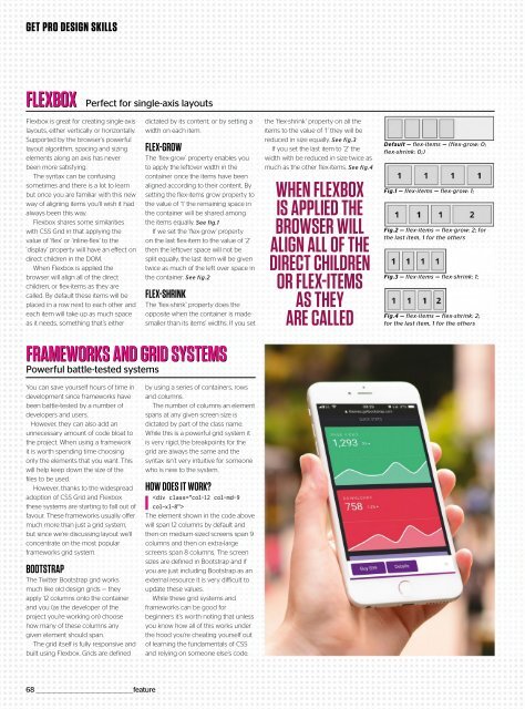
FLEX-GROW<br />
The ‘flex-grow’ property enables you<br />
to apply the leftover width in the<br />
container once the items have been<br />
aligned according to their content. By<br />
setting the flex-items grow property to<br />
the value of ‘1’ the remaining space in<br />
the container will be shared among<br />
the items equally. See fig.1<br />
If we set the ‘flex-grow’ property<br />
on the last flex-item to the value of ‘2’<br />
then the leftover space will not be<br />
split equally, the last item will be given<br />
twice as much of the left over space in<br />
the container. See fig.2<br />
FLEX-SHRINK<br />
The ‘flex-shink’ property does the<br />
opposite when the container is made<br />
smaller than its items’ widths. If you set<br />
the ‘flex-shrink’ property on all the<br />
items to the value of ‘1’ they will be<br />
reduced in size equally. See fig.3<br />
If you set the last item to ‘2’ the<br />
width with be reduced in size twice as<br />
much as the other flex-items. See fig.4<br />
WHEN FLEXBOX<br />
IS APPLIED THE<br />
BROWSER WILL<br />
ALIGN ALL OF THE<br />
DIRECT CHILDREN<br />
OR FLEX-ITEMS<br />
AS THEY<br />
ARE CALLED<br />
Default — flex-items — (flex-grow: 0;<br />
flex-shrink: 0;)<br />
Fig.1 — flex-items — flex-grow: 1;<br />
Fig.2 — flex-items — flex-grow: 2; for<br />
the last item, 1 for the others<br />
Fig.3 — flex-items — flex-shrink: 1;<br />
Fig.4 — flex-items — flex-shrink: 2;<br />
for the last item, 1 for the others<br />
You can save yourself hours of time in<br />
development since frameworks have<br />
been battle-tested by a number of<br />
developers and users.<br />
However, they can also add an<br />
unnecessary amount of code bloat to<br />
the project. When using a framework<br />
it is worth spending time choosing<br />
only the elements that you want. This<br />
will help keep down the size of the<br />
files to be used.<br />
However, thanks to the widespread<br />
adoption of CSS Grid and Flexbox<br />
these systems are starting to fall out of<br />
favour. These frameworks usually offer<br />
much more than just a grid system,<br />
but since we’re discussing layout we’ll<br />
concentrate on the most popular<br />
frameworks grid system.<br />
BOOTSTRAP<br />
The Twitter Bootstrap grid works<br />
much like old design grids — they<br />
apply 12 columns onto the container<br />
and you (as the developer of the<br />
project you’re working on) choose<br />
how many of these columns any<br />
given element should span.<br />
The grid itself is fully responsive and<br />
built using Flexbox. Grids are defined<br />
by using a series of containers, rows<br />
and columns.<br />
The number of columns an element<br />
spans at any given screen size is<br />
dictated by part of the class name.<br />
While this is a powerful grid system it<br />
is very rigid, the breakpoints for the<br />
grid are always the same and the<br />
syntax isn’t very intuitive for someone<br />
who is new to the system.<br />
HOW DOES IT WORK?<br />
<br />
The element shown in the code above<br />
will span 12 columns by default and<br />
then on medium-sized screens span 9<br />
columns and then on extra-large<br />
screens span 8 columns. The screen<br />
sizes are defined in Bootstrap and if<br />
you are just including Bootstrap as an<br />
external resource it is very difficult to<br />
update these values.<br />
While these grid systems and<br />
frameworks can be good for<br />
beginners it’s worth noting that unless<br />
you know how all of this works under<br />
the hood you’re cheating yourself out<br />
of learning the fundamentals of CSS<br />
and relying on someone else’s code.<br />
68 _________________________________________________feature
 Change language