

Web_Designer_UK__May_2018

You also want an ePaper? Increase the reach of your titles
YUMPU automatically turns print PDFs into web optimized ePapers that Google loves.
Tutorials<br />
Shrink your code with CSS4 variables<br />
7. Going responsive<br />
At present the design is not responsive so let’s set up a<br />
way to do that and use a CSS variable to control the width<br />
of the card layout. This means all that needs to be<br />
updated in media queries is the width variable. Add the<br />
width variable to the code you had in step 1.<br />
--width: 25%;<br />
8. Boxing clever<br />
Now find the ‘box’ CSS class, where the width is being<br />
calculated from 25% minus 40 pixels. Remove the<br />
‘25%’ and replace it with the width variable. This can<br />
now be controlled dynamically by changing the width<br />
CSS variable.<br />
.box {<br />
float: left;<br />
width: calc(var(--width) - 40px);<br />
margin: 20px;<br />
box-shadow: 0 2px 8px rgba(0, 0, 0, 0.5);<br />
background: #ccc;<br />
color: #666;<br />
}<br />
9. Break point<br />
Placing a media query into your CSS at the end of the<br />
CSS gives us the kind of mid-sized screen that is often<br />
found on tablets. Here the root section of CSS is updated<br />
to have the width set to 50% and therefore give us a<br />
two-column card layout that would better suit that sized<br />
screen. Resize your browser to see it switch.<br />
@media (max-width: 960px) {<br />
:root {<br />
--width: 50%;<br />
} }<br />
Changing via<br />
JavaScript<br />
It’s possible to update the CSS variables via JS as a<br />
quick way to update many items at once. It shows<br />
off the runtime power of CSS variables.<br />
10. Mobile friendly<br />
The final breakpoint will be for devices that are less than<br />
500 pixels, such as mobile screen sizes. Here the width<br />
variable is updated to take full advantage of the full width<br />
of the display in order to be able to see the card content.<br />
Again save this and resize your browser to see the display<br />
update when a smaller screen size is used.<br />
@media (max-width: 500px) {<br />
:root {<br />
--width: 100%;<br />
}<br />
}<br />
11. Creating colour themes<br />
The next part of the tutorial will focus on using JavaScript<br />
to dynamically alter the CSS variables to create different<br />
colour themes for the page. To get started some new<br />
variables need to be declared in the ‘root’ of the CSS…<br />
--main-bg: #fff;<br />
--main-type: #333;<br />
--alt-bg: #f5f5f5;<br />
12. Changing to variables<br />
Now various elements will start to get these variables<br />
added in order to control the theme of the page. Find the<br />
‘main-header’ class and change the colour and<br />
background colour to be controlled via variables added in<br />
the previous step.<br />
.main-header {<br />
color: var(--main-type);<br />
background-color: var(--alt-bg);<br />
text-align: center;<br />
padding: 15px 0 10px 0;<br />
box-shadow: 0 2px 8px rgba(0, 0, 0, 0.5);<br />
}<br />
13. Styling buttons<br />
Find the ‘buttons’ class. This time the variable will be the<br />
main background colour, whereas the header used an<br />
alternative background colour. By having two different<br />
background colours it allows the content to have some<br />
contrast as they are viewed. Controlling the text colour<br />
means that a high contrast text can be added.<br />
.button {<br />
text-decoration: none;<br />
padding: 5px 10px;<br />
color: var(--main-type);<br />
background-color: var(--main-bg);<br />
font-family: ‘Barlow Semi Condensed’,<br />
sans-serif;<br />
font-weight: 600;<br />
}<br />
14. Footing the bill<br />
Now move to the class that controls the footer – ‘mainfooter’.<br />
As with the header this will also have an alternate<br />
background colour so that it will stand out from the<br />
remainder of the page. The colour is also changed so that<br />
it will be visible.<br />
.main-footer {<br />
clear: both;<br />
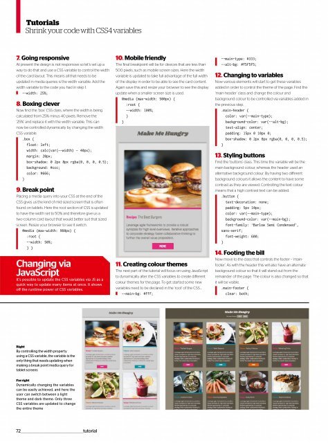
Right<br />
By controlling the width property<br />
using a CSS variable, the variable is the<br />
only thing that needs updating when<br />
making a break point media query for<br />
tablet screens<br />
Far right<br />
Dynamically changing the variables<br />
can be easily achieved, and here the<br />
user can switch between a light<br />
theme and dark theme. Only three<br />
CSS variables are updated to change<br />
the entire theme<br />
72__________________________________________________tutorial
 Change language