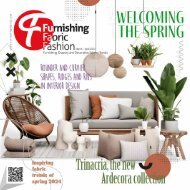
Furnishing Fabric Fashion January/February 2019

Create successful ePaper yourself
Turn your PDF publications into a flip-book with our unique Google optimized e-Paper software.
61
Furnishing Fabric Fashion
Imprinted in our psyches as a restful color,
PANTONE 19-4052, Classic Blue brings a
sense of peace and tranquility to the
spirit, offering refuge. Aiding conbringing
laser-like clarity, PANTONE
re-centers our thoughts. A reflective
fosters resilience.
human
centration and
19-4052, Classic Blue
blue tone, Classic Blue
As technology continues to race ahead of the human ability to process it all, it
is easy to understand why we gravitate to colors that are honest and offer the
promise of protection. Non-aggressive and easily relatable, the trusted PAN-
TONE 19-4052, Classic Blue lends itself to relaxed interaction. Associated with
the return of another day, this universal favorite is comfortably embraced.
“The Pantone Color of the Year highlights the relationship between trends in
color and what is taking place in our global culture at a moment in time, a color
that reflects what individuals feel they need that color can hope to answer.”
added Laurie Pressman, Vice President of the Pantone Color Institute. “As
society continues to recognize color as a critical form of communication, and
a way to express and affect ideas and emotions, designers and brands should
feel inspired to use color to engage and connect. The Pantone Color of the Year
selection provides strategic direction for the world of trend and design, reflecting
the Pantone Color Institute’s year-round work doing the same for designers
and brands.”
To fully bring to life the true meaning of PANTONE 19-4052 Classic Blue, Pantone
has translated PANTONE 19-4052 Classic Blue into a multi-sensory experience.
By extending the sensory reach of PANTONE 19-4052 Classic Blue, Pantone is