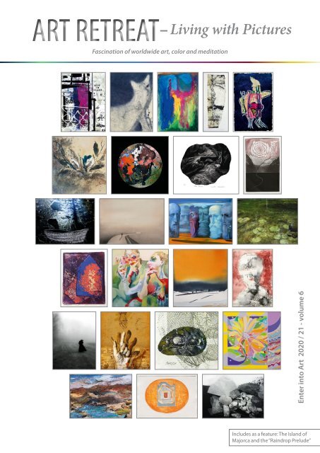
Art Retreat - Living with Pictures, 2020-21, vol. 6
Fascination of worldwide art, color and meditation Small-format pictures from all over the world are not only suitable for an affordable as well as exotic art collection, but also for creating inspired refuges in living spaces. On the occasion of the 6th international “Enter into Art” art competition for the promotion of small-format pictures the art book shows - in addition to exquisite large-format pictures - over 150 works by artists from 36 Countries and 5 continents. At the same time it is a poetry book for relaxation with art, poetry and colors. The pictures are arranged in color chapters for careful viewing and relaxation. One chapter of the book is dedicated to the 210th anniversary of birth of the Polish composer Frédéric Chopin. During his stay with the French writer George Sand on the island of Mallorca, he wrote the world-famous "Rainbow Prelude". Chopin's dreamy Mallorca pieces flow into the creative contemplation of the pictures as musical recommendations. The printed book is available in the book trade and in internet bookshops. Softcover: ISBN 978-3-98527-215-0, Publisher: Re Di Roma-Verlag, Language: English, German, Size: 29 x 21 cm Or at Peecho (soft- and hardcover) by the following link: http://www.peecho.com/checkout/162187384649059167/1018526/art-retreat-living-with-pictures-2020-21-vol-6 Faszination weltweiter Kunst, Farbe und Meditation Kleinformatige Bilder aus aller Welt eignen sich nicht nur für eine sowohl erschwingliche als auch exotische Kunstsammlung, sondern auch für die Erschaffung musenvoller Refugien in Wohnräumen. Das Kunstbuch anlässlich des 6. Internationalen „Enter into Art“-Kunstwettbewerbes zur Förderung kleinformatiger Bilder zeigt – neben erlesenen großformatigen Bildern - über 150 Werke von Künstlern aus 36 Ländern und 5 Kontinenten. Gleichzeitig ist es ein Poesiebuch zur Entspannung mit Kunst, Lyrik und Farben. Die Bilder sind in Farbkapiteln zum achtsamen Betrachten und Entspannen arrangiert. Ein Kapitel des Buches ist dem 210. Geburtstag des polnischen Komponisten Frédéric Chopin gewidmet. Während seines Aufenthaltes mit der französischen Schriftstellerin George Sand auf der Insel Mallorca schrieb er das weltberühmte „Regenbogen-Prélude“. Chopins verträumte Mallorca-Stücke fließen als musikalische Empfehlungen in die musenvolle Betrachtung der Bilder ein.
Fascination of worldwide art, color and meditation
Small-format pictures from all over the world are not only suitable for an affordable as well as exotic art collection, but also for creating inspired refuges in living spaces. On the occasion of the 6th international “Enter into Art” art competition for the promotion of small-format pictures the art book shows - in addition to exquisite large-format pictures - over 150 works by artists from 36 Countries and 5 continents. At the same time it is a poetry book for relaxation with art, poetry and colors. The pictures are arranged in color chapters for careful viewing and relaxation. One chapter of the book is dedicated to the 210th anniversary of birth of the Polish composer Frédéric Chopin. During his stay with the French writer George Sand on the island of Mallorca, he wrote the world-famous "Rainbow Prelude". Chopin's dreamy Mallorca pieces flow into the creative contemplation of the pictures as musical recommendations.
The printed book is available in the book trade and in internet bookshops. Softcover: ISBN 978-3-98527-215-0, Publisher: Re Di Roma-Verlag, Language: English, German, Size: 29 x 21 cm
Or at Peecho (soft- and hardcover) by the following link:
http://www.peecho.com/checkout/162187384649059167/1018526/art-retreat-living-with-pictures-2020-21-vol-6
Faszination weltweiter Kunst, Farbe und Meditation
Kleinformatige Bilder aus aller Welt eignen sich nicht nur für eine sowohl erschwingliche als auch exotische Kunstsammlung, sondern auch für die Erschaffung musenvoller Refugien in Wohnräumen. Das Kunstbuch anlässlich des 6. Internationalen „Enter into Art“-Kunstwettbewerbes zur Förderung kleinformatiger Bilder zeigt – neben erlesenen großformatigen Bildern - über 150 Werke von Künstlern aus 36 Ländern und 5 Kontinenten. Gleichzeitig ist es ein Poesiebuch zur Entspannung mit Kunst, Lyrik und Farben. Die Bilder sind in Farbkapiteln zum achtsamen Betrachten und Entspannen arrangiert. Ein Kapitel des Buches ist dem 210. Geburtstag des polnischen Komponisten Frédéric Chopin gewidmet. Während seines Aufenthaltes mit der französischen Schriftstellerin George Sand auf der Insel Mallorca schrieb er das weltberühmte „Regenbogen-Prélude“. Chopins verträumte Mallorca-Stücke fließen als musikalische Empfehlungen in die musenvolle Betrachtung der Bilder ein.

Create successful ePaper yourself
Turn your PDF publications into a flip-book with our unique Google optimized e-Paper software.
ART RETREAT<br />
– <strong>Living</strong> <strong>with</strong> <strong>Pictures</strong><br />
Fascination of worldwide art, color and meditation<br />
Enter into <strong>Art</strong> <strong>2020</strong> / <strong>21</strong> - <strong>vol</strong>ume 6<br />
1<br />
Includes as a feature: The Island of<br />
Majorca and the “Raindrop Prelude”
Editor / Herausgeberin:<br />
Gabriele Walter<br />
ART RETREAT<br />
Fascination of worldwide art, color and meditation<br />
KUNSTRETREAT<br />
Faszination weltweiter Kunst, Farbe und Meditation<br />
Enter into <strong>Art</strong> 20<strong>21</strong><br />
<strong>Living</strong> <strong>with</strong> <strong>Pictures</strong> - Wohnen mit Bildern<br />
109 artists from 36 countries - 109 Künstler aus 36 Ländern<br />
(153 works of art and 51 poems - 153 Kunstwerke und 51 Gedichte)<br />
2 3<br />
A symbol of country living - the finca: Joan Miró’s former home on the island of Majorca.<br />
Ein Symbol des ländlichen Wohnens - die Finca: Haus von Joan Miró auf der Insel Mallorca.
Content<br />
Foreword ‥‥‥‥‥‥‥‥‥‥‥‥‥‥‥‥‥‥.‥‥‥‥...........‥‥‥‥‥7<br />
The Sound of Raindrops ‥‥‥‥‥‥‥‥‥‥‥‥‥‥‥‥..‥‥‥‥‥‥‥9<br />
George Sand and Frédéric Chopin on the Isle of Majorca<br />
<strong>Living</strong> <strong>with</strong> pictures ‥‥‥‥‥‥‥‥‥‥‥‥‥‥‥‥‥‥‥..‥‥‥‥‥‥12<br />
Collect, arrange and enjoy art<br />
Awards 20<strong>21</strong> ‥‥‥‥‥‥‥‥‥‥‥‥‥‥‥‥‥‥‥‥‥‥...........‥‥‥16<br />
Meditation instructions ‥‥‥‥‥‥‥‥.............‥‥‥‥‥‥‥‥‥26<br />
Meditation <strong>with</strong> art, color and sound<br />
<strong>Art</strong> meditation <strong>with</strong> colorful colors ‥......‥‥‥‥‥............‥‥30<br />
<strong>Art</strong> meditation <strong>with</strong> red hues ‥‥‥‥‥‥............‥‥‥............42<br />
<strong>Art</strong> meditation <strong>with</strong> orange hues .‥‥‥.........................‥‥.50<br />
<strong>Art</strong> meditation <strong>with</strong> yellow hues ...‥‥.......................‥‥‥‥62<br />
<strong>Art</strong> meditation <strong>with</strong> green hues ‥‥‥‥‥.......................‥‥‥70<br />
<strong>Art</strong> meditation <strong>with</strong> blue hues ‥‥‥.........................‥‥‥‥‥82<br />
<strong>Art</strong> meditation <strong>with</strong> violet hues ..‥‥‥............‥.............‥‥94<br />
<strong>Art</strong> meditation <strong>with</strong> black and white hues ‥....................‥102<br />
Music recommendation ‥‥‥‥‥‥‥‥‥‥‥‥‥‥‥..‥‥.........113<br />
"Chopin en Mallorca"<br />
Index ‥‥‥‥‥‥‥‥‥‥‥‥‥‥‥‥‥‥‥‥‥‥‥‥‥‥‥...........‥113<br />
Imprint ‥‥‥‥‥‥‥‥‥‥‥.....‥‥.....................................114<br />
Featured <strong>Art</strong>ists<br />
Megan Vun Wong, Canada ‥‥‥‥‥‥‥‥‥‥‥......‥‥‥‥‥..38 - 39<br />
Peter Kadrmas, Spain ‥‥‥‥‥‥‥‥‥‥‥‥‥............‥‥‥‥4o - 41<br />
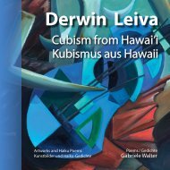
Derwin Leiva, USA ‥‥‥‥‥‥‥‥‥‥‥‥‥‥‥‥..................48 - 49<br />
Carolin Rechberg, USA ‥‥‥‥‥‥‥‥‥‥‥‥‥‥‥........‥‥...58 - 59<br />
Lucien Martini, Switzerland ‥‥‥‥‥‥‥‥‥‥‥‥........‥‥‥60 - 61<br />
Jette van der Lende, Norway ...........‥‥‥‥‥‥‥‥‥‥‥‥...68 - 69<br />
Jani Jan J., Austria ‥‥.‥‥‥‥‥‥‥‥‥‥‥‥‥....................78 - 79<br />
Rowena Božič, Slovenia ‥‥‥‥‥‥‥‥‥‥‥‥‥........‥‥‥..80 - 81<br />
Patricia Karen Gagic, Canada ‥‥.‥‥‥‥‥‥‥.......‥‥‥‥‥.90 - 91<br />
Carla Kleekamp, The Netherlands ..........‥‥‥‥‥‥.‥‥‥‥...92 - 93<br />
David Beeri, USA ‥‥‥‥‥‥‥‥‥‥‥‥‥‥‥..................100 - 101<br />
Alina Jackiewicz-Kaczmarek, Poland ‥‥‥‥‥‥‥‥‥‥‥.108 - 109<br />
Dan McCormack, USA ‥‥‥‥‥‥‥‥‥‥‥‥‥‥‥............110 - 111<br />
Poems<br />
Vicky Tsalamata, Greece ‥‥‥‥‥..........‥‥‥‥........‥‥‥‥‥‥11<br />
Gabriele Walter, Germany ....8, 36, 46, 56, 66, 76, 88, 98, 106, 112<br />
<strong>Living</strong> <strong>with</strong> the color<br />
Colorful colors ‥......‥‥‥‥‥............‥‥............................35<br />
Red ‥‥‥‥‥‥............‥‥‥..............................................45<br />
Orange .‥‥‥.........................‥‥...................................55<br />
Yellow ...‥‥.......................‥‥‥...................................‥65<br />
Green ‥‥‥‥‥.......................‥‥.................................‥75<br />
Blue ‥‥‥.........................‥‥‥‥.................................‥.87<br />
Violet ‥‥‥‥............‥.............‥‥....................................97<br />
Black and white ‥....................‥..................................105<br />
Inhalt<br />
Vorwort ‥‥‥‥‥‥.‥‥‥‥‥.‥‥‥‥‥‥‥‥........‥‥‥‥‥‥‥‥6<br />
Wenn Regentropfen klingen ‥‥.‥.‥‥‥‥‥‥‥................10<br />
George Sand und Frédéric Chopin auf der Insel Mallorca<br />
Wohnen mit Bildern .‥‥‥‥‥‥...‥‥‥‥‥........................14<br />
Kunst sammeln, arrangieren und genießen<br />
Preisträger 20<strong>21</strong> ‥‥‥‥‥‥‥‥‥.‥‥‥‥‥.‥‥.‥‥‥‥‥‥‥‥‥16<br />
Meditationsanleitung .‥.‥‥‥‥‥‥‥.‥‥‥‥‥‥‥.......‥‥‥28<br />
Meditation mit Kunst, Farbe und Klang<br />
Kunstmeditation mit bunten Farbtönen ..........‥‥‥‥‥.‥‥‥30<br />
Kunstmeditation mit roten Farbtönen ‥‥‥..........‥‥‥‥‥‥42<br />
Kunstmeditation mit orangen Farbtönen ‥‥‥..‥........‥‥‥50<br />
Kunstmeditation mit gelben Farbtönen ‥..‥‥..‥........‥‥‥62<br />
Kunstmeditation mit grünen Farbtönen ‥...........‥‥‥‥‥‥‥70<br />
Kunstmeditation mit blauen Farbtönen ...........‥‥‥‥‥‥‥‥82<br />
Kunstmeditation mit violetten Farbtönen ‥‥‥.........‥‥‥‥94<br />
Kunstmeditation mit schwarzweißen Farbtönen ‥.........‥102<br />
Musik-Empfehlung ..........‥‥‥‥‥‥‥‥‥‥‥‥‥‥‥..‥‥‥‥113<br />
"Chopin en Mallorca"<br />
Index ‥‥‥‥‥‥‥‥‥‥‥‥‥‥‥‥‥........‥‥‥..‥‥‥‥‥‥‥113<br />
Impressum ..........................‥‥‥‥‥‥‥‥‥‥‥..‥‥‥‥‥‥114<br />
Ausgewählte Künstler<br />
Megan Vun Wong, Kanada ‥‥‥‥‥‥‥‥‥‥‥.‥‥‥‥‥‥38 - 39<br />
Peter Kadrmas, Spanien ‥‥‥‥‥...‥‥‥‥‥‥..‥‥‥‥‥‥40 - 41<br />
Derwin Leiva, USA ‥‥‥‥‥‥‥‥‥‥‥‥‥‥..................48 - 49<br />
Carolin Rechberg, USA ‥‥‥‥..‥‥‥‥‥‥‥‥‥.‥‥‥‥...58 - 59<br />
Lucien Martini, Schweiz ‥‥.......‥‥‥‥‥‥.‥‥‥‥‥‥‥.60 - 61<br />
Jette van der Lende, Norwegen .‥‥‥‥‥‥‥.‥‥‥‥‥‥...68 - 69<br />
Jani Jan J., Österreich ‥‥‥‥‥‥‥‥‥‥‥‥‥.‥‥‥.........78 - 79<br />
Rowena Božič, Slowenien ‥‥‥‥‥‥‥‥‥‥.‥‥‥‥‥‥‥.80 - 81<br />
Patricia Karen Gagic, Kanada ‥‥‥‥‥.‥‥‥‥‥.‥‥‥‥‥.90 - 91<br />
Carla Kleekamp, Niederlande ..‥‥‥‥‥‥‥‥.‥‥‥‥‥‥...92 - 93<br />
David Beeri, USA ‥‥‥‥‥‥‥‥‥‥‥‥‥‥‥‥.............100 - 101<br />
Alina Jackiewicz-Kaczmarek, Polen ‥‥‥‥‥‥‥‥‥‥‥.108 - 109<br />
Dan McCormack, USA ‥‥‥‥‥‥‥‥‥‥‥.......‥‥‥‥‥110 - 111<br />
Gedichte<br />
Vicky Tsalamata, Greece ..‥‥...‥‥‥..........‥‥‥‥‥‥‥‥‥‥11<br />
Gabriele Walter, Germany ......8, 37, 47, 57, 67, 77, 89, 99, 107, 112<br />
Wohnen mit der Farbe<br />
Bunt ‥......‥‥‥‥‥...............‥‥..................................35<br />
Rot ‥‥‥‥‥............‥....‥‥.........................................45<br />
Orange .‥‥‥...........................‥‥..............................55<br />
Gelb ...‥‥........................‥‥‥.................................‥65<br />
Grün ‥‥‥‥‥.........................‥‥..............................‥75<br />
Blau ...‥‥..........................‥‥‥‥...............................87<br />
Violett ‥‥‥............‥...............‥‥..............................97<br />
Schwarz-Weiß ‥......................‥...............................105<br />
The chapters are arranged in the order of the relaxation <strong>with</strong> colors to help you<br />
relax alone while browsing.<br />
Die Farbkapitel sind in der Reihenfolge der Farbentspannung angeordnet,<br />
wodurch man schon allein beim Durchblättern relaxen kann!<br />
This book is illustrated <strong>with</strong> landscape photographs focusing on the subject of<br />
Illustriert wurde das Buch mit Fotos zum Thema Wohnen aus der<br />
living on the Mediterranean island of Majorca where Frédéric Chopin, George<br />
Landschaft der Mittelmeerinsel Mallorca, in welcher sich Frédéric<br />
Sand and also Gertrude Stein spent several months during their lifetime. In<br />
Chopin, George Sand und auch Gertrude Stein einige Monate lang<br />
addition, each color chapter features a composition Chopin wrote while on<br />
aufhielten. Darüber hinaus finden Sie in den Farbkapiteln jeweils ein<br />
Majorca. For more information, see pages 9, 16 and 113.<br />
von Chopin auf Mallorca komponiertes Musikstück. Näheres erfahren<br />
Sie auf den Seiten 9, 16 und 113.<br />
4 5
Vorwort<br />
Foreword<br />
Liebe Leserinnen und Leser<br />
Dear reader<br />
Es war die Leidenschaft der genuss<strong>vol</strong>len<br />
Entspannung, welche mich einst dazu<br />
bewog, anstelle eines Kunstkatalogs ein<br />
meditatives Kunst- und Geschenkbuch<br />
herauszugeben. Der Genuss von Kunst bzw. ihre<br />
achtsame Betrachtung stehen in dieser Buchreihe<br />
im Vordergrund, welche sich vornehmlich der kleinformatigen<br />
Kunst, aber auch großformatigen Werken<br />
ausgewählter Künstler widmet. Im Rahmen<br />
des Buchprojekts wurden 24 internationale Preise<br />
für das Kleinformat vergeben. Die Preisträgerbilder<br />
werden auf dem Buchcover und am Anfang des Buches<br />
hervorgehoben.<br />
Neben der Faszination weltweiter Kunst liegt<br />
der Schwerpunkt im Buch auf dem Thema „Wohnen<br />
mit Bildern“, wobei die kleinformatige Kunst eine<br />
wichtige Rolle spielt. Insbesondere auch mit kleineren<br />
Bildern und Skulpturen kann man sich in seiner<br />
Wohnung ein kreatives Refugium der Muse einrichten,<br />
ja der Wohnumgebung das Flair eines privaten<br />
Kunstmuseums verleihen und originale Bilder betrachten,<br />
wann immer man begehrt. Kunstsammler<br />
finden Anregungen für die Gestaltung von Bilderwänden,<br />
sie können sich in den verschiedenen<br />
Farbkapiteln umsehen und ein passendes Bilderarrangement<br />
zusammenzustellen.<br />
Musikalische Empfehlung<br />
Als Untermalung zur Entspannung mit Kunst<br />
bietet jedes Farbkapitel zudem eine musikalische<br />
Empfehlung aus dem klassischen Repertoire und<br />
dazu passende Haiku-Lyrik an. Ich möchte den <strong>21</strong>0.<br />
Geburtstag des polnischen Komponisten Frédéric<br />
Chopin zum Anlass nehmen, an die Entstehung seiner<br />
berühmten Mallorca-Préludes und den gemeinsamen<br />
Aufenthalt mit der französischen Schriftstellerin<br />
George Sand auf der Insel zu erinnern. Möge<br />
es in den schweren Corona-Zeiten allen Künstlern<br />
und Kunstliebhabern Mut machen, dass aus einer<br />
langen Regenzeit auf einem so sonnigen Eiland sowie<br />
aus Liebe und Melancholie ein weltberühmtes<br />
Werk wie das „Regentropfen Prélude“ entstehen<br />
kann.<br />
Als gebürtige Leipzigerin bin ich gleich Chopin<br />
auch eine Verehrerin von Johann Sebastian Bach.<br />
Chopin hatte eine Kopie der Präludien aus dem<br />
"Wohltemperierten Klavier" in seinem Reisegepäck<br />
und ließ sich davon inspirieren. Er beginnt bei<br />
C-Dur und bewegt sich im Uhrzeigersinn durch den<br />
Quintenzirkel, was übrigens auch der tonalen Farbordnung<br />
in diesem Buch entspricht. Beim Blättern<br />
durch die Farbkapitel erfahren die Leser einen beruhigenden<br />
Effekt. Ich habe eine Auswahl von Chopins<br />
Mallorca-Werken sowohl entsprechend ihrer<br />
Tonart als auch nach ihrer musikalischen Aussage<br />
den Farben zugeordnet (s. auch S. 113).<br />
Bunt: Polonaise in A-Dur op. 40 Nr. 1<br />
Rot: Prélude A-Moll op. 28 Nr. 2<br />
Orange: Ballade in F-Dur op. 38 Nr. 2<br />
Gelb: Prélude E-moll op. 28 Nr. 4<br />
Grün: Regentropfen-Prélude in Des-Dur op. 28 Nr. 15<br />
Blau: Prélude H-moll op. 28 Nr. 7<br />
Violett: Prélude in B-Dur op. 28 Nr. <strong>21</strong><br />
Schwarz-Weiß: Nocturne in G-Moll op. 37 Nr.<br />
Die Kürze der Préludes lassen sie gleich kleinformatigen<br />
Bildern und Haiku-Gedichten oft nur als<br />
Momentaufnahmen einer Stimmung erscheinen.<br />
Kunst und Meditation<br />
Für eine Kunstmeditation müssen Sie, als Leser<br />
des Buches kein Kunstkenner sein, aber Sie können<br />
dabei entspannen, Ihre Achtsamkeit trainieren und<br />
loslassen. Meditation und Kunst finden deshalb<br />
wunderbar zusammen, weil der Mensch durch die<br />
Umwandlung negativer Kräfte in positive Energie<br />
entspannen kann. Die intensive bzw. achtsame<br />
Betrachtung eines Bildes prägt sich leicht ein und<br />
wird deshalb eine nachhaltige Wirkung auf den<br />
Betrachter ausüben. Kunst kann einen wichtigen<br />
Beitrag dazu leisten, Schönheit in Herz und Geist zu<br />
senden. Kunst ist Energie und strahlt diese wie die<br />
Sonnenenergie auf uns ab. Ich betrachte es deshalb<br />
nicht als meine Aufgabe, durchweg alle Bilder mit<br />
meinen poetischen Kunstbetrachtungen zu untermalen,<br />
vielmehr möchte ich Sie ermuntern, ganz<br />
eigene Gefühle und Gedanken zu den Bildern zu<br />
entwickeln und zu vertiefen. Jedes Kunstbild wird<br />
symbolisch zu einer verstehenden Person, mit der<br />
man Gefühle und Gedanken teilen und auf meditative<br />
Weise kommunizieren kann.<br />
Wenn man ein Kunstbuch aufschlägt (oder<br />
auch eine Ausstellung besucht), dann sind einem<br />
die Werke zunächst weitgehend unbekannt und<br />
es mutet an, als ob sie schlummern würden. Die<br />
Kontemplation mit der Kunst animiert dazu, ein<br />
Kunstwerk zum Leben zu erwecken. Wenn man sich<br />
in ein Kunstwerk vertieft und immer wieder zu ihm<br />
zurückkehrt, dann kann man es „aufwecken“. Es<br />
erwacht und beginnt, sich zu regen bzw. seine Geschichte<br />
zu erzählen, ja sich mit uns zu unterhalten.<br />
Plötzlich versteht man seine Schönheit und Wahrheit<br />
sowie seinen einzigartigen Wert. Nach längerem<br />
achtsamem Betrachten kann man diejenigen<br />
Bilder, die rätselhaft und schwer zu erfassen sind,<br />
besser erfassen und verstehen bzw. erfühlen und<br />
dieses Gefühl genüsslich in sich aufsaugen.<br />
Das Buch möchte dazu einladen, ein Kunstwerk<br />
mit Geist und Seele zu erfassen. Entdecken Sie nach<br />
dem Motto „Ich sehe was, was du nicht siehst!“ mit<br />
offenen Augen die Welt der Kunst. Der Augenblick<br />
ist heilig, er wird in stiller Achtsamkeit genossen<br />
und als einzigartig wahrgenommen. Die Kunstbetrachtung<br />
kann sowohl emotional als auch intellektuell<br />
erfahren werden. Gewinnen Sie Abstand vom<br />
Alltag, um die Außenwelt danach aus einem neuen<br />
Blickwinkel heraus zu betrachten. Es geht allein<br />
darum, die Kunst <strong>vol</strong>ler Würde zu genießen und zu<br />
entspannen.<br />
Es ist keinesfalls abwegig, ein Bild immer wieder<br />
neu zu betrachten und dies mit Meditationspraktiken<br />
zu verbinden. Ich wünsche Ihnen viel Freude<br />
und Entspannung dabei und danke allen Künstlerinnen<br />
und Künstlern für ihre schönen Werke.<br />
Gabriele Walter<br />
(Herausgeberin)<br />
It was the passion for pleasurable relaxation<br />
that once moved me to publish a meditative<br />
art and gift book instead of an art catalog.<br />
The enjoyment of art and its mindful contemplation<br />
are in the foreground in this series of<br />
books, which is primarily dedicated to small-format<br />
art, but also to large-format works by selected artists.<br />
As part of the book project, 24 international<br />
prizes were awarded for the small-format artworks.<br />
The award-winning images will be highlighted on<br />
the book cover and at the beginning of the book.<br />
In a addition to the fascination of art worldwide,<br />
the focus of the book is on the subject of "<strong>Living</strong><br />
<strong>with</strong> <strong>Pictures</strong>", <strong>with</strong> small-format art playing an<br />
important role. With smaller pictures and sculptures<br />
in particular, you can set up a creative retreat for<br />
contemplation in your living space, lend the home<br />
environment the elegant style of a private art museum<br />
and look at original pictures whenever you<br />
want. <strong>Art</strong> collectors find ideas for the design of picture<br />
walls, they can browse in the various chapters<br />
on color, and put together a suitable arrangement<br />
of pictures.<br />
Music suggestion<br />
As an accompaniment to relaxation through art,<br />
each color chapter also offers a musical recommendation<br />
from the classical repertoire and matching<br />
haiku poetry. I would like to use the <strong>21</strong>0th birthday<br />
of the Polish composer Frédéric Chopin as an opportunity<br />
to remember the creation of his famous<br />
Majorca Preludes and the time he stayed on the island<br />
together <strong>with</strong> the French writer George Sand.<br />
May it encourage all artists and art lovers in these<br />
difficult Corona times that a world-famous work<br />
like the "Raindrop Prelude" can emerge from a long<br />
rainy season on such a sunny island as well as from<br />
love and melancholy.<br />
Born in Leipzig, I am, like Chopin, also an admirer<br />
of Johann Sebastian Bach. Chopin had a copy of<br />
the preludes from the "Well-Tempered Piano" in<br />
his luggage and was inspired by it. It starts <strong>with</strong> C<br />
major and moves clockwise through the circle of<br />
fifths, which basically corresponds to the tonal order<br />
of colors in this book. When leafing through the<br />
color chapters, readers experience a relaxing effect.<br />
I have assigned a selection of Chopin's Majorca Preludes<br />
to the colors, both according to their key and<br />
according to their musical statement (s. also p. 113).<br />
Multicolored: Polonaise in A Major op. 40 No. 1<br />
Red: Prélude in A Minor op. 28 No. 2<br />
Orange: Ballade in F Major op. 38 No. 2<br />
Yellow: Prélude in E Minor op. 28 No. 4<br />
Green: "Raindrop Prélude" in D Flat Major op. 28 No. 15<br />
Blue: Prélude in B Minor op. 28 No. 7<br />
Violet: Prélude in B Flat Major op. 28 No. <strong>21</strong><br />
Black-White: Nocturne in G Minor op. 37 No. 1<br />
The shortness of the Préludes allows small-format<br />
paintings and haiku poems equally to appear<br />
often only as snapshots of a mood.<br />
<strong>Art</strong> and meditation<br />
As a reader of the book, you do not have to be<br />
an art connoisseur for an art meditation, but you<br />
can relax, train your attention and let go. Therefore,<br />
meditation and art come together wonderfully,<br />
because one can relax through the conversion of<br />
negative forces into positive energy. The intensive<br />
or mindful contemplation of a picture is easy to<br />
remember and will therefore have a lasting effect<br />
on the viewer. <strong>Art</strong> can make an important contribution<br />
to sending beauty into the heart and mind.<br />
<strong>Art</strong> is energy and radiates it on us like solar energy.<br />
I therefore do not see it as my task to accompany all<br />
of the pictures <strong>with</strong> my poetic interpretation of art,<br />
rather I would like to encourage you to develop and<br />
deepen your own feelings and thoughts about the<br />
pictures. Every artwork symbolically becomes an<br />
understanding individual <strong>with</strong> whom one can share<br />
feelings and thoughts and communicate in a meditative<br />
way.<br />
When you open an art book (or visit an exhibition),<br />
the works are initially largely unknown and it<br />
seems as if they are sleeping. Contemplation <strong>with</strong><br />
art encourages you to bring a work of art to life. If<br />
you immerse yourself in a work of art and keep coming<br />
back to it, then you can “wake it up”. It wakes<br />
up and begins to bestir or to tell its story, even to<br />
talk to us. Suddenly one understands its beauty and<br />
truth as well as its unique worth. After prolonged<br />
mindful consideration one can better detect those<br />
images that are enigmatic and difficult to understand,<br />
better grasp and understand or feel their<br />
spirit and soak up this feeling <strong>with</strong> relish.<br />
The book would like to invite you to grasp a work<br />
of art <strong>with</strong> mind and soul. Discover the world of art<br />
<strong>with</strong> open eyes according to the motto “I see what<br />
you don't see!”. The moment is sacred, it is enjoyed<br />
in quiet mindfulness and perceived as unique. Viewing<br />
art can be experienced both emotionally and<br />
intellectually. Gain distance from everyday life in<br />
order to see the outside world from a new perspective.<br />
It’s all about enjoying the art <strong>with</strong> dignity and<br />
relaxing.<br />
It is by no means absurd to look at a picture over<br />
and over again and to merge this <strong>with</strong> meditative<br />
practices. I wish you much joy and relaxation while<br />
looking at the artworks and thank the artists for<br />
their beautiful works.<br />
Gabriele Walter<br />
(editor)<br />
Note for translation:<br />
Feel free to use “Google Translate” to help you read<br />
our posts in your language. Some texts of the book<br />
may be available for your own translation on the Internet.<br />
You can visit our websites:<br />
www.enterintoart.com<br />
www.enter-into-art.com<br />
6 7
The Sound of Raindrops<br />
George Sand and Frédéric Chopin on the Isle of Majorca<br />
In the South<br />
Gaze drifting away<br />
Through palm fronds resting on the<br />
White fluff of the sea.<br />
Lined by cypresses<br />
The stairs seem alive <strong>with</strong> the<br />
Scent of oranges.<br />
Oh Elysium<br />
Of gnarled, crooked olive trees,<br />
your drunken glory!<br />
A fishing boat rocks<br />
In the untamed turbulence<br />
Of the mighty sea.<br />
Rocky valley. Home<br />
To nuns, eucalyptus, and<br />
The birds’ arias.<br />
Im Süden<br />
Durch Palmenwedel<br />
Weit der Blick im flauschigen<br />
Silbermeerweiß ruht.<br />
Zypressengesäumt<br />
Die Treppe vom Dufthauch<br />
Der Orangen beseelt.<br />
Oh, du trunkenes<br />
Elysium knorriger<br />
Olivenhaine.<br />
In ungezähmter<br />
Wildheit tosender See ein<br />
Fischkutter schaukelt.<br />
Felstal der Nonnen.<br />
Zum Eukalyptusduft sanft<br />
Die Vogelarien.<br />
The Majorcan mountain village of Valldemossa<br />
is a dreamy place. Surrounded<br />
by almond and olive groves, its intricate<br />
tangle of houses makes it seem<br />
like from a different time. The locals have a famous<br />
couple to thank for the tourists swarming the fragrant<br />
streets of the village during the day. French<br />
writer George Sand and Polish composer Frédéric<br />
Chopin spent the winter of 1838/39 in the rainy northwest<br />
of the picturesque island. Thousands of visitors<br />
come pouring into cells 2 and 4 of the Carthusian<br />
Monastery in Valldemossa every year, in search<br />
of what the couple left behind. The place is only 9<br />
miles from Palma. Memorabilia on display include<br />
the Pleyel upright piano on which the famous<br />
"Raindrop Prelude" was heard for the first time.<br />
George Sand, an exceptional<br />
woman<br />
It was the bold idea of an adventurous woman<br />
to embark on what was possibly the first ever family<br />
trip to Majorca 180 years ago. Chopin’s wonderful<br />
preludes were composed thanks to Aurore Lucile<br />
Dupin (1804-76), a brave poet who used a male<br />
pen name, wore men’s clothes and liked to think<br />
outside the box to help preserve democratic rights.<br />
Her numerous love affairs were an expression of<br />
her freedom-loving nature. To her, the thought of<br />
a loveless marriage resembled being sentenced to<br />
work at the oar. She would rather have her books<br />
banned than betray her own soul or her friends.<br />
For this, she was not only loved but revered. “I miss<br />
her,” Gustave Flaubert wrote to her son Maurice after<br />
her death.<br />
Convincing a man like Chopin to undertake a<br />
sojourn to Majorca must have taken a good measure<br />
of feminine charm. He followed Sand from Paris<br />
to Perpignan by stagecoach. Together, they went<br />
to Port-Vendre from where they left for Barcelona<br />
by ship. On the afternoon of 7 November, they embarked<br />
on the steamer “El Mallorquin” transporting<br />
pigs from the peasant island to Barcelona for an 18-<br />
hour crossing.<br />
Winter in Majorca<br />
In „Winter in Majorca”, George Sand vents her<br />
irritation <strong>with</strong> the locals. Although it rained for two<br />
months straight, the peasants kept insisting that it<br />
never rained on their island. In general, the encounter<br />
between them and the two unusual guests from<br />
Paris was a clash of two different worlds. Sand, the<br />
socially critical writer who preferred giving to the<br />
poor to serving the rich was disappointed in the islanders,<br />
especially concerning the way they treated<br />
her sick lover.<br />
The doctor had recommended a warmer climate.<br />
Upon their arrival, however, the demanding guests<br />
from Paris were unable to find accommodation.<br />
Finally, they found their first lodgings at the beautifully<br />
situated country mansion Son Vent - “House<br />
of the Wind” - near Palma. The rainy weather made<br />
the lime walls soak up water like a sponge. While<br />
George Sand’s son Maurice recovered from his rheumatism,<br />
the composer was ailing <strong>with</strong> severe pneumonia,<br />
and his health increasingly deteriorated.<br />
News of the “consumptive stranger“ quickly<br />
spread all over town. The couple were forced to<br />
whitewash the house at their own expense to kill<br />
off every last “pathogen”. Finally, they moved to an<br />
abandoned Carthusian monastery at the western<br />
edge of the island. Not a bad place for two romantics,<br />
but the peasants ostracized the unmarried<br />
couple that did not attend church, charging them<br />
exorbitant prices for groceries and letting them go<br />
hungry if they dared to try and haggle. The caring<br />
George Sand who had been known to publicly call<br />
her lover “our little one” and “our invalid” in Paris felt<br />
rejected and misunderstood.<br />
Preludes of Melancholy<br />
In spite of this, to George Sand, who had spent<br />
two years at an Augustinian convent as a young girl,<br />
initially joining the rebellious “devils”, the abandoned<br />
monastery was paradise on earth. She enjoyed<br />
the ivy and the flowers, the clean air and the<br />
blue sea. At least during the first and the last days of<br />
their three-months stay, the weather was splendid.<br />
Sand compared the shapes of the ancient olive trees<br />
around the monastery to giant wrestlers and coiled<br />
up boa constrictors.<br />
To the sick Chopin, however, the monastery was<br />
a place full of terrors and phantoms, where he spent<br />
many sad and lonely hours. Returning from her<br />
long walks, George Sand bore witness to the creation<br />
of some of the most beautiful compositions in<br />
classical music – the cycle of 24 preludes, op. 28:<br />
She would find Chopin “pale at his piano, his eyes<br />
haggard, his hair standing almost on end. It would<br />
take him some moments to recognize us. He would<br />
make an effort to laugh, and he would play us the<br />
sublime things he had just composed…”<br />
In her autobiographical works, Sand continues:<br />
“'He saw himself drowned in a lake. Heavy drops of<br />
icy water fell in a regular rhythm on his breast, and<br />
when I made him listen to the sound of the drops<br />
of water indeed falling in rhythm on the roof, he<br />
denied having heard it.” Although Chopin denied<br />
the onomatopoeic connection between his famous<br />
"Raindrop Prelude" in D flat major and the real rain,<br />
due to the frequent ostinati, millions of music lovers<br />
still associate it <strong>with</strong> the rain that tunefully hit the<br />
roof of the Carthusian monastery back then.<br />
Sources:<br />
Armin Strohmeyr, George Sand, Eine Biographie,<br />
Reclam-Leipzig, 2004<br />
Source of the translation from George Sand’s<br />
“History of My Life”: https://www.upenn.edu/<br />
gazette/1102/1102gaz7.html Accessed on 12 April<br />
20<strong>21</strong>, 3.35 p.m.<br />
Source of the translation from George Sand’s<br />
“Winter in Majorca”: https://halloffame.classicfm.<br />
com/2013/chart/position/287/ Accessed on 13 April<br />
20<strong>21</strong>, 11.56 a.m.<br />
8 9
Wenn Regentropfen klingen<br />
George Sand und Frédéric Chopin auf der Insel Mallorca<br />
Das mallorquinische Bergdorf Valldemossa<br />
ist ein verträumter Ort.<br />
Umgeben von Mandel- und Olivenhainen<br />
scheint es mit seinem verschachtelten<br />
Häusergewirr unserer Zeit entrückt.<br />
Einem berühmten Liebespaar verdanken es die<br />
Mallorquiner, dass es tagsüber in seinen duftenden<br />
Gassen von Touristen wimmelt. Die französische<br />
Schriftstellerin George Sand und der polnische<br />
Komponist Frédéric Chopin verbrachten 1838/39<br />
im regenreichen Nordwesten des schönen Eilands<br />
einen ganzen Winter. Tausende Besucher strömen<br />
jährlich in die Zellen 2 und 4 des Kartäuserklosters<br />
in Valldemossa – auf der Suche nach den Hinterlassenschaften<br />
des Paares. Der Ort liegt nur 15 km<br />
von Palma entfernt. Zu sehen gibt es unter anderem<br />
das Pleyel-Klavier, auf welchem das berühmte<br />
Regentropfen-Prélude erstmalig erklang.<br />
George Sand, eine<br />
außergewöhnliche Frau<br />
Die wohl erste Familienreise nach Mallorca vor<br />
180 Jahren entsprang der kühnen Fantasie einer<br />
abenteuerlichen Frau. Chopins wunder<strong>vol</strong>le Préludes<br />
haben wir Aurore Lucile Dupin (1804-76) zu<br />
verdanken – einer mutigen Dichterin, die einen<br />
männlichen Künstlernamen und Männerkleidung<br />
trug und gerne querdachte, damit demokratische<br />
Rechte erhalten bleiben. Ihre zahlreichen Amouren<br />
waren Ausdruck einer freidenkerischen Natur,<br />
die eine Ehe ohne Liebe wie eine Galeerenstrafe<br />
empfinden musste. Lieber nahm sie das Verbot<br />
ihrer Bücher in Kauf, als dass sie ihre Seele oder<br />
ihre Freunde verriet. Deshalb wurde sie nicht nur<br />
geliebt, sondern auch verehrt. Gustave Flaubert<br />
schrieb nach ihrem Tod an ihren Sohn Maurice: „Sie<br />
fehlt mir.“<br />
Sicher hatte es einigem weiblichen Charme<br />
gekostet, einen Mann wie Chopin zu der Voyage<br />
nach Mallorca zu bewegen. Er folgte von Paris mit<br />
der Eilpostkutsche bis Perpignan, dann ging es gemeinsam<br />
im Reisewagen nach Port-Vendres, von<br />
dort per Schiff nach Barcelona. Am Nachmittag des<br />
7. Novembers begann die 18-stündige Überfahrt<br />
mit dem Raddampfer „El Mallorquin“, der von der<br />
Bauerninsel Schweine nach Barcelona transportierte.<br />
Winter auf Mallorca<br />
Laut den Zeilen in ihrem Buch „Ein Winter auf<br />
Mallorca“ war George Sand über die Menschen<br />
auf Mallorca verärgert. Abgesehen davon, dass die<br />
Insel-Bauern bis zum Ende der beiden Monate strömenden<br />
Regens darauf beharrten, dass es auf Mallorca<br />
niemals regnet, stießen während des Aufenthalts<br />
der beiden außergewöhnlichen Feriengäste<br />
aus Paris Welten aufeinander. Die sozialkritische<br />
Schriftstellerin, die lieber stets den armen Leuten<br />
etwas schenkte, als reiche Leute bewirtete, war von<br />
den Insulanern enttäuscht, was vor allem auf deren<br />
Verhalten gegenüber dem kranken Chopin zurückzuführen<br />
war.<br />
Der Arzt hatte ihm einen Klimawechsel angeraten.<br />
Jedoch konnten die anspruchs<strong>vol</strong>len Gäste aus<br />
Paris dort keine Unterkunft finden, die für sie bewohnbar<br />
gewesen wäre. Logis fanden sie zunächst<br />
im schön gelegenen Landhaus Son Vent bei Palma -<br />
das „Haus des Windes“. Aufgrund des Regenwetters<br />
saugte sich der Kalk der Zimmerwände <strong>vol</strong>l wie ein<br />
Schwamm. Während George Sands Sohn Maurice<br />
von seinen rheumatischen Beschwerden geheilt<br />
wurde, verschlechterte sich die Gesundheit des<br />
Komponisten zusehends, der unter einer schweren<br />
Lungenentzündung litt.<br />
Rasch verbreitete sich die Kunde von dem<br />
„schwindsüchtigen Fremden“ in der ganzen Stadt.<br />
Das Paar musste die Zimmer des Hauses auf eigene<br />
Kosten frisch kalken lassen, um jeden „Krankheitserreger“<br />
abzutöten. Schließlich zogen sie in das verlassene<br />
Kartäuserkloster am Westrand der Insel. Kein<br />
schlechter Ort für zwei Romantiker, aber die Bauern<br />
hatten sich gegen das unverheiratete Paar verschworen,<br />
zumal sich die beiden nicht bei den Gottesdiensten<br />
sehen ließen. Lebensmittel verkauften sie ihnen<br />
nur zu Wucherpreisen. Wagten sie zu handeln, ließ<br />
man sie – laut George Sand - einfach „hungern“. Die<br />
mütterliche George Sand, die ihren Geliebten in Paris<br />
in aller Öffentlichkeit „unser Kleiner“ und „unser<br />
Kranker“ nannte, fühlte sich ausgestoßen und unverstanden.<br />
Präludien der Melancholie<br />
George Sand, die als junges Mädchen zwei Jahre<br />
in einem Augustinerkloster verbrachte und dort zur<br />
„Gruppe der Teufel“ gehörte, genoss die verlassene<br />
Kartause dennoch als einen paradiesischen Ort<br />
der Inspiration. Sie erfreute sich an Efeuranken und<br />
Blütenpracht, an der reinen Luft und dem so blauen<br />
Meer. Zumindest in den ersten und letzten Tagen<br />
ihres fast dreimonatigen Aufenthaltes hatte sich das<br />
Wetter von seiner schönsten Seite gezeigt. Die alten<br />
Olivenbäume drum herum vergleicht sie mit zyklopischen<br />
Ringkämpfern und in sich verschlungenen<br />
Riesenschlangen.<br />
Dagegen war das mallorquinische Kloster für<br />
den von Krankheit geplagten Chopin ein Ort des<br />
Schreckens und der Geister, in denen er Stunden der<br />
Einsamkeit und des Trübsinns verbrachte. George<br />
Sands Bericht nach einem längeren Spaziergang ist<br />
ein hautnahes Zeugnis der Entstehung schönster<br />
Meisterstücke der klassischen Musik - dem Zyklus<br />
von 24 Präludien, op. 28: Demnach saß Chopin bleich<br />
an seinem Klavier..., „sein Blick war verstört und es<br />
schien, als stünden seine Haare zu Berge. Er brauchte<br />
eine Weile, bis er uns erkannte. Dann brach er in ein<br />
gezwungenes Lächeln aus und spielte uns herrliche<br />
Musik vor, die er gerade komponiert hatte.“<br />
Und weiter heißt es in ihren autobiographischen<br />
Werken: „Er kam sich vor, als wäre er in einem See<br />
ertrunken; schwere, eisige Wassertropfen fielen<br />
ihm im Takt auf die Brust. Als ich ihn aufhorchen<br />
hieß, denn man konnte tatsächlich den gleichmäßigen<br />
Takt von Tropfen hören, die auf das Dach fielen,<br />
bestand er darauf, das nicht gehört zu haben.“<br />
Obwohl sich Chopin gegen einen tonmalerischen<br />
Zusammenhang seines berühmten Regentropfen-<br />
Préludes in Des-Dur verwahrte, lauschen – aufgrund<br />
der gleichmäßigen Ostinati in dem Stück<br />
- noch heute Millionen Musikliebhaber klang<strong>vol</strong>l<br />
dem Regen, der auf das Dach der Kartause schlug.<br />
Literaturnachweis:<br />
Armin Strohmeyr, George Sand, Eine Biographie,<br />
Reclam-Leipzig, 2004<br />
George Sand, Geschichte meines Lebens, 1855, herausgegeben<br />
von Karl-Maria Guth, Berlin 2016<br />
Τ+Α+Ξ+Ι+Δ+Ι+Α<br />
Τα ταξίδια σε ταξιδεύουν<br />
Οι λέξεις και οι ήχοι τους σε ταξιδεύουν<br />
Οι οσμές σε ταξιδεύουν<br />
Μια κίνηση ένα άγγιγμα σε ταξιδεύει<br />
Το τοπίο του προσώπου σε ταξιδεύει<br />
Το τοπίο του βλέμματος σε ταξιδεύει<br />
Στον ορίζοντα που είναι πάντα γαλάζιος<br />
Μια κορυφογραμμή σε ταξιδεύει<br />
Το ξωκλήσι του Αι Γιάννη<br />
Λευκό σαν το βότσαλο στο φώς, σε ταξιδεύει<br />
Το βλέμμα το υγρό<br />
Που παίρνει ιριδισμούς κόκκινους<br />
Για το χαμό του φίλου, σε ταξιδεύει<br />
Ταξίδια, ταξίδια, ταξίδια<br />
Αρμενίσματα, μικρά αρμενάκια<br />
Στον πόντο της ζωής.<br />
Σ’ ένα από εκείνα τα ταξίδια<br />
συνάντησα τον Μεγάλο Κουμπλάι Χάν.<br />
By Vicky Tsalamata<br />
Β.Τ.<br />
Πάτμος 2000<br />
V+O+Y+A+G+E+S<br />
Les voyages te font voyager<br />
Les mots, leurs sons te font voyager<br />
Les odeurs te font voyager<br />
Un mouvement, une caresse te fait voyager<br />
Le paysage du visage te fait voyager<br />
Le paysage du regard te fait voyager<br />
A l’horizon qui est toujours bleu<br />
Une ligne de crête te fait voyager<br />
La chapelle de Saint – Jean<br />
Blanche comme le galet sous la lumière, te fait voyager<br />
Le regard humide<br />
Qui prend des reflets rouges irisés<br />
Pour la perte de l’ami, te fait voyager<br />
Voyages, Voyages, Voyages.<br />
Errances, à petits voiliers<br />
Dans l’océan de la vie .<br />
Lors d’un de ces voyages<br />
J’ai rencontré le Grand Kublai Khan<br />
De Vicky Tsalamata<br />
V.T.<br />
Île de Patmos 2000<br />
10 11
<strong>Living</strong> <strong>with</strong> pictures<br />
Collect, arrange and enjoy art<br />
There are many reasons to collect art:<br />
prestige, value and appreciation of the<br />
artist’s reputation may play a role for<br />
one collector, a personal relationship<br />
<strong>with</strong> the artist, the joy of collecting or the responsibility<br />
for art and its promotion for another. In addition,<br />
there are those who are profit-oriented, for<br />
whom a work of art is primarily an investment <strong>with</strong>out<br />
there being a personal, emotional connection<br />
or in-depth specialist knowledge.<br />
Amazingly, they are also advised to make enthusiasm<br />
for a work of art the supreme reason for<br />
their decision to buy. Because whoever buys a work<br />
of art does not simply acquire a handmade object,<br />
but there is always also spirit and soul - that which<br />
one secretly longs for.<br />
Building an art collection not only generally<br />
makes a company better known, it also gives the<br />
collector a high sympathy factor in the intellectual<br />
world. The emotional boost, the joy of collecting<br />
and arousing astonishment, are the intention <strong>with</strong><br />
which are presented pictures and art objects from<br />
all over the world in this book. And a longing for the<br />
far-away has always been a driving force of many<br />
collectors. The selection of works of art in various<br />
styles and painting techniques from countries<br />
around the world is both surprising and fascinating<br />
at the same time.<br />
Refuge of the muse<br />
Anyone can set up a refuge for a musical retreat<br />
at home - for example in a corner of a room or on<br />
the wall above a fireplace or piano, perhaps separated<br />
by a folding screen or a stylish shelf. <strong>Pictures</strong><br />
shape the character of a room, they create moods,<br />
they subtly influence what is happening through<br />
motifs, colors and shapes. In an art refuge you can<br />
have a dialogue, breathe in thought impulses, let<br />
your mind and soul be inspired, and maybe you will<br />
come up <strong>with</strong> new ideas because the perspective<br />
changes. A reading area can be decorated <strong>with</strong> a<br />
stylish table lamp, candles, fragrant flowers and<br />
mirrors. (The latter enlarge the space.) On an antiquated<br />
chair or stool there are books that you are<br />
reading or CDs that you always want to listen to<br />
in peace. It is ideal if the place is combined <strong>with</strong> a<br />
beautiful view or the proximity to a flickering fire by<br />
the fireplace.<br />
<strong>Art</strong> makes the room noble, it soaks it <strong>with</strong> an intellectual<br />
touch. A terracotta bust is a reminder of<br />
the craftsmanship of the Etruscans or Roman antiquity.<br />
Works of art address the emotions. The muse<br />
raises the quality of life through sensitive experience<br />
and promotes communication. The passionate<br />
art lover can stand out from everyday life at any<br />
time, letting the pictures speak for themselves. In<br />
the surroundings of art, creative spaces of thought<br />
develop, which are inspired by meditation, silence<br />
and poetic power.<br />
With colors and light<br />
to inspire the spirit<br />
In the old days, when there was no internet or<br />
even color printing, people devoured every original<br />
picture <strong>with</strong> their eyes. Today we are overloaded<br />
<strong>with</strong> images and it is time to pause or find a mindful<br />
way to enjoy them. The meditation instructions in<br />
this book may not only encourage you to create a<br />
refuge for art, but also to regularly draw your attention<br />
to a picture and to relax <strong>with</strong> art in a wonderful<br />
way. For that reason mostly meditative and relaxing<br />
images have been chosen.<br />
Targeted lighting emphasizes certain images,<br />
but works on paper in particular should be protected<br />
from direct sunlight. The question of whether a<br />
room is primarily used in daylight or artificial light<br />
is also relevant. Daylight from the side is desirable,<br />
but it is not recommended to hang pictures on the<br />
wall opposite the window unless anti-reflective<br />
glass is used in the frame. Or you can also play <strong>with</strong><br />
the light decoratively. Upward spotlights create an<br />
intimate atmosphere. With light you can create subtle<br />
moods and reflections. A similar vibrancy as <strong>with</strong><br />
natural light can be created.<br />
Communicating nonverbally<br />
<strong>with</strong> the whole world<br />
Moreover, it is fun to add smaller objects, for example,<br />
and elevate them to objects of art in order to<br />
create a heightened spatial illusion. With a pleasing<br />
arrangement, one also practices the non-verbal<br />
language of art, in that feeling for the relationship<br />
between images and other things. You enjoy the<br />
pleasure of putting together arrangements and<br />
changing them again. In this way, many new statements<br />
can be discovered in the pictures at the same<br />
time. If the objects are chosen carefully and the proportions<br />
are balanced, it can make a room look even<br />
bigger. Diversity creates an exciting tension and<br />
tells stories about the residents.<br />
Plea for the small format<br />
Own originals even in a<br />
small living space<br />
The desire or interest in unusual possessions can<br />
be satisfied even when the lack of space becomes<br />
a problem. Small-format artworks in particular<br />
resemble precious crystals and fit into any niche,<br />
no matter how small. In classy folders, cassettes<br />
or behind wooden sliding and cabinet doors there<br />
is space for additional pictures, which can be rearranged<br />
depending on your preferences and mood.<br />
<strong>Art</strong> shouldn't be seen as a product made exclusively<br />
for sale, because most of the time you buy a picture<br />
because you just can't resist it. The small works of<br />
art on the colored pages of the book can be enjoyed<br />
like a sip of noble wine or the scent of a wonderful<br />
flower.<br />
Tasteful design and relaxation<br />
In addition to collecting small-format pictures,<br />
art lovers should be encouraged to create a completely<br />
new work of art from a picture arrangement in<br />
their home environment. <strong>Pictures</strong> <strong>with</strong> smaller formats<br />
are ideally suited to design the interrelationship<br />
between pictures and their surroundings <strong>with</strong><br />
skill and sensitivity, even in a smaller space, and to<br />
experience art <strong>with</strong> pleasure. For in art you discover<br />
worlds that you might miss in your own life. The<br />
picture wall can also be opposite the door, so that it<br />
catches the eye when entering the room, or it serves<br />
- perhaps in the form of a folding screen - as a freestanding<br />
privacy screen. A simple room can serve as<br />
a frame for the picture wall, which can be viewed in<br />
meditative calm. A picture wall can consist of pictures<br />
of the same color, but also of the same medium,<br />
style or content.<br />
Or you can spontaneously sort them according<br />
to taste and associations - composed like a symphonic<br />
work <strong>with</strong> overture, main part and finale.<br />
The living environment then has the special charm<br />
of a miniature museum. And you can visit it every<br />
day! In this sense, small pictures are also well<br />
suited to distributing them over several rooms.<br />
<strong>Art</strong>fully framed, the pictures can be put together<br />
in pairs and groups of four or - according to the St.<br />
Petersburg hanging - lavish, densely hung themed<br />
walls can be created. And then the works of art begin<br />
to tell a story, stimulate the craving for food or<br />
spread a touch of the exotic. It doesn't hurt if you<br />
choose a few magenta-colored pictures to match<br />
the perhaps wine-red armchair in order to arrange<br />
them <strong>with</strong> sculptures, poems or other objects. The<br />
three-dimensional combination also gives the images<br />
more depth.<br />
Color and space<br />
The colored background design of the room<br />
needs to be well thought out. For a room facing<br />
north, you shouldn't use colors that are too cool<br />
or too dark. An intense dark wall color, in turn, increases<br />
the effect of antiquated frames. Purple is a<br />
traditional color for picture galleries. In conjunction<br />
<strong>with</strong> gold, it gives a room royal splendor. Likewise,<br />
violet and white, as well as green <strong>with</strong> gold, convey<br />
a luxurious aura, while yellow and orange create<br />
a sunny mood. A cheerful image <strong>with</strong> a vivid color<br />
will also suit a sunny mood. Color also spreads fragrance<br />
and sound in the room. Walls can take up the<br />
coloring of the pictures and be designed in a similar<br />
tone or complementary color.<br />
The pictures can continue in three dimensions<br />
into the room, or the color design of the room can<br />
lead to the picture wall. With the latter design principle,<br />
individual images can be staged. A smaller<br />
work of art is then given - for example - a particularly<br />
ornate, oversized frame and becomes - like<br />
an icon - a dazzling eye-catcher. Corridors and less<br />
used entrance areas of the house are particularly<br />
suitable for this. Minimalist art appears to best<br />
advantage in minimalist rooms. The opposite “extreme”<br />
would be to “pave” a room all around or in<br />
a mosaic shape <strong>with</strong> pictures. Narrow corridors or<br />
stairwells become small galleries and acquire a very<br />
special charisma.<br />
Collages or different painting techniques <strong>with</strong><br />
different surface properties can also be combined<br />
to create artistic scenes. Above all, the sense of<br />
touch is addressed, while motifs <strong>with</strong> fruit, drinks<br />
and food animate the sense of taste. Color, texture<br />
and image motifs result in a musical scale, a lyrical<br />
sound that can be intensified by reading poetry.<br />
Frames and arrangement<br />
Small-format pictures can also stand on a chest<br />
of drawers, on the window sill or on a shelf. You can<br />
then easily take it in your hand, make yourself comfortable<br />
in the wing chair or lying down and enjoy<br />
its beauty in peace. Like on a house altar, they can<br />
be used as part of a still life, even if their subject<br />
is not a still life at all. You can then pick them up<br />
again in hand at will and place them back in three<br />
rows, or put them in a better light. The motifs can<br />
best be viewed from the low eye level of the seated<br />
person; for example nature and the moon are ideal<br />
when complemented <strong>with</strong> poetry. If you want, you<br />
can also turn conventions upside down, for example<br />
by hanging pictures in front of a photo mural <strong>with</strong><br />
blossoming trees or in front of a cross window, as if<br />
they were floating.<br />
The greater the number of images, the more<br />
subtly our subconscious makes imaginative connections<br />
between them. Gilded or white frames<br />
make the pictures shine. Frames accentuate groups<br />
of pictures and at the same time go well <strong>with</strong> the<br />
(perhaps carved) furniture. A uniform optical effect<br />
is achieved through regularity and symmetry. To the<br />
right and left of a door or as a border around a kitchen<br />
hatch, pictures themselves then simulate the<br />
effect of an artistic frame. But disorderly arrangement<br />
also has its charm. Chaos is only another form<br />
of order that just requires a different way of looking<br />
at things. A philosophically well-thought-out mishmash<br />
and apparent chaos go well <strong>with</strong> art, because<br />
it is mysteriously free, like thoughts, spirit and the<br />
soul.<br />
12 13<br />
Studio Gallery "Apollinaire"
Wohnen mit Bildern<br />
Kunst sammeln, arrangieren und genießen<br />
Es gibt viele Gründe, Kunstbilder zu<br />
sammeln: Prestige, Geltung und die<br />
Aufwertung des Ansehens mögen bei<br />
dem einen eine Rolle spielen, eine<br />
persönliche Beziehung zu dem kunstschaffenden<br />
Menschen, die Freude am Sammeln oder die Verantwortung<br />
für Kunst und deren Förderung bei dem<br />
anderen Kunstfreund. Hinzu kommen die Rendite-<br />
Orientierten, für die ein Kunstwerk in erster Linie<br />
eine Kapitalanlage ist, ohne über einen persönlichemotionalen<br />
Bezug oder fundierte Fachkenntnisse<br />
zu verfügen. Erstaunlicherweise empfiehlt man<br />
auch ihnen, die Begeisterung für ein Kunstwerk zu<br />
den Königswerten ihrer Kaufentscheidung zu machen.<br />
Denn wer ein Kunstbild kauft, erwirbt nicht<br />
einfach einen handwerklichen Gegenstand, sondern<br />
auch immer Geist und Seele – jenes, wonach<br />
man im Geheimen sehnsuchts<strong>vol</strong>l verlangt.<br />
Der Aufbau einer Kunstsammlung macht nicht<br />
nur ein Unternehmen in der Regel bekannter, er<br />
verleiht dem Sammler einen hohen Sympathiefaktor<br />
in der intellektuellen Welt. Emotionale Aufladung,<br />
Freude am Sammeln und das Wecken von Erstaunen<br />
sind die Intention, mit der in diesem Buch<br />
Bilder aus aller Welt vorgestellt werden. Und auch<br />
die Sehnsucht nach Ferne ist von jeher eine Triebfeder<br />
vieler Sammler. Die Auswahl von Kunstwerken<br />
verschiedenster Stilrichtungen und Maltechniken<br />
aus Ländern rund um den Globus überrascht und<br />
fasziniert zugleich.<br />
Refugium der Muse<br />
Ein Refugium für ein musisches <strong>Retreat</strong> kann<br />
sich jedermann zu Hause einrichten – zum Beispiel<br />
in einer Raumecke oder an der Wand über einem<br />
Kamin oder Klavier, vielleicht abgeteilt durch einen<br />
Paravent oder ein stil<strong>vol</strong>les Regal. Bilder prägen den<br />
Charakter eines Raumes, sie schaffen Stimmungen,<br />
subtil beeinflussen sie das Geschehen durch Motive,<br />
Farben und Formen. In einem Kunstrefugium kann<br />
man einen Dialog führen, sich Denkimpulse einhauchen,<br />
Geist und Seele beflügeln lassen und vielleicht<br />
gelangt man dabei zu innovativen Ideen, weil<br />
sich die Perspektive ändert. Ein Leseplatz lässt sich<br />
mit einer stil<strong>vol</strong>len Tischlampe, Kerzen, duftenden<br />
Blumen und Spiegeln ausschmücken. (Letztere vergrößern<br />
den Raum.) Auf einem antiquierten Stuhl<br />
oder Hocker liegen Bücher, in denen man gerade<br />
liest oder CDs, die man schon immer mal in Ruhe<br />
hören will. Ideal ist es, wenn sich der Ort mit einem<br />
schönen Ausblick oder der Nähe zum flackernden<br />
Feuer am Kamin verbindet.<br />
Kunst macht edel, sie tränkt den Raum mit einem<br />
intellektuellen Hauch. So erinnert eine Terrakotta-Büste<br />
an die Kunstfertigkeit der Etrusker oder<br />
an die römische Antike. Kunstwerke sprechen die<br />
Gefühlsebene an. Die Muse hebt die Lebensqualität<br />
durch feinfühliges Erleben und fördert die Kommunikation.<br />
Der passionierte Kunstfreund kann sich<br />
jederzeit aus dem Alltag herausheben, die Bilder zu<br />
sich selbst sprechen lassen. In der Umgebung von<br />
Bildern entwickeln sich kreative Denkräume, die<br />
von Meditation, Stille und poetischer Kraft beseelt<br />
sind.<br />
Mit Farben und Licht<br />
den Geist beflügeln<br />
Früher, als es kein Internet, ja noch nicht einmal<br />
Farbdrucke gab, haben die Menschen jedes<br />
Original-Bild mit den Augen verschlungen. Heute<br />
sind wir mit Bildern überladen und es ist an der Zeit<br />
innezuhalten bzw. einen achtsamen Weg zu ihrer<br />
genuss<strong>vol</strong>len Betrachtung zu finden. Die Meditationsanleitung<br />
in dem Buch möge Sie nicht nur dazu<br />
anregen, ein Refugium der Kunst zu kreieren, sondern<br />
regelmäßig Ihre Aufmerksamkeit auf ein Bild<br />
zu lenken und in wunder<strong>vol</strong>ler Weise mit Kunst zu<br />
entspannen. Deshalb wurden vorzugsweise meditative<br />
und entspannende Motive ausgewählt.<br />
Gezielte Beleuchtung betont bestimmte Bilder,<br />
wobei man aber vor allem Arbeiten auf Papier vor<br />
direkter Sonneneinstrahlung schützen sollte. Relevant<br />
ist dabei auch die Frage, ob ein Raum vorwiegend<br />
bei Tages- oder bei Kunstlicht benutzt wird.<br />
Wünschenswert ist seitlich einfallendes Tageslicht,<br />
dagegen empfiehlt es sich nicht, Bilder auf der dem<br />
Fenster gegenüberliegenden Wand aufzuhängen,<br />
sei denn es wird entspiegeltes Glas im Rahmen<br />
verwendet. Oder man spielt zudem dekorativ mit<br />
dem Licht. Nach oben gerichtete Strahler schaffen<br />
eine intime Atmosphäre. Mit Licht kann man subtile<br />
Stimmungen und Reflexionen erzeugen. Dabei<br />
kann eine ähnliche Lebendigkeit wie beim Naturlicht<br />
erzeugt werden.<br />
Nonverbal mit aller Welt<br />
kommunizieren<br />
Darüber hinaus macht es Spaß, zum Beispiel<br />
kleinere Gegenstände hinzuzufügen und zu Kunstobjekten<br />
zu erheben, um eine verstärkte räumliche<br />
Illusion zu erzeugen. Beim wohnlichen Gestalten<br />
übt man sich auch in der nonverbalen Sprache der<br />
Kunst, in jenem Gefühl für die Beziehung zwischen<br />
Bildern und anderen Dingen. Dabei genießt man<br />
die Freude, Arrangements zusammenzustellen und<br />
wieder zu verändern. So lassen sich gleichzeitig<br />
auch viele neue Aussagen in den Bildern entdecken.<br />
Wenn die Objekte sorgfältig ausgewählt und die<br />
Proportionen ausgewogen sind, kann ein Zimmer<br />
dadurch sogar größer wirken. Verschiedenartigkeit<br />
sorgt für anregende Spannung und erzählt Geschichten<br />
über den Bewohner.<br />
Plädoyer für das Kleinformat<br />
Originale auch im<br />
kleinen Wohnraum besitzen<br />
Das Verlangen bzw. das Interesse an einem ungewöhnlichem<br />
Besitz kann man sogar noch dann<br />
stillen, wenn der fehlende Platz zum Problem wird.<br />
Insbesondere kleinformatige Kunstbilder gleichen<br />
edlen Kristallen und passen in jede noch so kleine<br />
Wohnungsnische hinein. In noblen Sammelmappen,<br />
Kassetten oder hinter hölzernen Schiebe- und<br />
Schranktüren können weitere Bilder Platz finden,<br />
die je nach Vorliebe und Laune ausgetauscht werden<br />
können. Kunst sollte man nicht als eine ausschließlich<br />
zum Verkauf produzierte Ware ansehen,<br />
denn meistens kauft man ein Bild, weil man ihm<br />
einfach nicht widerstehen kann. Die kleinen Kunstwerke<br />
auf den farbigen Sammelseiten des Buches<br />
kann man wie einen Schluck adligen Weins oder<br />
den Duft einer wunder<strong>vol</strong>len Blüte genießen.<br />
Gestalten und Entspannen<br />
Dabei sollen die Kunstliebhaber neben dem<br />
Sammeln kleinformatiger Bilder dazu angeregt<br />
werden, in ihrer häuslichen Umgebung aus einem<br />
Bilder-Arrangement ein ganz neues Kunstwerk<br />
entstehen zu lassen. Bilder mit kleineren Formaten<br />
sind ideal dazu geeignet, mit Geschick und Fein-<br />
fühligkeit die Wechselbeziehung zwischen Bildern<br />
und ihrer Umgebung auch auf engerem Raum zu<br />
gestalten und Kunst genuss<strong>vol</strong>l zu erleben. Denn in<br />
der Kunst entdeckt man Welten, die man im eigenen<br />
Leben vielleicht vermisst. Die Bilderwand kann<br />
auch gegenüber der Tür liegen, sodass sie beim<br />
Betreten des Raums ins Auge fällt, oder sie dient –<br />
vielleicht in Form eines Paravents - als freistehender<br />
Sichtschirm. Ein schlichter Raum kann als Rahmen<br />
für die Bilderwand dienen, die es in meditativer<br />
Ruhe zu betrachten gilt. Eine Bilderwand kann aus<br />
Bildern gleicher Farbgebung, aber auch gleichen<br />
Mediums, Stils oder Inhalts bestehen.<br />
Oder man sortiert sie spontan nach Geschmack<br />
und Assoziationen – durchkomponiert wie ein sinfonisches<br />
Werk mit Ouvertüre, Hauptteil und Finale.<br />
Die Wohnumgebung erhält dann das Flair eines<br />
Miniaturmuseums. Und dieses können Sie täglich<br />
besuchen! In diesem Sinne eignen sich kleine Bilder<br />
auch gut dazu, sie auf mehrere Räume zu verteilen.<br />
Kunst<strong>vol</strong>l gerahmt, kann man die Bilder zu Paaren<br />
und Vierergruppen zusammenstellen oder – entsprechend<br />
der Petersburger Hängung - fürstlich<br />
dicht behangene Themenwände kreieren. Und<br />
dann beginnen die Kunstwerke eine Geschichte zu<br />
erzählen, das Verlangen nach Nahrung anzuregen<br />
oder den Hauch von Exotik zu verbreiten. Dabei<br />
schadet es nicht, wenn man passend zum vielleicht<br />
weinroten Sessel ein paar magentafarbene Bilder<br />
aussucht, um sie mit Skulpturen, Gedichten oder<br />
anderen Objekten zu arrangieren. Die dreidimensionale<br />
Kombination gibt auch den Bildern mehr<br />
Tiefe.<br />
Farbe und Raum<br />
Die farbige Hintergrundgestaltung des Raumes<br />
möchte dazu gut durchdacht sein. Für einen nach<br />
Norden ausgerichteten Raum sollte man keine zu<br />
kühlen oder zu dunklen Farben verwenden. Eine<br />
intensive dunkle Wandfarbe steigert wiederum die<br />
Wirkung von antiquierten Rahmen. Purpur ist eine<br />
traditionelle Farbe für Bildergalerien. In Verbindung<br />
mit Gold verleiht sie einem Raum königliche Pracht.<br />
Ebenso vermitteln Violett und Weiß sowie Grün in<br />
Verbindung mit Gold eine luxuriöse Aura, während<br />
Gelb und Orange eine sonnige Stimmung erzeugen.<br />
Zu einer sonnigen Stimmung passt auch ein fröhliches<br />
Bild mit einer lebhaften Farbe. Farbe verbreitet<br />
zudem Duft und Klang im Raum. Wände können<br />
den Farbton der Bilder aufgreifen und in einem<br />
ähnlichen Ton oder auch in einer Komplementärfarbe<br />
gestaltet werden.<br />
Die Bilder können sich dreidimensional in den<br />
Raum hinein fortsetzen oder die farbliche Gestaltung<br />
des Raums kann zur Bilderwand hinführen.<br />
Mit letzterem Gestaltungsprinzip lassen sich einzelne<br />
Bilder in Szene setzen. Ein kleineres Kunstwerk<br />
erhält dann – zum Beispiel - einen ganz besonders<br />
schmuck<strong>vol</strong>len, überdimensionalen Rahmen und<br />
wird – gleich einer Ikone - zum schillernden Blickfang.<br />
Insbesondere auch Flure und weniger genutzte<br />
Eingangsbereiche des Hauses sind dafür hervorragend<br />
geeignet. Minimalistische Kunst kommt in<br />
minimalistischen Räumen am besten zur Geltung.<br />
Das gegenteilige „Extrem“ wäre, einen Raum rundum<br />
bzw. mosaikförmig mit Bildern zu „bepflastern“.<br />
Schmale Korridore oder auch Treppenhäuser werden<br />
dadurch zu kleinen Galerien und gewinnen<br />
eine ganz besondere Ausstrahlung.<br />
Auch Collagen oder verschiedene Maltechniken<br />
mit unterschiedlicher Oberflächenbeschaffenheit<br />
können zu künstlerischen Szenerien kombiniert<br />
werden. Dabei wird vor allem der Tastsinn angesprochen,<br />
während Motive mit Obst, Getränken und<br />
Speisen den Geschmack animieren. Farbe, Textur<br />
und Bildmotive ergeben eine musikalische Skala,<br />
einen lyrischen Klang, der durch das Lesen von Poesie<br />
verstärkt werden kann.<br />
Rahmen und Anordnung<br />
Kleinformatige Bilder können auch auf einer<br />
Kommode, auf dem Fensterbrett oder in einem<br />
Regal stehen. Dann kann man sie leicht in die Hand<br />
nehmen, es sich im Ohrensessel oder im Liegen<br />
bequem machen und in aller Ruhe ihre Schönheit<br />
genießen. Wie auf einem Hausaltar kann man sie<br />
als Teil eines Stilllebens verwenden, selbst wenn<br />
ihr Motiv gar kein Stillleben ist. Beliebig kann<br />
man sie dann erneut in die Hand nehmen und in<br />
drei Reihen hintereinander wieder hinstellen oder<br />
in ein besseres Licht rücken. In der niedrigen Augenhöhe<br />
des Sitzenden lassen sich die Motive am<br />
besten betrachten, zum Beispiel sind die Natur und<br />
der Mond ideal, um sie mit Lyrik zu ergänzen. Wer<br />
will, kann auch Konventionen auf den Kopf stellen,<br />
also beispielsweise Bilder vor einer Fototapete mit<br />
blühenden Bäumen oder vor einem Fensterkreuz<br />
aufhängen, so, als ob sie schweben würden.<br />
Je größer die Anzahl der Bilder, desto subtiler<br />
stellt unser Unterbewusstsein fantasiereiche<br />
Verbindungen zwischen ihnen her. Vergoldete<br />
oder auch weiße Rahmen bringen die Bilder zum<br />
Leuchten. Rahmen akzentuieren Bildgruppen und<br />
passen zugleich gut zu den (vielleicht geschnitzten)<br />
Möbeln. Eine einheitliche optische Wirkung erlangt<br />
man durch Regelmäßigkeit und Symmetrie. Rechts<br />
und links von einer Tür oder auch als Umrandung<br />
einer Durchreiche täuschen Bilder dann selbst den<br />
Effekt eines kunst<strong>vol</strong>len Rahmens vor. Aber auch<br />
die ungeordnete Anordnung hat ihren Reiz. Chaos<br />
ist nur eine andere Form der Ordnung, die lediglich<br />
eine andere Betrachtungsweise verlangt. Passen<br />
doch philosophisch durchdachter Mischmasch und<br />
scheinbarer Wirrwarr bestens zur Kunst, denn diese<br />
ist geheimnis<strong>vol</strong>l frei, wie die Gedanken, der Geist<br />
und die Seele.<br />
14 15<br />
Studio Gallery "Apollinaire"
Awards 20<strong>21</strong> Preisträger 20<strong>21</strong><br />
The following chapter introduces the winning<br />
artists of the 6th international 'Enter into <strong>Art</strong>'<br />
contest in the small formats category.<br />
Das folgende Kapitel stellt die Preisträger des<br />
Kunstwettbewerbs „6. 'Enter into <strong>Art</strong>' International“<br />
für kleinformatige Bilder vor.<br />
„Enter into <strong>Art</strong>“ Tip for art lovers:<br />
„Enter into <strong>Art</strong>“ Tipp für Kunstfreunde:<br />
Buy art<br />
instead of clothes!<br />
Kaufen Sie Kunst<br />
statt Kleider!<br />
Ernest Hemingway about Gertrude Stein:<br />
In his book "A Moveable Feast", Hemingway reports on his life as a young<br />
journalist in Paris. In addition to writers, he also met many artists and<br />
Gertrude Stein there. The foreword of the book leaves open to what extent<br />
the short stories are fictional. In the second chapter of his memoirs,<br />
Miss Stein gives the young Hemingway some nice advice on buying art. In<br />
essence, she advises him to buy art instead of clothes.<br />
(In 1914, also Gertrude Stein spent six months on Majorca. In 1916, she returned<br />
to the island once again.)<br />
Ernest Hemingway über Gertrude Stein:<br />
In seinem Buch „Paris – Ein Fest fürs Leben“ berichtet Hemingway von seinem<br />
Leben als junger Journalist in Paris. Neben Literaten lernte er dort auch viele<br />
Künstler und Gertrude Stein kennen. Das Vorwort des Buches lässt offen,<br />
inwieweit die Kurzgeschichten fiktiv sind. Im zweiten Kapitel seiner Erinnerungen<br />
gibt Miss Stein dem jungen Hemingway ein paar nette Ratschläge<br />
hinsichtlich des Ankaufs von Kunst. Sinngemäß rät sie ihm dabei, Kunst statt<br />
Kleider zu kaufen.<br />
(Im Jahre 1914 wohnte auch Gertrude Stein ein halbes Jahr lang auf Mallorca,<br />
1916 besuchte sie die Insel erneut.)<br />
Additional book design awards - see back cover:<br />
Derwin Leiva , Rowena Božič, Peter Kadrmas, Carla Kleekamp<br />
Zusätzliche Buchdesign-Preise - s. Backcover:<br />
Derwin Leiva , Rowena Božič, Peter Kadrmas, Carla Kleekamp<br />
16 17
1. Jury-Preis Druckgrafik 1. Jury-Preis Mixed Media<br />
Isao Kobayashi | Japan Gerhard Rasser | Austria<br />
Quo Vadis?<br />
<strong>2020</strong><br />
watercolor<br />
29 x <strong>21</strong> cm<br />
Jury:<br />
Grand Juror: Hyun-Jin Kim, Taiwan<br />
The Proof Of The Existence No.73<br />
2019<br />
digital print<br />
20 x 24 cm<br />
Cleo Wilkinson, Australia; Gerhard Rasser, Austria; Iosif Mihailo, Romania (professor); Kumnam Baik, South Korea (professor);<br />
Lurdi Blauth, Brazil; Melinda Kostelac, Croatia (professor); Majlinda Kelmendi, Albania (professor); R. Geoffrey Blackburn,<br />
United States; Takanori Iwase, Japan; Vicky Tsalamata, Greece (professor)<br />
18 19
2. Jury-Preis - Druckgrafik<br />
Vicky Tsalamata | Greece<br />
2. Jury-Preis - Mixed Media<br />
Dorte Bundesen | Denmark<br />
Paradise, Ancient Seal Stones Series,<br />
2007<br />
etching<br />
20 x 26,8 cm<br />
Leaving Right Now<br />
<strong>2020</strong><br />
mixed media<br />
20 x 26 cm<br />
3. Jury-Preis - Druckgrafik 3. Jury-Preis - Mixed Media<br />
Takanori Iwase | Japan Vike Pedersen | Denmark<br />
At Dusk<br />
<strong>2020</strong><br />
wood engraving<br />
15 x 12 cm<br />
Subway<br />
2019<br />
acrylic and silkscreen<br />
<strong>21</strong> x 29 cm<br />
Sonderpreis - Druckgrafik<br />
Ana Galvão | Portugal<br />
Sonderpreis - Mixed Media<br />
Pamela Ecker | Austria<br />
Crepúsculo na Falésia<br />
<strong>2020</strong><br />
copper etching<br />
25 x 15,5 cm<br />
Canarian Landscape<br />
2019<br />
photo collage and oil pastel on cardboard<br />
17 x 23,5 cm<br />
20 <strong>21</strong>
Preisträger Excellence<br />
Druckgrafik<br />
Preisträger Excellence<br />
Mixed Media<br />
1. Patricia Karen Gagic, Canada, The Path, 2018, photograph, 24 x 30 cm<br />
2. Kathie Pettersson, Sweden, House, 2019, etching, 17 x 14 cm<br />
3. Masha Orlovich, Israel, Ani 45 - An Ant, etching and mixed technique on paper, 18 x 16,5 cm<br />
4. Patricia Pascazzi, Argentina, Renacido, 2017, punta seca s/tetra, 29 x 12,5 cm<br />
1. d. W. Whitfield, France, Untitled, 2017, Watercolour, 20 x 20 cm<br />
2. Else Juhl Lundhus, Denmark, Landscape, <strong>2020</strong>, watercolour, 18 x 18 cm<br />
3. Agron Bytyçi, Kosovo, Traveling, 2005, oil on canvas, 27 x 22 cm<br />
4. Sabrina Villaseñor V., Mexico, Unyielding, 20<strong>21</strong>, sumi ink,walnut ink, acrylic, pastel on washi japanese paper, <strong>21</strong> x 20 cm<br />
2<br />
1<br />
2<br />
1<br />
3<br />
4<br />
3<br />
4<br />
22 23
Preisträger Ehren<strong>vol</strong>le Erwähnung - Druckgrafik<br />
1. Kana Kobayashi, Japan, CAT, <strong>2020</strong>, etching, <strong>21</strong> x 15 cm<br />
2. Alina Jackiewicz-Kaczmarek, Poland, Fossil III, 2019, Intaglio, 12,5 x 17,5 cm<br />
Preisträger Ehren<strong>vol</strong>le Erwähnung - Mixed Media<br />
1. Rosa Viñas, Spain, Greta Dreams, <strong>2020</strong>, watercolor, 29 x 20 cm<br />
2. Megan Vun Wong, Canada, 2022, 20<strong>21</strong>, acrylic on paper, 18 x 29 cm<br />
2<br />
1<br />
1<br />
2<br />
Bernstein-Preis - Druckgrafik<br />
1. Ivana Gagić Kičinbači, Croatia, The Earth, <strong>2020</strong>, digital print, 28 x 28 cm<br />
2. Yvan LaFontaine, Canada, Némufares, <strong>2020</strong>, digital print and burin, 26 x 20 cm<br />
Bernstein-Preis - Mixed Media<br />
1. Ai-Wen Wu Kratz, USA, Color Logic II / Yellow, 2018, acrylic on canvas, 25 x 25 cm<br />
2. Aliza Thomas, Netherlands, The Traveler, looking For Rest, <strong>2020</strong>, indigo dyed handmade paper, <strong>with</strong> stitched collage<br />
1<br />
2 1<br />
2<br />
24 25
Meditation instruction<br />
Meditation <strong>with</strong> art, color and sound<br />
The instructions for mindful meditation <strong>with</strong> art,<br />
color and poetry are divided up as follows:<br />
Quick guide for an art meditation<br />
• Attunement<br />
• Image selection and relaxation <strong>with</strong> poetry<br />
• Summaries of the detailed mindfulness- and<br />
pleasurable meditation<br />
• Résumé<br />
The various instructions can be used for any<br />
mindful contemplation of works of art. The Quick<br />
guide is a summary of the detailed mindfulness and<br />
pleasurable meditation and is best suited for a selection<br />
of pictures.<br />
The two detailed instructions are primarily used<br />
for meditation <strong>with</strong> original pictures (see www.<br />
enterintoart.com). Of course, they can also be<br />
used for any other viewing of art. Mindfulness<br />
meditation is based on the principles of art contemplation<br />
(painting technique, art style, design<br />
language, color, light) and artistic mastery, while<br />
the deepened pleasurable meditation is primarily<br />
dedicated to the spiritual charisma of the work of<br />
art and the associated aesthetic pleasure.<br />
Viewing art is free! You can use each part of the<br />
meditation on its own, <strong>with</strong> the two introductory<br />
parts first. With the summary you can end the<br />
meditation. Mindfulness meditation can also be<br />
expanded through pleasurable meditation or vice<br />
versa. Alternatively, it can also be combined <strong>with</strong><br />
one of the two detailed instructions for an art meditation.<br />
Quick guide for an art<br />
meditation<br />
„The aim of art is simply to create a mood“<br />
Oscar Wilde<br />
Attunement to color and art<br />
meditation<br />
1. Get an overview of all the pictures in this book,<br />
which are assigned to various “color spaces” in<br />
a relaxing sequence: multicolored, red, orange,<br />
yellow, green, blue, violet, black and white.<br />
2. Feel intuitively inside yourself and discover<br />
which color appeals to you most at the moment.<br />
Open the appropriate chapter in the book!<br />
3. In each color chapter you will find a description<br />
of the respective color qualities and their effect<br />
on body, mind and soul. Read about the properties<br />
and feel yourself into the color!<br />
4. Hear the given sound <strong>with</strong>in you, it corresponds<br />
to the color! You can also include scents and<br />
gemstones in your meditation. If available, you<br />
can play the sound on a musical instrument or<br />
listen to the piece of music specified in the color<br />
chapter.<br />
5. By looking at the colored sculptures in the photos<br />
you can strengthen the feeling of the color<br />
tone (or perceive contrasts)!<br />
6. Close your eyes and watch or hear your breathing<br />
until you feel a pleasant calm <strong>with</strong>in you!<br />
7. Now inhale the color or let it flow into your<br />
whole body.<br />
8. Beam in the color as if you were standing in a<br />
color cocoon. Your thoughts dissolve into the<br />
color!<br />
9. The color now spreads from the pictures to you<br />
and envelops you. The whole room around you<br />
shines in this color.<br />
10. Open and relax your eyes by moving them in a<br />
butterfly shape.<br />
11. To get in the mood you may also read the affirmation<br />
that is next to the photo <strong>with</strong> the sculpture.<br />
Image selection and<br />
Relaxation <strong>with</strong> poetry<br />
Relax <strong>with</strong> poetry and sound:<br />
• Choose a book page <strong>with</strong> pictures!<br />
On each page you will find works of art by various<br />
artists from around the world. Haiku<br />
poems are also distributed throughout the<br />
book. In the respective color chapter you will<br />
find the music title from the classical and contemporary<br />
area for tonal or sound massage.<br />
• Read the haiku poems repeatedly in silence so<br />
that they appear <strong>with</strong>in you as an image. Feel<br />
into yourself <strong>with</strong> all your senses (sight, hearing,<br />
smell, taste, touch) into the verbal sound<br />
of vowels, sounds and rhythm. Let the energy of<br />
the haiku and the beauty of its poetry flow into<br />
your body. That also works <strong>with</strong> foreign language<br />
poetry!<br />
• You can let the music sound softly <strong>with</strong>in you or<br />
listen to it on a CD/record or on the Internet.<br />
Now turn to the individual art images:<br />
• Pick an image that speaks to you spontaneously.<br />
It should look at you and send out a signal or<br />
an impulse as if it were saying “Hello!” to you.<br />
Perhaps it was the composition, the color harmony<br />
or the color dissonance, a certain association or a<br />
kind of bang? The picture knocked on your door and<br />
moved something <strong>with</strong>in you.<br />
Summary of mindfulness<br />
meditation<br />
1. Imagine entering a sacred room or temple. Now<br />
let yourself be led into the holy of holies of art<br />
in the same way. The image you selected is now<br />
the sanctuary.<br />
2. The level of painting technique is the furthest<br />
out. You can find out about the names of the<br />
artists and their origins by means of the picture<br />
labels.<br />
3. Then visualize the design principles or the painting<br />
style of the picture! Which shapes, lines<br />
and planes can you discover? Is it more about<br />
structures, patterns, reliefs or figurative representations?<br />
4. Farthest inside, in the sanctuary, you come<br />
across the mental form or the direct expression<br />
of the artist‘s soul. The latter is so valuable<br />
because it is not teachable and basically not<br />
learnable. It is the mysterious, the unspeakable,<br />
which springs from the soul of the individual<br />
artist that is only there once, as long as this soul<br />
lives on earth.<br />
Summary of pleasurable<br />
meditation<br />
When looking at a work of art, the most important<br />
thing is the feeling it triggers in you. Now you can<br />
not only see something, but maybe also hear, smell<br />
or in the broadest sense even taste something or<br />
feel something indescribable or aesthetic. Yes,<br />
works of art can dance <strong>with</strong>in themselves or radiate<br />
movement. Now your imagination is summoned,<br />
nothing is forbidden, you are now completely free!<br />
1. Concentrate on the colors and shapes and intuitively<br />
feel yourself into the picture. You don‘t<br />
have to name or describe anything exactly. It is<br />
perfectly sufficient if you feel something, even if<br />
it cannot be precisely pinpointed.<br />
2. Let both the color and the associated feeling<br />
(sound, smell, taste?) and the light or the luminosity<br />
of the colors flow through your body.<br />
3. The picture touches you. Open your heart to it<br />
and let the radiant feeling enter your body and<br />
stream through it.<br />
Should the short meditation not satisfy your desire<br />
for pleasure and relaxation in art, then please deploy<br />
both detailed instructions for an art meditation<br />
or read through them again!<br />
(see www.enterintoart.com)<br />
Résumé<br />
After effect of the art meditation:<br />
What mood does the picture create in you now? You<br />
don‘t need to put it into words.<br />
• Feel into the mood and take it in to yourself!<br />
• How do you feel now? What has changed in your<br />
inner life?<br />
Add a short summary: Were you able to switch<br />
off and take yourself out of everyday life? If<br />
you can answer the question positively, just<br />
linger there, because it‘s so nice to relax <strong>with</strong><br />
art and poetry. You are now completely free.<br />
The language of art is rich and powerful!<br />
Ending meditation <strong>with</strong> a picture:<br />
• Now let the image step back slowly, it flows out<br />
of you.<br />
• Breath deep. Either end your art meditation or<br />
turn to another image.<br />
• According to the “law of oversaturation” you<br />
may want to meditate <strong>with</strong> a different color. In<br />
this case, repeat the entire meditation <strong>with</strong> a<br />
different color!<br />
„<strong>Art</strong> is a mediator of the Inexpressible.“<br />
Johann Wolfgang von Goethe<br />
26 27
Meditationsanleitung<br />
Meditation mit Kunst, Farbe und Klang<br />
Die Anleitung für die achtsame Meditation mit<br />
Kunst, Farben und Lyrik unterteilt sich wie folgt:<br />
Kurzanleitung für eine Kunstmeditation<br />
• Einstimmung<br />
• Bildauswahl und Entspannung mit Poesie<br />
• Zusammenfassungen der ausführlichen Achtsamkeits-<br />
und Genussmeditation<br />
• Resümee<br />
Die verschiedenen Anleitungen können für jede<br />
achtsame Betrachtung von Kunstwerken eingesetzt<br />
werden. Die Kurzanleitung stellt eine Zusammenfassung<br />
der ausführlichen Achtsamkeits- und Genussmeditation<br />
dar und ist für eine Auswahl von<br />
Bildern am besten geeignet.<br />
Die beiden ausführlichen Anleitungen (siehe<br />
www.enterintoart.com) dienen vor allem der<br />
Meditation mit den originalen Bildern. Selbstverständlich<br />
können sie auch für jede andere<br />
Kunstbetrachtung eingesetzt werden. Die Achtsamkeitsmeditation<br />
baut auf den Grundlagen der<br />
Kunstbetrachtung (Maltechnik, Kunststil, Formensprache,<br />
Farbe, Licht) und der künstlerischen<br />
Meisterschaft auf, während sich die vertiefte Genussmeditation<br />
vor allem der seelischen Ausstrahlung<br />
des Kunstwerks und dem damit verbundenen<br />
ästhetischem Genuss widmet.<br />
Die Betrachtung von Kunst ist frei! Sie können<br />
jeden Teil der Meditation für sich allein einsetzen,<br />
wobei die beiden einführenden Teile vorangesetzt<br />
werden sollten. Mit dem Resümee können Sie die<br />
Meditation beenden. Ebenso lässt sich die Achtsamkeitsmeditation<br />
durch die Genussmeditation<br />
erweitern oder umgekehrt. Alternativ kann sie<br />
jeweils auch mit einer der beiden ausführlichen<br />
Anleitungen für eine Kunstmeditation kombiniert<br />
werden.<br />
Kurzanleitung für eine<br />
Kunstmeditation<br />
„Ziel der Kunst ist, einfach eine<br />
Stimmung zu erzeugen.“<br />
Oscar Wilde<br />
Einstimmung in die Farb- und<br />
Kunstmeditation<br />
1. Verschaffe dir einen Überblick über alle Bilder in<br />
dem vorliegenden Buch, die in entspannender<br />
Folge verschiedenen „Farbräumen“ zugeordnet<br />
sind: Bunt, Rot, Orange, Gelb, Grün, Blau, Violett,<br />
Schwarz-Weiß.<br />
2. Spüre intuitiv in dich hinein und erkunde,<br />
welche Farbe dich momentan am meisten anspricht.<br />
Schlage im Buch das entsprechende<br />
Kapitel auf!<br />
3. In jedem Farbkapitel findest du eine Beschreibung<br />
der jeweiligen Farbqualitäten bzw. ihrer<br />
Wirkung auf Körper, Geist und Seele. Lies dir die<br />
Eigenschaften durch und fühle dich in die Farbe<br />
hinein!<br />
4. Lass den dort angegebenen Klang still in dir<br />
erklingen, er entspricht dem Farbton! Du kannst<br />
auch Düfte und Edelsteine in deine Meditation<br />
einbeziehen. Falls vorhanden kannst du auf einem<br />
Musikinstrument den Klanglaut ertönen<br />
lassen oder das im Farbkapitel angegebene<br />
Musikstück hören.<br />
5. Durch die Betrachtung der farbigen Skulpturen<br />
auf den Fotos kannst du das Farb(ton)feeling<br />
verstärken (oder Kontraste spüren)!<br />
6. Schließe deine Augen und beobachte bzw. höre<br />
deinen Atem, und zwar so lange, bis du angenehme<br />
Ruhe in dir spürst!<br />
7. Atme nun die Farbe ein oder lass sie in den ganzen<br />
Körper einströmen.<br />
8. Strahle in der Farbe, so als ob du in einem Farbkokon<br />
stehst. Deine Gedanken lösen sich in der<br />
Farbe auf!<br />
9. Die Farbe breitet sich nun von den Bildern zu dir<br />
aus und hüllt dich ein. Der ganze Raum um dich<br />
herum erstrahlt in dieser Farbe.<br />
10. Öffne und entspanne deine Augen, indem du sie<br />
schmetterlingsförmig bewegst.<br />
11. Lies zur Einstimmung auch die Affirmation,<br />
welche jeweils bei dem Foto mit der Skulptur<br />
steht.<br />
Bildauswahl und Entspannung<br />
mit Poesie<br />
Mit Poesie und Klang entspannen:<br />
• Suche dir eine Bilderseite im Buch aus!<br />
Auf jeder Seite findest du Kunstwerke verschiedener<br />
Künstler aus aller Welt. Außerdem sind Haiku-<br />
Gedichte im Buch verteilt. Im jeweiligen Farbkapitel<br />
findest du zudem Musiktitel aus dem klassischen<br />
und zeitgenössischen Bereich zur Ton- bzw. Klangmassage.<br />
• Lies wiederholt die Haiku-Gedichte still, sodass<br />
sie als Bild in dir erstehen. Spüre dich mit allen<br />
Sinnen (Sehen, Hören, Riechen, Schmecken,<br />
Fühlen) in den sprachlichen Klang der Vokale,<br />
Laute und des Rhythmus hinein. Lass die Energie<br />
der Haiku und die Schönheit ihrer Poesie in<br />
deinen Körper einfließen. Das funktioniert übrigens<br />
auch mit fremdsprachiger Lyrik!<br />
• Die Musik kannst du nach Belieben leise in dir<br />
ertönen lassen oder auch mit einer CD / Schallplatte<br />
sowie im Internet hören.<br />
Wende dich nun den einzelnen Kunstbildern<br />
zu:<br />
• Suche dir ein Kunstbild aus, das dich spontan<br />
anspricht. Es soll dich sozusagen anblicken und<br />
ein Signal bzw. einen Impuls aussenden, als ob<br />
es „Hallo!“ zu dir sagen würde.<br />
Vielleicht war es die Komposition, die farbliche Harmonie<br />
oder auch die Farbdissonanz, eine bestimmte<br />
Assoziation oder eine <strong>Art</strong> Paukenschlag? Das Bild<br />
hat angeklopft und in dir etwas bewegt.<br />
Zusammenfassung der<br />
Achtsamkeitsmeditation<br />
1. Stell dir vor, du würdest einen dir heiligen Raum<br />
oder einen Tempel betreten. Lass dich jetzt in<br />
derselben Weise in das Allerheiligste der Kunst<br />
hineinführen, wobei das von dir ausgewählte<br />
Bild das Heiligtum ist.<br />
2. Am weitesten draußen befindet sich die Stufe<br />
der Mal- oder Kunsttechnik, über die du dich<br />
ebenso wie über die Namen und das Herkunfts<br />
land der Künstler anhand der Bildbeschriftungen<br />
informieren kannst.<br />
3. Vergegenwärtige dir dann die Gestaltungsprinzipien<br />
bzw. den Malstil des Bildes! Welche Formen,<br />
Linien und Ebenen kannst du entdecken?<br />
Handelt es sich eher um Strukturen, Muster,<br />
Reliefs oder figürliche Darstellungen?<br />
4. Am weitesten drinnen im Heiligtum stößt du<br />
auf die seelische Form bzw. die unmittelbare<br />
Äußerung der Seele des Künstlers. Letztere ist<br />
deshalb so wert<strong>vol</strong>l, weil sie nicht lehrbar und<br />
im Grunde auch nicht lernbar ist. Sie ist das Geheimnis<strong>vol</strong>le,<br />
das Unaussprechliche, das rein<br />
aus der Seele Quellende des einzelnen Künstlers,<br />
das nur einmal da ist, solange diese eine<br />
Seele auf Erden weilt.<br />
Zusammenfassung der<br />
Genussmeditation<br />
Beim Betrachten eines Kunstwerks ist vor allem<br />
dasjenige Gefühl wichtig, das es in dir auslöst. Du<br />
kannst jetzt nicht nur etwas sehen, sondern vielleicht<br />
auch etwas hören, riechen oder im weitesten<br />
Sinne sogar schmecken bzw. etwas Unbeschreibbares<br />
oder Ästhetik fühlen. Ja, Kunstwerke können in<br />
sich selbst tanzen bzw. eine Bewegung ausstrahlen.<br />
Nun ist deine Fantasie gefragt, nichts ist verboten,<br />
du bist jetzt ganz frei!<br />
1. Konzentriere dich auf die Farben und Formen<br />
und spüre dich intuitiv in das Bild hinein. Du<br />
musst nichts beim Namen benennen oder<br />
genau bezeichnen. Es ist <strong>vol</strong>lkommen ausreichend,<br />
wenn du etwas fühlst, auch wenn es sich<br />
nicht genau fassen lässt.<br />
2. Lass sowohl die Farbe als auch das damit verbundene<br />
Gefühl (Klang, Duft, Geschmack?) und<br />
das Licht bzw. die Leuchtkraft der Farben durch<br />
deinen Körper strömen.<br />
3. Das Bild berührt dich, öffne ihm dein Herz und<br />
lass das Gefühl, welches es ausstrahlt, in deinen<br />
Körper eintreten und sich dort ausbreiten.<br />
Sollte die Kurzmeditation dein Verlangen nach<br />
Kunstgenuss und Entspannung nicht befriedigen,<br />
dann setze bitte die beiden ausführlichen Anleitungen<br />
für eine Kunstmeditation ein oder lies sie<br />
einmal durch! (siehe www.enterintoart.com)<br />
Resümee<br />
Nachklang der Kunstmeditation:<br />
Welche Stimmung erzeugt das Bild jetzt in dir? Du<br />
brauchst sie nicht in Worte zu fassen.<br />
• Spüre dich in die Stimmung hinein und nimm<br />
sie in dich auf!<br />
• Wie fühlst du dich jetzt? Was hat sich in deinem<br />
Innenleben verändert?<br />
Füge ein kurzes Resümee ein: Konntest du abschalten<br />
und dich aus dem Alltag herausnehmen? Wenn<br />
du die Frage positiv beantworten kannst, verweile<br />
doch einfach, denn es ist so schön, mit Kunst und<br />
Poesie zu entspannen. Du bist jetzt <strong>vol</strong>lkommen<br />
frei. Die Sprache der Kunst ist reich und kraft<strong>vol</strong>l.<br />
Beendigung der Meditation mit einem<br />
Bild:<br />
• Lass nun das Bild langsam zurücktreten, es<br />
strömt aus dir heraus.<br />
• Atme tief durch. Beende entweder deine Kunstmeditation<br />
oder wende dich einem anderen<br />
Bild zu.<br />
• Laut dem „Gesetz der Übersättigung“ möchtest<br />
du vielleicht auch mit einer anderen Farbe meditieren.<br />
Wiederhole in diesem Falle die gesamte<br />
Meditation mit einer anderen Farbe!<br />
„Die Kunst ist eine Vermittlerin des<br />
Unaussprechlichen.“<br />
Johann Wolfgang von Goethe<br />
28 29
Composed by Frédéric Chopin on the Isle of Majorca<br />
<strong>Art</strong> meditation <strong>with</strong> many colors<br />
Many-colored means the joy of color, combining vividness <strong>with</strong> joie de vivre. Colorful<br />
design can be found wherever happiness is spread (e.g. festivals, carnivals). Like red<br />
and orange, many-colored also boosts energy that wakes us up and also makes us<br />
laugh. Multicolored also means letting go of constraint. It embodies the acceptance<br />
of differences and leads to inner liberation. It is not <strong>with</strong>out reason that children prefer<br />
bright colors. After all, our world is beautiful and interesting because it is diverse.<br />
Properties of many-colored:<br />
joy, freedom, knowledge, inspiration, imagination, diversity, pop, playfulness<br />
2<br />
• Sound: do re mi fa sol la si<br />
• Scent: jasmine<br />
• Gemstone: topaz<br />
• Complementary: white<br />
1<br />
Objet d‘art<br />
<strong>with</strong> sculpture and light<br />
1. Megan Vun Wong, Canada<br />
2022, 20<strong>21</strong>, acrylic on paper, 18 x 29 cm<br />
2. Micheline Couture, Canada<br />
Oiseaux d’Hiver, <strong>2020</strong>, numerical print, 29 x 20 cm<br />
Kunstmeditation mit bunten Farbtönen<br />
3. Mira Satryan, USA,<br />
Desire, <strong>2020</strong>, mixed media, 20 x 20 cm<br />
Bunt bedeutet Farbenfreude, welche sich mit Lebendigkeit und Lebensfreude verbindet.<br />
Farbenfrohe Gestaltung findet man überall dort, wo sich Frohsinn ausbreitet<br />
(z.B. Folklore, Karneval). Ähnlich wie Rot und Orange fördert auch Bunt Energie, die<br />
uns wachrüttelt und auch zum Lachen bringt. Mehrfarbigkeit heißt zudem Loslassen<br />
von Zwang. Sie verkörpert die Akzeptanz von Unterschiedlichkeit und führt zu<br />
innerer Befreiung. Nicht ohne Grund bevorzugen Kinder bunte Farben. Schließlich ist<br />
unsere Welt deshalb schön und interessant, weil sie abwechslungsreich ist.<br />
Many-colored<br />
I enjoy the radiance of all colors.<br />
Playfully I dance <strong>with</strong> joy.<br />
I feel happiness and diversity.<br />
4. Josip Rubes, Croatia,<br />
Geometric Composition, <strong>2020</strong>, oil on canvas, 20 x 30 cm<br />
3<br />
Bunt<br />
Eigenschaften der Farbe Bunt:<br />
Freude, Freiheit, Erkenntnis, Inspiration, Imagination, Mannigfaltigkeit, Pop,<br />
Verspieltheit<br />
Ich genieße das Strahlen aller Farben.<br />
Ausgelassen tanze ich <strong>vol</strong>ler Freude.<br />
• Ton: do re mi fa sol la si<br />
• Duft: Jasmin<br />
• Edelstein: Topas<br />
• Komplementär: Weiß<br />
Ich spüre Heiterkeit und Vielfalt.<br />
4<br />
30 31<br />
Impression einer poetischen Landschaft des Dichters und Kunstkritikers Guillaume Apollinaire
1 2<br />
1<br />
2<br />
3<br />
1. Ann Dunbar, France,<br />
Fantastic Fragility, <strong>2020</strong>, embroidery on water colour, 29 x 20 cm<br />
3<br />
2. Frans Baake, The Netherlands,<br />
Coming To-2, <strong>2020</strong>, linocut, 20 x 27 cm<br />
4<br />
4<br />
3. Pamela Ecker, Austria,<br />
Canarian Landscape, 2019, photo collage and oil pastel, 17 x 23,5 cm<br />
4. Carla Kleekamp, The Netherlands,<br />
Save The Seas, 2019, Japanese brush on rice paper,<br />
collage / aquarelle, 19 x <strong>21</strong> cm<br />
1. Ramon Rivas, Spain,<br />
Unicellular Surgery, <strong>2020</strong>, mixed media vitra system, 20 x 20 cm<br />
2. d. W. Whitfield, France,<br />
Untitled, 2017, watercolour, 20 x 20 cm<br />
3. Sompong Tang-Sathapornnit, Thailand,<br />
The Pollution – <strong>2020</strong>#2, <strong>2020</strong>, acrylics on canvas, 20 x 29 cm<br />
4. Jerzy Gorbas, Poland,<br />
Figure With Two Houses-Street, <strong>2020</strong>, ink-water colour, 20 x 29 cm<br />
32 33
<strong>Living</strong> <strong>with</strong> MANY-COLORED<br />
Those who have the courage to use color can get wonderful inspiration from all over the world. Black, white and gray appear monotonous<br />
and cold. This overall impression can be loosened up <strong>with</strong> colored accents and brightly colored contrasts. These can be colorful folksy sofa<br />
cushions, curtains, tablecloths, or carpets in an oriental style.<br />
<strong>Pictures</strong> in a wide variety of colors are also ideal for this. With colorful pictures you can not only set up accents, they can liven up a shady or<br />
colorless room and fill it <strong>with</strong> energy. In northern rooms they also create warmth. A colorful picture is always welcome on white walls, because<br />
white is easily perceived as a lack of color.<br />
But white walls by no means imply that you do <strong>with</strong>out color, because basically you have all the colors in the room at once. A colored<br />
picture gives the white wall an energy boost. It is lifted from its relative boredom into sensuality. Color is particularly welcome in the nursery.<br />
An exclusively bright color scheme of a living room would be too restless, however, so that bright colors in the living space are only suitable for<br />
colored accents.<br />
1 2<br />
Wohnen mit der Farbe BUNT<br />
Wer Mut zur Farbe hat, kann sich reiz<strong>vol</strong>le Anregungen aus aller Welt verschaffen. Schwarz, Weiß und Grau wirken eintönig und kalt.<br />
Diesen Gesamteindruck kann man durch farbliche Akzente und buntfarbene Kontraste auflockern. Das können farbenfrohe folkloristische<br />
Sofakissen, Vorhänge, Tischdecken oder Teppiche im orientalischen Stil sein.<br />
Hervorragend eignen sich dazu auch Kunstbilder in den verschiedensten Farben. Mit farbenfrohen Bildern lassen sich nicht nur Akzente<br />
setzen, sie können einen schattigen oder farblosen Raum beleben und mit Energie erfüllen. In nördlich gelegenen Räumen assoziieren sie<br />
auch Wärme. An weißen Wänden ist ein farbenfrohes Bild stets willkommen, denn Weiß wird leicht als Fehlen von Farbe empfunden.<br />
Weiße Wände bedeuten aber mitnichten, dass man auf Farbe verzichtet, denn im Grunde hat man damit alle Farben auf einmal in dem<br />
Raum. Durch ein farbiges Bild erhält die weiße Wand einen Energieschub. Aus ihrer relativen Langweiligkeit wird sie in die Sinnlichkeit enthoben.<br />
Farbenfreudigkeit ist insbesondere im Kinderzimmer willkommen. Eine ausschließlich bunte Farbgestaltung eines Wohnraums wäre<br />
jedoch zu unruhig, sodass sich knallige Farben in der Wohnung allein für farbliche Akzente eignen.<br />
3<br />
1. Ai-Wen Wu Kratz, USA,<br />
Color Logic II / Yellow, 2018, acrylic on canvas, 25 x 25 cm<br />
2. Ivana Gagić Kičinbači, Croatia,<br />
The Earth, <strong>2020</strong>, digital print, 28 x 28 cm<br />
3. Maria Margherita Martinelli, Italia,<br />
My UFO, <strong>2020</strong>, ink, tempera colours on paper, 20 x 29 cm<br />
4<br />
4. Susan Lizotte, USA,<br />
Aphrodite, oil on canvas, 30,5 x 30,5 cm<br />
34 35
Happy color tones...<br />
Farbenfroh die Meisen...<br />
Inside that raindrop<br />
Clinging to the rosehip – Swoosh!<br />
The silver blue sea.<br />
Im Regentropfen<br />
An der Hagebutte rauscht<br />
Silberblau das Meer.<br />
A woman, a rucksack,<br />
Seagulls, the evening sun,<br />
And the sea.<br />
Eine Frau, ein Rucksack,<br />
Möwen, die Abendsonne<br />
Und das Meer.<br />
In fairy-tale white<br />
Frost, tits are harmonizing<br />
Happy color tones.<br />
Im märchenhaften<br />
Weiß des Raureifs farbenfroh<br />
Die Meisen singen.<br />
After a stormy night<br />
Window shutters open up<br />
To morning light.<br />
Nach dunkler Regennacht.<br />
Fensterläden sich öffnen<br />
Zum Morgenlicht.<br />
The roar of the storm<br />
Is a frequent visitor.<br />
Villa by the sea.<br />
Das Sturmwindbrausen<br />
Ein unentwegter Hausfreund.<br />
Villa am Meer.<br />
36 37
Featured <strong>Art</strong>ist / Ausgewählte Künstler<br />
Megan Vun Wong<br />
Canada / Kanada<br />
Megan Vun Wong<br />
Oscillating Mosaics<br />
Megan Vun Wong’s take on nonrepresentational painting unites unpredictable<br />
shapes <strong>with</strong> a groovy gesture resulting in a highly polished artistic style. The<br />
artist develops her abstract paintings out of wild, overlapping lines combined<br />
<strong>with</strong> a limited number of dominant shapes. Loving surprises, she breathes life<br />
into her work by leaving a lot of it up to chance. On the other hand, she integrates<br />
recognizable objects like splattered rubber gloves into her nonrepresentational<br />
art – albeit sparingly, and highly aware of their effect. In the context of her<br />
paintings dominated by a small number of powerful shapes, the varying colors<br />
appear rich and heavy. To each color trace and shape, Wong purposefully assigns<br />
a precise function in the overall picture. At times, landscape elements seem to<br />
appear, swirling <strong>with</strong> movement. Then again, the message of her creations is<br />
redefined through alien objects. The power of chance objects to imbue her work<br />
<strong>with</strong> meaning activates Wong’s compositions in a special way. Her colorful paintings<br />
are made to be aesthetically pleasing, while her Perspex-based objet d’art<br />
focuses its elegant brightness on playing <strong>with</strong> light and shade.<br />
1<br />
2<br />
3<br />
Schillerndes Lebensmosaik<br />
Megan Vun Wongs Auseinandersetzung mit der ungegenständlichen Malerei<br />
vereint unberechenbare Formen mit einem fetzigen Gestus zu einem bravourösen<br />
malerischen Können. Ihre abstrakten Bilder entwickelt sie aus wilden, sich<br />
überlagernden Linien und wenigen dominanten Formen. Dabei überlässt sie<br />
absichtlich vieles dem Zufall, denn sie liebt die Überraschung. Dies verleiht ihren<br />
Bildern ein starkes Eigenleben. Gleichwohl bringt sie in ihre gegenstandslose<br />
Kunst auch Gegenstände wie <strong>vol</strong>lgekleckste Gummihandschuhe ein - sparsam<br />
und mit großem Gefühl für deren Wirkung. In den auf wenige kraft<strong>vol</strong>le Formen<br />
reduzierten Bildinhalten wirken die variierenden Farben schwer und satt. Jeder<br />
Farbspur und jeder Form verleiht Wong bewusst eine präzise Funktion innerhalb<br />
des Ganzen. Zum Teil vermag man Landschaftselemente zu erkennen, durch die<br />
sich eine strudelnde Bewegung drängt. Dann wieder erfahren die Bilder durch<br />
eingefügte Fremdkörper eine neue Deutung. Diese sinngebende Kraft scheinbar<br />
zufälliger Fundstücke dient der Aktivierung der Kompositionen. Die farbenfrohen<br />
Gemälde sollen rein ästhetisch befriedigen und stehen im Gegensatz zu<br />
dem aus Plexiglasplatten zusammengesetzten Kunstobjekt, das in seiner eleganten<br />
Helligkeit mit Licht und Schatten spielt.<br />
1. Urban Might, 2017, mixed media on canvas, 122 x 122 cm<br />
2. Modernity, 2017, enamel on plexi-construction, 76 x 76 x 10 cm<br />
3. Ethos Of Time, 2010, mixed media on canvas, 76 x 76 cm<br />
4. FORMALITY, 2016, enamel on plexi-construction, 61 x 144 x 12 cm<br />
https://meganvunwong.com/<br />
4<br />
38 39
Featured <strong>Art</strong>ist / Ausgewählte Künstler<br />
Peter Kadrmas<br />
Spain / Spanien<br />
Peter Kadrmas<br />
Exotic Close-ups<br />
In Peter Kadrmas’ small graphic works, colors and shapes succinctly unite in<br />
abstract symbols of nature. Whether he depicts plants or animals seems less important.<br />
With simple means and no frills, the artist living on the Canary Islands<br />
imbues small images <strong>with</strong> great power, and makes the line between meaning<br />
and abstract ornamentation blur. The key element of Kadrmas’ work is the right<br />
degree of abstraction in each motif, and his characteristic color choices, color<br />
tone being his main vehicle of expression. Scorching sun and burned earth are<br />
visualized in a simple yellow line on brown background in the shape of a camel’s<br />
head. The artist’s colors and striking contrasts draw observers into each motif<br />
and intensify the associations ensuing in their imagination. His work shows traces<br />
of a never-ending journey. These are reflected in the introspections and reflections<br />
of his idiosyncratic iconography. Representational elements are given<br />
meaning through outlined shapes, while abstract details move them closer to<br />
the observer, turning printing paper into exotic sceneries.<br />
1<br />
2<br />
Nahegebrachte Exotik 3<br />
In den kleinformatigen Grafiken Peter Kadrmas‘ ergänzen sich Farbe und<br />
Form zu abstrahierten Natursymbolen. Ob es sich um Pflanzen oder Tiere<br />
handelt, scheint dabei sekundär. Mit einfachsten Mitteln und ohne jegliche<br />
Effekthascherei erreicht der auf den Kanarischen Inseln lebende Künstler große<br />
Wirkung im Kleinformat. Dabei ist der Übergang zwischen Bedeutung und<br />
ornamentaler Abstraktion fließend. Entscheidend sind der zum Motiv passende<br />
Abstraktionsgrad und die charakteristische Farbauswahl, wobei der Farbton<br />
Hauptausdrucksträger ist. Sengende Sonne und verbrannte Erde visualisiert<br />
Kadrmas mit einer einfachen gelben Linie auf braunem Grund in Form eines Kamelkopfes.<br />
Seine Farben ziehen den Betrachter durch das kontrastierende Motiv<br />
in das erkennbare Bild hinein und dienen als Assoziationsverstärker für eigene<br />
Fantasieräume. In seinen Werken lassen sich die Spuren einer ewigen Reise<br />
nachverfolgen. Diese spiegeln sich in den Introspektionen und Projektionen<br />
seiner individuellen Ikonografie wider. Gegenständliches findet in Formenschemen<br />
eine sinnfällige Darstellung und wird im abstrahierten Detail nahe an den<br />
Betrachter herangerückt. Druckpapier wird zu exotischer Natur.<br />
1. Pflanze, 2018, linocut, 10 x 10 cm<br />
2. Der Weise, 2019, linocut, 10 x 10 cm<br />
3. La Hierba, 2017, mixta, 10 x 10 cm<br />
4. Falter, 2015, technika Haiter, 10 x 10 cm<br />
4<br />
www.kadrmas.eu<br />
40 41
Composed by Frédéric Chopin on the Isle of Majorca<br />
<strong>Art</strong> meditation <strong>with</strong> red<br />
Red conveys physical energy and life force. It awakens fervent emotions and<br />
strengthens the courage to act optimistically. Rose-colored, however, is balm for the<br />
heart and soul and creates a harmonious and lovely atmosphere. Magenta embodies<br />
mercy implying the love of the little things to care for and regeneration, while pink is<br />
a bold signal color. Red colors should be avoided in states of tension. The combination<br />
of red and black amplifies the energy of the color red.<br />
1 2<br />
Properties of the color red:<br />
Will to live, energy, survival, security, basic trust, self-preservation, grounding, structure,<br />
struggle, passion, activity<br />
• Sound: C<br />
• Scent: rose oil<br />
• Gemstone: ruby<br />
• Complementary: green<br />
Objet d‘art<br />
<strong>with</strong> sculpture and light<br />
4<br />
Kunstmeditation mit roten Farbtönen<br />
3<br />
Rot vermittelt physische Energie und Lebenskraft. Es weckt glühende Emotionen<br />
und stärkt den Mut zu optimistischen Taten. Rosa ist dagegen Balsam für Herz und<br />
Seele und schafft eine harmonische und liebliche Atmosphäre. Magenta verkörpert<br />
Barmherzigkeit, indem es die Liebe zu den kleinen Dingen, zu Fürsorge und Regeneration<br />
impliziert, während Pink eine kecke Signalfarbe darstellt. Bei Spannungszuständen<br />
sollte man rote Farben meiden. Die Kombination von Rot und Schwarz<br />
verstärkt die Energie der Farbe Rot.<br />
Eigenschaften der Farbe Rot:<br />
Lebenswille, Energie, Überleben, Sicherheit, Urvertrauen, Selbsterhaltung, Erdung, Struktur,<br />
Kampf, Leidenschaft, Aktivität<br />
• Ton: C<br />
• Duft: Rosenöl<br />
• Edelstein: Rubin<br />
• Komplementär: Grün<br />
Red<br />
I shine in the color red.<br />
I feel the warmth and power of the color red.<br />
I feel the energy of colors and forms.<br />
Rot<br />
Ich leuchte in der Farbe Rot.<br />
Ich spüre die Wärme und Kraft der roten Farbe.<br />
Ich spüre die Energie von Farben und Formen.<br />
1. Eileen Ta<strong>vol</strong>acci, USA,<br />
Untitled, November, 2019, monotype print, 20 x 29 cm<br />
2. Sivi Davey, Scotland,<br />
Shelter, <strong>2020</strong>, monoprint, 16 x 13 cm<br />
3. Mary Kritz, Canada,<br />
Butterfly Landscapes, 2012, artist book, 4,3 x 2,8 x 2 cm<br />
4. Haruko Cho, Japan,<br />
B-Cushion Trad #4, <strong>2020</strong>, digital, 20 x 29 cm<br />
5. Ovidiu Petca, Romania,<br />
The Walk of Postmodern Egyptian Girls XXVI, 2018,<br />
digital art, <strong>21</strong>,4 x 15 cm<br />
6. Ann Löwenstein, Sweden,<br />
Growing I, <strong>2020</strong>, mixed media, 4 x 16 cm<br />
5<br />
6<br />
42 43
<strong>Living</strong> <strong>with</strong> the color RED<br />
1<br />
2<br />
Warm colors push forward. In rooms <strong>with</strong> predominantly red or yellow colors, the temperature is felt to be a few degrees warmer than in<br />
blue or white rooms. Red is particularly suitable for setting accents when designing rooms <strong>with</strong> white and black colors.<br />
Red and orange stimulate the circulation and cheer up the soul. Extreme room dimensions can be simulated <strong>with</strong> warm-cold contrasts:<br />
wall protrusions are particularly emphasized. Red definitely attracts the viewer‘s attention, it intensifies the fiery energy - also in love. Purple,<br />
red and orange have an active effect and are therefore often chosen for rooms in which activity is more important than relaxation.<br />
Pink, on the other hand, is gentle and loving, it embodies a world <strong>with</strong>out problems and worries. If you close your eyes and imagine Rosa,<br />
anger may subside. It looks warm, but not hot. Pale pink is a nice color for bedrooms because it is similar to skin color and feels cozy. It‘s a<br />
mixture of the passion of red and the purity of white. Purples, magenta and pinks are great choices for a party basement. A wall in cheeky pink<br />
also goes well in the children‘s room.<br />
Wohnen mit der Farbe ROT<br />
3<br />
Warme Farben drängen nach vorn. In Zimmern mit überwiegend roter oder gelber Farbgebung wird die Temperatur um einige Grade<br />
wärmer empfunden als in blauen oder weißen Räumen. Insbesondere bei der Raumgestaltung mit weißen und schwarzen Farben ist Rot gut<br />
dazu geeignet, Akzente zu setzen.<br />
Rot und Orange regen den Kreislauf an und muntern seelisch auf. Durch Warm-Kalt-Kontraste können extreme Raumdimensionen vorgetäuscht<br />
werden: Wandvorsprünge werden besonders betont. Rot weckt auf jeden Fall die Aufmerksamkeit des Betrachters, es verstärkt<br />
die feurige Energie – auch in der Liebe. Purpur, Rot und Orange wirken aktiv und werden deshalb oft für Räume gewählt, in denen Aktivität<br />
wichtiger als Entspannung ist.<br />
Rosa wirkt dagegen sanft und liebe<strong>vol</strong>l, es verkörpert eine Welt ohne Probleme und Sorgen. Wenn man die Augen schließt und sich Rosa<br />
vorstellt, kann Ärger nachlassen. Es wirkt warm, aber nicht hitzig. Blasses Rosa ist eine schöne Farbe für Schlafräume, weil es der Hautfarbe<br />
ähnelt und behaglich wirkt. Es ist eine Mischung aus der Leidenschaft von Rot und der Reinheit von Weiß. Purpur, Magenta und Pink sind eine<br />
gute Wahl für einen Partykeller. Eine Wand im frechen Pink passt aber auch gut ins Kinderzimmer.<br />
4<br />
1. Rosa Viñas, Spain,<br />
Greta Dreams, <strong>2020</strong>, watercolor, 29 x 20 cm<br />
2. Conceição Freitas, Portugal,<br />
Interweaving, <strong>2020</strong>, mezzotint and water ink, 20 x 29 cm<br />
3. Valentina Anopova, Russia.<br />
Erotic Dream – India, 2007, engraving on copper, 9,7 x 15 cm<br />
4. Jan Wellens, Belgium,<br />
My eye!, <strong>2020</strong>, linocut, <strong>21</strong> x 15 cm<br />
5<br />
5. Nuria Pena, Spain,<br />
Color 19, 2018, pigmented digital print and chine-collé on<br />
cotton paper, 20 x 20 cm<br />
44 45
Ruby cornet...<br />
Im Rosarot...<br />
Pearl necklace dangling<br />
From the rose tree branch now ripped<br />
In two by the wind.<br />
Die Perlenkette<br />
Am Rosenstockzweig nun vom<br />
Winde zerrissen.<br />
Silver raindrops gleam<br />
Inside the ruby cornet<br />
Of the deep petal.<br />
Die Silbertropfen<br />
Des Regens im Rosarot<br />
Des Blütentrichters.<br />
The sun is ashamed<br />
Of the gray winter, sinking<br />
With a distinct blush.<br />
Die Sonne vor Scham<br />
Und Röte versinkt nach<br />
Diesem grauen Winter.<br />
As night approaches<br />
Dusk’s reflection cries soft tears<br />
Of cool rosewater.<br />
Der Widerschein der<br />
Dämmerung nun sein zartes<br />
Rosenwasser weint.<br />
Sun rises and birds<br />
Start singing after a long<br />
Night of pouring rain.<br />
Zum Sonnenaufgang<br />
Das Vogelzwitschern nach der<br />
Langen Regennacht.<br />
46 47
Featured <strong>Art</strong>ist / Ausgewählte Künstler<br />
Derwin Leiva<br />
USA<br />
Derwin Leiva<br />
Architechtural Color Bliss<br />
Cuban artist Derwin Leiva made his way into the progressive art scene on the<br />
heavenly islands of Hawai’i. Using suggestive colors and fragmented shapes,<br />
he presents his distinctive style <strong>with</strong> an unmistakable touch of lively genius. In<br />
clay-like color tones, he brings out details, protrusions, and light effects. If the<br />
colors and the sunset are vibrant enough, the artist occasionally finds inspiration<br />
in scenes of bohemian night life featuring wine and dance. Mostly using<br />
geometric structures and incorporating the third dimension, his motifs come<br />
out airy and laid back. His compositions have a three-dimensional look about<br />
them arising from architectural ideas and a perspective embracing the supreme<br />
authority of feeling. While sticking to his own signature style, Leiva translates<br />
Latin American cubism into a distinctly Hawai’an version. He depicts recognizable<br />
city spaces and indoor musical performances <strong>with</strong> a special interest in the<br />
cubic qualities of their objects. With distinguished coloring and vivacious technical<br />
skills, Leiva imbues his work <strong>with</strong> radiant colors and an exuberant variety<br />
of shapes. Looking at them, one can literally feel his love of painting and music,<br />
and his irresistible urge to create.<br />
1<br />
Architektonische Farbwonnen<br />
Der kubanische Künstler Derwin Leiva hat auf der Trauminsel Hawai‘i seinen<br />
Weg in die progressive Kunstszene gefunden. Farblich suggestiv und wirkungs<strong>vol</strong>l<br />
in aufgesplitterten Formen präsentiert er rege und genial seinen markanten<br />
Stil. In tonigem Kolorit werden Details, Erhöhungen und Lichteffekte herausgearbeitet.<br />
Bei genügend Farb- und Sonnenpracht lässt sich der Künstler auch<br />
von abendlichen Bohème-Szenen mit Rotwein und Tanz inspirieren. Zu großen<br />
Teilen geometrisch aufgebaut und erweitert durch die dritte Dimension wirken<br />
seine Bilder duftig und locker. Den plastisch erscheinenden Kompositionen liegen<br />
architektonische Ideen und eine vom Supremat des Gefühls geprägte Betrachtungsweise<br />
zugrunde. Den lateinamerikanischen Kubismus übersetzt der<br />
Künstler in einen spezifisch haiwai‘ianischen, zugleich jedoch sehr persönlichen<br />
Stil. In wiedererkennbarer Weise stellt er Stadtansichten und musische Interieurs<br />
dar, wobei er sich vor allem für die kubische Qualität der Objekte interessiert.<br />
Den Bildern des hochrangigen Koloristen und beschwingten Technikers<br />
wohnen glühende Farben und eine überbordende Formenfülle inne. Man spürt<br />
seine Freude am Malen und seine Liebe zur Musik, welche ihm einen geradezu<br />
unwiderstehlichen Schaffensdrang verleihen.<br />
3<br />
2<br />
1. The Cello Player, 2018, oil on Canvas, 152 x 122 cm<br />
2. The Market, <strong>2020</strong>, oil on Canvas, 99 x 91 cm<br />
3. The Violinist, 2018, oil on Canvas, 152 x 122 cm<br />
www.derwinleiva.com<br />
48 49
Composed by Frédéric Chopin on the Isle of Majorca<br />
<strong>Living</strong> <strong>with</strong> the color ORANGE<br />
Due to its bright and lively radiance orange is invigorating. It vitalizes and harmonizes<br />
at the same time. The latter primarily affects hyperactivity and states of irritability.<br />
It helps to overcome depression and lethargy and prompts you to let go of outdated<br />
things or to find an optimistic happiness in life. The earth colors, on the other hand,<br />
contain darkness, but also endurance and steadfastness. They indicate a down-toearth<br />
attitude and lead to a feeling of inner concentration.<br />
Properties of the color orange:<br />
Happiness, creativity, sensuality, procreation, closeness, body awareness, joy of life,<br />
cheerfulness<br />
• Sound: D<br />
• Scent: orange<br />
• Gemstone: amber<br />
• Complementary: blue<br />
Objet d‘art<br />
<strong>with</strong> sculpture and light<br />
1<br />
2<br />
Kunstmeditation mit orangen Farbtönen<br />
Orange<br />
Aufgrund seiner heiteren und lebensfrohen Ausstrahlung wirkt Orange belebend. Es<br />
vitalisiert und harmonisiert zugleich. Letzteres betrifft vor allem die Hyperaktivität<br />
und Zustände von Überreiztheit. Es hilft, Depression und Lethargie zu überwinden,<br />
und fordert dazu auf, überholte Dinge loszulassen bzw. sich einem optimistischen Lebensglück<br />
hinzugeben. Die Erdfarben tragen dagegen Dunkelheit in sich, aber auch<br />
Ausdauer und Standfestigkeit. Sie deuten auf Bodenständigkeit hin und führen zum<br />
Gefühl der inneren Sammlung.<br />
I happily play <strong>with</strong> the color orange.<br />
I feel pure joy of life<br />
Cheerfulness and energy as well as enjoying life.<br />
3<br />
4<br />
Eigenschaften der Farbe Orange:<br />
Fröhlichkeit, Kreativität, Sinnlichkeit, Fortpflanzung, Nähe, Körperbewusstsein, Lebensfreude,<br />
Heiterkeit<br />
Orange<br />
Fröhlich spiele ich mit der Farbe Orange.<br />
1. Else Juhl Lundhus, Denmark,<br />
Landscape, <strong>2020</strong>, watercolour, 18 x 18 cm<br />
• Ton: D<br />
• Duft: Orange<br />
• Edelstein: Bernstein<br />
• Komplementär: Blau<br />
Ich empfinde pure Lebensfreude,<br />
Heiterkeit und Tatkraft sowie Genuss.<br />
2. Alessandra Dieffe, Italy,<br />
Jane Avril, 2016, arte digitale, 20 x 20 cm<br />
3. Barbara Niscior, Poland,<br />
Introspection 1, 20<strong>21</strong>, mixed media, 7 x 7 cm<br />
4. Kurt Ries, Germany,<br />
Infernal, 2014, carborundum, 10 x 10 cm<br />
50 51
1<br />
1<br />
2<br />
2<br />
3<br />
1. Marleen van Engelen, The Netherlands,<br />
Mask, 20<strong>21</strong>, linocut, 6,5 x 10,5 cm<br />
2. Hyejeong Kwon, Korea,<br />
Monologue 1, <strong>2020</strong>, etching, aquatint, 17,5 x 25 cm<br />
3. Janice A. Fehr, Canada,<br />
Ascension #23, 20<strong>21</strong>, digital <strong>Art</strong>, 18 x 23 cm<br />
4. Vicky Tsalamata, Greece,<br />
Paradise, Ancient Seal Stones Series, 2007, etching, 20 x 26,8 cm<br />
3<br />
1. Yulia Sadovskaya, Russia,<br />
How Uncle Vasya The Farmer Explained The Stove<br />
and Much More Besides, <strong>2020</strong>, tempera,<br />
pastel, pencil on paper. 28,5 x <strong>21</strong> cm<br />
2. Watana Kreetong, Thailand,<br />
Self Portrait, <strong>2020</strong>, watercolor on paper, 15 x <strong>21</strong> cm<br />
3. Sirkka Laakkonen, Finland,<br />
Rocks, <strong>2020</strong>, oil on canvas, 29 x 18 cm<br />
4<br />
52 53
<strong>Living</strong> <strong>with</strong> the color ORANGE<br />
1<br />
In rooms <strong>with</strong> a predominantly orange color one feels inevitably joy and exhilaration as well as southern warmth. Orange is ideal for playrooms<br />
or winter gardens, which arouse sienna-colored associations <strong>with</strong> Tuscany. In contrast to beige, however, caution should be exercised<br />
<strong>with</strong> brown color schemes. It can lead to depression and callousness.<br />
Just like red, orange pushes forward. Orange also gives you a boost of energy, but it is a bit slower than <strong>with</strong> red. It fits everywhere where<br />
red is too strong and yellow is not stimulating enough. It is the color of the flowers and fruits and stimulates the senses and the appetite.<br />
Orange stands for sociability, optimism and good humor, as living color, it creates a cheerful atmosphere. The latter also speaks in favor of<br />
the color design of the children‘s room. Because it promotes communication between people and is reminiscent of peaches and oranges, the<br />
color orange goes well in the living room and dining room. Delicate orange, on the other hand, is more suitable for the relaxation area; due to<br />
its skin-colored appearance, it is just as suitable for the bedroom as pink.<br />
Wohnen mit der Farbe ORANGE<br />
In Zimmern mit überwiegend oranger Farbgebung empfindet man unweigerlich Freude und Heiterkeit sowie südliche Wärme. Orange<br />
eignet sich bestens für Spielzimmer oder auch Wintergärten, welche sienafarbene Assoziationen mit der Toskana wecken. Im Gegensatz zu<br />
Beige sollte man bei brauner Farbgestaltung allerdings Vorsicht walten lassen. Sie kann zu Depression und Gefühlskälte führen.<br />
Ebenso wie Rot drängt Orange nach vorn. Auch von Orange bekommt man einen Energieschub, der jedoch etwas abgebremster als bei der<br />
roten Farbe ist. Es passt überall dorthin, wo Rot zu kräftig und Gelb zu wenig anregend ist. Es ist die Farbe der Blüten und Früchte und regt die<br />
Sinne und den Appetit an.<br />
Orange steht für Geselligkeit, Optimismus und gute Laune, als Wohnfarbe erzeugt es eine fröhliche Atmosphäre. Letzeres spricht auch für<br />
die farbliche Gestaltung des Kinderzimmers. Weil sie die Kommunikation zwischen den Menschen fördert und an Pfirsische und Orangen erinnert,<br />
passt die Farbe Orange gut ins Wohn- und auch ins Esszimmer. Zartes Orange passt dagegen eher in den Entspannungsbereich, aufgrund<br />
seiner hautfarbenen Erscheinung ist es ebenso wie Rosa für das Schlafzimmer geeignet.<br />
2 3<br />
1. Gerhard Rasser, Austria,<br />
Quo Vadis?, <strong>2020</strong>, watercolor, 29 x <strong>21</strong> cm<br />
2. Oya Pekmener, Turkey,<br />
Butterfly, 2017, mezzotint, 12,5 x 12,5 cm<br />
3. Lau (Claudina Marques Coelho), Portugal,<br />
<strong>2020</strong>, aquatint, aquaforte, 23 x 20 cm<br />
4. Kaoru Shiraishi, Japan,<br />
Where do you want to go next?, 2017, mezzotint, 14 x 19,5 cm<br />
4<br />
54 55
In an Amber rose...<br />
Die Bernsteinrose...<br />
Tears well up looking<br />
Into the wilted garden.<br />
November drizzle.<br />
Tränenreich der Blick<br />
In den welken Garten.<br />
Novembernieseln.<br />
Oaks look like copper<br />
In the dripping melody<br />
Of this misty day.<br />
Kupfern die Eichen<br />
In der tropfenden Melodie<br />
Des Nebeltages.<br />
Turned into perfume,<br />
The water of a dew drop<br />
In an Amber rose.<br />
Im Tautropfen<br />
Wasser zu Parfüm verwandelt.<br />
Die Bernsteinrose.<br />
With a drop hanging<br />
In the corner of his mouth<br />
Fall creeps up on us.<br />
Mit einem steten<br />
Tropfen auf den Lippen sich<br />
Der Herbst heranschleicht.<br />
Hovering above<br />
The expanse of the sandy<br />
Cove: clouds and bell sounds.<br />
Über der weiten<br />
Sandbucht die Wolken und der<br />
Glockenton schweben.<br />
56 57
Featured <strong>Art</strong>ist / Ausgewählte Künstler<br />
Carolin Rechberg<br />
USA<br />
Carolin Rechberg<br />
Magical Metaphors<br />
Magische Metaphorik<br />
Seemingly addicted to light and wind, Carolin Rechberg dynamically expresses<br />
the atmospheric structure of natural phenomena. Her oversized woodcuts<br />
resemble products of action painting and reflect the interplay between multiple<br />
associations and the sounds and movements of nature. Looking at them is like<br />
hearing the sound of an aeolian harp. Overflowing weightlessness is flooded<br />
<strong>with</strong> light and resounds as a musical composition in which the voices of nature<br />
unite dynamic and monochrome elements in perfect harmony. Surrounded<br />
by a fantastic microcosm, observers seem to find themselves in the middle of<br />
a storm. The artist uses the linear structure of her intense nature sketches to<br />
develop abstract formations. Their tones of shimmering gold are subdued in a<br />
monochromatic two-color scale; contours blur melting into the background. The<br />
dynamics of the wind are expressed in tempestuous structures suggesting varying<br />
degrees of velocity. The artist’s small stone sculpture on the other hand, uses<br />
solid matter as a main element of artistic expression. Surrounded by an atmospheric<br />
aura, the sculpture defines itself based on its surface.<br />
Scheinbar abhängig von Licht und Wind dringt Carolin Rechberg mit bewegter<br />
Spannung in die atmosphärische Struktur von Naturerscheinungen ein. Ihre<br />
Holzschnitt-Druckaktionen in übergroßen Formaten erinnern an die Produkte<br />
gestischer Malaktionen und spiegeln die Wechselwirkungen vielfältiger Assoziationen<br />
mit den Klängen und Bewegungen der Natur wider. Beim Betrachten<br />
meint man, die Töne einer Äolsharfe zu vernehmen. Flutende Schwerelosigkeit<br />
wird von Licht durchströmt und erklingt in ihrer dynamischen und monochromen<br />
Ausgewogenheit als musikalische Komposition aus Naturstimmen. Umgeben<br />
von einem fantastischen Mikrokosmos wähnt sich der Betrachter inmitten<br />
eines stürmischen Geschehens. Durch die lineare Struktur ihrer intensiven Naturstudien<br />
entwickelt die Künstlerin abstrakte Gebilde. Diese werden von einer<br />
leicht goldschillernden Farbigkeit begleitet, herabgedämpft bis zur zweifarbigen<br />
Monochromie, während die Schärfen der Konturen durch Verschmelzung<br />
mit dem Hintergrund gemildert werden. Die Dynamik des Windes zeigt sich als<br />
Geschwindigkeitsdarstellung in scheinbar sturmentbrannten Gebilden. Bei der<br />
kleinformatigen Steinskulptur hingegen ist die feste Masse ein bildnerisches<br />
Element. Umgeben von einer sphärischen Aura definiert sie sich ausgehend von<br />
ihrer Oberfläche.<br />
2<br />
1. Transitions I, 2019, woodblock, printmaking, 123 x 305 cm<br />
2. Contemplation Stone, 2019, stoneware sculpture, 15 x 35 x 45 cm<br />
3. Transitions II, 2019, polyptych woodblock, printmaking, 152 x 365 cm<br />
1<br />
3<br />
https://www.carolinrechberg.com<br />
58 59
Featured <strong>Art</strong>ist / Ausgewählte Künstler /<br />
Lucien Martini<br />
Switzerland / Schweiz<br />
Lucien Martini<br />
Playing <strong>with</strong> Light<br />
To Lucien Martini, graphic expression is a dynamic act. Bizarrely veiled and<br />
almost surreal, the structure pervading his shapes allows him to articulate a vital<br />
understanding in his woodcuts. The artist’s intense expressiveness creates a<br />
flickering dynamic capable of breaking even the most rigid lines. In an exemplary<br />
fashion, these works present Martini as a master of abstraction <strong>with</strong> a<br />
highly individual signature. His motifs dissolve in torrents of floating light like<br />
footsteps left behind by a virtuoso. Based on solid visual concepts, he uses tangled<br />
strokes and electrifying, cold color tones to develop expansive drawings.<br />
Each of his paintings harbors its own secret. Soberly pale or even cold, his visual<br />
parables nevertheless manage to exude a blazing light intensified by the soft,<br />
uneven structure of the paper. Due to their vehement direction, Martini’s lines<br />
seem to be under high tension. Figures emerge from multi-layered vortices,<br />
and lose themselves again in new lines. The blurred images resemble engraved<br />
surfaces demanding to be deciphered. They also evoke the eruptive brush<br />
strokes of abstract expressionists. Upon taking a closer look, however, outlines<br />
unfailingly emerge.<br />
1<br />
Spiel mit Licht<br />
Der grafische Gestaltungsvorgang ist für Lucien Martini ein dynamischer Akt.<br />
Bizarr verschleiert, beinahe unwirklich zeigt sich die tragende Struktur seiner<br />
Formen, mit der er in seinen Holzschnitten ein vitales Verständnis artikuliert.<br />
Gesteigerte Expressivität führt zu einem Flimmern, das starre Linien aufbricht.<br />
Martini ist ein Meister des abstrahierten Stils mit einer individuellen Handschrift,<br />
die in diesen Blättern exemplarisch zum Ausdruck kommt. Motive lösen<br />
sich in Fluten gleitenden Lichts auf wie die Spuren eines Virtuosen. Basierend<br />
auf einer festen Bildvorstellung entwickelt der Künstler aus wirren Strichen und<br />
elektrisierenden kalten Tönen flächige Zeichnungen. Jedes seiner Bilder hat ein<br />
eigenes Geheimnis. Nüchtern fahl bis kalt versprühen seine Bildparabeln dennoch<br />
ein loderndes Licht, das auf dem weichen griffigen Papier strahlend zur<br />
Geltung kommt. Die vehemente Linienführung scheint unter Hochspannung zu<br />
stehen. Aus einer strudelnden Vielschichtigkeit entwickeln sich Figuren, in der<br />
Lineatur verlieren sie sich wieder. Die verschwommen angelegten Bilder gleichen<br />
gemeißelten Oberflächen und laden dazu ein, entziffert zu werden. Auch<br />
erinnern sie an die eruptiven Pinselhiebe der abstrakten Expressionisten. Bei<br />
achtsamer Betrachtung werden nach und nach die Umrisse deutlich.<br />
2<br />
1. Les Deux Gardiens, <strong>2020</strong>, woodcut, 30 x 38 cm<br />
2. Mysterium, <strong>2020</strong>, woodcut, 28 x 37 cm<br />
3. Mysterium, <strong>2020</strong>, woodcut, 30 x 38 cm<br />
3<br />
http://lucien-martini.com/contact.html<br />
60 61
Composed by Frédéric Chopin on the Isle of Majorca<br />
<strong>Art</strong> meditation <strong>with</strong> yellow<br />
Yellow stands for light and a sunny smile. It embodies life and immortality. With its<br />
brightness it displaces melancholy and pessimism. Its life-affirming radiance cheers<br />
up and stimulates the mind. It can give lightheartedness and energy or encourage<br />
decisiveness. Golden yellow refers to highly spiritual and noble qualities, while darker<br />
yellow is sometimes associated <strong>with</strong> envy in popular beliefs.<br />
Properties of the color yellow:<br />
Willpower, personality, self-control, emotions, sense of self, sensitivity, dominance,<br />
freedom from fear<br />
Gold: sun, light, splendor, festivity, wealth, power<br />
1<br />
• Sound: E<br />
• Scent: lemon<br />
• Gemstone: citrine<br />
• Complementary: violet<br />
Objet d‘art<br />
<strong>with</strong> sculpture and light<br />
3<br />
Kunstmeditation mit gelben Farbtönen<br />
Gelb steht für Licht und sonniges Lächeln. Es verkörpert Leben und Unsterblichkeit.<br />
Mit seiner Helligkeit verdrängt es Melancholie und Pessimismus. Seine lebensbejahende<br />
Strahlkraft muntert auf und erheitert das Gemüt. Es kann Sorglosigkeit und<br />
Tatkraft schenken bzw. die Entschlussfreudigkeit fördern. Goldgelb verweist auf<br />
hochgeistige und noble Qualitäten, während dunkleres Gelb im Volksglauben zuweilen<br />
auch in Zusammenhang mit Neid gebracht wird.<br />
Yellow<br />
Yellow spreads radiantly <strong>with</strong>in me.<br />
I take in wonderful brightness.<br />
I let my feelings run free.<br />
2<br />
Eigenschaften der Farbe Gelb:<br />
Willenskraft, Persönlichkeit, Selbstkontrolle, Emotionen, Ich-Gefühl, Sensibilität,<br />
Dominanz, Befreiung von Angst<br />
Gold: Sonne, Licht, Pracht, Festlichkeit, Reichtum, Macht<br />
• Ton: E<br />
• Duft: Zitrone<br />
• Edelstein: Zitrin<br />
• Komplementär: Violett<br />
Gelb<br />
Gelb breitet sich strahlend in mir aus.<br />
Ich nehme wunderbare Helligkeit auf.<br />
Ich lasse meinen Gefühlen freien Lauf.<br />
1. Herbert Hermans, The Netherlands,<br />
Mystic Hall, <strong>2020</strong>, oil on canvas, 20 x 20 cm<br />
2. Patricia Pascazzi, Argentina,<br />
Renacido, 2017, punta seca s/tetra, 29 x 12,5 cm<br />
3. Isao Kobayashi, Japan,<br />
The Proof Of The Existence No.73, 2019, digital print, 20 x 24 cm<br />
4. Margaret Harrell, USA,<br />
Pensive Woman, 2018, silver halide (film) photograph, 20 x 29 cm (flexible)<br />
4<br />
62 63<br />
Impression einer poetischen Landschaft des Dichters und Kunstkritikers Guillaume Apollinaire
<strong>Living</strong> <strong>with</strong> the color YELLOW<br />
2<br />
In rooms <strong>with</strong> a predominantly yellow color scheme, not only is the temperature a few degrees warmer, the room also spreads a sunny and<br />
cheerful atmosphere. The color yellow is particularly suitable for children‘s rooms. Yellow is also a good alternative for rooms that are located<br />
on the north side or that receive little sunlight.<br />
Solitary pieces of furniture in antique yellow (and also in copper green) or a cheerful lemon yellow, combined <strong>with</strong> azure blue, hand-made,<br />
bright yellow pottery, wallpaper borders as a colorful link to flowery and checkered fabrics, convey the cheerful mood of Tuscany.<br />
Yellow is an ideal color for living and dining areas. It enlarges, brightens and can replace the missing sun. It is also ideal for eastern rooms!<br />
So they look cheerful not only in the morning, but throughout the day. Yellow is also very suitable for the study, when you are surrounded by<br />
sunny energy even on a rainy day. Yellow on black steps forward. However, babies are supposed to scream noticeably more in yellow rooms,<br />
perhaps because yellow is a good color to wake up. It also probably boosts self-esteem.<br />
1<br />
Wohnen mit der Farbe GELB<br />
4<br />
In Zimmern mit überwiegend gelber Farbgebung wird nicht nur die Temperatur um einige Grade wärmer empfunden, der Raum verbreitet<br />
zudem eine sonnige und heitere Atmosphäre. Insbesondere eignet sich die gelbe Raumfarbe für Kinderzimmer. Auch für Räume, welche auf<br />
der Nordseite gelegen sind oder nur wenig Sonneneinstrahlung erhalten, bildet Gelb eine gute Alternative.<br />
Solitärmöbel in Antikgelb (und auch in Kupfergrün) oder ein fröhliches Zitronengelb, kombiniert mit leuchtendem Blau, handgetöpfertes,<br />
quietschgelbes Geschirr, Tapetenbordüren als farbenfrohes Bindeglied zu blumigen und karierten Stoffen vermitteln die heitere Stimmung<br />
der Toskana.<br />
Gelb ist eine ideale Farbe für den Wohn- und Essbereich. Es vergrößert, hellt auf und kann die fehlende Sonne ersetzen. Auch für Osträume<br />
ist es ideal! So wirken sie nicht nur am Morgen, sondern den ganzen Tag über heiter. Gelb eignet sich auch sehr gut für das Arbeitszimmer,<br />
dann ist man auch an einem Regentag von sonniger Energie umgeben. Gelb auf Schwarz tritt hervor. Babies sollen in gelben Zimmern allerdings<br />
merklich mehr schreien, vielleicht weil Gelb eine gute Farbe zum Aufwachen ist. Es stärkt wohl auch das Selbstwertgefühl.<br />
3<br />
1. Aomi Kikuchi, Japan,<br />
Crane Fly, <strong>2020</strong>, silk embroidery, 16 cm round<br />
2. António Canau, Portugal,<br />
Two Minotaur‘s Dogs in Gold, arguing!?, <strong>2020</strong>, digital print, 10,9 x 15 cm<br />
3. Charlotte Shroyer, USA,<br />
Which One?, <strong>2020</strong>, oil on paper, 15 x 10 cm<br />
5<br />
4. Kumnam Baik, Korea,<br />
Recollection XXXI, <strong>2020</strong>, CG pigment print, 14 x 20 cm<br />
5. Peter Kadrmas, Spain,<br />
Beschränkung, <strong>2020</strong>, Linoleum, 10 x 10 cm<br />
64 65
Undulating gold...<br />
Über wallendem Gold...<br />
Oh, beautiful sun<br />
Squinting through the ripples of<br />
Your cloud all golden!<br />
Oh, schöne Sonne<br />
Aus deinem Kräuselwölkchen<br />
Schielst golden hervor.<br />
The glow of sleet.<br />
Sitting by the cozy fire,<br />
The soul warms itself.<br />
Eisregenglanz.<br />
Am lauschigen Kaminfeuer<br />
Sich die Seele wärmt.<br />
At the horizon<br />
A black veil descends swiftly<br />
From a golden cloud.<br />
Am Horizont<br />
Die goldene Wolke einen<br />
Schwarzen Schleier ließ.<br />
The old lanterns come<br />
Alive <strong>with</strong> light as the sky<br />
Starts drizzling fine tears.<br />
Die alten Laternen<br />
Ihr Licht anzünden. Das<br />
Nieseln wie Tränen.<br />
Undulating gold<br />
The moon beaming in the midst<br />
Of a star-drunk night<br />
Über wallendem<br />
Gold der Mond erglänzt in<br />
Sternentrunkener Nacht.<br />
66 67
Featured <strong>Art</strong>ist / Ausgewählte Künstler<br />
Jette van der Lende<br />
Norway / Norwegen<br />
Jette van der Lende<br />
Luminous Revelations<br />
Jette van der Lende’s oil paintings render philosophy into art and challenge<br />
intellectuals to start a new debate. With serious artistic expression and profound<br />
thoughts explained in long commentaries, she imbues her work <strong>with</strong> social and<br />
dramatic elements, probing for the truth behind the scenes of life. With a special<br />
passion for light effects, van der Lende defines the relationship between space<br />
and object <strong>with</strong> astounding precision. Her three-dimensional objects resemble<br />
surprising discoveries. Mainly due to the influence of the old masters and the<br />
expert use of chiaroscuro, looking at them draws an intense emotional response.<br />
Van der Lende’s art represents what we see, while challenging us to make new<br />
discoveries. Capable of much more than social criticism, the gifted artist combines<br />
captivating motifs <strong>with</strong> artistic depth. Her paintings speak of loneliness,<br />
sadness, and poetry, as well as beauty and grace. They represent a marriage<br />
between realism and symbolism. With her critical intellect, the artist scrutinizes<br />
life and, in her capacity as a realist, tells us about her issues <strong>with</strong> reality. Her<br />
paintings showcase both the comedy and the tragedy of being human.<br />
1<br />
2 3<br />
Licht<strong>vol</strong>le Enthüllungen<br />
Jette van der Lendes Ölgemälde verwandeln Philosophie in Kunst und fordern<br />
zu einer Debatte unter Intellektuellen auf. Mit ernsthaftem künstlerischen<br />
Ausdruck und <strong>vol</strong>ler Tiefsinn, erläutert in längeren Bildkommentaren, bereichert<br />
sie ihre Werke durch soziale und dramatische Elemente. Dabei spürt sie<br />
der Wahrheit hinter den Kulissen des Lebens nach. Mit ihrer Begeisterung für<br />
szenische Lichteffekte definiert sie in ihren Bildern höchstpräzise den Zusammenhang<br />
zwischen Raum und Figuren. Ihre dreidimensionalen Objekte gleichen<br />
überraschenden Fundstücken, bei deren Betrachtung der altmeisterliche<br />
Einfluss und die gekonnten Hell-Dunkel-Effekte ein Maximum an emotionaler<br />
Wirkung erzielen. Van der Lendes Kunst gibt wieder, was wir sehen, und lässt<br />
uns zugleich Neues entdecken. Neben der fesselnden Motivik lässt sie das künstlerische<br />
Moment nicht außer Acht, befähigt sie doch ihre geniale Begabung zu<br />
weit mehr als zur moralischen Entrüstung über gesellschaftliche Unzulänglichkeiten.<br />
Aus ihren Bildern sprechen Einsamkeit, Trauer und Poesie, ebenso wie<br />
Grazie und Anmut. Sie sind eine Vermählung von Realismus und Symbolismus.<br />
Die Künstlerin erforscht das Dasein mit kritischem Intellekt, erzählt von den<br />
Konflikten einer Realistin mit der Realität und inszeniert in ihren Bildern gleichermaßen<br />
die Komödie und die Tragödie des Menschseins.<br />
1. St. Peters Keys, 2003, oil on canvas, 105 x 70 cm<br />
2. Opposite Cures The Opposite, 2003, oil on canvas, 105 x 70 cm<br />
3. Wisdom Through My Eyes, 2003, oil on canvas, 105 x 70 cm<br />
4. I don‘t dare to see behind your mask because you are too fragile., 2012, oil on canvas, 70 x 70 cm<br />
https://www.jette.gallery/<br />
4<br />
68 69
Composed by Frédéric Chopin on the Isle of Majorca<br />
<strong>Art</strong> meditation <strong>with</strong> green<br />
As the color of the heart and hope, the color green centers and strengthens at the<br />
same time. As the spirituality of nature, it stands for resurrection and fertility. It<br />
calms, refreshes, harmonizes and neutralizes. As a rule, green is associated <strong>with</strong><br />
closeness to nature, growth and affirmation of life. Green also symbolizes adaptability.<br />
Earth, sun, heart and breath meet in green, which leads to life and health. Olive is<br />
associated inter alia <strong>with</strong> the olive branch in the beak of the dove of peace.<br />
Properties of the color green:<br />
Balance, inner cleansing, calming down, relaxing, understanding nature, love, compassion,<br />
humanity, unity, sociability<br />
1<br />
• Sound: F<br />
• Scent: cedar<br />
• Gemstone: jade<br />
• Complementary: red, magenta<br />
3<br />
Objet d‘art<br />
<strong>with</strong> sculpture and light<br />
Kunstmeditation mit grünen Farbtönen<br />
Als Farbe des Herzens und der Hoffnung zentriert und stärkt die Farbe Grün zugleich.<br />
Als Geistigkeit der Natur steht sie für Auferstehung und Fruchtbarkeit. Sie beruhigt,<br />
erfrischt, harmonisiert und neutralisiert. In der Regel wird Grün mit Naturverbundenheit,<br />
Wachstum und Lebensbejahung in Verbindung gebracht. Ebenso symbolisiert<br />
Grün die Anpassungsfähigkeit. In Grün treffen sich Erde, Sonne, Herz und Atem,<br />
was zu Leben und Gesundheit führt. Olivgrün assoziiert u.a. den Olivenzweig im<br />
Schnabel der Friedenstaube.<br />
Green<br />
I breathe fresh green, I feel the forest air.<br />
My body is filled <strong>with</strong> poetry and nature.<br />
With cordiality I give and receive love.<br />
2<br />
Eigenschaften der Farbe Grün:<br />
Ausgleich, innere Reinigung, Beruhigung, Entspannung, Naturverständnis, Liebe,<br />
Mitgefühl, Menschlichkeit, Einheit, Kontaktfreudigkeit<br />
• Ton: F<br />
• Duft: Zeder<br />
• Edelstein: Jade<br />
• Komplementär: Rot, Magenta<br />
Grün<br />
Frisches Grün atme ich ein, ich spüre Waldluft.<br />
Mein Körper ist von Poesie und Natur erfüllt.<br />
Mit Herzlichkeit gebe und empfange ich Liebe.<br />
1. Carlos Marin, Colombia,<br />
Gratitud, <strong>2020</strong>, two color etching on paper, 19 x 15 cm<br />
2. Ivy Stevens-Gupta, USA,<br />
Blue Optimism, <strong>2020</strong>, acrylic on birch board, 20 x 20 x 4 cm<br />
3. Jette van der Lende, Norway,<br />
Dragonqueen, <strong>2020</strong>, oil on panel, 40 x 40 cm<br />
4. Adrianna Bonomi, France,<br />
Etrange, <strong>2020</strong>, mixed media, 23 x 16 cm<br />
4<br />
70<br />
Impression einer poetischen Landschaft des Dichters und Kunstkritikers Guillaume Apollinaire<br />
71
1<br />
2<br />
1<br />
1. Magdalena Pastuszak, Poland,<br />
The Birth Of Venus, <strong>2020</strong>, smartgraphy, 20 x 20 cm<br />
2. Sarah Bridget, United Kingdom,<br />
Exploring, 2012, mixed media on 300g aquarelle paper, 25 x 25 cm<br />
3. Masha Orlovich, Israel,<br />
Ani 45 - An Ant, etching and mixed technique on paper, 18 x 16,5 cm<br />
4. Yvan LaFontaine, Canada,<br />
Némufares, <strong>2020</strong>, digital print and burin, 26 x 20 cm<br />
3<br />
3<br />
1. Gerhardt Gallagher, Ireland,<br />
Rocky Detour, 2018, aquatint etching, 18 x <strong>21</strong> cm<br />
2. Silvia Anton, Romania,<br />
Static, oil on cardboard, 30 x 20 cm<br />
2<br />
3. Michele Piccoli, Singapore,<br />
Rushing To The Supermarket, <strong>2020</strong>,<br />
monotype etching, <strong>21</strong>,7 x <strong>21</strong> cm<br />
4<br />
72 73
<strong>Living</strong> <strong>with</strong> the color GREEN<br />
1<br />
Because of its pleasant effect on the eyes and soul, Johann Wolfgang von Goethe recommended green for living in his „Theory of Colors“.<br />
Green lets thoughts of forests and meadows arise, peace and security are signaled, it visually expands the rooms just like blue.<br />
In the dining area in particular, it creates a cozy and healthy atmosphere. The kitchen radiates coolness and freshness. Olive green <strong>with</strong><br />
white looks very elegant in the living room. A very refined contrast between chic and rusticity! Because of their radiance of calm, soft green<br />
tones are also welcome in the bedroom.<br />
As a color of concentration, green is also suitable for the study. There it gives a feeling of stability. It also has a balancing effect and relaxes<br />
the eyes. Because it doesn‘t strain the eyes, it‘s also beneficial in the library. However, pale green is “decried” as the color of the authorities.<br />
In addition, green is suitable for blurring the boundaries between the interior and exterior. It regenerates the body and refreshes the soul.<br />
Particularly light shades of green symbolize the awakening of spring.<br />
Wohnen mit der Farbe GRÜN<br />
2<br />
Wegen seiner angenehmen Wirkung auf Augen und Seele empfahl schon Johann Wolfgang von Goethe in seiner „Farbenlehre“ das Grün<br />
zum Wohnen. Grün lässt Gedanken an Wälder und Wiesen aufkommen, Ruhe und Geborgenheit werden signalisiert, es weitet die Räume<br />
optisch ebenso wie Blau.<br />
Insbesondere im Essbereich verbreitet es eine wohlige und gesunde Atmosphäre. In der Küche strahlt es Kühle und Frische aus. Sehr elegant<br />
wirkt Olivgrün mit Weiß im Wohnzimmer. Ein ganz raffinierter Kontrast von Schick und Rustikalität! Wegen ihrer Ruheausstrahlung sind<br />
sanfte Grüntöne auch im Schlafzimmer willkommen.<br />
Als Farbe der Konzentration eignet sich Grün zudem für das Arbeitszimmer. Dort vermittelt es ein Gefühl von Stabilität. Es wirkt auch ausgleichend<br />
und entspannt die Augen. Weil es die Augen nicht anstrengt, ist es auch in der Bibliothek von Vorteil. Blasses Grün ist allerdings als<br />
Behördenfarbe „verschrien“. Zudem eignet sich Grün zur Verwischung von Grenzen zwischen dem Innen- und Außenraum. Es regeneriert den<br />
Körper und erfrischt die Seele. Besonders helle Grüntöne symbolisieren das Frühlingserwachen.<br />
3<br />
1. Monica Romero, Mexico,<br />
Echoes Of Self, 20<strong>21</strong>, mezzotint dry point chine-collé, 9,5 x 29 cm<br />
2. Sirkka Laakkonen, Finland,<br />
Plunge, 20<strong>21</strong>, watercolor, 12,5 x 29 cm<br />
3. Katharina Bossmann, USA,<br />
Aufbruch zum Meer (Towards the Sea), <strong>2020</strong>, multi-layer color etching, 20 x 26 cm<br />
74 75
Under the pine tree...<br />
Unter der Pinie...<br />
Grass tucked in under<br />
Thousands of dew drops crying<br />
With misty voices.<br />
Nebligen Schlaf des<br />
Grases tausende Tropfen<br />
Tauend weinen.<br />
Lit up by tender<br />
Lime green, the sea oscillates<br />
Emerald at dusk.<br />
Von zartem Lindgrün<br />
Beglänzt es wallet das<br />
Abenddämmernde Meer.<br />
After the long rain<br />
The golden green of the creek<br />
Offers redemption.<br />
Wie erlösend das<br />
Goldgrün im Bach nach den<br />
Langen Regentagen.<br />
Inside the dew drop<br />
Clinging to the bamboo’s leaves<br />
The sound of the sea.<br />
Nun im Tautropfen<br />
Am Bambusstrauchblatt seegrün<br />
Der Klang des Meeres.<br />
Under the pine tree<br />
A rock in the chirping roar<br />
Of the evening.<br />
Unter der Pinie<br />
Ein Felsen dort im zwitschernden<br />
Abendgrollen.<br />
76 77
Featured <strong>Art</strong>ist / Ausgewählte Künstler<br />
Jani Jan J. Austria / Österreich<br />
Jani Jan J.<br />
Creatures on the Run<br />
Jani Jan J. has created a fantasy figure he tirelessly sets in motion to explore<br />
the possibilities of visual depiction in his very own style. Reduced to visual<br />
stenographs, the figure emerges from various color spaces, revealing the artist’s<br />
affinity for colorful folklore and mysticism. Fleeting, ghostly scenes appear in<br />
radiant contrast against nocturnal backgrounds. Restlessly prancing, the characters<br />
populating the artist’s abstract color universe seem to be engaged in a<br />
wild dance. With an inventor’s tenacity, Jan keeps developing his creature, passi-<br />
onately integrating mythological and fairy-tale themes culminating in his own<br />
idiosyncratic world. At the same time, the many versions of his figure seem to<br />
follow spontaneous impulses reflected in their dynamic movements. Like a relief,<br />
the color-born being springs out of the dense, black background <strong>with</strong> its<br />
ornamental circles. The interpretation of each performance is in the eye of the<br />
beholder.<br />
1<br />
Fliehende Wesen<br />
2<br />
Jani Jan J. hat sich eine Kunstfigur geschaffen, an der er unermüdlich und<br />
mit unverwechselbarer Handschrift die Möglichkeiten der Darstellung diskutiert.<br />
Die zu malerischen Stenogrammen reduzierte Figur geht aus verschiedenen<br />
Farbräumen hervor, wobei sich der Künstler sowohl der farbenfrohen<br />
Folklore als auch der Mystik verbunden fühlt. Fliehende, bis ins Unheimliche<br />
reichende Szenen leuchten im scharfen Kontrast aus einem nächtlichen Hintergrund<br />
hervor. Unruhige, dahinjagende Kreaturen scheinen wild zu tanzen und<br />
eine abstrahierte Fabelwelt zu bevölkern. Mit der Beharrlichkeit eines Tüftlers<br />
entwickelt der Künstler seine Fantasiewesen weiter, bearbeitet leidenschaftlich<br />
mythologische und märchenhafte Themen, und entfaltet dadurch eine eigene,<br />
in sich stimmige Welt. Gleichzeitig scheinen die vielen Spielarten der Figur<br />
momentanen Impulsen zu folgen, die sich in ihren dynamischen Bewegungen<br />
widerspiegeln. Das aus Farbe geformte Geschöpf hebt sich als Skulpturenrelief<br />
von einem zu schwarzer Farbe verdichteten und mit kreisförmigen Ornamenten<br />
ausgeschmückten Hintergrund ab. Die jeweilige Interpretation des Sujets liegt<br />
im Auge des Betrachters.<br />
1. Transformation In Motion Nr. 30, <strong>2020</strong>, mixed media on for this series own developed surface, 16,2 x 25,5 cm<br />
2. Transformation In Motion Nr. 2, <strong>2020</strong>, mixed media on for this series own developed surface, 15 x 15,8 cm<br />
3. Transformation In Motion Nr. 1, <strong>2020</strong>, mixed media on for this series own developed surface, 16,4 x 16,4 cm<br />
3<br />
www.janijanj.com<br />
78 79
Rowena Božič<br />
Slovenia / Slowenien<br />
Featured <strong>Art</strong>ist / Ausgewählte Künstler<br />
Rowena Božič<br />
Simplified Structures<br />
Exploring the border between linear and planar elements of expression,<br />
Rowena Božič settles on elongated shapes remindful of plant morphologies.<br />
Between appearance and reality, her mysterious, encrypted, almost nonrepresentational<br />
figures culminate in playful floating lines, incorporated into the<br />
separate elements of her signature style, a vessel she tirelessly boards to sail<br />
towards new artistic discoveries. To express her artistic personality, she moves<br />
through analytical and synthetic stages of harmonious shape and color compositions.<br />
Her abstract creations reveal a freedom-loving, poetic spirit and an<br />
inner necessity to express her feelings. Božič’s compositions are brimming <strong>with</strong><br />
change and movement. White backgrounds conjure up images of snow and<br />
winter. Then again, a colorful geometric shape populates the painting, a strange<br />
creature <strong>with</strong> a head and a circular body that seems to be picking up elements<br />
from the background as it continues to assemble itself. While the individual<br />
components of Božič’s paintings overlap and communicate <strong>with</strong> each other, they<br />
strive towards a stabilizing architecture. The dominant green gives the creature<br />
an aura of lyrical poetry.<br />
2<br />
3 4<br />
Vereinfachte Schematisierung<br />
1<br />
Rowena Božič<br />
1. No Title, 2017, collage, 17 x 11 cm<br />
2. No Title, 2019, collage, 24 x 25 cm<br />
3. No Title, 2015, drawing, collage, 7,5 x 5 cm<br />
4. No Title, 2015, drawing, collage, 7,5 x 5 cm<br />
Im Spannungsfeld zwischen linearen und flächigen Gestaltungselementen<br />
verwendet Rowena Božič Formenstreifen mit Anklängen an pflanzliche<br />
Morphologien. Zwischen Erscheinung und Sein gehen die rätselhaft verschlüsselten,<br />
nahezu ungegenständlichen Gebilde der Künstlerin in schwebende,<br />
verspielte Striche über, werden jedoch gleichzeitig in die deutlich getrennten<br />
Segmente ihres bildnerischen Stils eingebettet, mit welchem sie sich immer<br />
wieder zu einer Reise ins Neuland der Kunst aufmacht. Dabei durchfährt sie<br />
analytische und synthetische Stadien harmonischer Form- und Farbkompositionen,<br />
mit denen sie ihrer individuellen künstlerischen Persönlichkeit Ausdruck<br />
verleiht. Ihre abstrakten Schöpfungen legen eine freie, dichterische Fantasie<br />
und die innere Notwendigkeit offen, ihrem Fühlen Ausdruck zu verleihen. Božičs<br />
Kompositionen zeugen von Veränderung und Bewegung. Der weiße Untergrund<br />
weckt Schnee- und Winterassoziationen. Dann wiederum bevölkert eine farbige<br />
geometrische Gestalt das Bildfeld, ein schemenhaftes Wesen mit Kopf und<br />
kreisförmigen Körper, in welchem sich die Elemente des Hintergrundes auftun.<br />
Während sich ihre Bildformen aufeinander beziehen und gegenseitig überlagern,<br />
streben sie nach einer stabilisierenden Architektur. Das dominante Grün<br />
verleiht der Figur lyrische Poesie.<br />
80 81
Composed by Frédéric Chopin on the Isle of Majorca<br />
<strong>Art</strong> meditation <strong>with</strong> blue<br />
The color blue stands for the sky and the sea, which let the eye rest and, in places of<br />
meditative immersion, lead to boundless peace. Blue creates an atmosphere of contemplation<br />
and romance. Sunny sky blue promotes the alpha state. Like the starry<br />
sky, indigo is also the color of eternity, which leads to boundlessness and freedom,<br />
but also stands for sobriety. Turquoise is the color of the south. It promotes intuitive<br />
and creative powers and is associated <strong>with</strong> strengthening the immune system.<br />
Properties of the color blue:<br />
Meditation, coolness, harmonious regulation, communication, truth, fantasy, expressiveness,<br />
musicality, individuality, self-realization<br />
1<br />
• Sound: G<br />
• Scent: hyacinth<br />
• Gemstone: lapis lazuli<br />
• Complementary: orange<br />
Objet d‘art<br />
<strong>with</strong> sculpture and light<br />
3<br />
Kunstmeditation mit blauen Farbtönen<br />
Die Farbe Blau steht für den Himmel und das Meer, die das Auge in sich ruhen lassen<br />
und als Orte der meditativen Versenkung zu grenzenlosem Frieden führen. Blau<br />
schafft eine Atmosphäre der Kontemplation und Romantik. Sonniges Himmelblau<br />
fördert den Alphazustand. Dem Sternenzelt gleich gilt auch Indigo als Ewigkeitsfarbe,<br />
die in die Grenzenlosigkeit und Freiheit führt, aber auch für Nüchternheit steht.<br />
Türkis ist die Farbe des Südens. Sie fördert die intuitiven und kreativen Kräfte und<br />
wird in Verbindung mit der Stärkung der Abwehrkräfte gebracht.<br />
Blue<br />
Swimming, I glide through clear turquoise.<br />
I feel the blue expanse of the horizon.<br />
I am floating in the power of the imagination.<br />
2<br />
Eigenschaften der Farbe Blau:<br />
Meditation, Kühle, harmonische Regulation, Kommunikation, Wahrheit, Fantasie,<br />
Ausdruckskraft, Musikalität, Individualität, Selbstverwirklichung<br />
Blau<br />
Schwimmend gleite ich durch klares Türkis.<br />
1. Beverly Ashcraft Johnson, USA,<br />
Night Procession, <strong>2020</strong>, mezzotint and digital, 20 x 20 cm<br />
2. Michael Jiliak, The Netherland,<br />
Defeseur, 2019, oil mix acrylic on canvas, 28 x 28 cm<br />
• Ton: G<br />
• Duft: Hyazinthe<br />
• Edelstein: Lapislazuli<br />
• Komplementär: Orange<br />
Ich spüre die blaue Weite des Horizonts.<br />
Ich schwebe in der Kraft der Fantasie.<br />
3. Harumi Hoshida, Japan,<br />
Continue, 2019, acrylicon canvas, 18 x 14 cm<br />
4. Florence Chapuis, France,<br />
Deep Waves, 20<strong>21</strong>, acrylic on paper, 19,7 x 24,3 cm<br />
4<br />
82 83
1. Agron Bytyçi, Kosovo,<br />
Traveling, 2005, oil on canvas, 27 x 22 cm<br />
2. Fridrun Schuster, Austria,<br />
Die Patriarchin, 2012, Radierung, 5 x 5 cm<br />
3. Eleanora Hofer, South Africa,<br />
Beyond Words 1V, 2019, linocut printed over inkjet, 12 x 12 cm<br />
4. Kana Kobayashi, Japan,<br />
CAT, <strong>2020</strong>, etching, <strong>21</strong> x 15 cm<br />
3<br />
1<br />
1<br />
4<br />
2<br />
3<br />
2<br />
1. Elsa Charalampous, Greece,<br />
False Paradise, 2019, digital art print, 20 x 20 cm<br />
2. Hiromi Kawano, Japan,<br />
Wishing For City, <strong>2020</strong>, digital art<br />
(photography / multiple exposure), <strong>21</strong> x 29,7 cm<br />
3. Stefania Grasso, Italy,<br />
Pain du Sucre, <strong>2020</strong>, photography, 20 x 30 cm<br />
5<br />
5<br />
4. Solange Kowalewski, France,<br />
Eau et Pierres, <strong>2020</strong>, digital print, 20 x 26,66 cm<br />
5. Dorte Bundesen, Denmark,<br />
Leaving Right Now, <strong>2020</strong>, mixed media, 20 x 26 cm<br />
4<br />
5. Fabienne Burdet-Ichtchenko, France,<br />
Dragon Horse, linocut, 2016, 15 x 20 cm<br />
84 85
1. Veryal Zimmerman, USA,<br />
Rays of Hope, <strong>2020</strong>, pastel, 15,24 x 20,32 cm<br />
1<br />
2. Patricia Borges, Brazil,<br />
Milky Way, 2019, cyanotype, 20 x 29 cm<br />
3. Sabrina Villaseñor V., Mexico,<br />
Unyielding, 20<strong>21</strong>, sumi ink,walnut ink, acrylic,<br />
pastel on washi japanese paper, <strong>21</strong> x 20 cm<br />
4. Kaisu Fanit, Finland,<br />
Blue 2019, graphics, 14 x 14 cm<br />
<strong>Living</strong> <strong>with</strong> the color BLUE<br />
In blue rooms the temperature is felt to be a few degrees cooler. The room gains depth through cold colors, making small rooms appear<br />
larger (similar effects can be achieved <strong>with</strong> large patterns and blurred contours). Blue, gray and green tones visually expand the living space,<br />
since the eye does not perceive them as a limitation.<br />
Colors from the blue range promote relaxation and inspiration. Just looking at a blue color surface, similar to a view of the water or the sky,<br />
results in a feeling of space and silence. Navy blue furniture creates a sailor atmosphere that conveys the sunny colors of a Greek island. You can<br />
also create this mood <strong>with</strong> a pigeon-blue design.<br />
Pigeon blue has a particularly soothing effect on the nerves and mind, as psychologists have found out. A blue-striped sofa (or curtains),<br />
a wooden beam ceiling (or wooden floor) painted in pigeon blue, and ceilings clad <strong>with</strong> bamboo reinforce this impression. People who prefer<br />
blue as a furnishing color often see their home as a place of retreat. Dark blue is also suitable for the study because it conveys security and<br />
promotes concentration. Warm tones such as turquoise, on the other hand, are more advantageous in the bathroom than cool steel blue.<br />
Turquoise exudes a particularly beautiful flair in the bathroom, reminiscent of sunny bathing beaches.<br />
Wohnen mit der Farbe BLAU<br />
2<br />
In blauen Räumen wird die Temperatur um einige Grade kühler empfunden. Der Raum gewinnt durch kalte Farben an Tiefe, kleine Zimmer<br />
wirken dadurch größer (ähnliche Effekte erreicht man mit großen Mustern und verschwimmenden Konturen). Blau-, Grau- und Grüntöne<br />
weiten die Wohnräume optisch, da das Auge sie nicht als Begrenzung wahrnimmt.<br />
Farben aus dem Blaubereich fördern die Entspannung und die Inspiration. Schon aus dem Betrachten einer blauen Farbfläche, ähnlich dem<br />
Blick aufs Wasser oder in den Himmel, resultiert ein Gefühl von Weite und Stille. Marineblaue Möbel erzeugen eine Seemannsatmosphäre, die<br />
die sonnigen Farben einer griechischen Insel vermitteln. Auch durch taubenblaues Design erzeugt man diese Stimmung.<br />
Taubenblau wirkt besonders besänftigend auf Nerven und Gemüt, wie Psychologen herausgefunden haben. Ein blaugestreiftes Sofa (oder<br />
Vorhänge), eine taubenblau gestrichene Holzbalkendecke (oder Holzfußboden) sowie mit Bambus verkleidete Decken verstärken diesen Eindruck.<br />
Menschen, die Blau als Einrichtungsfarbe bevorzugen, betrachten ihre Wohnung oft als Rückzugsort. Dunkelblau eignet sich auch für<br />
das Arbeitszimmer, weil es Sicherheit vermittelt und die Konzentration fördert. Warme Töne wie Türkis sind dagegen im Bad vorteilhafter als<br />
kühles Stahlblau. Im Bad verbreitet Türkis ein besonders schönes Flair, wo es an sonnige Badestrände erinnert.<br />
3<br />
4<br />
86 87
Seagull blue...<br />
Im Blau die Wolken...<br />
Droplets from the sky<br />
Melt down blue lilac and dissolve<br />
Into perfume.<br />
Die Himmelströpfchen<br />
Am blauen Flieder schmelzen<br />
Zu Parfüm dahin.<br />
White against blue, clouds<br />
Pass by like little sailboats<br />
And mighty steamers.<br />
Im Blau die Wolken gleich<br />
Segelschiffchen und Dampfer<br />
vorbeiziehen.<br />
As blue night descends<br />
The moon in its misty shrine<br />
Talks about the rain.<br />
Der Mond mit seinem<br />
Nebligen Schrein in blauer Nacht<br />
Vom Regen erzählt.<br />
A roar, a murmur,<br />
Then a thunder in their voice,<br />
The waves sing blue notes.<br />
Mit Rauschen, Murmeln<br />
Und Tosen türmt sich auf der<br />
Wellenchor im Blau.<br />
Atop a fleeting<br />
Seagull blue, clouds, white like petals<br />
Keep wandering.<br />
Über schwebendem<br />
Möwenblau die blütenweißen<br />
Wolken wandern.<br />
88 89
Featured <strong>Art</strong>ist / Ausgewählte Künstler<br />
Patricia Karen Gagic<br />
Canada / Kanada<br />
Patricia Karen Gagic<br />
Unbridled Experience<br />
Patricia Karen Gagic does not depict nature as it presents itself to the<br />
naked eye. This allows her to engage in a subtle game <strong>with</strong> illusion and reality.<br />
With brilliant colors, she worships God’s creation. Using cool tones and a<br />
touch of mystery, she happily keeps pursuing the same motifs. In the abstract<br />
gesture of her work, we can hear the sea ice of the arctic ocean, spray slapping<br />
onto dark rocks in the storm. In<strong>vol</strong>untarily, observers get dragged into a<br />
roaring vortex evoking a spontaneous meditation on the forces of nature and<br />
the universe we are exposed to as a human beings. Solemn, dramatic light<br />
effects intensify the tumultuous action, while, at the same time, making it<br />
appear more compelling and graceful. The informal expressiveness of Gagic’s<br />
work is the result of sailing through the storm and experiencing it firsthand.<br />
It is instinct ruled by movement that motivates Gagic’s artistic expression and<br />
unleashes its suggestive prowess in its wake. The artist virtually lives inside<br />
her emotional bond <strong>with</strong> the scenery, a space where she effortlessly becomes<br />
one <strong>with</strong> the overwhelming wildness of the ocean. Her expert use of light<br />
effects allows her to accurately depict moods, generating a powerful pull remindful<br />
of nocturnal scenes on the high seas.<br />
1<br />
Bewegte Selbsterfahrung<br />
2<br />
1. Entering Enlightenment, 2019, acrylic on canvas, 122 x 99 cm<br />
2. Canada, Serenity, 2019, acrylic on canvas, 90 x 120 cm<br />
3. Escape To Reality, 2019, acrylic on canvas, 76 x 100 cm<br />
Patricia Karen Gagic gibt die Natur nicht so wieder, wie sie sich dem Menschen<br />
gemeinhin zeigt. Dadurch spielt sie in subtiler Weise mit Schein und<br />
Wirklichkeit. Mit brillanter Farbigkeit preist sie die Schöpfung des Allmächtigen.<br />
Zugleich farblich kühl und geheimnis<strong>vol</strong>l anmutend begnügt sie sich<br />
mit einem eingegrenzten Motivkanon. In ihren gestisch-abstrakten Werken<br />
klirren Eismeere; stürmisch brandet die See an dunkle Felsenriffe. Unwillkürlich<br />
wird man in ein berstendes Rauschen hineingezogen und zu einer<br />
Meditation über die Kräfte von Kosmos und Natur verleitet, denen man als<br />
Mensch ausgeliefert ist. Feierliche, dramatische Lichteffekte überhöhen das<br />
bewegte Geschehen, lassen es gleichzeitig gewaltiger und anmutiger erscheinen.<br />
Die informelle Expressivität der Werke speist sich aus einer unmittelbar<br />
sinnlichen Erfahrung bei schwerem Wellengang. Ein von Bewegtheit<br />
beherrschter Instinkt treibt Gagic zu künstlerischem Ausdruck und entwickelt<br />
darin eine beeindruckende suggestive Kraft. Die Künstlerin lebt förmlich in<br />
ihrem Gefühl für Landschaftsszenerie, in dem sie sich mit der kraftstrotzenden<br />
Wildheit des Meeres vereint. Mit gekonnt gesetzten Lichteffekten greift<br />
sie atmosphärische Stimmungen heraus und verdichtet sie zu einem unwiderstehlichen<br />
Sog, welcher an nächtliche Szenen auf hoher See erinnert.<br />
3<br />
http://patriciakarengagic.com/<br />
90 91
Featured <strong>Art</strong>ist / Ausgewählte Künstler<br />
Carla Kleekamp<br />
The Netherlands / Niederlande<br />
Carla Kleekamp<br />
Dialogue <strong>with</strong> Nature<br />
Carla Kleekamp enters the area of landscape studies on an abstract path, engaging<br />
in a kind of dialogue <strong>with</strong> nature. The artist’s main interest is the disparity<br />
between the act of seeing and the content perceived therein. She confronts<br />
observers <strong>with</strong> shapes based on different principles ranging from lyrical and<br />
biomorphic to geometric. Her visual signals are messages made up of rhythm<br />
and associative patterns. Vertical and horizontal structures culminate in an imaginative<br />
geometry of generous compartments. At first, due to the morbid color<br />
scheme, they appear odd and bizarre. The tonal values suggest an autumnal<br />
mood, leaves are sailing down an earthy color scale. Then again, simplified details<br />
dissolve and come together in graphic entities including human shapes.<br />
The starting points of Kleekamp’s etchings are visual impressions reflected in<br />
simplified shapes, making reference to plant structures, and implying multiple<br />
meanings. Nature is perceived as a process of movement, of coming and<br />
going. The eccentric composition of elements based on this perspective results<br />
in sketches of a new world.<br />
1<br />
2<br />
Dialog mit der Natur<br />
Carla Kleekamp beschreitet durch eine <strong>Art</strong> Zwiesprache mit der Natur auf<br />
abstrakten Wegen das Landschaftsstudium. Insbesondere beschäftigt die<br />
Künstlerin das Spannungsfeld zwischen dem Sehen und dem zu Sehenden. Sie<br />
konfrontiert den Betrachter mit verschiedenen Prinzipien lyrisch-biomorpher<br />
und geometrischer Formgebung. Ihre visuellen Signale sind Mitteilungen aus<br />
Rhythmus und assoziativen Mustern. Ihr System senkrechter und waagerechter<br />
Anordnung mündet in flächig gegliederten Formerfindungen. Auf den Betrachter<br />
wirken sie zunächst fremd und eigenartig, zumal die Farben einen eher morbiden<br />
Ton anschlagen. Die Tonigkeit verweist auf eine herbstliche Stimmung,<br />
in der Blätter einer blassen, erdigen Farbskala herabrieseln. Dann wiederum<br />
verflüssigen sich vereinfachte Details und vereinen sich in zeichnerischen Gebilden<br />
bis hin zu menschlichen Figuren. Ausgangspunkt für die Radierungen<br />
ist ein optischer Eindruck, der sich in vereinfachten Formideen widerspiegelt,<br />
Gedanken an Pflanzliches anklingen lässt und zu Mehrdeutigkeit verleitet. Die<br />
Natur wird als Prozess von Bewegung, Werden und Vergehen aufgefasst. Die<br />
daraus entstehende, eigenwillige Zusammensetzung der Dinge mündet im<br />
Entwurf einer neuen Welt.<br />
1. The Old And The New Way, 2018, etching, aquarelle, collage, 70 x 50 cm<br />
2. Pollution, 1996, etching, aquarelle, 70 x 35 cm<br />
3. Talking About Culture, 2011, etching, aquarelle, 60 x 38 cm<br />
3<br />
www.carlakleekamp.nl<br />
92 93
Composed by Frédéric Chopin on the Isle of Majorca<br />
<strong>Art</strong> meditation <strong>with</strong> violet<br />
Violet is considered the color of dreams. With the highest vibration of light, it overcomes<br />
space and time and stands out from the material world. It embodies the esoteric<br />
and the occult, leading to spiritual awareness and conveying knowledge through inspiration,<br />
imagination and meditation. It stands for self-respect, dignity and depth<br />
of feeling. Violet converts negative energy into positive. As the color of healing, it<br />
affects the entire lymphatic system.<br />
2<br />
Properties of the color violet:<br />
Transformation, healing, subconscious, knowledge, inspiration, imagination, wisdom,<br />
divinity<br />
1<br />
• Sound: H / B<br />
• Scent: lavender, lilac<br />
• Gemstone: amethyst<br />
• Complementary: yellow<br />
Objet d‘art<br />
<strong>with</strong> sculpture and light<br />
Kunstmeditation mit violetten Farbtönen<br />
Violett gilt als Farbe der Träume. Mit der höchsten Lichtschwingung überwindet sie<br />
Raum und Zeit und hebt sich aus der materiellen Welt heraus. Sie verkörpert Esoterik<br />
und das Okkulte, wobei sie zu spiritueller Bewusstheit führt und Erkenntnis durch Inspiration,<br />
Imagination und Meditation vermittelt. Sie steht für Selbstrespekt, Würde<br />
und Gefühlstiefe. Violett wandelt negative Energie ins Positive. Als Farbe der Heilung<br />
wirkt sie sich auf das gesamte lymphatische System aus.<br />
Violet<br />
I bathe in purple color.<br />
I feel the vibration of violet healing.<br />
I feel relief and inspiration.<br />
3<br />
4<br />
Eigenschaften der Farbe Violett:<br />
Umwandlung, Heilung, Unterbewusstsein, Erkenntnis, Inspiration, Imagination,<br />
Weisheit, Göttlichkeit<br />
• Ton: H / B<br />
• Duft: Lavendel, Flieder<br />
• Edelstein: Amethyst<br />
• Komplementär: Gelb<br />
Violett<br />
Ich bade mich in violetter Farbe.<br />
Heilsam spüre ich die Schwingung von Violett.<br />
Ich spüre Erleichterung und Inspiration.<br />
1. Katarína Smetanová, Slovakia,<br />
The Moon, 2004, watercolour tempera, 32 x 23 cm<br />
2. Kenan K., Turkey,<br />
Quantum Effect (Essence Of Universe), <strong>2020</strong>, digital photography, 15 x 15 cm<br />
3. Agata Dworzak-Subocz, Poland,<br />
Space 1460, 20<strong>21</strong>, CGD, 10 x 10 cm<br />
4. Aliza Thomas, Netherlands, <strong>2020</strong>,<br />
The Traveler, looking For Rest, handmade paper, <strong>with</strong> stitched collage<br />
5<br />
5. Kathie Pettersson, Sweden,<br />
House, 2019, etching, 17 x 14 cm<br />
94 Impression einer poetischen Landschaft des Dichters und Kunstkritikers Guillaume Apollinaire<br />
95
<strong>Living</strong> <strong>with</strong> the color VIOLET<br />
Because it encourages creative thinking, the violet color is well suited for the study. It creates a calm atmosphere in the living area. Violet<br />
traditionally stands for royal splendor, it is a noble, luxurious color. It is said to promote balance between the left and right hemispheres of<br />
the brain.<br />
As a pastel, pale wall color, violet looks extremely elegant, especially in combination <strong>with</strong> white furniture. As a dream color and a color of<br />
healing, it is well suited for the bedroom. Raspberry or lilac-colored it can also set accents in the kitchen. In the winter garden it enhances the<br />
exotic flair and creates a fragrant atmosphere.<br />
Violet can also be combined well <strong>with</strong> the color gray, whereby it can set bright accents. Violet on black, on the other hand, optically disappears.<br />
The combination <strong>with</strong> other colors should be used carefully, as this can quickly make the room look too colorful.<br />
1<br />
2<br />
Wohnen mit der Farbe VIOLETT<br />
Weil sie das kreative Denken fördert, eignet sich die violette Farbe gut für das Arbeitszimmer. Im Wohnbereich schafft sie eine ruhige Atmosphäre.<br />
Violett steht traditionell für königliche Pracht, es ist eine edle luxuriöse Farbe. Angeblich fördert es die Ausgewogenheit zwischen der linken und der<br />
rechten Hirnhälfte.<br />
Als pastellfarbene, blasse Wandfarbe wirkt Violett ungeheuer elegant, insbesondere in Kombination mit weißen Möbeln. Als Traumfarbe und als Farbe<br />
der Heilung ist es für das Schlafzimmer gut geeignet. Himbeer- oder fliederfarbig kann es auch in der Küche Akzente setzen. Im Wintergarten verstärkt<br />
es das exotische Flair und verbreitet eine duftige Atmosphäre.<br />
Ebenso lässt sich Violett auch gut mit der Farbe Grau kombinieren, wobei es leuchtende Akzente setzen kann. Violett auf Schwarz verschwindet dagegen<br />
optisch. Die Kombination mit anderen Farben sollte umsichtig eingesetzt werden, schnell kann der Raum dadurch zu bunt wirken.<br />
3<br />
4<br />
1. Ana Galvão, Portugal,<br />
Crepúsculo na Falésia, <strong>2020</strong>, copper etching, 25 x 15,5 cm<br />
2. Anna Arminen, Finland,<br />
Queen of Gambling Den, 2019, etching and carborundum, 6,5 x 9 cm<br />
3. Izabela Kucharska, Poland,<br />
Work Records III, 20<strong>21</strong>, etching <strong>with</strong> digital background, 12 x 17 cm<br />
4. Vike Pedersen, Denmark,<br />
Subway, 2019. acrylic and silkscreen, <strong>21</strong> x 29 cm<br />
5. Elisabeth Jobin-Sanglard, Switzerland,<br />
Cacaotier-Contrasts-Green-Pop, 2019, digital print, 20 x <strong>21</strong>,34 cm<br />
5<br />
96 97
A tender purple...<br />
Zartblau violett...<br />
The wilted lilac<br />
Emitting a sweet perfume<br />
In the drizzling rain.<br />
Der schon welke<br />
Lila Flieder im leisen<br />
Nieselregen duftet.<br />
Mother-of-pearl drops<br />
Gracing the magnolia.<br />
Silver night-time rain.<br />
Perlmuttperlen dort<br />
Den Magnolienbaum schmücken.<br />
Nachtsilberregen.<br />
Thunderstorm subsides.<br />
Fragrant tamarisk goes out<br />
For a sea air bath.<br />
Nach dem Gewitter<br />
Die Tamariske duftend im<br />
Meerdunst badet.<br />
Evening brocade<br />
Makes the puddles shine. The sea<br />
Breathes out purple.<br />
Im Abendbrokat<br />
Schillern die Pfützen. Das Meer<br />
Haucht purpur herauf.<br />
A tender purple<br />
Blooms upon the horizon<br />
Into a rainbow.<br />
Zartblau violett<br />
Dort am Horizont ein<br />
Regenbogen erblüht.<br />
98 99
Featured <strong>Art</strong>ist / Ausgewählte Künstler<br />
David Beeri<br />
USA<br />
David Beeri<br />
Dreamy Beauty<br />
David Beeri’s landscapes evoke extraterrestrial habitats, his portraits exude<br />
the flashy fascination of pop art. The artist’s work is marked by a variety of motifs<br />
and styles and makes an effort to avoid frills. His landscapes seem to overcome<br />
gravity and take off from the surface of the earth. Both in his landscapes<br />
and in his portraits, Beeri’s subjects take on a strange, surreal atmosphere. His<br />
paintings pay tribute to beauty and describe an ideal aesthetic state. Beeri uses<br />
an entire library of rosy, purple, and mother-of-pearl like color tones resembling<br />
those found in rare shells that demand tender treatment from his hands.<br />
His ideal landscapes play <strong>with</strong> reality and illusion hovering between real and<br />
fictitious spaces. While the world is presented as an ideal image, the juxtaposition<br />
of unconnected objects creates a surreal tableau as scenes merge into<br />
dreams and poetry. Soft contours produce a dim light that evokes a suggestive,<br />
almost magical mood reflected in the overall emotionality of Beeri’s work, including<br />
his female portraits.<br />
1<br />
1. Island Of Beauty, <strong>2020</strong>, oil on canvas, 51 x 61 cm<br />
2. Divine <strong>Pictures</strong> XIV, <strong>2020</strong>, oil on canvas, 76 x 101 cm<br />
3. Girl-Beauty, <strong>2020</strong>, oil on canvas, 44 x 32 cm<br />
2<br />
Traumverklärte Schönheit<br />
David Beeris Landschaften erinnern an extraterrestrische Erscheinungsformen,<br />
während seine Kopfbilder den bestechenden Oberflächencharme der<br />
Pop-<strong>Art</strong> zitieren. Das Werk des Künstlers ist von verschiedenartigen Motiven<br />
und Stilvielfalt geprägt. Dabei vermeidet er zu dekorative Ergebnisse. Seine<br />
Landschaften scheinen die Schwerkraft zu überwinden und sich von der Erde<br />
zu lösen. Beeris Themenkanon nimmt sowohl bei den Landschaften als auch in<br />
den Portraits eine eigentümliche, surreale Atmosphäre an. Die Gemälde preisen<br />
das Schöne und beschreiben einen ästhetischen Idealzustand. Beeri besitzt eine<br />
ganze Bibliothek rosig-violetter und perlmuttartiger Farbtöne, wie man sie<br />
an seltenen Muscheln sieht, die möglichst zart zur Darstellung gebracht werden<br />
wollen. Seine idealen Landschaften spielen mit Wirklichkeit und Schein,<br />
schweben zwischen realen und fiktiven Räumen. Während das Irdische als<br />
Idealbild erscheint, entsteht durch das Nebeneinandersetzen unzusammenhängender<br />
Gegenstände ein surreales Tableau. Die Szenen verklären sich zu<br />
Traum und Poesie. Die weichen Konturen erzeugen ein dämpfendes Licht, das<br />
eine suggestive, beinahe magische Stimmung hervorruft. Diese spiegelt sich<br />
auch in der Emotionalität der Werke und dem durch Frauenköpfe erweiterten<br />
Bildfundus wider.<br />
3<br />
www.davidbeeri.com<br />
100 101
Composed by Frédéric Chopin on the Isle of Majorca<br />
<strong>Art</strong> meditation <strong>with</strong> black and white tones<br />
In relaxation pedagogy, black and white embody the yin and yang from Asian<br />
healing doctrine, which symbolize the contrasts in life. Therefore, black and white<br />
also promotes decision-making power. White has the quality of perfection and purity,<br />
the ability to overcome polarity and renewal. It contains all of the colors while<br />
black absorbs them. Like silver, mother-of-pearl is associated <strong>with</strong> the moon and<br />
<strong>with</strong> wealth. (Silver) gray stands for cool restraint. Black forms the basis of creation<br />
and (in addition to mourning) also combines protection, concentration and elegance.<br />
Black-and-white<br />
2<br />
Properties of the colors black and white:<br />
Activity, passion, decision making, foreclosure, protection, elegance, demand<br />
Silver: mirror of ourselves, festivity, speed, modernity, restraint, association <strong>with</strong><br />
gold, splendor<br />
1<br />
• Sound: C<br />
• Scent: incense<br />
• Gemstone: onyx<br />
• Complementary: black and white (mutually)<br />
Objet d‘art<br />
<strong>with</strong> sculpture and light<br />
Kunstmeditation mit schwarzweißen Farbtönen<br />
Schwarz und Weiß verkörpern in der Entspannungspädagogik das Yin und Yang<br />
aus der asiatischen Heillehre, welche die Gegensätze des Lebens versinnbildlichen.<br />
Daher fördert Schwarzweiß vor allem auch die Entscheidungskraft. Weiß besitzt die<br />
Qualität der Vollkommenheit und der Reinheit, der Überwindungsmöglichkeit von<br />
Polarität und der Erneuerung. Es enthält alle Farben, während Schwarz die Farben<br />
absorbiert. Ebenso wie Silber ist auch Perlmutt mit dem Mond und mit Reichtum<br />
verbunden. (Silber)grau steht für kühle Zurückhaltung. Schwarz bildet den Urgrund<br />
der Schöpfung und vereint (neben Trauer) auch Schutz sowie Konzentration und Eleganz<br />
in sich.<br />
Black and White<br />
I feel protected.<br />
I will surely come to a decision.<br />
I shine in the color white and open up.<br />
1. Patricia Karen Gagic, Canada,<br />
The Path, 2018, photograph, 24 x 30 cm<br />
3<br />
4<br />
Eigenschaften der Farben Schwarz und Weiß:<br />
Aktivität, Leidenschaft, Entscheidungsfindung, Abschottung, Schutz, Eleganz, Forderung<br />
Silber: Spiegel unseres Selbst, Festlichkeit, Schnelligkeit, Modernität, Zurückhaltung,<br />
Assoziation mit Gold, Pracht<br />
• Ton: C (hoch und tief)<br />
• Duft: Weihrauch<br />
• Edelstein: Onyx<br />
• Komplementär: Schwarz und Weiß (gegenseitig)<br />
Schwarz-Weiß<br />
Ich fühle mich beschützt.<br />
Ich finde gewiss eine Entscheidung.<br />
Ich strahle in der Farbe Weiß und öffne mich.<br />
2. Alina Jackiewicz-Kaczmarek, Poland,<br />
Fossil III, 2019, intaglio, 12,5 x 17,5 cm<br />
3. Magdalena Niscior, Poland,<br />
The Illusion Of Matter 2, 20<strong>21</strong>, ink on paper, 15 x 15 cm<br />
4. Tamara Rogozina, Ukraine,<br />
Shakuhachi, <strong>2020</strong>, oil on paper, 29 x 20 cm<br />
5. Carlos Braché, Peru,<br />
The Fabulous Destiny Of The Memory, 20<strong>21</strong>, drawing, 20 x 29 cm<br />
5<br />
102 Impression einer poetischen Landschaft des Dichters und Kunstkritikers Guillaume Apollinaire<br />
103
<strong>Living</strong> <strong>with</strong> BLACK-AND-WHITE<br />
1<br />
2<br />
Black, white and gray are generally referred to as non-colors. They seem monotonous and cold. So you don‘t have to reject them completely<br />
- not even in a country house style. If you want to combine them <strong>with</strong> each other, you should loosen up the overall impression <strong>with</strong> blatant<br />
color accents (red, orange, many-colored).<br />
While pictures in black and white tones emphasize a plain spatial impression, works of art in all other colors are ideal for accents! Due to<br />
its dark power, black makes colors shine and gray also subtly emphasizes them. Rooms in black and white convey classic chic. People who like<br />
white often have exceptionally high standards. Broken whites are more advantageous for the living space.<br />
The temperature feels cooler in white rooms. Too much white also creates an atmosphere of sterility and pedantry. Associations <strong>with</strong> a<br />
hospital should be avoided and white rooms should be combined <strong>with</strong> other colors. With white we associate thoughts of snow and ice, while<br />
gray is reminiscent of rocks and stones.<br />
Gray looks inconspicuous and thereby directs the eye to form and structure. Ornate handicrafts are often made in white because the neutral<br />
color lets the beauty of shapes and patterns emerge. It is also ideal as an admixture color to achieve delicate pastel or chalky tones. Tinting<br />
<strong>with</strong> black, on the other hand, easily leads to dreary colors, which is why you should be careful <strong>with</strong> it.<br />
Wohnen mit der Farbe SCHWARZ-WEISS<br />
5<br />
3<br />
4<br />
Schwarz, Weiß und Grau bezeichnet man im Allgemeinen als Unfarben. Sie wirken eintönig und kalt. Deshalb muss man sie aber nicht <strong>vol</strong>lkommen<br />
ablehnen – nicht einmal im Landhausstil. Wer sie miteinander kombinieren will, sollte den Gesamteindruck durch krasse farbliche<br />
Akzente auflockern (Rot, Orange, Bunt).<br />
Während Bilder in Schwarz-Weiß-Tönen einen schlichten Raumeindruck betonen, eignen sich hier Kunstwerke in allen anderen Farben<br />
bestens für Akzente! Durch seine dunkle Kraft bringt Schwarz die Farben zum Leuchten und auch Grau hebt sie dezent hervor. Räume in<br />
Schwarz und Weiß vermitteln klassischen Chic. Menschen, die Weiß mögen, haben oft außergewöhnlich hohe Ansprüche. Gebrochene Weißtöne<br />
sind für die Wohnung vorteilhafter.<br />
In weißen Räumen fühlt sich die Temperatur kühler an. Allzu viel Weiß verbreitet aber auch eine Atmosphäre der Sterilität und Pedanterie.<br />
Assoziationen mit einem Krankenhaus sollten vermieden bzw. weiße Räume mit anderen Farben kombiniert werden. Mit Weiß verbinden wir<br />
Gedanken an Schnee und Eis, während Grau an Felsen und Steine erinnert.<br />
Grau wirkt unauffällig und lenkt dadurch den Blick auf Form und Struktur. Auch kunst<strong>vol</strong>le Handarbeiten werden oft in Weiß gefertigt,<br />
weil die neutrale Farbe die Schönheit von Formen und Muster hervortreten lässt. Sie eignet sich zudem bestens als Beimischungsfarbe, um<br />
zarte pastellfarbene oder kreidige Töne zu erreichen. Die Abtönung mit Schwarz führt dagegen leicht zu tristen Farbtönen, weshalb man<br />
damit vorsichtig verfahren sollte.<br />
6<br />
1. Barry Cottrell, United Kingdom,<br />
By The Bright Breeze, 2002,<br />
burin engraving on copper, 15 x 20 cm<br />
4. Ping He, China,<br />
Life Zone, <strong>2020</strong>, pencil on paper, 30 x 20 cm<br />
2. J. F. Bolet, USA,<br />
Chicago Street, <strong>2020</strong>, ink on paper, 22,8 x 30,4 cm<br />
5. Elisabeth Ernst, Austria,<br />
Without Title, 20<strong>21</strong>, digital art, variable<br />
3. Katsuko Ono, Japan,<br />
Still Waiting, <strong>2020</strong>, etching aquatint, 17 x 18,5 cm<br />
6. Takanori Iwase, Japan,<br />
At Dusk, <strong>2020</strong>, wood engraving, 15 x 12 cm<br />
104 105
Silver taffeta...<br />
Oh, das Taftsilber...<br />
On a winter’s day<br />
The world freezes motionless<br />
Puddles turn crystal.<br />
Am eiserstarrten<br />
Wintertag die Pfützen zu<br />
Kristall gefroren.<br />
In the gentle mist<br />
Waves cast a veil on the white spray<br />
Out there, a boat.<br />
Im sanften Nebel<br />
Wellen verschleiern die Gischt.<br />
Dort draußen ein Boot.<br />
Suddenly the sun<br />
Comes out in a veil black dress.<br />
Silver taffeta.<br />
Oh, das Taftsilber<br />
Urplötzlich die Sonne<br />
Im schleierschwarzen Kleid.<br />
Cloud titans walking<br />
Barefoot in waves of white snow<br />
On the horizon.<br />
Wolkentitanen<br />
Dort am Horizont. Barfuß<br />
Durch den Wellenschnee.<br />
Crystal clear water<br />
in the bay. Raindrops playing<br />
piano on its keys.<br />
Auf glasklarem<br />
Wasser der Bucht Regentropfen<br />
Piano spielen.<br />
106 107
Featured <strong>Art</strong>ist / Ausgewählte Künstler<br />
Alina Jackiewicz-Kaczmarek<br />
Poland / Polen<br />
Alina Jackiewicz-Kaczmarek<br />
No-nonsense Landscapes<br />
Looking at Alina Jackiewicz-Kaczmarek’s aquatint etchings, one can feel<br />
her love for the northern landscapes she etches and prints so passionately. Her<br />
compositions are often dominated by diagonals, conveying a sense of movement<br />
in the form of flowing water or drifting floes. Chiaroscuro effects make<br />
her images appear like polished crystals. Brilliant and seemingly fragile, they<br />
radiate coolness and bareness. Their elegant shapes make them resemble artistically<br />
composed black and white photographs. The extraordinary typographical<br />
quality leads to an unconventional twist on the artistic treatment of ideal<br />
sceneries. Combining her observations of reality <strong>with</strong> her visual imagination,<br />
the artist uses abstract structures to create a mirror of her soul, and puts it on<br />
display. Rugged mountain landscapes remind observers of inhospitable craters<br />
and invite them on an expedition into the geology of freshly hardened planets.<br />
With their convincing monochrome tones suggesting a confrontation between<br />
positive photo prints and their negatives, the dreamy impressions surpass our<br />
tangible reality. Composed only from space, their color scheme highlights the<br />
dualism between heaven and earth.<br />
1<br />
Schnörkellose Landschaften<br />
In Alina Jackiewicz-Kaczmareks Aquatinta-Radierungen<br />
spürt man deutlich ihre Liebe zu den Motiven nordischer<br />
Landschaften, welche von ihr mit großer Hingabe graviert<br />
und gedruckt werden. Ihre häufig von Diagonalen dominierten<br />
Kompositionen vermitteln ein Gefühl von Bewegung in<br />
Form fließenden Wassers oder treibender Eisschollen. Hell-<br />
Dunkel-Effekte lassen die Bilder wie geschliffene Kristalle<br />
erscheinen. Brillant und scheinbar zerbrechlich strahlen<br />
sie Kühle und Kargheit aus. Mit ihren eleganten Formen<br />
erinnern sie an inszenierte Schwarz-Weiß-Fotos. Durch<br />
die ungewöhnliche drucktechnische Qualität erfahren die<br />
idealen Szenerien eine unkonventionelle Behandlung des<br />
Landschaftsthemas. Dabei wird die reale Beobachtung mit<br />
dem Malerisch-Fantastischen verbunden und in abstrahierten<br />
Strukturen ein Spiegel der eigenen Seele vorgeführt.<br />
Zerklüftete Berglandschaften erinnern an ungastliche Krater<br />
und laden zu einer Expedition in die Geologie frisch erkalteter Planeten ein. Die<br />
über unsere greifbare Wirklichkeit hinausgehenden Traumgefilde überzeugen<br />
durch eine monochrome Tonigkeit, welche an die Konfrontation von positiven<br />
Fotoabzügen mit dem Negativ erinnern. Komponiert aus purem Raum betont<br />
die Farbigkeit den Dualismus zwischen Himmel und Erde.<br />
1. Spitsbergen III, 2019, aquatint, 54 x 74 cm<br />
2. Lodowiec I, 2010, aquatint, 43 x 61 cm<br />
3. Arktyka II, 2013, aquatint, 122 x 93 cm<br />
2<br />
3<br />
Alina Jackiewicz-Kaczmarek<br />
108 109
Featured <strong>Art</strong>ist / Ausgewählte Künstler<br />
Dan McCormack USA<br />
Dan McCormack<br />
Photograms from the Darkroom<br />
Dan McCormack’s photographs are reflections of femininity. While his main<br />
mode of expression is the female nude, elevated to the rank of a magical still life,<br />
he has also created a signature style of photograms featuring multiple shapes<br />
and ornaments. Amidst a swarm of elements, ornate calligraphic lines appear.<br />
His vibrating compositions depict personal experiences. Always stimulating<br />
observers’ retina and invading their memory, he reshuffles the same artistic<br />
elements to bring out several different layers of meaning, never forgetting to<br />
play his own characteristic part in the process. His photograms look like stills<br />
taken from dreams, lifeforms from different planets painted onto a starry sky.<br />
They stimulate observer’s imagination and take their minds to remote places.<br />
Shapes fool the eye, reality and imagination converge in a super-reality. McCormack<br />
manages to be careful, yet enthusiastic and full of sensual expressiveness<br />
as he creates his figures from abstract materials. Besides his female nudes, the<br />
gray tonal schemes of his photograms give Mc Cormack another fitting artistic<br />
stage whose space he uses to assemble his ideas.<br />
1. Vox_07-12-17- -10, 2017, photogram, 20 x 15,6 cm<br />
2. Vera_10-03-15 - - 01, 2015, photogram, 20 x 15,38 cm<br />
3. Savanna_07-25-18 - - 04, 2018, photogram, 20 x 14,6 cm<br />
1<br />
Fotogramme aus der Dunkelkammer<br />
2<br />
Dan McCormacks Fotografien sind Reflektionen über das weibliche Geschlecht.<br />
Während seine Hauptspezialität auf den Rang magischer Stillleben erhobene<br />
weibliche Akte sind, gehören zu seinen individuellen Ausdrucksformen<br />
auch mit Figuren und Ornamenten überzogene Fotogramme. In einem Gewimmel<br />
verschiedener Gestalten taucht hier schnörkelhaftes Beiwerk mit kalligraphischer<br />
Ausstrahlung auf. Die vibrierenden Schilderungen verleihen persönlichen<br />
Erlebnissen einen expressiven Ausdruck. Stets die Netzhaut reizend und<br />
ins Gedächtnis dringend dekliniert der Künstler die bildnerische Struktur seiner<br />
Werke auf mehreren Ebenen durch – und spielt darin seinen eigenen unverwechselbaren<br />
Part. Die Fotogramme wirken wie Traumbilder - Wesen anderer<br />
Sterne, gemalt auf ein funkelndes Himmelszelt. Sie stimulieren die Imagination<br />
und tragen die Gedanken fort. Während Formen das Auge narren, erblüht die<br />
Fantasie - Realität und Vorstellungskraft gehen in einer Überwirklichkeit auf.<br />
Dabei bewegt sich der Künstler vorsichtig und doch <strong>vol</strong>ler unverkrampfter Lebensfreude<br />
und sinnlicher Expressivität aus der Abstraktion in die Figuration<br />
hinein. Neben den für sein Werk charakteristischen Aktfotos lebt er sich in den<br />
Grauwerten seiner Fotogramme aus. Dabei dient ihm die Fläche als Aktionsfeld.<br />
3<br />
https://waamart.org/artist_page/dan-mccormack-figurative-photography/<br />
110 111
Elegy<br />
In the gentle mist<br />
Shrouding the valley at night<br />
The nightingale sings.<br />
Sad and gray, the sea<br />
Says farewell, murmuring,<br />
Mermering, murmuring.<br />
A dim curtain falls<br />
On the sunset’s performance.<br />
Adieu la mer! Cut.<br />
Rain, rain, rain,<br />
Tears, tears, tears.<br />
The play is over.<br />
The birds are singing<br />
Elegies, disappearing<br />
Into the deep gorge.<br />
Elegie<br />
Zum sanften Nebel<br />
Im abendlichen Tal das Lied<br />
Der Nachtigall.<br />
Grau und traurig das Meer<br />
Von mir Abschied nimmt. Es rauscht<br />
Und rauscht und rauscht.<br />
Ein trüber Vorhang<br />
Sich vor das Abendrot zieht.<br />
Adieu la mer! Filmriss.<br />
Regen, Regen, Regen,<br />
Tränen, Tränen, Tränen.<br />
Ende des Schauspiels.<br />
Vogelgesang der<br />
Elegien. In die Tiefe<br />
Der Schlucht versunken.<br />
Commemorating the difficult situation of artists during the years of the Covid-19 pandemic. The beauty and creativity of art and poetry gives people joy, diversity,<br />
courage, hope, and confidence! Wishing good health to everybody sharing our home <strong>with</strong> us - on this earth!<br />
In Erinnerung an die schwere Situation kunst- und kulturschaffender Menschen in den Jahren der Corona-Krise. Die Schönheit und Kreativität von Kunst und Poesie<br />
gibt den Menschen Freude, Vielfalt, Mut, Hoffnung und Zuversicht! Mit besten Wünschen für eine gute Gesundheit an alle, die zu unserem gemeinsamen Zuhause<br />
gehören, diese Erde!<br />
Heinrich Heine about Frédéric Chopin:<br />
“… His fingers are only servants of his soul, and it is applauded by people<br />
who hear not only <strong>with</strong> their ears, but also <strong>with</strong> their souls. Chopin is<br />
therefore the darling of that elite that seeks the highest spiritual<br />
pleasures in music. „<br />
One example of a recording of the Chopin works listed in this book is the following<br />
Spanish CD. The compositions on this CD were composed by Frédéric<br />
Chopin on his Pleyel upright piano in Cell No. 4 at the Carthusian Monastery of<br />
Valldemossa.<br />
CD No.<br />
CHOPIN EN MALLORCA, PIANO IRENEUSZ JAGLA<br />
7<br />
2<br />
16<br />
4<br />
12<br />
5<br />
14<br />
15<br />
Composition<br />
Multicolored: Polonaise in A Major<br />
op. 40 No. 1<br />
Red: Prélude in A Minor op. 28 No. 2<br />
Orange: Ballade in F Major op. 38 No. 2<br />
Yellow: Prélude in E Minor op. 28 No. 4<br />
Green: „Raindrop Prélude“ in<br />
D Flat Major op. 28 No. 15<br />
Blue: Prélude in B Minor op. 28 No. 7<br />
Violet: Prélude in B Flat Major op. 28 No. <strong>21</strong><br />
Black-White: Nocturne in G Minor<br />
op. 37 No. 1<br />
Description<br />
Heinrich Heine über Frédéric Chopin:<br />
Dance-like, folkloristic, 5.30 min<br />
Richly textured depth, 2.10 min<br />
Playful, 7.50 min<br />
Full of light, radiant, 2.0 min<br />
Lyrical, desperate, dark, 5.50 min<br />
Like the expanse of the sky, 2.0 min<br />
Dreamy, 2.25 min<br />
Melancholy, 6.35 min<br />
„… seine Finger sind nur Diener seiner Seele, und diese wird applaudiert<br />
von Leuten, die nicht bloß mit Ohren hören, sondern auch mit der Seele.<br />
Chopin ist daher der Liebling jener Elite, die in der Musik die höchsten<br />
Geistesgenüsse sucht.“<br />
Die im Buch aufgeführten Chopin-Werke sind zum Beispiel auf folgender spanischer<br />
CD enthalten. Alle auf dieser CD befindlichen Werke komponierte Frédéric<br />
Chopin auf dem Pleyel-Klavier in der Zelle Nr. 4 des Kartäuserklosters zu Valldemossa<br />
CD-Nr.<br />
CHOPIN EN MALLORCA, PIANO IRENEUSZ JAGLA<br />
7<br />
2<br />
16<br />
4<br />
12<br />
5<br />
14<br />
15<br />
Komposition<br />
Bunt: Polonaise in A-Dur op. 40 Nr. 1<br />
Rot: Prélude A-Moll op. 28 Nr. 2<br />
Orange: Ballade in F-Dur op. 38 Nr. 2<br />
Gelb: Prélude E-moll op. 28 Nr. 4<br />
Grün: Regentropfen-Prélude in De s-Dur op. 28 Nr. 15<br />
Blau: Prélude H-moll op. 28 Nr. 7<br />
Violett: Prélude in B-Dur op. 28 Nr. <strong>21</strong><br />
Schwarz-Weiß: Nocturne in G-Moll op. 37 Nr. 1<br />
Eigenschaften<br />
Tänzerisch, folkloristisch, 5.30 min<br />
Klang<strong>vol</strong>le Tiefe, 2.10 min<br />
Verspielt, 7.50 min<br />
Licht<strong>vol</strong>l erstrahlend, 2.0 min<br />
Lyrisch, verzweifelt, dunkel, 5.50 min<br />
Himmlische Weite, 2.0 min<br />
Verträumt, 2.25 min<br />
Melancholisch, 6.35 min<br />
Index<br />
A<br />
Adrianna Bonomi 71<br />
Agata Dworzak-Subocz 95<br />
Agron Bytyçi 23, 85<br />
Ai-Wen Wu Kratz 25, 34<br />
Alessandra Dieffe 51<br />
Alina Jackiewicz-Kaczmarek 24,<br />
103,108,109<br />
Aliza Thomas 25, 95<br />
Ana Galvão 20, 96<br />
Anna Arminen 96<br />
Ann Dunbar 32<br />
Ann Löwenstein 43<br />
António Canau 64<br />
Aomi Kikuchi 64<br />
B<br />
Barbara Niscior 51<br />
Barry Cottrell 104<br />
Beverly Ashcraft Johnson 83<br />
C<br />
Carla Kleekamp 32, 92, 93<br />
Carlos Braché 103<br />
Carlos Marin 71<br />
Carolin Rechberg 58, 59<br />
Charlotte Shroyer 64<br />
Conceição Freitas 44<br />
D<br />
Dan McCormack 110, 111<br />
David Beeri 100, 101<br />
David Whitfield 23, 33<br />
Derwin Leiva 48, 49<br />
Dorte Bundesen <strong>21</strong>, 84<br />
E<br />
Eileen Ta<strong>vol</strong>acci 43<br />
Eleanora Hofer 85<br />
Elisabeth Ernst 104<br />
Elisabeth Jobin-Sanglard 96<br />
Elsa Charalampous 84<br />
Else Juhl Lundhus 23, 51<br />
Ersan Tokoğlu, Turkey 86<br />
F<br />
Fabienne Burdet-Ichtchenko 85<br />
Florence Chapuis 83<br />
Frans Baake 32<br />
Fridrun Schuster 85<br />
G<br />
Gerhardt Gallagher 72<br />
Gerhard Rasser 19, 54<br />
H<br />
Haruko Cho 43<br />
Harumi Hoshida 83<br />
Herbert Hermans 63<br />
Hiromi Kawano 84<br />
Hyejeong Kwon 52<br />
I<br />
Isao Kobayashi 18, 63<br />
Ivana Gagić Kičinbači 24, 34<br />
Ivy Stevens-Gupta 71<br />
Izabela Kucharska 96<br />
J<br />
Janice A. Fehr 52<br />
Jani Jan J. 78, 79<br />
Jan Wellens 44<br />
Jerzy Gorbas 33<br />
Jette van der Lende 68, 69, 71<br />
J. F. Bolet 104<br />
Josip Rubes 31<br />
K<br />
Kaisu Fanit 86<br />
Kana Kobayashi 24, 85<br />
Kaoru Shiraishi 54<br />
Katarína Smetanová 95<br />
Katharina Bossmann 74<br />
Kathie Pettersson 22, 95<br />
Katsuko Ono 104<br />
Kenan K. 95<br />
Kumnam Baik 64<br />
Kurt Ries 51<br />
L<br />
Lau (Claudina Marques Coelho) 54<br />
Lucien Martini 60, 61<br />
M<br />
Magdalena Niscior 103<br />
Magdalena Pastuszak 73<br />
Maria Margherita Martinelli 34<br />
Margaret Harrell 63<br />
Marleen van Engelen 52<br />
Mary Kritz 43<br />
Masha Orlovich 22, 73<br />
Megan Vun Wong 25, 31, 38, 39<br />
Michael Jiliak 83<br />
Michele Piccoli 72<br />
Micheline Couture 31<br />
Mira Satryan 31<br />
Monica Romero 74<br />
N<br />
Nuria Pena 44<br />
O<br />
Ovidiu Petca 43<br />
Oya Pekmener 54<br />
P<br />
Pamela Ecker <strong>21</strong>, 32<br />
Patricia Borges 86<br />
Patricia Karen Gagic 22, 90, 91, 103<br />
Patricia Pascazzi 22, 63<br />
Peter Kadrmas 40, 41, 64<br />
Ping He 104<br />
R<br />
Ramon Rivas 33<br />
Rosa Viñas 25, 44<br />
Rowena Božič 80, 81<br />
S<br />
Sabrina Villaseñor V. 23, 86<br />
Sarah Bridget 73<br />
Silvia Anton 72<br />
Sirkka Laakkonen 53, 74<br />
Sivi Davey 43<br />
Solange Kowalewski 84<br />
Sompong Tang-Sathapornnit 33<br />
Stefania Grasso 84<br />
Susan Lizotte 34<br />
T<br />
Takanori Iwase 20, 104<br />
Tamara Rogozina 103<br />
V<br />
Valentina Anopova 44<br />
Veryal Zimmerman 86<br />
Vicky Tsalamata 11, 20, 52<br />
Vike Pedersen <strong>21</strong>, 96<br />
W<br />
Watana Kreetong 53<br />
Y<br />
Yulia Sadovskaya 53<br />
Yvan LaFontaine 24, 73<br />
112 113
Bibliographic reference / Literaturnachweis:<br />
Gottfried Niemann, Einführung in die bildende Kunst, Freiburg 1928<br />
Johannes Jansen, Frédéric Chopin, dtv portrait, München 1999<br />
KUNSTRETREAT <strong>2020</strong> - <strong>21</strong>, <strong>vol</strong>. 6<br />
Fascination of worldwide art, color and meditation<br />
Book Series: Enter-into-<strong>Art</strong> – <strong>Art</strong> <strong>Retreat</strong><br />
Published by: Gabriele Walter<br />
Imprint<br />
Written by: Gabriele Walter<br />
Poetry written by: Gabriele Walter<br />
(unless stated otherwise)<br />
Cover / artistic design by: Kurt Ries<br />
Poems, art reviews and p. 9 translated into English by:<br />
Anna Sanner<br />
Copyright:<br />
Gabriele Walter<br />
Pützstücker Straße 45<br />
D-53639 Königswinter<br />
Tel. 0049 2244 3823<br />
www.enterintoart.com<br />
www.enter-into-art.com<br />
www.meditaterra.de<br />
© Königswinter, 20<strong>21</strong><br />
Bibliographic information of the German National Library.<br />
KUNSTRETREAT <strong>2020</strong> - <strong>21</strong>, Band 6<br />
Faszination weltweiter Kunst, Farbe und Meditation<br />
Buchreihe: Enter into <strong>Art</strong> – Kunstretreat<br />
Herausgeber: Gabriele Walter<br />
Impressum:<br />
Text: Gabriele Walter<br />
Gedichte: Gabriele Walter<br />
(wenn nicht anderes angegeben)<br />
Cover / künstlerische Gestaltung: Kurt Ries<br />
Übersetzung der Gedichte und der Kunstinterpretationen<br />
sowie der Seite 9 ins Englische: Anna Sanner<br />
Copyright:<br />
Gabriele Walter<br />
Pützstücker Straße 45<br />
D-53639 Königswinter<br />
Tel. 0049-2244-3823<br />
www.enterintoart.com<br />
www.enter-into-art.com<br />
www.meditaterra.de<br />
The German National Library lists this publication in the German National Bibliography; detailed bibliographic data<br />
are available on the Internet – http://dnb.ddb.de<br />
Übersetzung der Druck- und Maltechniken<br />
acrylic<br />
algraphy<br />
aquarell<br />
aquatint<br />
ballpoint pen<br />
blind embossing<br />
burin on copper<br />
C2 engraving burin<br />
C3<br />
CAD<br />
carbon<br />
carborundum<br />
CGD pigment print<br />
charcoal<br />
charcoal and ink<br />
chine collée<br />
collagraph<br />
color woodcut + typo<br />
colour etching<br />
computer print<br />
copper<br />
copper plate print<br />
digital painting<br />
drawing, embroidery, cutting<br />
dry point<br />
dry printing<br />
embroidery<br />
embrossing<br />
enamel<br />
engraving<br />
etching<br />
gauffering ink<br />
gilding<br />
(gofrat) embossed<br />
gouache<br />
(grabado tecnica mixta)<br />
graving<br />
hand made silk screen print<br />
Acrylmalerei<br />
Alu-Lithographie<br />
Aquarell<br />
Aquatinta, Tuschätzung<br />
Kugelschreiber<br />
Blindprägung<br />
Kupferstich<br />
Kupferstich<br />
C3 Radierung<br />
Computergrafik<br />
Kohle<br />
Carborundum (Drucktechnik)<br />
Digitale Graphik<br />
Kohle<br />
Kohle und Tusche/Tinte<br />
Chine Collée<br />
Collagraphie<br />
Farbholzschnitt + Textcollage<br />
Farbradierung<br />
Computerdruck<br />
Kupfer<br />
Radierung auf Kupfer<br />
Digitale Malerei<br />
Zeichnung, Stickerei, Papierschnitt<br />
Kaltnadel (Tiefdrucktechnik)<br />
Kaltnadeldruck<br />
Stickarbeit<br />
Prägung<br />
Emaille<br />
Gravierung<br />
Radierung<br />
Prägung und Tusche/Tinte<br />
Vergoldung<br />
Prägedruck<br />
Gouache<br />
Gaphik und Mischtechnik<br />
Gravur<br />
Siebdruck (handgedruckt)<br />
hand pulled serigraph<br />
infography<br />
ink and oil on paper<br />
inkjet<br />
intaglio<br />
intaglio, polymer<br />
linocut (linoleum)<br />
litho polyester plate<br />
lithography (litho)<br />
mezzotint<br />
mixed graphic technique<br />
mixed media<br />
monotype (mono print)<br />
oil on canvas<br />
oil on wood panel<br />
own technique<br />
paper<br />
photoengraving <strong>with</strong> matrix included<br />
photogravur<br />
photopolymer<br />
piezo graph<br />
polymer<br />
print<br />
relief<br />
screenprint<br />
silkscreen<br />
soft ground<br />
solar plate<br />
solar print<br />
spitbite<br />
vinylcut print<br />
viscosity<br />
watercolor<br />
woodblock (cut)<br />
woodcarving<br />
woodcut<br />
woodengraving<br />
xilografia<br />
Siebdruck (handgedruckt)<br />
Digitale Spezialtechnik<br />
Tusche (Tinte )und Öl auf Papier<br />
Tintenstrahldruck<br />
Tiefdruck (säurefrei)<br />
Fotoradierung<br />
Linolschnitt<br />
Lithographie auf Polyesterplatte<br />
Lithographie,<br />
Mezzotinto / Schabkunst<br />
Graphische Mischtechnik<br />
Mixed Media (individuelle Mischtechnik)<br />
Monotypie<br />
Öl auf Leinwand<br />
Öl auf Holz<br />
Eigene Technik<br />
Papier<br />
Fotoradierung mit integrierter Druckplatte<br />
Fotoradierung<br />
Fotoradierung<br />
Digitale Graphik<br />
Fotoradierung<br />
Druck<br />
Hochdruck, Xylographie<br />
Siebdruck<br />
Siebdruck<br />
Weichgrund-Radierung<br />
Lichtdruck / Fotoradierung<br />
Solardruck<br />
Direktätzung, Aquatinta<br />
Vinylschnitt<br />
Hoch- und Tiefdrucktechnik (kombiniert)<br />
Aquarell<br />
Holzschnitt<br />
Holzschnitzerei<br />
Holzschnitt<br />
Holzstich<br />
Holzschneidekunst<br />
All rights reserved. Any reprinting in full or in part, any distribution by film, broadcasting, or television, any publication<br />
on the internet, or through photomechanical reproduction, sound recording, or data processing systems of any<br />
kind requires the written consent of the publisher.<br />
„Enter into <strong>Art</strong>“ contest <strong>2020</strong> -<strong>21</strong>:<br />
Bibliographische Information der Deutschen Bibliothek:<br />
Die Deutsche Bibliothek verzeichnet diese Publikation in der Deutschen Nationalbibliographie, detaillierte bibliographische<br />
Daten sind im Internet über http://dnb.ddb.de abrufbar.<br />
Alle Rechte vorbehalten. Nachdruck, auch auszugsweise, sowie die Verbreitung durch Film, Funk, Fernsehen und<br />
Internet, durch fotomechanische Wiedergabe, Tonträger und Datenverarbeitungssysteme jeglicher <strong>Art</strong> nur mit<br />
schriftlicher Genehmigung der Herausgeber.<br />
There were 17 ”finalists nominee“ in 20<strong>21</strong>. In addition there are the 24 winners (see page 16 - 25 and cover). The finalists were<br />
selected by an international Grand Juror after an extensive preselection. The 11 jury members come from 11 countries (see p. 19).<br />
Note: The award winning images on the cover were arranged purely for design-related reasons.<br />
Im Jahre 20<strong>21</strong> gab es 17 „Finalisten Nominee“. Hinzu kommen die 24 Preisträger (siehe S. 16 bis 25 und Cover). Die Finalisten<br />
werden nach einer reichlichen Vorauswahl von einem internationalen Grand Juror ausgewählt. Die 11 Jury-Mitglieder kommen<br />
aus 11 Ländern (siehe S. 19).<br />
Hinweis: Die Preisträgerbilder auf dem Cover wurden ausschließlich nach gestalterischen Gesichtspunkten angeordnet.<br />
www.enterintoart.com<br />
114 Valldemossa, Majorca / Mallorca<br />
115
KUNSTRETREAT<br />
– Wohnen mit Bildern<br />
Faszination weltweiter Kunst, Farbe und Meditation<br />
Small-format pictures from all over the world<br />
are not only suitable for an affordable as well as<br />
exotic art collection, but also for creating inspired<br />
refuges in living spaces. On the occasion of the 6th<br />
international “Enter into <strong>Art</strong>” art competition for the<br />
promotion of small-format pictures the art book shows<br />
- in addition to exquisite large-format pictures - over<br />
150 works by artists from 36 countries and 5 continents.<br />
At the same time it is a poetry book for relaxation <strong>with</strong><br />
art, poetry and colors. It is a joint project that the editor<br />
conceived in her capacity as an author and relaxation<br />
teacher. The pictures are arranged in color chapters for<br />
careful viewing and relaxation, whereby in addition<br />
to the various artistic techniques and styles as well as<br />
sculptures, lyric poetry, relaxing music and sound, the<br />
idea of intercultural exchange is also incorporated. Instructions<br />
for the mindful enjoyment of art are available<br />
for readers, which can be implemented on request. As<br />
part of the art competition, an international jury selected<br />
24 winners. One chapter of the book is dedicated<br />
to the <strong>21</strong>0 th anniversary of the birth of the Polish composer<br />
Frédéric Chopin. During his stay <strong>with</strong> the French<br />
writer George Sand on the island of Mallorca, he wrote<br />
the world-famous „Raindrop Prelude“. Chopin‘s dreamy<br />
Mallorca pieces flow into the creative contemplation of<br />
the pictures as musical recommendations.<br />
Kleinformatige Bilder aus aller Welt eignen sich nicht nur für eine sowohl<br />
erschwingliche als auch exotische Kunstsammlung, sondern<br />
auch für die Erschaffung musen<strong>vol</strong>ler Refugien in Wohnräumen. Das<br />
Kunstbuch anlässlich des 6. Internationalen „Enter into <strong>Art</strong>“-Kunstwettbewerbes<br />
zur Förderung kleinformatiger Bilder zeigt – neben erlesenen großformatigen<br />
Bildern - über 150 Werke von Künstlern aus 36 Ländern und 5 Kontinenten.<br />
Gleichzeitig ist es ein Poesiebuch zur Entspannung mit Kunst, Lyrik und Farben.<br />
Es handelt sich um ein Gemeinschaftsprojekt, welches die Herausgeberin auch<br />
in ihrer Eigenschaft als Autorin und Entspannungspädagogin konzipierte.<br />
Die Bilder sind in Farbkapiteln zum achtsamen Betrachten und Entspannen<br />
arrangiert, wobei neben den verschiedenen künstlerischen Techniken und<br />
Stilrichtungen sowie Skulpturen, Lyrik und Klang auch der Gedanke des interkulturellen<br />
Austausches einfließt. Für die Leser steht eine Anleitung zum achtsamen<br />
Kunstgenuss bereit, die auf Wunsch umgesetzt werden kann. Im Rahmen<br />
des Kunstwettbewerbs hat eine internationale Jury 24 Preisträger ermittelt.<br />
Ein Kapitel des Buches ist dem 200. Geburtstag des polnischen Komponisten<br />
Frédéric Chopin gewidmet. Während seines Aufenthaltes mit der französischen<br />
Schriftstellerin George Sand auf der Insel Mallorca schrieb er das weltberühmte<br />
„Regentropfen-Prélude“. Chopins verträumte Mallorca-Stücke fließen als musikalische<br />
Empfehlungen in die musen<strong>vol</strong>le Betrachtung der Bilder ein.<br />
Featured <strong>Art</strong>ist / Ausgewählte Künstler:<br />
116