Spa Executive June 2021

You also want an ePaper? Increase the reach of your titles
YUMPU automatically turns print PDFs into web optimized ePapers that Google loves.
Colors for your treatment rooms<br />
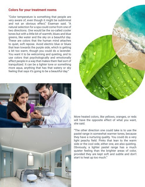
“Color temperature is something that people are<br />
very aware of, even though it might be subliminal<br />
and not an obvious effect,” Eiseman said. “A<br />
natural selection for a spa could come from one of<br />
two directions. One would be the so-called cooler<br />
tones but with a little bit of warmth, blues and blue<br />
greens, like water and the sky on a beautiful day.<br />
These are colors that the human mind attaches<br />
to quiet, soft repose. Avoid electric blue or blues<br />
that lean towards the purple side, which is getting<br />
a bit too warm, though you could do a lavender.<br />
You want it to be welcoming and quieting, and to<br />
use colors that psychologically and emotionally<br />
affect people in a way that makes them feel sort of<br />
tranquilized. It can be a lighter tone or something<br />
more aqua, anything that has that watery or sky<br />
feeling that says it’s going to be a beautiful day.”<br />
More heated colors, like yellows, oranges, or reds<br />
will have the opposite effect of what you want,<br />
she said.<br />
“The other direction one could take is to use the<br />
pastel range in somewhat warmer tones, because<br />
they have a nurturing quality. You could do a very<br />
light peachy field. Pinks that lean to the warm<br />
side or the cool side, either one, are also quieting.<br />
Obviously, a lighter pastel range has a much<br />
quieter feeling than the brighter areas of color,<br />
provided they are kept soft and subtle and don’t<br />
start to heat up too much.”