Spa Executive June 2021

Create successful ePaper yourself
Turn your PDF publications into a flip-book with our unique Google optimized e-Paper software.
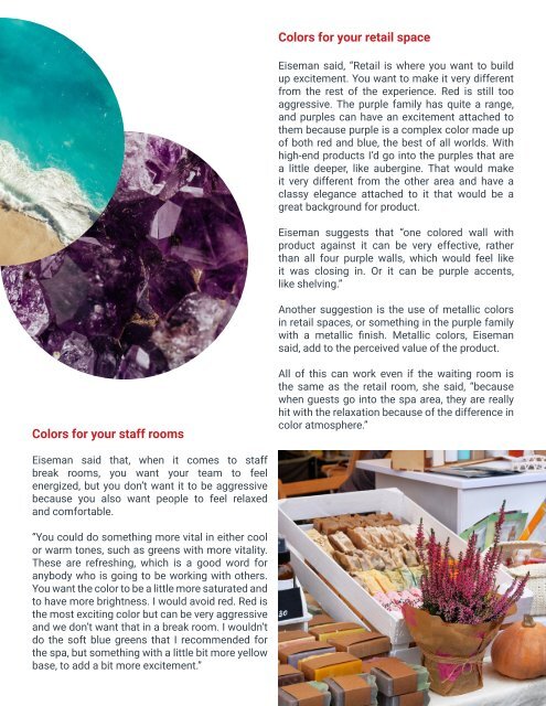
Colors for your retail space<br />
Eiseman said, “Retail is where you want to build<br />
up excitement. You want to make it very different<br />
from the rest of the experience. Red is still too<br />
aggressive. The purple family has quite a range,<br />
and purples can have an excitement attached to<br />
them because purple is a complex color made up<br />
of both red and blue, the best of all worlds. With<br />
high-end products I’d go into the purples that are<br />
a little deeper, like aubergine. That would make<br />
it very different from the other area and have a<br />
classy elegance attached to it that would be a<br />
great background for product.<br />
Eiseman suggests that “one colored wall with<br />
product against it can be very effective, rather<br />
than all four purple walls, which would feel like<br />
it was closing in. Or it can be purple accents,<br />
like shelving.”<br />
Another suggestion is the use of metallic colors<br />
in retail spaces, or something in the purple family<br />
with a metallic finish. Metallic colors, Eiseman<br />
said, add to the perceived value of the product.<br />
Colors for your staff rooms<br />
All of this can work even if the waiting room is<br />
the same as the retail room, she said, “because<br />
when guests go into the spa area, they are really<br />
hit with the relaxation because of the difference in<br />
color atmosphere.”<br />
Eiseman said that, when it comes to staff<br />
break rooms, you want your team to feel<br />
energized, but you don’t want it to be aggressive<br />
because you also want people to feel relaxed<br />
and comfortable.<br />
“You could do something more vital in either cool<br />
or warm tones, such as greens with more vitality.<br />
These are refreshing, which is a good word for<br />
anybody who is going to be working with others.<br />
You want the color to be a little more saturated and<br />
to have more brightness. I would avoid red. Red is<br />
the most exciting color but can be very aggressive<br />
and we don’t want that in a break room. I wouldn’t<br />
do the soft blue greens that I recommended for<br />
the spa, but something with a little bit more yellow<br />
base, to add a bit more excitement.”