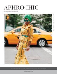
AphroChic Magazine: Issue No. 12

Create successful ePaper yourself
Turn your PDF publications into a flip-book with our unique Google optimized e-Paper software.
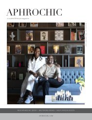
THE BLACK FAMILY HOME<br />
sitting room. A desk faced the wall while<br />
sparsely placed chairs were oriented<br />
vaguely towards a wall-mounted television.<br />
An awkwardly large electric fireplace<br />
dominated the wall and the room. At the<br />
same time, undersized furniture made<br />
the room feel small and cramped. But all<br />
of that just meant that transforming it was<br />
going to be fun.<br />
We began by putting together a<br />
moodboard, reflecting on some of our<br />
favorite libraries for inspiration. As much<br />
as we love our country home, we’re city<br />
folks at heart, so we try to bring the vibe of<br />
the city with us — starting with Brooklyn.<br />
The library room at Dumbo House, the<br />
same room where we launched <strong>AphroChic</strong><br />
magazine, was an obvious choice. A perfect<br />
gentlemen’s room, with moody blue walls,<br />
deep club chairs, and large tables to work<br />
from, it was one of our favorite places to<br />
work when we were at the House — which<br />
was almost daily — and our favorite place<br />
to relax when the day was done. Memories<br />
of that vibe set the tone for what we wanted<br />
in this space.<br />
The Ett Home Hotel by Studioilse in<br />
Stockholm, Sweden, was another source<br />
of inspiration. More of a bucket-list destination<br />
than a favorite hangout, the library<br />
features a large, modern shelving unit<br />
mounted to a wall. More than a spacesaver,<br />
the unit is a place for play, housing<br />
books, art, and sculpture alike. It was an<br />
attractive idea as we pondered the living<br />
space for our art collection, as well. The<br />
work of blending books and art — our respective<br />
passions — came to highlight the<br />
theme that defines the room: the balance<br />
of masculine and feminine sustained<br />
through the room’s many elements.<br />
A final touch of inspiration came<br />
from the <strong>No</strong>Mad hotel’s Library Bar. <strong>No</strong>w<br />
closed, the former Manhattan chill spot<br />
was decidedly moody, surrounding guests<br />
with walls lined with hundreds of classic<br />
books. It was that sense of intimacy and<br />
warmth that makes you feel like can sink<br />
into a room, and we wanted it.<br />
Inspiration acquired, we redefined<br />
the space with a new floor plan, dividing<br />
the open plan room into two distinct<br />
areas. One area would became a lounge.<br />
Expected to house most of the books, it<br />
would pair shelving with generous seating,<br />
the perfect area for stretching out, reading<br />
by the window, or just reaching up from<br />
the sofa to grab a book off the shelf.<br />
Every good library has a reference<br />
section for big projects, the kind that<br />
spread books and papers everywhere<br />
while the laptop shifts from one end of the<br />
table to the other. To make that happen, we<br />
brought in a large dining table that also fit<br />
8-10 people. In addition to providing more<br />
than ample workspace, when not being<br />
used as an office space, this size of the<br />
table allows the room to double as a dining<br />
room for holidays and family gatherings.<br />
To make the two spaces feel even more<br />
cohesive, we decided to cover the entire<br />
room in Farrow & Ball’s Inchyra Blue.<br />
Chosen to complement and contrast<br />
the pink undertones of our living room, the<br />
pink and blue mix between rooms is a larger<br />
example of the equal blend of masculine<br />
and feminine elements that is woven into<br />
the design of the home as a whole. Painted<br />
on the walls, ceiling and trim, the color<br />
is reminiscent of the wall color at Dumbo<br />
House, itself inspired by the Manhattan<br />
Bridge. Blue can be a challenging color to<br />
design with. Too much can feel too cool and<br />
icy, and layering with it can have bad results<br />
if the shades feel unrelated. To avoid these<br />
pitfalls, we spent time with the Farrow<br />
& Ball team finding just the right shade.<br />
Inchyra was perfect. Deep and soulful,<br />
packed with pigment, it works in all types<br />
of light, which is important when a room<br />
tends be dark. It has notes of brown which<br />
help to create a cozy feel in the evenings.<br />
Color was the key to tying the space<br />
together. But to make the room a library,<br />
what we really needed was shelving large<br />
enough to ground the space and showcase<br />
the books and art. Once the shade was<br />
decided, we worked with our friends at<br />
Resource Furniture to design the custom<br />
shelving. We worked closely with Resource’s<br />
Manhattan showroom, designing<br />
an open-shelf library system, similar<br />
to the Ett Home Hotel. Every detail was<br />
custom. The shelves were designed to have<br />
height and depth to them for housing large<br />
art books, and artworks, vertically. The<br />
dark, melamine Oak Moro that we chose<br />
for the unit went perfectly with the deep<br />
Inchyra Blue covering the walls. Ensuring<br />
that the library vibe extended from one<br />
end of the room to the other, shelves were<br />
placed in each area. As a finishing touch,<br />
Resource offered one last idea: matte<br />
lacquer panels in blue, made in Italy to<br />
match our wall color perfectly, making<br />
the shelving feel even more like part of<br />
the room. It was an amazing idea, and we<br />
decided to add a media unit under the television<br />
in the shade, to hold remotes, wires<br />
and any other tech.<br />
With the layout decided, our attention<br />
turned to the many furnishings and accessories<br />
that would bring the space to<br />
18 aphrochic