

HIRE ME?!
HIRE ME?!
HIRE ME?!

Create successful ePaper yourself
Turn your PDF publications into a flip-book with our unique Google optimized e-Paper software.
08 GRIDS<br />
USE A gRID<br />
gRIDS ARE A gREAT WAY TO LAY OUT YOUR CONTENT<br />
Use a grid. Seriously! A grid is<br />
not an arbitrary smattering of<br />
guidelines across the page. It’s<br />
a legitimate structural guide.<br />
Imagine driving in a new town.<br />
The lines on the road act as your<br />
guides. Now, imagine if those<br />
lines weren’t there. It’s a stressful<br />
environment where you can<br />
only focus on one thing - getting<br />
through it.<br />
First things first: you’re using<br />
InDesign, right? Right? If you<br />
aren’t using InDesign you’re<br />
making your life harder. InDesign<br />
has a great feature that makes<br />
grids for you.<br />
There are examples of grid<br />
systems on the following pages<br />
that you can use as a guide.<br />
Use your grid to line up your<br />
graphics exactly and to inform<br />
yourself as to where things look<br />
evenly placed. Use a copy and paste<br />
workflow to keep titles, subheadings<br />
and different blocks information all<br />
in the exact same place.<br />
Having consistent and logical<br />
alignments throughout your<br />
portfolio is essential. It’s important<br />
to stick to your grid. Arbitrary<br />
combinations of columns, lines,<br />
and rows do not project a logical<br />
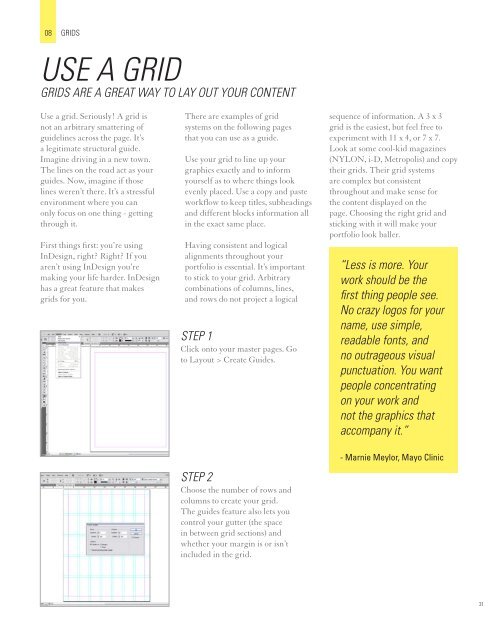
STEp 1<br />
Click onto your master pages. Go<br />
to Layout > Create Guides.<br />
STEp 2<br />
Choose the number of rows and<br />
columns to create your grid.<br />
The guides feature also lets you<br />
control your gutter (the space<br />
in between grid sections) and<br />
whether your margin is or isn’t<br />
included in the grid.<br />
sequence of information. A 3 x 3<br />
grid is the easiest, but feel free to<br />
experiment with 11 x 4, or 7 x 7.<br />
Look at some cool-kid magazines<br />
(NYLON, i-D, Metropolis) and copy<br />
their grids. Their grid systems<br />
are complex but consistent<br />
throughout and make sense for<br />
the content displayed on the<br />
page. Choosing the right grid and<br />
sticking with it will make your<br />
portfolio look baller.<br />
“Less is more. Your<br />
work should be the<br />
first thing people see.<br />
No crazy logos for your<br />
name, use simple,<br />
readable fonts, and<br />
no outrageous visual<br />
punctuation. You want<br />
people concentrating<br />
on your work and<br />
not the graphics that<br />
accompany it.”<br />
- Marnie Meylor, Mayo Clinic<br />
31