

HIRE ME?!
HIRE ME?!
HIRE ME?!

Create successful ePaper yourself
Turn your PDF publications into a flip-book with our unique Google optimized e-Paper software.
36<br />
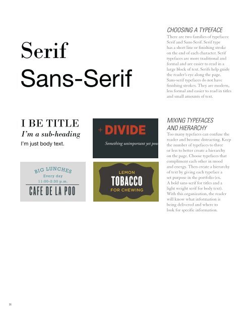
Serif<br />
Sans-Serif<br />
I BE TITLE<br />
I’m a sub-heading<br />
I’m just body text.<br />
BIG LUNCHES<br />
Every day<br />
11:00-2:30 p.m.<br />
CAFE D E L A POO<br />
CHOOSINg A TYpEFACE<br />
There are two families of typefaces:<br />
Serif and Sans-Serif. Serif type<br />
has a short line or finishing stroke<br />
on the end of each character. Serif<br />
typefaces are more traditional and<br />
formal and are easier to read in a<br />
large block of text. Serifs help guide<br />
the reader’s eye along the page.<br />
Sans-serif typefaces do not have<br />
finishing strokes. They are modern,<br />
less formal and easier to read in titles<br />
and small amounts of text.<br />
MIxINg TYpEFACES<br />
AND HIERARCHY<br />
DIVIDE<br />
Too many typefaces can confuse the<br />
reader and become distracting. Keep<br />
Something unimportant yet powerful the for you. number of typefaces to three<br />
or less to better create a hierarchy<br />
on the page. Choose typefaces that<br />
compliment each other in mood<br />
and energy. Then create a hierarchy<br />
LEMON<br />
of text by giving each typeface a<br />
set purpose in the portfolio (ex.<br />
TOBACCO<br />
A bold sans-serif for titles and a<br />
FOR CHEWING<br />
light weight serif for body text).<br />
With this organization, the reader<br />
will know what information is<br />
being delivered and where to<br />
look for specific information.