

Volume 5–2.pdf - U&lc
Volume 5–2.pdf - U&lc
Volume 5–2.pdf - U&lc

You also want an ePaper? Increase the reach of your titles
YUMPU automatically turns print PDFs into web optimized ePapers that Google loves.
4<br />
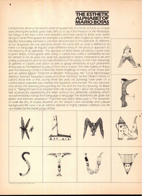
THE ESTHETIC<br />
ALPHABETOF<br />
MARIO BOTAS<br />
Comparisons among the world's great languages are, in a sense, as futile as comparisons<br />
among the world's great rivers. Who is to say if the Amazon or the Mississippi,<br />
the Volga or the Nile, is the most beautiful and most useful to those who dwell<br />
along its banks? Portuguese, for example, is as different from English as night is from<br />
day. But, fortunately, we have a common denominator in the alphabet. As different<br />
as our languages are, our alphabets remain the same. Still, as wide a difference as<br />
there is in language, an equally wide difference exists in the physical approach to<br />
the drawing of an alphabet—the alphabet of Mario Botas providing a good case<br />
in point. Botas, a Portuguese artist living in Lisbon:has culled a formidable record<br />
for himself in his 26 years. His work has appeared in several international art and<br />
poetry publications, and he has had exhibitions of his artistry in one-man showings<br />
at galleries in Oporto and Lisbon as well as group exhibitions at such prominent<br />
showcases as The National Society of Fine Arts in Lisbon, The Nike Gallery in Tokyo,<br />
and The Drawing Center in New York. Name headings of many of the shows present<br />
an added appeal: "Eroticism in Modern Portuguese Art;' "Local Mythologies:<br />
and (our favorite) "Exquisite Corpses and Other Paintings" (at the Ottalini Gallery in<br />
Lisbon). Botas tells us that, cluing these last years, his drawings have taken on a<br />
confrontation between two realities: the figuration. and the text. The two become<br />
one whole, the drawing presupposing the text and the text the drawing. As Botas<br />
puts it: "Taking the text to its simplest form, the single letter, I allow the drawing the<br />
task of physically representing the letter without any deliberate codiying, which<br />
would inevitably change from language to language.The letterforms are given full<br />
plastic and thematic autonomy" That's the way Mario Botas puts it. The reception<br />
of work like this, of course, depends on the viewer's own sensibility and cultural<br />
background. We view it as an esthetic exercise of highly creative invention, but let<br />
our readers be the better judge of that.<br />
THIS ARTICLE WAS SET IN ITC ERAS LIGHT


