Communications Guide - Fran O'hara
Communications Guide - Fran O'hara
Communications Guide - Fran O'hara

You also want an ePaper? Increase the reach of your titles
YUMPU automatically turns print PDFs into web optimized ePapers that Google loves.
Accessibility <strong>Guide</strong>lines 5<br />
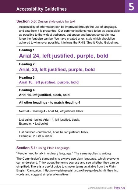
Section 5.0: Design style guide for text<br />
Accessibility of information can be improved through the use of language,<br />
and also how it is presented. Our communications need to be as accessible<br />
as possible to the widest audience, but space and budget constrain how<br />
large the font size can be. We have created a text style which should be<br />
adhered to whenever possible, it follows the RNIB ‘See it Right’ <strong>Guide</strong>lines.<br />
Heading 1<br />
Arial 24, left justified, purple, bold<br />
Heading 2<br />
Arial, 20, left justified, purple, bold<br />
Heading 3<br />
Arial 16, left justified, purple, bold<br />
Heading 4<br />
Arial 14, left justified, black, bold<br />
All other headings - to match Heading 4<br />
Normal - Heading 4 - Arial 14, left justified, black<br />
List bullet - bullet, Arial 14, left justified, black,<br />
Example: • List bullet<br />
List number - numbered, Arial 14, left justified, black<br />
Example: 2. List number<br />
Section 5.1: Using Plain Language<br />
“People need to talk in ordinary language.” The same applies to writing.<br />
The Commission’s standard is to always use plain language, which everyone<br />
can understand. Think about the terms you use and see whether they can be<br />
simplified. There is a useful guide to simpler terms available from the Plain<br />
English Campaign. (http://www.plainenglish.co.uk/free-guides.html), they list<br />
words and suggest simpler alternatives.<br />
<strong>Communications</strong> <strong>Guide</strong> Page 5.0