Communications Guide - Fran O'hara
Communications Guide - Fran O'hara
Communications Guide - Fran O'hara

You also want an ePaper? Increase the reach of your titles
YUMPU automatically turns print PDFs into web optimized ePapers that Google loves.
Design <strong>Guide</strong>lines 6<br />
• Use the primary/full colour or reversed out logos whenever<br />
possible.<br />
Only use the greyscale or single colour logo where budget or print<br />
restrictions prevent the use of the primary/full colour logo. The logo<br />
can be printed in any appropriate colour.<br />
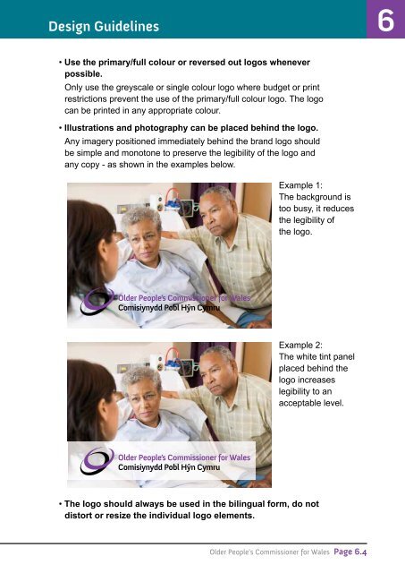
• Illustrations and photography can be placed behind the logo.<br />
Any imagery positioned immediately behind the brand logo should<br />
be simple and monotone to preserve the legibility of the logo and<br />
any copy - as shown in the examples below.<br />
Example 1:<br />
The background is<br />
too busy, it reduces<br />
the legibility of<br />
the logo.<br />
Example 2:<br />
The white tint panel<br />
placed behind the<br />
logo increases<br />
legibility to an<br />
acceptable level.<br />
• The logo should always be used in the bilingual form, do not<br />
distort or resize the individual logo elements.<br />
Older People’s Commissioner for Wales Page 6.4