Mapping Cultural Participation in Chicago - Cultural Policy Center
Mapping Cultural Participation in Chicago - Cultural Policy Center
Mapping Cultural Participation in Chicago - Cultural Policy Center

Create successful ePaper yourself
Turn your PDF publications into a flip-book with our unique Google optimized e-Paper software.
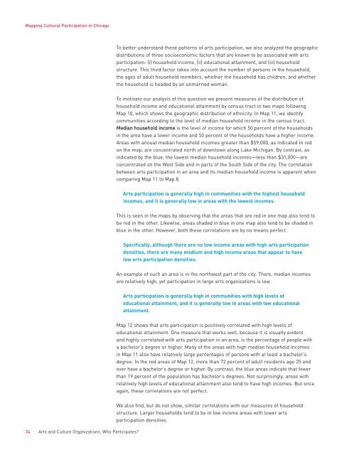
<strong>Mapp<strong>in</strong>g</strong> <strong>Cultural</strong> <strong>Participation</strong> <strong>in</strong> <strong>Chicago</strong>To better understand these patterns of arts participation, we also analyzed the geographicdistributions of three socioeconomic factors that are known to be associated with artsparticipation: (i) household <strong>in</strong>come, (ii) educational atta<strong>in</strong>ment, and (iii) householdstructure. This third factor takes <strong>in</strong>to account the number of persons <strong>in</strong> the household,the ages of adult household members, whether the household has children, and whetherthe household is headed by an unmarried woman.To motivate our analysis of this question we present measures of the distribution ofhousehold <strong>in</strong>come and educational atta<strong>in</strong>ment by census tract <strong>in</strong> two maps follow<strong>in</strong>gMap 10, which shows the geographic distribution of ethnicity. In Map 11, we identifycommunities accord<strong>in</strong>g to the level of median household <strong>in</strong>come <strong>in</strong> the census tract.Median household <strong>in</strong>come is the level of <strong>in</strong>come for which 50 percent of the households<strong>in</strong> the area have a lower <strong>in</strong>come and 50 percent of the households have a higher <strong>in</strong>come.Areas with annual median household <strong>in</strong>comes greater than $59,000, as <strong>in</strong>dicated <strong>in</strong> redon the map, are concentrated north of downtown along Lake Michigan. By contrast, as<strong>in</strong>dicated by the blue, the lowest median household <strong>in</strong>comes—less than $31,000—areconcentrated on the West Side and <strong>in</strong> parts of the South Side of the city. The correlationbetween arts participation <strong>in</strong> an area and its median household <strong>in</strong>come is apparent whencompar<strong>in</strong>g Map 11 to Map 8.Arts participation is generally high <strong>in</strong> communities with the highest household<strong>in</strong>comes, and it is generally low <strong>in</strong> areas with the lowest <strong>in</strong>comes.This is seen <strong>in</strong> the maps by observ<strong>in</strong>g that the areas that are red <strong>in</strong> one map also tend tobe red <strong>in</strong> the other. Likewise, areas shaded <strong>in</strong> blue <strong>in</strong> one map also tend to be shaded <strong>in</strong>blue <strong>in</strong> the other. However, both these correlations are by no means perfect.Specifically, although there are no low <strong>in</strong>come areas with high arts participationdensities, there are many medium and high <strong>in</strong>come areas that appear to havelow arts participation densities.An example of such an area is <strong>in</strong> the northwest part of the city. There, median <strong>in</strong>comesare relatively high, yet participation <strong>in</strong> large arts organizations is low.Arts participation is generally high <strong>in</strong> communities with high levels ofeducational atta<strong>in</strong>ment, and it is generally low <strong>in</strong> areas with low educationalatta<strong>in</strong>ment.Map 12 shows that arts participation is positively correlated with high levels ofeducational atta<strong>in</strong>ment. One measure that works well, because it is visually evidentand highly correlated with arts participation <strong>in</strong> an area, is the percentage of people witha bachelor’s degree or higher. Many of the areas with high median household <strong>in</strong>comes<strong>in</strong> Map 11 also have relatively large percentages of persons with at least a bachelor’sdegree. In the red areas of Map 12, more than 72 percent of adult residents age 25 andover have a bachelor’s degree or higher. By contrast, the blue areas <strong>in</strong>dicate that fewerthan 19 percent of the population has bachelor’s degrees. Not surpris<strong>in</strong>gly, areas withrelatively high levels of educational atta<strong>in</strong>ment also tend to have high <strong>in</strong>comes. But onceaga<strong>in</strong>, these correlations are not perfect.34 Arts and Culture Organizations: Who Participates?We also f<strong>in</strong>d, but do not show, similar correlations with our measures of householdstructure. Larger households tend to be <strong>in</strong> low <strong>in</strong>come areas with lower artsparticipation densities.