Mapping Cultural Participation in Chicago - Cultural Policy Center
Mapping Cultural Participation in Chicago - Cultural Policy Center
Mapping Cultural Participation in Chicago - Cultural Policy Center

Create successful ePaper yourself
Turn your PDF publications into a flip-book with our unique Google optimized e-Paper software.
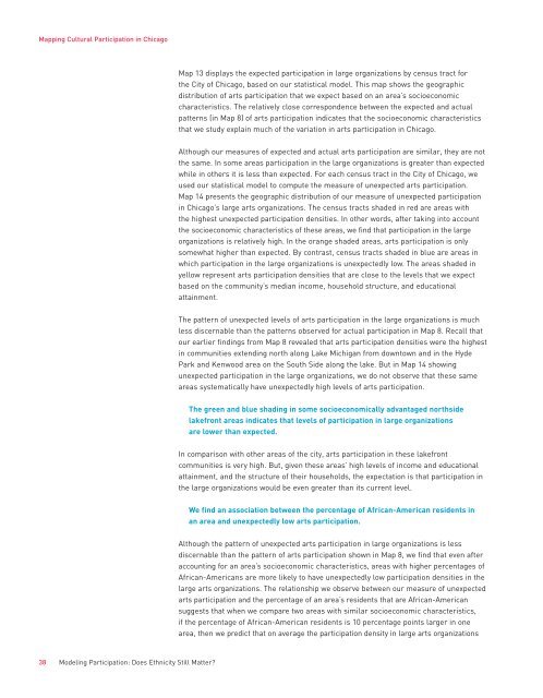
<strong>Mapp<strong>in</strong>g</strong> <strong>Cultural</strong> <strong>Participation</strong> <strong>in</strong> <strong>Chicago</strong>Map 13 displays the expected participation <strong>in</strong> large organizations by census tract forthe City of <strong>Chicago</strong>, based on our statistical model. This map shows the geographicdistribution of arts participation that we expect based on an area’s socioeconomiccharacteristics. The relatively close correspondence between the expected and actualpatterns (<strong>in</strong> Map 8) of arts participation <strong>in</strong>dicates that the socioeconomic characteristicsthat we study expla<strong>in</strong> much of the variation <strong>in</strong> arts participation <strong>in</strong> <strong>Chicago</strong>.Although our measures of expected and actual arts participation are similar, they are notthe same. In some areas participation <strong>in</strong> the large organizations is greater than expectedwhile <strong>in</strong> others it is less than expected. For each census tract <strong>in</strong> the City of <strong>Chicago</strong>, weused our statistical model to compute the measure of unexpected arts participation.Map 14 presents the geographic distribution of our measure of unexpected participation<strong>in</strong> <strong>Chicago</strong>’s large arts organizations. The census tracts shaded <strong>in</strong> red are areas withthe highest unexpected participation densities. In other words, after tak<strong>in</strong>g <strong>in</strong>to accountthe socioeconomic characteristics of these areas, we f<strong>in</strong>d that participation <strong>in</strong> the largeorganizations is relatively high. In the orange shaded areas, arts participation is onlysomewhat higher than expected. By contrast, census tracts shaded <strong>in</strong> blue are areas <strong>in</strong>which participation <strong>in</strong> the large organizations is unexpectedly low. The areas shaded <strong>in</strong>yellow represent arts participation densities that are close to the levels that we expectbased on the community’s median <strong>in</strong>come, household structure, and educationalatta<strong>in</strong>ment.The pattern of unexpected levels of arts participation <strong>in</strong> the large organizations is muchless discernable than the patterns observed for actual participation <strong>in</strong> Map 8. Recall thatour earlier f<strong>in</strong>d<strong>in</strong>gs from Map 8 revealed that arts participation densities were the highest<strong>in</strong> communities extend<strong>in</strong>g north along Lake Michigan from downtown and <strong>in</strong> the HydePark and Kenwood area on the South Side along the lake. But <strong>in</strong> Map 14 show<strong>in</strong>gunexpected participation <strong>in</strong> the large organizations, we do not observe that these sameareas systematically have unexpectedly high levels of arts participation.The green and blue shad<strong>in</strong>g <strong>in</strong> some socioeconomically advantaged northsidelakefront areas <strong>in</strong>dicates that levels of participation <strong>in</strong> large organizationsare lower than expected.In comparison with other areas of the city, arts participation <strong>in</strong> these lakefrontcommunities is very high. But, given these areas’ high levels of <strong>in</strong>come and educationalatta<strong>in</strong>ment, and the structure of their households, the expectation is that participation <strong>in</strong>the large organizations would be even greater than its current level.We f<strong>in</strong>d an association between the percentage of African-American residents <strong>in</strong>an area and unexpectedly low arts participation.Although the pattern of unexpected arts participation <strong>in</strong> large organizations is lessdiscernable than the pattern of arts participation shown <strong>in</strong> Map 8, we f<strong>in</strong>d that even afteraccount<strong>in</strong>g for an area’s socioeconomic characteristics, areas with higher percentages ofAfrican-Americans are more likely to have unexpectedly low participation densities <strong>in</strong> thelarge arts organizations. The relationship we observe between our measure of unexpectedarts participation and the percentage of an area’s residents that are African-Americansuggests that when we compare two areas with similar socioeconomic characteristics,if the percentage of African-American residents is 10 percentage po<strong>in</strong>ts larger <strong>in</strong> onearea, then we predict that on average the participation density <strong>in</strong> large arts organizations38 Model<strong>in</strong>g <strong>Participation</strong>: Does Ethnicity Still Matter?