Design-Expert 5.0 Reference Manual - Statease.info
Design-Expert 5.0 Reference Manual - Statease.info
Design-Expert 5.0 Reference Manual - Statease.info

You also want an ePaper? Increase the reach of your titles
YUMPU automatically turns print PDFs into web optimized ePapers that Google loves.
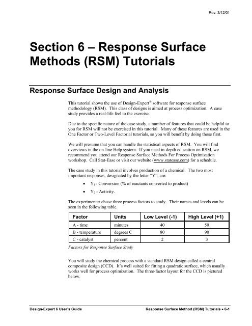
Section 6 – Response Surface<br />
Methods (RSM) Tutorials<br />
Response Surface <strong>Design</strong> and Analysis<br />
Rev. 3/12/01<br />
This tutorial shows the use of <strong>Design</strong>-<strong>Expert</strong> ® software for response surface<br />
methodology (RSM). This class of designs is aimed at process optimization. A case<br />
study provides a real-life feel to the exercise.<br />
Due to the specific nature of the case study, a number of features that could be helpful to<br />
you for RSM will not be exercised in this tutorial. Many of these features are used in the<br />
One Factor or Two-Level Factorial tutorials, so you will benefit by doing those first.<br />
We will presume that you can handle the statistical aspects of RSM. You will find<br />
overviews in the on-line Help system. If you need in-depth education on RSM, we<br />
recommend you attend our Response Surface Methods For Process Optimization<br />
workshop. Call Stat-Ease or visit our website (www.statease.com) for a schedule.<br />
The case study in this tutorial involves production of a chemical. The two most<br />
important responses, designated by the letter “Y”, are:<br />
• Y1 - Conversion (% of reactants converted to product)<br />
• Y2 - Activity.<br />
The experimenter chose three process factors to study. Their names and levels can be<br />
seen in the following table.<br />
Factor Units Low Level (-1) High Level (+1)<br />
A - time minutes 40 50<br />
B - temperature degrees C 80 90<br />
C - catalyst percent 2 3<br />
Factors for Response Surface Study<br />
You will study the chemical process with a standard RSM design called a central<br />
composite design (CCD). It’s well suited for fitting a quadratic surface, which usually<br />
works well for process optimization. The three-factor layout for the CCD is pictured<br />
below.<br />
<strong>Design</strong>-<strong>Expert</strong> 6 User’s Guide Response Surface Method (RSM) Tutorials • 6-1
<strong>Design</strong> the Experiment<br />
Central Composite <strong>Design</strong> for Three Factors<br />
Assume that the experiments will be conducted over a two-day period, in two blocks:<br />
1. Twelve runs: composed of eight factorial points, plus four center points.<br />
2. Eight runs: composed of six star (axial) points, plus two more center points.<br />
Start the program by finding and double clicking the <strong>Design</strong>-<strong>Expert</strong> software icon. Take<br />
the quickest route to initiating a new design by clicking on the blank-sheet icon � on the<br />
left of the toolbar. The other route is via File, New <strong>Design</strong> (or associated Alt keys).<br />
Main Menu and Tool Bar<br />
Click on the Response Surface folder tab to show the designs available for RSM.<br />
Response Surface <strong>Design</strong> Tab<br />
6-2 • Response Surface Method (RSM) Tutorials <strong>Design</strong>-<strong>Expert</strong> 6 User’s Guide
Rev. 3/12/01<br />
The default selection is the Central Composite design, which will be used for this case<br />
study. The picture shows the layout of the CCD for two factors. Click on the choices<br />
for Box-Behnken and 3-Level Factorial to see what these alternative designs look like.<br />
After exploring the Response Surface menu, re-select the Central Composite design.<br />
Then click on the entry field for Numeric Factors and enter 3. (The maximum<br />
allowable number of factors is 10.) Ignore the option of including categorical factors in<br />
your designs (leave at default of 0).<br />
Factor Selection<br />
Replace the default entries for factor Name (A, B, C), and levels for Low (-1) and<br />
High (1), by tabbing or clicking to each cell and entering the details given in the<br />
introduction to this case study. The top of your screen should now match that shown<br />
below.<br />
Completed Data Entry Form<br />
The low and high values you entered above will be assigned to the limits of the factorial<br />
part of the design, i.e., the low and high levels will be coded -1 and +1. In the on-screen<br />
picture of the CCD, the factorial portion is represented by the gray points forming a box.<br />
The star (axial) points are located at the end of the arrows that come from the center<br />
point.<br />
Now look at the bottom of the central composite design form. Leave the Type at its<br />
default value of Full. You will need two blocks for this design, one for each day, so<br />
click on the Blocks field and select 2.<br />
<strong>Design</strong>-<strong>Expert</strong> 6 User’s Guide Response Surface Method (RSM) Tutorials • 6-3
Central Composite <strong>Design</strong> Dialog Box - After Selecting 2 Blocks<br />
The default selection of “Alpha,” set at 1.68179 in coded units, is the axial distance from<br />
the center point and makes the design rotatable. A rotatable design provides equally<br />
good predictions at points equally distant from the center, a very desirable property for<br />
RSM. You can change alpha to other values via Options.<br />
Normally the coded value for alpha exceeds the plus or minus one range of the factorial<br />
points, thus pushing the star points outside the factorial box. Therefore, if you enter low<br />
and high limits in terms of the factorial portion of the design, you must check the star<br />
points to be sure they don’t exceed your operating limits. If you must keep your CCD<br />
within specified limits, you will need to check the “Factor ranges entered in terms of<br />
alpha” box and then enter the extreme values for each factor. The impact of doing this<br />
will be much clearer if you actually click the alpha box and see what happens, then click<br />
it again and leave it blank. Do this now. Notice that the ranges change to the more<br />
extreme values of the axial points.<br />
Click on the Continue button to reach the second page of the “wizard” for building a<br />
response surface design. Select 2 from the pull down list for Responses. Then enter<br />
the response Name and Units for each response as shown below. At any time in the<br />
design-building phase, you can return to the previous page by pressing the Back button.<br />
Then you can revise your selections.<br />
Completed Response Form<br />
Press the Continue button to get the design layout.<br />
6-4 • Response Surface Method (RSM) Tutorials <strong>Design</strong>-<strong>Expert</strong> 6 User’s Guide
Save the Data to a File<br />
Completed <strong>Design</strong> Layout (Only partially shown, your run order may be different.)<br />
Rev. 3/12/01<br />
The three columns on the left of the design layout identify the experimental runs.<br />
<strong>Design</strong>-<strong>Expert</strong> will randomize the order, so your runs will probably not match the layout<br />
shown above. If you like, adjust the widths of the columns by dragging them with your<br />
mouse wherever a double-ended arrow appears on your screen. By right-clicking at the<br />
top of a column, you are presented with an option to sort the design by any given<br />
variable. The right-click menu also offers an option called Edit Info, which allows you<br />
to reformat or change the factor levels. Try it! For example, right-click at the top of<br />
Factor 1 (A:time). Notice that you can also change factor names and units of measure.<br />
See the on-line Help system for more details on Edit Info and other ways in which you<br />
can manipulate the design layout.<br />
Now that you’ve invested some time into your design, it would be prudent to save your<br />
work. Click on the File menu item and select Save As.<br />
Save As Selection<br />
<strong>Design</strong>-<strong>Expert</strong> 6 User’s Guide Response Surface Method (RSM) Tutorials • 6-5
Examine the <strong>Design</strong> Runs<br />
You will be shown a standard dialog box that you can use to specify the name and<br />
destination of your data file.<br />
File Save As Dialog Box<br />
Now you can enter a file name in the field with the default extension of dx6. (We<br />
suggest tut-rsm.dx6). Then, click on Save.<br />
The design layout contains the completed design in run order showing the actual factor<br />
levels. You can also view this in coded factor levels by selecting Display Options,<br />
Process Factors, Coded from the menu bar.<br />
Display Options menu for Coded Factor Levels<br />
You can then right click on the Run column header and select Sort by Standard<br />
Order (or do the same on the Std column, or select View, Std Order from the menu).<br />
Right Click Menu for Run Column<br />
6-6 • Response Surface Method (RSM) Tutorials <strong>Design</strong>-<strong>Expert</strong> 6 User’s Guide
Analyze the Results<br />
<strong>Design</strong> Layout with Coded Factor Levels in Standard Order<br />
Rev. 3/12/01<br />
Add, delete or duplicate any experimental points by right clicking on the button (empty<br />
square) to the left of the row. (It’s best to have your design in standard order before you<br />
do this.) If you add or delete runs, the experiments can be re-randomized by right<br />
clicking on the run column heading. You can change block names too, if you like. Go<br />
ahead and try some of these editing functions. See the Help system for more details.<br />
Assume that you have completed the experiment. You now need to enter the responses<br />
into <strong>Design</strong>-<strong>Expert</strong>. We see no benefit to making you type all the numbers, particularly<br />
with the potential confusion due to differences in randomized run orders. Use the File,<br />
Open <strong>Design</strong> menu and select Rsm.dx6 from the <strong>Design</strong>-<strong>Expert</strong> software program<br />
Data directory. Click on Open to load the data.<br />
Let’s examine the data. Move your cursor to the top of the Block column and do a right<br />
click. Choose Display Point Type.<br />
Displaying the Point Type<br />
<strong>Design</strong>-<strong>Expert</strong> 6 User’s Guide Response Surface Method (RSM) Tutorials • 6-7
Again move your cursor to the top of the Type column (previously the Block column)<br />
and do a right click. This time select Sort by Point Type. The results can be seen<br />
below.<br />
<strong>Design</strong> Sorted by Point Type<br />
Now you can examine the results. Notice the variation in response for the replicated<br />
center points.<br />
Before doing the analysis, it might be interesting to take a look at some simple plots.<br />
Select View, Graph Columns.<br />
Graph Columns Feature for <strong>Design</strong> Layout<br />
By default the graph shows a plot of factor A versus the first response. Click on the<br />
Y-axis and choose Activity (the second response). The graph shows a strong<br />
correlation between the levels of time and the activity response.<br />
6-8 • Response Surface Method (RSM) Tutorials <strong>Design</strong>-<strong>Expert</strong> 6 User’s Guide
Graph of Factor A: Time versus Response: Activity<br />
Rev. 3/12/01<br />
Go ahead and explore the data further by changing the x-axis and/or y-axis. You may<br />
want to graph individual factors versus one or the other response. In this way you can<br />
get a feel for the relationships. When you are done exploring, get back to the design<br />
layout screen by selecting View, <strong>Design</strong> Layout.<br />
You will now start analyzing the responses numerically. Click on the node labeled<br />
Conversion. A new set of buttons appears at the top of your screen. They are<br />
arranged from left to right in the order needed to complete the analysis. What could be<br />
simpler?<br />
Begin Analysis of Conversion<br />
<strong>Design</strong>-<strong>Expert</strong> 6 User’s Guide Response Surface Method (RSM) Tutorials • 6-9
<strong>Design</strong>-<strong>Expert</strong> provides a full array of response transformations via the Transform<br />
option. See the on-line Help system for details. For now, accept the default<br />
transformation selection of None.<br />
Click on the Fit Summary button next. At this point <strong>Design</strong>-<strong>Expert</strong> fits linear, twofactor<br />
interaction (2FI), quadratic and cubic polynomials to the response. The program<br />
displays a measure of progress during the calculations. For large data sets you may have<br />
to wait a few moments while your PC works. In most cases it will be done before you<br />
know it.<br />
After the computations are complete, the program displays the results. To move around<br />
the display, use the side and/or bottom scroll bars. You will first see the identification of<br />
the response, immediately followed in this case by a warning: “The Cubic Model is<br />
Aliased.” Do not be alarmed. By design, the central composite matrix provides too few<br />
unique design points to determine all of the terms in the cubic model. It's set up only for<br />
the quadratic model (or some subset). Next you will see several extremely useful<br />
summary tables for model selection. Each of these tables will be discussed briefly<br />
below.<br />
The “Sequential Model Sum of Squares” summary table shows how terms of increasing<br />
complexity contribute to the total model. The model hierarchy is described below:<br />
• “Linear”: the significance of adding the linear terms to the mean and blocks.<br />
• “2FI”: the significance of adding the two factor interaction terms to the<br />
mean, block and linear terms already in the model.<br />
• “Quadratic”: the significance of adding the quadratic (squared) terms to the<br />
mean, block, linear and two factor interaction terms already in the model.<br />
• “Cubic”: the significance of the cubic terms beyond all other terms.<br />
Summary Table: Sequential Model Sum of Squares<br />
6-10 • Response Surface Method (RSM) Tutorials <strong>Design</strong>-<strong>Expert</strong> 6 User’s Guide
Rev. 3/12/01<br />
For each source of terms (linear, etc.), examine the probability (“PROB > F”) to see if it<br />
falls below 0.05 (or whatever statistical significance level you choose). So far, the<br />
quadratic model looks best – these terms are significant, but adding the cubic order terms<br />
will not significantly improve the fit. (Even if they were significant, the cubic terms<br />
would be aliased, so they wouldn’t be useful for modeling purposes.) Scroll down to the<br />
next table for lack of fit tests on the various model orders.<br />
Summary Table: Lack of Fit Tests<br />
The “Lack of Fit Tests” table compares the residual error to the “Pure Error” from<br />
replicated design points. If there is significant lack of fit, as shown by a low probability<br />
value (“Prob>F”), then be careful about using the model as a response predictor. In this<br />
case, the linear model definitely can be ruled out, because its Prob > F falls below 0.05.<br />
The quadratic model, identified earlier as the likely model, does not show significant<br />
lack of fit. Remember that the cubic model is aliased, so it should not be chosen.<br />
Summary Table: Model Summary Statistics<br />
The “Model Summary Statistics” table lists other statistics useful in comparing models.<br />
The quadratic model comes out best: It exhibits low standard deviation (“Std. Dev.”),<br />
high “R-Squared” values and a low “PRESS.”<br />
The program automatically underlines at least one “Suggested” model. Always confirm<br />
this suggestion by looking at these tables. See the on-line Help system for more<br />
<strong>info</strong>rmation about the procedure for choosing model(s).<br />
<strong>Design</strong>-<strong>Expert</strong> 6 User’s Guide Response Surface Method (RSM) Tutorials • 6-11
<strong>Design</strong>-<strong>Expert</strong> now allows you to select a model for an in-depth statistical study. Click<br />
on the Model button at the top of the screen next to see the terms in the model.<br />
Model Results<br />
At this stage you could press the Add Term button and insert higher degree terms with<br />
integer powers up to 6 th order in total, up to a certain number of factors. Check Help for<br />
details. Also, remember that help is at your fingertips for program features. For<br />
example, if you place your mouse over the Add Term button and right-click you get the<br />
“What’s This” option. Click it to get the following explanation.<br />
Getting Help via the Right-Click “What’s This?” Feature of <strong>Design</strong>-<strong>Expert</strong><br />
The program defaults to the “Suggested” model from the Fit Summary screen. If you<br />
want, you can choose an alternate model from the Process Order pull-down list. (Be<br />
sure to do this in the rare cases when <strong>Design</strong>-<strong>Expert</strong> suggests more than one model.) For<br />
this case study, we’ll leave the selection at Quadratic. You could manually reduce the<br />
model by clicking off insignificant effects. For example, you will see in a moment that<br />
several terms in this case are marginally significant at best. <strong>Design</strong>-<strong>Expert</strong> also provides<br />
several automatic reduction algorithms as alternatives to the “<strong>Manual</strong>” method:<br />
“Backward,” “Forward” and “Stepwise.” Click the down arrow on the Selection list box<br />
to use these.<br />
Click on the ANOVA button to produce the ANOVA table for the selected model. The<br />
ANOVA table is available in two views. The standard ANOVA will display all the<br />
6-12 • Response Surface Method (RSM) Tutorials <strong>Design</strong>-<strong>Expert</strong> 6 User’s Guide
Rev. 3/12/01<br />
statistical details necessary for analysis. If you choose View, Annotated ANOVA, you<br />
will get the same statistics with text providing brief explanations and guidelines. The<br />
software will default to whichever view was used last. The screen shown below is<br />
selected by choosing View, ANOVA.<br />
Statistics for Selected Model: ANOVA Table<br />
The ANOVA in this case confirms the adequacy of the quadratic model (the Model<br />
Prob>F is less than 0.05.) You can also see probability values for each individual term<br />
in the model. You may want to consider removing terms with probability values greater<br />
than 0.10. Use process knowledge to guide your decisions.<br />
Scroll down to bring the following table to your screen.<br />
<strong>Design</strong>-<strong>Expert</strong> 6 User’s Guide Response Surface Method (RSM) Tutorials • 6-13
Coefficients for the Quadratic Model<br />
Following the ANOVA table you see the coefficients and associated confidence<br />
intervals for each term in the model. The mean effect shift for each block is listed here<br />
too.<br />
Again scroll down to bring the next section to your screen.<br />
Final Equation for Conversion Response: Coded<br />
Just below the model coefficients table you will find the model equation in terms of the<br />
coded factors and the model equation in the actual factors. Block terms are left out.<br />
These terms can be used to re-create the results of this experiment, but they cannot be<br />
used for modeling future responses.<br />
6-14 • Response Surface Method (RSM) Tutorials <strong>Design</strong>-<strong>Expert</strong> 6 User’s Guide
Rev. 3/12/01<br />
Finally, by scrolling down a little further, you see the predicted values (which do include<br />
block effects), residuals and diagnostic <strong>info</strong>rmation on the individual experiments. (You<br />
may need to drag the border between the icons on the left and the data table so you can<br />
get all the columns on screen. Give this a try.)<br />
Residuals and Diagnostics (partially shown)<br />
The note below the table (“Predicted values include block corrections.”) alerts you that<br />
any shift from block 1 to block 2 will be included for purposes of residual diagnostics,<br />
but won’t be seen in the equations shown above the table. The residuals (errors of<br />
prediction) should be carefully evaluated to ensure that you’ve satisfied the statistical<br />
assumptions underlying the analysis of variance. You will make plots of these<br />
diagnostics in a moment. The plots tell the story at a glance.<br />
You cannot edit any of the ANOVA outputs. However, you can copy and paste the data<br />
to your favorite Windows word processor or spreadsheet.<br />
Diagnose the Statistical Properties of the Model<br />
The diagnostic details provided by <strong>Design</strong>-<strong>Expert</strong> can best be analyzed by inspection of<br />
various plots, which you will now generate. Click on the Diagnostics button.<br />
Residuals will be studentized unless you uncheck the first box on the floating tool<br />
palette (this is not advised). This counteracts varying leverages due to location of design<br />
points. For example, the centerpoints carry little weight in the fit and thus exhibit low<br />
leverage.<br />
The most important diagnostic will be the normal probability plot of the studentized<br />
residuals. It comes up by default. You can drag the line with the mouse pointer to ‘eyefit’<br />
the residuals to a normal probability distribution. The data points should be<br />
approximately linear. A non-linear pattern (look for an S-shaped curve) indicates nonnormality<br />
in the error term, which may be corrected by a transformation. There are no<br />
signs of any problems in our data. You can identify the source of any data point on the<br />
graph with a mouse click on the point.<br />
At the left of the screen you see the Diagnostics Tool palette. Each button on the<br />
palette represents a different diagnostics graph. Check out the other graphs if you like.<br />
Explanations for most of these graphs were covered in the Factorial Tutorials. In this<br />
case, none of the graphs indicate any cause for alarm.<br />
<strong>Design</strong>-<strong>Expert</strong> 6 User’s Guide Response Surface Method (RSM) Tutorials • 6-15
Examine Model Graphs<br />
Normal Probability Plot of the Residuals<br />
The diagnosis of residuals reveals no statistical problems, so you will now generate the<br />
response surface plots. Click on the Model Graphs button. The 2D contour plot of<br />
factors A versus B comes up by default.<br />
Response Surface Plotting Range with Defaults<br />
6-16 • Response Surface Method (RSM) Tutorials <strong>Design</strong>-<strong>Expert</strong> 6 User’s Guide
Rev. 3/12/01<br />
Note that <strong>Design</strong>-<strong>Expert</strong> will display any actual point included in the design space<br />
shown. In this case you see a plot of conversion as a function of time and temperature at<br />
a mid-level slice of catalyst. This slice includes six centerpoints as indicated by the dot<br />
at the middle of the contour plot. By replicating center points, you get a very good<br />
power of prediction at the middle of your experimental region.<br />
The Factors Tool comes along with the default plot. Move this floating tool as needed<br />
by clicking on the top blue border and dragging it. The tool controls which factor(s) are<br />
plotted on the graph. The Gauges view is the default. Each factor listed will either have<br />
an axis label, indicating that it is currently shown on the graph, or a red slider bar, which<br />
allows you to choose specific settings for the factors that are not currently plotted. The<br />
red slider bars will default to the midpoint levels of the factors not currently assigned to<br />
axes. You can change a factor level by dragging the red slider bars or by right clicking<br />
on a factor name to make it active (it becomes highlighted) and then typing the desired<br />
level in the numeric space near the bottom of the tool palette. Click on the C:catalyst<br />
toolbar to see its value. Don’t worry if it shifts a bit – we will instruct you on how to reset<br />
it in a moment.<br />
Factors Tool with Factor C Highlighted and Value Displayed<br />
Switch to the Sheet View by clicking on the Sheet button.<br />
Factors Tool Palette –Sheet View<br />
In the columns labeled Axis and Value you can change the axes settings or type in<br />
specific values for factors. If the catalyst value shifted from its mid-point value of 2.50,<br />
correct it now. Then return to the default view by clicking on the Gauges button.<br />
<strong>Design</strong>-<strong>Expert</strong> 6 User’s Guide Response Surface Method (RSM) Tutorials • 6-17
Perturbation Plot<br />
At the bottom of the Factors Tool is a pull-down list from which you can also select the<br />
factors to plot. Only the terms that are in the model are included in this list. If you<br />
select a single factor (such as A) the graph will change to a One Factor Plot. If you<br />
choose a two-factor interaction term (such as AC) the plot will become the Interaction<br />
graph of that pair. The only way to get back to a Contour graph is to use the menu item<br />
View, Contour.<br />
Wouldn’t it be handy to see all your factors on one response plot? You can do this with<br />
the perturbation plot, which provides silhouette views of the response surface. The real<br />
benefit from this plot is for selecting axes and constants in contour and 3D plots.<br />
Use the View, Perturbation menu item to select it.<br />
The Perturbation Plot<br />
For response surface designs the perturbation plot shows how the response changes as<br />
each factor moves from the chosen reference point, with all other factors held constant at<br />
the reference value. <strong>Design</strong>-<strong>Expert</strong> sets the reference point default at the middle of the<br />
design space (the coded zero level of each factor).<br />
Click on the curve for factor A to see it better. (The software will highlight it with a<br />
different color.) In this case, you can see that factor A (time) produces a relatively small<br />
effect as it changes from the reference point. Therefore, because you can only plot<br />
contours for two factors at a time, it makes sense to choose B and C, and slice on A.<br />
6-18 • Response Surface Method (RSM) Tutorials <strong>Design</strong>-<strong>Expert</strong> 6 User’s Guide
Contour Plot<br />
Rev. 3/12/01<br />
Let’s look at the contour plot of factors B and C. Return to the contour plots via the<br />
View, Contour selection. Right click on the catalyst bar in the Factors tool palette.<br />
Then select X axis by left clicking on it.<br />
You now see a catalyst versus temperature plot of conversion, with time held as a<br />
constant at its midpoint.<br />
Response Surface - Time Constant<br />
If you like, change the time constant by dragging the slider left and right. See how it<br />
affects the shape of the contours. Also, notice how the plot darkens as you approach the<br />
extremes. You’re getting into areas of extrapolation. Be careful out there! When<br />
you’re done, put the slider back at its centerpoint.<br />
<strong>Design</strong>-<strong>Expert</strong> draws five contour levels by default. They range from the minimum<br />
response to the maximum response. Click on a contour to highlight it. You can move<br />
the contours by dragging them to new values. (Place the mouse cursor on the contour<br />
and hold down the left button while moving the mouse.) Give this a try – it’s fun! Add<br />
new contours or set flags via a right mouse click. Check it out.<br />
To get more precise contour levels for your final report, you could right-click each one<br />
and enter the desired value. Check this out if you like. But we recommend another<br />
approach: right click in the drawing or label area of the graph and choosing Graph<br />
Preferences. Then choose Contours.<br />
<strong>Design</strong>-<strong>Expert</strong> 6 User’s Guide Response Surface Method (RSM) Tutorials • 6-19
Now select the Incremental option and fill in the Start at 66, Step at 3 and Levels at<br />
8. Your screen should now match that shown below.<br />
Contours Dialog Box: Incremental Option<br />
Press OK to get a good-looking contour plot.<br />
Contour Plot with New Contour Values<br />
6-20 • Response Surface Method (RSM) Tutorials <strong>Design</strong>-<strong>Expert</strong> 6 User’s Guide
Rev. 3/12/01<br />
Right clicking on a contour gives you the following options: Delete contour, Set contour<br />
value, Add flag, Add contour and Graph Preferences. Check it out. (First left click on a<br />
contour line to highlight it, then right click to get the menu options.)<br />
Options Available with a Right Click on a Contour Line<br />
Move your mouse to a spot near the top of the graph, where the response hits the<br />
maximum. Click the right mouse button and Add flag. It displays the value of the<br />
response at that point. Now do a right click of the mouse on the flag and select Toggle<br />
size. The expanded flag displays a 95 percent confidence interval on the prediction.<br />
Use this to ‘manage expectations’ about individual confirmation runs near this point.<br />
Natural variability plus imprecision in the estimate of the mean (SE mean) will cause<br />
actual outcomes to differ from the prediction. The larger flag also lists the point<br />
coordinates.<br />
Contour Plot with Larger Flag Planted<br />
If you have a printer, you can print the contour plot by using the File, Print menu item.<br />
<strong>Design</strong>-<strong>Expert</strong> 6 User’s Guide Response Surface Method (RSM) Tutorials • 6-21
Selecting View, 3D Surface will result in a three-dimensional display of the response<br />
surface. If you want nicer numbers on the response axis, do a right click to bring up the<br />
graph preferences and change values for the Z-axis. Check it out.<br />
3D Response Surface Plot<br />
The Rotation tool allows you to view the 3D surface plot from any angle.<br />
Control for Rotating 3D Response Plot<br />
Move your cursor over the tool. The pointer changes to a hand. Now use the hand to<br />
rotate the vertical or horizontal wheel. Watch the 3D surface change. It’s fun! Press the<br />
Default button when you’re done playing. The graph then re-sets to its original position.<br />
Notice that you can also specify the horizontal (“h”) and vertical (“v”) coordinates.<br />
Remember that you’re only looking at a ‘slice’ of factor A (time) at its center point.<br />
Normally, you’d want to make additional plots with slices of A at the minus and plus<br />
one levels. But let’s move on to another plot provided by <strong>Design</strong>-<strong>Expert</strong> software.<br />
6-22 • Response Surface Method (RSM) Tutorials <strong>Design</strong>-<strong>Expert</strong> 6 User’s Guide
Standard Error Plot<br />
Rev. 3/12/01<br />
The standard error plot shows how the variance associated with prediction changes over<br />
your design space. The shape depends only on input factors, so you really should look<br />
at this plot before you gather data. It’s a great tool for evaluating your design. To<br />
generate this plot, use the View, Standard E rror menu selection.<br />
3D Plot of Standard Error<br />
You can see that the central composite design provides relatively precise predictions<br />
over a broad area around the centerpoint. Also, notice the circular contours. This<br />
indicates the statistical property of rotatability, another desirable feature of central<br />
composite design.<br />
You can manipulate the standard error plot just like the response plots. Choose View,<br />
Contour to get a better view of the circular contours. Let’s see what happens if you<br />
extrapolate beyond the region of experimentation. First select Display Options,<br />
Process Factors, Coded. Then do a right mouse click on the graph and select<br />
Graph preferences. Change the default X Axis value for Low to -2 and the High<br />
value to 2.<br />
<strong>Design</strong>-<strong>Expert</strong> 6 User’s Guide Response Surface Method (RSM) Tutorials • 6-23
Changing X-axis Values<br />
Next, click on the Y Axis tab and change the Low value to -2 and the High value to 2.<br />
After making all these changes to the graph properties, press OK. (If you see any<br />
leftover flags, right click on them and delete.)<br />
Contour Plot of Standard Error with Expanded Axes, Extrapolated Area Shaded<br />
6-24 • Response Surface Method (RSM) Tutorials <strong>Design</strong>-<strong>Expert</strong> 6 User’s Guide
Response Prediction<br />
Rev. 3/12/01<br />
Notice that the corners of the contour plot are shaded. These areas cannot be predicted<br />
as well as the interior region. <strong>Design</strong>-<strong>Expert</strong> provides the shading as a warning against<br />
extrapolation. It begins at one-half the standard deviation and increases linearly up to<br />
1.5 times the standard deviation. You will also see the shading on response (model)<br />
plots. So long as you stay within the specified factorial ranges, the pictures will remain<br />
relatively clear, but if you widen the ranges, don’t be surprised to see considerable<br />
darkening. Be wary of predictions in these nether regions! Remember that the darker<br />
shading represents higher standard error. You now can see that it’s dangerous to<br />
extrapolate outside the plus or minus one region, the factorial portion of this central<br />
composite design. Select Display Options, Process Factors, Actual to view the<br />
factors in their original units of measure.<br />
This feature in <strong>Design</strong>-<strong>Expert</strong> software allows you to generate predicted response(s) for<br />
any set of factors. To see how this works, click on the Point Prediction icon in the<br />
optimization section (lower left on your screen).<br />
Point Prediction Data Table<br />
The Factors Tool again allows you to adjust the settings to any values you wish. Go<br />
ahead and play with them now if you like. You can either move the slider controls, or<br />
switch to the Sheet view and enter values.<br />
Be sure to look at the 95% prediction interval (“PI low” to “PI high”). This tells you<br />
what to expect for an individual confirmation test. You might be surprised at the level<br />
of variability, but it will help you manage expectations. (Note: block effects are not<br />
accounted for in the prediction.) You can print the results by using the File, Print<br />
command.<br />
Analyze the Data for the Second Response<br />
This step is a BIG one. Analyze the data for the second response, activity. Be sure you<br />
find the appropriate polynomial to fit the data, examine the residuals and plot the<br />
response surface. Hint: The correct model is linear.<br />
Before you quit, do a File, Save to preserve your analysis. <strong>Design</strong>-<strong>Expert</strong> will save<br />
your models. To leave <strong>Design</strong>-<strong>Expert</strong>, use the File, Exit menu selection. The program<br />
will warn you to save again if you’ve modified any files.<br />
<strong>Design</strong>-<strong>Expert</strong> 6 User’s Guide Response Surface Method (RSM) Tutorials • 6-25
Response Surface Optimization Tutorial<br />
This tutorial shows the use of <strong>Design</strong>-<strong>Expert</strong> software for optimization experiments. It's<br />
based on the data from the Response Surface Tutorial. You should go back to this<br />
section if you've not already completed it.<br />
For details on optimization, see the on-line program help. Also, Stat-Ease provides indepth<br />
training in its Response Surface Methods For Process Optimization workshop.<br />
Call or visit our web site for <strong>info</strong>rmation on content and schedules.<br />
In this section, you will work with a three-factor central composite design on a chemical<br />
reaction. The factors are: time, temperature and catalyst. The experimenters measured<br />
two responses: yield and activity. You will optimize the process using models<br />
developed earlier in the Response Surface Tutorial.<br />
Start the program by finding and double clicking on the <strong>Design</strong>-<strong>Expert</strong> icon.<br />
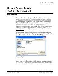
You will find the case study data, with the responses already analyzed, stored in a file<br />
named Rsm-a.dx6. Use the File, Open <strong>Design</strong> menu to load the data file. The<br />
standard file open dialog box appears.<br />
File Open Dialog Box<br />
Once you have found the proper drive, directory and file name, click on Open to load<br />
the data. To see a description of the design status, click on the Status node. Drag the<br />
left border and open the window to see the report better. You can also re-size columns<br />
with the mouse. From the design status screen you can see that we modeled conversion<br />
with a quadratic model and activity with a linear model.<br />
6-26 • Response Surface Method (RSM) Tutorials <strong>Design</strong>-<strong>Expert</strong> 6 User’s Guide
<strong>Design</strong> Status Screen<br />
Numerical Optimization<br />
Rev. 3/12/01<br />
<strong>Design</strong>-<strong>Expert</strong> software’s numerical optimization will maximize, minimize or target:<br />
• A single response<br />
• A single response, subject to upper and/or lower boundaries on other responses<br />
• Combinations of two or more responses.<br />
We will lead you through the latter case: a multiple response optimization. Click on the<br />
Numerical node to start the process.<br />
Setting Numeric Optimization Criteria<br />
<strong>Design</strong>-<strong>Expert</strong> 6 User’s Guide Response Surface Method (RSM) Tutorials • 6-27
<strong>Design</strong>-<strong>Expert</strong> allows you to set criteria for all variables, including factors and<br />
propagation of error (POE). (We will get to POE later.) To be safe, the program sets the<br />
factor ranges to the actual levels (plus one to minus one in coded values). The limits for<br />
the responses default to the observed extremes. In this case, you should leave the<br />
settings for time, temperature and catalyst factors alone, but you will need to make some<br />
changes to the response criteria.<br />
Now you get to the crucial phase of numerical optimization: assignment of<br />
“Optimization Parameters.” The program uses five possibilities for a “Goal” to<br />
construct desirability indices (di):<br />
• is maximum<br />
• is minimum<br />
• is target<br />
• is in range<br />
• is equal to (factors only)<br />
Desirabilities range from zero to one for any given response. The program combines the<br />
individual desirabilities into a single number and then searches for the greatest overall<br />
desirability. A value of one represents the ideal case. A zero indicates that one or more<br />
responses fall outside desirable limits. <strong>Design</strong>-<strong>Expert</strong> uses an optimization method<br />
developed by Derringer and Suich, described by Myers and Montgomery in Response<br />
Surface Methodology, John Wiley and Sons, New York (available from Stat-Ease).<br />
For this tutorial case study, assume that you need the conversion to be as high as<br />
possible. Click on Conversion and set its Goal at is maximum. Set the Lower<br />
Limit to 80, the lowest acceptable value. You must enter an Upper Limit to get the<br />
desirability equation to work properly, so set it at the theoretical high of 100.<br />
Conversion Criteria Settings<br />
6-28 • Response Surface Method (RSM) Tutorials <strong>Design</strong>-<strong>Expert</strong> 6 User’s Guide
Rev. 3/12/01<br />
Now click on the second response, Activity. Set its Goal to is target of 63. Enter a<br />
Lower Limit of 60 and an Upper Limit of 66. These limits indicate that it is most<br />
desirable to achieve the targeted value of 63, but values in the range of 60-66 are<br />
acceptable. Values outside that range are not acceptable.<br />
Activity Criteria Settings<br />
These settings create the following desirability functions:<br />
1. Conversion:<br />
• if less than 80%, then desirability (di) equals zero<br />
• from 80 to 100%, di ramps up from zero to one<br />
• if over 100%, then di equals one<br />
2. Activity:<br />
• if less than 60, then di equals zero<br />
• from 60 to 63, di ramps up from zero to one<br />
• from 63 to 66, di ramps back down to zero<br />
• if greater than 66, then di equals zero<br />
The user can select additional parameters, called weights, for each response. Weights<br />
give added emphasis to upper or lower bounds or emphasize a target value. With a<br />
weight of 1, the di will vary from 0 to 1 in linear fashion. Weights greater than 1<br />
(maximum weight is 10) give more emphasis to the goal. Weights less than 1 (minimum<br />
weight is 0.1) give less emphasis to the goal. Leave the Weights fields at their default<br />
values of 1.<br />
Importance is a relative scale for weighting each of the resulting di in the overall<br />
desirability product. If you want to emphasize one response over the rest, set its<br />
<strong>Design</strong>-<strong>Expert</strong> 6 User’s Guide Response Surface Method (RSM) Tutorials • 6-29
Running the optimization<br />
importance higher than the other response importances. For this study, leave the<br />
Importance field at +++, a medium setting.<br />
See the on-line help system for a more in-depth explanation of the construction of the<br />
desirability function, and formulas for the weights and importance.<br />
The Options button controls the number of cycles (searches) per optimization. If you<br />
have a very complex combination of response surfaces, increasing the number of cycles<br />
will give you more opportunities to find the optimal solution. The Duplicate solution<br />
filter establishes the epsilon (minimum difference) for eliminating duplicate solutions.<br />
Leave these options at their default levels (shown below).<br />
Optimization Options Dialog Box<br />
Start the optimization by clicking on the Solutions icon.<br />
Numerical Optimization Report on Solutions (Your results may differ)<br />
6-30 • Response Surface Method (RSM) Tutorials <strong>Design</strong>-<strong>Expert</strong> 6 User’s Guide
Rev. 3/12/01<br />
The program randomly picks a set of conditions from which to start its search for<br />
desirable results. Multiple cycles improve the odds of finding multiple local optimums,<br />
some of which will be higher in desirability than others. After grinding through 10<br />
cycles of optimization, the results appear.<br />
The report view shows the results in tabular form. Due to the random starting<br />
conditions, your results are likely to be slightly different from those shown here. Note<br />
that the last solution falls short of the first for conversion. There may be some<br />
duplicates in between. These passed through the filter discussed earlier. If you want to<br />
adjust the filter, go to the Options button and change the Duplicate Solutions Filter. If<br />
you move the Filter bar to the right you will decrease the number of solutions shown.<br />
Likewise, moving the bar to the left increases the number of solutions.<br />
The Solutions tool provides three views of the same optimization. (Drag the tool to a<br />
convenient location on the screen.)<br />
Click on the solutions view option Ramps.<br />
Ramps Report on Numerical Optimization<br />
The ramp display combines the individual graphs for easier interpretation. The dot on<br />
each ramp reflects the factor setting or response prediction for that solution. The height<br />
of the dot shows how desirable it is. Press the different solution buttons (1, 2, 3,…) and<br />
watch the dots. They may move only very slightly from one solution to the next.<br />
However, if you look closely at temperature, you should find two distinct optimums, one<br />
near 80 degrees and the other near 90 degrees. You may see slight differences in the<br />
results due to variations in approach from the various random starting points.<br />
Select the Histogram view.<br />
<strong>Design</strong>-<strong>Expert</strong> 6 User’s Guide Response Surface Method (RSM) Tutorials • 6-31
Optimization Graphs<br />
Solution to Multiple Response Optimization - Desirability Histogram<br />
The histogram shows how well each variable satisfied the criteria: values near one are<br />
good. Nearly duplicate solutions, as found by the duplicate solutions filter, will be<br />
eliminated. In this example, you will find two or more somewhat different solutions.<br />
You can cycle through each of the solutions: the best is listed first.<br />
Press Graphs to view the results of the first optimization run. Go to the Factor control<br />
and right click on catalyst. Make it the Y axis. Temperature then becomes a constant<br />
factor at 90 degrees.<br />
Desirability Graph (After Changing Axes)<br />
6-32 • Response Surface Method (RSM) Tutorials <strong>Design</strong>-<strong>Expert</strong> 6 User’s Guide
Rev. 3/12/01<br />
<strong>Design</strong>-<strong>Expert</strong> software sets a flag at the optimal point. You can plant additional flags<br />
by doing a right mouse click at any location. Right click again on the flag and Toggle<br />
size to see the associated desirability value and the factor levels.<br />
To view the responses associated with the desirability, select the desired Response<br />
from the drop down list. Take a look at the plot for Conversion.<br />
Conversion Contour Plot (with optimum flagged)<br />
If you like, look at the optimal activity response as well.<br />
To look at the desirability surface in three dimensions, click again on Response and<br />
choose Desirability. Then select View, 3D Surface from the main menu. Drag the<br />
tools out of the way as needed to view the results. Then rotate the plot for a different<br />
perspective by using the Rotation tool. Drag the rim of the wheels with your mouse<br />
pointer to change the orientation of the 3D plot.<br />
You can change the quality of the 3D graph by going to the Edit, Preferences menu<br />
item, or by doing a right mouse click on the graph. Click on the Graph tab and then set<br />
parameters as you desire. Give this a try. Then if you have a printer attached, make a<br />
hard copy by doing a File, Print. Show your colleagues what <strong>Design</strong>-<strong>Expert</strong> software<br />
will do!<br />
<strong>Design</strong>-<strong>Expert</strong> 6 User’s Guide Response Surface Method (RSM) Tutorials • 6-33
3D Desirability Plot<br />
Adding Propagation of Error (POE) to the Optimization<br />
If you have prior knowledge of the variation in your input factors, this <strong>info</strong>rmation can<br />
be fed into <strong>Design</strong>-<strong>Expert</strong> software. Then you can generate propagation of error (POE)<br />
plots that show how that error is transmitted to the response. Look for conditions that<br />
minimize the transmitted variation, thus creating a process that’s robust to the factor<br />
settings.<br />
Start by clicking on the <strong>Design</strong> node on the left side of the screen to get back to the<br />
design layout. Then select View, Column Info Sheet. Enter the following<br />
<strong>info</strong>rmation into the Std. Dev. column: time: 0.5, temperature: 1.0, catalyst: 0.05, as<br />
shown on the screen below.<br />
Column Info Sheet with Factor Standard Deviations Filled In<br />
6-34 • Response Surface Method (RSM) Tutorials <strong>Design</strong>-<strong>Expert</strong> 6 User’s Guide
Rev. 3/12/01<br />
Notice that the software already entered the standard deviation for the analyzed<br />
response, Conversion (4.10). Since you haven’t changed any other data, the software<br />
will remember your previous analysis choices and you can simply click through the<br />
analysis buttons. This time the Propagation of Error (POE) graph, which was grayed out<br />
before, will be available from the Model Graph node.<br />
Click on the Conversion analysis node on the left to start the analysis again. Then<br />
jump past the intermediate buttons for analysis and click on the Model Graphs button.<br />
Select View, Propagation of Error and View, 3D Surface.<br />
3D Surface view of the POE Graph<br />
The lower the POE the better, because less of the error in control factors will be<br />
transmitted to the selected response. The end result is a more robust process. However,<br />
POE will only work when the response surface is non-linear, such as for the Conversion.<br />
When the surface is linear, such as that for Activity, the error will be transmitted equally<br />
throughout the region.<br />
For an in-depth explanation of POE, attend Stat-Ease’s workshop Robust <strong>Design</strong>, DOE<br />
Tools for Reducing Variability. Call, or check our web site for a schedule.<br />
Now that you’ve found optimum conditions for the two responses, let’s go back and add<br />
criteria for the propagation of error. Click on Numerical optimization node. Set the<br />
POE (Conversion) Goal to is minimum with a Lower Limit of 4 and an Upper<br />
Limit of 5 as shown below.<br />
<strong>Design</strong>-<strong>Expert</strong> 6 User’s Guide Response Surface Method (RSM) Tutorials • 6-35
Set Goal and Limits for POE (Conversion)<br />
Now click on the Solutions node to generate new solutions with the additional criteria.<br />
Solutions Generated with Added POE Criteria (Your results may differ)<br />
6-36 • Response Surface Method (RSM) Tutorials <strong>Design</strong>-<strong>Expert</strong> 6 User’s Guide
Rev. 3/12/01<br />
Click on the solutions view option Ramps. Click on the alternate solutions (2, 3,…).<br />
Watch the red dots. What changes?<br />
Select the Graphs node. Click the number 1 solution. If you haven’t already, choose<br />
View, Contour. To make the view similar to what we had before, on the Factors tool<br />
palette change catalyst to the Y axis. Also right-click on the flag and Toggle Size.<br />
This solution represents the formulation that best maximizes conversion and achieves a<br />
target value of 63 for activity, while at the same time finds the spot with the minimum<br />
error transmitted to the responses. So, this should represent process conditions that are<br />
robust to slight variations in the factor settings.<br />
Optimal Solution with Added POE Criteria<br />
<strong>Design</strong>-<strong>Expert</strong> 6 User’s Guide Response Surface Method (RSM) Tutorials • 6-37
Graphical Optimization<br />
When you did the numerical optimization, you found an area of satisfactory solutions at<br />
a temperature of 90 degrees. To see a broader operating window, click on the<br />
Graphical node. The requirements are essentially the same as in the numerical<br />
optimization:<br />
• 80 < Conversion<br />
• POE(Conversion) < 5<br />
• 60 < Activity < 66<br />
For Conversion, which comes up by default, enter 80 for the Lower Limit. You do<br />
not need to enter a high limit for the graphical optimization to work.<br />
Completed Screen for Graphical Optimization: Conversion<br />
Click on the response for POE(Conversion). Enter 5 for the Upper Limit.<br />
Finally, click on the response of Activity. Enter 60 for the Lower Limit and 66 for<br />
the Upper Limit.<br />
Then click on the Graphs button to produce the “overlay” plot. Notice that regions not<br />
meeting your specifications are shaded out, leaving (hopefully!) an operating window or<br />
“sweet spot.”<br />
6-38 • Response Surface Method (RSM) Tutorials <strong>Design</strong>-<strong>Expert</strong> 6 User’s Guide
Overlay Plot<br />
Rev. 3/12/01<br />
To match the numerical optimization, go to the Factors tool, right click on catalyst<br />
and select it for the Y-axis. Then press the Sheet option and set temperature as a<br />
constant Value at 90.<br />
Sheet Mode to Set Constant for Temperature<br />
<strong>Design</strong>-<strong>Expert</strong> now overlays response contours for each response. Click on the<br />
Gauges option to make the Factors Tool less obtrusive. Now you can search for a<br />
“compromise” optimum - windows of operability where requirements simultaneously<br />
meet the critical properties.<br />
<strong>Design</strong>-<strong>Expert</strong> 6 User’s Guide Response Surface Method (RSM) Tutorials • 6-39
You can optimize a virtually unlimited number of responses on the same graph.<br />
However, they must first be analyzed. In the first tutorial you developed a quadratic<br />
model for conversion and a linear model for activity. Only those responses for which<br />
you enter lower and/or upper levels will be plotted.<br />
The shaded areas on the graphical optimization plot do not meet the selection criteria.<br />
The lines mark the high or low boundaries on the responses. The clear (or colored<br />
yellow if you haven’t made changes to your color scheme) “window” shows where you<br />
can set the factors to satisfy the requirements on both responses.<br />
Move the mouse pointer into the clear (or yellow) area. Right click to add a flag. The<br />
flag shows the predicted value of conversion, the propagation of error for conversion<br />
and activity, at that point on the plot.<br />
Graphical Optimization Plot, Axes Changed, Flag Added<br />
Plant multiple flags if you like. Delete flags by right clicking on them and selecting<br />
Delete flag. You can also change criteria “on the fly” by clicking and dragging the<br />
contour lines. You can explore this window for high values of conversion. You will<br />
find the maximum conversion in the 90-degree slice is about 96%.<br />
Graphical optimization works great for two factors, but as the factors increase, it<br />
becomes more and more tedious. You will find solutions much more quickly by using<br />
the numerical optimization feature. Then return to the graphical optimization and<br />
produce outputs for presentation purposes.<br />
6-40 • Response Surface Method (RSM) Tutorials <strong>Design</strong>-<strong>Expert</strong> 6 User’s Guide
Final Comments<br />
Rev. 3/12/01<br />
We feel that numerical optimization provides powerful insights when combined with<br />
graphical analysis. Numerical optimization becomes essential when you investigate<br />
many components with many responses. However, computerized optimization will not<br />
work very well in the absence of subject matter knowledge. For example, a naive user<br />
may define impossible optimization criteria. The result will be zero desirability<br />
everywhere! To avoid this, try setting broad acceptable ranges. Narrow them down as<br />
you gain knowledge about how changing factor levels affect the responses. Often, you<br />
will need to make more than one pass to find the “best” factor levels to satisfy<br />
constraints on several responses simultaneously.<br />
The Response Surface Optimization Tutorial completes the basic introduction to doing<br />
RSM with <strong>Design</strong>-<strong>Expert</strong> software. If you want to learn more about the methods shown<br />
in this tutorial, attend the Stat-Ease workshop Response Surface Methods For Process<br />
Optimization.<br />
We appreciate your questions and comments on <strong>Design</strong>-<strong>Expert</strong> software. Call us, send<br />
an annotated fax of output, write us a letter or send us an e-mail. You will find our<br />
address, phone number and web site listed in the last part of the Introduction to this<br />
manual.<br />
<strong>Design</strong>-<strong>Expert</strong> 6 User’s Guide Response Surface Method (RSM) Tutorials • 6-41