

Web_Designer_Issue_262_2017

You also want an ePaper? Increase the reach of your titles
YUMPU automatically turns print PDFs into web optimized ePapers that Google loves.
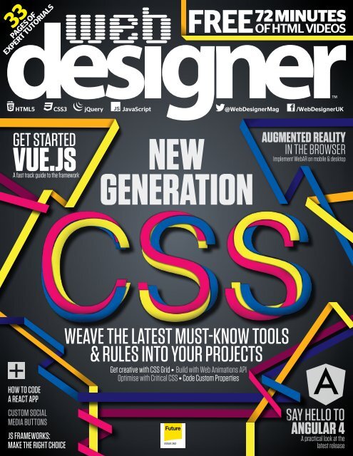
33<br />
PAGES OF<br />
EXPERT TUTORIALS<br />
FREE<br />
72 MINUTES<br />
OF HTML VIDEOS<br />
HTML5<br />
CSS3<br />
jQuery<br />
JavaScript<br />
@<strong>Web</strong><strong>Designer</strong>Mag<br />
/<strong>Web</strong><strong>Designer</strong>UK<br />
GET STARTED<br />
VUE.JS<br />
A fast track guide to the framework<br />
NEW<br />
GENERATION<br />
AUGMENTED REALITY<br />
IN THE BROWSER<br />
Implement <strong>Web</strong>AR on mobile & desktop<br />
HOW TO CODE<br />
A REACT APP<br />
CUSTOM SOCIAL<br />
MEDIA BUTTONS<br />
JS FRAMEWORKS:<br />
MAKE THE RIGHT CHOICE<br />
WEAvE THE LATEST MUST-KNOW TOOLS<br />
& RULES INTO YOUR PROJECTS<br />
Get creative with CSS Grid • Build with <strong>Web</strong> Animations API<br />
Optimise with Critical CSS • Code Custom Properties<br />
<strong>Issue</strong> <strong>262</strong><br />
SAY HELLO TO<br />
ANGULAR 4<br />
A practical look at the<br />
latest release
welcome<br />
Welcome<br />
to the issue<br />
Highlight<br />
THE WEB DESIGNER MISSION<br />
To be the most accessible and<br />
inspiring voice for the industry,<br />
offering cutting-edge features<br />
and techniques vital to<br />
building future-proof<br />
online content<br />
Steven<br />
Jenkins<br />
“<br />
JavaScript has<br />
developed far<br />
enough that mostly<br />
jQuery isn’t really<br />
needed anymore<br />
Digital pioneers wild tell us ”<br />
they are heading to the frontier<br />
of digital design<br />
Page 36<br />
CSS was a sensitive soul, once an<br />
awkward teenager, but now, with the<br />
help of browser support, it is starting<br />
to grow and realise its potential.<br />
Our latest lead feature (page 44)<br />
takes a closer look at the latest tools<br />
and rules that are taking the king of<br />
styling forward to a brave new era. The<br />
darling of the moment CSS Grid is here. We take<br />
a look at positioning and ofer a host of useful<br />
tips and tricks to get more from the spec.<br />
Discover the benefits that Custom Properties, or<br />
CSS Variables if you prefer, will bring to your<br />
coding. Plus, find out what you can do with CSS<br />
CSS is growing up<br />
Element Queries, how to build with the <strong>Web</strong> Animations<br />
API and how to speed up your website with Critical CSS.<br />
While CSS is bigging itself up JavaScript frameworks<br />
have been building in abundance. There is no shortage<br />
of them, in fact, and with so many it’s hard to decide<br />
which one to use. Help is at hand on page 66. We take a<br />
look at the features of the more popular frameworks,<br />
Angular, React, Ember, Meteor, plus a few up-and-coming<br />
options, and help you choose the right one for your<br />
projects. Talking of JS frameworks we show you how to<br />
install and get started with the popular Vue.js on page 74.<br />
Elsewhere learn how to utilise React to build a<br />
dashboard application, find out what’s new in Angular 4<br />
and create custom social media buttons. Enjoy the issue.<br />
“<br />
Many of us have<br />
been using variables<br />
in CSS for a few years<br />
through the use of<br />
preprocessors like<br />
Sass and LESS, but<br />
now we can use them<br />
in native CSS<br />
”<br />
Follow us on Twitter for all the news & conversation @<strong>Web</strong><strong>Designer</strong>Mag<br />
Visit our blog for opinion, freebies & more www.gadgetdaily.xyz<br />
FREE – exclusive with this issue<br />
<strong>Designer</strong> resources<br />
78<br />
Video Tuition – 72 minutes of expert video guides on HTML/CSS/JS<br />
troubleshooting from Pluralsight (www.pluralsight.com)<br />
Assets – 16 Orange and Teal Photoshop actions<br />
70 vintage wood textures<br />
– Tutorial files and assets<br />
www.filesilo.co.uk/webdesigner<br />
meta _________________________________________________________________________ 3
contributors<br />
This issue’s panel of experts<br />
Welcome to that<br />
bit of the mag<br />
where we learn<br />
more about the<br />
featured writers<br />
and contributors…<br />
“ With full spec<br />
implementation<br />
blunders out of the<br />
way, CSS has a<br />
bunch of exciting<br />
new features on<br />
the horizon<br />
”<br />
Mark Shufflebottom<br />
Mark is a Professor of<br />
Interaction Design at<br />
Sheridan College of<br />
Advanced Learning near<br />
Toronto. Mark is exploring the<br />
power of AR.js to bring<br />
augmented reality through<br />
<strong>Web</strong>RTC and <strong>Web</strong>GL to the<br />
browser. Page 54<br />
Steven Roberts<br />
Steven is a front-end developer from Teesside. In this article he’ll be taking<br />
a look at what’s new, upcoming and exciting in CSS. He ofers top tips on<br />
using CSS Grid, how to use Custom Properties (aka CSS Variables), work<br />
with the <strong>Web</strong> Animations API & peek inside CSS Element Queries. Page 44<br />
Tam Hanna<br />
Tam has an ambivalent<br />
relationship with JavaScript<br />
and is always interested<br />
in new frameworks<br />
promising to streamline the<br />
development process. This<br />
issue he gets up close and<br />
personal with the JavaScript<br />
framework Vue. Page 74<br />
Simon Jones<br />
Simon likes his code quick,<br />
clean and maintainable,<br />
which means modularity<br />
and well-defined design<br />
principles. Frameworks help<br />
bring these benefits to the<br />
web. In this issue he helps<br />
you decide which is the best<br />
framework for you. Page 66<br />
Future Publishing Ltd<br />
Richmond House, 33 Richmond Hill<br />
Bournemouth, Dorset, BH2 6EZ<br />
% +44 (0) 1202 586200<br />
<strong>Web</strong>: www.gadgetdaily.xyz<br />
www.greatdigitalmags.com<br />
www.futureplc.com<br />
Editorial<br />
Editor Steve Jenkins<br />
steve.jenkins@futurenet.com<br />
% 01202 586233<br />
<strong>Designer</strong> Harriet Knight<br />
Production Editor Rachel Terzian<br />
Photographer James Sheppard<br />
Senior Art Editor Will Shum<br />
Editor in Chief Amy Hennessey<br />
Contributors<br />
Mark Stuckert, Arabella Lewis-Smith, Annie Hall, Mark Billen,<br />
Leon Brown, Deutsch, wild, David Howell, Steven Roberts,<br />
Mark Shuflebottom, Sarah Maynard, Simon Jones, Tam Hanna,<br />
Jemmima Knight, Matt Crouch<br />
Advertising<br />
Digital or printed media packs are available on request.<br />
Commercial Sales Director Clare Dove<br />
Advertising Manager Mike Pyatt<br />
% 01225 687538<br />
michael.pyatt@futurenet.com<br />
Account Director George Lucas<br />
george.lucas@futurenet.com<br />
Advertising Sales Executive Chris Mitchell<br />
chris.mitchell@futurenet.com<br />
Licensing<br />
<strong>Web</strong> <strong>Designer</strong> is available for licensing. Contact the licensing<br />
department to discuss further opportunities.<br />
Head of International Licensing Matt Ellis<br />
% +44 (0) 1225 442244<br />
matt.ellis@futurenet.com<br />
Subscriptions<br />
For all subscription enquiries:<br />
webdesigner@servicehelpline.co.uk<br />
% 0844 848 8413<br />
% Overseas +44 1795 592 878<br />
www.imaginesubs.co.uk<br />
Head of subscriptions Sharon Todd<br />
FileSilo.co.uk<br />
Assets and resource iles for this magazine can<br />
be found on this website.<br />
Register now to unlock thousands of useful iles.<br />
Support ilesilohelp@futurenet.com<br />
Circulation<br />
Circulation Director Darren Pearce<br />
% 01202 586200<br />
Production<br />
Head of Production US & UK Mark Constance<br />
Production Project Manager Clare Scott<br />
Advertising Production Manager Joanne Crosby<br />
Digital Editions Controller Jason Hudson<br />
Production Manager Nola Cokely<br />
Sarah Maynard<br />
Matt Crouch<br />
Sarah is a freelance<br />
WordPress developer who<br />
likes to make colourful<br />
websites. In this issue she’ll<br />
be giving a demonstration<br />
on making good-looking<br />
social media icons without<br />
diving into the backend of<br />
WordPress. Page 60<br />
Matt is a front-end<br />
developer based in London.<br />
In this issue, Matt takes a<br />
beginner-friendly look at<br />
React and how to make a<br />
dashboard application you<br />
can use to keep up to date<br />
with important statistics<br />
within a project. Page 86<br />
Jemmima Knight<br />
Leon Brown<br />
Jemmima leads a team of<br />
software engineers,<br />
developing and maintaining<br />
enterprise-scale applications.<br />
This issue she takes a closer<br />
look at Angular and<br />
demonstrates how to make<br />
use of the latest release, 4.<br />
Page 80<br />
Leon is a freelance web<br />
developer and trainer who<br />
assists web developers in<br />
creating efficient code for<br />
projects. This issue he<br />
reveals a host of techniques,<br />
as seen in the top-class<br />
websites featured in our<br />
Lightbox. Page 14<br />
David Howell<br />
David is an experienced<br />
writer, author and journalist<br />
who runs his own company,<br />
Nexus Publishing. This issue<br />
he gets the lowdown on<br />
Austrian agency wild. He<br />
finds out how the digital<br />
pioneers operate on a<br />
day-to-day basis. Page 36<br />
Got<br />
web skills?<br />
We’re always looking for the<br />
hottest web-design talent. Email<br />
webdesigner@imagine-publishing.co.uk<br />
with examples of your creative work.<br />
Management<br />
Finance & Operations Director Marco Peroni<br />
Creative Director Aaron Asadi<br />
Art & Design Director Ross Andrews<br />
Printing & Distribution<br />
Printed by Southernprint Ltd, 17-21 Factory Road<br />
Upton Industrial Estate, Poole, Dorset, BH16 5SN<br />
Distributed in the UK, Eire & the Rest of the World by<br />
Marketforce, 5 Churchill Place, Canary Wharf, London, E14 5HU<br />
% 0203 787 9060 www.marketforce.co.uk<br />
Distributed in Australia by Gordon & Gotch Australia Pty Ltd,<br />
26 Rodborough Road, Frenchs Forest, New South Wales 2086<br />
% + 61 2 9972 8800 www.gordongotch.com.au<br />
Disclaimer<br />
The publisher cannot accept responsibility for any unsolicited material lost or<br />
damaged in the post. All text and layout is the copyright of Future Publishing Ltd.<br />
Nothing in this magazine may be reproduced in whole or part without the written<br />
permission of the publisher. All copyrights are recognised and used speciically for<br />
the purpose of criticism and review. Although the magazine has endeavoured to<br />
ensure all information is correct at time of print, prices and availability may change.<br />
This magazine is fully independent and not afiliated in any way with the companies<br />
mentioned herein.<br />
If you submit material to Future Publishing via post, email, social network or any<br />
other means, you automatically grant Future Publishing an irrevocable, perpetual,<br />
royalty-free licence to use the material across its entire portfolio, in print, online and<br />
digital, and to deliver the material to existing and future clients, including but not<br />
limited to international licensees for reproduction in international, licensed editions<br />
of Future Publishing products. Any material you submit is sent at your risk and,<br />
although every care is taken, neither Future Publishing nor its employees, agents or<br />
subcontractors shall be liable for the loss or damage.<br />
© <strong>2017</strong> Future Publishing Ltd<br />
ISSN 1745-3534<br />
4 __________________________________________________________________________meta
inside<br />
contents<br />
issue <strong>262</strong><br />
Cutting-edge features, techniques and inspiration for web creatives<br />
Chat with the team and other readers and discuss the latest tech, trends and techniques. Here’s how to stay in touch…<br />
webdesigner@imagine-publishing.co.uk @<strong>Web</strong><strong>Designer</strong>Mag www.gadgetdaily.xyz<br />
Quick look…<br />
08 Browsers and the current<br />
state of support<br />
If only browser support was the same for all. We<br />
look at what’s going on with the latest versions<br />
10 <strong>Web</strong>kit: The best must-try<br />
resources out there<br />
Discover the libraries and frameworks that<br />
will make your site a better place to visit<br />
11 Fantasy UX<br />
Lead designer at Sequence, Mark Stuckert,<br />
talks fantasy inspiration for real-world UX<br />
14 Lightbox<br />
A showcase of inspirational sites and the<br />
techniques used to create them<br />
28 Walking on water<br />
Discover how creative agency Deutsch<br />
delivered a serious message via an engaging<br />
digital experience<br />
36 Wild design<br />
With an insatiable appetite to discover the<br />
frontier of digital design, <strong>Web</strong> <strong>Designer</strong> simply<br />
had to talk to prospective pioneers wild<br />
Cover focus<br />
44<br />
44 New-generation CSS<br />
Work with CSS Grid, code Custom Properties<br />
and build with the <strong>Web</strong> Animations API<br />
66 Front-end frameworks: make<br />
the right choice<br />
With so many options out there, which one do<br />
you need? We help you make the best choice<br />
74 Get started with Vue.js<br />
Find out how to install and start using the<br />
popular JavaScript framework<br />
92 Course listings<br />
Want to start learning online? Check out what<br />
courses are out there with this list<br />
94 Hosting listings<br />
An extensive list of web hosting companies.<br />
Pick the perfect host for your needs<br />
98 Next month<br />
What’s in the next issue of <strong>Web</strong> <strong>Designer</strong>?<br />
36<br />
ProFile: wild<br />
Pioneering folk at the frontier of digital design<br />
14<br />
Lightbox: Three Cents<br />
Selling through illustration and animation<br />
6 __________________________________________________________________________meta
FileSilo<br />
96 Get the latest must-have resources and videos<br />
A comprehensive collection<br />
of free designer resources!<br />
• 72 minutes of troubleshooting<br />
video guides from Pluralsight<br />
• 70 vintage wood textures<br />
• 16 Orange and Teal PS actions<br />
96<br />
Visit the WEB DESIGNER online shop at<br />
myfavouritemagazines.co.uk<br />
for the latest issue, back issues and specials<br />
<br />
<strong>Web</strong> gurus take you step-by-step<br />
through professional techniques<br />
54 Code augmented reality markers<br />
Learn how augmented reality can be achieved in the<br />
browser using native web technologies<br />
60 Create custom social media buttons<br />
Create great social media buttons using the WordPress<br />
menu tool, built-in icon fonts and a little CSS<br />
66<br />
Which front-end framework do you need? We help you decide<br />
<br />
The tools and trends to<br />
inspire your web projects<br />
08 The current state of<br />
browser support<br />
What’s being supported and what’s not<br />
10 <strong>Web</strong>kit: The best must-try<br />
resources out there<br />
Need a new framework or library? Then<br />
this is where you should start<br />
11 Comment:<br />
Mark Stuckert<br />
Lead designer at Sequence discusses how<br />
fantasy inspiration could one day affect<br />
real-world UI and UX<br />
Nowadays we even<br />
have to avoid HTML<br />
code as hacking text.<br />
Audiences are just too<br />
easily pulled out of the<br />
illusion<br />
Mark Stuckert<br />
Never<br />
miss an issue<br />
Subscribe<br />
Turn to page 34 now<br />
USA readers turn to<br />
page 85 for an<br />
exclusive offer<br />
web workshop<br />
52 Animate multiple elements<br />
tram-house.com<br />
Introduce multiple animations across a single page<br />
58 Code draggable navigation<br />
poligraph.live<br />
Let the user take control<br />
64 Create interactive navigation<br />
ivanaivazovsky.life<br />
Implement different background images on hover<br />
web developer<br />
74 Get started with Vue.js<br />
Find out how to install and start using the<br />
popular JavaScript framework<br />
80 Say hello to Angular 4<br />
There’s been some fundamental changes to how Angular<br />
works. See how they can benefit your application<br />
86 Create a dashboard app with React<br />
Make the most out of reusable components to create a<br />
highly flexible data visualisation screen<br />
meta _________________________________________________________________________ 7
News<br />
CONTACT US AT: webdesigner@imagine-publishing.co.uk | @<strong>Web</strong><strong>Designer</strong>Mag<br />
Header<br />
The tools, trends and news to<br />
inspire your web projects<br />
The current state<br />
of browsers<br />
What browser supports what, and which browsers<br />
are people using? <strong>Web</strong> <strong>Designer</strong> takes a closer look<br />
Get <strong>Web</strong><br />
<strong>Designer</strong><br />
digital<br />
editions<br />
Get your hands<br />
on a collection<br />
of the best<br />
contemporary<br />
techniques<br />
N<br />
New specifications are<br />
hamstrung by browser<br />
support. Until the moment<br />
that major browser vendors<br />
decide to ofer/include support for a new<br />
feature, it is efectively a plaything. You can<br />
try a feature out, but using it in production<br />
is still a no-no. CSS Grid is a good example<br />
of how the process works. Firefox and<br />
Chrome have ofered full support since the<br />
beginning of March <strong>2017</strong>, and Safari 10.1<br />
introduced it at the end of March <strong>2017</strong>,<br />
around the same time as Opera 44.<br />
Microsoft Edge 15 does ofer support,<br />
but for an older specification. On mobile<br />
Chrome for Android it is fully supported<br />
and so is Safari on iOS. The actual CSS Grid<br />
specification had a working draft as far<br />
back as 2011, but with support now (almost)<br />
universal it is quickly being adopted by<br />
designers and developers everywhere.<br />
This is a typical scenario and one that all<br />
designers and developers have to contend<br />
with continuously.<br />
Here we take a quick look at the current<br />
state of browsers and see what their latest<br />
versions have to ofer designers and<br />
developers. Let’s start with everyone’s<br />
favourite, Microsoft Edge. The latest version<br />
at the time of writing (this applies to all<br />
browsers in the article) is 15. So, what does<br />
this have included in the latest version?<br />
Notable additions are preview support for<br />
the new Payment Request API, added<br />
support for CSS Custom Properties (aka<br />
CSS Variables) and <strong>Web</strong>RTC 1.0 enabled by<br />
default. Find out more at bit.ly/2q4Xnzu.<br />
The latest version of Chrome includes full<br />
screen for progressive web apps, Firefox<br />
includes JSON Viewer enabled by default<br />
“<br />
When it comes to worldwide usage<br />
it is streets ahead. Chrome has over<br />
53% market share for all devices<br />
”<br />
If you need to know if a specific element is supported in a browser, caniuse.com should be your first port of call<br />
and a selection of tweaks. Check out the full<br />
list at developer.mozilla.org/en-US/<br />
Firefox/Releases/53. Safari 10.1 has support<br />
for Custom Elements, the Gamepad API<br />
and CSS Grid. Check out more at apple.<br />
co/2o8cqdp. If looking for a specific<br />
feature, for example <strong>Web</strong>GL, the best place<br />
to find out if support exists is the popular<br />
Can I Use site over at caniuse.com.<br />
Adoption of a specification by the<br />
browser vendors is when it becomes a<br />
reality. But, this still doesn’t solve the old<br />
issue of whether you should wait for total<br />
support or simply start using a feature<br />
when the major browsers have support.<br />
Does anyone still consider IE11 when<br />
thinking of support? It’s not hard to guess<br />
what the most popular browser is – Google<br />
Chrome. When it comes to worldwide<br />
usage it is streets ahead. According to<br />
StatCounter, Chrome has over 53% market<br />
share for all devices. Change this to desktop<br />
and mobile and it is still much the same.<br />
Safari comes in a distant second with 12%,<br />
UC Browser 8% and Firefox 7%. Change<br />
location to Europe and Chrome stays out in<br />
front, but Firefox and Safari come in with<br />
around 12% of the market share. Swap to<br />
North America and again Chrome is way<br />
out in front with over 50%, but Safari comes<br />
in with 25% while Firefox is below 10%. In<br />
Africa Chrome has taken over from Opera<br />
in the last year. Lots of information to<br />
absorb and lots of permutations to<br />
consider, so browse the stats at your leisure<br />
at gs.statcounter.com.<br />
We at <strong>Web</strong> <strong>Designer</strong> look forward to the<br />
day when we can wonder the web with a<br />
utopian vision of the browser. But, until that<br />
day (will it ever happen?) we will sit back,<br />
adopt the major browsers (especially<br />
Chrome) and pretend the rest don’t exist. It<br />
may prove to be foolish, but we will be a lot<br />
saner for the choice.<br />
Need an instant hit of <strong>Web</strong><br />
<strong>Designer</strong>? Then check our digital<br />
specials. The <strong>Web</strong> Apps Handbook<br />
Volume 2 and The Developer’s<br />
Guide to JS reveal the best tools<br />
and methods to build apps with<br />
web technologies and learn how to<br />
get started with ES6 and NPM.<br />
Don’t forget Animate with<br />
HTML & CSS and 3D and the<br />
<strong>Web</strong>. We cherry-pick a collection<br />
of the best animation and 3Drelated<br />
techniques to add interest<br />
to any project.<br />
Plus, check out Advanced<br />
Angular, 20 Quickfire HTML & CSS<br />
Techniques and Amazing <strong>Web</strong>sites<br />
and How to Build them Vol 04.<br />
How can you get your hands on a<br />
<strong>Web</strong> <strong>Designer</strong> digital edition? Head<br />
to bit.ly/1hsGYgl, download the<br />
free <strong>Web</strong> <strong>Designer</strong> app and find<br />
them waiting for you as an<br />
in-app purchase.<br />
8 _______________________________________________________________________header
Header<br />
Inspiration<br />
Sites of the month<br />
02.<br />
01.<br />
01.<br />
03.<br />
04.<br />
01. Poppers<br />
popperscoolers.com/fr<br />
Lots of design craziness here. Plenty to<br />
keep the viewer amused and engaged.<br />
02. Qantas Dreamliner<br />
dreamliner.qantas.com/explore<br />
Discover what the inside of a Dreamliner<br />
looks like in this interactive 3D experience.<br />
03. I Buongiorno<br />
ibuongiorno.com/en<br />
A vertical and horizontal scrolling<br />
experience guides the user to tell its tale.<br />
04. Truffle Art<br />
truff.co<br />
Smart, smooth animations coupled with<br />
imaginative transitions and design.<br />
Graphics<br />
Halftone Posters<br />
bit.ly/2p3Pg9q<br />
We love a halftone graphic. Check out this<br />
collection of posters from the talented hand<br />
of Jake Arnold.<br />
Colour picker<br />
thinking of you…<br />
bit.ly/2pd1E1U<br />
#D4DE25<br />
Typesetter<br />
Goldana<br />
bit.ly/2qKUQcQ<br />
Inspired by Art Deco, Goldana is very<br />
versatile with a host of options to make it<br />
three dimensional.<br />
WordPress<br />
Seese<br />
bit.ly/2qp9slH<br />
eCommerce theme with many talents,<br />
contemporary layouts and colour schemes,<br />
plus some very useful search features.<br />
#96Cb65<br />
#63A765<br />
#3C8E8b<br />
#E26DAA<br />
header_______________________________________________________________________9
Header<br />
Resources<br />
CONTACT US AT:<br />
webdesigner@imagine-publishing.co.uk | @<strong>Web</strong><strong>Designer</strong>Mag<br />
webkit<br />
Discover the must-try resources that<br />
will make your site a better place<br />
Insight Stash<br />
insightstash.com<br />
Every site needs feedback. Giving the<br />
user what they want means that more<br />
people will visit, use and appreciate your<br />
site and ultimately come back. This<br />
software uses a familiar and intuitive<br />
interface to help build surveys, polls and<br />
testimonials. Users can customise the<br />
look by uploading their own custom CSS<br />
files and include their own branding.<br />
Prepack<br />
prepack.io<br />
Prepack is a tool to help you optimise<br />
your JavaScript code. Currently in<br />
early-stage development, help out<br />
and tell them what you think.<br />
SmartPhotos.js<br />
appleple.github.io/SmartPhoto<br />
An easy-to-use responsive image viewer<br />
especially for mobile devices. Features<br />
intuitive gestures and ofers accessibility<br />
from keyboards and screen-readers.<br />
CSS Peeper<br />
csspeeper.com<br />
A Chrome extension with a touch of<br />
style, its purpose is to ‘Extract CSS and<br />
build beautiful styleguides.’ A viewer<br />
that allows designers to focus on design.<br />
TOP 5 <strong>Web</strong> conferences – June <strong>2017</strong><br />
Get yourself a seat at the biggest and best conferences coming your way soon<br />
<strong>Web</strong> Rebels<br />
www.webrebels.org<br />
There’s a great selection of<br />
speakers at this two-day,<br />
one-track event in Norway,<br />
with 16 speakers in total.<br />
Generate<br />
bit.ly/2qSmdC4<br />
The conference heads to San<br />
Francisco and brings with it a<br />
host of speakers across two<br />
tracks for one day.<br />
UX Scotland<br />
uxscotland.net/<strong>2017</strong><br />
A UX and design conference that<br />
‘allows participants to connect<br />
and learn from their peers<br />
and leaders in the industry.’<br />
Kerning<br />
<strong>2017</strong>.kerning.it<br />
Two days of workshops and a<br />
one-day conference in the<br />
heart of Italy dedicated solely<br />
to typography.<br />
Patterns Day<br />
patternsday.com<br />
An event for web designers and<br />
developers on design systems,<br />
pattern libraries, style guides<br />
and components.<br />
10 _____________________________________________________________________header
Header<br />
Opinion<br />
Real-world UX and<br />
fantasy inspiration<br />
D<br />
esigning UI for the real world is<br />
no easy challenge. You need to consider<br />
easy-to-use navigation, functionality,<br />
readability and<br />
more. But when it comes to designing UX for sci-fi and<br />
fantasy, we are swamped with a realm of possibilities.<br />
The diferences between fictional and real-world UX<br />
are huge. When we have a scene that needs to be<br />
filled with fantasy UI, we can just fill it. The images<br />
don’t have coding behind them. Unlike real-world UX,<br />
it doesn’t require any practical purpose, it just needs<br />
to look good.<br />
Our biggest challenge now is that audiences are so<br />
desensitised to UI – if the smallest detail isn’t believable,<br />
they are easily pulled out of the story. From phones to<br />
consoles, daily life at the ofice and even self-service at<br />
the supermarket, audiences know what is believable<br />
and what is not. Compared to 15 years ago, viewers are<br />
far more easily pulled out of the fantastical experience.<br />
Our team has a lot of experience in designing UI/UX<br />
for motion comics, art and animation. It’s really<br />
important for us, and anyone creating concepts for<br />
the fantasy and sci-fi landscape, to make sure UI aligns<br />
with that world. If I’m watching an animation and the<br />
screen flashes ‘downloading virus’, I’m immediately<br />
pulled out of the experience because it is inherently<br />
unbelievable in any context. In addition, if we were to<br />
create UX for a real-world setting such as live action<br />
– with flesh and blood actors – overly fantastical UI can<br />
break that experience. You need to consider each<br />
medium diferently when<br />
designing UI. Nowadays we<br />
even have to avoid HTML code<br />
as hacking text. Audiences are<br />
just too easily pulled out of the<br />
illusion from these small, yet<br />
crucial, elements.<br />
As part of this trend, we have<br />
also seen skeuomorphism become outdated<br />
– something I am personally glad to see. Fantasy<br />
UI followed this trend, which really broke out with<br />
Oblivion. I think that was a watershed moment for<br />
FUI, and we’re still continuing with the trend. Fantasy<br />
design is becoming more real and aesthetically<br />
functional in appearance.<br />
Mark Stuckert explains how fantasy is evolving to outrun real-world UI<br />
Mark Stuckert Lead designer thesequencegroup.com<br />
When we begin a project, we create team rules and<br />
guidelines based on the new material. When we created UI<br />
for Halo: The Fall of Reach, we had a lot of franchise history<br />
to pull from – colour, line work, typography and more. The<br />
next step was for us to create a UI that looked good in the<br />
specific sequences. We take into consideration whether the<br />
UI will be in focus or out of focus in the shot. If it’s the main<br />
focal point, it will relate to the story and have a<br />
purpose – so looking good is a key concern.<br />
While art is an obvious inspiration, we also pull<br />
a lot from real-world technology – places you<br />
don’t expect! I prefer using a lot of older, industry-<br />
specific references and operating systems as<br />
inspiration. For example, I use reference images from<br />
software used by the US Air Force and NASA. These<br />
are programs that aren’t consumer-facing and appear<br />
complex to average audiences. I even turn to some<br />
operating systems for inspiration, including macOS,<br />
iOS, early versions of Windows and really old Xerox<br />
interfaces. Older legacy examples are busy and<br />
complex; they easily amalgamate into a sci-fi setting.<br />
When creating the UI, we likewise think about the<br />
overall shape of what we’re trying to build. In some<br />
sci-fi universes, a futuristic shape can have a lot of<br />
extraneous angles, edges, details and other random<br />
bits. In others, like Ex Machina and Batman V<br />
Superman, the interfaces look like a Dieter Rams<br />
version of macOS or Windows. It’s about what works<br />
in that world. In animation, it’s about how the little<br />
assets interact and make the whole screen feel both<br />
alive and realistic.<br />
“<br />
Our biggest challenge now is that<br />
audiences are so desensitised to UI – if<br />
the smallest detail isn’t believable,<br />
they are pulled out of the story<br />
”<br />
That said, if you look at an actual computer screen<br />
there’s probably not much animating or blinking – you<br />
have to dramatise it for film and cinematics. Another<br />
option is creating a hyper-minimal interface, which<br />
means you don’t necessarily need a lot going on.<br />
In short, we no longer need to sell the<br />
‘computer-ness’ of technology in<br />
fantasy and sci-fi, unlike when<br />
desktop computers were first<br />
emerging and many people didn’t<br />
have a working knowledge of them.<br />
Our target audiences all know about<br />
interfaces now, so we have a lot<br />
more freedom to get creative.<br />
Both fantasy and real UI/UX are developing faster<br />
and faster as technology becomes more mainstream.<br />
Future UI is going to continue delving into every<br />
dimension of the modern world going forward –<br />
from phone UI to computers and smart cars. I<br />
envision a convergence of UI and fantasy UI in the<br />
years to come.<br />
header_______________________________________________________________________11
Header<br />
Resources<br />
CONTACT US AT:<br />
webdesigner@imagine-publishing.co.uk | @<strong>Web</strong><strong>Designer</strong>Mag<br />
webkit<br />
Discover the must-try resources that<br />
will make your site a better place<br />
Mobile<br />
<strong>Web</strong> Video<br />
Playback<br />
bit.ly/2qJIu8u<br />
How do you create the best mobile media<br />
experience? This in-depth guide from<br />
Google Developers delves into a host of<br />
techniques that will help ensure that the<br />
video experience on mobile is spot on.<br />
ReactXP<br />
microsoft.github.io/reactxp<br />
This is a ‘library for building crossplatform<br />
apps.’ It enables developers to<br />
share most of their code between web,<br />
iOS, Android and Windows.<br />
stylelint<br />
stylelint.io<br />
A modern CSS linter to help you enforce<br />
consistent conventions and avoid errors<br />
in your stylesheets. Use via a host of<br />
plugins for most tools and text editors.<br />
Barba.js<br />
barbajs.org/index.html<br />
A small (4.4kB minified and gzipped),<br />
flexible and dependency-free library that<br />
helps you create fluid and smooth<br />
transitions between your site’s pages.<br />
TOP 5 WordPress e-commerce themes<br />
Make the online shopping experience more enjoyable with this collection of themes<br />
Handmade<br />
bit.ly/2pYtEbm<br />
A big image slider takes centre<br />
stage with ofers and products.<br />
Sitting neatly underneath is a<br />
new-product carousel.<br />
Gon CakeShop<br />
gonthemes.com/cakeshop<br />
Visual impact is king here, from<br />
the full-width hero image<br />
through to the gallery, featured<br />
products and latest blog.<br />
Sash<br />
althemist.com/sash<br />
Big full-width hero image and<br />
associated buttons get straight<br />
to the point and give the viewer<br />
an easy-to-make decision.<br />
MaxStore<br />
maxstore.kutethemes.net<br />
A contemporary layout is<br />
brought up a level by smart<br />
positioning of call-to-action<br />
boxouts and simple designs.<br />
More<br />
bit.ly/2pnkjIq<br />
A grid-based layout that wastes<br />
no time is getting the user to<br />
click on a product. Includes neat<br />
and engaging transitions.<br />
12 ______________________________________________________________________header
Header<br />
Opinion<br />
<strong>Web</strong> design – art<br />
or science?<br />
In the highest league of web design, does data trump design or is creativity king?<br />
Arabella Lewis-Smith (Founder) & Annie Hall (Planner) at Salad<br />
saladcreative.com<br />
A<br />
nnie: Data-driven design often<br />
and so on. It would be dangerous to assume<br />
gets a bad rep in industry<br />
that just because we’re communicating through<br />
discourse – Google’s 41 shades<br />
a screen, we lose visitors’ desire for clean,<br />
of blue testing is a well-cited<br />
attractive and easy-to-follow design.<br />
example. However, there’s no getting away from<br />
the fact that digital product design must be<br />
user-centric. The most commonly agreed stat<br />
suggests we have 50 milliseconds to make a<br />
positive impression on a web visitor and that<br />
can’t be achieved by design alone.<br />
If a user has to wait or work too hard to find<br />
what they’re looking for, if there’s too many<br />
clicks between making a decision and acting on<br />
it, or the landing page simply doesn’t seem to<br />
match the search they entered to get there<br />
– you’ve already lost them.<br />
And your users aren’t the only people<br />
who will punish you for getting this wrong.<br />
Google will too. Google wants to<br />
Beautiful, imaginative and innovative design<br />
transforms an intelligent digital experience from<br />
one of function to an enriching and joyful<br />
experience. Great design aims to make you feel<br />
something and the experience should<br />
ultimately influence the choices you make.<br />
Design is the reason a customer will select your<br />
product or service, because they have enjoyed<br />
the journey that got them to the choice.<br />
Brands that invest in design are more<br />
attractive and ultimately sell more products,<br />
because by owning a beautifully designed<br />
product, customers feel it says something<br />
about them. Everyone enjoys beautiful design,<br />
whether it’s a shirt, book sleeve<br />
“<br />
remain the most popular search<br />
or a San Pellegrino can – which,<br />
engine by serving the best<br />
Truly great design is better for playing devil’s advocate, you<br />
websites. Google penalises sites<br />
could argue is a Fanta in<br />
business. It builds excitement and<br />
that fail to meet ever-changing<br />
costume. The reality is that<br />
standards around content, design, loyalty amongst your customers<br />
”<br />
truly great design is better for<br />
relevance and speed.<br />
business. It builds excitement<br />
To make matters more complicated, user behaviour in a seven per cent loss in conversion. In fact, 40 per cent and loyalty amongst your customers and pride<br />
changes as well. The ever-widening range of mobile,<br />
platform and connected device is impacting the way<br />
we shop and search. <strong>Web</strong> design must be adaptable<br />
and responsive. Making use of A/B testing and agile<br />
development can ensure a level of longevity that<br />
creative ad campaigns, by comparison, can’t live up to.<br />
Whether you’ve been working on the same site for<br />
decades, or work on a diferent site every month,<br />
understanding the goals and perceptions of any<br />
possible visitor over time takes more than creative<br />
intuition. Assumptions and ideas must be continuously<br />
tested and validated. This requires thoughtful research<br />
methods, objective experimentation and insight<br />
gathered quickly and at scale.<br />
In 2016, it was reported that 40 per cent of all<br />
internet users – over one billion people – had bought<br />
products online, and UK e-tail sales reached over<br />
£52.25 million in 2015. Yet research has found just a<br />
one-second delay in website loading time can result<br />
of web users will abandon a website if it takes longer than<br />
three seconds to load.<br />
No matter how practised an art may be, when there’s<br />
that much riding on your website’s performance, can you<br />
really aford to trust creative hands over a scientific mind?<br />
Bella: While that’s a valid argument, if every website<br />
were left to science alone, we would experience the<br />
death of beauty in the digital sphere. The science may be<br />
able to navigate people through a digital experience, but<br />
surely we can argue that the ‘enjoyment’ of that experience<br />
is largely due – at least in part – to the aesthetics. Colour,<br />
composition, the use of photography, film and even<br />
typography can influence the overall enjoyment we<br />
experience when navigating a website, because we are<br />
visual creatures.<br />
Even the way we communicate with one another ofline<br />
remains predominantly non-verbal – around 55 per cent<br />
is attained through our body language, facial expressions<br />
amongst employees.<br />
Ultimately, it can be argued that a laser-focus on the<br />
science of UX data is vital but only half of the picture. In<br />
the same way, web copy written purely to maximise<br />
organic SEO leaves little room for brand personality.<br />
A mixed-method approach is always advocated,<br />
where quantitative data is evaluated in context<br />
alongside qualitative feedback and the gut-feel of our<br />
studio experts. When the science of design becomes<br />
too tactical (identifying the optimum shade of blue, for<br />
example) it begins to sufocate creativity capable of<br />
building new and exciting experiences. Analysts,<br />
designers and developers need to work collaboratively,<br />
which involves learning to speak each other’s language.<br />
Salad’s value proposition ‘Beautifully Efective’<br />
underpins everything and perfectly captures the<br />
promise made to clients. It’s about striking the balance<br />
between beautiful design and measurable efectiveness<br />
in every project.<br />
header______________________________________________________________________13
Three Cents<br />
threecents.gr<br />
<strong>Designer</strong>: Red Collar Digital – redcollar.digital<br />
Development technologies WordPress, jQuery, WooCommerce, PHP<br />
“<br />
Distinctively rustic in design, this<br />
promo site for a line of boutique<br />
beverages blends illustrations with<br />
subtle scrolling effects<br />
”<br />
14 ____________________________________________________________________ lightbox
LightBox<br />
Three Cents<br />
#FFFFFF<br />
#ADC7D2<br />
#EED9BA<br />
#D1E6EF<br />
Above<br />
Rukola font designed by Nikola Giacintová styles the<br />
distinctive script typeface that appears throughout the site<br />
Above<br />
Futura BK Book by Neufville Digital and Linotype is used<br />
across all the site’s remaining paragraph text<br />
lightbox ____________________________________________________________________15
LightBox<br />
Three Cents<br />
Above<br />
Scrolling down the page brings into focus the individual flavours using subtle circular animations and random floating bubbles, which reveal elements of the background<br />
Above<br />
Smart and simple animations turn the bottle illustrations into<br />
real-life product photography<br />
Above<br />
The crisp, clean product photography provides a tempting insight into what the Three<br />
Cents product range has to offer<br />
16 ____________________________________________________________________ lightbox
LightBox<br />
Three Cents<br />
Create animated responses<br />
to navigation interactions<br />
Use CSS transitions and target selector to present animation in response to user interactions<br />
1. HTML document template<br />
The first step is to initiate the project’s HTML document.<br />
This contains the markup to define the general<br />
document structure that holds the visible content inside<br />
the body, along with the descriptive metadata and<br />
resource links inside the head section. The HTML content<br />
will be placed inside the body section in steps 2 and 3.<br />
<br />
<br />
<br />
<br />
<br />
<br />
Animate Into View<br />
<br />
<br />
<br />
*** STEP 2<br />
<br />
<br />
2. Body content: navigation<br />
The first step for building the example content is the<br />
creation of the navigation links. These will be used to<br />
trigger the presentation of diferent content sections. In<br />
this case, the navigation links reference elements with<br />
ID ‘p1’ and ‘p2’ that will be defined in step 3. The ability<br />
to use the # symbol to link on page ID elements will<br />
enable us to create interactivity with CSS without the<br />
need for JavaScript.<br />
3. Body content: articles<br />
The page section contents are placed inside article<br />
containers that have ID attributes referenced by the<br />
links defined in step 2. Animated elements have a<br />
‘data-animate’ attribute assigned to them, which will<br />
be referenced by CSS in later steps to apply their<br />
presentation and animation settings. The ability to<br />
specify data attributes like this allows for elements<br />
we want to animate to be given a unique name<br />
reference to use for their animation.<br />
<br />
Page 1<br />
Text<br />
item.<br />
<br />
<br />
<br />
Page 2<br />
Another<br />
text item.<br />
<br />
<br />
4. CSS initiation<br />
With the HTML now complete, create a new file called<br />
‘styles.css’ and initiate its content with CSS to define<br />
the HTML document, content body and navigation<br />
containers. The main HTML document and its body is<br />
set to be fully visible with a black background and<br />
white text. The navigation needs to remain visible while<br />
visiting the diferent content sections, hence fixed<br />
positioning is used.<br />
body,html {<br />
display: block;<br />
width: 100%;<br />
height: 100%;<br />
background: #000;<br />
color: #fff;<br />
padding: 0;<br />
margin: 0; }<br />
nav{<br />
position: fixed;<br />
top: 0;<br />
width: 100%;<br />
z-index: 9999;<br />
background: #000; }<br />
5. Articles & animated elements<br />
The articles have a requirement for their animated<br />
elements to be animated relative to their position, so they<br />
use relative positioning. Child elements with the<br />
‘data-animate’ attribute use absolute positioning, which<br />
becomes relative to their parent article. These elements<br />
become animated through the use of the transition rule<br />
applied. They are also placed out of view of the screen by<br />
default using the left attribute.<br />
article{<br />
position: relative;<br />
height: 100vh;<br />
width: 100vw;<br />
padding-top: 1em;<br />
overflow: auto; }<br />
article [data-animate]{<br />
position: absolute;<br />
transition: left 1s, top 1s, right 1s,<br />
bottom 1s;<br />
left: -100vw;<br />
}<br />
6. Target page animation<br />
The animated changes for article with ID ‘p1’ are defined<br />
in this step using the target selector. Individual elements<br />
are referenced using the ‘data-animate’ attribute, in which<br />
unique properties are applied. Left, top, right<br />
and bottom alterations appear animated due to the<br />
previously applied. The ‘pictureItem’ element is to be<br />
animated coming from the right instead of the left,<br />
hence its default left attribute is unset and replaced<br />
with a default right position.<br />
#p1:target [data-animate=”textItem”]{<br />
left: 10vw;<br />
top: 20vh;<br />
color: #fff; }<br />
#p1 [data-animate=”pictureItem”]{<br />
left: unset;<br />
right: -100vw; }<br />
#p1:target [data-animate=”pictureItem”]{<br />
right: 50vw;<br />
display: block;<br />
width: 20vw;<br />
height: 20vw;<br />
background: blue; }<br />
7. More target animations<br />
The same approach to animating the ‘data-animate’<br />
elements is used for the article section with ID of ‘p2’.<br />
These elements have diferent sizes, colours and<br />
positioning, which you could replace with your own<br />
settings. You can add as many elements as you want to<br />
the HTML and add their specific rules to the CSS.<br />
#p2:target [data-animate=”textItem”]{<br />
left: 20vw;<br />
top: 40vh;<br />
color: green; }<br />
#p2 [data-animate=”pictureItem”]{<br />
left: unset;<br />
right: -100vw; }<br />
#p2:target [data-animate=”pictureItem”]{<br />
right: 20vw;<br />
display: block;<br />
width: 20vw;<br />
height: 10vw;<br />
background: red; }<br />
Enhance usability<br />
Consider how the use of animated responses to<br />
navigation interactions can help improve the usability<br />
or understandability of the content.<br />
lightbox ____________________________________________________________________ 17
Alcanyte<br />
alcanyte.io<br />
<strong>Designer</strong>: Hailiax – hailiax.io<br />
Development technologies HTML5, jQuery UI, Modernizr, SoundCloud<br />
“<br />
This dynamically animated call to arms<br />
hopes to connect non-profit organisations<br />
with digital designers seeking professional<br />
work experience<br />
”<br />
18 ____________________________________________________________________ lightbox
#89FFFF #4668B4<br />
#F472C6 #2B2529<br />
Above<br />
Josefin Sans font by Santiago Orozco for Google Fonts is the only typeface used, in Thin and Light weights<br />
lightbox ____________________________________________________________________19
LightBox<br />
Alcanyte<br />
Above<br />
The central line graphic comes to life on hover as a simple animation that encourages the user to play the background video<br />
Above<br />
What’s that song? Head to SoundCloud to discover more about the soundtrack<br />
Above<br />
Click, hold and drag to induce a wobble effect to the selected background element<br />
20 __________________________________________________________________ lightbox
LightBox<br />
Alcanyte<br />
Create an article section<br />
play button for navigation<br />
Use CSS to present a navigation link as a play button for linking to a specified content section<br />
1. HTML document template<br />
Start the project by defining the HTML document<br />
template. This is made from markup for defining the<br />
HTML document container, which is responsible for<br />
containing the head and body sections. The head<br />
section contains descriptions of the document such<br />
as the title, as well as links to external resources such<br />
as the CSS file. The page body is where the visible<br />
content is placed in step 2.<br />
<br />
<br />
<br />
Play Button<br />
<br />
<br />
<br />
*** STEP 2<br />
<br />
<br />
2. Visible content<br />
The visible content is made from two articles – one for<br />
storing the play button, and the other for storing the<br />
content that the play button links to. The play triangle<br />
is made from the HTML symbol code ►, which<br />
allows for better scalability and faster loading than<br />
using an image. The button link references the<br />
corresponding article ID ‘content’.<br />
<br />
Play ►<br />
<br />
<br />
Content<br />
<br />
3. CSS initiation<br />
Now that the HTML is complete, a new file called<br />
‘styles.css’ should be created to store the CSS<br />
presentation rules. Start this file with rules for the<br />
HTML document and body content containers.<br />
Avoiding<br />
annoyances<br />
As well as directing users to a content<br />
presentation, this is an alternative to the<br />
increasingly common yet annoying auto<br />
play of video and presentations.<br />
These set the default size, fonts and colours to use to<br />
ensure that the content is fully visible without default<br />
border spacing.<br />
html,body{<br />
display: block;<br />
width: 100%;<br />
height: 100%;<br />
margin: 0;<br />
padding: 0;<br />
font-family: Helvetica, sans-serif;<br />
background: #000;<br />
color: #fff;<br />
}<br />
4. Article containers<br />
An important part of the presentation is how each<br />
content section uses an article to contain each separate<br />
part of the content. These articles are set to the full size<br />
of the screen using the vw and vh measurements. This<br />
is important to make sure that no presentation content<br />
is visible when the play button area is being displayed,<br />
and vice versa.<br />
article{<br />
display: block;<br />
width: 100vw;<br />
height: 100vh;<br />
overflow: auto;<br />
transition: top 1s;<br />
}<br />
5. Button styles<br />
The button is displayed as a padded block through<br />
the use of border and padding styling. A transition<br />
rule is also applied so that the hover selector triggers<br />
an animated change in colour when the button is<br />
hovered by the user, to indicate its interactivity. A<br />
display of inline-block is used to allow padding<br />
without forcing the element to stretch across the<br />
fully available space.<br />
.button{<br />
display: inline-block;<br />
padding: .5em;<br />
text-decoration: none;<br />
border: 1px solid;<br />
color: #fff;<br />
transition: background 1s, color 1s;<br />
}<br />
.button:hover{<br />
background: #fff;<br />
color: #000;<br />
}<br />
6. Sizing and positioning<br />
The button requires its text content to be presented<br />
at a bigger size than the main content. This can be<br />
guaranteed by using a font-size set using em, hence<br />
it will always be three times bigger than the defined<br />
content size. A margin is also used to automatically<br />
place the button in the horizontal middle of the screen.<br />
.big{<br />
font-size: 3em;<br />
}<br />
.centered{<br />
margin: 0 auto 0 auto;<br />
}<br />
Above<br />
Recreate cursor actions with fingers on mobile<br />
lightbox ____________________________________________________________________21
MORE SMART SERIES<br />
seedsandsupply.com/mss<br />
<strong>Designer</strong>: MEFILAS Inc<br />
Development technologies HTML, CSS, JavaScript, jQuery<br />
“<br />
The background text keeps the<br />
user engaged while waiting for the<br />
main product image to slide in<br />
from the top of the page<br />
”<br />
22 ___________________________________________________________________ lightbox
#BEA47D<br />
#FFFFFF<br />
#000000 #E0D4C2<br />
Above<br />
The animated background text is powered by images. The only font<br />
used throughout the page is Oswald by Vernon Adams<br />
lightbox ___________________________________________________________________ 23
VOL.4<br />
vol4.co<br />
<strong>Designer</strong>: VOL.4 (in-house)<br />
Development technologies HTML5, CSS3, JavaScript, Cloudflare<br />
“<br />
This minimalist calling card for<br />
LA-based agency VOL.4 uses colour<br />
flipping and floating text animations<br />
to notable effect<br />
”<br />
24 ___________________________________________________________________ lightbox
#E73D1A<br />
#FFFFFF<br />
#111111 #2341BE<br />
Above<br />
The only font used on the modicum of text found throughout the<br />
site is Akzidenz-Grotesk BQ Medium Extended, by H. Berthold<br />
lightbox ___________________________________________________________________ 25
LightBox<br />
VOL.4<br />
Create an animated<br />
colour palette selector<br />
Use JavaScript and CSS to change your webpage colour palette in response to user interactions<br />
1. HTML document template<br />
The first step is to initiate the HTML structure of the<br />
webpage. A head section is used to contain document<br />
description information and links to resources such as<br />
the CSS stylesheet. The body section will contain the<br />
visible content. The HTML content will be placed inside<br />
the body section in step 2. Take note how the body<br />
container also has a ‘data-palette’ attribute describing<br />
the default palette to use.<br />
<br />
<br />
<br />
Palette Change<br />
<br />
<br />
<br />
<br />
*** STEP 2<br />
<br />
<br />
2. Control and content<br />
The webpage consists of a drop-down list of available<br />
colour palette options, along with a visible content<br />
section. The drop-down list will be used as a control to<br />
trigger JavaScript functionality that will in turn trigger<br />
changes via the CSS style rules. This approach is highly<br />
useful for maintainability – hence keeping functionality to<br />
JavaScript and visual presentation within CSS.<br />
<br />
Palette 1<br />
Palette 2<br />
Palette 3<br />
<br />
<br />
In a galaxy far away...<br />
<br />
3. CSS initiate<br />
With the page HTML now complete, the next step is to<br />
create a new file called ‘styles.css’. This file is initiated with<br />
a set of rules to set the HTML document and body<br />
UX and visuals<br />
This type of feature can be used as both a visual<br />
efect and also to help visually impaired people<br />
– such as for colour blindness.<br />
container to cover the full screen without border spacing.<br />
Default font and colour settings are also set in this stage.<br />
html,body{<br />
display: block;<br />
width: 100%;<br />
height: 100%;<br />
margin: 0;<br />
padding: 0;<br />
font-family: Helvetica, sans-serif;<br />
background: #fff;<br />
color: #000;<br />
}<br />
4. Palette initiation<br />
The changing colour feature is made possible through<br />
the ‘data-palette’ attribute applied to the document body<br />
in step 1. This attribute can be applied to any element to<br />
control a specific area of the page. The default palette<br />
settings make sure that a transition of one second is<br />
applied and the background and colour changes so that<br />
they appear animated.<br />
[data-palette]{<br />
transition: background 1s, color 1s;<br />
}<br />
5. Palette definitions<br />
The final part of the CSS is to define the colours for each<br />
available palette option. The diferent palettes are<br />
identified by the ‘data-attribute’ value – options for 1, 2<br />
and 3 are defined in this example, but you can use text<br />
names and other numbers too. Take note how these data<br />
values correspond to the options in the drop-down<br />
menu defined in step 2.<br />
[data-palette=”1”]{<br />
background: #fff;<br />
color: #000;<br />
}<br />
[data-palette=”2”]{<br />
background: #9C27B0;<br />
color: #FFEB3B;<br />
}<br />
[data-palette=”3”]{<br />
background: #9E9E9E;<br />
color: #E91E63 }<br />
6. JavaScript event listener<br />
Finally, create a new file called ‘code.js’ to store the<br />
JavaScript interaction code. First, the JavaScript waits for<br />
the page to load before applying an event listener to the<br />
drop-down list defined in step 2. This allows for the value<br />
of the drop-down menu to be applied to the ‘data-palette’<br />
attribute applied to the body – hence triggering the CSS<br />
presentation when it is changed.<br />
window.addEventListener(“load”, function()<br />
{<br />
document.querySelector(‘[name=”palet<br />
te”]’).addEventListener(“change”,<br />
function(){<br />
document.body.setAttribute(“datapalette”,<br />
this.value)<br />
});<br />
});<br />
26 ___________________________________________________________________ lightbox
SAN FRANCISCO<br />
9 JUNE <strong>2017</strong><br />
14 speakers, two tracks, one amazing day<br />
TICKETS ON SALE NOW<br />
www.generateconf.com
PROJECT<br />
THE HIDDEN<br />
DANGERS PROJECT<br />
WEB<br />
HIDDENDANGERSPROJECT.COM<br />
AGENCY<br />
DEUTSCH<br />
WEB<br />
DEUTSCH.COM<br />
PROJECT DURATION<br />
7 MONTHS<br />
PEOPLE INVOLVED<br />
28<br />
PERSONNEL<br />
MENNO KLUIN<br />
EXECUTIVE CREATIVE<br />
DIRECTOR<br />
ALIZA ADAM<br />
VP, INTERACTIVE<br />
DESIGN DIRECTOR<br />
ALEX MILLER<br />
SENIOR INTERACTIVE<br />
DESIGNER<br />
LAUREN BROOKS<br />
UX DESIGNER<br />
28 _____________________________________________________________ design diary
WalkinG on Water<br />
WalkinG<br />
on Water<br />
Creative agency Deutsch describes how its talented team negotiated any hidden creative<br />
dangers when it came to delivering an engaging digital experience for WATERisLIFE<br />
I<br />
n this increasingly cynical world of fake news and<br />
inwardly looking social media, some might be<br />
forgiven for questioning certain causes. It seems<br />
that everywhere we look these days, the zeitgeist<br />
is one of gloom and doom, with a prevalence for<br />
dramatic, attention-grabbing headlines. So<br />
against that kind of sensationalist backdrop, how might<br />
charitable and humanitarian issues find a space to raise<br />
awareness and maybe, just maybe, write good news<br />
stories in the process? Well, thankfully, cutting-edge web<br />
and digital technologies can also be utilised to do just<br />
that, delivering engaging ways to educate on a global<br />
scale. Charities are developing innovative methods to<br />
not merely appeal to our wallets for handouts, but<br />
spread the word on quite complex issues and make us<br />
pause long enough to think. Of course, the most<br />
efective campaigns speak to the next generations, and<br />
often kids who are excited by advancements in stuf like<br />
virtual reality. That’s really the thinking behind the<br />
Hidden Dangers Project and the terrific work that the<br />
design diary _____________________________________________________________29
Grab instruments and get to<br />
the end. Not as easy as you<br />
might think<br />
Users are required to take on<br />
water-dwelling monsters,<br />
symbolising a variety of bacteria<br />
TRANSLATING A STORY<br />
Hidden Dangers was, and remains,<br />
a remarkable campaign for<br />
attempting to communicate a<br />
serious environmental issue with<br />
real ingenuity. The idea of spanning<br />
multiple digital channels including<br />
the exciting advancements in virtual<br />
reality was ambitious and would<br />
demand a cohesive concept that the<br />
website would need to reinforce. So<br />
where did the central idea come<br />
from, what kind of considerations<br />
were made in the initial phases and<br />
how did they inform the subsequent<br />
design? “The initial idea for the<br />
Hidden Dangers Project – the<br />
creation of an educational VR game<br />
to make invisible monsters, the<br />
pollutants in the water, visible to<br />
children – was set so we focused a<br />
lot on how to translate that story<br />
and expand on it,” explains senior<br />
interactive director Alex Miller. “The<br />
site needed to be easy to navigate<br />
and simple, but we also wanted to<br />
encourage users to follow the<br />
narrative, so we designed it in a<br />
way that would make it easy to<br />
just go with the flow of the story<br />
but skip around if necessary.<br />
We also made sure that the<br />
donate button was in focus<br />
wherever possible and even set<br />
the donation section up as an<br />
informational device to let<br />
users know exactly what their<br />
donations would be used for.<br />
We bounced around some<br />
rough wires that became a lo-fi<br />
prototype, and concurrent to<br />
that, we were developing the<br />
visual and UI elements.”<br />
organisation WATERisLIFE is doing to communicate<br />
the importance of clean water. Placing the lives of<br />
children in Southeast Asia at its heart, the campaign<br />
illustrates how polluted water in the rivers, so<br />
essential to local people in such communities, puts<br />
young lives at risk. The beautiful oficial site at<br />
hiddendangersproject.com highlights the unseen<br />
risks or ‘monsters’ lurking below the surface with a<br />
Pokémon-style narrative. Supplemented by a<br />
downloadable VR game for Oculus<br />
Rift, the experience can be<br />
deployed in classrooms<br />
everywhere to entertain and<br />
teach. To deliver such an<br />
ambitious vision, WATERisLIFE<br />
enlisted the services of Deutsch,<br />
a creative agency with ofices in LA and New York.<br />
No strangers to devising compelling campaigns for<br />
high-profile commercial brands, the team would<br />
embark on a seven-month project with a weighty<br />
conscience to consider. We discover how Deutsch<br />
negotiated any ‘hidden dangers’ of its own<br />
to wow browsers and headsets alike.<br />
CROSSING THE STREAMS<br />
In terms of projects, from the outset there was<br />
nothing ‘typical’ about Hidden Dangers for client<br />
WATERisLIFE, or WiL for short. Previously the charity<br />
has employed traditional storytelling techniques such<br />
as the film 4 Year Old’s Bucket List to bring poignant<br />
stories to the fore. They ‘hijacked’ social memes on<br />
Twitter with Hashtag Killer and even constructed a<br />
book from water filter paper with The Drinkable Book.<br />
Point being, every project and campaign has never<br />
shied away from innovation and fresh thinking when<br />
spreading the word on the world’s water crisis. But as<br />
Deutsch was aware of almost immediately, nothing<br />
stands still when it comes to efective communications<br />
and the challenge of capturing busy modern minds.<br />
“One of our biggest hurdles in teaching future<br />
generations about proper water sanitation and<br />
hygiene is no longer just a language or awareness<br />
barrier,” the team begins. “To truly engage with<br />
children on a personal level and capture their<br />
imaginations, we knew we had to create an<br />
educational experience that would mimic their<br />
surrounding environments and accurately teach<br />
30 ____________________________________________________________ design diary
WalkinG on Water<br />
them about the dangers of the water they use<br />
daily; all while keeping them entertained.” So how<br />
is such a thing achieved in <strong>2017</strong>? Well, you might<br />
think the concept of a pioneering educational VR<br />
game set in the remote jungles of Thailand to be a<br />
tad ambitious. You’d be right, and Deutsch knew<br />
that to realise such a thing would require some<br />
backup. Production partners would be brought on<br />
board in the shape of studios NTROPIC (ntropic.<br />
com) and m ss ng p eces (mssngpeces.com),<br />
adding the invaluable VR directorial expertise of<br />
Tucker Walsh and Ray Tintori. “The Hidden<br />
Dangers campaign was always going to be a<br />
multifaceted efort, supporting the fundraising<br />
eforts of WiL that drive clean water initiatives and<br />
the distribution of clean water filtration straws<br />
around the world. In addition to the educational<br />
VR game, which continues to travel around schools<br />
in America and abroad, the campaign consists of a<br />
three-minute docu-short illustrating the charity’s<br />
impact in a remote Thai village as well as the<br />
website itself.”<br />
FLUID FOUNDATIONS<br />
As with many agency-client arrangements, this<br />
particular project had its roots in an already<br />
established working relationship. However, although<br />
we often hear that such closeness implies tight<br />
collaboration with constant consultation, Deutsch<br />
enjoyed more freedom to get the job done. “We’ve<br />
had a working relationship with WATERisLIFE for<br />
about eight years now and there is a lot of shared<br />
trust,” admits executive creative director, Menno<br />
Kluin. “So only at key moments would we share<br />
updates with the client. The conversation with the<br />
client is mostly around if the messaging is correct,<br />
but other than that they place trust in us to do what is<br />
right by them and the project.” Such a position makes<br />
sense when dipping into new technological waters of<br />
course, but it did ofer useful creative fluidity when<br />
interpreting the earliest brief. “When the creative<br />
team approached us with the initial idea and<br />
tasked us with expanding it to a digital<br />
space, it was clear that<br />
there were a lot of<br />
directions we could take<br />
it,” explains Alex Miller,<br />
design diary ______________________________________________________________ 31
SITE HIGHLIGHT<br />
The underwater scene is definitely a highlight.<br />
When we’re in the Trash Monster world, there are<br />
cans floating around, and when we’re in the<br />
Bacteria Monster world there is toilet paper, and<br />
so on and so forth. The CSS floating particles, the<br />
fish that swim in and out of frame… the whole<br />
thing is a design, illustration and coding<br />
achievement!<br />
Aliza Adam - VP, Interactive Design Director<br />
“<br />
We added CSS<br />
details that would<br />
bring our underwater<br />
environment to life<br />
”<br />
senior interactive designer on the project. “We<br />
started brainstorming ideas with the focus on<br />
building a relationship between the users and the<br />
villagers, to demonstrate just how much clean water<br />
can make an impact. We knew almost immediately<br />
that we wanted an underwater aspect to the user<br />
journey, and with so much of the story being about<br />
what’s in the water, it only made sense that we<br />
explored that territory further.”<br />
DIVING INTO THE DESIGN<br />
Hardly surprising then that a website for a<br />
WATERisLIFE campaign would want to put water<br />
firmly up front. With a message so intertwined<br />
with the real-world environment brought to life<br />
in film and VR, the site would need to transport<br />
visitors with an inventive use of front-end standards.<br />
“We started to look at ways we could execute that<br />
idea and felt that the best way to create a rich<br />
experience for users would be to illustrate our own<br />
underwater environment and animate it using subtle<br />
CSS animation,” Miller continues. “This would give<br />
users more context and visual reinforcement for<br />
the information we were presenting to them, in a<br />
more user-friendly way.”<br />
Visual reinforcements would be particularly<br />
crucial, not least in quickly capturing eyes and<br />
imaginations but also ensuring consistency of<br />
experience. Here the team could count on a<br />
cross-pollination of assets from the VR, print and<br />
film production happening alongside. “Our creative<br />
team had started working with Juan Carlos Paz, an<br />
illustrator who was helping create the monsters for<br />
the VR game and some print pieces. So we already<br />
had a great starting point for the site. We knew a<br />
dark interface with bright UI would give us the right<br />
mood to match the documentary video and<br />
convey that this idea revolved around a polluted<br />
river. We then designed and illustrated additional<br />
assets to bring the underwater world to life,<br />
simultaneously working with our developer to<br />
really bring out the details with motion. We added<br />
CSS details like floating particles, swimming fish<br />
and floating trash that would bring our underwater<br />
environment to life.”<br />
GO WITH THE FLOW<br />
Such a rich visual journey, especially one involving<br />
so much water, would still need to be mindful of flow.<br />
Telling a meaningful story with these assets had to<br />
revolve around certain narrative rules to hang<br />
together, as UX designer Lauren Brooks describes.<br />
“We did a lot of sketching and user flows to<br />
understand a series of questions: How can we best<br />
guide the user through the experience of life on the<br />
river? What’s the best way to introduce the Hidden<br />
Dangers monsters, as well as the VR experience?<br />
32 _____________________________________________________________ design diary
WalkinG on Water<br />
There was a lot to say, but we wanted to keep it<br />
simple too, so there was quite a bit of back and forth<br />
before we settled on the high-level flow.”<br />
Those cognitive challenges and issues of usability,<br />
general navigation and so on would of course be<br />
joined by the practicalities of making it all just work.<br />
In terms of back-end development slog, the team<br />
admits that significant efort was minimal thanks to<br />
the emphasis on serving the front-end. Here it was<br />
much more a case of ensuring that the various<br />
visual efects, animations and transitions were<br />
synchronised for maximum impact. “The back-end<br />
architecture is composed of a Node.js web server<br />
with React’s JavaScript framework built on top,”<br />
starts Aliza Adam, VP and interactive design director.<br />
“The site is primarily front-end though, and we put a<br />
lot of focus into the finesse of the smallest details.<br />
Making transitions smooth between looped video<br />
to underwater worlds, creating motion on<br />
hovers, lighting efects when the user was at the<br />
top of the river, plunging the user into the next<br />
story when they were at the bottom of the river,<br />
the works… so that the site felt very integrated<br />
and cohesive.”<br />
KEEPING IT RUNNING<br />
Anyone looking at and interacting with hidden<br />
dangersproject.com will admire the sense of<br />
cohesion achieved in just 31 weeks. The launched<br />
website does an enviable job of conveying the<br />
emotive message that purveys each channel of the<br />
campaign, particularly the short film. At the same time<br />
however, it manages to seamlessly handle such a<br />
weighty cause with the playfulness that children<br />
everywhere can identify with. Around launch time, it<br />
was therefore important to get the timing and<br />
marketing just right to capitalise on related initiatives<br />
and leave a lasting impression. “We mostly rely on PR<br />
and donated media to get the project out there,”<br />
Menno Kluin explains. “We launched the Hidden<br />
Dangers Project prior to World Water Day and<br />
Discovery and Time for Kids have been very helpful<br />
in spreading the project. Also, combining resources<br />
with partners like m ss ng p eces, who directed the<br />
docu-short, and NTROPIC, who developed the VR<br />
game, is extremely important to ensure we can<br />
execute on the overall creative vision and deliver<br />
an experience people will never forget.”<br />
Certainly if the online industry reception is<br />
anything to go by, forgetting hiddendangersproject.<br />
com won’t be happening anytime soon. The Deutsch<br />
team are understandably very proud of the<br />
recognition the work continues to garner since<br />
going live. More crucially, the URL’s success is<br />
perhaps measured best as a fundraising tool for the<br />
client and one that must be kept afloat 24/7. “We’re<br />
currently hosting HiddenDangersProject.com since<br />
we built it in-house, so there’s no hand-of on this<br />
one. We’ve been really lucky in winning The FWA Of<br />
The Day, a CSS Design Awards Site Of The Day, and<br />
an Awwwards Site Of The Day, so our most recent<br />
upkeep is adding the win banners to our site. The<br />
site is also a portal for donations at any time for<br />
WATERisLIFE, so ensuring this component is<br />
constantly up and running is really important for us.”<br />
design diary _____________________________________________________________ 33
Try 5<br />
issues<br />
for £5<br />
save<br />
up To<br />
83%<br />
Never miss an issue<br />
13 issues a year and you’ll be sure<br />
to get every one<br />
Delivered to your home<br />
Free delivery of every issue, direct<br />
to your doorstep<br />
Get the biggest savings<br />
Get your favourite magazine for<br />
less by ordering direct<br />
Simply visit www.imaginesubs.co.uk/spriNG171<br />
Hotline 0844 856 0644
Choose from our<br />
best-selling magazines<br />
save<br />
82%<br />
save<br />
76%<br />
save<br />
80%<br />
Games TM<br />
How it Works<br />
all about History<br />
save<br />
80%<br />
save<br />
80%<br />
save<br />
80%<br />
Digital photographer<br />
retro Gamer<br />
World of animals<br />
See our entire range online<br />
www.imaginesubs.co.uk/spriNG171<br />
*Terms and conditions: This offer entitles new UK Direct Debit subscribers to receive their irst 5 issues for £5. After these issues standard pricing will apply.<br />
New subscriptions will start with the next available issue. Offer code SPRING171 must be quoted to receive this special subscription price. Details of the Direct<br />
Debit guarantee available upon request. This offer expires 31 th July <strong>2017</strong>. + Calls will cost 7p per minute plus your telephone company’s access charge<br />
OFFeR<br />
eNDS<br />
31 july<br />
<strong>2017</strong>
wild<br />
design<br />
As a small group of designers, developers, producers and explorers, wild has<br />
become a preeminent design agency. Their insatiable appetite to discover<br />
the frontier of the digital landscape makes them pioneers that others follow<br />
who wild<br />
what <strong>Web</strong>sites, digital content, virtual<br />
reality, e-Commerce, mobile, social<br />
media and design<br />
where Zeitgasse 12/2/9, 1080,<br />
Vienna, Austria<br />
web wild.as<br />
key clients<br />
Google Creative Lab<br />
Red Bull<br />
Sid Lee<br />
Wieden + Kennedy<br />
Sherpa<br />
36 _________________________________________________________________pro file
The level of concentration is<br />
intense on a typical day at wild<br />
Wild is Matthias Mentasti (creative<br />
director), Thomas Lichtblau<br />
(creative director), Thomas Strobl<br />
(tech director) and Thomas<br />
Ragger (tech director). Starting<br />
just two and a half years ago, the founders began<br />
their careers as freelancers. It quickly became clear<br />
that with the knowledge and<br />
skills that each founder<br />
possessed, it made sense that<br />
they should create their own<br />
design agency.<br />
“We are all from a freelance<br />
background and decided that it<br />
would be a good idea to found a company together,”<br />
explained Thomas Ragger.<br />
“We started with a lot of international clients such<br />
as Adidas, Intel, Acura or Al Gore. We were able to<br />
bring those projects into the company mainly<br />
through contacts we had gained while freelancing.<br />
After a while we were able to build a reputation<br />
inside Austria, where we continue to work with a<br />
growing roster of local clients.” Thomas continued:<br />
“Our art directors both went to design school.<br />
Thomas Strobl is completely self-taught and I went<br />
to design school only to teach myself coding over<br />
the course of a lot of insightful internships and jobs<br />
at Firstborn NY, Hellohikimori Paris, and Stinkdigital<br />
“We immediately thought<br />
it captures our spirit and our<br />
way of tackling things”<br />
(now Stinkstudios) in London and New York.” The<br />
current iteration of wild’s website is a minimal afair<br />
shunning the flashing graphics that can often be<br />
seen on other agency sites. Matthias outlined wild’s<br />
approach to naming their company: “When we were<br />
still individual freelancers, we rented a fairly gnarly<br />
ofice space together which had a giant black board<br />
to draw onto. One day Matthias drew a big bear with<br />
the typo “where the wild things are” and we kept it<br />
for quite a while since it was the first thing you saw<br />
when you entered the space and it felt kinda right.”<br />
Thomas Ragger also said: “When looking for a<br />
name we lunged for something short and concise<br />
while still not being used by a big company in our<br />
industry. After some failed<br />
attempts of settling on a name,<br />
one of us looked at the board<br />
and saw the word ‘wild’. We<br />
immediately thought it captures<br />
our spirit and our way of tackling<br />
things while still being short and<br />
rather unused in the industry. Afterwards we tried to<br />
look for domains and obviously all major TLDs were<br />
taken, but then one of us came up with the clue of<br />
using the .as extension and playing with the first URL<br />
parameter afterwards. Thus, wild.as/hell was born.”<br />
With Thomas Strobl also commenting: “I think our<br />
agency site is the main point of contact for anyone<br />
pro file _________________________________________________________________ 37
Konterball<br />
konterball.com<br />
Konterball allowed wild to flex their <strong>Web</strong>GL<br />
muscles with addictive effect<br />
Konterball is a ping-pong game we developed in<br />
<strong>Web</strong>GL together with Google Creative Lab for<br />
the launch of the latest Google Chrome. Chrome<br />
is one of the first browsers to natively support<br />
<strong>Web</strong>VR, which massively lowers the barrier of<br />
entry for VR experiences.<br />
Now you don’t have to download a clunky<br />
app, as VR can be experienced directly inside of<br />
the browser just like the regular web. The game<br />
can be played with Google Cardboard, HTC Vive,<br />
Occulus Rift or just using your phone/desktop.<br />
We started developing simple prototypes in<br />
<strong>Web</strong>GL to find the best game mechanic.<br />
At the same time, we explored various visual<br />
styles. After the game mechanic was working<br />
well, we went on to develop various game<br />
modes and integrate animations and transitions.<br />
After an extensive testing and fine-tuning phase,<br />
we launched the project. Konterball was well<br />
received and the new Google <strong>Web</strong>VR<br />
Experiments Platform was picked up by the<br />
likes of Techcrunch and Product Hunt.<br />
We also open sourced all the code on GitHub<br />
for people to be able to browse through and<br />
learn from it. You can play the game by yourself<br />
or with friends in VR space in real-time by using<br />
a websocket connection, which is a lot of fun.<br />
who has heard about us or has seen our work so it’s<br />
pretty important. For us it’s more important to keep<br />
it up-to-date to showcase the range of our projects<br />
rather than making it<br />
extremely fancy. We prefer a<br />
clean minimalistic agency site<br />
and would like for the projects<br />
to speak for themselves.”<br />
As a relatively new agency<br />
wild has continued to use an<br />
array of techniques to gain new clients. “We did a<br />
few pitches recently where we were invited to<br />
participate,” said Matthias. “We want to make sure to<br />
only put time and efort into a pitch if we’re<br />
convinced that it can be an amazing project. And if<br />
we do get started we want to deliver the best<br />
possible output. It often starts with just a random<br />
“We are not afraid to get somebody<br />
on a project who can do specific things<br />
better than ourselves in order to push<br />
the project to the next level”<br />
idea and develops into more than what the client<br />
asked for in a positive way. Another way to get work<br />
which can be a lot of fun is through collaborating<br />
with other people. We are not afraid to get<br />
somebody on a project who can do specific things<br />
better than ourselves in order to push the project to<br />
the next level.”<br />
Matthias continued: “We’ve<br />
had <strong>Web</strong>GL shader<br />
developers, amazing<br />
copywriters, illustrators, film<br />
makers or composers come<br />
in before and it was always an<br />
amazing experience. Not only<br />
have we that way created beautiful work together,<br />
we’ve also made new friends. It has happened more<br />
than once that one of these people would later<br />
reach out to us and in turn, we would work on a<br />
INDUSTRY INSIGHT<br />
Thomas Lichtblau<br />
Creative Director and Co-founder<br />
“I think JavaScript has developed far<br />
enough that mostly jQuery isn’t really<br />
needed anymore. As for the development<br />
of the web in general, we have seen great<br />
progress over the last few years and really<br />
anything is possible on the web now –<br />
especially looking at <strong>Web</strong>GL and <strong>Web</strong>VR”<br />
38 _________________________________________________________________pro file
AGENCY<br />
BREAKDOWN<br />
2x Tech Director<br />
1x Creative Director<br />
1x Art Director<br />
1x <strong>Designer</strong><br />
2x Senior Developers<br />
1x Junior Developer<br />
1x Project Manager<br />
1x Social Media Manager<br />
project with them. We think collaboration is a key<br />
factor to creating ground-breaking projects, which<br />
often later result in new work. Additionally, we try to<br />
maintain a good relationship with agencies as well<br />
as direct clients and have ongoing conversations<br />
with them about potential projects.”<br />
wild, like all creative services, needs to balance the<br />
needs of their business with the desire and drive to<br />
create ground-breaking pieces of work for their<br />
clients. Thomas Ragger outlined their approach to<br />
the ‘business’ of being a growing design agency:<br />
“We try to only take on work where we have the<br />
freedom to participate starting from the initial<br />
concept phase, over design and through to<br />
development, sometimes also helping with the art<br />
direction of content production.<br />
“For us this has proven to be the only way to keep<br />
a consistently high level of quality for all of our<br />
projects. Small projects can be fun as well and<br />
sometimes they ofer more freedom and we’re able<br />
to achieve a better outcome through that. We have<br />
already worked with quite a few start-ups where<br />
people came to us with just an idea and a small<br />
budget. We got hooked and wanted to help bring<br />
the idea to life. One of these projects recently was<br />
named a <strong>Web</strong>by Honoree even though it’s still<br />
only in public beta (trysherpa.com). All our projects<br />
speak to the ethos of our agency, while still being<br />
very diferent at the same time. We always<br />
try to develop a distinctive style for each project that<br />
fits it best. But all our projects will include a high<br />
level of detail when it comes to design, animations<br />
and execution.”<br />
Thomas Ragger also commented: “I think Falter<br />
shows this quite well when you start playing around<br />
and notice more and more details over time such<br />
The offices of wild have a<br />
distinctive minimalist<br />
approach to their design<br />
pro file _________________________________________________________________ 39
The people that are wild (L-R): Thomas Ragger (Partner/Technical Director),<br />
Melissa Graf (Producer), Max Hermetter (Senior Developer), Thomas Lichtblau<br />
(Partner/Creative Director), Moriz Büsing (Senior Developer), Thomas Strobl<br />
(Partner/Technical Director), Manuel Haring (Art Director) and Matthias Mentasti<br />
(Creative Director/Partner)<br />
as hover states in the navigation or particle reacting<br />
to your mouse. Send A Message (sendamessage.to)<br />
as an internal project, brings across our attitude<br />
and weirdness very well which often results in<br />
making something that is a lot of fun, a bit random<br />
but looks beautiful.<br />
“People seem to like it, they sent out 300K<br />
messages already – not a bad result for a one-week<br />
project. For Konterball (konterball.com) we could<br />
have just made a fun, nice looking minimal<br />
ping-pong game – but then we added a rainbow<br />
mode (press R) and had a composer create a<br />
custom soundtrack which is now available on<br />
Spotify. I guess we do go overboard sometime. But<br />
that’s the point; we want to have fun creatively and<br />
release something that’s flawlessly programmed so<br />
as a user you can just lean back, enjoy the<br />
experience with all its little details.” As a relatively<br />
compact team, developing eficient working<br />
processes has been vital to ensure deadlines are<br />
met. “Since we’re still quite small, usually one or two<br />
of our founders (one tech, one art director) will take<br />
the lead on the project,” said Thomas Strobl.<br />
“That means doing the initial client<br />
communication, working out scope, budget and<br />
timeline. Once the project goes into production, one<br />
partner will always stay on as the main point of<br />
contact for the<br />
project. We will<br />
hand of day-to-day<br />
tasks to our project<br />
manager, do tech<br />
direction and<br />
oversee<br />
development and<br />
the same goes for art direction and design.<br />
“A project team usually consists of one dev, one<br />
designer and a project manager plus additional<br />
specialists for things like <strong>Web</strong>GL shader<br />
development if needed. We have two types of<br />
projects: regular websites and microsites, which go<br />
anywhere from 6-12 weeks and longer ongoing<br />
projects like bigger e-commerce and platform<br />
solutions and collaborations with start-ups, as well as<br />
ongoing social media management.<br />
“For shorter timelines, we usually have UX, design<br />
and development (alpha, beta) phases. Most of the<br />
time always goes<br />
“I guess we do go<br />
overboard sometime.<br />
But that’s the point; we<br />
want to have fun creatively”<br />
into fine tuning all<br />
the details,<br />
animations, hovers<br />
and transitions in<br />
the end as well as<br />
testing on all<br />
platforms to make<br />
sure the quality of the site is up to our standards. For<br />
longer timelines, we work in continuous sprints<br />
between UX, design, development but also here finetuning<br />
should never be left out.”<br />
Each agency will have their own preferred toolset<br />
40 _________________________________________________________________pro file
wild extensively<br />
used <strong>Web</strong>GL to deliver<br />
delicate interactions<br />
Falters InFerno<br />
falter.wild.plus/#en<br />
that enables them to achieve the vision they have<br />
for their clients. Thomas Lichtblau outlined what’s in<br />
the wild toolset: “We mainly use Dropbox for<br />
file-sharing rather than bespoke server solutions.<br />
Adobe for anything design and animation related<br />
– although we are switching to Sketch now for app<br />
design in specific – and <strong>Web</strong>storm/Sublime for<br />
development. To be honest we don’t really focus on<br />
the tools so much since often they are mainly based<br />
on personal preference.<br />
“I think JavaScript has developed far enough that<br />
mostly jQuery isn’t really needed anymore. As for<br />
the development of the web in general, we have<br />
seen great progress over the last few years and<br />
really anything is possible on the web now –<br />
especially looking at <strong>Web</strong>GL and <strong>Web</strong>VR.<br />
“We recently worked on a really interesting project<br />
using <strong>Web</strong>VR which the new version of Chrome<br />
supports natively. <strong>Web</strong>VR makes VR accessible to<br />
anyone with a browser and it allows your friends to<br />
For Falters Inferno we worked with Salon Alpin<br />
– an Austrian animation studio – who had<br />
already developed an amazing short film for<br />
Austrian newspaper Falter. We wanted to bring<br />
their animation alive digitally and somehow<br />
transform the linear narrative into a non-linear<br />
interactive story.<br />
To do that, we brought all different animation<br />
layers into <strong>Web</strong>GL and added custom <strong>Web</strong>GL<br />
Shaders and subtle interactions which you can<br />
trigger by moving your mouse or interacting<br />
with touch. We optimised the experience to<br />
perform especially well on mobile and focused<br />
on making it as seamless as possible. For this<br />
TIMELINE<br />
Year<br />
2014<br />
No. of employees<br />
4<br />
wild works on Al Gore’s<br />
climate change site. He<br />
broadcasts live to the web<br />
for 24 hours straight.<br />
Year<br />
2015<br />
No. of employees<br />
5<br />
We hire our first<br />
employee, talented<br />
coder and good<br />
friend Max.<br />
project, we spent about two full weeks just on<br />
fine-tuning but I think the effort has paid off.<br />
People really liked it and even though Falter is<br />
only available in some parts of Austria, over<br />
200k people from around the web visited the<br />
experience which by the way wasn’t advertised<br />
anywhere at all.<br />
We also won three Gold Lions at Cannes and<br />
site of the year on Awwwards. Our favourite<br />
prize was the <strong>Web</strong>by. We went to the award<br />
ceremony in NYC and were amazed to meet<br />
Action Bronson and Jessica Alba in person.<br />
Taking a selfie with Action is my favourite<br />
memory from that trip.<br />
Year<br />
2016<br />
No. of employees<br />
8<br />
Falter wins a <strong>Web</strong>by<br />
and SOTY at Awwwards.<br />
We build the Red Bull<br />
Mindgamers platform.<br />
Year<br />
<strong>2017</strong><br />
No. of employees<br />
10<br />
We launch our first<br />
<strong>Web</strong>VR game<br />
Konterball with<br />
Google Creative Lab.<br />
pro file __________________________________________________________________41
join into the same virtual space and interact with<br />
you. We think that this technology can become<br />
really interesting.”<br />
“Also, we love working with React and React<br />
native. It’s one framework we can use throughout<br />
mobile, web and desktop development, that all our<br />
developers know<br />
and use. It allows us<br />
explained: “Social media is a really important topic<br />
for us. We recently started developing bigger social<br />
media campaigns as an efort to communicate with<br />
the audience on a broader level. It must be treated<br />
as an equal digital touchpoint of a brand. We don’t<br />
see it only as an opportunity to drive trafic to the<br />
client’s site, but as<br />
an efort to increase<br />
“It’s a really interesting<br />
time and we’re learning<br />
something new each day”<br />
to work more<br />
eficiently and focus<br />
on all the design<br />
details and<br />
refinements that are<br />
important to us. In general, JavaScript has gotten<br />
powerful recently. You can use it to do anything<br />
from frontend, backend, mobile and desktop<br />
development. It’s awesome.”<br />
Mobile and social media have become the twin<br />
development hubs that all brands want to exploit.<br />
Does wild pay close attention to these channels<br />
when developing for their clients? Thomas Ragger<br />
visibility of the<br />
brand and interact<br />
with customers.<br />
Thomas continued:<br />
“Mobile has a really<br />
high priority for us and we usually work with a<br />
module based system where the modules we use in<br />
our site such as images, videos and custom<br />
animations will be able to adapt to any environment<br />
in their design and capabilities, whether it’s tablet,<br />
mobile and desktop. In general, with mobile phones<br />
and their OS’s continually getting faster and more<br />
performant desktop and mobile are growing closer<br />
together in a sense.”<br />
Working for an agency like wild isn’t all about<br />
technical skill. What is vital is the design sensibilities<br />
you bring to the team. Thomas Ragger explained:<br />
“The most important thing for us is personality – for<br />
people to fit in with wild. We don’t mind if you’re not<br />
the best coder or designer in the world yet. Most of<br />
these things can be taught or learned. But what we<br />
do ask from everyone is to not be afraid to ask<br />
questions and to be interested in learning new<br />
things all the time.”<br />
With the present being forward thinking, what<br />
does the future hold for wild? Thomas Strobl<br />
concluded: “Our definition of wild is actually<br />
constantly changing,” he said. “We come from a<br />
background of microsites and now have developed<br />
to cover a much broader range of digital. From<br />
social media, content production and product<br />
websites to big e-commerce platforms. It’s a really<br />
interesting time and we’re learning something new<br />
each day which is awesome!”<br />
esKapIsmus<br />
bergluft.hervis.at/chapter/1<br />
110% is an Austrian monthly magazine. They<br />
wanted to bring their print edition into digital.<br />
We developed a custom module system so<br />
they’re able to show integrated video content,<br />
audio quotes, and 360-degree and panoramic<br />
images. The whole website was developed as a<br />
reusable framework which allows future<br />
editions to be released in a much shorter time<br />
frame. But what got us really excited about the<br />
project were the content shoots.<br />
For the first edition, we had to hike to the top<br />
of the mountain together with a small film crew<br />
and a photographer which meant having to get<br />
up really early just to get that perfect morning<br />
sunrise. After a few hours of walking through<br />
the snow we had finally reached the peak and<br />
had an amazing ski run downhill. To finish off,<br />
we received an amazing meal at a local<br />
restaurant at the bottom of the mountain.<br />
Experiencing this through the web is not<br />
quite the same, but it still gets close to getting<br />
across the vibe of this amazing tour. The next<br />
edition will be about running so be sure to look<br />
out for it. Funnily enough, our whole company<br />
is participating at the Vienna marathon and is<br />
equally afraid of it – so we think this topic might<br />
be one that you might prefer experiencing from<br />
the comfort of your living room couch!<br />
42 _________________________________________________________________pro file
INDUSTRY INSIGHT<br />
Thomas Ragger<br />
Tech Director and Co-founder<br />
“The most important thing for us is<br />
personality – for people to fit in with wild.<br />
We don’t mind if you’re not the best coder<br />
or designer in the world yet. Most of these<br />
things can be taught or learned. But what<br />
we do ask from everyone is to not be<br />
afraid to ask questions and to be interested<br />
in learning new things all the time”<br />
wild.as<br />
One of the many<br />
‘meetings’ that<br />
wild hold to really<br />
get inside their<br />
next project<br />
Founders<br />
Matthias Mentasti, Thomas<br />
Lichtblau, Thomas Strobl,<br />
Thomas Ragger<br />
Year founded<br />
2014<br />
Current employees<br />
10<br />
Locations<br />
Vienna<br />
Services<br />
Strategy<br />
Creative Art Direction<br />
App, <strong>Web</strong> and VR Development<br />
Photo and Video Content<br />
Production<br />
E-commerce<br />
pro file _________________________________________________________________ 43
• GET THIS FEATURE’S FULL CODE ON FILESILO<br />
filesilo.co.uk/webdesigner<br />
NEW<br />
GENERATION<br />
Weave the LateSt muSt-knoW tooLS<br />
& ruLeS into your projectS<br />
44 ________________________________________________________________ feature
NEW GENERATION CSS<br />
CSS, just like every programming language, is<br />
always evolving as the web adapts and changes.<br />
CSS is maturing as it comes out of its awkward<br />
teenage years and into its twenties, with full spec<br />
implementation blunders out of the way and<br />
a bunch of exciting new features on the horizon.<br />
CSS Grid has already started to gain traction.<br />
It has been the centre of attention lately, so some<br />
of the other new features have been left feeling a<br />
little neglected. One of these is CSS Variables or<br />
Custom Properties. Many of us have been using<br />
variables in CSS for a few years through the use of<br />
preprocessors like Sass and LESS, but now we can<br />
use them in native CSS, allowing these variables to<br />
be updated on the fly with JavaScript or inside<br />
CSS GRID<br />
To really harness the power of CSS Grid you need<br />
to understand how the grid lines are drawn. The<br />
number of grid lines is dependant on the number<br />
of rows and columns in the grid.<br />
Numbering starts from the very top left of the<br />
grid with the number one – this is row one, column<br />
one. As a minimum with one cell in the grid, the<br />
coordinates (or start and end points) for the one<br />
cell would be row one/two and column one/two,<br />
with the cell spanning one single grid line on<br />
both axes, creating a single cell on a one-by-one<br />
celled grid.<br />
The grid we’ll be creating is a five by four, 20-<br />
celled grid. We’ll be using the grid placement tools<br />
to position the last item in the grid in the centre<br />
HTML<br />
The HTML consists of one div<br />
with the class of ‘grid’ and 15<br />
divs inside each with a class<br />
of ‘grid__item’. Each of the<br />
items also has a diferent<br />
background image.<br />
POSITIONING THE LAST ITEM<br />
Using the grid and column<br />
start and end properties we<br />
can position any item<br />
anywhere on the grid. Using<br />
the :last-child selector we<br />
can select the last item and<br />
position it in the centre of<br />
the grid.<br />
.grid__item:last-child {<br />
grid-column-start: 2;<br />
grid-column-end: 5;<br />
grid-row-start: 2;<br />
grid-row-end: 4;<br />
}<br />
media queries, aiding in responsive design and<br />
the implementation of custom user settings.<br />
Speaking of media queries, we’ll also be looking<br />
at the current state of Element or Container<br />
Queries, which allow elements to be targeted with<br />
queries instead of the viewport. This enables us,<br />
for example, to detect the width of an element and<br />
apply certain styles at diferent widths. This is an<br />
interesting topic with a couple of JavaScript<br />
libraries already ofering support.<br />
Animation is another area we’ll be covering with<br />
the new <strong>Web</strong> Animations API, which aims to create<br />
a simple way to create animation in the browser,<br />
unifying all of the animation tools currently used to<br />
interact with elements in the DOM.<br />
CSS GRID HAS SOME POWERFUL POSITIONING<br />
TOOLS BUILT RIGHT INTO THE SPECIFICATION<br />
while spanning three columns and two rows. To<br />
accomplish this we will only need to place 15 items<br />
into the grid – this is because the algorithm<br />
supporting grid will automatically place the other<br />
items around placed items. Since the centred item<br />
will span three columns and two rows, taking up six<br />
cells, the single cells equal 14 – including the last<br />
cell, which takes up the space of six cells, we have<br />
our total of 20 cells made up of 15 items.<br />
• 5 * 4 = 20 cells (five columns, four rows)<br />
• 3 * 2 = 6 cells for our placed item (three<br />
columns, two rows)<br />
• 20 - 6 = 14 items without our placed item<br />
• 14 + 1 = 15 items when our placed item<br />
is re-added<br />
BROWSER SUPPORT<br />
Browser support for CSS Grid is getting better<br />
and better, with the current versions of all<br />
major desktop browsers currently supporting<br />
it. Edge, however, only currently supports an<br />
older version of the specification requiring<br />
prefixes. The new specification is currently<br />
in development and will hopefully be in the<br />
new update, and you can keep up to date with<br />
the progress here on the Edge Development<br />
Roadmap (srt.lt/b4P0T2). It would seem mobile<br />
support has sneaked in almost undetected, with<br />
the latest updates to Chrome on Android, iOS<br />
Safari and Firefox for Android all adding support<br />
for CSS Grid.<br />
57+ (Current version 57)<br />
52+ (Current version 53)<br />
12+<br />
Uses an older version of the<br />
spec (Current version 15)<br />
10.1+ (Current version 10.1)<br />
BASIC GRID<br />
The CSS to create the basic<br />
grid requires the ‘grid’ display<br />
setting and then the row and<br />
column declarations:<br />
display: grid;<br />
grid-template-columns:<br />
repeat(5, 1fr);<br />
grid-template-rows:<br />
repeat(4, 1fr);<br />
min-height: 100vh;<br />
min-width: 100vw;<br />
SHORTHAND PROPERTIES<br />
As with a lot of properties in<br />
CSS there are shorthand<br />
properties for grid positioning.<br />
These shorthand properties<br />
allow for the start and end<br />
positions to be grouped into<br />
one property. The example<br />
below, using two properties,<br />
is the same as the four<br />
used previously.<br />
grid-column: 2/5;<br />
grid-row: 2/4;<br />
feature ________________________________________________________________ 45
new generation CSS<br />
10 ESSENTIAL TIPS & TRICKS<br />
1. grid terminology<br />
grid Container: The element in which the ‘display’<br />
property is set to ‘grid’, ‘inline-grid’<br />
or ‘subgrid’.<br />
grid item:<br />
grid line:<br />
grid traCk:<br />
grid Cell:<br />
grid area:<br />
The direct children of the Grid<br />
Container become Grid Items.<br />
Either Column Lines (vertical) or<br />
Row Lines (horizontal). These lines<br />
are used for positioning elements<br />
onto the grid.<br />
The space between two grid lines.<br />
The space between four grid lines<br />
and smallest unit in the grid.<br />
The space between four grid<br />
lines that can cover any amount<br />
of grid cells.<br />
2. new meaSurement unitS<br />
CSS Grid brings a new measurement unit: the ‘fr’<br />
unit equaling a fraction. This new unit will account<br />
for margins in the grid meaning there is no need<br />
for calc() units.<br />
3. grid temPlate rowS and ColumnS<br />
Set on the Grid Container, grid template rows and<br />
columns are used to define the number of cells that<br />
will be created on the grid. These properties will<br />
accept a number of diferent measurement units<br />
CSS ELEMENT QUERIES<br />
Element containers have been a hot topic for a few<br />
years now. The idea is that we could query any<br />
individual element instead of the viewport. Using a<br />
similar syntax to media queries, EQCSS uses an<br />
‘@element’ query in the same way you would use a<br />
media query. There’s also other syntax being<br />
considered that is more in line with current CSS:<br />
@element .example and (min-width: 400px) {<br />
.example/$this {...}<br />
}<br />
.example[min-width~=”400px”] {...}<br />
Tommy Hodgins (@innovati on Twitter and the<br />
author of EQCSS) is a huge advocate of this feature<br />
and has put forward one specification (srt.lt/nE1X)<br />
for CSS Element Queries as well as The Responsive<br />
Images Community Group (srt.lt/k0Jc8G) who also<br />
have a specification written up.<br />
and will accept the new repeat, minmax and<br />
auto-fill functions.<br />
grid-template-columns: 200px 20em auto<br />
15rem 1fr;<br />
grid-template-rows: repeat(4, 1fr);<br />
grid-template-columns: repeat(auto-ill,<br />
minmax(15rem, 1fr));<br />
4. grid named lineS<br />
Lines on the grid can be named when being<br />
defined and then referenced for positioning.<br />
grid-template-columns: [col1-start] 200px<br />
[col2-start] 20em [col2-start] auto<br />
[col3-start] 15rem [col4-start] 1fr<br />
[col4-end];<br />
5. grid PoSitioning<br />
Using the Grid Line Numbers or Named Lines on<br />
the grid, Grid Items can be positioned anywhere<br />
on the grid regardless of their position in the DOM.<br />
.grid__item:last-child {<br />
grid-column: 2/5;<br />
grid-row: 2/4;<br />
grid-column: col2-start / col5-start;<br />
grid-row: row2-start / row4-start;<br />
}<br />
6. grid named areaS<br />
Areas of the grid can be defined by giving child<br />
elements area names. These names are defined<br />
by the developer and can then be used when<br />
defining the grid template.<br />
header {<br />
grid-area: header; }<br />
QUERY THE ELEMENT NOT THE VIEWPORT<br />
define a grid layout with eQCSS<br />
Once we have included the EQCSS script we can<br />
use Element Queries the same way we use media<br />
queries. By doing this we can check to see the<br />
width of the grid and change the layout by<br />
redefining the grid-template-areas when the grid is<br />
at a minimum width.<br />
.grid {<br />
}<br />
grid-template-areas:<br />
“header”<br />
“article”<br />
“left-sidebar”<br />
“right-sidebar”<br />
“footer”<br />
;<br />
}<br />
@element .grid and (min-width: 500px) {<br />
7. grid temPlateS<br />
Once Grid Items have been given names grid<br />
templates can be created. Grid templates are<br />
written using an ASCII-style notation and can be<br />
redefined using media queries, allowing complex<br />
layouts to be easily maintained.<br />
grid-template-areas:<br />
“header header header”<br />
“left-sidebar article right-sidebar”<br />
“footer footer footer”<br />
;<br />
8. rePeat, minmax & auto-fill<br />
These powerful new functions allow for the<br />
browser to take suggestions you make about the<br />
layout and calculate the best way to fit all of the<br />
elements inside, especially when combined with<br />
the auto-flow properties.<br />
grid-template-columns: repeat(auto-ill,<br />
minmax(15rem, 1fr));<br />
grid-auto-low: dense;<br />
9. ComBine with flexBox<br />
Grid Items can be turned into a flex-container<br />
allowing complex layouts to be created inside<br />
a single Grid Item, making CSS Grid perfect for<br />
page layout.<br />
10. firefox devtoolS<br />
Firefox Devtools has a CSS Grid Highlighter<br />
built in that will visually show you the lines of<br />
any grid. This highly useful tool can be quickly<br />
toggled on and of and can be a huge help<br />
when it comes to development.<br />
.grid {<br />
grid-template-areas:<br />
“header header header”<br />
“left-sidebar article right-sidebar”<br />
“footer footer footer”<br />
;<br />
}<br />
deteCt orientation with eQCSS<br />
EQCSS enables us to test for many diferent<br />
properties. One of particular interest is detecting<br />
the orientation of an element. If for example the<br />
element is displayed in the main content we can<br />
apply one set of styles, and others when placed<br />
in the sidebar or a smaller container. The same<br />
layout can be achieved using the Element<br />
46 ________________________________________________________________ feature
NEW GENERATION CSS<br />
Queries library but requires a set width to be used.<br />
/* Using EQCSS */<br />
@element .box and (orientation: landscape)<br />
{<br />
$this {<br />
display: inline-lex;<br />
}<br />
$this .image-container {<br />
margin-right: 1rem;<br />
margin-bottom: 0;<br />
}<br />
}<br />
/* Using Element Queries */<br />
.box[min-width~=”400px”] {<br />
display: inline-lex;<br />
}<br />
.box[min-width~=”400px”] .image-container {<br />
margin-right: 1rem;<br />
margin-bottom: 0;<br />
}<br />
EQCSS PROS AND CONS<br />
EQCSS (elementqueries.com) is a great library<br />
that adds a collection of new ways to approach<br />
responsive design. When combined with<br />
Flexbox and Grid new possibilities are created<br />
and truly dynamic, modular elements are<br />
written as a result. Browser support for the<br />
plugin is IE9+ but can support IE8 using an<br />
extra polyfill.<br />
The downsides to using EQCSS is that this isn’t<br />
something native to the browser, so using it<br />
requires an extra script being loaded into the<br />
page – and if you’re a fan of squeaky clean markup<br />
EQCSS won’t be your best friend.<br />
Other libraries (CSS-Element-Queries for one<br />
– srt.lt/Bz9f) are trying to achieve the same thing<br />
using a diferent syntax and diferent extra markup,<br />
but still require the use of external resources.<br />
PLANNED SUPPORT<br />
When asked about native support for Element<br />
Queries, the CSS Working Group on Twitter<br />
(@csswg) recently said – “Not currently, no.<br />
Nobody’s solved the architectural issue or<br />
attempted to re-architect their engine around<br />
such a dependency yet”.<br />
feature ________________________________________________________________ 47
NEW GENERATION CSS<br />
CUSTOM PROPERTIES<br />
Custom Properties are a powerful new tool that<br />
allow for a whole new level of flexibility when<br />
coding, with a few benefits over their Sass and<br />
LESS counterparts. Custom Properties are now<br />
aware of the cascade and can be inspected and<br />
updated using the browser’s devtools at runtime,<br />
something not possible with preprocessors.<br />
The new syntax is diferent from what we’re used<br />
to, but this is not by mistake. This is to ensure they<br />
CUSTOM PROPERTIES (OR CSS VARIABLES) WILL<br />
SIMPLIFY DEVELOPMENT AND REFACTORING<br />
can be used with preprocessors and not conflict<br />
with the ‘$’ or ‘@’ used by existing languages.<br />
Instead Custom Properties are defined or<br />
set beginning with a double dash --customproperty<br />
and then retrieved using var(--customproperty).<br />
It is best practice to set the Custom<br />
Properties inside the :root{...} selector – this is the<br />
same as ‘html’ but with a higher specificity. By<br />
declaring Custom Properties on the :root element<br />
using the normal CSS rules of specificity, they can<br />
be easily overwritten by a more specific selector.<br />
Combining Custom Properties with existing<br />
CSS modules allows for some truly flexible code.<br />
For example, we can set a Custom Property for<br />
the font-size and then base all of our other<br />
spacing values and font-sizes on that single<br />
value, ensuring hierarchy and rhythm all using<br />
the calc() function.<br />
Using JavaScript we<br />
can take the input from<br />
a range slider to update<br />
the Custom Property<br />
controlling the font size<br />
and spacing.<br />
We can also use HTML5<br />
colour inputs to change<br />
the Custom Properties<br />
controlling the background<br />
and text colours.<br />
Using the new value<br />
from the range slider<br />
we can use calc() to<br />
process the new size.<br />
Using similar methods you<br />
could easily provide a<br />
number of diferent<br />
pre-defined colour pallets,<br />
ensuring a good level of<br />
contrast and pairing.<br />
CSS SCROLL SNAP POINTS<br />
SCROLL SNAP POINTS AIM TO TAKE SCROLL MANIPULATION AWAY<br />
FROM JAVASCRIPT AND IMPLEMENT IT NATIVELY IN CSS<br />
Anyone who has tried to create some kind of scroll<br />
locking, snapping or manipulating will know how<br />
tricky it can be. Until recently JavaScript was the<br />
only option but always seemed produce a mixture<br />
of success and choppy or questionable<br />
performance from device to device. Using this new<br />
property, carousels or sliders and other scroll<br />
manipulation techniques can be easily created and<br />
controlled using CSS.<br />
Due to varying implementations of the<br />
specification multiple properties are required to<br />
experiment with this new CSS. The main new<br />
properties required to experiment with this new<br />
feature are:<br />
scroll-snap-type: mandatory;<br />
scroll-snap-destination: 100% 0%;<br />
scroll-snap-points-y: repeat(100%);<br />
The scroll-snap-type property currently accepts<br />
three values; none (the default value), mandatory<br />
and proximity. The mandatory value will force the<br />
scroll inside the snap container to the nearest snap<br />
point, proximity will snap but in a much more<br />
relaxed manner. Both the scroll-snap-destination<br />
and scroll-snap-points-y are applying the same<br />
value: both apply the scroll snap points to 100% of<br />
the height of the elements inside the scroll snap<br />
container (defined by the scroll-snap-type)<br />
property, along the Y (vertical) axis. Combined with<br />
the ‘vh’ and ‘vw’ properties fullscreen elements can<br />
easily be created.<br />
.carousel {<br />
width: 100vw;<br />
height: 100vh;<br />
overlow-x: hidden;<br />
scroll-snap-type: mandatory;<br />
scroll-snap-destination: 100% 0%;<br />
scroll-snap-points-y: repeat(100%);<br />
}<br />
.carousel__item {<br />
width: 100%;<br />
height: 100%;<br />
}<br />
48 ________________________________________________________________ feature
UPDATE CSS CUSTOM PROPERTIES WITH JAVASCRIPT<br />
USING CUSTOM PROPERTIES AND CALC() WE CAN ENSURE HIERARCHY AND VERTICAL RHYTHM<br />
In this short tutorial we’ll be creating a simple page<br />
with input controls. The CSS will contain a number<br />
of CSS Custom Properties, which we can update<br />
with input from the user using JavaScript.<br />
We’ll be using the calc() function to set the<br />
font-sizes and spacing, allowing everything to be<br />
updated by changing a single Custom Property.<br />
01. HTML SETUP<br />
We’ll start by building a simple page with a<br />
headline, paragraph and some basic form elements<br />
to control our Custom Properties with input from<br />
the user, using the ‘onchange’ property on the form<br />
elements to fire our JavaScript function.<br />
<br />
...<br />
...<br />
<br />
<br />
02. OUR FIRST CUSTOM PROPERTY<br />
In our CSS we’ll create a :root selector and create<br />
our first Custom Property. Using the double dash<br />
(‘--’) prefix we can then add any name we want, so<br />
we’ll start by creating a base font size.<br />
:root {<br />
--base-font-size: 1rem;<br />
}<br />
03. CALC() MAGIC<br />
Once we’ve created a Custom Property for the<br />
font-size, we can create our spacing unit Custom<br />
Property and base that on a calculation of the<br />
font-size Custom Property using the CSS calc()<br />
BROWSER SUPPORT<br />
At the moment Scroll Snap Points have quite<br />
limited browser support, with Firefox ofering the<br />
best support. However, the specification became<br />
a candidate recommendation in February this<br />
year so wider support should soon follow (srt.<br />
lt/rT2xJr). There’s also a polyfill available to<br />
provide support for Chrome (srt.lt/Er6Ri).<br />
In development<br />
12+<br />
function. Our calculation works like this; 1rem is<br />
equal to 16px (the default browser font-size), so our<br />
base-font-size is 16px. Our Spacing unit is then 16px<br />
multiplied by one and half. So by default our<br />
spacing-unit is equal to 24px.<br />
--spacing-unit: calc(var(--base-font-size) *<br />
1.5);<br />
04. USING OUR CUSTOM PROPERTIES<br />
Now we’ve set our Custom Properties on the :root<br />
element we can use them when styling elements in<br />
the page by using the new syntax var(). Inside this<br />
we recall our Custom Property name and optionally<br />
multiple fallback values, which can be other<br />
Custom Properties or values.<br />
body {<br />
font-size: var(--base-font-size, 1rem);<br />
padding: calc(var(--spacing-unit, 1.5rem) *<br />
2);<br />
}<br />
h1 {<br />
font-size: calc(var(--base-font-size, 1rem) *<br />
2.4);<br />
margin: 0 auto calc(var(--spacing-unit,<br />
1.5rem) * 1.5);<br />
}<br />
05. JAVASCRIPT FUNCTION<br />
Using JavaScript we can take the input from the<br />
range slider to update the Custom Property<br />
controlling the font size, which will in turn update<br />
the spacing unit using calc().<br />
function updateCustomProperties() {<br />
var size = document.getElementById(“getsize”).value;<br />
document.body.style.setProperty(‘--base-font-<br />
NEW GENERATION CSS<br />
size’, size + ‘rem’);<br />
}<br />
We can also use HTML5 colour inputs to change the<br />
background and text colours by adding them to the<br />
HTML and then adding new variables and<br />
setProperty values inside the JavaScript function.<br />
BROWSER SUPPORT<br />
CSS Custom Properties are now supported in the<br />
current version of all modern browsers, Edge<br />
included. Mobile support as of the most recent<br />
versions is good too with only IE, Blackberry and<br />
Opera Mini lacking support.<br />
49+<br />
(Current version 57)<br />
15+<br />
Uses an older version of the<br />
spec (Current version 15)<br />
31+<br />
(Current version 53)<br />
9.1+<br />
(Current version 10.1)<br />
ESSENTIAL READING<br />
• CSS-Tricks<br />
Covers everything you need to know about<br />
front-end development and blurring the lines<br />
into UI/UX, design and back-end development.<br />
CSS Tricks ofers blogs, videos, forums and an<br />
impeccable CSS Almanac making it well worth<br />
adding to your bookmarks.<br />
• Smashing Magazine<br />
Through their articles, digital books, job<br />
resources and industry conferences they<br />
have a lot to ofer anyone in the web industry.<br />
Consistently provides quality resources for<br />
beginners and pros alike.<br />
39+<br />
9+<br />
Above: When the user scrolling has stopped the browser will automatically scroll to the closest snap point<br />
feature ________________________________________________________________49
NEW GENERATION CSS<br />
WEB ANIMATIONS API<br />
WHETHER YOU’RE ANIMATING IN CSS OR JAVASCRIPT, THEY WILL BOTH HARNESS<br />
THE POWER OF THE SAME UNDERLYING ENGINE<br />
There are so many methods out there when it<br />
comes to animating on the web, from the old<br />
days of Flash through to JavaScript with jQuery,<br />
.animate(), then CSS3 and SVG and the<br />
animate tag, birthing libraries like Velocity<br />
and GreenSock.<br />
The <strong>Web</strong> Animations API hopes to achieve a<br />
mixture of all of these libraries and tools by<br />
using the power and simplicity of CSS animations<br />
and the flexibility of JavaScript to interact with<br />
elements on the page, including SVG, leaving the<br />
browser to deal with performance.<br />
Basic usage of the API requires the use of<br />
‘.animate’ inside of JavaScript. The ‘.animate’<br />
call takes two parameters; an array of keyframes<br />
and the timing properties for the animation. If<br />
you’ve written CSS animation before this will<br />
look really familiar.<br />
element.animate([<br />
{ transform: ‘rotate(0)’ },<br />
{ transform: ‘rotate(360deg)’}<br />
], {<br />
duration: 5000,<br />
iterations: Ininity,<br />
direction: ‘normal’,<br />
ill: ‘forwards’,<br />
delay: 100,<br />
easing: ‘linear’<br />
});<br />
The new API keeps the benefits gained from CSS,<br />
like hardware acceleration, and adds more<br />
tools such as variables, finer controls and<br />
playback controls.<br />
KEYFRAME EFFECTS<br />
The new KeyframeEfect property in JavaScript<br />
adds more power to the API, allowing for<br />
animations to be modular and easily reused. The<br />
property takes three parameters; an element, an<br />
array of keyframes and timing properties. All of<br />
these can be mixed into as many KeyframeEfect<br />
properties as you want.<br />
Above: A selection of the frames that make up the animation<br />
CREATE A SIMPLE ‘LIKE’ ANIMATION<br />
The animation we’ll be creating will consist of four<br />
keyframes, increasing and decreasing the scale and<br />
changing the colour of the SVG. We can also use<br />
JavaScript to retrieve the values of Custom<br />
Properties set in the CSS. Although this animation<br />
could be created in CSS we’ll be using JavaScript to<br />
familiarise ourselves with the <strong>Web</strong> Animations API.<br />
01. HTML AND CSS SETUP<br />
The HTML and CSS is really simple. It’s just a button<br />
containing an SVG and some CSS to apply some<br />
basic styling including some Custom Properties.<br />
<br />
<br />
<br />
<br />
<br />
:root {<br />
--colour-inactive: #a4a4a4;<br />
--colour-active: #ff4848; }<br />
02. GET OUR CUSTOM PROPERTIES IN JS<br />
By setting the colours we’re going use in the<br />
USE THE WEB ANIMATIONS API TO CREATE A SIMPLE SVG ANIMATION<br />
animation as Custom Properties, we can then pull<br />
them out in the JavaScript and use them in our<br />
animation. To do this we need to set them as<br />
variables in JavaScript.<br />
var getCustomProperties = window.<br />
getComputedStyle(document.<br />
querySelector(“html”));<br />
var colourInactive =<br />
getCustomProperties.getPropertyValue(‘--<br />
colour-inactive’);<br />
var colourActive =<br />
getCustomProperties.getPropertyValue(‘--<br />
colour-active’);<br />
03. SET THE KEYFRAMES<br />
Next we’ll create a variable containing the<br />
keyframes for our pop animation; we’ll do this using<br />
the transform: scale() property. By shrinking the<br />
element slightly first and then pushing it over the<br />
initial size and back down, we’re creating an<br />
animation that expresses joy and seems ‘happy’<br />
when coupled with the animated colour change.<br />
var keyframesPop = [<br />
{ transform: ‘scale(1)’ },<br />
{ transform: ‘scale(0.8)’, ill:<br />
colourInactive },<br />
{ transform: ‘scale(1.2)’ },<br />
{ transform: ‘scale(1)’, ill: colourActive<br />
}<br />
];<br />
04. SET UP THE TIMING PROPERTIES<br />
Now we have our variable containing our<br />
keyframes we need to create another variable<br />
containing our timing properties. The duration is<br />
set in milliseconds, the number of iterations, the<br />
fill (which controls what happens when the<br />
animation is finished) and the easing, which we<br />
will set in cubic-bezier to give us greater control<br />
over the easing.<br />
var timingPop = {<br />
duration: 750,<br />
iterations: 1,<br />
ill: ‘forwards’,<br />
easing: ‘cubic-bezier(.61,-0.4,.69,1.32)’<br />
}<br />
50 ________________________________________________________________ feature
new generation CSS<br />
5 key propertieS<br />
.animate()<br />
The simplest way to create an animation is to call<br />
.animate() on an element.<br />
timeline<br />
The player timeline allows for the current time of<br />
an animation to be either written or read using<br />
.currentTime(), allowing multiple animations to<br />
be synced or staged.<br />
ControlS and Play-StateS<br />
Play-states can be detected and triggered<br />
using .pause(), .play(), .cancel() or .finish(),<br />
allowing animations to be user controlled or<br />
chained together.<br />
PlayBaCk rate<br />
A separate control for the speed of playback allows<br />
for fine-tuning an animation without changing the<br />
easing or duration properties using animation.<br />
playbackRate = .25.<br />
keyframe, grouP & SeQuenCe effeCtS<br />
These new properties provide a simple way to<br />
group keyframes, timing properties and animations<br />
into groups, which can be played in sequence.<br />
CrtiCal CSS: what & why?<br />
SPEED UP YOUR WEBSITE WITH CRITICAL CSS<br />
Critical CSS is a way of reducing the number of<br />
render blocking elements in order to render the<br />
page as quickly as possible.<br />
Render blocking is caused when the browser<br />
has to wait until all of the CSS files in the of<br />
the document have downloaded before rendering<br />
the page. This is so that the browser<br />
can accurately calculate the layout. So large CSS<br />
files can significantly slow down the page.<br />
Critical CSS is a way of optimising the critical<br />
rendering path or, to put it another way,<br />
prioritising the display of elements. This is<br />
achieved by inlining the styles for elements<br />
that will be seen first (the above-the-fold<br />
content) into a tag in the of the<br />
document. The remaining CSS is then loaded<br />
asynchronously into the page with JavaScript.<br />
There are a number of ways to achieve this:<br />
it can be done manually, or by using build<br />
tools such as Gulp and Grunt (github.com/<br />
addyosmani/critical).<br />
eSSential reading<br />
• Critical Rendering Path<br />
This free, in-depth course from Google covers<br />
every aspect of web performance, covering<br />
exactly how the browser renders the page<br />
and how to optimise your code.<br />
srt.lt/S8j6<br />
• Understanding Critical CSS<br />
This article written by Dean Hume on<br />
Smashing is an in-depth look at Critical CSS,<br />
including tutorials to get you creating faster<br />
rendering pages in no time.<br />
srt.lt/WtE6a1<br />
05. Play the animation on CliCk<br />
With both our keyframes and timing properties<br />
created as variables we now need to combine them<br />
into an animation when the button is clicked. To do<br />
this we find the button and heart in the page and<br />
then listen for the button being clicked, running the<br />
‘.animate’ function and passing it to the two required<br />
parameters on the heart when clicked.<br />
var button = document.querySelector(‘.<br />
button’);<br />
var heart = document.querySelector(‘.heart’);<br />
button.addEventListener(‘click’, function(e) {<br />
heart.animate(keyframesPop, timingPop);<br />
});<br />
06. Polyfill and fallBaCk<br />
Due to limited browser support it’s recommended to<br />
use a polyfill to provide support for a few more<br />
modern browsers (github.com/web-animations).<br />
For browsers with no support we can provide a<br />
fallback. Inside the button click function we can add<br />
a class of is-active to the heart and then in CSS we<br />
can change the colour when this class is applied.<br />
heart.classList.add(‘is-active’);<br />
.heart.is-active {ill: var(--colour-active);}<br />
BrowSer Support 36+<br />
Browser support is currently limited to<br />
Chrome, Firefox and Opera but both<br />
Edge and Safari have the feature ‘Under<br />
Consideration’, so hopefully we’ll see it in the<br />
33+<br />
not-so-distant future.<br />
Under<br />
consideration<br />
Under<br />
consideration<br />
feature _________________________________________________________________ 51
web workshop<br />
Animate multiple<br />
elements simultaneously<br />
As seen on tram-house.com<br />
Side scrolling<br />
The site’s home page is side<br />
scrolling with the user still scrolling<br />
downwards to move the content<br />
on. Page elements animate onto<br />
the screen from the sides as the<br />
user moves through.<br />
Home link<br />
As with any project, using<br />
the logo takes the user<br />
back to the home page. As<br />
other content loads it will<br />
cover the existing design,<br />
so it’s important to ensure<br />
users can get back to the<br />
main content.<br />
Site music player<br />
The old record player icon<br />
controls the music<br />
playing on the site, and it<br />
simply allows for it to be<br />
turned on and of.<br />
Interactive exploration<br />
Users have to interact with<br />
content to explore further, in<br />
this case dragging the key into<br />
the lock to load more content<br />
onto the page.<br />
Loading animation<br />
As the user puts the key in the lock,<br />
concentric circles animate<br />
outwards in bands of strong colour,<br />
taking over the screen until it loads<br />
the new content.<br />
52
Animate multiple elements simultaneously<br />
DOWNLOAD TUTORIAL FILES<br />
www.filesilo.co.uk/webdesigner<br />
EXPERT ADVICE<br />
Include or exclude music?<br />
The inclusion of music on sites is a<br />
tricky bone of contention with web<br />
designers and users alike. Suddenly<br />
having music blasting out of your<br />
speakers, especially in a work<br />
environment, can be shocking. Try<br />
and keep the music subtle and<br />
unintrusive, but always let the user<br />
decide if it should be there.<br />
A<br />
tram-themed website for an upcoming<br />
apartment development might seem a<br />
little odd when you first visit this site,<br />
but the site’s aim here is to take the<br />
essence of memories of trams and what they evoke,<br />
using that as a theme. The site claims that the tram taps<br />
into memories from our childhood, a hark back to<br />
halcyon days. The tram is about movement as well and<br />
the site is an “endless movement of our dreams about<br />
kind and joyful life”.<br />
The site asks the user to scroll down as normal, but as<br />
soon as they do the site starts to scroll horizontally<br />
<br />
What our<br />
experts think<br />
of the site<br />
instead of vertically. Animation of typography and<br />
images feature strongly as the user scrolls and elements<br />
are brought together into a well-designed site that<br />
entices the user to interact at diferent stages.<br />
One of the best uses of interactions on the site is the<br />
act of getting the user to move a key into a lock. A strong<br />
metaphor for what the overall purpose of the site’s goals<br />
are, selling apartments! Aesthetically this has a bold use<br />
of imagery with the site using a distinguished hipster<br />
gentleman throughout to add character to the many<br />
areas and later with some unexpected animation that’s<br />
definitely worth checking out.<br />
Bringing the design together<br />
“The tram concept has been used extensively throughout the design and while<br />
the design is extremely contemporary, there is great use of imagery that<br />
invokes a bygone time that is forgotten. The consistency of this message is<br />
completely in keeping with the design of the new apartments.”<br />
Mark Shufflebottom<br />
Technique<br />
1. Random tram movements<br />
The Tram House site features a pre-loader with some<br />
trams moving left and right in random movement, which<br />
will be explored here. The HTML structure for this is fairly<br />
simple with the container being the columns and the<br />
tram div containing the tram animation.<br />
<br />
<br />
<br />
<br />
<br />
<br />
<br />
<br />
<br />
<br />
<br />
2. CSS animation<br />
There are a number of diferent classes used to control<br />
the columns and content on the screen. The main two<br />
that are of importance to us are the ones that contain the<br />
animation. Here the left animation is set up so that it calls<br />
keyframes, moving the background image.<br />
.left {<br />
animation: mleft 1s linear; }<br />
@keyframes mleft {<br />
0% { background-position: 500px 0px; }<br />
100% { background-position: -700px 0px; } }<br />
3. Randomised animation<br />
The Tram House site features animation from the left and<br />
right so this is the CSS animation for the right. These will<br />
be called from JavaScript and by having two diferent<br />
animations will achieve the random look.<br />
.right {<br />
animation: mright 1s linear; }<br />
@keyframes mright {<br />
0% { background-position: -700px 0px;}<br />
100% {background-position: 500px 0px;} }<br />
4. Calling the page<br />
The main functionality is found in the JavaScript, and the<br />
page content is stored in a variable so that it is cached.<br />
The trams are then put into an array called ‘trams’. A<br />
timer variable will later control the repeat timing.<br />
var content = document.<br />
getElementById(‘content’);<br />
var timer;<br />
function makeChange() {<br />
var trams = content.querySelectorAll(‘.<br />
tram’);<br />
5. Changing up<br />
The trams need to be given a new animation so the left<br />
and right classes are removed if they have previously<br />
been applied. A random number generates a margin top<br />
to each of the tram div tags on the page.<br />
function change() {<br />
for (let i = 0; trams.length > i; i++) {<br />
trams[i].classList.remove(‘left’);<br />
trams[i].classList.remove(‘right’);<br />
var random = Math.random();<br />
var ht = Math.ceil(random * 400);<br />
trams[i].style.marginTop = ht + “px”;<br />
6. Applying the class<br />
The final part is to apply either the left or right animation<br />
CSS class. The timer continues to call the change<br />
function so that it is applied to the trams.<br />
if (Math.ceil(2 * random) === 2) {<br />
trams[i].classList.add(‘left’);<br />
} else {<br />
trams[i].classList.add(‘right’); } }<br />
timer = setTimeout(change, 970); }<br />
change(); } makeChange();<br />
53
Tutorials<br />
Code augmented<br />
reality markers<br />
Augmented reality can be achieved in the browser using native web<br />
technologies, detecting markers and displaying content<br />
54<br />
DOWNLOAD TUTORIAL FILES<br />
www.filesilo.co.uk/webdesigner
Tutorials<br />
A<br />
ugmented reality has been around for<br />
a while now and it isn’t anything new,<br />
however with the support of <strong>Web</strong>RTC<br />
(Real-Time Communication), access to<br />
the phone’s camera can now be realised on Android<br />
devices and on desktop. At present, iOS can’t support<br />
this as it hasn’t been implemented in the <strong>Web</strong>Kit browser<br />
that powers Safari, but it is in development and you can<br />
check the status of it here bit.ly/2qadVFS. If you do<br />
have an iOS device though you don’t have to miss out,<br />
as you can still use the webcam on your desktop<br />
computer. An important note to get this working on the<br />
mobile Chrome browser is that the content must be<br />
served by a secure socket layer over https rather than<br />
standard http. Desktop currently works with regular<br />
http though.<br />
In this tutorial an augmented reality marker is going<br />
to be placed in front of the camera. This will be picked<br />
up by the browser and AR.js, and content will be<br />
mapped over the top in 3D, sticking to the AR marker.<br />
The idea here is that you might want to create a simple<br />
3D résumé, maybe even adding some of your core skills,<br />
and then the AR marker could be printed on your<br />
business card.<br />
Because you can walk around the marker, this is great<br />
for content that you might want to see from diferent<br />
angles – think of a certain Swedish furniture manufacturer<br />
giving you animated steps that can be viewed from any<br />
angle! There are so many possibilities that this can be<br />
useful for.<br />
1. Add the libraries<br />
From the project folder, open the start folder in your<br />
code editor and then open up the ‘index.html’ file ready<br />
for editing. At this stage the libraries need to be linked up<br />
and as this is doing a lot, there are a lot of libraries! These<br />
are in three sections for Three.js, JSARToolKit, then the<br />
Three.js extension for the ARToolKit and marker.<br />
<br />
<br />
<br />
<br />
<br />
<br />
<br />
THREEx.ArToolkitContext.baseURL =<br />
‘/‘<br />
2. CSS styling<br />
In the head section of the page, add some script tags<br />
and just drop in the style rules here for the body and<br />
the canvas element, to ensure they are placed correctly<br />
on the page without the default margins added by<br />
the browser.<br />
body {<br />
margin: 0px;<br />
overflow: hidden;<br />
}<br />
canvas {<br />
position: absolute;<br />
top: 0;<br />
left: 0;<br />
}<br />
3. Global variables<br />
In the body section of the page, add some script tags<br />
where the remaining JavaScript code for this tutorial will<br />
go. There are a number of variables that are needed; the<br />
first line is for Three.js, the second for the AR.js, the third<br />
for the model and then a variable to load the model.<br />
var renderer, scene, camera;<br />
var arToolkitContext, onRenderFcts,<br />
arToolkitSource, markerRoot,<br />
artoolkitMarker, lastTimeMsec;<br />
var model, tube1, tube2, mid, details,<br />
pulse;<br />
var loader = new THREE.ColladaLoader();<br />
4. Load the model<br />
Before the scene is set up the model will be loaded so<br />
that it can be displayed when markers are detected. This<br />
is scaled down by 10 to fit exactly onto the AR marker.<br />
The model is 10cm for the width and height, so the<br />
marker is 1cm which translates to 1 increment in Three.js.<br />
loader.load(‘model/scene.dae’,<br />
function(collada) {<br />
model = collada.scene;<br />
model.scale.x = model.scale.y = model.<br />
scale.z = 0.1;<br />
details = model.getObjectByName(“details”,<br />
true);<br />
5. Fix some display issues<br />
Still inside the Collada loading code, once the model is<br />
loaded there will be a couple of tubes that spin around<br />
so they are found in the Collada scene. The first tube is<br />
found and its material is grabbed. Here the material is set<br />
to just render on the inside of the model, not the outside.<br />
tube1 = model.getObjectByName(“tube1”,<br />
true);<br />
var a = tube1.children[0].material;<br />
a.transparent = true;<br />
a.side = THREE[“BackSide”];<br />
a.blending = THREE[“AdditiveBlending”];<br />
Blend modes<br />
Blending modes change the way that certain<br />
coloured pixels blend with pixels that are located<br />
below them. Additive blending makes all dark<br />
pixels transparent while adding light to the<br />
bright pixels.<br />
Top left<br />
The library AR.js has been downloaded and put into<br />
folders for you with all the dependencies, including<br />
the Three.js library<br />
Top right<br />
If the transparency and additive blending is not enabled,<br />
the model looks like this when loaded and displayed on<br />
top of the AR marker – not very exciting and barely visible!<br />
Left<br />
Experimenting with the lighting colours can give some<br />
different tints. Here a bright, light-blue colour has been<br />
applied to the direction light. Try experimenting with the<br />
colour of both lights<br />
55
Tutorials<br />
Code augmented reality markers<br />
a.opacity = 0.9;<br />
6. Repeat the fix<br />
As in the last step, this same principle is repeated for the<br />
second tube and the blending mode, similar to those<br />
found in After Efects and Photoshop, is set to be an<br />
additive blend. This enables the outside of the pixels to<br />
have a softer transition to the camera image.<br />
tube2 = model.getObjectByName(“tube2”,<br />
true);<br />
c = tube2.children[0].material;<br />
c.transparent = true;<br />
c.side = THREE[“BackSide”];<br />
c.blending = THREE[“AdditiveBlending”];<br />
c.opacity = 0.9;<br />
7. Final fix<br />
The last model is a spinning circle just at the middle of<br />
the design. This follows the same rules as before but<br />
doesn’t render the back of the object, just the front. The<br />
opacity of each of these materials has been set to 90%<br />
just to make it slightly softer. Once the model is loaded<br />
the init function is called.<br />
mid = model.getObjectByName(“mid”, true);<br />
b = mid.children[0].material;<br />
b.transparent = true;<br />
b.blending = THREE[“AdditiveBlending”];<br />
b.opacity = 0.9;<br />
init();<br />
});<br />
8. Initialise the scene<br />
The init function is set up and inside here the renderer<br />
settings are created. The renderer is using <strong>Web</strong>GL to give<br />
Included marker<br />
In the project files folder is the file ‘marker.pdf’. If<br />
you print this, you can place either your webcam<br />
or a phone camera from the webpage to look at<br />
this so that it will display the 3D content.<br />
the fastest render speed to the content, and the<br />
background alpha value is set to transparent so that<br />
the camera image can be seen behind this.<br />
function init() {<br />
renderer = new THREE.<strong>Web</strong>GLRenderer({<br />
alpha: true<br />
});<br />
renderer.setClearColor(new THREE.<br />
Color(‘lightgrey’), 0);<br />
renderer.setSize(window.innerWidth,<br />
window.innerHeight);<br />
document.body.appendChild(renderer.<br />
domElement);<br />
9. Create the scene display<br />
The renderer is made to be the same size as the<br />
browser window and added to the Document Object<br />
Model of the page. Now an empty array is created that<br />
will store objects that must be rendered. A new scene is<br />
created so that content can be displayed inside of this.<br />
onRenderFcts = [];<br />
scene = new THREE.Scene();<br />
10. Light up<br />
To be able to see content in the scene, just like in the<br />
real world, lights are needed. One is an ambient grey<br />
light while the directional light is a muted blue colour<br />
just to give a slight tint to the 3D content on display in<br />
the scene.<br />
var ambient = new THREE.<br />
AmbientLight(0x666666);<br />
scene.add(ambient);<br />
var directionalLight = new THREE.<br />
DirectionalLight(0x4e5ba0);<br />
directionalLight.position.set(-1, 1,<br />
1).normalize();<br />
scene.add(directionalLight);<br />
11. Lights, camera, action!<br />
With the lights added to the scene, the next part to set<br />
up is the camera. As previously with the lights, once<br />
created it has to be added into the scene to be used.<br />
This camera will auto align with the position of the<br />
webcam or phone camera through AR.js.<br />
camera = new THREE.Camera();<br />
scene.add(camera);<br />
12. Set up AR.js<br />
Now AR.js is set up so that it takes the webcam as<br />
its input, it can also take an image or a prerecorded<br />
video. The AR toolkit is told to initialise and if it’s<br />
resized it will match the same as the renderer on the<br />
HTML page.<br />
arToolkitSource = new THREEx.<br />
ArToolkitSource({<br />
sourceType: ‘webcam’,<br />
});<br />
arToolkitSource.init(function onReady() {<br />
arToolkitSource.onResize(renderer.<br />
domElement)<br />
});<br />
13. Keep it together<br />
Because resizing is something that happens a lot with<br />
mobile screens, as the device can easily rotate to the<br />
point that it re-orientates, the browser window is given<br />
an event listener to check for resizing. This resizes the<br />
AR toolkit.<br />
window.addEventListener(‘resize’, function()<br />
{<br />
arToolkitSource.onResize(renderer.<br />
domElement)<br />
});<br />
14. AR renderer<br />
The AR.js needs a context set up, calling the Three.JS<br />
extension to do so. Here it takes the camera data file,<br />
which is included in the data folder, and detects at 30<br />
frames per second with the canvas width and height<br />
set up for it.<br />
arToolkitContext = new THREEx.<br />
ArToolkitContext({<br />
Top left<br />
Enabling the webcam in step 12 means that both desktop<br />
webcam and the phone’s camera can be used to view<br />
the content<br />
Top right<br />
The diferent parts of the model are set to animate in<br />
step 17 and here the tubes and discs are spinning while<br />
the hexagon model in the centre moves up and down<br />
Right<br />
This is the image that will be detected by the camera as<br />
an AR marker; as you can see it shares some similarities<br />
with a QR marker, which you might be familiar with<br />
56
Tutorials<br />
Code augmented reality markers<br />
Make the model<br />
In this project the model<br />
was created in Cinema 4D,<br />
but most 3D modelling<br />
applications will be able<br />
to create the model. The<br />
main point you should look<br />
for is that you can export<br />
to Three.js, which does<br />
support a wide range of 3D<br />
model formats. One of the<br />
most popular is the Collada<br />
model format, which is<br />
XML based and has the file<br />
extension of DAE standing<br />
for Digital Asset Exchange.<br />
When the models are<br />
named in the modelling<br />
application, this ties up<br />
directly with the name<br />
of the models in steps<br />
4 to 7 by using the<br />
getModeByName<br />
command. Once these<br />
are stored in a variable<br />
it’s easy to get access to<br />
them and computationally<br />
animate these in the<br />
browser window.<br />
cameraParametersUrl: ‘data/camera_para.<br />
dat’,<br />
detectionMode: ‘mono’,<br />
maxDetectionRate: 30,<br />
canvasWidth: 80 * 3,<br />
canvasHeight: 60 * 3,<br />
});<br />
15. Get the camera data<br />
The AR toolkit is initialised now and the camera in the<br />
<strong>Web</strong>GL scene gets the same projection matrix as the<br />
input camera from the AR toolkit. The AR toolkit is<br />
pushed into the render queue so that it can be displayed<br />
on the screen every frame.<br />
arToolkitContext.init(function onCompleted()<br />
{<br />
camera.projectionMatrix.<br />
copy(arToolkitContext.<br />
getProjectionMatrix());<br />
});<br />
onRenderFcts.push(function() {<br />
if (arToolkitSource.ready === false)<br />
return<br />
arToolkitContext.update(arToolkitSource.<br />
domElement)<br />
});<br />
16. Match the marker<br />
The markerRoot is a group that will be used to match the<br />
shape in augmented reality. It’s first added to the scene,<br />
then this is used along with the AR toolkit to detect the<br />
pattern, which is also located in the data folder.<br />
markerRoot = new THREE.Group<br />
scene.add(markerRoot)<br />
artoolkitMarker = new THREEx.ArMarkerControl<br />
s(arToolkitContext, markerRoot, {<br />
type: ‘pattern’,<br />
patternUrl: ‘data/patt.hiro’<br />
});<br />
17. Add the model<br />
Back in the early steps a model was loaded and stored<br />
in the variable of the model. This is added to the<br />
markerRoot group from the previous frame. The model<br />
had some specific elements within it that are going to be<br />
animated every frame. They are also pushed into the<br />
render queue.<br />
markerRoot.add(model);<br />
onRenderFcts.push(function() {<br />
tube1.rotation.y -= 0.01;<br />
tube2.rotation.y += 0.005;<br />
mid.rotation.y -= 0.008;<br />
details.position.y = (5 + 3 * Math.<br />
sin(1.2 * pulse));<br />
});<br />
18. Finish the init function<br />
The renderer is told to render the scene with the camera<br />
every frame by adding it into the render queue, which is<br />
the array set up in step 9. The animate function is called,<br />
and this will render every frame to display content. The<br />
closing bracket finishes and closes the init function.<br />
onRenderFcts.push(function() {<br />
renderer.render(scene, camera)<br />
});<br />
lastTimeMsec = null;<br />
animate();<br />
}<br />
19. Just keep going<br />
The animate function is created now and uses the<br />
browser’s requestAnimationFrame, which is a call to<br />
repaint before the screen is drawn. This continues to call<br />
itself, and the browser attempts to call this function at 60<br />
frames per second.<br />
function animate(nowMsec) {<br />
// keep looping<br />
requestAnimationFrame(animate);<br />
20. Timing issues<br />
Mobile browsers sometimes find it dificult to reach 60<br />
frames per second with diferent apps running. Here<br />
timing is worked out so that the screen is updated<br />
based on timing. This means if frames drop, it looks<br />
much smoother.<br />
lastTimeMsec = lastTimeMsec || nowMsec -<br />
1000 / 60;<br />
var deltaMsec = Math.min(200, nowMsec -<br />
lastTimeMsec);<br />
lastTimeMsec = nowMsec;<br />
pulse = Date.now() * 0.0009;<br />
21. Finish it up<br />
Finally each of the elements in the render queue are<br />
now rendered to the screen. Save the page and view<br />
this from a https server on mobile or a regular http<br />
server on desktop, print the supplied marker and hold<br />
it in front of the camera to see the augmented content.<br />
onRenderFcts.forEach(function(onRenderFct) {<br />
onRenderFct(deltaMsec / 1000, nowMsec /<br />
1000);<br />
});<br />
}<br />
57
web workshop<br />
Create a draggable left and<br />
right navigation panel<br />
As seen on poligraph.live<br />
Display the news<br />
When the user clicks the news<br />
icon a bubble pops up with the<br />
facts summarised, and there’s<br />
also a link so the user can see<br />
the article for themselves.<br />
Timeline of events<br />
As the user drags, the<br />
relevant days of the week<br />
are on display showing<br />
when the news story<br />
came out and when it<br />
was contested.<br />
Keep the<br />
navigation clear<br />
In case it isn’t clear what the<br />
user has to do, an icon and<br />
instruction are helpfully<br />
positioned on the page, just to<br />
make it absolutely obvious.<br />
Polygraph fact check<br />
The polygraph shows a wavy<br />
line when there is information<br />
that has been fact checked<br />
and found to be untrue. Here<br />
is a clickable information point<br />
for the user.<br />
Change the view<br />
The display can be a real-time<br />
feed as news is released and<br />
fact checked, but the best view<br />
is probably the week view,<br />
which displays the last seven<br />
days of news.<br />
58
Create a draggable left and right navigation panel<br />
DOWNLOAD TUTORIAL FILES<br />
www.filesilo.co.uk/webdesigner<br />
EXPERT ADVICE<br />
Function follows theme<br />
As this site is named The Poli-Graph<br />
it sticks fairly rigidly to a polygraph<br />
for the site’s theming. Using the<br />
polygraph idea for the news<br />
checking means that the graph itself<br />
becomes the navigation, and<br />
therefore the functionality follows<br />
out of the concept. This even<br />
dictates how the site content will<br />
look as the user browses the news.<br />
T<br />
here has been no end of controversy<br />
following the election of President<br />
Trump to the White House. One of the<br />
biggest areas of pontification has been<br />
around the subject of ‘fake news’, with even the President<br />
himself claiming that news outlets are making stories up.<br />
Simultaneously there have been a number of facts<br />
claimed by the President that have later been disputed,<br />
leading to a cat-and-mouse game of fact checking that<br />
seems to constantly pervade our news feeds.<br />
Into this space comes the hilarious website, The<br />
Poli-Graph, which aggregates disputed President Trump<br />
<br />
What our<br />
experts think<br />
of the site<br />
facts by some of the largest global news outlets. The<br />
site was created by Camilla Ploug and Martin Furze who<br />
have day jobs as art directors, but they represent no<br />
organisation with this production.<br />
Using the polygraph theme users get to browse the<br />
facts of President Trump in a timeline representing the<br />
graph line from a polygraph. Over the top of this is a<br />
fantastic PNG image with Trump’s head, Photoshopped<br />
up with Pinocchio styling to show the extent of his lies.<br />
While this project is just a bit of fun, it does show some<br />
very disturbing realities about the state of the world in<br />
which we live.<br />
Detecting porky pies<br />
“The Poli-Graph is an online lie detector, hooking Trump up to it 24/7. Every<br />
false claim will be detected automatically via an AI and posted to our site the<br />
moment it is posted on the web. This was something we produced in our<br />
spare time, to highlight something we thought was important.”<br />
Camilla Ploug, Art director<br />
Technique<br />
1. Create the draggable timeline<br />
The poligraph.live site has a draggable timeline that<br />
enables the user to drag a graph line back and forth. To<br />
recreate this efect, add the CSS on FileSilo to your<br />
page to hide the overflow content on the x axis to stop<br />
left to right scroll bars.<br />
2. Draggable area<br />
The draggable area is styled up now. It’s been created<br />
much wider than the screen at 3,000 pixels wide. This is<br />
so that it can be dragged left and right. The background<br />
image is placed in to fill the background, and the cursor<br />
changes to a pointer when the mouse is over this.<br />
#drag {<br />
position: absolute;<br />
width: 3000px;<br />
height: 300px;<br />
background: url(img/line.png) no-repeat;<br />
cursor: pointer; }<br />
3. HTML content<br />
The HTML part of the code is very sparse, it really is just<br />
a nested div tag. The outer div is named ‘container’ and<br />
the inner element is ‘drag’. There are mouse events on<br />
here for mousedown and mouseup to handle the<br />
mouse being pressed.<br />
<br />
<br />
<br />
4. Add the functionality<br />
Before the closing HTML tag on your page, add the script<br />
tags and enter the code here. The main part of this is to<br />
work out the screen’s width and then take the 3,000-<br />
pixel width of the draggable div of this. This sets up how<br />
much we can then drag in each direction.<br />
<br />
var drag = document.getElementById(‘drag’);<br />
var absRight = window.innerWidth - 3000;<br />
drag.style.left = absRight + ‘px’;<br />
function startMoving(evt) {<br />
evt = evt || window.event;<br />
var posX = evt.clientX;<br />
var divLeft = drag.style.left;<br />
divLeft = divLeft.replace(‘px’, ‘’);<br />
var diffX = posX - divLeft;<br />
5. Move the mouse<br />
When the mouse is pressed on the draggable div, the<br />
function here is added to it. This works out the position of<br />
the div by taking its current position and taking of the<br />
current position of the mouse. The if statements stop it<br />
being dragged too far left and right.<br />
document.onmousemove = function(evt) {<br />
evt = evt || window.event;<br />
var posX = evt.clientX;<br />
var newX = posX - diffX;<br />
if (newX > 0) newX = 0;<br />
if (newX < absRight) newX = absRight;<br />
drag.style.left = newX + ‘px’;<br />
}<br />
}<br />
6. Release the mouse<br />
Once the mouse is released the mousemove function<br />
is wiped out so that it doesn’t keep firing. Save the<br />
document and try the page in your browser so that<br />
you can see the draggable content. To improve this you<br />
could add an event listener to check for the browser<br />
resizing and update the absRight variable with the<br />
new window width.<br />
function stopMoving() {<br />
document.onmousemove = function() {}<br />
}<br />
<br />
59
Tutorials<br />
Code social media<br />
buttons for WordPress<br />
Create great social media buttons using the WordPress<br />
menu tool, built-in icon fonts and a little CSS<br />
60<br />
DOWNLOAD TUTORIAL FILES<br />
www.filesilo.co.uk/webdesigner
Tutorials<br />
S<br />
ocial media is a huge part of our internet<br />
identity, so most websites have links to<br />
your sites of choice in a header, footer or<br />
sidebar. Engaging your audience and<br />
encouraging them to click on these links, let alone<br />
drawing attention to them in the first place, can be a<br />
tricky business. In this tutorial, we’ll cover how to make<br />
icons that stand out, using just the tools that WordPress<br />
provides for us. You don’t even need to know any coding,<br />
just be a copy-paste master!<br />
We’re opting for moderately sized buttons that will look<br />
great on mobile and desktop, with subtle hover states,<br />
coloured backgrounds, gradients, and even support for IE<br />
9+ (with a graceful IE8 fallback). By using WordPress’s<br />
powerful menu, a plugin and customisation tools, we can<br />
accomplish this all through the Admin panel without<br />
digging into background code. There’s no need to crack<br />
open your theme, and all the changes made will be saved<br />
in the WordPress Admin panel.<br />
This tutorial breaks down into three easy steps: set up<br />
a menu, install the FontAwesome icon font using a plugin,<br />
and add CSS to the customisation panel. If you’re<br />
CSS-savvy, you can easily scale these buttons to be<br />
smaller, larger, and change the icon and background<br />
colours to match your theme.<br />
1. Create menu in WordPress<br />
The first step is to set up the menu using the WordPress<br />
menu options. Go to your Admin panel, and open<br />
Appearance>Menus. Click ‘Create a new menu’ next to<br />
the Select dropdown. This will open a blank menu, now<br />
name your new menu and then click Create Menu.<br />
2. Add menu items<br />
Click the Custom Links dropdowns on the left-hand side.<br />
Add each social media link by inserting the URL and<br />
name into the fields provided and click Add to Menu after<br />
each one. You should end up with a list on the right-hand<br />
side. To reorder the list simply drag and drop.<br />
3. Set email mailto link<br />
For an email link, you can use the mailto link. Instead of a<br />
URL, in the URL box type mailto:example@email.com,<br />
with your contact address instead. When clicked on, this<br />
link will open a visitor’s email client, with your email<br />
automatically in the To field.<br />
4. Enable CSS Classes field<br />
We also need to assign CSS classes to our menu items so,<br />
if it isn’t already enabled, go to Screen Options in the<br />
top right and turn on the CSS Classes. Title Attribute<br />
and Link Target will also be useful, so turn those on<br />
too. Doing so will add more options to edit your menu<br />
items below.<br />
5. Add CSS classes and titles<br />
Add a title in Title Attribute, eg, ‘Find us on Facebook’.<br />
Check the ‘Open link in new tab’ box. Assign two classes<br />
in CSS Classes, a shared and a unique class with spaces<br />
between, eg ‘social-button facebook-button’,<br />
‘social-button twitter-button’. Do this for each link and<br />
then click Save Menu.<br />
6. Assign the menu to a location<br />
Assign the new menu to a theme-defined location at the<br />
bottom of the menu edit page by selecting one of the<br />
Display Location options. Alternately put the new menu<br />
into a widget by going to Appearance>Widgets, drag a<br />
Custom Menu widget into the sidebar and select the<br />
name of your new menu.<br />
7. Install FontAwesome<br />
WordPress has its own built-in font icon set which you<br />
can enable, but currently (WordPress Version 4.7.3) only<br />
packs Twitter and Facebook icons. For a more complete<br />
range, we can install FontAwesome, a free font icon set.<br />
For quick installation, get the Easy FontAwesome Plugin.<br />
Edit link options<br />
You can edit link configurations at any time.<br />
Expand link options with the dropdown arrow on<br />
the right of each bar. If you later need to change a<br />
link or remove one, you can do that here too!<br />
Left<br />
Adding a title will, by default, add a small hover state that<br />
shows the title so users know what to expect when<br />
clicking the link<br />
Top left<br />
Check the ‘Open link in a new tab’ option to turn on the<br />
target=”_blank” attribute for links, so clicking them will not<br />
take users away from your main site<br />
Top right<br />
Adding classes will give us something easy to hook onto<br />
with CSS later. Make sure there’s a space between each<br />
class, and use something memorable<br />
61
Tutorials<br />
Code social media buttons for WordPress<br />
8. Default menu display<br />
Your new menu should now appear in your layout in the<br />
area you selected. It will currently be in the style of the<br />
other menus, with text and not icons. The generated<br />
markup, depending on your theme, will look similar to this<br />
(additional IDs and classes added by WordPress have<br />
been omitted for clarity).<br />
<br />
Facebook<br />
Twitter<br />
[...]<br />
<br />
9. Start styling<br />
You can now add CSS to your theme files, or in<br />
WordPress 4.7 and above, you can add CSS via the<br />
Additional CSS theme options. Go to<br />
Appearance>Customise in the Admin panel and open the<br />
Additional CSS tab. CSS saved here will apply only to this<br />
theme, and will not edit your theme files.<br />
FontAwesome is<br />
an icon font<br />
They scale to any size, big or small! They are great<br />
for all screen types: desktop and mobile. They’re<br />
also tiny in file size so they load faster than<br />
images and can be recoloured with CSS!<br />
10. Align buttons side by side<br />
Start by adding styles for all the buttons as a basis for<br />
customising each individual link. This code will start by<br />
aligning your buttons side by side. Depending on your<br />
theme you may need to make adjustments.<br />
#menu-social-media-menu .social-button {<br />
display: inline-block;<br />
box-sizing: border-box;<br />
padding: 0;<br />
border: 0;<br />
}<br />
11. Turn text into button shapes<br />
Add block and background to the anchor links with width<br />
and height settings to make the base shape. Use a tall line<br />
height and hide the overflow to hide the text out of the<br />
viewport while still making it available to screen-readers.<br />
Add a margin to put some space between buttons.<br />
#menu-social-media-menu .social-button > a {<br />
display: block;<br />
background: #555;<br />
height: 30px;<br />
width: 30px;<br />
overflow: hidden;<br />
line-height: 200px;<br />
margin: 0px 3px;<br />
position: relative;<br />
}<br />
12. Add some style<br />
Give your buttons some panache! Set the border<br />
radius to 100% to make circles. Transition and transform<br />
can give your hover states a bit of a zoom and<br />
background colour change. This continues on from the<br />
last step’s additions.<br />
#menu-social-media-menu .social-button > a {<br />
[...]<br />
transition: all 0.2s;<br />
border-radius: 100%;<br />
}<br />
#menu-social-media-menu .social-button ><br />
a:hover {<br />
transform: scale(1.2);<br />
background: #ccc;<br />
}<br />
13. Add icon placeholder<br />
Now create the placeholder for the icon using the :after<br />
pseudo class. This will create a fake element using CSS<br />
that overlays your buttons, similarly to a div that we can<br />
style and add the icon to.<br />
#menu-social-media-menu .social-button ><br />
a:before {<br />
content: “\f00d”;<br />
font-family: “FontAwesome”;<br />
font-size: 14px;<br />
transform: rotate(0.001deg); /* IE Fix */<br />
color: #000;<br />
position: absolute;<br />
width: 30px;<br />
line-height: 30px;<br />
text-align: center;<br />
}<br />
Top left<br />
The list of FontAwesome icons is available at<br />
fontawesome.io/icons. There are many icon types<br />
available, not just social media logos<br />
Top right<br />
Use the search function to refine the view to a<br />
specific icon or scroll down to Brand Icons to see<br />
all site brand logos<br />
Right<br />
Click the icon to expand the full view. The unicode code<br />
that you need for CSS is in the grey bar just under the<br />
different sizes<br />
62
Tutorials<br />
Code social media buttons for WordPress<br />
Gradient backgrounds<br />
with CSS3<br />
Creating gradient backgrounds can<br />
be time-consuming and require a lot<br />
of maths. Thankfully, tools exist to<br />
generate backgrounds for us!<br />
Google ‘CSS gradient generators’ for<br />
a selection. For this tutorial, we used<br />
the generator at colorzilla.com/<br />
gradient-editor. It provides an easy<br />
UI to choose your colours, lets you<br />
add and remove stops, and outputs<br />
code that’s compatible with many<br />
recent browsers. It even provides IE<br />
support, for those versions that are<br />
capable (with some limitations). It’s<br />
important to always provide a<br />
backup colour for browsers that do<br />
not support it, and you can always<br />
check caniuse.com/#search=lineargradient<br />
to see which browsers it<br />
will work best on.<br />
14. Get social icon unicode<br />
Go to fontawesome.io/icons and search the name of<br />
each social network. Click the relevant icon and make a<br />
note of the ‘Unicode’ code. This is the character’s position<br />
in the font file, and the CSS will use it to display the<br />
character as the icon.<br />
15. Set up individual icon style<br />
For each button copy the following code and create a<br />
rule for each, then change the class each time to match<br />
the unique ones previously set when the menu was<br />
created. For example, for this part there will be six<br />
versions of this rule, with the ‘facebook-button’ class<br />
diferent for each.<br />
#menu-social-media-menu .social-button.<br />
facebook-button a:before {<br />
/* icon here */<br />
}<br />
16. Add icons to CSS<br />
Fill out all six button rules with the following. Use the<br />
unicode from fontawesome.io/icons and overwrite the<br />
content attribute for each button. Make sure to include<br />
the backslash before each unicode so CSS knows to<br />
escape the code and display the icon, otherwise it will<br />
display the code itself.<br />
#menu-social-media-menu .social-button.<br />
facebook-button a:before {<br />
content: “\f09a”; /* Facebook icon */<br />
}<br />
17. Icon display<br />
All your icons should now have their unique icons.<br />
Being an icon font, all your icons should be lined up<br />
neatly, but if you need to change any of the positions, just<br />
add top or left values to the icon’s individual :before: rules<br />
to bump the image. Use font-size to make the icons<br />
bigger or smaller.<br />
#menu-social-media-menu .social-button.<br />
facebook-button a:before {<br />
content: “\f09a”; /* Facebook icon */<br />
top: 2px;<br />
font-size: 12px;<br />
}<br />
18. Set up individual button style<br />
Use each social media’s brand colours to add some<br />
colour to your buttons. Start by making a new rule for<br />
each of the links, similarly to the way we added the icons<br />
to the :before element. Copy the following code for each<br />
button and amend the ‘facebook button’ class to the<br />
unique one for each.<br />
#menu-social-media-menu .social-button.<br />
facebook-button a {<br />
background: #HEX /* see next step */<br />
}<br />
19. Add colour to your buttons<br />
Replace HEX inside each button’s rule above, using the<br />
codes below. Each of these is a site’s main brand colour<br />
(or a theme-fitting colour in email’s case), place one into<br />
each of the rules you set up in the previous step, eg<br />
‘background: #3b5998;’ for Facebook.<br />
3b5998; /* Facebook*/<br />
00aced; /* Twitter */<br />
007bb6; /* LinkedIn */<br />
d93175; /* Instagram */<br />
cb2027; /* Pinterest */<br />
6c469b; /* Email */<br />
20. Instagram’s gradient<br />
Using CSS3 gradients, we can emulate the Instagram<br />
brand gradient. As gradients are not supported in all<br />
browsers, it’s important to provide a backup colour. Try<br />
this code as your instagram background; the first line is<br />
your backup colour.<br />
background: #d93175;<br />
background: -moz-linear-gradient(45deg,<br />
#ffd521 10%, #f50401 50%, #b900b4 85%);<br />
background: -webkit-linear-gradient(45deg,<br />
#ffd521 10%,#f50401 50%,#b900b4 85%);<br />
background: linear-gradient(45deg, #ffd521<br />
10%,#f50401 50%,#b900b4 85%);<br />
21. Final word<br />
For the finishing touches, make sure your :hover status is<br />
at the end of your CSS so it overwrites your button<br />
colours. If you feel like the left-hand correlation of blue is<br />
too much, use the menu tool to reorder your menu and<br />
alternate the blue buttons with other colours.<br />
63
web workshop<br />
Create an interactive<br />
navigation display<br />
As seen on ivanaivazovsky.life<br />
Less essentials<br />
Less essential features<br />
are placed in a location that<br />
doesn’t obstruct the main<br />
content, but are still easily<br />
noticeable and accessible.<br />
Navigation links<br />
These are the page<br />
navigation links that<br />
alter the page<br />
background when the<br />
user hovers the mouse<br />
pointer over them.<br />
Page background<br />
The background image<br />
is set to cover the full<br />
area of the page. It is<br />
sized to cover the<br />
full area using<br />
background sizing.<br />
Background positioning<br />
Central positioning used for the<br />
background makes sure that the<br />
middle area of the image is always<br />
in view to avoid obvious clipping.<br />
Logo and others<br />
Like the less essential features, other<br />
navigation and the logo are placed in<br />
a way that doesn’t obstruct the main<br />
page content.<br />
64
Create an interactive navigation display<br />
DOWNLOAD TUTORIAL FILES<br />
www.filesilo.co.uk/webdesigner<br />
I<br />
t’s annoying for users to click on a link only to<br />
find that the webpage isn’t of interest. Not<br />
only does this waste time, but also data – which<br />
is always going to be a concern for mobile users<br />
who are paying for their data usage.<br />
With space often limited, especially on mobile devices,<br />
it is beneficial to provide additional information about<br />
content being linked to from page navigations in a way<br />
that doesn’t require additional space. Using the page<br />
background is a good way to achieve this; using a picture<br />
that communicates the theme of the link provides the<br />
user with an opportunity to gain insight before<br />
committing to loading the page.<br />
Technique<br />
1. HTML document<br />
Create the main HTML document template, which<br />
consists of the HTML container storing the head<br />
and body section. The head section stores description<br />
information such as the document title, as well as links<br />
to external resources – ie CSS and JavaScript. The<br />
body stores the document content. A significant<br />
feature of the body is the ‘data-theme’ attribute it has<br />
applied – to be modified by JavaScript to trigger CSS<br />
presentation changes.<br />
<br />
<br />
<br />
Navigation Background<br />
<br />
<br />
<br />
<br />
*** STEP 2<br />
<br />
<br />
2. Navigation HTML<br />
The page content consists of a navigation container<br />
containing links. The navigation’s ID and the titles of the<br />
child links will be used by JavaScript to listen for<br />
interactions and alter the ‘data-theme’ attribute defined<br />
as part of the body container in step 1.<br />
<br />
Page 1<br />
Page 2<br />
Page 3<br />
<br />
3. Initiate the CSS file<br />
The HTML content is now complete, so create a new file<br />
called ‘styles.css’. This file stores the CSS formatting rules<br />
that control the visual presentation. Start this file with<br />
rules to present the HTML document and its body to<br />
appear across the full screen using a white background<br />
and black text.<br />
Another user experience design issue that using<br />
the page background can address are interpretation<br />
issues such as dyslexia. In these cases, the saying ‘a<br />
picture speaks a thousand words’ comes in very<br />
handy by allowing you to communicate additional<br />
information to the user without overloading them with<br />
too much text.<br />
As with any efect that combines text with background<br />
images, make sure that your text remains readable at all<br />
times. This can be achieved by placing a semitransparent<br />
colour on your navigation links. Also consider<br />
UX readability for issues such as colour blindness that<br />
afect how users are able to interpret coloured text.<br />
html,body{<br />
display: block;<br />
width: 100%;<br />
height: 100%;<br />
margin: 0;<br />
padding: 0;<br />
font-family: Helvetica, sans-serif;<br />
color: #000; }<br />
4. Theme definition<br />
An important component for the efect is the use of<br />
the ‘data-theme’ attribute applied to the document<br />
body. A rule is set to define its default behaviour – which<br />
will be for background positioning and change<br />
transitioning. This avoids the need to repeat these rule<br />
definitions for each individual theme; this means it is also<br />
better for maintainability.<br />
[data-theme]{<br />
transition: background 1s;<br />
background: no-repeat center center;<br />
background-size: cover; }<br />
5. Theme design<br />
The design of each theme is set using the value of the<br />
data-theme attribute. To achieve the desired efect, we<br />
are setting a diferent background image for each version<br />
of the theme. The previous step takes care of all of the<br />
default settings that these themes will inherit.<br />
[data-theme=”Page 1”]{<br />
background-image: url(image1.jpg);<br />
}<br />
[data-theme=”Page 2”]{<br />
background-image: url(image2.jpg);<br />
}<br />
[data-theme=”Page 3”]{<br />
background-image: url(image3.jpg);<br />
}<br />
6. Navigation container<br />
The navigation container is used to make sure that links<br />
are presented with a consistent width placed in the<br />
middle of the screen. A width of 50% and auto calculation<br />
used for horizontal margining is applied. This approach<br />
provides a guarantee of consistency regardless of the<br />
user’s screen resolution/size.<br />
<br />
What our<br />
experts think<br />
of the site<br />
As an accessibility asset<br />
“The use of visual design to reduce written<br />
communication can help to make your<br />
website more accessible to people who<br />
have difficulty in reading text. Visual<br />
communication will benefit many people<br />
who have difficulties interpreting text.”<br />
Leon Brown, web developer and e-learning content<br />
creator at Nextpoint<br />
#mainNav{<br />
display: block;<br />
width: 50%;<br />
margin: 0 auto 0 auto; }<br />
7. Navigation links<br />
The links inside the navigation container are to be<br />
displayed as blocks set to adapt to the width of the<br />
container. This means that their 100% width is defined by<br />
the container’s width. Padding, borders and background<br />
colouring are also applied to make sure that they stand<br />
out from the background images.<br />
#mainNav a{<br />
display: block;<br />
width: 100%;<br />
background: rgba(255,255,255,.3);<br />
color: #000;<br />
padding: 1em;<br />
margin-top: .5em;<br />
border: 1px solid; }<br />
#mainNav a:hover{<br />
background: rgba(0,0,0,.5);<br />
color: #fff; }<br />
8. Link event listeners<br />
The CSS is now complete, so create a new file called<br />
‘code.js’ for the JavaScript. The efect requires each link<br />
inside the navigation to listen and react to a mouseover<br />
event where the user hovers over a link. This listener<br />
applies the ‘title’ value of the link to the data-theme<br />
attribute of the document body – hence triggering styles<br />
in the CSS. After the page window had loaded, the<br />
navigation link nodes are placed into an array, upon<br />
which a for loop is used to apply the event listener.<br />
window.addEventListener(“load”, function(){<br />
var nodes = document.<br />
querySelectorAll(“#mainNav a”);<br />
for(var i=0; i
Which front-end frameWork?<br />
which<br />
front-end<br />
framework?<br />
for many web developers frameworks are a must, yet<br />
the ever-growing list of options can be mystifying. we<br />
take a look at the features of some popular front-end<br />
Javascript frameworks, and how to make the best<br />
choice for your proJect<br />
66 ________________________________________________________________ feature
Which front-end frameWork?<br />
FRAMEWORKS: SIMPLIFY YOUR WORKFLOW<br />
frameworks can help you develop better, faster<br />
code. but is it worth the efort to learn one?<br />
When we talk about front-end frameworks,<br />
fundamentally we’re thinking of collections of<br />
tools and libraries that aim to simplify web<br />
development practices. You’ve probably heard of<br />
some of these or used them already; Angular and<br />
React are currently the most popular.<br />
The strongest argument for the use of<br />
frameworks is looking at the problems that exist in<br />
‘vanilla’ web development: convoluted code, lack<br />
of modularity and a great deal of time devoted to<br />
building basic functionality. Frameworks solve this<br />
by ofering a layer of abstraction between the code<br />
written by a developer and that which is rendered<br />
by the browser, providing simplified ways of<br />
achieving common requirements. Essentially, you<br />
no longer have to worry about implementation<br />
details for simple things like manipulating the<br />
DOM. Frameworks also generally focus around<br />
component-driven development, which can make a<br />
huge diference to the maintainability of a page.<br />
For many years, jQuery was the go-to<br />
abstraction solution for web developers. However,<br />
as app complexity has increased, the need has<br />
emerged for more extensive rethinks of how we<br />
develop for the web. As a result, there is now a<br />
proliferation of front-end frameworks, each with a<br />
diferent opinion on how things should be done.<br />
Along with Angular and React, we also have<br />
Backbone, Ember, Vue and more. In spite of their<br />
diferences, ultimately each of these will ofer<br />
improved code organisation and reuse, while<br />
helping to enforce good design patterns.<br />
There are downsides to framework use,<br />
however. Each comes with its own learning curve<br />
and often an ‘opinionated’ design, which forces<br />
developers to adhere to design patterns that the<br />
framework author considers correct. For many the<br />
learning curve will be overcome quickly through<br />
improved productivity. But perhaps the biggest<br />
watch-out when adopting frameworks is how<br />
quickly the marketplace is changing. It’s possible<br />
to learn a framework then find it discontinued or<br />
redesigned, as many found with AngularJS. You<br />
need to be prepared to keep up with the latest<br />
releases, updating code when needed.<br />
A HISTORY OF THE WEB<br />
1991<br />
birth of the world wide web<br />
The first ever website is published,<br />
describing the project itself<br />
1993<br />
html<br />
The venerable HTML<br />
specification is published<br />
for the first time<br />
amazingly, the world wide web is only 26 years old. it’s come a tremendous way, and a look at its<br />
history helps understand why we need frameworks to manage the increasing complexity of apps<br />
1995<br />
Javascript<br />
A scripting language is<br />
introduced to enable more<br />
dynamic pages<br />
2004<br />
web 2.0<br />
The term <strong>Web</strong> 2.0 is coined<br />
to describe the emergence of<br />
user-generated content<br />
1996<br />
flash<br />
The release of Flash opens up<br />
never-before-seen freedom<br />
for page design<br />
1996<br />
css<br />
Cascading style sheets<br />
are introduced to separate<br />
presentation from content<br />
2006<br />
Jquery<br />
Limitations are becoming<br />
apparent. jQuery is released to<br />
help simplify development<br />
2007<br />
mobile<br />
The iPhone is released,<br />
marking a huge shift towards<br />
mobile web browsing<br />
2008<br />
html5<br />
The first working draft of<br />
HTML5 is published, allowing<br />
for a richer web experience<br />
2010<br />
knockout.Js<br />
2010<br />
angularJs<br />
The first release of Angular, which<br />
would quickly become one of the<br />
most popular frameworks on the web<br />
2010<br />
backbone.Js<br />
2011<br />
ember.Js<br />
2009<br />
node.Js<br />
Server-side JavaScript rapidly<br />
gains ground after the release<br />
of Node<br />
2012<br />
meteor.Js<br />
IF YOU’RE SLIGHTLY BEWILDERED BY THE WIDE RANGE<br />
OF WEB FRAMEWORKS, TOOLS AND LIBRARIES, THE<br />
GOOD NEWS IS THAT IT ISN’T JUST YOU. THERE’S A<br />
HUGE AMOUNT OF CHOICE OUT THERE. RESEARCH AND<br />
EXPERIMENTATION WILL HELP YOU FIND ONE THAT<br />
SUITS YOUR STYLE THE BEST, AND YOU’LL QUICKLY SEE<br />
GREAT IMPROVEMENTS IN PRODUCTIVITY.<br />
Simon Jones<br />
Software engineering director<br />
feature ________________________________________________________________ 67
Which front-end frameWork?<br />
WHAT’S NEW<br />
IN ANGULAR 4?<br />
After a bumpy ride moving from<br />
AngularJS to Angular 2, the latest<br />
release is less intimidating<br />
CREATE A COMMENTS PAGE WITH ANGULAR<br />
Let’s create the outline of a simple comments page, which will enable us to<br />
post a comment and view existing ones<br />
Released in March <strong>2017</strong>, Angular 4 introduces<br />
a relatively small set of changes compared to<br />
Angular 2. This will come as particularly<br />
good news for AngularJS developers who<br />
had dificulty with Angular 2’s extensive and<br />
fundamental changes. If you’re already<br />
developing in Angular 2, the modifications<br />
you’ll need to make range from ‘none’ to<br />
‘very minor’.<br />
Some of the more notable changes<br />
introduced in version 4 include:<br />
• Movement of animations to their<br />
own package in @angular/platformbrowser/animations<br />
• Replacement of the template tag with<br />
ng-template, since template is now an<br />
HTML5 tag for web components<br />
• Introduces if/else syntax in templates,<br />
which will be very useful for<br />
conditional templates<br />
• Numerous minor improvements, such as<br />
a titlecase pipe and email validator – plus,<br />
of course, bug fixes<br />
On top of these changes, there’s also significant<br />
optimisation to deliver more compact, faster<br />
code. In particular, Ahead-of-Time (AoT)<br />
compilation has undergone a major overhaul,<br />
which the Angular team have found to yield<br />
substantial reductions in the size of<br />
distributables. It’s also worth mentioning<br />
that Angular now utilises semantic versioning,<br />
whereby major changes to core libraries<br />
increment the leading version number.<br />
Complete re-writes should be a thing of the<br />
past, and as a result, we should start calling<br />
it simply ‘Angular’, rather than ‘Angular 2’ or<br />
‘Angular 4’. Oh, and the Angular team<br />
skipped version 3.<br />
Angular is probably the best-known JavaScript<br />
front-end framework, and with good reason. It’s<br />
designed to enable development of cross-platform,<br />
high-performance web applications, which are<br />
built from custom components. Component<br />
functionality is written in TypeScript, which is a<br />
powerful superset of JavaScript. It’s typical to run<br />
Angular with a Node.js server, which we’ll do here.<br />
01. PLAN THE COMPONENTS<br />
In a component-based world, before we start<br />
developing it helps to think about how we would<br />
break down our page. Within our comments page<br />
component (AppComponent), we’ll have several<br />
other components: a new comment submission<br />
box (CommentBoxComponent), and a comment<br />
history section (CommentHistoryComponent),<br />
which will be a collection of individual comments<br />
(CommentComponent).<br />
02. SET UP AN ANGULAR PROJECT<br />
The easiest way to get Angular up and running is<br />
using the Angular CLI, a command-line interface<br />
that can create projects, files, deployments and so<br />
on. To do this, you’ll need to install Node.js and<br />
npm (nodejs.org/en and npmjs.com). Once you’ve<br />
done this, in your console or command line, you<br />
can use:<br />
npm install g @angular/cli<br />
This will install the Angular CLI globally. We can<br />
then create a new project using:<br />
ng new angular-app<br />
This will create a project folder and a set of files to<br />
get you started. From the project directory, we can<br />
then have the CLI build and launch our app:<br />
ng serve --open<br />
03. CREATE OUR COMPONENTS<br />
We’ll want to create several Angular components<br />
in line with our design, which the CLI can do for us:<br />
ng generate component comment-box<br />
ng generate component comment-history<br />
ng generate component comment-history/comment<br />
04. THE COMMENT COMPONENT<br />
A component in Angular consists of TypeScript<br />
that defines its behaviour, with HTML and CSS<br />
defining its appearance. You can see each of these<br />
has been generated by the CLI for the Comment<br />
component. Let’s start by modifying its<br />
appearance in the HTML file to allow for a text<br />
variable and some Like/Dislike buttons:<br />
<br />
{{text}}<br />
Like<br />
Dislike<br />
<br />
To enable the text field to be populated by the<br />
parent component, we need to add an input<br />
property to the TypeScript file:<br />
export class CommentComponent implements<br />
OnInit {<br />
@Input() text: string;<br />
...<br />
68 ________________________________________________________________ feature
Which front-end frameWork?<br />
This requires us to import Input from @angular/<br />
core. Note also the selector statement, which<br />
enables us to use this component with the tag<br />
.<br />
05. THE COMMENTHISTORY COMPONENT<br />
CommentHistory will be a collection of Comments.<br />
The HTML is simple and uses ngFor, which lets us<br />
iterate over a collection in our HTML:<br />
<br />
<br />
<br />
<br />
<br />
Note the text={{comment}} attribute, which passes<br />
the comment variable to the input property of<br />
each Comment component that we just created.<br />
In this component, we’ll also hardcode the<br />
commentsList array with some historic comments<br />
for now (you’d want to read these from a database<br />
or JSON really). Finally, let’s create an addComment<br />
method that can be called to add to this array.<br />
addComment(comment) {<br />
this.commentsList.push(comment);<br />
}<br />
06. THE COMMENTBOX COMPONENT<br />
CommentBox is a little more involved. Let’s look<br />
first at the HTML:<br />
<br />
{{instruction}}<br />
<br />
<br />
<br />
<br />
<br />
<br />
<br />
We already know that {{instruction}} displays text<br />
from a variable. But we also have a form element<br />
that calls the handleSubmit function when the<br />
Submit button is clicked. We also have an input<br />
field with some unusual syntax. [(ngModel)]<br />
enables two-way data binding, which enables us to<br />
read and modify the text in the field by modifying<br />
the comment variable.<br />
07. GENERATE EVENTS<br />
We want our CommentBox to generate an event<br />
when a comment is submitted, which the parent<br />
component can use to update the history box. In<br />
the TypeScript, we’ll define a component output:<br />
@Output() submission: EventEmitter =<br />
tip<br />
STYLING<br />
We’ve skipped details of the CSS<br />
styling in this tutorial, but you can<br />
modify each component’s CSS<br />
file alongside its HTML<br />
to achieve the<br />
desired look.<br />
new EventEmitter();<br />
This requires us to import Output and EventEmitter<br />
from @angular/core. We can then have the<br />
handleSubmit function to generate a submission<br />
event that includes the comment string:<br />
handleSubmit(formData) {<br />
if (formData.value.comment.trim() != “”) {<br />
this.submission.next(formData.value.comment);<br />
}<br />
this.comment=””;<br />
}<br />
We must also define the instruction variable and<br />
set up the comment variable as an @Input to<br />
enable us to modify it.<br />
08. BUILD THE ROOT COMPONENT<br />
Now that we’ve created our individual<br />
components, it’s time to bring them together. The<br />
AppComponent class is our ‘root’ component,<br />
which is added to index.html via . We’ll<br />
modify the AppComponent HTML as follows:<br />
<br />
<br />
<br />
{{title}}<br />
<br />
<br />
<br />
<br />
<br />
This not only adds our comment box and<br />
history, but includes handlers for the<br />
submission event we created in the<br />
last step. When the comment box<br />
generates this event, we call the<br />
handleComment function.<br />
09. THE FINISHING TOUCHES<br />
The only thing left to do is<br />
create the handleComment<br />
function. This will call the<br />
addComment method of the<br />
CommentHistory component that we<br />
already created:<br />
handleComment (comment) {<br />
this.commentHistory.addComment(comment);<br />
}<br />
However, we must also explicitly allow the parent<br />
component access to the child’s functions, which is<br />
done by adding an @ViewChild statement:<br />
@ViewChild(CommentHistoryComponent)<br />
private commentHistory:<br />
CommentHistoryComponent;<br />
We can then finish up by defining the title variable,<br />
and that’s it! The basics of your page should now<br />
be working. If you’re still running the Node server,<br />
you should have seen your changes refresh<br />
automatically as you went along.<br />
5<br />
aNgular plugiNs,<br />
tools & libraries<br />
AngulAr universAl<br />
universal.angular.io<br />
Angular Universal allows server-side rendering<br />
for Angular apps, which means users will see<br />
a server-rendered view of your page on their<br />
first visit, greatly improving performance<br />
and SEO.<br />
AngulAr MAteriAl 2<br />
material.angular.io<br />
If you’re looking for high-performance UI<br />
components designed for the web, mobile and<br />
desktop, then Angular Material may be the<br />
solution for you. You can also style them to<br />
your theme or brand!<br />
ng-bootstrAp<br />
ng-bootstrap.github.io<br />
For years, Bootstrap has been a staple of<br />
front-end web development. Now, ngbootstrap<br />
brings the components of<br />
Bootstrap 4 to Angular, so you can have<br />
the best of both worlds.<br />
seMAntic ui<br />
semantic-ui.com<br />
Angular integration is still in development, but<br />
this will be exciting when ready. Semantic UI<br />
introduces some very interesting concepts to<br />
enable UI layouts to be created with naturallanguage<br />
HTML and JavaScript syntax.<br />
ionic FrAMework<br />
ionicframework.com<br />
Ionic is focused on mobile app development,<br />
and can be used to create some truly<br />
impressive experiences. It also comes with a<br />
wide range of plugins to maximise the user<br />
experience on mobile devices.<br />
feature ________________________________________________________________69
Which front-end frameWork?<br />
CREATE A SIMPLE<br />
PAGE WITH REACT<br />
Let’s create the same comments page we built in<br />
Angular, but this time using React<br />
React has seen an incredible surge in popularity<br />
since its release, and is focused first and foremost<br />
on creating high-performance, component-based<br />
user interfaces. The main purpose of React is to<br />
bind HTML elements to data, updating the<br />
elements when the data changes without reloading<br />
the page. Usually, React development is done with<br />
JSX syntax, an extension of JavaScript that enables<br />
HTML to be embedded directly in the script.<br />
01. PLANNING AND INSTALLATION<br />
Once again, the easiest way to get started is using<br />
npm. The create-react-app package will set up a<br />
build pipeline for you:<br />
npm install g create-react-app<br />
create-react-app react-app<br />
This will install the package and use it to create a<br />
react-app folder. Navigate to that folder, and you<br />
can serve and open the app:<br />
npm start<br />
02. REACT’S HANDLING OF COMPONENTS<br />
Like most frameworks, React is focused on<br />
component development, and we’ll use the same<br />
component structure for React that we designed<br />
for our Angular implementation. This time, we<br />
don’t need to create a whole folder structure for<br />
our components. Instead, for simplicity, we’ll build<br />
them all within a single JSX file.<br />
If you open App.js, which was created<br />
automatically, you’ll notice that what a component<br />
displays is controlled by the render() function,<br />
which JSX allows to encompass HTML-like syntax.<br />
03. CREATE A COMMENT COMPONENT<br />
Our comment component needs to display some<br />
text, plus Like and Dislike buttons. Let’s define a<br />
You’ll notice that JavaScript frameworks are<br />
generally designed for a Node.js server<br />
environment. Node is understandably popular<br />
with front-end developers for the ability to code<br />
JavaScript on the server side. You don’t strictly<br />
have to use Node, however. Both Angular and<br />
React will play just fine with other popular server<br />
environments such as Java, PHP or Rails. You may<br />
find documentation relatively thin on the ground,<br />
however. There’s also arguably not a lot of reason<br />
to do this, unless you have a pre-existing backend<br />
to integrate with. Most web applications will be<br />
component and update the render() method with<br />
JSX code to do this:<br />
class Comment extends Component {<br />
render () {<br />
return (<br />
<br />
{this.props.text}<br />
Like<br />
<br />
Dislike<br />
<br />
);<br />
}<br />
}<br />
This goes inside the App class, which is already<br />
there. Note that React uses className where you<br />
might be used to using the class attribute to specify<br />
CSS classes. You can create stubs for the Like and<br />
Dislike functions for now, which are triggered when<br />
the buttons are clicked.<br />
SERVER SIDE OPTIONS Do we have to use Node?<br />
well-served by something like the MEAN stack<br />
(mean.io), which integrates MongoDB, Express.js,<br />
Angular and Node.js to provide a full-stack<br />
development framework.<br />
However, even if you aren’t using Node for your<br />
web server, you’ll likely still need it for your<br />
development environment. Front-end<br />
development with any modern framework is<br />
highly dependent on tools such as npm and<br />
webpack, and you’ll find almost all guides assume<br />
you’re running Node. It’s also a straightforward<br />
way to run a local development server.<br />
04. PASS DATA BETWEEN COMPONENTS<br />
In the render() function we just created, {this.<br />
props.text} displays the value of a property of<br />
the component called text. This is accessible<br />
as an attribute of the element created by this<br />
component. In JSX, this would look like<br />
.<br />
Let’s use this to create a CommentHistory<br />
component that will create a set of Comment<br />
elements based on an array input:<br />
class CommentHistory extends Component {<br />
render () {<br />
var comments=this.props.comments;<br />
return (<br />
<br />
{<br />
comments.map(function(comment, index) {<br />
return ;<br />
})<br />
}<br />
<br />
);<br />
}<br />
}<br />
The map function calls a specified function (in this<br />
case, generating a Comment element) for every<br />
element in the comments variable. We use<br />
{comment} to pass that specific comment string<br />
into the newly created component.<br />
05. CREATE THE COMMENTBOX COMPONENT<br />
Now let’s try something a little more complex.<br />
The CommentBox component needs a text<br />
input and buttons, so we can create a render()<br />
function accordingly:<br />
render () {<br />
return (<br />
<br />
70 ________________________________________________________________ feature
Which front-end frameWork?<br />
FRAMEWORK...?<br />
If we’re talking technicality, React might not<br />
be considered a framework as such. It’s<br />
fundamentally a library for front-end<br />
development, so other technologies are<br />
required for a complete development toolset.<br />
However, when developers refer to React,<br />
they’re often referring to a stack of libraries and<br />
tools that together ofer a distinct development<br />
experience. As such, a common decision for<br />
developers is between Angular, React or some<br />
other framework.<br />
Please feel free to leave me a comment<br />
below...<br />
<br />
<br />
<br />
<br />
<br />
<br />
<br />
);<br />
}<br />
handleChange(event) {<br />
this.setState({text: event.target.value});<br />
}<br />
Most of this is self-explanatory, but the interesting<br />
parts are the data-value={this.state.text} and<br />
value={this.state.text} attributes, and the<br />
handleChange function. These enable us to link<br />
the state of the component to the input, and<br />
store it as a data attribute of the form. We’ll use<br />
this later.<br />
06. GENERATE A SUBMIT EVENT<br />
Much as with Angular, we need our React<br />
component to generate an event when the Submit<br />
button is clicked. We’ve told the form to call<br />
handleSubmit when submitted, so let’s create that<br />
function within the CommentBox class:<br />
handleSubmit(event) {<br />
event.preventDefault();<br />
if (this.state.text.trim() != “”) {<br />
this.props.onChange(event);<br />
}<br />
this.setState({text: “”}); }<br />
With this we use the state of the component, which<br />
we talked about in the last step, to both read the<br />
comment that was entered, and reset it to empty.<br />
We also raise an onChange event that the parent<br />
component can react to.<br />
07. BIND EVENT HANDLERS<br />
There’s a small nuance to the way JavaScript<br />
handles the ‘this’ object, which requires us to do<br />
some extra work here. Essentially, ‘this’ won’t work<br />
in the event callback unless we explicitly bind it.<br />
There are a few ways to do this, but React’s<br />
recommended approach is to do so in a<br />
constructor that is called when the component<br />
is created:<br />
constructor (props) {<br />
super(props);<br />
this.state = {<br />
text: “”<br />
}<br />
this.handleChange = this.<br />
handleChange.bind(this);<br />
this.handleSubmit = this.<br />
handleSubmit.bind(this);<br />
}<br />
08. BRING IT TOGETHER<br />
Now our components are built, we can<br />
modify the main App component to display them:<br />
render() {<br />
return (<br />
<br />
<br />
Welcome to my React comments page<br />
<br />
this.<br />
submitComment(event)} /><br />
<br />
<br />
);<br />
}<br />
We also need a submitComment function. You’ll<br />
notice that the CommentHistory component<br />
gets its list of comments from the state of the<br />
App component, so our submitComment function<br />
will update this state based on the onChange<br />
event it receives.<br />
submitComment(event) {<br />
this.setState({<br />
commentsList : this.state.commentsList.<br />
concat(event.target.dataset.value)<br />
});<br />
}<br />
09. THE FINISHING TOUCHES<br />
Now our app is ready. All that’s left to do is<br />
initialise the commentsList variable in the state<br />
using the App component’s constructor:<br />
constructor(props) {<br />
super(props);<br />
this.state = {<br />
commentsList: [“...”, ”...”, ...]<br />
}<br />
}<br />
If you’re still running Node,<br />
you should once again see<br />
your page refreshing live as<br />
you make changes. From here<br />
you can experiment – perhaps<br />
try to implement functional Like/<br />
Dislike buttons, comment deletion<br />
and more.<br />
5 REACT PLUGINS, TOOLS & LIBRARIES<br />
reActbootstrAp<br />
bit.ly/1kpFlFr<br />
Yes, there’s a Bootstrap for<br />
React too! This provides an<br />
opportunity to clean up the<br />
Bootstrap code and take<br />
advantage of JSX syntax.<br />
React-Bootstrap will reach a<br />
version 1.0.0 release soon.<br />
reActcss<br />
reactcss.com<br />
So with JSX you can inline<br />
your HTML in the JavaScript.<br />
What if you want to do the<br />
same with your CSS? We’re<br />
sure this won’t be for<br />
everybody, but take a look<br />
and see if it’s something you<br />
like the look of.<br />
seMAntic ui<br />
react.semantic-ui.com/<br />
introduction<br />
Semantic UI is also available<br />
for React. Once again, it’s<br />
under development, but<br />
much of the functionality is<br />
already available for you to<br />
experiment with. So why not<br />
start now?<br />
reAct nAtive<br />
facebook.github.io/<br />
react-native<br />
Okay, it isn’t quite a library,<br />
but React Native is a mobile<br />
development framework<br />
that allows mobile apps<br />
to be built using only<br />
JavaScript, with the same<br />
design as React.<br />
redux<br />
redux.js.org<br />
While you don’t have to<br />
use it with React, it’s<br />
particularly popular to do<br />
so. Redux manages<br />
application state for you,<br />
and since React allows your<br />
UI to respond to state, it<br />
makes a compelling pairing.<br />
feature _________________________________________________________________71
Which front-end frameWork?<br />
WHO ELSE TO CONSIDER<br />
Angular and React aren’t the only options on the<br />
table. So what else might we consider?<br />
EMBER<br />
emberjs.com<br />
“A framework for creating<br />
ambitious web applications”<br />
Ember aims to provide a complete solution for<br />
client-side development, and takes a strongly<br />
‘opinionated’ approach in doing so. While it doesn’t<br />
have the backing of a single major company like<br />
Google or Facebook, it’s nonetheless used on many<br />
popular sites, including LinkedIn, PlayStation Now<br />
and Apple Music.<br />
Ember uses the Handlebars templating engine,<br />
which provides the ability to embed expressions in<br />
the HTML to dynamically change what is displayed.<br />
Ember places heavy emphasis on components,<br />
using Handlebars to describe their appearance and<br />
JavaScript to implement behaviour.<br />
Ember may be a particularly good choice for<br />
developers who like their frameworks prescriptive<br />
and all-inclusive, and who lack the inclination to<br />
piece together libraries from multiple sources.<br />
Many find its learning curve to be challenging, and<br />
it may be quicker to put together smaller pages in<br />
something like React. Ember has, however, found<br />
particular popularity with developers using Rails<br />
for their backend, perhaps because Rails itself<br />
ofers a similarly opinionated design philosophy.<br />
WHAT TO LOOK OUT FOR IN <strong>2017</strong><br />
SVELTE<br />
svelte.technology<br />
Svelte is focused on being<br />
super lightweight, enabling<br />
faster loading and faster<br />
running apps. Could this be<br />
the beginning of a shift from<br />
heavyweight frameworks<br />
towards performanceoptimised<br />
approaches?<br />
AURELIA<br />
aurelia.io<br />
Developed by an ex-Angular<br />
team member, one of<br />
Aurelia’s primary focuses is<br />
modularity. There are<br />
evident similarities with<br />
Angular, but the syntax is<br />
simpler and closer to<br />
standard JavaScript.<br />
METEOR<br />
meteor.com<br />
“The fastest way to build<br />
JavaScript apps”<br />
Meteor is a full-stack framework, and like Ember,<br />
is highly opinionated. It comes with a front-end<br />
rendering system called Blaze, which can be<br />
swapped out for Angular or React if you so desire.<br />
Blaze uses a templating system, Spacebars,<br />
which is similar to Handlebars but takes advantage<br />
of some of Meteor’s more powerful features. The<br />
templates are very close to HTML, which makes<br />
them immediately readable. Many find that this<br />
sits in a sweet spot, ofering a gentler learning<br />
curve than Angular yet a more structured code<br />
style than React. Blaze also integrates very well<br />
with other JavaScript tools and libraries such as<br />
jQuery, and will not have issues with changes<br />
they make to the page.<br />
Meteor and Blaze may be particularly good<br />
choices for full-stack development, especially<br />
where a database is required, since they ofer<br />
particularly powerful integration between DOM<br />
and data sources. It’s also become a highly<br />
popular choice to combine Meteor with React,<br />
and the developers behind Blaze indicate that<br />
closer coupling of the two is likely in the future.<br />
CYCLE.JS<br />
cycle.js.org<br />
Cycle has been around for a<br />
couple of years, ofering a<br />
functional programming<br />
framework. There’s growing<br />
interest in functional web<br />
development these days,<br />
so we could see a rise in<br />
popularity this year.<br />
PREACT<br />
preactjs.com<br />
VUE<br />
vuejs.org<br />
“The progressive<br />
JavaScript framework”<br />
Vue was created by a single developer who had<br />
worked for Google on AngularJS. His objective was<br />
to build something that delivered its strengths<br />
while remaining lightweight and less opinionated.<br />
In a short space of time, its activity on GitHub had<br />
surpassed other popular frameworks and libraries.<br />
One of the key attractions to Vue for many<br />
developers is its simplicity and straightforward<br />
learning curve. It’s close enough to regular<br />
JavaScript that there is no need to learn complex<br />
syntax specific to the framework, and it also comes<br />
with very strong documentation.<br />
Vue ofers strong performance, outperforming<br />
both Angular and React in many benchmarks. This<br />
is in part because it implements a similar virtual<br />
DOM to React (and in fact Ember), enabling only<br />
the components that need changing to refresh.<br />
It’s apparent that Vue comes with a very fresh<br />
approach to the problems facing developers, and<br />
has learned from the journeys of both Angular and<br />
React. Overall, it may be a good choice for those<br />
new to developing with frameworks, who may not<br />
benefit from all the features of larger frameworks.<br />
Preact positions itself as<br />
a small, fast alternative to<br />
React. And weighing only<br />
3kB, it’s hard to dispute<br />
this. With growing concern<br />
about large framework<br />
footprints, could it gain<br />
ground this year?<br />
POLYMER<br />
polymer-project.org<br />
We’re banking on web<br />
components really taking<br />
of this year, and Polymer<br />
gives some insight into how<br />
developers may solve for<br />
componentisation in the<br />
future without relying on<br />
frameworks at all.<br />
72 ________________________________________________________________ feature
Which front-end frameWork?<br />
MAKING THE RIGHT CHOICE<br />
You might be able to get an initial feel for these<br />
frameworks by looking at the code samples and<br />
deciding for yourself whether their design<br />
philosophy is useful or absurd. However, it can be<br />
dificult to see all the benefits and pitfalls until you<br />
start spending time working with them.<br />
Looking back at the pages we built in this article,<br />
the React code is concise and very readable for this<br />
simple scenario, thanks to JSX. Many feel that it has<br />
a simpler learning curve as a result. Angular,<br />
meanwhile, enforces more structure and design<br />
discipline, which can be powerful for large-scale,<br />
complex applications. The distinction is personal<br />
there are a lot of options out there,<br />
but how do we pick the right one?<br />
preference, and these are the two best-known<br />
frameworks for a reason. Vue, however, is a relative<br />
newcomer that has rapidly gained a significant<br />
following and is well regarded by its users.<br />
A significant factor in considering a framework<br />
should also be longevity. React, Vue and Angular<br />
are all seeing an active increase in usage, indicating<br />
that they’re likely to be around and improving for<br />
some time to come. If you pick one of these three,<br />
you’re likely to be in safe hands. Conversely,<br />
older frameworks seeing a drop in interest, such<br />
as AngularJS, may be coming towards the end of<br />
their life.<br />
WHAT DOES THE<br />
FUTURE HOLD?<br />
frameworks are certainly here to stay,<br />
but expect some changes in how we<br />
work with them<br />
AngularJS<br />
2010<br />
Backbone<br />
2010<br />
Knockout<br />
2010<br />
Ember<br />
2011<br />
Meteor<br />
2012<br />
React<br />
2013<br />
Vue<br />
2014<br />
Angular 2+<br />
2016<br />
POPULARITY<br />
100<br />
75<br />
50<br />
25<br />
0<br />
Jan‘15<br />
Vue<br />
Angular 2+<br />
0<br />
WINNER<br />
Learning curve<br />
GITHUB STARS<br />
AngularJS<br />
Backbone<br />
Knockout<br />
Ember<br />
Meteor<br />
React<br />
8,153<br />
WINNER<br />
Power<br />
WINNER<br />
Developer satisfaction<br />
angular and vue have been the popular searches over the last two years<br />
Aug‘15<br />
stars are efectively a like and demonstrate the popularity of the repository<br />
17,804<br />
23,646<br />
26,<strong>262</strong><br />
Mar‘16<br />
37,261<br />
Source: Google Trends<br />
51,988<br />
55,576<br />
Jan‘17<br />
Angular 2+<br />
Vue<br />
React<br />
Ember<br />
AngularJS<br />
Backbone<br />
Knockout<br />
Meteor<br />
65,620<br />
Source: GitHub<br />
70k<br />
The challenges in web development that<br />
frameworks have emerged to solve aren’t<br />
going away. <strong>Web</strong> apps continue to grow in<br />
complexity, especially with the proliferation of<br />
progressive web apps. Meanwhile, HTML and<br />
JavaScript continue to evolve but retain many<br />
of the same fundamental limitations that have<br />
existed for decades. In some places, there’s an<br />
undertone of frustration emerging within the<br />
web community. Some argue that things have<br />
become too divergent, and that many<br />
frameworks introduce complexity unnecessary<br />
for the majority of users. It’s likely that we’ll<br />
start to see more done without frameworks,<br />
which may start to reverse this. Modularity and<br />
templating, which are some of the leading<br />
benefits of frameworks, are now part of the<br />
HTML specification. When the web<br />
components specification is implemented<br />
across all browsers, developers will find less<br />
reason to move to the likes of Angular.<br />
Where frameworks remain in use, we’re likely<br />
to see an increased focus on lightweight<br />
footprints and performance optimisation.<br />
There’s growing realisation that these are<br />
important considerations, and many newer<br />
frameworks highlight them as key selling<br />
points relative to the heavyweights. We may<br />
also see some consolidation of frameworks (or<br />
at least convergence of styles and patterns), to<br />
bring more standardisation and help reduce<br />
the risk that particular frameworks fall out of<br />
favour over time.<br />
feature ________________________________________________________________ 73
GETTING STARTED WITH VUE.JS<br />
GETTING STARTED WITH<br />
Vue.js<br />
MVVM frameworks can be found in abundance. Sadly, many<br />
– if not most – burden developers with a variety of custom<br />
syntaxes and DSLs. Vue.js takes a refreshingly approach…<br />
74 _____________________________________________________________________feature
GETTING STARTED WITH VUE.JS<br />
WHAT IS VUE.JS AND WHY USE IT?<br />
<strong>Web</strong> development will forever sufer from a fundamental conlict of interest because the web was once intended<br />
as a medium for sharing documents. Due to that, HTML/CSS/JavaScript are always at odds with the rest of the system<br />
Libraries such as Angular add an additional<br />
abstraction layer on top, which causes overhead and<br />
binds developers to their custom syntax.<br />
Broadly speaking, one can claim Vue.js to take<br />
inspiration from classics like Knockout.js.<br />
The simplest example to show of – proudly<br />
pilfered from the documentation – realises a basic<br />
data binding scenario.<br />
<br />
{{ message }}<br />
<br />
var app = new Vue({<br />
el: '#app',<br />
data: {<br />
message: 'Hello Vue!'<br />
}<br />
})<br />
Experienced HTML hands will soon realise that the<br />
code is fully compliant to ECMAScript 5 – this is,<br />
incidentally, the reason why Internet Explorer 8 is not<br />
among the supported browsers.<br />
Running the example above in a page that<br />
includes Vue.js – the various deployment assistants<br />
allow you to reduce the additional file size to less<br />
than 20KB – reveals a website whose content is<br />
replaced with the value found in the message<br />
variable. This, however, it but a small subset of the<br />
total feature complement: the framework can also<br />
provide validation and other services to simplify the<br />
creation of attractive user interfaces.<br />
COMPONENT CREATION<br />
Considering Vue.js to be little more than a glorified<br />
data binding framework, however, is a grave mistake.<br />
The extremely flexible underlying architecture allows<br />
the framework to take in a variety of plugins that<br />
expand its capabilities beyond the already impressive<br />
ones found in the default distribution.<br />
One particularly impressive feature is Vue.js's<br />
capability to create components: they can then be<br />
deployed as ‘custom user interface elements’. The<br />
framework expands HTML5's component<br />
specification with a variety of comfort features – for<br />
example, the visibility of components can be limited.<br />
PLAYS NICE WITH OTHERS<br />
Finally, allow us to remark that Vue.js can be<br />
integrated along almost any other web framework<br />
known to man: if a list of ‘un-opinionated’ frameworks<br />
were to be created, Vue would definitely find itself at<br />
the top of the list.<br />
HOW TO INSTALL<br />
Vue.js can join your project in a variety of fashions.<br />
For sure, the simplest is the local inclusion of a JS<br />
file. A more involved process switches that for a JS<br />
file hosted on a CDN – in principle, the two<br />
approaches are much the same.<br />
Recent advancements in the world of<br />
JavaScript development have led to the<br />
emergence of various ‘package managers’. Vue.<br />
js, of course, integrates into NPM – however, it<br />
also comes with a CLI of its own.<br />
WHICH BUILD?<br />
MAKING SURE YOU USE THE RIGHT EDITION OF VUE.JS IS AN OBVIOUS FIRST STEP<br />
Vue.js is made available in various editions: the The presence of this rather large and unwieldy<br />
most important distinction is between release module is required whenever strings are to be<br />
and debug builds. The first ones omit error<br />
parsed at runtime – a classic would be the following<br />
checking and protection logic for higher speed snippet populating the template attribute via a<br />
and lower bandwidth demands, while the latter string of markup.<br />
are better suited for the actual development new Vue({<br />
process. Distinction number two is concerned template: `{{ hi }}`<br />
with the compiler feature.<br />
})<br />
feature_____________________________________________________________________75
GETTING STARTED WITH VUE.JS<br />
VUE KEY PROPERTIES AND COMPONENTS<br />
THE INS AND OUTS OF WHAT MAKES THE VUE.JS FRAMEWORK TICK<br />
CONTROl PROPERTIEs<br />
In some cases, a property of a control must be<br />
controlled from the Vue instance. A good example<br />
for that would be the changing of the visibility of<br />
the activeness of a control: in a to-do program,<br />
checkboxes must be checked and unchecked as the<br />
state of task fields changes.<br />
A simple way to solve this is the v-bind<br />
attribute, which allows you to specify the target<br />
attribute comfortably:<br />
Button<br />
DIRECT hTMl<br />
INjECTION wITh v-hTMl<br />
If the string generated in the back-end contains<br />
HTML, using a classic text binding will not go far.<br />
Instead, use v-html to inject code directly – be<br />
aware that this facility cannot be used to create<br />
new templates.<br />
<br />
//code-ends<br />
DO IT ONCE<br />
By default, Vue.js will attempt to update the results of<br />
bindings as often as possible. Should you want to run<br />
a binding only once, assign it the v-once attribute:<br />
This will never change: {{<br />
msg }}<br />
However, be careful that v-once applies to all child<br />
bindings: if half of your web app stops working after<br />
you deploy it, finding the culprit should not be hard.<br />
DO IT CONDITIONAlly<br />
Vue bindings can also provide logic of their own.<br />
A nice example for this would be the v-if binding<br />
that afects visibility in relation to the state of a<br />
back-end object.<br />
Now you see me<br />
Another nice trick involves deploying<br />
JavaScript directly inside a binding – a good<br />
example would be this snippet, which performs a<br />
chain of string operations.<br />
{{ message.split('').reverse().join('') }}<br />
Please keep in mind that the JavaScript terms<br />
provided as binding targets must be evaluatable:<br />
while, if and co do not qualify, while the ternary<br />
operator does.<br />
MODEl-A-gOgO!<br />
Simple bindings are limited in the support of data<br />
flow: if you want to realise advanced interactions, use<br />
models as binding targets. Further information on<br />
this topic can be found at https://vuejs.org/v2/<br />
guide/forms.html.<br />
Finally, consider yourself made aware of the<br />
surprisingly well-written API reference found at<br />
https://vuejs.org/v2/api. It provides a detailed<br />
overview of the various elements of the framework,<br />
so it's well worth a read.<br />
"If the string generated in the backend<br />
contains HTML, using a classic<br />
text binding will not go far. Instead,<br />
use v-html to inject code directly"<br />
DEMOS AND EXAMPLES<br />
A CLOSE LOOK AT VUE.JS BEING USED ON THE WEB<br />
BIND TO svg<br />
vuejs.org/v2/examples/svg.html<br />
Vue.js is one of the few data binding frameworks<br />
that does not limit itself to classic DOM<br />
elements. This is best demonstrated in this little<br />
example, which creates a diagram made up of an<br />
SVG polyline that has its control points<br />
connected to data stored in the back-end.<br />
TODOMvC A lA vuE<br />
vuejs.org/v2/examples/todomvc.html<br />
A somewhat simplistic task-managing application<br />
specification called TodoMVC can be considered a<br />
benchmark for the performance of various<br />
frameworks – while its practical value is limited, the<br />
results obtained are interesting. Vue.js's preferred<br />
example takes up but 120 lines: a value that does<br />
not pale in comparison to its competitors.<br />
gRIDDIE-gO-ROuND!<br />
vuejs.org/v2/examples/grid-component.html<br />
The above-mentioned component system can<br />
be used to create well-designed widgets. One of<br />
the most impressive ones involves the spawning<br />
of a simple Excel-like grid, whose design is<br />
modified via CSS. Be aware that the program is<br />
not interactive – adding click-handling logic<br />
would be a job for someone seeking to learn<br />
more about Vue.<br />
76 _____________________________________________________________________feature
GETTING STARTED WITH VUE.JS<br />
UP CLOSE WITH VUE.JS CODE<br />
The Vue.js component framework is really powerful. This example shows a small application…<br />
DECLARE WORKSPACE AND TAG!<br />
The HTML component specification lets<br />
developers specify custom tags, which – by and<br />
large – behave like in-built tags. In our case, the<br />
component will go by the name<br />
futurecomponent, and bears one parameter<br />
called message. This example provides two<br />
instances of futurecomponent with diferent<br />
values of message. When run, the two span<br />
elements will be shown above one another with<br />
their diferent textual contents.<br />
USE SOME PROPS<br />
TO EXPOSE COMPONENTS<br />
Vue treats the template string just as any<br />
other binding source: most of the bindings<br />
discussed in this article can also be used inside<br />
of the template.<br />
Parameters that are to be populated from the<br />
tag invoking the component must be exposed<br />
via the props array: it can contain one or more<br />
tag names, which are then extracted from the<br />
DOM using a parser.<br />
POPULATE THE COMPONENT<br />
Creating templated objects must be announced<br />
to Vue outside of the declaration of an actual<br />
Vue instance: the component is provided with a<br />
string naming the component along with a<br />
JSON object containing one or more parameters<br />
which modify the behaviour of the element at<br />
large. In addition to that, the template string is<br />
required – it contains the HTML, plus any<br />
markup, which is to be shown inside of the<br />
declared tags.<br />
BEWARE OF THE DATA ATTRIBUTE<br />
When using Vue.js's component system,<br />
the data parameter must always take the form<br />
of a function that returns a new instance for<br />
every element. This is important, as the function<br />
gets invoked once for each component<br />
instance: if a new instance of the backing store<br />
is not returned for every element, the widgets<br />
will share state and emit all kinds of odd<br />
program behaviour.<br />
NORMAL INVOCATION REQUIRED<br />
Keep in mind that the component framework of<br />
Vue.js is not working outside of designated<br />
working areas. Due to that, the last act in the life<br />
of our little example involves the creation of an<br />
empty Vue instance.<br />
Its sole parameter contains a reference to<br />
the parent element that is to be targeted – in<br />
our app example, it is but a div containing the<br />
template invocations.<br />
REDUCES<br />
REDUNDANCY!<br />
When applied correctly,<br />
using components provides<br />
a significant reduction in<br />
code complexity: if you find<br />
yourself cutting and pasting<br />
large blocks of mark-up, keep<br />
this facility in mind!<br />
feature_____________________________________________________________________77
GETTING STARTED WITH VUE.JS<br />
RUN THE VUE!<br />
Getting started with Vue can be a daunting process. Let us take it step by step<br />
self-hosted?<br />
Obtaining resources from a<br />
content delivery network can<br />
be problematic; if the Vue<br />
developer team changes a<br />
few APIs, your application<br />
might break.<br />
The following steps guide you through the creation<br />
of a simple program which demonstrates some of<br />
the key aspects of the Vue.js framework!<br />
LOAD VUE AND VUEX Using a framework<br />
1 requires it to be loaded. In addition to the basic<br />
Vue.js environment found in vue.js, we also load vuex.<br />
js. This file is part of an extension framework found at<br />
https://vuex.vuejs.org/en/intro.html – deploy it to<br />
make state management easier. Vuex.js is<br />
unproblematic – just be careful to make sure it gets<br />
included after the main Vue framework.<br />
<br />
<br />
VueTodo<br />
<br />
<br />
<br />
<br />
DECLARE THE WORK AREA Vue.js instances<br />
2 do their work inside a tag containing the<br />
various elements along with the directives intended<br />
to populate them. In the case of our to-do list, we<br />
furthermore create a template object which is bound<br />
to an element in the back-end via the v-for attribute.<br />
<br />
<br />
<br />
{{ item.text }}<br />
<br />
<br />
CREATE THE VUE INSTANCE Our template<br />
3 binds itself to a field named taskfield, which is<br />
expected to contain one or more subitems that have<br />
two properties each. This is best accomplished by<br />
the code snippet here – using JSON syntax to create<br />
objects inline might not be a best practice, but makes<br />
life easier for small test programs.<br />
window.app = new Vue({<br />
el: '#workSpace',<br />
data: {<br />
taskfield: [<br />
{ text: 'Check in for flight', done: true<br />
},<br />
{ text: 'Download files', done: true },<br />
{ text: 'Cook tea', done: false }<br />
]<br />
}<br />
});<br />
PLACE THE CODE CORRECTLY Vue instances<br />
4 can be created only when the work area DOM<br />
elements have raised successfully. While this can also<br />
be ensured by using documentReady or jQuery, a<br />
simple way involves arranging the individual<br />
elements as shown in the skeletal outline<br />
accompanying this step.<br />
<br />
<br />
. . .<br />
<br />
<br />
<br />
<br />
window.app = new Vue({<br />
el: '#workSpace',<br />
data: {<br />
RUN THE PROGRAM With this out of the way,<br />
5 open the file in a supported browser of choice.<br />
The three to-do items declared will show up. As an<br />
added challenge, wire up a button with the code<br />
accompanying this step – due to the reactivity,<br />
pushing an element into the taskfield will lead to the<br />
updating of the rendered view.<br />
function runner(){<br />
var anO=new Object();<br />
anO.text = "Undone item";<br />
anO.done = false;<br />
app.taskfield.push(anO);<br />
}<br />
78 _____________________________________________________________________feature
CREATE THE IMPOSSIBLE<br />
www.photoshopcreative.co.uk<br />
Available<br />
from all good<br />
newsagents and<br />
supermarkets<br />
ON SALE NOW<br />
• Striking imagery • Step-by-step guides • Essential tutorials<br />
PHOTO EDITING DIGITAL PAINTING PHOTO ART<br />
TOOL GUIDES BEGINNER TIPS<br />
BUY YOUR ISSUE TODAY<br />
Print edition available at www.myfavouritemagazines.co.uk<br />
Digital edition available for iOS and Android<br />
Available on the following platforms<br />
facebook.com/PhotoshopCreative<br />
twitter.com/PshopCreative
Developer tutorials<br />
What’s new in<br />
Angular 4?<br />
There’s been some fundamental changes to how Angular<br />
works. See how they can benefit your application!<br />
DOWNLOAD TUTORIAL FILES<br />
80 www.filesilo.co.uk/webdesigner
Developer tutorials<br />
W<br />
ith web frameworks in active<br />
development releasing increasingly<br />
frequent updates, it’s important for<br />
any developer or team to be aware<br />
of the latest features and deprecations. This is the first<br />
major version release since the adoption of semantic<br />
versioning by the Angular team. So don’t worry, you didn’t<br />
miss 3.0! There were two major updates to be released<br />
and these were both rolled up to version 4.0.<br />
The Angular team are calling it an ‘invisible makeover’,<br />
because most of the changes are in the background<br />
rather than with core coding functionality. An important<br />
change is the move to Ahead-of-Time compilation as<br />
standard, which has the potential to drastically improve<br />
performance when used correctly. TypeScript 2.1+ is also<br />
now supported, which gives us access to all the new<br />
features of ES2015.<br />
That’s not to say there aren’t also any useful changes<br />
to the basics; some useful new template-binding syntax<br />
enables us to simplify our code by adding an ‘else’ option<br />
to ngIf and the ability to assign local variables within<br />
an ngFor. In this tutorial we’ll show you how to utilise<br />
some of these new features as well as demonstrate<br />
some of the powerful performance-enhancing, under-<br />
the-hood changes.<br />
1. Node and npm<br />
Starting from scratch, we can use the Angular CLI to build<br />
our Hello World app in the latest version. If you want to<br />
update an existing app, skip to step 4. If you haven’t<br />
already, get Node, which comes with npm and can be<br />
downloaded from nodejs.org. If you’ve got Node already,<br />
check you’ve got at least Node 6.9.x and npm 3.x.x from<br />
the command line.<br />
$ node -v<br />
v6.10.2<br />
$ npm -v<br />
3.10.10<br />
2. New project setup<br />
Now we have a package manager we can use it to install<br />
Angular and the Angular CLI (command-line interface).<br />
You can find the latest CLI documentation at angular.io/<br />
docs/ts/latest/cli-quickstart.html. Among other things,<br />
it gives you the ability to easily generate new projects<br />
and components.<br />
$ npm install -g @angular/cli<br />
$ ng new my-first-angular4-app # Angular CLI<br />
commands use 'ng'<br />
$ ng serve -open # This command will<br />
bootstrap your app and launch it in the<br />
browser<br />
3. Check versioning<br />
If you’ve not seen an Angular project before, take time to<br />
familiarise yourself with the file structure generated by<br />
the CLI. You can get information on each of them in the<br />
Project File Review section of the CLI Quickstart page on<br />
Angular.io. For our new project, our package.json should<br />
list version 4.0.0 Angular packages. If so, skip to step 5.<br />
"dependencies": {<br />
"@angular/common": "^4.0.0",<br />
"@angular/compiler": "^4.0.0",<br />
"@angular/core": "^4.0.0",<br />
"@angular/forms": "^4.0.0",<br />
"@angular/http": "^4.0.0",<br />
"@angular/platform-browser": "^4.0.0",<br />
"@angular/platform-browser-dynamic": "^4.0.0",<br />
"@angular/router": "^4.0.0" [...]}<br />
4. Upgrade to Angular 4<br />
If you have an existing Angular app with 2.x versions<br />
listed in your package.json, it’s really easy to update to<br />
version 4 for most cases. We just need to install and<br />
update the relevant packages from the command line.<br />
Mac:<br />
$ npm install @angular/<br />
{common,compiler,compilercli,core,forms,http,platform-browser,platformbrowser-dynamic,platformserver,router,animations}@latest<br />
typescript@<br />
latest --save<br />
Windows:<br />
> npm install @angular/common@latest @<br />
angular/compiler@latest @angular/<br />
compiler-cli@latest @angular/core@latest @<br />
angular/forms@latest @angular/http@latest @<br />
angular/platform-browser@latest @angular/<br />
platform-browser-dynamic@latest @angular/<br />
platform-server@latest @angular/router@latest<br />
@angular/animations@latest typescript@latest<br />
--save<br />
5. Download tutorial app<br />
From now on we’ll be working with an Angular 2 example<br />
app that you can download from the tutorial file share.<br />
Note that this app has been created purely for illustrative<br />
purposes. Once you’ve downloaded the app Flower Shop<br />
into your root directory, install dependencies and launch<br />
in the browser.<br />
$ npm install<br />
$ ng serve --open<br />
6. Upgrade Flower Shop to 4.0<br />
Execute step 6 within the flower-shop directory. For our<br />
Flower Shop app, we have some UNMET PEER<br />
DEPENDENCY errors after upgrading.<br />
Angular vs AngularJS<br />
Angular 1.x is now known as AngularJS, and<br />
Angular 2+ is simply referred to as Angular. Be<br />
wary as some third-party tutorials and libraries<br />
may not have updated their use of these terms.<br />
Left<br />
Download and install Node.js by following the instructions in the wizard.<br />
Node comes pre-packaged with npm (node package manager)<br />
Top left<br />
Hello World app generated simply by using the Angular CLI command<br />
‘ng new test-app’ and launched in the browser using ‘ng serve --open’<br />
Top right<br />
A tutorial app created for illustrative purposes, launched in the browser<br />
using ‘ng serve --open’<br />
81
Developer tutorials<br />
What’s new in Angular 4?<br />
7. Unmet Peer Dependencies<br />
Peer dependencies are for managing projects that<br />
have packages relying on diferent versions of the<br />
same dependencies. You have to add these manually<br />
to your package.json file. The peer dependencies that<br />
we need for Flower Shop include older versions of<br />
package.json<br />
For ongoing Angular projects, your package.json<br />
will need monitoring. If you update any part of your<br />
app, subsequent errors are likely to be solved by<br />
checking your dependency versions. The best place<br />
to check this is in terminal errors on npm install.<br />
@angular/{core,http}, rxjs and zone.js. Review the errors in<br />
the terminal output and add each missing dependency<br />
to package.json.<br />
"peerDependencies": {<br />
"@angular/core": ">= 2.0.0",<br />
"@angular/http": ">= 2.0.0",<br />
"rxjs": "^5.0.0",<br />
"zone.js": "0.7.8"<br />
},<br />
8. Watch out for custom<br />
component name changes<br />
Our Flower Shop app is making use of an open-source<br />
custom component called ng2-modal. However, the<br />
author has since updated their naming convention to<br />
ngx-modal. We need to modify our dependency name<br />
and ng-module imports accordingly.<br />
package.json:<br />
"dependencies": {<br />
[...]<br />
"ngx-modal": "0.0.25",<br />
[...]<br />
},<br />
app/app.module.ts:<br />
import { ModalModule } from 'ngx-modal';<br />
9. Check versions<br />
Our custom modal component also needs updating<br />
to a more recent version, so be sure to update it<br />
with npm.<br />
$ npm install ngx-modal@latest --save<br />
10. Check your work<br />
Now that we’ve patched up our dependencies, it’s a<br />
good idea to clear node_modules and build it again<br />
from our package.json. If all goes well you should<br />
have a clean build! If you don’t, something may still<br />
be missing in your dependency versions. Take<br />
another look.<br />
$ rm -rf node_modules/<br />
$ npm cache clean<br />
$ npm install<br />
$ ng serve --open<br />
11. View engine<br />
Let’s see what new features we can use in 4.0. The new<br />
view engine compiles to a much smaller bundle, meaning<br />
Top<br />
Our custom modal module needs renaming to match new versions of<br />
angular naming conventions<br />
Above<br />
Our build should succeed now that we’ve corrected our dependency<br />
version discrepancies<br />
Right<br />
Make sure all third-party and custom-dependency versions are up to date!<br />
Use @latest or one of the stated ‘valid install target’ version numbers<br />
82
Developer tutorials<br />
What’s new in Angular 4?<br />
Animations<br />
One of the changes in<br />
4.0 is to strip out the<br />
animations module from @<br />
angular/core. It’s large and<br />
therefore an unwelcome<br />
bulk in your build unless<br />
you’re using it. It’s easy to<br />
add back in if you do need<br />
it though, just import it<br />
like any other Angular<br />
module. Import the new<br />
BrowserAnimationsModule<br />
from @angular/platformbrowser/animations<br />
into<br />
your root ngModule. The<br />
best place to learn how to<br />
use animations in Angular,<br />
and how to select the<br />
right one for your use<br />
case, is to use the live<br />
example feature at bit.<br />
ly/2q2shvj. A powerful<br />
feature of Angular’s<br />
animations module is its<br />
slick handling of state<br />
transitions. It’s certainly<br />
worth experimenting<br />
with – try adding an<br />
animation to our<br />
Flower Shop app!<br />
extra performance benefits from using AoT compilation<br />
with the Angular compiler, ngc. This means that<br />
compilation happens at build time, once, rather than<br />
multiple times in the browser at runtime. Let’s give it a<br />
try with our app.<br />
$ npm install @angular/compiler-cli @angular/<br />
platform-server --save<br />
12. Create AoT config file<br />
We need to create a new config file to tell our ngc<br />
compiler what’s what. Create a new file in the<br />
project root and name it ‘tsconfig-aot.json’. Enter the<br />
following configuration:<br />
{<br />
"compilerOptions": {<br />
"target": "es5",<br />
"module": "es2015",<br />
"moduleResolution": "node",<br />
"sourceMap": true,<br />
"emitDecoratorMetadata": true,<br />
"experimentalDecorators": true,<br />
"lib": ["es2015", "dom"],<br />
"noImplicitAny": true,<br />
"suppressImplicitAnyIndexErrors": true<br />
},<br />
"files": [<br />
"src/app/app.module.ts",<br />
"src/main.ts"<br />
],<br />
"angularCompilerOptions": {<br />
"genDir": "aot",<br />
"skipMetadataEmit" : true<br />
}<br />
}<br />
13. Initiate AoT compiler<br />
We can now run our ngc compiler, and there’s an<br />
intentional bug in our code so we can see it working.<br />
$ node_modules/.bin/ngc -p tsconfig-aot.json<br />
14. Fix the bug<br />
In our items.component.ts file, we’ve forgotten to assert<br />
the type of our ‘item’ parameter. This doesn’t show up as<br />
an error in the editor but might cause problems at<br />
runtime. Ngc enables us to catch these issues early.<br />
Correct buyItem and cancelItem.<br />
buyItem(item: Item) {<br />
item.inBasket = true;<br />
83
Developer tutorials<br />
What’s new in Angular 4?<br />
Top<br />
Using the AoT Angular compiler we can see errors before we ship our<br />
app to the browser. In this example we’ve forgotten to assert type for<br />
our ‘item’ parameter<br />
Above<br />
Our email validator easily recognises only valid email addresses and will<br />
only enable the Submit button when one is entered into the form<br />
Right<br />
Titlecase pipe applied to flower description text forces the first letter of<br />
each word to be capitalised. Unfortunately this has also been applied to<br />
the possessive ‘s’ on Friend’S!<br />
}<br />
cancelItem(item: Item) {<br />
item.inBasket = false;<br />
}<br />
15. Email validator<br />
Another handy new feature in 4.0 is the new email<br />
validator, which makes it much easier to validate an<br />
ngForm input type of ‘email’. Maybe our Flower Shop<br />
needs a newsletter. First, import the FormsModule<br />
to ngModule.<br />
import { FormsModule } from '@angular/forms';<br />
@NgModule({<br />
imports: [<br />
[...]<br />
FormsModule<br />
],<br />
16. Form template<br />
Next, add an ngForm field in the item.component<br />
.html template.<br />
<br />
<br />
Enter your email address to subscribe to<br />
our newsletter:<br />
<br />
<br />
<br />
<br />
17. Handle @Input<br />
Include handling for the email address input form field<br />
to item.component.ts.<br />
@Input() emailEntry: string;<br />
handleSubmit(form: any)<br />
{<br />
alert("Email address: "+form.value.<br />
emailEntry+" has been subscribed to the<br />
Flower Shop newsletter");<br />
}<br />
18. Test in the browser<br />
We should find that we can only use the Submit<br />
button when we’ve entered a string that meets<br />
the basic criteria for an email address. Well that<br />
was easy!<br />
19. Structural directive syntax<br />
The final thing we’re going to update is our structural<br />
directive syntax. ngFor and ngIf both have extended<br />
syntax options. ngIf now allows an ‘else’ conditional.<br />
Let’s modify our ngIf in items.component.html to<br />
include an ‘else’. The element selected by the ‘else’<br />
condition must be within an ng-template.<br />
<br />
Item Reserved<br />
Cancel Purchase<br />
<br />
<br />
Buy Flower<br />
<br />
20. ngFor<br />
We have updated syntax in ngFor iterators to enable the<br />
‘as’ keyword to track an index. It’s trivial and doesn’t add<br />
much value to our Flower Shop app, but say we were<br />
receiving high volumes of item.json objects over HTTP<br />
and wanted to limit or count how many we are displaying<br />
on the page, this change makes that much easier.<br />
section class="card" *ngFor="let item of<br />
items; index as i"><br />
{{i}}<br />
<br />
<br />
[...]<br />
<br />
<br />
[...]<br />
<br />
<br />
<br />
21. New pipes<br />
Finally, we have a new pipe! Titlecase can be used to<br />
force capitalisation of the first letter of each word in a<br />
string. This can be useful for consuming data from name<br />
and address form fields, for example. Let’s test it out on<br />
the interpolated item descriptions. There’s lots more<br />
to explore with Angular 4, with the most significant<br />
improvements in larger apps, but hopefully this tutorial<br />
has made updating seem a little less daunting!<br />
<br />
{{item.name}}<br />
{{item.<br />
about|titlecase}}<br />
<br />
84
Special offer for readers in North America<br />
6 issues free<br />
free<br />
resource<br />
downloads<br />
every issue<br />
When you subscribe<br />
The only magazine<br />
you need to design<br />
and develop<br />
stunning websites<br />
Order hotline +44 (0)1795 592862<br />
Online at www.imaginesubs.co.uk/wed<br />
*Terms and conditions This is a US subscription offer. You will actually be charged £80 sterling for an annual subscription. This is equivalent to<br />
$105 at the time of writing, exchange rate may vary. 6 free issues refers to the USA newsstand price of $14.99 for 13 issues being $194.87, compared<br />
with $105 for a subscription. Your subscription starts from the next available issue and will run for 13 issues. This offer expires 31 July <strong>2017</strong>.<br />
Quote<br />
USA3<br />
for this<br />
exclusive<br />
offer!
Developer tutorials<br />
Create a dashboard<br />
app with React<br />
Make the most out of reusable components to create a<br />
highly flexible data visualisation screen<br />
DOWNLOAD TUTORIAL FILES<br />
86 www.filesilo.co.uk/webdesigner
Developer tutorials<br />
A<br />
fter you have covered the basics of<br />
creating a web application with React, it<br />
can be hard to know what advantages it<br />
provides over updating the page using<br />
something like jQuery.<br />
Component creation is a significant bonus. The ability<br />
to create self-contained, reusable components means<br />
you can keep code smaller and more organised. If<br />
components are set up well enough, they can be<br />
dropped in where necessary with no additional setup<br />
required at all.<br />
In this tutorial, we will be making a dashboard<br />
application that keeps an eye on important support<br />
metrics. The screen is split up into a grid, which can be<br />
customised to show diferent visuals depending on the<br />
data it needs to show.<br />
By making a generic widget component we can chop<br />
and change the display without afecting any of the<br />
underlying code. Wrapping these in a container<br />
component allows us to control the source of that data<br />
separate from its display.<br />
We will be making use of CSS Grids – a new way of<br />
displaying content in defined blocks. While its syntax is<br />
not a focus of this tutorial, you may find it useful to have<br />
an understanding of how it works beforehand (see page<br />
44). Browsers that do not support it will display in a single<br />
column, much like when using a smaller screen.<br />
1. Download the dependencies<br />
After getting the project files we need to pull down all the<br />
required packages we need for the project. These include<br />
files from ‘create-react-app’, which deals with the build<br />
process for us.<br />
We also need to run two servers – one that provides<br />
hot reloading for the page and another that provides<br />
some fake data to test with.<br />
Enter the following on the command line while inside<br />
the project directory:<br />
/* in one window */<br />
> yarn install<br />
> yarn start<br />
/* in another window */<br />
> yarn serve<br />
2. Add the first widget<br />
To start things of, we will render a simple component<br />
on the page. With Babel set up, we can write<br />
components using ES2015 classes. All we need to do<br />
is import them when we need to and Babel with<br />
<strong>Web</strong>pack will do the rest.<br />
Open up /src/components/App.js and add the import<br />
to the top of the page. Then, inside the render function,<br />
place the component inside the container .<br />
import Widget from<br />
‘../components/Widget’;<br />
[…]<br />
<br />
<br />
<br />
3. Style a widget box<br />
On this project, <strong>Web</strong>pack is set up to pick up CSS imports.<br />
This means we can import CSS files like we did with<br />
JavaScript in the previous step, which allows us to<br />
create separate files for each component. Add the<br />
following import to the top of Widget.js. This will link up<br />
with the ‘Widget’ className and will scope the styles to<br />
that component.<br />
import ‘../styles/Widget.css’;<br />
4. Add heading and content<br />
Each widget will need a short description of what data it is<br />
showing. To keep things customisable, we will pass this in<br />
as a property – or “prop” – to the component when we<br />
use it.<br />
As for the content, React supplies a special ‘children’<br />
prop, which will contain the content entered between a<br />
component’s opening and closing tags.<br />
Replace the placeholder in the render function<br />
with the following. The Loading component will come<br />
into play later on.<br />
<br />
{this.props.heading}<br />
{this.props.loading ? :””}<br />
<br />
<br />
{this.props.children}<br />
<br />
5. Let the widget span the grid<br />
In addition to the stylesheets we import, we can also<br />
create React styles dynamically based on the props<br />
passed through.<br />
To span columns and rows with CSS Grid use the<br />
grid-column and grid-row properties. We can pass<br />
through ‘colspan’ and ‘rowspan’ props to alter this per<br />
Use curly brackets<br />
Curly brackets should surround any numbers<br />
being passed through in props directly, as<br />
otherwise they may be evaluated as strings by the<br />
recipient and fail any of its type checks.<br />
Left<br />
With the CSS Grid specification, layout elements such as<br />
gutters will be applied regardless of any styling applied to<br />
child elements<br />
Top left<br />
When importing CSS with <strong>Web</strong>pack, styles can be scoped to<br />
just the component in question to avoid them leaking to other<br />
parts of the page<br />
Top right<br />
In future versions of React, PropTypes will no longer be part<br />
of the React directly. Instead they will need to be imported as<br />
a separate package<br />
87
Developer tutorials<br />
Create a dashboard app with React<br />
component in a similar way to how table cells work<br />
in HTML.<br />
Apply styles in the Widget constructor and link them<br />
to the container .<br />
if (props.colspan !== 1) {<br />
this.spanStyles.gridColumn<br />
= `span ${props.colspan}`;<br />
}<br />
if (props.rowspan !== 1) {<br />
this.spanStyles.gridRow<br />
= `span ${props.rowspan}`;<br />
}<br />
[…]<br />
<br />
6. Supply default props<br />
Right now our Widget is blank as we do not supply any<br />
props as yet. In these cases, we can supply default props<br />
to use instead.<br />
Unless told otherwise, CSS Grids will default to taking<br />
up the smallest unit it can, which in this case is a 1x1<br />
square. Just before we export the Widget, supply some<br />
default props to that efect.<br />
Widget.defaultProps = {<br />
heading: “Unnamed Widget”,<br />
colspan: 1,<br />
rowspan: 1<br />
}<br />
Slow down requests<br />
To help test out loading states, you can delay<br />
responses from the data server by either running<br />
‘yarn serve-delayed’, or by throttling the connection<br />
using the developer tools in the browser.<br />
7. Enforce specific props<br />
Components can provide hints as to what type of values<br />
should be sent as props. While developing an application,<br />
any incorrectly passed props will show up in the console<br />
as warnings to help avoid bugs further down the line.<br />
Just underneath the default props, define what props<br />
should or need to be passed in, and what type they<br />
should be.<br />
Widget.propTypes = {<br />
heading: React.PropTypes.string,<br />
colspan: React.PropTypes.number,<br />
rowspan: React.PropTypes.number,<br />
children:<br />
React.PropTypes.element.isRequired<br />
}<br />
8. Add props to the app<br />
By defining the ‘children’ prop as required, you may<br />
notice the browser complaining it’s currently undefined.<br />
While this will not break the app, it will keep bugging us<br />
until it’s sorted.<br />
Head back over to App.js and add a heading prop to<br />
the widget we created earlier. Instead of making the tag<br />
self-closing, open it up and add some placeholder<br />
content to show it’s working.<br />
<br />
This is some content<br />
<br />
9. Display some data<br />
The NumberDisplay component works much like the<br />
widget we just created – it renders some text based<br />
purely on the props we pass into it. We can drop it in<br />
where we need to and have a consistent display of<br />
numerical data.<br />
Import the NumberDisplay component at the top<br />
and use it to replace the placeholder content you just<br />
added within Widget.<br />
import NumberDisplay from ‘../components/<br />
NumberDisplay’;<br />
[…]<br />
<br />
Top left<br />
The NumberDisplay component is a ‘presentational’<br />
component, as it has no internal state and relies wholly<br />
on the props passed to it<br />
Top right<br />
ListWidget uses CSS Flexbox styling to make the most of<br />
the space available. When spanning multiple rows, this<br />
allows more items to be displayed<br />
Right<br />
We can use the @supports syntax in CSS to detect<br />
whether or not the browser supports grid layouts. If not,<br />
we default to the single-column view<br />
88
Developer tutorials<br />
Create a dashboard app with React<br />
Using ‘create-react-app’<br />
Getting development environments<br />
set up can be tricky to set up for<br />
every project. There are many<br />
React ‘boilerplates’ that have all the<br />
necessary tools in place to start<br />
your next project from.<br />
Facebook has released<br />
‘create-react-app’, which<br />
will instead generate a new<br />
project based on the latest best<br />
practices and includes <strong>Web</strong>pack,<br />
Babel and the testing tool Jest from<br />
the outset.<br />
The advantage over traditional<br />
boilerplate projects is that it<br />
equates to a single dependency,<br />
which keeps things simple while a<br />
project is young. Once a more<br />
complicated setup is required,<br />
running the ‘eject’ command splits<br />
things out with helpful comments<br />
to know what each piece does.<br />
To find out more, check out the<br />
GitHub project at: github.com/<br />
facebookincubator/create-react-app<br />
10. Convert to NumberWidget<br />
At the moment, there is quite a lot of code used to show<br />
something that will not change across widgets. We can<br />
make a special component to encapsulate all of it. That<br />
way we only need to import NumberWidget.<br />
Replace the Widget and NumberDisplay imports at the<br />
top of App.js with NumberWidget. Make sure to also<br />
replace them in the render method.<br />
import NumberWidget from<br />
‘../components/NumberWidget’;<br />
[…]<br />
<br />
11. Show a progress bar<br />
Inside NumberWidget.js there are a couple of methods<br />
that help us to render things under certain conditions. We<br />
can call these in the render method and they can return<br />
what we need to output.<br />
Inside showProgress() add some code that works out if<br />
we should render a progress bar. We need a minimum,<br />
maximum and a value at the very least.<br />
if (this.props.min !== undefined &&<br />
this.props.max !== undefined &&<br />
this.props.value !== undefined) {<br />
return ;<br />
}<br />
return null;<br />
12. Add a Container component<br />
Manually adding data isn’t going to be much help to us.<br />
We can add a container around NumberWidget that will<br />
supply it with fresh data from our server. Inside App.js,<br />
replace what we added in step 10 with the<br />
NumberWidgetContainer and pass it a URL to load<br />
data from.<br />
import NumberWidgetContainer from<br />
../components/NumberWidgetContainer’;<br />
[…]<br />
<br />
13. Fetch data on load<br />
Over its lifetime, a React component will call many<br />
diferent methods depending on what point it’s at. The<br />
componentDidMount method will be called when a<br />
component first renders, which makes it an ideal place to<br />
fetch data.<br />
Add the following to componentDidMount in<br />
NumberWidgetContainer.js. This will call the fetchData<br />
method now and every minute after that. We will fix the<br />
TypeError in the next step.<br />
this.getData().then(_ => {<br />
this.interval =<br />
setInterval(this.getData, 60000);<br />
});<br />
14. Update the state<br />
Each component can have its own internal state, which<br />
holds information about itself at any given moment. We<br />
can pass this state as props for other components to use.<br />
Make the request to the supplied ‘href’ prop URL using<br />
the AJAX module Axios and update the state with the<br />
values supplied. These will automatically be passed to<br />
NumberWidget, which will then update itself.<br />
this.setState({ loading: true });<br />
return axios.get(this.props.href)<br />
.then(resp => {<br />
this.setState({<br />
loading: false,<br />
min: resp.data.min,<br />
max: resp.data.max,<br />
value: resp.data.value<br />
});<br />
})<br />
15. Add in a List Widget<br />
The groundwork we have done for NumberWidget can<br />
be applied to other types of widgets too.<br />
ListWidgetContainer can be passed the same props<br />
as NumberWidgetContainer, but will render a list of<br />
values instead.<br />
Import ListWidgetContainer alongside the rest, and<br />
place the component just above<br />
NumberWidgetContainer in the render method.<br />
import NumberWidgetContainer from<br />
‘../components/NumberWidgetContainer’;<br />
[…]<br />
<br />
16. Display list items<br />
With the data supplied in the sortedItems variable as an<br />
array, we can iterate over the results and render a<br />
separate component for each.<br />
To do this we can use the ‘map’ method on the array<br />
prototype. This creates a new array of components that<br />
React will render.<br />
Inside the ListDisplay component in showWidget, add<br />
the map function to create new ListItems.<br />
{sortedItems.map((item, index) =><br />
)}<br />
89
Developer tutorials<br />
Create a dashboard app with React<br />
Using Container<br />
components<br />
There are many React patterns<br />
that if followed can help develop<br />
stable, more reusable<br />
components. One of the most<br />
common is the container, or<br />
‘smart’ component pattern.<br />
Instead of coupling a<br />
component with the logic of<br />
fetching its data, we can get<br />
the data elsewhere and pass<br />
it through props. The<br />
container component has no<br />
visuals and will only render<br />
the other component that makes<br />
use of the data.<br />
This means if the format of the<br />
fetched data has changed, we can<br />
fix the container without having<br />
to touch the inner component,<br />
which could be in use in multiple<br />
places across the application.<br />
Separating the concerns of<br />
these components makes them<br />
easier to use elsewhere in a<br />
project, as well as more simple to<br />
unit test.<br />
17. Sort data by value<br />
We should avoid relying on data being sorted at the<br />
source to ensure we provide useful information to the<br />
user. We can use a sorting function to do this inside the<br />
sortListItems method.<br />
Array sorting functions take two values and compare<br />
them. Apply this to sortedItems and return it to sort its<br />
content in descending order.<br />
return sortedItems.sort((a, b) => {<br />
if (a.value > b.value) {<br />
return -1;<br />
} else if (a.value < b.value) {<br />
return 1;<br />
}<br />
return 0;<br />
});<br />
18. Add a Graph widget<br />
Graph widgets can display large sets of data clearer<br />
than the number or list widgets. It uses a library called<br />
Chart.js with a React wrapper that updates as props<br />
change. Switch back to App.js, import<br />
GraphWidgetContainer and add it to the render function<br />
under the existing widgets.<br />
import GraphWidgetContainer from<br />
‘../components/GraphWidgetContainer’;<br />
[…]<br />
<br />
19. Prepare data for display<br />
Chart.js takes data in a specific format. In this case,<br />
the ‘datasets’ array is a collection of points used to<br />
draw a line.<br />
We will use state to hold all the configuration data for<br />
Chart.js and update it with the datasets fetched from the<br />
URL, which arrive in a diferent format.<br />
Open up GraphWidget.js and loop over the props in<br />
generateDatasets to update the state.<br />
props.data.forEach(function (data) {<br />
datasets.push({<br />
label: data.label,<br />
data: data.data,<br />
fill: false,<br />
borderColor: data.color,<br />
pointRadius: 0,<br />
pointHitRadius: 10<br />
});<br />
}, this);<br />
20. Regenerate when<br />
props change<br />
The React wrapper for Chart.js will update when its props<br />
change, but as the state holds the set up, we do not<br />
update those values directly.<br />
componentWillReceiveProps is another lifecycle<br />
method that will fire when a component’s props will<br />
update. Sometimes this can fire when values have not<br />
changed, but a quick check for that can protect against<br />
unnecessary updates.<br />
Call generateDatasets if the data has<br />
changed.<br />
if (this.props.data !== nextProps.data){<br />
this.generateDatasets(nextProps);<br />
}<br />
21. Add remaining widgets<br />
Finally, all that is left to do is add in some more data. With<br />
the flexibility we have created from the various widgets,<br />
we can add in whichever widgets are necessary.<br />
Fill in the remaining gaps on the page. Play around<br />
with the types, row and column spans, and positions of<br />
widgets to suit the data best.<br />
<br />
<br />
<br />
90
Discover another of our great bookazines<br />
From science and history to technology and crafts, there<br />
are dozens of Future bookazines to suit all tastes
Get your listing in our directory<br />
To advertise here contact Chris<br />
chris.mitchell@futurenet.com<br />
+44 (0)1225 687832<br />
COURSE LISTINGS<br />
About us<br />
Makers Academy is a fully immersive,<br />
12-week computer programming<br />
boot camp. With their help, you will<br />
learn the principles of software<br />
craftsmanship and they’ll also help you<br />
get your first job. They’re Europe’s<br />
number-one developer boot camp,<br />
running highly selective classes of the<br />
ofline course every six weeks, and a<br />
Featured:<br />
Makers Academy<br />
www.makersacademy.com<br />
Twitter : @makersacademy<br />
Facebook: MakersAcademy<br />
remote course every 12 weeks. They<br />
take a ‘learn by doing’ approach,<br />
through project-based work. Students<br />
are encouraged to work in pairs on<br />
coding challenges, with weekly tests,<br />
culminating in a final project. They help<br />
set up job interviews via their network<br />
of hiring partners including<br />
ThoughtWorks and Deloitte Digital.<br />
“<br />
Europe’s #1 developer<br />
boot camp, running highly<br />
selective classes of our<br />
offline course every six<br />
weeks, and a remote course<br />
every 12 weeks ”.<br />
What we offer<br />
•On-site:<br />
12 week full-time coding<br />
course from the on-site<br />
campus in London<br />
•Remote:<br />
12 week full-time coding<br />
course remotely from home<br />
5 tips from the pros<br />
1.Researchallyouroptions<br />
Do your research into lots of<br />
diferent boot camps, read the<br />
reviews, read the student blogs<br />
and reach out to previous<br />
graduates and speak to them.<br />
2.Dabbleincode<br />
Although the course is for<br />
beginners, it’s important that<br />
you’ve started to at least try to<br />
learn to code on your own.<br />
sure you go through all the<br />
resources and give yourself two<br />
weeks to prepare.<br />
4.Budget<br />
The course is full-time for three<br />
months and it can take up to<br />
three months after to secure a<br />
job. It’s important to financially<br />
plan for the period you won’t<br />
be working.<br />
5.Visitus!<br />
Book a visit and come visit us!<br />
Come see the Makers Academy<br />
HQ in person and learn more.<br />
3.Preparefortheinterview<br />
We send you everything to<br />
prepare for the interview. Make<br />
“ “<br />
Richard Watkins<br />
Ina Tsetsova:<br />
Science teacher to junior developer<br />
Email campaign manager to<br />
at Shift<br />
graduate software developer at<br />
Makers Academy was frustrating and<br />
ThoughtWorks<br />
daunting but amazing and I wouldn’t<br />
I found a really nice community and<br />
change any of it. I landed the job 28<br />
I’ve met really cool people. I got a job<br />
days after finishing the course.<br />
quicker than I expected. “like<br />
92<br />
Hannah Carney<br />
3D designer to junior developer at<br />
Play Consulting<br />
Makers Academy not only focuses on<br />
your learning for code, but they also<br />
focus on your well-being. Work feels<br />
fun and I’ve finally found a job I love.
Get your listing in our directory<br />
To advertise here contact Chris<br />
chris.mitchell@futurenet.com<br />
+44 (0)1225 687832<br />
WE GOT CODERS<br />
UDEMY<br />
www.udemy.com<br />
Twitter: @udemy<br />
Facebook: udemy<br />
The inspiration for Udemy began in a<br />
small village in Turkey, where founder<br />
Eren Bali grew up frustrated by the<br />
limitations of being taught in a<br />
one-room school house. Realising<br />
the potential of learning on the internet,<br />
he set out to make quality education<br />
more accessible. Udemy is now a<br />
global marketplace for learning and<br />
teaching online. Students can master<br />
new skills by choosing from an<br />
extensive library of over 40,000<br />
courses including HTML, CSS, UX,<br />
JavaScript and web development.<br />
40,000+ courses: There is a<br />
course for every designer and dev<br />
Self-paced learning: Learn how<br />
to code at your own pace<br />
THE<br />
IRON YARD<br />
www.theironyard.com<br />
Twitter: @TheIronYard<br />
Facebook: TheIronYard<br />
The Iron Yard is one of the world’s<br />
largest and fastest-growing in-person<br />
code schools. It ofers full-time and<br />
part-time programs in Back-End<br />
Engineering, Front-End Engineering,<br />
Mobile Engineering and Design. The<br />
Iron Yard exists to create real, lasting<br />
change for people, their companies<br />
and communities through technology<br />
education. The in-person, immersive<br />
format of The Iron Yard’s 12-week<br />
courses helps people learn to code<br />
and be prepared with the skills needed<br />
to start a career as junior-level<br />
software developers.<br />
12-week code school: Learn<br />
the latest skills from industry pros<br />
Free crash courses: One-night<br />
courses, the perfect way to learn<br />
www.wegotcoders.com<br />
hello@wegotcoders.com<br />
We Got Coders is a consultancy that<br />
provides experts in agile web<br />
development, working with startups,<br />
agencies and government. Take one of<br />
their 12-week training course that covers<br />
all that is required to become a web<br />
developer, with highly marketable<br />
full-stack web development skills.<br />
• Classroom-based training<br />
• Real-world work experience<br />
• Employment opportunities<br />
FUTURELEARN<br />
www.futurelearn.com<br />
feedback@futurelearn.com<br />
Choose from hundreds of free online<br />
courses: from Language & Culture to<br />
Business & Management; Science &<br />
Technology to Health & Psychology.<br />
Learn from the experts. Meet educators<br />
from top universities who’ll share their<br />
experience through videos, articles,<br />
quizzes and discussions.<br />
• Learn from experts<br />
• Free courses<br />
• All-device access<br />
GYMNASIUM<br />
www.thegymnasium.com<br />
help@thegymnasium.com<br />
Gymnasium ofers free online courses<br />
designed to teach creative<br />
professionals in-demand skills.<br />
Courses are all self-paced and taught by<br />
experienced practitioners with a passion<br />
for sharing practical lessons from the<br />
design trenches.<br />
• Gain real-world skills<br />
• Get expert instruction<br />
• Career opportunities<br />
93
Get your listing in our directory<br />
To advertise here contact Chris<br />
chris.mitchell@futurenet.com<br />
+44 (0)1225 687832<br />
HOSTING LISTINGS<br />
Featured host: Netcetera<br />
www.netcetera.co.uk<br />
0800 808 5450<br />
About us<br />
Formed in 1996, Netcetera is one of<br />
Europe’s leading web hosting service<br />
providers, with customers in over 75<br />
countries worldwide.<br />
As the premier provider of<br />
data centre colocation, cloud hosting,<br />
dedicated servers and managed web<br />
hosting services in the UK, Netcetera<br />
ofers an array of services designed to<br />
more efectively manage IT<br />
infrastructures. A state-of-the-art data<br />
centre environment enables Netcetera<br />
to ofer your business enterprise-level<br />
colocation and hosted solutions.<br />
Providing an unmatched value for your<br />
budget is the driving force behind our<br />
customer and managed infrastructure<br />
services. From single server to fully<br />
customised data centre suites, we focus<br />
on the IT solutions you need.<br />
“<br />
Premier provider of<br />
data centre colocation, cloud<br />
hosting, dedicated servers<br />
and managed web hosting<br />
services in the UK<br />
”<br />
What we offer<br />
• Managed hosting – A full<br />
range of solutions for a costefective,<br />
reliable, secure host.<br />
• Cloud hosting – Linux,<br />
Windows, Hybrid and Private<br />
Cloud Solutions with support<br />
and scalability features.<br />
• Data centre colocation<br />
– Single server through to full<br />
racks with FREE setup and a<br />
generous bandwidth.<br />
• Dedicated servers – From<br />
QuadCore up to Smart Servers<br />
with quick setup and<br />
fully customisable.<br />
5 tips from the pros<br />
1. Reliability, trust, support<br />
Reliability is a major factor when it<br />
comes to choosing a hosting partner.<br />
Netcetera guarantees 100% uptime,<br />
multiple internet routes with the ability<br />
to handle DDOS attacks, ensuring your<br />
site doesn’t go down when you need it.<br />
2. Secure & dependable<br />
Netcetera prides itself on ofering its<br />
clients a secure environment.<br />
It is accredited with ISO 27001 for<br />
Security along with the options of<br />
configurable secure rackspace available<br />
in various configurations.<br />
3. 24/7 Technical support<br />
Netcetera has a committed team of<br />
knowledgeable staf available 24/7 to<br />
provide you with assistance when<br />
you need it most. Our people make<br />
sure you are happy and your problems<br />
are resolved as quickly as possible.<br />
4. Value for money<br />
We do not claim to be the cheapest<br />
service available, but we do claim to<br />
ofer excellent value for money. We<br />
also provide a price match on a<br />
like-for-like basis, as well as a price<br />
guarantee for your length of service.<br />
5. Ecofriendly<br />
Netcetera’s environmental<br />
commitment is backed by use of<br />
ecocooling and hydroelectric<br />
power. This makes Netcetera one of<br />
the greenest data centres in Europe.<br />
Testimonials<br />
Roy T<br />
“ I have always had great service from Netcetera. Their technical support is<br />
second to none. My issues have always been resolved very quickly. ”<br />
Suzy B<br />
“ We have several servers from Netcetera and their network connectivity is<br />
top-notch, with great uptime and speed is never an issue. Tech support is<br />
knowledgeable and quick in replying. We would highly recommend Netcetera. ”<br />
Steve B<br />
“ We put several racks into Netcetera, basically a complete corporate backend.<br />
They could not have been more professional, helpful, responsive or friendly. All<br />
the team were an absolute pleasure to deal with, and nothing was too much<br />
trouble, so they matched our requirements 100%. ”<br />
94
get your listing in our directory<br />
To advertise here contact Chris<br />
chris.mitchell@futurenet.com<br />
+44 (0)1225 687832<br />
Supreme hosting<br />
SSD web hosting<br />
www.cwcs.co.uk<br />
0800 1 777 000<br />
CWCS Managed Hosting is the UK’s<br />
leading hosting specialist. They ofer a<br />
fully comprehensive range of hosting<br />
products, services and support. Their<br />
highly trained staf are not only hosting<br />
experts, they’re also committed to<br />
delivering a great customer experience<br />
and are passionate about what they do.<br />
www.bargainhost.co.uk<br />
0843 289 2681<br />
Since 2001, Bargain Host have<br />
campaigned to ofer the lowest possible<br />
priced hosting in the UK. They have<br />
achieved this goal successfully and built<br />
up a large client database which includes<br />
many repeat customers. They have also<br />
won several awards for providing an<br />
outstanding hosting service.<br />
• Colocation hosting<br />
• VPS<br />
• 100% Network uptime<br />
UK-based hosting<br />
www.cyberhostpro.com<br />
0845 5279 345<br />
Cyber Host Pro are committed to<br />
providing the best cloud server<br />
hosting in the UK; they are obsessed<br />
with automation. If you’re looking for a<br />
hosting provider who will provide you<br />
with the quality you need to help your<br />
business grow, then look no further<br />
than Cyber Host Pro.<br />
Budget hosting<br />
www.hetzner.com<br />
+49 (0)9831 505-0<br />
Hetzner Online is a professional web<br />
hosting provider and experienced data<br />
centre operator. Since 1997, the company<br />
has provided private and business clients<br />
with high-performance hosting products<br />
as well as the infrastructure for the<br />
eficient operation of sites. A combination<br />
of stable technology, attractive pricing,<br />
flexible support and services has enabled<br />
Hetzner Online to strengthen its market<br />
position both nationally & internationally.<br />
• Dedicated/shared hosting<br />
• Colocation racks<br />
• SSL certificates<br />
• Shared hosting<br />
• Cloud servers<br />
• Domain names<br />
Value Linux hosting<br />
patchman-hosting.co.uk<br />
01642 424 237<br />
Linux hosting is a great solution for<br />
home users, business users and web<br />
designers looking for cost-efective and<br />
powerful hosting. Whether you are<br />
building a single-page portfolio, or you<br />
are running a database-driven<br />
eCommerce website, there is a Linux<br />
hosting solution for you.<br />
• Cloud VPS servers<br />
• Reseller hosting<br />
• Dedicated servers<br />
• Student hosting deals<br />
• Site designer<br />
• Domain names<br />
Cluster web hosting<br />
Flexible cloud servers<br />
www.fasthosts.co.uk<br />
0808 1686 777<br />
UK based and operating 24/7 from<br />
dedicated UK data centres. Fasthosts<br />
keep over one million domains running<br />
smoothly and safely each day.<br />
Services can be self-managed through<br />
the Fasthosts Control Panel.<br />
• Dedicated servers<br />
• Cloud servers<br />
• Hosted email<br />
All-inclusive hosting<br />
www.1and1.co.uk<br />
0333 336 5509<br />
1&1 Internet is a leading hosting<br />
provider that enables businesses,<br />
developers and IT pros to succeed<br />
online. Established in 1988, 1&1 now<br />
operates across ten countries. With a<br />
comprehensive range of highperformance<br />
and afordable products, 1&1<br />
ofers everything from simple domain<br />
registration to award-winning website<br />
building tools, eCommerce packages and<br />
powerful cloud servers.<br />
• Easy domain registration<br />
• Professional eShops<br />
• High-performance servers<br />
elastichosts.co.uk<br />
020 7183 8250<br />
ElasticHosts ofer simple, flexible and<br />
cost-efective cloud services with<br />
high performance, availability and<br />
scalability for businesses worldwide.<br />
Their team of engineers provide<br />
excellent support 24/7 over the phone,<br />
email and ticketing system.<br />
• Cloud servers with any OS<br />
• Linux OS containers<br />
• 24/7 expert support<br />
95
Free with<br />
your magazine<br />
Essential assets<br />
and templates<br />
Get textures, fonts,<br />
backgrounds and more<br />
Exclusive<br />
video tutorials<br />
Learn to code/create with<br />
HTML, CSS, JS & PHP<br />
Tutorial<br />
project files<br />
All the assets you’ll need<br />
to follow our tutorials<br />
Plus, all of this<br />
is yours too…<br />
• All-new tutorial files to help you<br />
master this issue’s HTML, CSS<br />
and JavaScript techniques<br />
• 72 minutes of expert HTML/CSS/JS<br />
troubleshooting videos from<br />
Pluralsight<br />
(www.pluralsight.com)<br />
• 16 Orange and Teal Photoshop<br />
actions from SparkleStock<br />
(www.sparklestock.com)<br />
• 70 vintage wood textures<br />
Log in to www.filesilo.co.uk/webdesigner<br />
Register to get instant access<br />
to this pack of must-have<br />
creative resources, how-to<br />
videos and tutorial assets<br />
Free<br />
for digital<br />
readers too!<br />
Read on your tablet,<br />
download on your<br />
computer
The home of great<br />
downloads – exclusive to<br />
your favourite magazines<br />
from Future!<br />
Secure and safe online<br />
access, from anywhere<br />
Free access for every<br />
reader, print and digital<br />
Download only the files<br />
you want, when you want<br />
All your gifts, from all your<br />
issues, in one place<br />
Get started<br />
Everything you need to<br />
know about accessing<br />
your FileSilo account<br />
Unlock<br />
every<br />
issue<br />
Follow the instructions<br />
01 on screen to create an<br />
account with our secure FileSilo<br />
system. Log in and unlock the<br />
issue by answering a simple<br />
question about the magazine.<br />
Subscribe today & unlock the free<br />
gifts from more than 45 issues<br />
Access our entire library of resources with a money-saving<br />
subscription to the magazine – that’s more than 900 free resources<br />
You can access FileSilo<br />
02 on any computer, tablet<br />
or smartphone device using any<br />
popular browser. However, we<br />
recommend that you use a<br />
computer to download content,<br />
as you may not be able to<br />
download files to other devices.<br />
Over 53 hours<br />
of video guides<br />
Let the experts teach you<br />
to create and code<br />
More than<br />
400 tutorials<br />
Get the code you<br />
need to get creative<br />
Over 210<br />
creative assets<br />
Templates, fonts, textures<br />
and backgrounds<br />
If you have any<br />
03 problems with<br />
accessing content on FileSilo,<br />
take a look at the FAQs online<br />
or email our team at the<br />
address below.<br />
filesilohelp@futurenet.com<br />
Head to page 34 to subscribe now<br />
Already a print subscriber?<br />
Here’s how to unlock FileSilo today…<br />
Unlock the entire <strong>Web</strong> <strong>Designer</strong> FileSilo library with your<br />
unique <strong>Web</strong> ID – the eight-digit alphanumeric code printed<br />
above your address details on the mailing label of your<br />
subscription copies – also found on any renewal letters.<br />
More<br />
added<br />
every<br />
issue
Essential projects to create menus, layouts, forms, touch sliders and animation<br />
optimised to work perfectly on the small screen<br />
SAY HELLO TO<br />
REACT NATIVE<br />
Discover how to code and create<br />
with the JavaScript framework<br />
CSS BUTTONS<br />
& CHECKBOXES<br />
Build active radio buttons and<br />
checkboxes with CSS and HTML<br />
CODE A 3D SPHERE<br />
WITH WEBGL<br />
Impress visitors with a browser-based,<br />
data-driven 3D sphere<br />
UTILISE THE<br />
WEB AUDIO API<br />
Employ the power of web audio to<br />
build an in-browser instrument<br />
Visit the WEB DESIGNER online shop at<br />
myfavouritemagazines.co.uk<br />
for the latest issue, back issues and specials<br />
ALL IN YOUR NEXT<br />
WEB DESIGNER<br />
<strong>Issue</strong> 263 on sale<br />
Thursday 22nd June <strong>2017</strong><br />
98 _____________________________________________________________ next month
9000<br />
9021


 Change language