

Web_Designer_Issue_262_2017

Create successful ePaper yourself
Turn your PDF publications into a flip-book with our unique Google optimized e-Paper software.
NEW GENERATION CSS<br />
WEB ANIMATIONS API<br />
WHETHER YOU’RE ANIMATING IN CSS OR JAVASCRIPT, THEY WILL BOTH HARNESS<br />
THE POWER OF THE SAME UNDERLYING ENGINE<br />
There are so many methods out there when it<br />
comes to animating on the web, from the old<br />
days of Flash through to JavaScript with jQuery,<br />
.animate(), then CSS3 and SVG and the<br />
animate tag, birthing libraries like Velocity<br />
and GreenSock.<br />
The <strong>Web</strong> Animations API hopes to achieve a<br />
mixture of all of these libraries and tools by<br />
using the power and simplicity of CSS animations<br />
and the flexibility of JavaScript to interact with<br />
elements on the page, including SVG, leaving the<br />
browser to deal with performance.<br />
Basic usage of the API requires the use of<br />
‘.animate’ inside of JavaScript. The ‘.animate’<br />
call takes two parameters; an array of keyframes<br />
and the timing properties for the animation. If<br />
you’ve written CSS animation before this will<br />
look really familiar.<br />
element.animate([<br />
{ transform: ‘rotate(0)’ },<br />
{ transform: ‘rotate(360deg)’}<br />
], {<br />
duration: 5000,<br />
iterations: Ininity,<br />
direction: ‘normal’,<br />
ill: ‘forwards’,<br />
delay: 100,<br />
easing: ‘linear’<br />
});<br />
The new API keeps the benefits gained from CSS,<br />
like hardware acceleration, and adds more<br />
tools such as variables, finer controls and<br />
playback controls.<br />
KEYFRAME EFFECTS<br />
The new KeyframeEfect property in JavaScript<br />
adds more power to the API, allowing for<br />
animations to be modular and easily reused. The<br />
property takes three parameters; an element, an<br />
array of keyframes and timing properties. All of<br />
these can be mixed into as many KeyframeEfect<br />
properties as you want.<br />
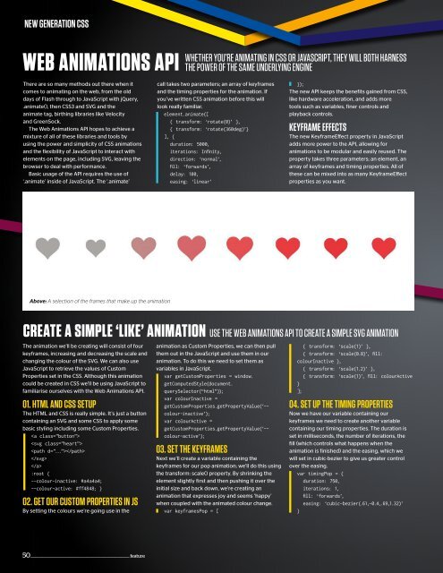
Above: A selection of the frames that make up the animation<br />
CREATE A SIMPLE ‘LIKE’ ANIMATION<br />
The animation we’ll be creating will consist of four<br />
keyframes, increasing and decreasing the scale and<br />
changing the colour of the SVG. We can also use<br />
JavaScript to retrieve the values of Custom<br />
Properties set in the CSS. Although this animation<br />
could be created in CSS we’ll be using JavaScript to<br />
familiarise ourselves with the <strong>Web</strong> Animations API.<br />
01. HTML AND CSS SETUP<br />
The HTML and CSS is really simple. It’s just a button<br />
containing an SVG and some CSS to apply some<br />
basic styling including some Custom Properties.<br />
<br />
<br />
<br />
<br />
<br />
:root {<br />
--colour-inactive: #a4a4a4;<br />
--colour-active: #ff4848; }<br />
02. GET OUR CUSTOM PROPERTIES IN JS<br />
By setting the colours we’re going use in the<br />
USE THE WEB ANIMATIONS API TO CREATE A SIMPLE SVG ANIMATION<br />
animation as Custom Properties, we can then pull<br />
them out in the JavaScript and use them in our<br />
animation. To do this we need to set them as<br />
variables in JavaScript.<br />
var getCustomProperties = window.<br />
getComputedStyle(document.<br />
querySelector(“html”));<br />
var colourInactive =<br />
getCustomProperties.getPropertyValue(‘--<br />
colour-inactive’);<br />
var colourActive =<br />
getCustomProperties.getPropertyValue(‘--<br />
colour-active’);<br />
03. SET THE KEYFRAMES<br />
Next we’ll create a variable containing the<br />
keyframes for our pop animation; we’ll do this using<br />
the transform: scale() property. By shrinking the<br />
element slightly first and then pushing it over the<br />
initial size and back down, we’re creating an<br />
animation that expresses joy and seems ‘happy’<br />
when coupled with the animated colour change.<br />
var keyframesPop = [<br />
{ transform: ‘scale(1)’ },<br />
{ transform: ‘scale(0.8)’, ill:<br />
colourInactive },<br />
{ transform: ‘scale(1.2)’ },<br />
{ transform: ‘scale(1)’, ill: colourActive<br />
}<br />
];<br />
04. SET UP THE TIMING PROPERTIES<br />
Now we have our variable containing our<br />
keyframes we need to create another variable<br />
containing our timing properties. The duration is<br />
set in milliseconds, the number of iterations, the<br />
fill (which controls what happens when the<br />
animation is finished) and the easing, which we<br />
will set in cubic-bezier to give us greater control<br />
over the easing.<br />
var timingPop = {<br />
duration: 750,<br />
iterations: 1,<br />
ill: ‘forwards’,<br />
easing: ‘cubic-bezier(.61,-0.4,.69,1.32)’<br />
}<br />
50 ________________________________________________________________ feature


 Change language