

Web_Designer_Issue_262_2017

You also want an ePaper? Increase the reach of your titles
YUMPU automatically turns print PDFs into web optimized ePapers that Google loves.
LightBox<br />
Three Cents<br />
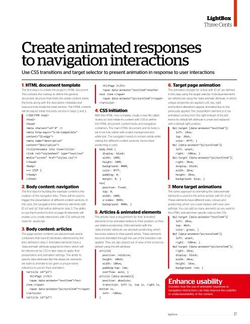
Create animated responses<br />
to navigation interactions<br />
Use CSS transitions and target selector to present animation in response to user interactions<br />
1. HTML document template<br />
The first step is to initiate the project’s HTML document.<br />
This contains the markup to define the general<br />
document structure that holds the visible content inside<br />
the body, along with the descriptive metadata and<br />
resource links inside the head section. The HTML content<br />
will be placed inside the body section in steps 2 and 3.<br />
<br />
<br />
<br />
<br />
<br />
<br />
Animate Into View<br />
<br />
<br />
<br />
*** STEP 2<br />
<br />
<br />
2. Body content: navigation<br />
The first step for building the example content is the<br />
creation of the navigation links. These will be used to<br />
trigger the presentation of diferent content sections. In<br />
this case, the navigation links reference elements with<br />
ID ‘p1’ and ‘p2’ that will be defined in step 3. The ability<br />
to use the # symbol to link on page ID elements will<br />
enable us to create interactivity with CSS without the<br />
need for JavaScript.<br />
3. Body content: articles<br />
The page section contents are placed inside article<br />
containers that have ID attributes referenced by the<br />
links defined in step 2. Animated elements have a<br />
‘data-animate’ attribute assigned to them, which will<br />
be referenced by CSS in later steps to apply their<br />
presentation and animation settings. The ability to<br />
specify data attributes like this allows for elements<br />
we want to animate to be given a unique name<br />
reference to use for their animation.<br />
<br />
Page 1<br />
Text<br />
item.<br />
<br />
<br />
<br />
Page 2<br />
Another<br />
text item.<br />
<br />
<br />
4. CSS initiation<br />
With the HTML now complete, create a new file called<br />
‘styles.css’ and initiate its content with CSS to define<br />
the HTML document, content body and navigation<br />
containers. The main HTML document and its body is<br />
set to be fully visible with a black background and<br />
white text. The navigation needs to remain visible while<br />
visiting the diferent content sections, hence fixed<br />
positioning is used.<br />
body,html {<br />
display: block;<br />
width: 100%;<br />
height: 100%;<br />
background: #000;<br />
color: #fff;<br />
padding: 0;<br />
margin: 0; }<br />
nav{<br />
position: fixed;<br />
top: 0;<br />
width: 100%;<br />
z-index: 9999;<br />
background: #000; }<br />
5. Articles & animated elements<br />
The articles have a requirement for their animated<br />
elements to be animated relative to their position, so they<br />
use relative positioning. Child elements with the<br />
‘data-animate’ attribute use absolute positioning, which<br />
becomes relative to their parent article. These elements<br />
become animated through the use of the transition rule<br />
applied. They are also placed out of view of the screen by<br />
default using the left attribute.<br />
article{<br />
position: relative;<br />
height: 100vh;<br />
width: 100vw;<br />
padding-top: 1em;<br />
overflow: auto; }<br />
article [data-animate]{<br />
position: absolute;<br />
transition: left 1s, top 1s, right 1s,<br />
bottom 1s;<br />
left: -100vw;<br />
}<br />
6. Target page animation<br />
The animated changes for article with ID ‘p1’ are defined<br />
in this step using the target selector. Individual elements<br />
are referenced using the ‘data-animate’ attribute, in which<br />
unique properties are applied. Left, top, right<br />
and bottom alterations appear animated due to the<br />
previously applied. The ‘pictureItem’ element is to be<br />
animated coming from the right instead of the left,<br />
hence its default left attribute is unset and replaced<br />
with a default right position.<br />
#p1:target [data-animate=”textItem”]{<br />
left: 10vw;<br />
top: 20vh;<br />
color: #fff; }<br />
#p1 [data-animate=”pictureItem”]{<br />
left: unset;<br />
right: -100vw; }<br />
#p1:target [data-animate=”pictureItem”]{<br />
right: 50vw;<br />
display: block;<br />
width: 20vw;<br />
height: 20vw;<br />
background: blue; }<br />
7. More target animations<br />
The same approach to animating the ‘data-animate’<br />
elements is used for the article section with ID of ‘p2’.<br />
These elements have diferent sizes, colours and<br />
positioning, which you could replace with your own<br />
settings. You can add as many elements as you want to<br />
the HTML and add their specific rules to the CSS.<br />
#p2:target [data-animate=”textItem”]{<br />
left: 20vw;<br />
top: 40vh;<br />
color: green; }<br />
#p2 [data-animate=”pictureItem”]{<br />
left: unset;<br />
right: -100vw; }<br />
#p2:target [data-animate=”pictureItem”]{<br />
right: 20vw;<br />
display: block;<br />
width: 20vw;<br />
height: 10vw;<br />
background: red; }<br />
Enhance usability<br />
Consider how the use of animated responses to<br />
navigation interactions can help improve the usability<br />
or understandability of the content.<br />
lightbox ____________________________________________________________________ 17


 Change language