Janoschka magazine Linked_V6_2021

You also want an ePaper? Increase the reach of your titles
YUMPU automatically turns print PDFs into web optimized ePapers that Google loves.
56 n e t w o r k & p e o p l e
issue #6 ©
l i n k e d
57
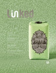
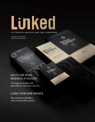
Limited Editions
trendy packaging for
trendy sorts
Linked2Brands ensures
brand consistency through
seamless processes
Limited editions, seasonal varieties, expanded product lines – customers
like to ring the changes. To ensure they don’t satisfy their thirst for
novelty elsewhere, astute brand manufacturers will do well to retain
customer loyalty with original and creative ideas. What is more, this form
of product differentiation gives companies an opportunity to test the
waters. Product variations are therefore a useful tool in many respects,
but only if they are presented to the customers in the right way.
First and foremost, packaging is the key to getting
a product noticed and arousing curiosity. It needs
to feel good, promise quality and match the brand.
A lot of time, design acumen and meticulous artwork
go into every detail of the brand identity:
the logo, the colours, the graphic elements, the
typography and the proportions. Taken together,
these ensure that customers immediately associate
a product with a certain brand. If small runs of
a brand product, like limited editions and seasonal
varieties, are to have the desired effect, i.e. contribute
to brand awareness, it is important to put
the same effort into them. “Even straying slightly
from the norm can backfire and will not pay off in
the long run,” says Markus Fautz, Site Manager at
Linked2Brands Germany. “If you want packaging
to instantly show customers that the brand keeps
its promises, even in special campaigns like limited
editions, it needs to have the familiar look and feel
at the point of sale – no matter whether it’s on a
shop shelf or sold through eCommerce.“
If all these aspects – from design and artwork to
production – slot together smoothly, brand owners
can be sure that all the elements and information
that make up the brand are visible on the packaging
according to the brand book or the style guide.
Know-how and a sure instinct are the name of the
game here, as is a meticulous approach throughout
the design-to-print-process.
Brands make promises about their whole product
range and the packaging design needs to back them
up. This is precisely where the brand guardians
at Linked2Brands come in. They ensure that the
design, layout and colour result in aconsistent brand
image – globally via all channels. And that is precisely
what brought K-fee to Linked2Brands.
k-fee.com
Design details accentuate the flavour
and the summery feel of the limited edition.