CHAPTER 27 ⢠Statistical Process Control
CHAPTER 27 ⢠Statistical Process Control
CHAPTER 27 ⢠Statistical Process Control

You also want an ePaper? Increase the reach of your titles
YUMPU automatically turns print PDFs into web optimized ePapers that Google loves.
<strong>27</strong>-24 <strong>CHAPTER</strong> <strong>27</strong> • <strong>Statistical</strong> <strong>Process</strong> <strong>Control</strong><br />
x and R charts, remember that the interpretation of these charts is just like the<br />
interpretation of x and s charts.<br />
Additional out-of-control signals. So far, we have used only the basic “one<br />
point beyond the control limits” criterion to signal that a process may have gone<br />
out of control. We would like a quick signal when the process moves out of control,<br />
but we also want to avoid “false alarms,” signals that occur just by chance<br />
when the process is really in control. The standard 3 control limits are chosen to<br />
prevent too many false alarms, because an out-of-control signal calls for an effort<br />
to find and remove a special cause. As a result, x charts are often slow to<br />
respond to a gradual drift in the process center that continues for some time<br />
before finally forcing a reading outside the control limits. We can speed the<br />
response of a control chart to lack of control—at the cost of also enduring more<br />
false alarms—by adding patterns other than “one-point-out” as signals. The most<br />
common step in this direction is to add a runs signal to the x chart.<br />
OUT-OF-CONTROL SIGNALS<br />
x and s or x and R control charts produce an out-of-control signal if:<br />
■ One-point-out: A single point lies outside the 3 control limits of either chart.<br />
■ Run: The x chart shows 9 consecutive points above the center line or 9 consecutive<br />
points below the center line. The signal occurs when we see the 9th point of the run.<br />
EXAMPLE <strong>27</strong>.7 Using the runs signal<br />
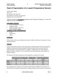
Figure <strong>27</strong>.11 reproduces the x chart from Figure <strong>27</strong>.6. The process center began a<br />
gradual upward drift at Sample 11. The chart shows the effect of the drift—the sample<br />
400<br />
x<br />
x<br />
350<br />
UCL<br />
x<br />
Sample mean<br />
300<br />
250<br />
x<br />
200<br />
LCL<br />
FIGURE <strong>27</strong>.11<br />
x chart for mesh tension data when<br />
the process center drifts upward. The<br />
“run of 9” signal gives an out-of-control<br />
warning at Sample 17.<br />
150<br />
1 2 3 4 5 6 7 8 9 10 11 12 13 14 15 16 17 18 19 20<br />
Sample number