software training courses 2010 corsi di addestramento ... - EnginSoft
software training courses 2010 corsi di addestramento ... - EnginSoft
software training courses 2010 corsi di addestramento ... - EnginSoft

You also want an ePaper? Increase the reach of your titles
YUMPU automatically turns print PDFs into web optimized ePapers that Google loves.
38 - Newsletter <strong>EnginSoft</strong> Year 6 n°4<br />
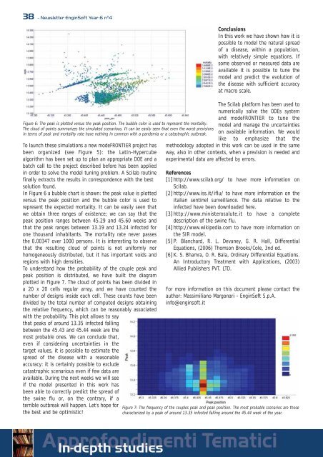
Figure 6: The peak is plotted versus the peak position. The bubble color is used to represent the mortality.<br />
The cloud of points summarizes the simulated scenarious. It can be easily seen that even the worst previsions<br />
in terms of peak and mortality rate have nothing in common with a pandemia or a catastrophic outbreak.<br />
To launch these simulations a new modeFRONTIER project has<br />
been organized (see Figure 5): the Latin-Hypercube<br />
algorithm has been set up to plan an appropriate DOE and a<br />
batch call to the project described before has been applied<br />
in order to solve the model tuning problem. A Scilab routine<br />
finally extracts the results in correspondence with the best<br />
solution found.<br />
In Figure 6 a bubble chart is shown: the peak value is plotted<br />
versus the peak position and the bubble color is used to<br />
represent the expected mortality. It can be easily seen that<br />
we obtain three ranges of existence; we can say that the<br />
peak position ranges between 45.29 and 45.60 weeks and<br />
that the peak ranges between 13.19 and 13.24 infected for<br />
one thousand inhabitants. The mortality rate never passes<br />
the 0.00347 over 1000 persons. It is interesting to observe<br />
that the resulting cloud of points is not uniformly nor<br />
homogeneously <strong>di</strong>stributed, but it has important voids and<br />
regions with high densities.<br />
To understand how the probability of the couple peak and<br />
peak position is <strong>di</strong>stributed, we have built the <strong>di</strong>agram<br />
plotted in Figure 7. The cloud of points has been <strong>di</strong>vided in<br />
a 20 x 20 cells regular array, and we have counted the<br />
number of designs inside each cell. These counts have been<br />
<strong>di</strong>vided by the total number of computed designs obtaining<br />
the relative frequency, which can be reasonably associated<br />
with the probability. This plot allows to say<br />
that peaks of around 13.35 infected falling<br />
between the 45.43 and 45.44 week are the<br />
most probable ones. We can conclude that,<br />
even if considering uncertainties in the<br />
target values, it is possible to estimate the<br />
spread of the <strong>di</strong>sease with a reasonable<br />
accuracy: it is certainly possible to exclude<br />
catastrophic scenarious even if few data are<br />
available. During the next weeks we will see<br />
if the model presented in this work has<br />
been able to correctly pre<strong>di</strong>ct the spread of<br />
the swine flu or, on the contrary, if a<br />
terrible outbreak will happen. Let's hope for<br />
the best and be optimistic!<br />
Conclusions<br />
In this work we have shown how it is<br />
possible to model the natural spread<br />
of a <strong>di</strong>sease, within a population,<br />
with relatively simple equations. If<br />
some observed or measured data are<br />
available it is possible to tune the<br />
model and pre<strong>di</strong>ct the evolution of<br />
the <strong>di</strong>sease with sufficient accuracy<br />
at macro scale.<br />
The Scilab platform has been used to<br />
numerically solve the ODEs system<br />
and modeFRONTIER to tune the<br />
model and manage the uncertainties<br />
on available information. We would<br />
like to emphasize that the<br />
methodology adopted in this work can be used in the same<br />
way, also in other contexts, when a prevision is needed and<br />
experimental data are affected by errors.<br />
References<br />
[1] http://www.scilab.org/ to have more information on<br />
Scilab.<br />
[2] http://www.iss.it/iflu/ to have more information on the<br />
italian sentinel surveillance. The data relative to the<br />
infected have been downloaded here.<br />
[3] http://www.ministerosalute.it to have a complete<br />
description of the swine flu.<br />
[4] http://www.wikipe<strong>di</strong>a.com to have more information on<br />
the SIR model.<br />
[5] P. Blanchard, R. L. Devaney, G. R. Hall, Differential<br />
Equations, (2006) Thomson Brooks/Cole, 3nd ed.<br />
[6] K. S. Bhamra, O. R. Bala, Or<strong>di</strong>nary Differential Equations.<br />
An Introductory Treatment with Applications, (2003)<br />
Allied Publishers PVT. LTD.<br />
For more information on this document please contact the<br />
author: Massimiliano Margonari - <strong>EnginSoft</strong> S.p.A.<br />
info@enginsoft.it<br />
Figure 7: The frequency of the couples peak and peak position. The most probable scenarios are those<br />
characterized by a peak of around 13.35 infected falling around the 45.44 week of the year.