RENAISSANCE HOTELS BRAND IDENTITY STANDARDS
RENAISSANCE HOTELS BRAND IDENTITy STANDARDS - Concord
RENAISSANCE HOTELS BRAND IDENTITy STANDARDS - Concord
- No tags were found...

Create successful ePaper yourself
Turn your PDF publications into a flip-book with our unique Google optimized e-Paper software.
<strong>BRAND</strong> <strong>IDENTITY</strong><br />
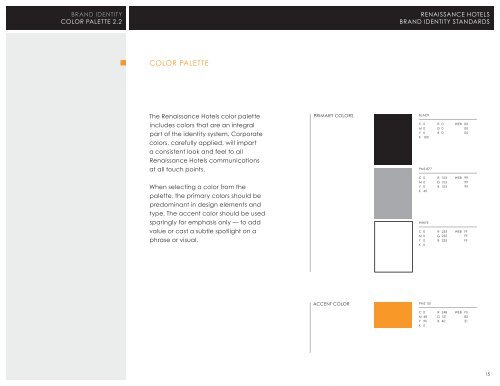
COLOR PALETTE 2.2<br />
<strong>RENAISSANCE</strong> <strong>HOTELS</strong><br />
<strong>BRAND</strong> <strong>IDENTITY</strong> <strong>STANDARDS</strong><br />
COLOR PALETTE<br />
The Renaissance Hotels color palette<br />
includes colors that are an integral<br />
part of the identity system. Corporate<br />
colors, carefully applied, will impart<br />
a consistent look and feel to all<br />
Renaissance Hotels communications<br />
at all touch points.<br />
When selecting a color from the<br />
palette, the primary colors should be<br />
predominant in design elements and<br />
type. The accent color should be used<br />
sparingly for emphasis only — to add<br />
value or cast a subtle spotlight on a<br />
phrase or visual.<br />
PRIMARY COLORS<br />
BLACK<br />
C 0 R 0 WEB 00<br />
M 0 G 0 00<br />
Y 0 B 0 00<br />
K 10 0<br />
PMS 877<br />
C 0 R 153 WEB 99<br />
M 0 G 153 99<br />
Y 0 B 153 99<br />
K 40<br />
WHITE<br />
C 0 R 255 WEB FF<br />
M 0 G 255 FF<br />
Y 0 B 255 FF<br />
K 0<br />
ACCENT COLOR<br />
PMS 151<br />
C 0 R 248 WEB F5<br />
M 48 G 151 80<br />
Y 95 B 40 21<br />
K 0<br />
15