

ebook-responsive-elearning-with-links-us

Create successful ePaper yourself
Turn your PDF publications into a flip-book with our unique Google optimized e-Paper software.
12<br />
2<br />
Understanding<br />
Responsive eLearning Design<br />
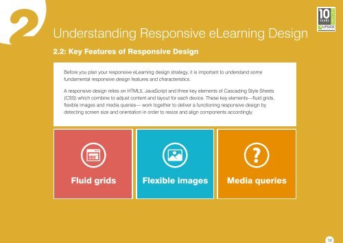
2.2: Key Features of Responsive Design<br />
Before you plan your <strong>responsive</strong> eLearning design strategy, it is important to understand some<br />
fundamental <strong>responsive</strong> design features and characteristics.<br />
A <strong>responsive</strong> design relies on HTML5, JavaScript and three key elements of Cascading Style Sheets<br />
(CSS) which combine to adj<strong>us</strong>t content and layout for each device. These key elements—fluid grids,<br />
flexible images and media queries— work together to deliver a functioning <strong>responsive</strong> design by<br />
detecting screen size and orientation in order to resize and align components accordingly.<br />
Fluid grids Flexible images Media queries
 Change language