

ebook-responsive-elearning-with-links-us

You also want an ePaper? Increase the reach of your titles
YUMPU automatically turns print PDFs into web optimized ePapers that Google loves.
20<br />
2<br />
Understanding<br />
Responsive eLearning Design<br />
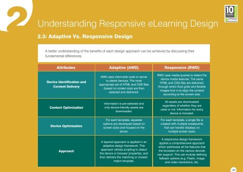
2.3: Adaptive Vs. Responsive Design<br />
A better understanding of the benefits of each design approach can be achieved by disc<strong>us</strong>sing their<br />
fundamental differences.<br />
Attributes<br />
Device Identification and<br />
Content Delivery<br />
Content Optimization<br />
Device Optimization<br />
Approach<br />
Adaptive (AWD)<br />
AWD <strong>us</strong>es client-side code or server<br />
to detect devices. The most<br />
appropriate set of HTML and CSS files<br />
(based on screen size) are then<br />
selected and delivered.<br />
Information is pre-selected and<br />
only device-friendly assets are<br />
downloaded.<br />
For each template, separate<br />
options are developed based on<br />
screen sizes and ho<strong>us</strong>ed on the<br />
server.<br />
A layered approach is applied in an<br />
adaptive design framework. This<br />
approach utilizes scripting to detect<br />
the device or browser properties, and<br />
then delivers the matching or closestmatch<br />
template.<br />
Responsive (RWD)<br />
RWD <strong>us</strong>es media queries to detect the<br />
device media features. The same<br />
HTML and CSS files are delivered,<br />
through which fluid grids and flexible<br />
images kick in to align the content<br />
according to the screen size.<br />
All assets are downloaded<br />
regardless of whether they are<br />
<strong>us</strong>ed or not. Information for every<br />
device is included.<br />
For each template, a single file is<br />
created <strong>with</strong> multiple breakpoints<br />
that can handle displays on<br />
multiple screen sizes.<br />
A <strong>responsive</strong> design framework<br />
applies a comprehensive approach<br />
which addresses all the features that<br />
the browsers on the vario<strong>us</strong> devices<br />
can support. This can include defining<br />
fallback options (e.g. Flash), image<br />
and video resolutions, etc.
 Change language