

ebook-responsive-elearning-with-links-us

Create successful ePaper yourself
Turn your PDF publications into a flip-book with our unique Google optimized e-Paper software.
8<br />
1<br />
A<br />
Responsive World<br />
1.2: Responsive Design: Understanding the Term<br />
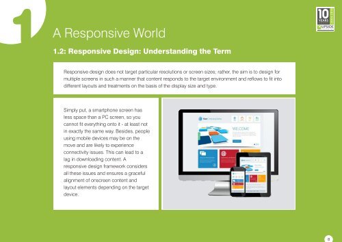
Responsive design does not target particular resolutions or screen sizes; rather, the aim is to design for<br />
multiple screens in such a manner that content responds to the target environment and reflows to fit into<br />
different layouts and treatments on the basis of the display size and type.<br />
Simply put, a smartphone screen has<br />
less space than a PC screen, so you<br />
cannot fit everything onto it - at least not<br />
in exactly the same way. Besides, people<br />
<strong>us</strong>ing mobile devices may be on the<br />
move and are likely to experience<br />
connectivity issues. This can lead to a<br />
lag in downloading content. A<br />
<strong>responsive</strong> design framework considers<br />
all these issues and ensures a graceful<br />
alignment of onscreen content and<br />
layout elements depending on the target<br />
device.
 Change language