

ebook-responsive-elearning-with-links-us

Create successful ePaper yourself
Turn your PDF publications into a flip-book with our unique Google optimized e-Paper software.
24<br />
2<br />
Understanding<br />
Responsive eLearning Design<br />
2.5: What Does a Responsive eLearning Design Look Like?<br />
Story/Scenario<br />
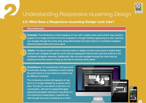
Desktops: The introductory content appears on top, <strong>with</strong> a single comic panel (which may include a<br />
graphic or an image and text in the form of speech or thought bubbles) appearing at a time. Learners<br />
can navigate through the comic strip <strong>us</strong>ing internal back and next buttons or numbered navigation<br />
elements placed below the comic panel.<br />
Tablets: The layout remains more or less the same on tablets, but the comic panel is scaled down.<br />
Learners can navigate through the comic strip by tapping the internal back and next buttons or the<br />
numbered navigation elements. Additionally, they can also navigate through the comic strip by<br />
swiping across the screen to bring up the next or previo<strong>us</strong> comic panel.<br />
Smartphones: On smartphones, the layout and<br />
functionality change completely to avoid scaling<br />
the panel down to a size where its contents can<br />
be difficult to decipher.<br />
The introductory content still appears on top,<br />
but it is no longer followed by a typical comic<br />
strip. The story is now shown in the form of a<br />
conversation, <strong>with</strong> text for speech/thoughts<br />
appearing alongside characters' mug shots in a<br />
non-interactive vertical layout. Learners can<br />
read through the story by swiping up or down.
 Change language