

ebook-responsive-elearning-with-links-us

You also want an ePaper? Increase the reach of your titles
YUMPU automatically turns print PDFs into web optimized ePapers that Google loves.
2<br />
Understanding<br />
Responsive eLearning Design<br />
2.3: Adaptive Vs. Responsive Design<br />
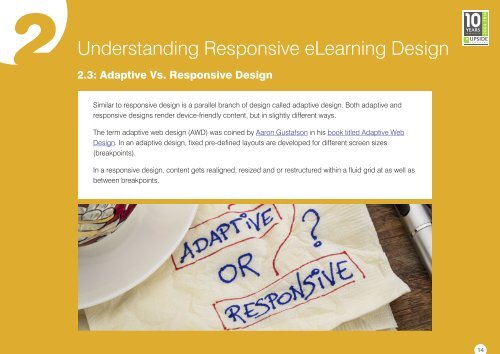
Similar to <strong>responsive</strong> design is a parallel branch of design called adaptive design. Both adaptive and<br />
<strong>responsive</strong> designs render device-friendly content, but in slightly different ways.<br />
The term adaptive web design (AWD) was coined by Aaron G<strong>us</strong>tafson in his book titled Adaptive Web<br />
Design. In an adaptive design, fixed pre-defined layouts are developed for different screen sizes<br />
(breakpoints).<br />
In a <strong>responsive</strong> design, content gets realigned, resized and or restructured <strong>with</strong>in a fluid grid at as well as<br />
between breakpoints.<br />
14
 Change language