

ebook-responsive-elearning-with-links-us

You also want an ePaper? Increase the reach of your titles
YUMPU automatically turns print PDFs into web optimized ePapers that Google loves.
3 Determining<br />
A Responsive eLearning Design Strategy<br />
3.3: Challenges and Solutions<br />
3.3.1: Design<br />
Here are a few things to keep in mind to ensure a good experience on a variety of devices:<br />
Ensure that interactive elements like buttons, hotspots, <strong>links</strong>, etc. are large. As per Fitt's Law, a<br />
larger, closer target is quicker and easier to select. However, if you do want smaller interactive<br />
elements from a design viewpoint, then you could consider increasing their hit area beyond their<br />
visible borders. [ Apple recommends that touch targets should be at least 44 x 44 pixels; both<br />
Android and Microsoft recommend a touch target size of around 34-36 pixels.]<br />
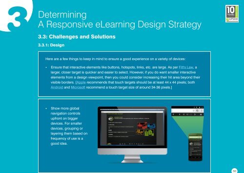
Show more global<br />
navigation controls<br />
upfront on bigger<br />
devices. For smaller<br />
devices, grouping or<br />
layering them based on<br />
frequency of <strong>us</strong>e is a<br />
good idea.<br />
50
 Change language