front-end-developer_1_
You also want an ePaper? Increase the reach of your titles
YUMPU automatically turns print PDFs into web optimized ePapers that Google loves.
Front-End-Developer - Level 1<br />
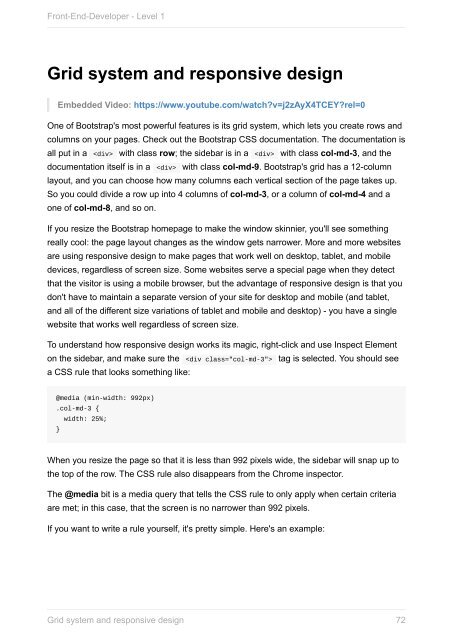
Grid system and responsive design<br />
Embedded Video: https://www.youtube.com/watch?v=j2zAyX4TCEY?rel=0<br />
One of Bootstrap's most powerful features is its grid system, which lets you create rows and<br />
columns on your pages. Check out the Bootstrap CSS documentation. The documentation is<br />
all put in a with class row; the sidebar is in a with class col-md-3, and the<br />
documentation itself is in a with class col-md-9. Bootstrap's grid has a 12-column<br />
layout, and you can choose how many columns each vertical section of the page takes up.<br />
So you could divide a row up into 4 columns of col-md-3, or a column of col-md-4 and a<br />
one of col-md-8, and so on.<br />
If you resize the Bootstrap homepage to make the window skinnier, you'll see something<br />
really cool: the page layout changes as the window gets narrower. More and more websites<br />
are using responsive design to make pages that work well on desktop, tablet, and mobile<br />
devices, regardless of screen size. Some websites serve a special page when they detect<br />
that the visitor is using a mobile browser, but the advantage of responsive design is that you<br />
don't have to maintain a separate version of your site for desktop and mobile (and tablet,<br />
and all of the different size variations of tablet and mobile and desktop) - you have a single<br />
website that works well regardless of screen size.<br />
To understand how responsive design works its magic, right-click and use Inspect Element<br />
on the sidebar, and make sure the tag is selected. You should see<br />
a CSS rule that looks something like:<br />
@media (min-width: 992px)<br />
.col-md-3 {<br />
width: 25%;<br />
}<br />
When you resize the page so that it is less than 992 pixels wide, the sidebar will snap up to<br />
the top of the row. The CSS rule also disappears from the Chrome inspector.<br />
The @media bit is a media query that tells the CSS rule to only apply when certain criteria<br />
are met; in this case, that the screen is no narrower than 992 pixels.<br />
If you want to write a rule yourself, it's pretty simple. Here's an example:<br />
Grid system and responsive design<br />
72


