RAPORT_ang_v2
You also want an ePaper? Increase the reach of your titles
YUMPU automatically turns print PDFs into web optimized ePapers that Google loves.
HANDBALL PLAYER WINGS / FLAMES<br />
• POLISH HUSSARS<br />
• ENERGY<br />
• POWER<br />
• SPEED<br />
• DYNAMICS<br />
• WIND<br />
• EMOTIONS<br />
• SHOT ON GOAL<br />
• ATTACK<br />
• OFFENSIVE<br />
HAND<br />
COLOR – GOLD<br />
• STRONG MALE HAND<br />
• THE TOUCH<br />
• FAIR PLAY<br />
• RESPECT<br />
• HANDSHAKE<br />
• HANDPRINT<br />
• WELCOME<br />
• HELP<br />
• GOLD MEDAL<br />
• ROYAL COLOR<br />
• GREAT & SUCCESSFUL<br />
CHAMPIONSHIP<br />
• LAURELS OF VICTORY<br />
• 3D EFFECT - METAL<br />
ORIGINAL FORM<br />
• INDIVIDUAL DESIGN<br />
REPORT<br />
7.1<br />
VISUAL IDENTIFICATION<br />
OF EHF EURO 2016<br />
The visual identification of EHF EURO 2016 was prepared by Artur<br />
Gosiewski in May 2014 and recorded as a brand book in electronic<br />
and printed versions.<br />
The brand book was created in order to describe all<br />
rules, information, recommendations and guidelines<br />
concerning the image of the EHF EURO 2016 brand.<br />
The brand book of the Championship catalogued mark<br />
designs for all identification carriers, product packages<br />
and advertising materials.<br />
The brand book was a basic tool for subcontractors performing<br />
creation tasks, thus becoming an effective marketing<br />
tool. Such documentation influenced the quality<br />
of reproduction of visual symbols of EHF EURO 2016.<br />
The properly reproduced logo was used as a basis for<br />
building brand awareness, and the document contributed<br />
to the reduction of costs of design of new carriers.<br />
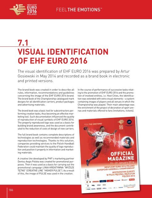
In the course of performance of successive tasks relating<br />
to the promotion of EHF EURO 2016 and the promotion<br />
of involved entities, i.e. Host Cities, the identification<br />
was extended with extra visual elements – a system<br />
containing images of players and all venues in which the<br />
Championship was played. Their main advantage was<br />
the enrichment of the project of decoration of sport arenas<br />
and materials offered to fans (invitations, tickets).<br />
The full brand book contains complete descriptions of<br />
technologies as well as recommended materials and<br />
reproduction technologies. Thanks to this solution,<br />
companies providing services to the Polish Handball<br />
Federation could maintain the quality of logo reproduction<br />
and position it properly in information and marketing<br />
materials.<br />
A creative line developed by PHF’s marketing partner<br />
Dentsu Aegis Polska was created for promotional purposes.<br />
Then it was used as a basis for carrying out the<br />
promotional campaign LINIA KREATYWNA “WYŻSZE<br />
TĘTNO” (CREATIVE LINE “HIGHER PULSE”). As a result<br />
of this, the image of PULSE was used in the creation.<br />
Symbols making up the logo of EHF EURO 2016<br />
186 187


