Sun

Create successful ePaper yourself
Turn your PDF publications into a flip-book with our unique Google optimized e-Paper software.
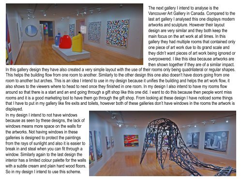
The next gallery I intend to analyse is the<br />
Vancouver Art Gallery in Canada. Compared to the<br />
last art gallery I analysed this one displays modern<br />
artworks and sculpture. However their layout<br />
design are very similar and they both keep the<br />
main focus on the art work at all times. In this<br />
gallery they had multiple rooms that contained only<br />
one piece of art work due to its grand scale and<br />
they didn’t want pieces of art work being ignored or<br />
overpowered. I like this idea because artworks are<br />
then shown together if they are of a similar impact.<br />
In this gallery design they have also created a very simple layout with the use of their rooms only being quadrilateral or regular shapes.<br />
This helps the building flow from one room to another. Similarly to the other design this one also doesn’t have doors going from one<br />
room to another but arches. This is an idea I intend to use in my design because it unifies the building and helps the art work flow, it<br />
also shows to the viewers where to head to next once they finished in one room. In my design I also intend to have my rooms flow<br />
around so that there is a start and an end going through a gift shop like this one did. I want to do this because then people wont miss<br />
rooms and it is a good marketing tool to have them go through the gift shop. From looking at these design I have noticed some things<br />
that I have to put in my gallery like fire exits and toilets, however both of these galleries don’t have windows in the rooms the artwork is<br />
displayed.<br />
In my design I intend to not have windows<br />
because as seen by these designs, the lack of<br />
windows means more space on the walls for<br />
the artworks. Not having windows in these<br />
galleries is designed to protect the paintings<br />
from the rays of sunlight and also it is easier to<br />
break in and steal when you can fit through a<br />
window. Similarly again to the last design the<br />
interior has a limited colour palette for the walls<br />
with a subtle cream and plain hard wood floors.<br />
So in my design I intend to use this scheme.