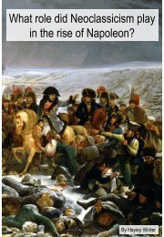
Sun

You also want an ePaper? Increase the reach of your titles
YUMPU automatically turns print PDFs into web optimized ePapers that Google loves.
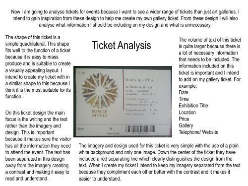
Now I am going to analyse tickets for events because I want to see a wider range of tickets than just art galleries. I<br />
intend to gain inspiration from these design to help me create my own gallery ticket. From these design I will also<br />
analyse what information I should be including on my design and what is unnecessary.<br />
The shape of this ticket is a<br />
simple quadrilateral. This shape<br />
fits well to the function of a ticket<br />
because it is easy to mass<br />
produce and is suitable to create<br />
a visually appealing layout. I<br />
intend to create my ticket with in<br />
a similar shape to this because I<br />
think it is the most suitable for its<br />
function.<br />
On this ticket design the main<br />
focus is the writing and the text<br />
rather than the imagery and<br />
design. This is important<br />
because it makes sure the visitor<br />
has all the information they need<br />
to attend the event. The text has<br />
been separated in this design<br />
away from the imagery creating<br />
a contrast and making it easy to<br />
read and understand.<br />
Ticket Analysis<br />
The volume of text of this ticket<br />
is quite larger because there is<br />
a lot of necessary information<br />
that needs to be included. The<br />
information included on this<br />
ticket is important and I intend<br />
to add on my gallery ticket. For<br />
example:<br />
Date<br />
Time<br />
Exhibition Title<br />
Location<br />
Price<br />
Gallery<br />
Telephone/ Website<br />
The imagery and design used for this ticket is very simple with the use of a plain<br />
white background and only one image. Down the center of the ticket they have<br />
included a red separating line which clearly distinguishes the design from the<br />
text. When I create my ticket I intend to keep my imagery separated from the text<br />
because they compliment each other better with the contrast and it makes it<br />
easier to understand.