Sun

Create successful ePaper yourself
Turn your PDF publications into a flip-book with our unique Google optimized e-Paper software.
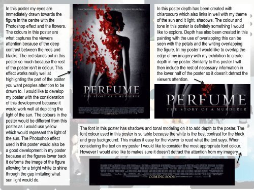
In this poster my eyes are<br />
immediately drawn towards the<br />
figure in the centre with the<br />
Photoshop effect and the flowers.<br />
The colours in this poster are<br />
what captures the viewers<br />
attention because of the deep<br />
contrast between the reds and<br />
blacks. The red stands out in this<br />
poster so much because the rest<br />
of the poster isn’t in colour. This<br />
effect works really well at<br />
highlighting the part of the poster<br />
you want peoples attention to be<br />
drawn to. I would like to develop<br />
my poster with the consideration<br />
of this development because it<br />
would work well at depicting the<br />
light of the sun. The colours in the<br />
poster would be different from this<br />
poster as I would use yellow<br />
which would represent the light of<br />
the sun. The Photoshop effect<br />
used in this poster would also be<br />
a good development in my poster<br />
because at the figures lower back<br />
it deforms the image of the figure<br />
allowing for a bright white to shine<br />
through the gap imitating what<br />
sun light would do.<br />
In this poster depth has been created with<br />
chiaroscuro which also links in well with my theme<br />
of the sun and it light, shadows. The colour and<br />
tone in this poster is definitely something I would<br />
like to explore. Depth has also been created in this<br />
painting with the use of overlapping this can be<br />
seen with the petals and the writing overlapping<br />
the figure. In my poster I would like to overlap the<br />
edge of my imagery with my exhibition to create<br />
depth in my poster. Similarly to this poster I will<br />
then include the rest of necessary information in<br />
the lower half of the poster so it doesn’t detract the<br />
viewers attention.<br />
The font in this poster has shadows and tonal modeling on it to add depth to the poster. The<br />
font colour used in this poster is suitable because the white is the best contrast for the black<br />
and grey background. This makes it easy for the viewer to read what the text says. When<br />
considering the text on my poster I would like to consider the most appropriate font colour.<br />
However I would also like to makes sure it doesn’t detract the attention from my imagery.