Sun

Create successful ePaper yourself
Turn your PDF publications into a flip-book with our unique Google optimized e-Paper software.
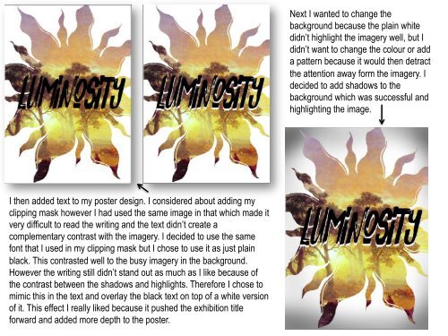
I then added text to my poster design. I considered about adding my<br />
clipping mask however I had used the same image in that which made it<br />
very difficult to read the writing and the text didn’t create a<br />
complementary contrast with the imagery. I decided to use the same<br />
font that I used in my clipping mask but I chose to use it as just plain<br />
black. This contrasted well to the busy imagery in the background.<br />
However the writing still didn’t stand out as much as I like because of<br />
the contrast between the shadows and highlights. Therefore I chose to<br />
mimic this in the text and overlay the black text on top of a white version<br />
of it. This effect I really liked because it pushed the exhibition title<br />
forward and added more depth to the poster.<br />
Next I wanted to change the<br />
background because the plain white<br />
didn’t highlight the imagery well, but I<br />
didn’t want to change the colour or add<br />
a pattern because it would then detract<br />
the attention away form the imagery. I<br />
decided to add shadows to the<br />
background which was successful and<br />
highlighting the image.