Sun

Create successful ePaper yourself
Turn your PDF publications into a flip-book with our unique Google optimized e-Paper software.
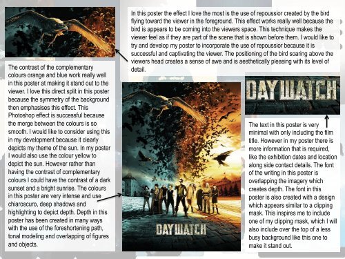
The contrast of the complementary<br />
colours orange and blue work really well<br />
in this poster at making it stand out to the<br />
viewer. I love this direct split in this poster<br />
because the symmetry of the background<br />
then emphasises this effect. This<br />
Photoshop effect is successful because<br />
the merge between the colours is so<br />
smooth. I would like to consider using this<br />
in my development because it clearly<br />
depicts my theme of the sun. In my poster<br />
I would also use the colour yellow to<br />
depict the sun. However rather than<br />
having the contrast of complementary<br />
colours I could have the contrast of a dark<br />
sunset and a bright sunrise. The colours<br />
in this poster are very intense and use<br />
chiaroscuro, deep shadows and<br />
highlighting to depict depth. Depth in this<br />
poster has been created in many ways<br />
with the use of the foreshortening path,<br />
tonal modeling and overlapping of figures<br />
and objects.<br />
In this poster the effect I love the most is the use of repoussior created by the bird<br />
flying toward the viewer in the foreground. This effect works really well because the<br />
bird is appears to be coming into the viewers space. This technique makes the<br />
viewer feel as if they are part of the scene that is shown before them. I would like to<br />
try and develop my poster to incorporate the use of repoussior because it is<br />
successful and captivating the viewer. The positioning of the bird soaring above the<br />
viewers head creates a sense of awe and is aesthetically pleasing with its level of<br />
detail.<br />
The text in this poster is very<br />
minimal with only including the film<br />
title. However in my poster there is<br />
more information that is required,<br />
like the exhibition dates and location<br />
along side contact details. The font<br />
of the writing in this poster is<br />
overlapping the imagery which<br />
creates depth. The font in this<br />
poster is also created with a design<br />
which appears similar to a clipping<br />
mask. This inspires me to include<br />
one of my clipping mask, which I will<br />
also include over the top of a less<br />
busy background like this one to<br />
make it stand out.