International Home Textile Magazine – April’17

Create successful ePaper yourself
Turn your PDF publications into a flip-book with our unique Google optimized e-Paper software.
90<br />
TRENDS<br />
HTE<br />
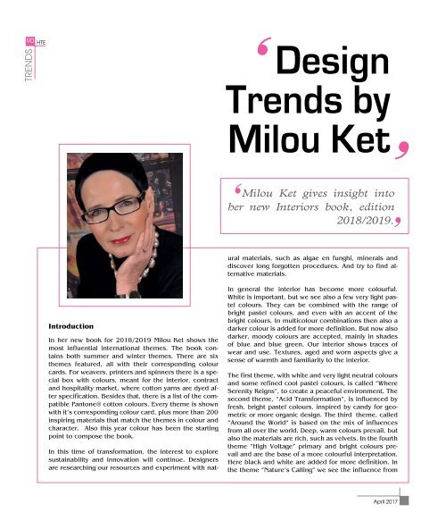
Design<br />
Trends by<br />
Milou Ket<br />
Milou Ket gives insight into<br />
her new Interiors book, edition<br />
2018/2019.<br />
ural materials, such as algae en funghi, minerals and<br />
discover long forgotten procedures. And try to find alternative<br />
materials.<br />
Introduction<br />
In her new book for 2018/2019 Milou Ket shows the<br />
most influential international themes. The book contains<br />
both summer and winter themes. There are six<br />
themes featured, all with their corresponding colour<br />
cards. For weavers, printers and spinners there is a special<br />
box with colours, meant for the interior, contract<br />
and hospitality market, where cotton yarns are dyed after<br />
specification. Besides that, there is a list of the compatible<br />
Pantone® cotton colours. Every theme is shown<br />
with it’s corresponding colour card, plus more than 200<br />
inspiring materials that match the themes in colour and<br />
character. Also this year colour has been the starting<br />
point to compose the book.<br />
In this time of transformation, the interest to explore<br />
sustainability and innovation will continue. Designers<br />
are researching our resources and experiment with nat-<br />
In general the interior has become more colourful.<br />
White is important, but we see also a few very light pastel<br />
colours. They can be combined with the range of<br />
bright pastel colours, and even with an accent of the<br />
bright colours. In multicolour combinations then also a<br />
darker colour is added for more definition. But now also<br />
darker, moody colours are accepted, mainly in shades<br />
of blue and blue green. Our interior shows traces of<br />
wear and use. Textures, aged and worn aspects give a<br />
sense of warmth and familiarity to the interior.<br />
The first theme, with white and very light neutral colours<br />
and some refined cool pastel colours, is called “Where<br />
Serenity Reigns”, to create a peaceful environment. The<br />
second theme, “Acid Transformation”, is influenced by<br />
fresh, bright pastel colours, inspired by candy for geometric<br />
or more organic design. The third theme, called<br />
“Around the World” is based on the mix of influences<br />
from all over the world. Deep, warm colours prevail, but<br />
also the materials are rich, such as velvets. In the fourth<br />
theme “High Voltage” primary and bright colours prevail<br />
and are the base of a more colourful interpretation.<br />
Here black and white are added for more definition. In<br />
the theme “Nature’s Calling” we see the influence from<br />
April 2017