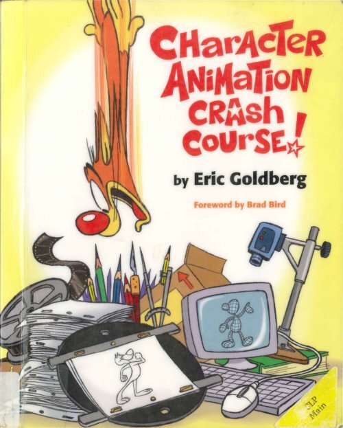
Character animation crash course

Create successful ePaper yourself
Turn your PDF publications into a flip-book with our unique Google optimized e-Paper software.
y Eric Goldberg
-·'
HarAceR<br />
tliftla iON<br />
CRAsh<br />
by Eric Goldberg<br />
NC1765.G65 2008<br />
Goldberg, Eric.<br />
<strong>Character</strong> <strong>animation</strong> <strong>crash</strong><br />
<strong>course</strong>!<br />
Los Angeles : Silman-James<br />
Press, c2008.<br />
SILMAN-JAMES PRESS<br />
LOS ANGELES
Copyright © 2008 by Eric Goldberg<br />
All rights reserved. No part of this book may be used or<br />
reproduced in any manner whatsoever without written<br />
permission from the publisher, except in the case of brief<br />
quotations embodied in critical articles and reviews.<br />
10 9 8 7 6 5 4 3 2 1<br />
Library of Congress Cataloging-in-Publication Data<br />
Goldberg, Eric.<br />
<strong>Character</strong> <strong>animation</strong> <strong>crash</strong> <strong>course</strong>! I by Eric Goldberg.<br />
p. em.<br />
ISBN 978-1-879505-97-1 (alk. paper)<br />
l. Animated fil ms--Technique. 2. Drawing--Technique. 3. <strong>Character</strong>s and<br />
characteri stics in art. I. Title.<br />
NC1765.G65 2008<br />
741.5'8--dc22<br />
2008024765<br />
Cover design by Eric Goldberg<br />
Book design by William Morosi<br />
Printed in Canada<br />
Silman-James Press<br />
1181 Angelo Drive<br />
Beverly Hills, CA 90210
For Susan,<br />
the best Art Director a guy could marry,<br />
whose gentle cajoling, acts of persuasion,<br />
remarkable patience, inspired cheerleading,<br />
and any other technique, short of<br />
physical violence or blackmail,<br />
made it possible for you to be holding this book in your hands.
Contents<br />
Foreword<br />
1x<br />
Introduction<br />
xi<br />
Special Thanks<br />
xv<br />
Definition of Terms<br />
xvu<br />
Conception<br />
1. Attitude Poses 3<br />
® AP1 8<br />
2. Acting in Anim ation- Part 1: Getting Started 16<br />
3. Acting in Animation - Part 2: Dialogue 29<br />
4. <strong>Character</strong> Construction and Design 42<br />
5. Drawing in Anim ation 54<br />
Technique 65<br />
6. The Exposure Sheet 67<br />
7. Layout and Staging 75<br />
8. Timing 98<br />
® T 1, 2, 3 99<br />
9. Spacing 102<br />
® SP 1, 2, 3, 4, 5, 6 103, 107, 108<br />
10. Having a Breakdown! 110<br />
® BD 1, 2, 3, 4, 5, 6, 7, 8, 9 111- 115<br />
VII
Introduction<br />
How do you create an animated character that has a distinct personality? How do you<br />
get from that blank sheet of paper or empty monitor screen to something that anyone,<br />
from age 6 to 96, can recognize as a living, breathing, emoting individual? Over the years<br />
there have been many books about <strong>animation</strong>: the coffee-table tomes lavishly illustrated<br />
with glossy color stills of all your favorite cartoon stars, anecdotal reminiscences of the<br />
halcyon days of <strong>animation</strong>'s Golden Age ("When Walt raised his eyebrow ... "), in-depth<br />
exposes of the seamy underbelly of the corrupt and moral-destroying medium of cartoons,<br />
and scholarly dissertations on the existential impact of fantasy violence considered<br />
in a media-continuum from the Road Runner to the Powerpuff Girls. There have also<br />
been technique books, some quite informative, that break down and analyze a myriad<br />
of actions for the eager animator to utilize. But where is the book that tells you how to<br />
conceive your characters and their movements from the inside out?<br />
It has always been my strong belief that you can't animate a character successfully<br />
until you know who that character is first. Then the technique is applied to communicate<br />
to the audience what that character is thinking and feeling. This, then, is the book I wish I<br />
had when I was first learning my craft. The first part stresses the thought and preparation<br />
required to animate, and the second part is a hands-on, no-nonsense manual describing<br />
classic <strong>animation</strong> techniques, all in service of getting great performances from your<br />
characters. On the technical side, there are some basic things not included in this book<br />
(varieties of walks and runs, classic character types, etc.) that I feel are already quite<br />
well covered in books readily available on the market. Instead, I'm trying to include the<br />
information that describes why actions appear a certain way, and the techniques used<br />
to create them. There are reasons why certain things look the way they do on screen, so<br />
X I
XII<br />
CHARAC TER ANIMATION CRASH COURSE<br />
here they are- how they work, and why they work the way they do. There will be some<br />
theory along the way, plus frequent referencing of classic cartoons for those wanting to<br />
see the ideas expressed here in glorious movement and colo r. Mostly, though, it's the<br />
nuts-and-bolts stuff that no one ever tells the serious student or the avid professional.<br />
It is essentially the souped-up version of my <strong>animation</strong> notes, created in the 1980's<br />
for up-and-coming animators at my former London studio, Pizazz Pictures. These<br />
notes have been Xeroxed and copied (and, yes, plagiarized) for a couple of decades<br />
now, passed from animator to animator as a kind of underground secret source of<br />
information. Well, now you hold it in your hands, complete with updated material,<br />
new chapters, new drawings (clearer ones, I hope, and ones the major stu dios won't<br />
consider copyright infringement), and further enhancements added during my years<br />
at Walt Disney Featu re Animation.<br />
I've had the benefit of working with some fanta stic animators, in my formative<br />
years, especially Richard Williams, Ken Harris, Art Babbitt, and Tissa David, whose<br />
knowledge (and generosity with it) continues to fuel and inspire me. I've also spent<br />
many years analyzing and dissecting the work of all of my <strong>animation</strong> heroes, attempting<br />
to distill their awesome mastery of the medium into the miracle elixir, "Essence of<br />
Cartoon ." I have derived so much pleasure and creative fulfillment from these people<br />
and their craft that I hope this book honors their tradition of imparting their wisdom<br />
to those who seek to know more.<br />
I'm particularly concentrating on traditional cartoon <strong>animation</strong>, since it's what animators<br />
most closely associate with my technique. However, applying these ideas to<br />
more subtle, realistic <strong>animation</strong> can often be simply a matter of toning down the<br />
broadness but utilizing the same principles - and, of <strong>course</strong>, these principles are just<br />
as viable in the ever-expanding fields of computer, Flash, and paperless <strong>animation</strong> as<br />
they are in the old-school hand-drawn world.<br />
In the end, no one can really "teach" anyone how to animate, and I make no<br />
attempt to do so here. The best I can do is offer insights and methods that have<br />
helped me over the years. The rest is up to the individual - to harness the information<br />
into something usable for his or her own creative expression. Whatever twists,<br />
turns, and technologies continue to develop in our medium, the investment of perso<br />
nal feelings and emotions will always be <strong>animation</strong>'s future.
INTRODUCTION<br />
XIII<br />
are:<br />
And now some set-up: two characters you wi ll be seeing frequently on these pages<br />
Norman and Earless Dog.<br />
They have both served me well over the years, as they're easy to draw and very<br />
malleable, so they're perfect ambassadors for the cartoony stuff I'm setting forth<br />
here. However, don't be fooled by their inherent elasticity: the sa me principles laid<br />
out here apply to even the most constructed and anatomical of characters.<br />
The other unique feature to point out is that severa l of the principles in this book<br />
have been fully animated and stored as movie files on the enclosed CD, complete<br />
with drawing numbers, indications of keys and breakdowns, and inbetween charts. If<br />
a picture is worth a thousand words, then moving pictures must be worth 24 times<br />
that, at least. They can be accessed one at a time as reference, or, if you're game<br />
enough, you can read the book next to your laptop, and play the movie as the examples<br />
come up. Within the text, each illustration that has an accompanying movie will<br />
be indicated by a symbol and number in the margin :<br />
SP&<br />
Happy animating!
Special Thanks<br />
It turns out that creating an <strong>animation</strong> book is as collaborative a process as <strong>animation</strong><br />
itself. Herewith, a deferential nod and a raised glass of pencil shavings to those<br />
who helped me make this a reality and not a pipe dream :<br />
-The nice people at Silman-James Press, Tom Rusch, Tom Morr, and especially<br />
the unbelievably patient and encouraging Gwen Feldman, who allowed my work<br />
schedule to trample over my deadlines, but never wavered in her support to make<br />
the book I really wanted.<br />
- Stuart and Amy Ng, who hooked me up with the nice people at Silman-James<br />
Press in the first place, and who continue to be great cheerleaders for <strong>animation</strong>.<br />
- William Morosi, the fabulous (and <strong>animation</strong>-knowledgeable) designer of this<br />
book's layout, and a swell fellow with whom to chew the <strong>animation</strong> fat as well.<br />
- My esteemed <strong>animation</strong> colleagues Brad Bird, Ron Clements, Andreas Deja,<br />
Roy E. Disney, Don Hahn, John Lasseter, John Musker, David Silverman, and Charles<br />
Solomon, for lending their time and expertise in support of this project.<br />
- Amy Ellenwood, Monica Elsbury, Cassandra Anderson, Karen Paik, and Heather<br />
Feng for helping to wrangle the above esteemed <strong>animation</strong> colleagues.<br />
- Kent Gordon of Disney Animation, who showed me, the world's most un-tech<br />
person, the key to making high-quality <strong>animation</strong> movie files with no image degradation,<br />
Scott Lowe, who mastered the disc material beautifully (and quickly!), and Chris<br />
Lovejoy, who had the awesome task of duplicating all of them .<br />
- Caroline Cruikshank, Theresa Wiseman, and Jon Hooper for providing their<br />
copies of my original notes when I had gaps in my own collection.<br />
XV
X VI<br />
CHARACT ER ANIMATION CRASH COURSE<br />
-Mark Pudleiner, Jennifer Cardon Klein, Kira Lehtomaki, Bobby Beck of Animation<br />
Mentor, and Alex Williams, for their vigilant and successful efforts to keep bootleg<br />
copies of this book off the Internet, and to those who graciously removed them from<br />
their sites.<br />
-Bert Klein, Scott Johnston, Tom and Pat Sito, Sue and Bill Kroyer, Bob Kurtz and<br />
Theresa Uchi, Phil Pignotti, Tom Roth, Hyun-min Lee, Tina Price of Creative Talent<br />
Network, and the extended network of <strong>animation</strong> friends and colleagues over the<br />
years, whose advice and reassurance, especially during the bad times, are always<br />
appreciated.<br />
-From The Walt Disney Company, Howard Green, Margaret Adamic, Dave Bossert,<br />
Eddie Khanbeigi, Christine Chrisman, and Katie Schock for allowing me generous and<br />
liberal use of the Genie, Aladdin, Phil, the Snotty Six flamingos, and an actual frame<br />
from Peter Pan, to demonstrate <strong>animation</strong> principles.<br />
- From Walt Disney Animation Studios, Tenny Chanin, Dawn Rivera-Ernster, and<br />
Pat Beckman, whose support and encouragement not just for this project but also<br />
for the ongoing mentorship and education of young animators at the studio is an<br />
inspiration.<br />
- Last but by no means least, my wife Susan and daughters Jenny and Rachel,<br />
who for all these years happily and unquestioningly accepted that I would occasionally<br />
burst out singing "Goodnight, Sweet Dreams" in Bugs Bunny's voice or make<br />
involuntary Donald Duck quacks whenever I dropped something. Now that's love.
Definition of Terms<br />
Like the instruction manuals that scream at us, "Read me first," I recommend a<br />
perusal of these terms before diving into the nitty-gritty of the text. Many of the terms<br />
may already be familiar to you; some may have my own personal twist. In any event,<br />
knowing this stuff will just make going through the book easier, since it is written for<br />
the most part without stopping to define terms every two sentences.<br />
Accents -The parts of the soundtrack that are louder or more stressed, which<br />
should be indicated in the <strong>animation</strong>. In dialogue, it can be louder parts of words<br />
or words that carry emotional stress; in music, it can be major beats or particularly<br />
present instruments.<br />
Anticipation - The smaller preparatory action that precedes a major action, used<br />
to show that a character must physically prepare to perform an action or gesture.<br />
Attitude Pose -A pose that expresses, through the entire body, what a character<br />
is thinking and feeling.<br />
Attitude Walk - A walk that expresses, both through poses and movement, how<br />
a character feels.<br />
Background -The painted (usually) scene against which the full-color characters<br />
perform in a finished scene. ("BG" for short.)<br />
Breakdown - The initial drawing or position made between two keys, which<br />
defines how a character transitions from one idea to the next. ("BD" for short.)<br />
Boil - The slang term used for the evident flickering of drawings when a scene<br />
is run at speed, which results when lines and forms have not been drawn carefully<br />
enough to follow through from one drawing to the next.<br />
XV II
XVII I<br />
CHARACTER ANIMATION CRASH COURSE<br />
Cel -Short for celluloid, the flammable material on which <strong>animation</strong> drawings were<br />
inked and painted. Replaced in later years by non-fire-hazardous acetate, the term is<br />
still in common usage (as in "held eel"), although almost all hand-drawn <strong>animation</strong> is<br />
now digitally in ked and painted.<br />
Clean-Ups -The drawings in an <strong>animation</strong> scene that are refined for final inking<br />
or scanning, usually made by placing a new sheet of paper over the rough and perfecting<br />
both the linework and the character nuances. In traditional <strong>animation</strong> today,<br />
these are the drawings the audience sees on the screen.<br />
Cushion-Out and Cushion-In - The drawings that accelerate out of a pose,<br />
spaced progressively farther apart (so the action does not start abruptly), and decelerate<br />
into the following pose, spaced progressively closer together (to complete the<br />
action with a smooth settling-in). Also known as "Slow-Out and Slow-ln."<br />
Drag - The drawing of action that indicates a portion of a character lagging behind,<br />
used to create more fluidity in the perceived movement.<br />
Eccentric Action - Specialized movement within an action that cannot be articulated<br />
through normal inbetweenin g. This can include leg positions in a walk or run,<br />
mouth positions, hand gestures, and elaborate movement on the entire body.<br />
Exposure Sheet - The bible of a scene in hand-drawn <strong>animation</strong>, showing the<br />
timing, the dialogue frame-by-frame, camera and fielding information, the number<br />
of eel levels required, and how many frames each drawing should be exposed.<br />
("X-sheet" for short.)<br />
Extreme - A key drawing or pose that is the most exaggerated or dynamic point<br />
of a particular action.<br />
Favoring - Making an inbetween position that favors either the position directly<br />
before it or after it, instead of making it directly in the center.<br />
Foot - Unit by which 35mm film is measured and exposure sheets are subdivided.<br />
1 foot= 16 frames, thus 1112 feet= 24 fram es, or 1 second of screen time. There are<br />
90 feet of film per minute of screen time.<br />
Film Grammar - The language of filmmaking, comprised of different types of<br />
shots, staging and editing principles, and scene transitions, and how they are used by<br />
filmmakers to help tell a story.
DEFINITION OF TERMS<br />
XIX<br />
Follow-Through - The natural elaboration of an action that shows how one part<br />
leads organically to the next until the action is resolved.<br />
Frame -One single picture, usually equaling lh 4 of a second in the cinema, whether<br />
film or digital projection is used. 24 frames = 1 second of screen time; 16 frames =<br />
1 foot. Because of differing electrical systems around the globe, some altered frame<br />
rates occur on television broadcasts. U.S. NTSC telev ision runs at 60 Hz per second,<br />
so some <strong>animation</strong> is timed to 30 frames per second (fps), although most is still<br />
produced at 24 fps and converted electronically. The PAL system in Europe is based<br />
on a 50Hz per second cycle, so <strong>animation</strong> is timed for 25 fps.<br />
Held Cel - Portion of a character that is not moving and is drawn onto its own eel<br />
level, used to avoid redrawing the non-moving part over a series of frames.<br />
lnbetween -A drawing or position made in a scene that comes between the keys<br />
and breakdowns. At times they can be right in the middle; at other times they can<br />
favor either the earlier or the later position.<br />
lnbetween Chart - Chart on a key drawing that indicates both the spacing of<br />
the inbetweens and the order in which they are to be drawn up until the next key.<br />
Keys - The important drawings or poses in a scene that establish the basic tentpoles<br />
of the movement and performance.<br />
Layout -The setting in which the animated action takes place, indicating sizes of<br />
characters in relation to their background, perspective, camera position and movement,<br />
major positions of characters within the scene, lighting, and composition of<br />
the shot.<br />
Limited Animation - Animation with a reduced number of drawings for either<br />
stylistic or economic reasons, most commonly seen in television cartoons.<br />
Line of Action - The first line indicated in a pose, showing the basic overall<br />
posture, prior to adding the rest of the details.<br />
Lip-Sync - The <strong>animation</strong> of lip and mouth shapes in synchronization to the<br />
number of frames indicated for each dialogue sound on the exposure sheets.<br />
Mass - A character's personal dimensionality; what his shapes look like in three<br />
dimensions, moving around.<br />
Moving Hold - A minimal amount of movement used to keep a character alive while<br />
still communicating a strong pose or attitude. Also known as a "Glorified Pose."
XX<br />
CHARACTER AN I MATION CRASH COURSE<br />
Ones - The exposure of drawings or positions for one frame each; there would be<br />
24 drawings on ones for a second of screen time.<br />
Overlap -The actions that indicate that not all parts of a character arrive at the<br />
same time, and can go past the point of arrival and settle back. Used to indicate<br />
weight, movement of clothing, hair, etc.<br />
Pantomime - An <strong>animation</strong> scene that has no dialogue, in which a character's<br />
thoughts and emotions are expressed entirely through his poses, expressions, and<br />
movement.<br />
Partial - A rough <strong>animation</strong> drawing that only includes the eccentric actions (lipsync,<br />
leg positions, a shut or partially shut eye), leaving the remainder to be done as<br />
a straight inbetween (usually by an assistant animator or rough inbetweener).<br />
Passing Position - In a walk, the intermediate pose in which one leg is passing<br />
in front of the other.<br />
Phrasing - The process of containing a sentence of dialogue within an organic<br />
pattern of movement.<br />
Pose-to-Pose - The method of animating by establishing key poses first, and<br />
then going back in to complete the breakdowns and inbetweens.<br />
Recoil -The after-effect of an abrupt stop, where a character (or parts of him) go<br />
past the eventual final pose and settle back into it.<br />
Roughs -The drawings in an <strong>animation</strong> scene made prior to clean-up, usually associated<br />
with the animator's first pass of realizing the movement and performance.<br />
Secondary Action - Action animated in addition to a major action, used to<br />
show nuance within the main idea. For example, a major action cou ld be a character<br />
settling into an impatient pose; the secondary action could be the character tapping<br />
his foot impatiently to a faster rhythm.<br />
Silhouette - The overall shape of a pose, which should read clearly even when<br />
the pose is blacked in without its internal details.<br />
Spacing - The process of determining how far apart the positions should be from<br />
one another, based on the knowledge that the farther apart, the faster the action, the<br />
closer together, the slower the action.<br />
Stagger - The mechanical manipulation of frames to achieve a vibration on<br />
screen.
DEFINITION OF TERMS<br />
XXI<br />
Staggered Timing - Parts of a scene or piece of <strong>animation</strong> that do not occur at<br />
the sa me time. For example, several characters doing the same dance step could be<br />
on staggered timing (one frame earlier, two frames later, etc.) in order for the group<br />
action to appear more naturally on the screen.<br />
Staging -The positioning of characters in a scene for maximum emotional content<br />
and clear readability of actions.<br />
Storytelling Drawings -The drawings in a scene that succinctly communicate<br />
to an audience the important ideas expressed through the action.<br />
Straight-Ahead - The technique of animating in order, from the beginning to<br />
the end of a scene, to achieve a natural flow from one drawing to the next. Not<br />
as easily controlled as the pose-to-pose method, straight-ahead <strong>animation</strong> requires<br />
strict attention to the maintaining of volumes and sizes, but can result in very fluidlooking<br />
movement.<br />
Strobing -The unwanted effect of a vibration across the screen, usually associated<br />
with vertical shapes perpendicular to the horizon. Strobing would occur if a character<br />
were animated on twos while the camera panned on ones - almost the optical versi<br />
on of a "stagger." The way to fix this problem is to put in the single inbetweens on<br />
ones for the duration of the pan.<br />
Successive Breaking of Joints- The term first coined by animator Art Babbitt<br />
to describe how a character can move fluidly based on anatomy. You can show a<br />
"wave" action in a character's arm, for example, by having the arm travel downward,<br />
"breaking" at the elbow, and then successively "breaking" at the wrist as the rest of<br />
the arm catches up, and then breaking in the opposite direction at elbow and wrist<br />
on the way back up.<br />
Texture - The appearance of differences in timing, spacing, pacing, and emotional<br />
range within an <strong>animation</strong> scene, in order to keep the scene interesting and believable<br />
to an audience.<br />
Thumbnails -A series of quick sketches (usually small, thus "thumbnail") used to<br />
figure out major poses and storytelling drawings in a scene.<br />
Tie-Downs - The drawings made as a secondary stage in rough <strong>animation</strong> that<br />
further refine the expressions and details throughout a scene, usually made by an<br />
animator on top of his own initial roughs.
XX II<br />
CHARACTER ANIMATION CRASH COURSE<br />
Timing - The process of determining how long each drawing or position should<br />
be on screen, based on the knowledge that 24 frames equal one second of<br />
screen time.<br />
Twos - The exposure of drawings or positions for two frames apiece; there would<br />
be twelve drawings on twos for one second of screen time.<br />
Traceback - Portion of a character that is held for several frames, but "traced<br />
back" to an original source drawing over the remaining amount of the hold. This is<br />
used to keep a character feeling alive, rather than separating the held portion onto a<br />
separate level.<br />
Volume - The amount of space a character takes up; even if a character is squashed,<br />
stretched, or distorted, his volume should remain consistent.<br />
Weight - Indication of a character's poundage, shown through the tim ing, overlap,<br />
and style of movement.
Attitude Poses<br />
Attitude poses are those succinct drawings in your scene that convey what your character<br />
is feeling while he's moving. If you can develop the ability to encapsulate an<br />
expression or attitude in a single drawing, then you've already gone some distance<br />
toward successfully communicating to your audience. By using strong attitudes,<br />
you can animate into, out of, or around, them -thus making your <strong>animation</strong> more<br />
dynamic and more readable. They also define who your characters are by the specific<br />
way they are posed for their particular personalities. One of my favorite examples<br />
of this is from Tex Avery's Little Rural Riding Hood. Upon entering the nightclub, City<br />
Wolf walks in, nose high in the air, his concave back leading in a supple way down<br />
the back of his smoothly dragging legs. His hand grips that of Country Wolf, a flailing<br />
compendium of disjointed angles and frenetic movement that define him as .. . well,<br />
an idiot. Classic stuff.<br />
When you start working, imagine yourself as a comic strip artist: the great ones all<br />
had the ability to express action and emotion in a single drawing. (Charles Schulz,<br />
Walt Kelly, Bill Watterson, and Johnny Hart immediately spring to mind .)
4 CHARACTER ANIMATION CRASH COURSE<br />
Below are some poses that have an imaginary "line of action" running through<br />
them. This gives your poses thrust and purpose- in a way, it's like developing the<br />
line of your character's spine, and then bui ldi ng the figure on top.<br />
The strength of your poses can also be tested by how well they read in silhouette:
ATTITUDE POSES<br />
When approaching a scene, make a series of drawings that "tell the story" of the<br />
scene (how the character feels, where he's going, what occurs physically in the plot,<br />
the character's attitudes throughout) in order of their appearance in the scene. Don't<br />
even worry about timing at this stage; just make the drawings communicate. In the<br />
case of television or commercial productions, these will often be the drawings you<br />
would get from the director as pose/layout drawings (an extension of the way Golden<br />
Age shorts directors worked). Whether they are provided for you, or you create them<br />
yourself, these storytelling drawings aren't necessarily the most extreme drawings in<br />
the scene. Rather, they are the ones most comfortable for the eye to settle on (while<br />
still retaining strength and directness in drawing). These drawings can be telegraphed<br />
strongly for more extreme, stylized action (Chuck Jones' Dover Boys, or your average<br />
Avery cartoon) or animated into and out of more subtly for feature-style <strong>animation</strong><br />
(which covers the poses with more secondary actions, overlap, limbs on different<br />
timings, etc. Milt Kahl was a firm advocate of storytelling drawings).<br />
I sometimes call this the "Name That Tune" school of animating. For those of you<br />
not ancient enough to remember this TV game show, contestants competed to name<br />
the title of a song in the fewest number of notes. ("I can name that tune in three<br />
notes, Bill.") If you can "name that scene" in the fewest number of drawings, your<br />
scene will convey a great deal of clarity to the viewer.
6 CHARACTER ANIMATION CRA SH COURSE<br />
Here's a sequence of five storytelling drawings, each of which represents a different<br />
attitude:<br />
@<br />
~~ ~<br />
® ® C1)<br />
~<br />
\\<br />
Here's what the character is thinking in each:<br />
1. "Hey, I'm a pretty slick item, as I rear up to start running."<br />
2. "Here I go, doop-de-doo, a goofball without a care in the world."<br />
3. "Whoops! Almost mashed a daisy!"<br />
4. "''ll be real careful so as not to step on the delicate little thing."<br />
5. "!@=#=%&*@!!"<br />
Note that we're not just talking facial expressions here; the entire body is used as a<br />
visual indicator to the thought process.
AT TITUDE POSES 7<br />
Attitude Poses in Walks and Runs<br />
Showing attitudes in walks and runs is a vital tool for communicating. Instead of just<br />
getting the character from one place to the next, use the journey to tell your audience<br />
how he's feeling. Here are just a few examples:<br />
ANGR.Y t£f£RMINAiioN f"\I'SCHI~F sycoPHANTIC.<br />
( SI-\UffL-1 N G BACKwA~DS)<br />
A live-action walk actually spends more screen time in the "passing position,"<br />
where one leg passes in front of the other, but an attitude walk reverses this, spending<br />
more screen time around the poses where the foot first contacts the ground.<br />
Although this is technically "incorrect," if you spend fewer frames on the passing<br />
position, and more frames cushioning into and out of the attitudes, it shows your<br />
audience the "intent" of the walk.
8 CHARACTER ANIMATION CRASH COURSE<br />
Here's a step-by-step method for animating an attitude walk:<br />
API~<br />
®<br />
Step 1: Determine a pose that expresses the feeling your character needs for the<br />
scene (in this case, a proud, confident strut). Call it (!).<br />
Step 2: Develop the same pose for the opposite arms and legs, bearing in mind<br />
angle changes, weight shifts, and foreshortening. Call it@. This means our doggie<br />
will take a step every 16 frames.
ATTITUDE POSES 9<br />
-q 2.5<br />
-<br />
Step 3: Develop two "passing position" breakdowns, ~ between G) and @ , and<br />
25 between @ and(!), making a 32-frame cycle. In a strut such as this, the passing<br />
position is better as a "down" (instead of an "up" for a normal walk) because it<br />
emphasizes the slide up into the exaggerated, chest-out pride. Also note that opposite<br />
things happen on the breakdown: head down instead of up, back convex instead<br />
of concave, wrists "broken" in the opposite direction as the arms move through.<br />
When charted as above, the spacing is much wider through the passing position,<br />
and more cushioned toward the keys CD and @ , meaning you 'll read his "attitude"<br />
much more strongly, because more screen time is being spent around the<br />
idea poses.
10 CHARACTER ANIMATION CRASH COURSE<br />
7<br />
"<br />
@<br />
@ 2.7<br />
Step 4: Now go in and further break down the action, putting 7 between CD and ~~<br />
11 between~ and@, 23 between@ and 25, and 27 between 25 and CD. Note,<br />
however, that these drawings are made to further enhance and favor keys CD and<br />
@ : 7 is closer to CD than ~~ 11 is closer to@ than~~ 23 is closer to@ than 25,<br />
and 27 is closer to CD than 25. The only place this favoring does not occur is when<br />
the foot contacts the ground, since this is a center-screen walk cycle. (This means that<br />
the contact foot must be animated in such a way that its spacing appears even, since a<br />
constantly panning background will be going across the screen at the same rate. If the<br />
foot is favored during contact, it will appear to slip and slide during the constant rate<br />
pan.) Now that you have these drawings, it is a simple matter to fill in the remaining<br />
inbetweens as charted, following arcs as the drawings indicate.
ATTITUDE POSES<br />
II<br />
Moving Holds<br />
Lots of animators use this technique to make a pose read, but still give the character<br />
so me life. The majority of the character can be traced back or on a held eel, with<br />
one or two moving bits (eyes, ears, whiskers, or some sort of secondary foot or<br />
hand movement). Another moving hold technique is to have the character cushion<br />
in slowly to your storytelling pose for what would be the duration of the proposed<br />
hold. (For example, if your character is meant t9 be held for 24 frames, draw one<br />
key slightly less progressed to the final pose, and do tight inbetweens that cushion<br />
in to the last key over the 24-frame length.) Computer <strong>animation</strong> makes even more<br />
frequent use of moving holds, since the common experience has been that having a<br />
CG character in a frozen hold makes it look like a very dead plastic model.
11 CHARACTER ANIMATION CRASH COURSE<br />
Example =11=1: Hipster wolf, looking bored and cool. His body is on a held eel, and<br />
the only action is the coin being flipped repeatedly, and the wafting of the non-PC<br />
cigarette smoke.
ATTITUDE POSES 13<br />
Exa mple #2: Peeved pig registers disgruntlement: 1. Eyes flick toward camera. 2. One<br />
eyebrow raises up. 3. One ear flaps down. Each action is timed separately instead of<br />
all at once, to make each minimal move more pointed.<br />
Attitude Poses in an Acting or Dialogue Scene<br />
Here are some ways that strong attitudes enhance a variety of <strong>animation</strong> scenes:<br />
In a pantomime scene, poses can be telegraphed for comic effect (with good<br />
elaboration on the <strong>animation</strong> and overlap whenever necessary). Very few inbetweens<br />
are needed between major poses. A fine example: Mike Lah 's "baseball" scene from<br />
Avery's The Chump Champ.<br />
In a dialogue or monologue, poses can also be utilized the same way for exaggeration<br />
and stylization. Check out Ken Harris' Charlie Dog "Da city!" speech from Jones'<br />
Often an Orphan .
14 CHARAC T ER AN I MATION CRASH COURSE<br />
In a musical scene, a major pose per musical phrase gives the <strong>animation</strong> direction<br />
and humor. Two examples, one animated, one live-action : 1. Ward Kimball's beautifully<br />
stylized <strong>animation</strong> of the title song in Disney's The Three Caballeros. 2. Gene<br />
Kelly, Frank Sinatra, and Jul es Munshin singing "New York, New York" in On the Town<br />
("The Bronx is up, and the Battery's down!").<br />
Animating in this way gives your characters force of intent. Obviously, not all <strong>animation</strong><br />
can be thought of in this manner, but how subtly or broadly you handle it can<br />
have a bearing on an infinite number of situations. If handled broadly, the <strong>animation</strong><br />
is stylized, telegraphing the audience - first one thought is read, then the next,<br />
then the next, and so on. If handled more subtly, which usually requires the lessfrenetic<br />
pacing found in features, it can result in more realistic movement but still<br />
give strength and intent to a scene. Milt Kahl 's Shere Khan or Glen Keane's Tarzan<br />
are sterling examples of <strong>animation</strong> that uses great storytelling drawings.<br />
Attitude Poses Developed from an Outside Source<br />
When you are called upon to animate an already-established, distinctive style, as is<br />
frequently the case in television commercials, look at the source material and find<br />
out how the artist handles various attitudes and postures you may need. Whether<br />
you're animating a famous comic-strip character, Japanese woodcuts, or fashion illustration,<br />
each would have attitudes that the original artist utilizes to communicate in<br />
the printed form . Examine how the artist expresses joy, sorrow, anger, relaxation,<br />
dejection; how the figure walks, runs, rests - the characteristic poses that make<br />
this artwork unique. Then utilize these as the storytelling drawings or action keys to<br />
give your <strong>animation</strong> accuracy to the original (and allow your audience to recognize<br />
the original). Just for yocks, imagine you got the secret dream assignment of many<br />
animators: do a 30-second test of Bill Watterson's Calvin and Hobbes. If you can<br />
figure out a better place to get your poses than in Watterson's beautiful, practically<br />
animated-already drawings, then good luck to you .
ATTITUDE POSES 15<br />
Limited Animation<br />
Attitude poses can be even more important in TV ca rtoons, since they rarely have the<br />
budgets and schedules for niceties like overlap and slow cushions. While it's true that<br />
much of television <strong>animation</strong> rests on the quality of the writing and voice work, the<br />
best exa mples utilize the visual as well as the verbal. John Kricfalusi's Ren & Stimpy is<br />
one of the best modern usages of strong posing for limited <strong>animation</strong>; also check out<br />
the wonderful U PA cartoons to see how it was done by the masters, especially John<br />
Hubley's Rooty Toot Toot and Babe Cannon's Gerald McBoing-Boing.<br />
A Word about Thumbnails<br />
I'm sad to report that I very rarely use thumbnail sketches to help determine my<br />
poses, since I prefer to work full-size. For me, this is the most comfortable method,<br />
beca use I can better explore using the entire body to be expressive. However, there<br />
are many staunch supporters of the thumbnail, some world-class animators among<br />
them, so who am I to disagree? If you find them useful, go for it.
Acting in Animation - Part 1:<br />
Getting Started<br />
What Is 11 Good Acting" in Animation?<br />
Simply, "good acting" is that which convinces an audience that the character exists.<br />
He should look as if he is in control, not a pile of drawings pushed around by an<br />
unseen artist. If he is reacting to stimulus, physical or emotional, he should be animated<br />
in a way that tells an audience that it is he who is reacting (his particular<br />
personality and facial expressions and his ground rules of weight and mass) and not<br />
another character. Or hers.<br />
• Get inside your characters!<br />
They won't be alive unless you invest them with a personal, intuitive set of feelings.<br />
If the cha racter is doing something physical, feel out the action for yourself (or act<br />
it out even!). Recall similar incidents you have experienced to that which your characters<br />
must undergo. Don't just settle for cornball cliches found in cartoons - base<br />
your drawin gs on a knowledge of cartooning and caricature, but also on observation<br />
of people around you and an awareness of personal experience. I'm going to<br />
concentrate primarily on pantomime here, but as you read farther, you will see that<br />
some fundamentals rely on the consideration of dialogue and plot content, even at<br />
the earliest point of character conception.<br />
16
ACTING IN ANIMATION - PART 1: GETTING STARTED 17<br />
How Do You Develop a Convincing <strong>Character</strong> in Animation?<br />
• Believe he exists! No one will believe in your character unless you do first.<br />
And if this character exists, he will have certain properties, physical and emotional,<br />
that you will need to convey to an audience.<br />
• Know who he is. Any character has to be conceived from the inside out. By<br />
understanding who your character is, you will define movements, gestures, and<br />
behavior that reflect his outlook. Often, <strong>animation</strong> characters start with archetypes,<br />
so the audience can "get" who they are quickly. I call this the "John and Ron"<br />
technique, since John Musker and Ron Clements are the directing team that uses<br />
this method so effectively. (Heck, they darn near invented it!) Let's use Disney's<br />
Hercules as an example: Meg is the "tough gal with a heart of gold/' Phil is the<br />
"feisty coach/' a has-been with a gruff exterior. However, these characters become<br />
richer when you define for the audience why they have become these archetypes<br />
and how they deal with it. Meg has been hurt in love before - so much that she's<br />
developed that hard shell as a defense mechanism - and it's the prospect of true<br />
love that makes her crack. Phil is a washout, a failure: he's given up and lives a life<br />
of debauchery to help him forget- but the prospect of Here just possibly being<br />
"the one" makes him drop his guard one more time. Now all of this may sound<br />
lofty for a broad cartoon comedy such as Hercules, but I assure you it is indeed<br />
the process the directors and animators went through to realize their characters.<br />
By giving your characters a history, your <strong>animation</strong> can evolve over the <strong>course</strong><br />
of a film : start by showing the audience the archetype, and deepen it- contrast<br />
with it- when revealing the character's motives, changing attitudes, and internal<br />
conflicts.<br />
• Ask yourself the right questions. Grill yourself over all the aspects of<br />
your character until you know the answers:<br />
• What makes your character who he is? What excites him? What makes him mad?<br />
What is his driving motivation? How does he look at life? What are his basic attitudes?<br />
How can you expand these basic attitudes to acquire more depth? What<br />
makes your particular character tick? What makes him unique? How do you show<br />
him thinking, changing mood?
18 CHARACTER ANIMATION CRASH COURSE<br />
• How does he walk? Run? Rest? How can you show what he is thinking and<br />
feeling through his movements? (Sir Laurence Olivier said that when he was<br />
realizing a character, the first thing he would crack was the character's walk.)<br />
• How does your character interact with the other characters in the show? How<br />
does he compare and contrast with them? What properties of movement make<br />
your character unique to the others around him? In Song of the South, Brer Bear<br />
is big, heavy, and stupid, and his movements are correspondingly slow and<br />
ponderous. Brer Fox is cunning, excitable, talkative- and his movements are<br />
quick and slick.<br />
• How old is your character? What is his weight and mass, and how does that<br />
affect his movement? How physically fit is your character? How weak?<br />
OL..D?<br />
W~16HTY? FIT? WEA.K ... _?<br />
• Is your character consistent? Sometimes animators can be trying so hard to<br />
express emotions that they can lose the essence of their particular character.<br />
Make sure your actions are consistent with his particular viewpoint on life.
ACTING IN ANIMATION - PART 1: GETTING STARTED 19<br />
• What are the psychological ground rules for your character that you should<br />
never, ever break? When should you break them? In other words, your character<br />
may remain consistent through most of the film, but break from his established<br />
character traits to express a different or deeper aspect of his personality. In Phil's<br />
case, he was always shown as a hot-tempered guy with a low boiling point.<br />
However, to show when Phil was truly hurt and angry, we made the choice to<br />
shrink him down into a more contained performance. By portraying him as loud<br />
and bombastic most of the time, it made a great contrast to have him quiet and<br />
restrained for his deepest emotions.<br />
• How does your character act in repose as well as in activity? How does he react<br />
as a secondary character when another character is performing or talking?<br />
• Can you use posture to convey emotions? How does the character's line of<br />
action/spine help to express what he's thinking and feeling? Get off the vertica<br />
l when doing humans! By that, I mean there is a tendency when animating<br />
humans in a scene together to have all of them standing up straight like they<br />
have poles up their ... well anyway, what's to stop you from using a variety<br />
of postures and angles within the characters to express their differences and<br />
enhance the staging?<br />
GET OFF THE VERTICAL! Here's a dull scene in which everyone stands<br />
up perfectly straight. ... Ho hum ....<br />
In this scene, Mean Lady leans forward, making her more threatenin g.<br />
Husband throws his chest out and leans forward on the opposite diagonal,<br />
making him more defiant. Wife curls around behind Husband,<br />
making her appear more fearful.
20 CHARACTER ANIMAT I ON CRASH COURSE<br />
• Does your character adopt an attitude throughout a scene or a series of them?<br />
Is he cocky, authoritative, meek, oily, insincere, warm, indignant, recalcitrant,<br />
caring, mischievous? Does he feign sincerity when talking to another character<br />
and reveal his true nature when that character's back is turned? (Think Zero<br />
Mastel in The Producers.) Is your character the type to conspire with the audience<br />
and look into the camera? How do you show these attitudes and expressions<br />
succinctly? The great mime Marcel Marceau used to appear on Johnny Carson's<br />
Tonight Show in the 70's. Johnny once asked him how he got his performances<br />
and characters to look so realistic. His answer: what the audience sees is completely<br />
stylized, edited so that the extraneous movements are not included. If he<br />
really did something realistic, the audience wouldn't understand it!<br />
• What is it about your character's attitudes that are unique to him? (Instead of<br />
utilizing poses that are standard <strong>animation</strong> cliches, what can you do to make<br />
poses that are unique to this character?)<br />
• What value can be gained from walks and runs- speed, gait, posture -that can<br />
show the character's attitudes? In other words, it's not just enough to develop a<br />
walk. What does that walk say about how he's feeling at the moment?
ACTING IN ANIMATION - PART 1: GETTING STARTED 21<br />
When animating:<br />
• Is your scene well-paced for its emotional content? Does it need to be slow,<br />
ponderous? Quick and snappy? Is there texture to the variety of timings and<br />
moods? Are your expressive poses on screen long enough to communicate to<br />
an audience?<br />
• How does your character break out of one thought before expressing another? Are<br />
anticipations used effectively to change mood or expression?<br />
• If there is more than one character in the scene, are their personalities clearly<br />
defined? Do you give them enough room to breathe and space to act without<br />
the audience feeling like they're watching a ping-pong match, with two characters<br />
constantly upstaging each other?<br />
• Is your character reacting to stimulus or trying to perform a task? Is he under<br />
physical strain or unfettered? Can he perform nonchalantly? Is he interested in<br />
what he's doing, or bored, distracted?<br />
R~ACiiN& lo 5-rfi"\UI-US o..- PERFORMING A !ASK? UNDER PHYSICAl- SIRA\N o.- UNF~I,-e:::R.ED?<br />
NONC.HA\....p._NT?<br />
\NTE:f
ll<br />
CHARACTER ANIMATION CRASH COURSE<br />
ACTION<br />
STt;P X<br />
DIAL<br />
I<br />
/<br />
( 3<br />
I<br />
\ ?<br />
\<br />
\ 7<br />
51£P X Cf<br />
I I (<br />
I<br />
\ 13<br />
\<br />
\ I~<br />
1 '<br />
S\£P X 17<br />
I<br />
l'f<br />
(<br />
\ 2.1<br />
\<br />
\ 2.3<br />
STOP X<br />
2.'><br />
__.)<br />
(<br />
)<br />
2.7<br />
"--._,<br />
'2Cf<br />
'S<br />
CV5HION~ 3{<br />
2 -3.<br />
!
ACTING IN ANIMATION -PART 1: GETTING STARTED<br />
ll<br />
It's a perfect visual indication of the rhythms and different timings you can have in<br />
a scene before you even start drawing.<br />
• Believability vs. Realism<br />
The most important attribute your character can possess is that he exists on his own<br />
terms: that his actions are a result of his thought processes, and that he has a consistent<br />
weight and volume in space (and that these things are accepted by an audience<br />
without question so that they can concentrate more on his expressions and performance).<br />
His lip-sync and accents come from his personality and are believable for<br />
his character. (Chuck Jones: "Bugs' walk isn't realistic, but it's believable.") It's not<br />
about aping realism - it's about observation and caricature, utilized in such a way<br />
that it convinces an audience of your character's existence. It could be nobody else<br />
but that character.<br />
• Think in pantomime.<br />
A pantomime scene is automatically more difficult than a dialogue scene: A good<br />
soundtrack can very often carry lukewarm <strong>animation</strong>, and still convey humor or<br />
emotional content. ("Rocky and Bullwinkle" never had the time or budget for lavish<br />
<strong>animation</strong>; in fact, they cheaped it out. However, they spent their dollars wisely on<br />
great scripts and great voice talent.) Pantomime has no crutches- it is the animator,<br />
center stage, alone! If the scene works without sound in conveying emotions and<br />
physical properties, that's the acid test. (Jones: If the scene works without sound, it's<br />
<strong>animation</strong>. If you can tell what's going on without picture, it's radio.) Moreover, the<br />
types of things included in a good pantomime scene (strong attitude poses, good<br />
timing, establishing and breaking rhythms, change of attitude) are also the same<br />
types of things that shou ld be in a good dialogue scene.
24 CHARACT ER ANI MATION CRASH COURSE<br />
• Use the entire body to express what your character is<br />
feeling.<br />
Don't just concentrate on the face and upper torso to tell the audience what's going<br />
through your character's mind. The entire body- through expressive attitude poses,<br />
and through the type and quality of the body's movements - should support what is<br />
going on in the character's head, and make strong statements about who he is.<br />
Examples: Glen Keane's Tarzan - A human, caught between animal and human<br />
behavior. His postures and movements show how comfortable he is on the animal<br />
side- he walks on his knuckles and picks up fruit with his foot, like an ape. When he<br />
fights Sabor, his animal instincts show through as quickness and agility - the actions<br />
and reactions are those of an animal in conflict.<br />
Chuck Jones' Bugs and Daffy - Bugs has confident, relaxed movements that show<br />
he is always in control. His casual walk says that nothing fazes him. Daffy has a
ACTING IN ANIMATION - PART 1: GETTING STARTED 15<br />
cowardly, "Get-the-hell-out-of-there" sneak. His craven movements are contrasted<br />
with his overzealous screaming and humiliating attempts to make Bugs a fall guy.<br />
"Phi l" in Hercules is part goat, so many of his movements and gestures are goatlike<br />
- he eats clay bowls, he paws the ground, he head-butts, he gives forth with<br />
involuntary "baa-aa-ahs."<br />
• How do you make a character sincere?<br />
A lot of the si ncerity comes from what has just been described. However, the character<br />
is not meant to work in a vacuum - he must relate to all the characters with<br />
whom he comes in contact. It is these relationships that often reflect sincerity the<br />
most - how your character regards the other characters in the show. If your character<br />
shows care and concern for the ones he bonds with closely in the show, that's a<br />
tangible form of sincerity. If he actively hates the villain, and you show that throu gh<br />
his actions and expressions, that's sincerity, too. It's all part of the larger picture of<br />
not only believing that your character exists, but that he exists in a world with rules<br />
and history, populated by other characters who interact with his story and goals. And<br />
speaking of goals -that's a good quality for any character, whether it's a negative<br />
goal (taking over the world) or a positive goal (yearning to be free). Giving your character<br />
a goal (a "want," in Disney parlance), and keeping it in mind as you animate,<br />
co lors everything the character will do- you can portray him as "incomplete" before<br />
he accomplishes it, and "whole" when he does.<br />
• Showing a range of emotions:<br />
Even when you have strong psychological ground rules for a character, you must<br />
show a breadth and depth to the range of emotions for the character to ring true. If<br />
a character is generally grouchy, that doesn't mean you animate him like a grouch in<br />
every scene - something must make him laugh, even if it's a hardened sense of cynicism.<br />
Something must crack that grouchy shell and make him feel, even if it's against<br />
everything he believes in (especially!!). Something must excite him to passion- even<br />
if it's the flame of a desire re-kindled from a long time ago. (See why a history is<br />
important?) The important thing to remember is that the range of emotions you<br />
show must be true to who that character is. Pocahontas is a free spirit with a love for<br />
her people and their regard for nature. If she smiles, it's with the excitement of new
26 CHARACTER ANIMATION CRASH COURSE<br />
possibilities, or her contentment with the natural world, but never out of sarcasm or a<br />
sense of irony (like Phil, for example). If she gets an gry, it's because of pride for her<br />
people, not because she's petulant and not getting her way. The choices you make<br />
for the range are all filtered through who that character is.<br />
•<br />
66<br />
Rhapsody in Blue" - A case history<br />
I've given a lot of complex information here, so as a way of boiling it down into<br />
something more easily gettable, let's concentrate on "Rhapsody in Blue" from<br />
Fantasia/ 2000. Here's what I knew about my characters before we started animating.<br />
Some of this came out in the storyboarding process; a lot of it came from knowing<br />
who the players were and what their desires were.<br />
John - Heading toward old age, torn between who he wants to be (a fun-loving<br />
guy, acting like a kid) and who he is forced to be (a sober, stuffy, dignified member<br />
of society). His wife Margaret glares him down when he tries to have fun, so his<br />
movements are a continual contrast - broad, energetic (well, as energetic as he can<br />
be given his weight) when acting out his fantasies, contrasted with moody resignation<br />
when hauled back to reality.<br />
Joe - Middle-aged, Joe is the symbol of the Depression. He's jobless, with absolutely<br />
no hope of finding employment in the current climate. He has a slow, "It's an<br />
effort just to put one foot in front of the other," walk, staring straight ahead with a<br />
mixture of despair and futility. Joe is also torn with moral dilemmas - he can't pay,<br />
he's hungry, so what does he do when faced with temptation? He takes the realist's<br />
view of survival first, but not without some soul-searching.<br />
Rachel - Based on our own daughter (albeit when she was quite young). She's<br />
privileged (not based on our bank accounts), but she's not happy. She's actually<br />
quite overwhelmed by the world, her tiny stature hardly a match for the whirling<br />
expectations demanded of her in New York "enhancement" classes. Her movements<br />
suggest those of a little girl for whom everything is too big or too complex, and she<br />
can't control her awkward little body without something going awry.<br />
Duke - The embodiment of jazz. His love for jazz shows in his body movements<br />
and gestures - he's spontaneous, improvisational, dynamic, inventive, cool. When<br />
he's in the groove, his movements are smooth and slick - like it was meant to be. As
ACTING IN ANIMATION -PART 1: GETTING STARTED 27<br />
it is, Duke is the most important character in the show, beca use it is his spontaneous<br />
choice for his own life that is the catalyst for everyone else finding their dreams.<br />
Knowing who these characters are, I also knew what they wanted. The visualization<br />
of th eir goals became the centerpiece of the show, with all of them ice skating at<br />
Rockefeller Center, looking their elegant best.<br />
Rachel just wants to spend time with her parents. So her movements are joyous<br />
and confident when skating with them . (They'd never drop her!)<br />
Joe just wants a job, money to live, a clean shirt. His movements are elegant- it's<br />
the first time he hasn't felt like a slob in yea rs.<br />
Duke wants to play jazz. His movements while skating and drumming are smooth,<br />
effortless, sensual, cool. It's where he really feels comfortable- at home.<br />
John wants to be free. Free of constraints, free of Margaret, free of everything<br />
that's expected of him -so he takes flight, literally. It takes a bit to hoist his bulk off<br />
the ground, but he doesn't care. He's free as a bird.<br />
So now if you're at all inspired to pop in the DVD for a peek, bear in mind that this<br />
was all the stuff we knew before anything was animated.<br />
Recommended Cartoons:<br />
The Little Whirlwind (Mickey Mouse/ Disney) - Clear poses, good timing and elaboration,<br />
attitude changes, value from walks, mostly by master Fred Moore. Acting<br />
with posture (whirlwind).<br />
The Bird Came COD. (Conrad Cat/ WB) - Defining a character through movement,<br />
timing, gesture, posing (mostly Ken Harris).<br />
Bear Feat (3 Bears/WB)- Weight and mass to establish character (Junyer Bear).<br />
Lost and Foundling (Sniffles, Hawk/ WB) - Establishing rhythm, slowing it down, as<br />
the hawk grows up to the Overture from William Tell.<br />
Mr. Mouse Takes a Tnp (Mickey, Pluto/ Disney) - Establishing a rhythm, altering ·<br />
with secondary actions (Walt Kelly sequence of Mickey running through the train and<br />
getting his foot stuck in some baggage).<br />
Out-Foxed (Droopy I MGM) - Clear poses for two characters, good orchestration<br />
and timing for readability in Babe Cannon's wonderful scene of two dogs determining<br />
what to do with a shovel.
28 CHARACTER ANIMATION CRASH COURSE<br />
The Bodyguard (Tom and Jerry/MGM) - Mixed range of emotions<br />
between two characters- clear attitude changes, good timing (especially in<br />
lrv Spence's "bubble gum" scene).<br />
Jerry's Cousin (Tom and Jerry/MGM)- Two characters designed alike,<br />
Jerry and his cousin, defined purely by posture and movement.<br />
The Tender Came (John and Faith Hubley) -Acting with abstract shapes,<br />
but still conveying emotion, humor, and personality (masterfully animated<br />
by Babe Cannon, Emery Hawkins, and Jack Schnerk).<br />
Dumbo (Disney) - Emotional content through avoidance of cliche.<br />
Bill Tytla's memorable reuniting of mother and son: after their long trunk<br />
caress, a lesser animator would go straight to Dumbo breaking down into<br />
tears. Tytla's choice to show us Dumbo's elation first, then have the tears<br />
well up, is brilliance.
Acting in Animation -<br />
Part 2: Dialogue<br />
Here we'll concentrate on the broad technical aspects of animating dialogue scenes,<br />
having covered most of the theoretical stuff in the previous chapter.<br />
• Listen to the soundtrack!<br />
Over and over again, in fact, until you have memorized the dialogue perfectly, with<br />
all of the accents and nuances intact. Is the dialogue a series of sentences or just one?<br />
Do you have to put across a range of emotions, or just a single thought? How do you<br />
con vey to the audience that your characters are in control of their own thoughts and<br />
bodies?<br />
• Phrasing<br />
Listen to the soundtrack carefully and think of an interesting pattern of movement<br />
in which to couch a particular phrase or sentence. This pattern of movement should<br />
serve two chief purposes: 1. to make a visual equivalent of the highs and lows found<br />
in the actor's delivery. 2. To express visually the thought behind the spoken words.<br />
It may be helpful to think of phrasing as a musical line (there is music to speech<br />
patterns) with notes that naturally rise and fall. Many animators find it useful to use<br />
a mirror to act out dialogue lines for themselves and then attempt to reproduce<br />
the ir acting in drawings. Others prefer to invent or recall ways of expressing emotio<br />
ns based on experience and intuition. Either way, by phrasing actions around a<br />
29
30 CHARACTER ANIMATION CRASH COURSE<br />
particular thought, your <strong>animation</strong> becomes clearer to read and more believable (as<br />
opposed to the idea of animating a separate pose for every word and accent). Also,<br />
a successfu l phrasing needn't be contained in a single scene. By straddling a cut<br />
between two scenes with one phrase, it gives the impression that the character exists,<br />
regardless of where the camera is situated.<br />
• Acting with the character's entire body<br />
Carrying the idea of phrasing further, bear in mind that it's not just head and handflapping,<br />
but that the whole body must be used as a means of expression . If the<br />
attitude poses you've settled on are strong and readable, then the phrasing patterns<br />
you choose should give fluidity and life while reinforcing these poses.<br />
Example: Say you've got two storytelling drawings: one prior to the line "I don't<br />
know" (A), and one expressing the thought (B). In the reading, stress is on the<br />
word "don't."<br />
"I DON'T KNOW."
ACTING IN ANIMATION - PART 2 : DIALOGUE 31<br />
By phrasing the action fluidly, you can express the idea and the reading while<br />
reinforcing the story poses:<br />
(Anticipation to get<br />
out of one thought<br />
and into another)<br />
(Cushion<br />
in to last<br />
"I---- DON'T -----KNOW."<br />
When timing something like this, the less time spent at the beginning of the move,<br />
and the more toward the end, the better. This reinforces the pose idea while keeping<br />
the character moving.
32 CHARACTER ANIMATION CRASH COURSE<br />
You may find it useful to think of one pattern of movement while a character<br />
is seen to be collecting his thoughts and then hit a strong pose when he actually<br />
exp resses them .<br />
Example: A character who splutters and stutters before speaking clearly says: ~~Butbut-but<br />
how?JJ<br />
(Head and<br />
hands moving<br />
quickly up and<br />
down for each<br />
II but")<br />
(Hit the accent hard out of<br />
the splutters and cushion into<br />
the more resolved pose.)<br />
JJBut - but - but<br />
HOW-----7"<br />
• Keep your characters sculptural.<br />
Know your character's construction thoroughly and utilize every opportunity to show<br />
different angles, head tilts, shifts of weight and posture. It is this quality of threedimensionality<br />
that wi ll ultimately convince your audience that the character is real<br />
and tangible. In dialogue scenes, full knowledge of head construction in particular<br />
can be used expressively .<br />
.;
ACTING IN ANIMATION - PART 2: DIALOGUE 33<br />
Just the tilt of a head can be very expressive if the construction is believable.<br />
"Oh, really?"<br />
"Do tell!"<br />
• Animating dialogue between two or more characters:<br />
• What contrasting qualities of the different voices can be expressed visually?<br />
Perhaps one· character is expansive and the other more contained. Or one a<br />
clever fast-talker and the other big and stupid. Or one very femin ine and one<br />
very masculine. One nervous and one confident. Find out the particular qualities<br />
of each voice you are dealing with and determine ways of showing these<br />
differences to the audience.<br />
• What do you want the audience to see and when? If character "A' speaks, then<br />
character "B" responds, "A' shouldn't go into a dead hold until he expresses his<br />
next thought. Chances are that "A' would linger on his last thought and then<br />
break out of it into repose, then react to what "B" is saying. And all of this secondary<br />
<strong>animation</strong> should be subtle enough not to upstage "8," who you want<br />
to see saying his line.
l4<br />
CHARACTER ANIMATION CRASH COURSE<br />
Exa mple: Three characters sitting in a circle arguing over directions.<br />
Ill thin k we should head west. I/<br />
11<br />
1 think we should go back east.l/<br />
1/Well I think - - you 're both -<br />
- NUTS!I/
ACTING IN ANIMATION - PART 2: DIALOGUE 35<br />
The most important factor in this kind of scene is that nothing should occur at the<br />
sam e time. Each reaction should be delayed well behind whoever is making the major<br />
move, and the two reacting to the third character should also react on staggered timings<br />
to each other. Note how you can get character value out of subtle reactions of<br />
the first two getting peeved at each other until both are upstaged and surprised by<br />
the third. This kind of subtle weaving in and out of major and minor thoughts is what<br />
gives your scene texture and makes it credible for the audience. If every action in the<br />
sce ne were staged and animated with equal intensity, the audience wouldn't know<br />
whe re to look, and the scene would be destroyed.<br />
• Using the voice actor's mannerisms:<br />
Often, adopting some of the gestures of the actor providing the character's voice<br />
can result in a strong marriage of dialogue and visuals. This partially trades on the<br />
au dience's awareness of the voice actor's screen persona, and thus sometimes works<br />
better with comedy sidekicks than with heroes or heroines. In Disney's Golden Age,<br />
no one knew what Verna Felton or Sterling Holloway (or, at Warner's, Mel Blanc)<br />
looked like- they were all on radio, so the animators had to come up with convincing<br />
visuals from the quality of the voice alone, and that's still the way most <strong>animation</strong><br />
is done. The use of the actor's mannerisms and expressions certainly can work, but it<br />
can also be a trap if you go overboard with it.
36 CHARACTER ANIMATION CRASH COURSE<br />
Personal Examples: Genie- I watched Robin William s' facial expressions,<br />
caricatured the Genie's face to be reminiscent of Robin, and wanted to use<br />
<strong>animation</strong>'s ability for razor-sharp timing to complement Robin's. I wanted<br />
to give the audience the fun of a great Robin performance in cartoon form .<br />
However, the Genie's body was completely different (strongman build;<br />
hard, bald cranium), not to mention the Hirschfeldian curves. Therefore, I<br />
looked at no live-action of Robin's for gestures. (I wanted the Genie to be<br />
even wilder- Robin sometimes keeps his arms very close to his body when<br />
performing, and he does more with his voice than with his actions - perfect<br />
for animators!)<br />
© Disney Enterprises. Inc.
ACTING IN ANIMATION- PART 2: DIALOGUE 37<br />
Phil- My earlier designs were like Taxi's Louie de Palma with horns, processed<br />
thro ugh a Gerald Scarfe blender. John and Ron wanted less of a Danny DeVito caricature,<br />
so I pushed him more toward Grumpy from Snow White and the Seven Dwarfs.<br />
(O kay, so he's the eighth dwarf, "Horny.") When I started animating him, I did a few<br />
scenes with very stylized, side-of-the-mouth lip-sync. It worked, but it was too mannered.<br />
At the recording session for Phil's song, "One Last Hope," there was a video<br />
ca mera close on Danny's face, and for the first time, I saw Danny's unique consonant<br />
shape (particularly for "s") - what I call the "under-the-nose bowtie."<br />
© Disney Enterprises, In c.<br />
It was such a unique lip shape that I started to incorporate it in the next scene.<br />
Hey, presto - all of a sudden, Phil worked.<br />
Rover Dangerfield - Without casting aspersions, this is an example of taking the<br />
mannerism thing too far. In practically every scene, they put so much effort into capturing<br />
every Rodney nuance, tick, and pop that they lost sight of an overall personality: the<br />
"who" Rover was, and not the "how he does it." Story problems aside, it's clear they put<br />
a lot of good effort into being true to Rodney, but that didn't make Rover a character in<br />
his own right.<br />
• Subtleties in Animation Acting<br />
No one can really teach someone how to be accomplished at the restrained performance.<br />
It's largely a matter of personal taste, and the talent to convey your intended<br />
acting choices. Here are some thoughts - some performance-based, some technical<br />
- that might help.<br />
• Listen to your soundtrack carefully for any accents that can be utilized. If your<br />
scene is short, and your movements constrained, you may only have one major<br />
accent in it - not several strung together of equal intensity.
38 CHARACTER ANIMAT I ON CRASH COURSE<br />
• Whenever possible, keep your characters relatively still during character acting<br />
scenes. If your scene involves physical activity during dialogue (instead of a<br />
talking head shot), try to show the character's emotions through how he performs-<br />
it can shed new light on his personality for the audience. If he's reading<br />
a book, tying a shoe, or painting a door while he's talking, how he does these<br />
things conveys character. Is he concentrating intensely, or is he off-handed<br />
about it? Measured? Haphazard? Absent-minded? Is he enjoying the activity or<br />
just going through the motions? Are his movements slick? Klutzy? Hesitant?<br />
• Hit your idea poses strongly, but then work out subtle complexities within the<br />
pose.<br />
"Oh, no!"<br />
"Please! Please go away!"<br />
In this example, the character is shocked by someone he's trying to avoid. He<br />
flies into B ("Oh, no!") by the time we hear the word "oh." Once he's in this<br />
pose, he shivers in fear within the pose. Also, "no" is louder on the track, so his<br />
head accent reflects this within the major pose. He slumps into C on the first<br />
"please." Once there, his hand massages his forehead, while his other hand<br />
makes feeble waving gestures to shoo away the offending party. Make sure to<br />
give your audience enough screen time to read your acting. Don't pass through<br />
the poses and secondary actions so quickly that none of them land.
ACTING I N ANIMATION -PART 2 : DI A LOGUE 39<br />
• Make your spacing contained enough for changes of expression to read. Example:<br />
You've decided to make the character's eyebrows wriggle, and you've worked it<br />
out perfectly. However, you've animated it on a head movement that is spaced<br />
more broadly than your wriggle -you'll never see the wriggle, because it's<br />
moving in smaller increments than the overall movement on the whole head.<br />
Instead, use a moving hold or series of tracebacks for the head, during which<br />
you move the brows- which leads us to our next point ...<br />
• Restrict movement generally to the area you want the audience to see. If you<br />
want the audience to watch an eye movement, don't have the arms flapping<br />
around at the same time.<br />
• Avoid even timing, especially on expression changes. If you go mechanically<br />
through the X-sheets and make a new drawing every eight frames, you'll wind<br />
up with mush when it's inbetweened. Figure out timings for your actions and<br />
poses either in seconds (or parts thereof) or for the duration of a spoken<br />
phrase. Don't be afraid to get to your "idea" pose with a minimum of drawings,<br />
and then work within and around the pose. Even thinking on twos as a general<br />
habit can be limiting if you want your timing to have fluidity and snap. The great<br />
Disney <strong>animation</strong> is always a combination of ones and twos in an acting scene,<br />
almost never totally ones or totally twos. This adds texture and weight to the<br />
timing, and when it's done well and spaced correctly, your viewer (yes, even the<br />
<strong>animation</strong> geeks) shouldn't be able to tell when it switches back and forth.<br />
• Think of unusual ways to get an idea across that will be entertaining to watch -<br />
unusual mouth shapes and positions, interesting eye and brow combinations<br />
and altering of eye shapes, use of eyelids and underlids, finger and hand gestures,<br />
and of <strong>course</strong> body posture used expressively.<br />
• Consider the cumulative effect of all of the different traits that will define the<br />
character's personality. In other words, instead of trying to pack a zillion different<br />
attitudes into a three-foot scene, settle on one or two key emotions per<br />
scene, and let the total effect of all the combined scenes shape an impression<br />
in the audience's mind.
40 CHARACTER ANIMATION CRASH COURSE<br />
• Observe and absorb! Watch as much as you can in live-action, <strong>animation</strong>,<br />
and life itself to understand the different and unique ways that<br />
people and animals express themselves. Log this information mentally<br />
or in sketches to utilize later. Although I'm a firm believer in avoiding<br />
the cliche, a comprehensive knowledge of cartoon and graphically<br />
drawn expressions can be invaluable. (And at least, if you know the cliches,<br />
then you know your starting point if you want to go in a different<br />
direction.) Here's a fun experiment: Video-record something relatively<br />
dull and static, like a talk show, and play it back at high speed. You'll<br />
see the participants click sharply into different poses and attitudes.<br />
Optional Exercise: Take this pair of eyes (eyes only!) and draw key positions<br />
for this line of dialogue:<br />
"OH! I- uh- er- I didn't- Nice day, isn't it?"
ACTING IN ANIMATION- P A RT 2: D I ALOGUE 41<br />
Re,ommended Cartoons<br />
Hold the Lion, Please (Bugs, Lion/WB) - Ken Harris' <strong>animation</strong> of the lion's henpecked<br />
telephone call is a great example of keeping the head sculptural.<br />
My Favorite Duck (Porky, Daffy /WB) - Phrasing, acting with the entire body, as<br />
shown in Babe Cannon's Daffy speech at the end, as he acts out the rest of the<br />
cartoon against a white field.<br />
Mickey's Rival (Mickey, Minnie, Mortimer/Disney) - Minnie goes gaga over<br />
Mortimer, her dialogue phrasing straddles cuts from long shot to close-up by cutting<br />
in to a smaller field.<br />
Falling Hare (Bugs, Gremlin/WB) - Bob McKimson's masterful <strong>animation</strong> of Bugs<br />
rea ding "Victory Through Hare Power" is a sterling example of keeping the character<br />
scu lptural and three-dimensionally convincing.<br />
Song of the South (Brers Fox, Bear, and Rabbit/Disney)- This one has it all: contrasting<br />
character types, multi-dialogue scenes with shifting points of interest, fantastic<br />
phrasing, character acting based on each individual personality and how they relate<br />
to one another.<br />
Alice in Wonderland (Disney) - Ward Kimball's Mad Tea Party shows masterfu<br />
l adapting of character mannerisms based on voice artists Ed Wynn and Jerry<br />
Colonna.<br />
The Jungle Book (Disney) - Milt Kahl's "interrogation" scene between Shere Khan<br />
and Kaa: complete understanding of the contrasting personalities through their individual<br />
movements, directing the audiences' eye through back-and-forth dialogue,<br />
mastery of head and body construction used for attitude and expression. (See "Lip<br />
Sync" chapter for more about this.)
<strong>Character</strong> Construction and Design<br />
Most "traditional" cartoon-character construction is based on circles and pear-shapes,<br />
as these tend to be easier to turn around and more fluid to animate. It doesn't necessarily<br />
mean that all shapes slosh around without any anatomy underneath, however,<br />
unless you're working for Fleischer's in the 1930's. "Cute" characters tend to have<br />
larger heads in relation to the rest of their bodies.<br />
2 H~At>s TALL<br />
42
CHARACTER CONSTRUCTION AND DESIGN 43<br />
Posture is a good place to start for good acting and poses. It's good to start with a<br />
simple line of action that establishes attitude, on which you can build the character<br />
(n ot unlike a wire armature for a clay sculpture).<br />
Although these simple shapes can be animated fluidly, be aware of at least a<br />
simple skeletal structure underneath on which the fleshy bits hang. Some animators<br />
(Art Babbitt, for example) would even have it that your character should work in this<br />
skeletal form without embellishment, if your <strong>animation</strong> is "correct," the theory being<br />
that the <strong>animation</strong> should work primarily due to "successive breaking of joints" for its<br />
fluidity, and not through Olive Oyl rubberizing.<br />
8L.BOW<br />
BREAKS<br />
EL-SOW 5R~AKS<br />
[N 011-lE:R J)II'
44 CHARACTER ANIMATION CRASH COURSE<br />
Even though you're animating cartoons, the knowled ge of human anatomy is very<br />
helpful, as the same muscles and bones that would be well-defined in a good life<br />
drawing would be defined (and perhaps refined) in a cartoon drawing. For example,<br />
bony parts that don't have much muscle around them, and are closer to the surface<br />
of the skin, benefit from definition in your <strong>animation</strong>: shoulders, elbows, wrists,<br />
knuckles, knees, heels, ankles, and a feeling for a ribcage and a pelvis underneath all<br />
help make your character "feel" convincing to an audience.<br />
Definition of joints can add<br />
elegance and a sophisticated<br />
attitude to your character!<br />
Even pudgy characters<br />
benefit from definition and<br />
knowledge of muscles and<br />
joints!
CHARACTER CONSTRUCTION AND DESIGN 45<br />
Hand construction<br />
Most cartoon hands tend to be rubbery and doughy, based on a circle for the palm<br />
and rubber fingers connected to it.<br />
Further definition, however, can be an added bonus. The above hands obviously aren't<br />
anato mically correct, but the more defined joints do add a feeling of structure and reality.<br />
Bear in mind that, although hands carry a great deal of detailed information, it's best to<br />
si mplify them in medium to long shots so they don't look unnaturally defined in relation<br />
to the rest of the design. Feet tend to be a bit neglected, but it's a good idea to have them<br />
constructed with at least the same feeling of underneath structure as the hands, so they<br />
look consistent within the design.<br />
Here, the hands are too<br />
complex, and the feet<br />
are not designed to<br />
match.<br />
These hands work<br />
better with the overall<br />
design.<br />
Now the feet match the<br />
anatomy indicated in<br />
the hands.
46 CHARACTER AN I MATION CRASH COURSE<br />
Facial construction<br />
Although the muscles and skin coverings all over the head are fl exible, some parts<br />
look better in distortion than others. If you can retain a feelin g of a solid cranium<br />
underneath, with more flexible jowls and eye muscles, your <strong>animation</strong> will be more<br />
believable than that which regularly distorts the cranium .<br />
Center lines<br />
Eyes on either side<br />
of center lines<br />
Muzzle<br />
connects<br />
Cheeks, ears,<br />
With a system like this based on simple shapes, it's easy to visualize the head in<br />
different angles and expressions.
CHARACTER CONSTRUCTION AND DESIGN 47<br />
Some cranial distortion is allowable, but it should not be left on screen lon g<br />
enough to be perceived as a goony drawin g.<br />
/.ecoil quickly into<br />
more "normal"<br />
construction!<br />
Some head construction is more<br />
complex, revealing more of the<br />
skull structure underneath.
48 CHARACTER ANIMATION CRASH COURSE<br />
Cute characters tend to have large<br />
craniums and small mouths.<br />
Tough characters tend toward small<br />
craniums and large jaws.<br />
More info of this type is found in the classic Preston Blair <strong>animation</strong> book.<br />
A word about llangular" character design:<br />
Don't let it throw you! In most cases, you can still use circular cartoon construction<br />
for your rough stages. If your <strong>animation</strong> has the right squash and<br />
stretch, breaking of joints, overlap, timing, etc., you can impose the niceties<br />
of angular design later when you tie down your roughs. (Of <strong>course</strong>, if you<br />
can do it all at once, bearing angular construction in mind as you animate,<br />
even better!)
CHARACTER CONSTRUCTION AND DESICN 49<br />
<strong>Character</strong> Design<br />
• Has the overall style of the film been determined? If it has, try to design your<br />
characters to reflect and complement that style (i.e., traditional or graphic, sparse<br />
backgrounds or fully rendered, etc.?) If lighting plays an important part in the film,<br />
will your characters be dimensional enough to show those effects? If they're designy,<br />
is there a design-y approach to how they're lit that will satisfy the requirements?<br />
Is there a medium, large, or minuscule budget on the film? Can you design the<br />
characters to reflect that budget (i.e., number of colors, amount of pencil-pushing<br />
required, number of characters in most scenes)?<br />
• How reality-based do your characters need to be? Are your characters in physical<br />
situations? Natural settings? Do they need to convince an audience that they exist<br />
perfectly in three dimensions? How can you use anatomy to define your characte<br />
rs? Can your characters be looser or more graphic with an understanding of a<br />
logical anatomy?<br />
• Details - Concentrate areas of detail where you want the audience to look. What<br />
facial and clothing details are necessary to define your characters? Instead of settling<br />
on lots of fussy, decorative trappings, try to conceive the characters simply and<br />
make the <strong>animation</strong> work harder to define the physical properties and attitudes.<br />
• Design your characters with the intent to pose them strongly- the fussier the<br />
detail, the less inclined you'll be to animate them dynamically, and the less an<br />
audience will read your attitudes. If the characters are a bit more streamlined, the<br />
tendency is to make their poses a bit more streamlined as well.
50 CHARACTER ANIMATION CRASH COURSE<br />
• If the film has several characters, design them to all live in the same world together.<br />
An overall approach to angularity, curviness, eye definition, hands, mouth shapes,<br />
and consistency of anatomy will help give the film a unified look.<br />
A B c<br />
<strong>Character</strong> A doesn't live in the same world as B ... but C does.<br />
• Color - Have colors been chosen to suit the environment the characters will perform<br />
in? Are there too many colors to read them against the BG? Do the character<br />
colors read in a number of situations in the film? Do they need to alter for a<br />
particular scene?
CHARACTER CONSTRUCTION ANO DESIGN 51<br />
• Appeal! Very elusive to define but probably the most important subject! Here are<br />
a few ideas to chew on :<br />
• Round shapes and pear-shapes are comfortable to look at. Angular shapes are<br />
more difficult to look at but are perceived as more sophisticated.<br />
• Eyes slightly crossed (but not so much that they need corrective lenses) give<br />
the character focus. Features radiating outward from the nose are usually more<br />
appealing than disjointed ones. Also, any amount of pliability in features (how<br />
soft they appear) in facial muscles, hands, clothing, etc., adds to appeal.<br />
Fig. 1 Fig. 2<br />
In Fig. 1, a prototypical 30's character, all the features are lined up on perpendicular<br />
axes, making the result stiff-looking.<br />
In Fig. 2, more of a 40's kinda guy, features radiate outward from the nose connection<br />
point. Eyes are slightly crossed (for focus) and pupils protrude slightly. Cheeks<br />
also protrude off of the main circle, and the whole thing is more organically drawn to<br />
exaggerate the pliability and fleshiness.
51 CHARACTER ANIMATION CRASH COURSE<br />
• Angles and defined shapes of even the smallest details can make a huge<br />
difference!<br />
Fig. 3 Fig. 4<br />
In Fig. 3, the pupil is just a bland dot, looking in no particular direction. The<br />
eyebrow is a straight slash bisected by the forehead, the mouth is a smooth but<br />
uninteresting curve.<br />
In Fig. 4, the pupil is elongated, and now angled to show where he's looking. The<br />
eyebrow, drawn with more flair, has more weight and length beyond the forehead .<br />
The addition of a smile line and a crinkle to the mouth gives more quirky character.<br />
• Body details should be compatible with facial details - clothing too! (In other<br />
words, if you are doing "40's pliable," for example, fingers, feet, body shapes<br />
should reflect that pliability as well as the face.)
CHARACTER CONSTRUCTION AND DESIGN 53<br />
Above, a little exercise: I've designed a cartoon mouse for a classic 40's chase<br />
cartoon, a retro graphic TV spot, a 1970's wiggly line short, and an "adult" TV sitcom.<br />
Try this with your own characters from different periods and film styles.
Drawing in Animation<br />
Finding the poses -What communicates best? What communicates best and is<br />
also unexpected? Try to arrive at storytelling drawings - not necessarily the ones that<br />
will be your broadest extremes, but rather those that will telegraph to an audience<br />
the "story" of your scene (the previously-mentioned "Name that Tune" technique).<br />
Then elaborate the action with further keys and breakdowns. (Of <strong>course</strong>, some<br />
scenes will work better posed-out, and others are better straight-ahead.)<br />
Go for the feeling first, anatomy second!! This works fo r both cartoony and straight<br />
characters (although knowledge of their anatomy is essential!). Make your drawings<br />
support the idea of the pose- so all elements work organically to portray movement<br />
and flexibility. Understand how overlap in your <strong>animation</strong> will strengthen its communicative<br />
power!<br />
54
DRAWING IN ANIMATION 55<br />
© Disney Enterprises, Inc.<br />
This pose concentrates on<br />
anatomy first: everything is<br />
well -constructed, limbs connect<br />
in all the right places, head<br />
structure is solid.<br />
This pose goes for feeling<br />
first: everything supports<br />
the "point."<br />
Now, the anatomy comes in<br />
when the pose is tied down.<br />
Everything connects where it<br />
should, but the entire figure is<br />
drawn to support the idea of the<br />
pose, including the overall arc of<br />
body and overlapping elements.<br />
Everything you draw or conceive should have a sense of "give" to it - that all of<br />
a character's body parts affect each other, and that they all have an inherent elasticity.<br />
Everything is in a constant state of motion, and even tiny movements indicating<br />
recoil, follow-through, and settling of overlap all contribute to the effect of your character<br />
being alive.
56 CHARACTER ANIMATION CRASH COURSE<br />
Loosening up!<br />
Here are some points to consider if you're feeling your work is a bit stiff-lookin g.<br />
• Work roughly, with attention to basic construction but not final detail when keying<br />
out a scene. Animate in a straight-ahead fashion from beginnin g to end of the<br />
scene, even though you're posing- this way you'll find various peaks and resolutions<br />
that come "organically" as you're drawing. In other words, instead of drawing<br />
keys disconnected in thought that you then attempt to connect:<br />
® ® ©<br />
Animate in a more straight-ahead way that follows the flow of movement.<br />
®<br />
®<br />
All of the above can be called "keys"; even though there are twice the drawings,<br />
each is of equal importance in defining the flow and thrust of the movement.
DRAWING I N ANIMATION 57<br />
• Drag and Overlap<br />
Practically any movement will benefit from a little anticipation, drag, and overlap -<br />
inclu ding "realistic" movement - as long as the degree to which they are used<br />
comp lements the style and brief. Generally, the quicker or broader the action, the<br />
more extreme the drag. If the direction of thrust is borne in mind when animating, the<br />
drag should come naturally.<br />
DiRE.CitoN<br />
OF<br />
"IHP.US\<br />
PRAG<br />
..--..
58 CHARACTER ANIMATION CRASH COURSE<br />
Drag on a human head turn :<br />
Dead-in-the-middle inbetween<br />
Tilt the head down, change the angle<br />
of the axis, lead with the cranium.
DRAWING IN ANIMATION 59<br />
Drag and overlap on hair:<br />
Drag on clothing:<br />
Drag and overlap on floppy appendages:
60 CHARACTER ANIMATION CRASH COURSE<br />
Drag on major body movements:<br />
Try to wrest every opportunity for drag out of even "simple" movements:<br />
Instead of making direct paths of movement for mushy action-<br />
0<br />
- make a movement that has to go up first before it comes down - i.e., one that<br />
takes full advantage of <strong>animation</strong>'s fluidity.<br />
Try some drag on the entire body, not just parts of it, as in the above sequence,<br />
where the head leads, and the body follows through .
DRAWING IN ANIMATION 61<br />
Drag on facial muscles:<br />
If you treat the cranium as relatively solid, and the mouth and jowls as loose and<br />
plastic, your face <strong>animation</strong> should become more fluid without looking unbelievable.<br />
• Clean-up and Tie-down<br />
The clean-up process in traditional <strong>animation</strong> can often result in making <strong>animation</strong><br />
appear stiffer- but that has less to do with the talent of the clean-up artists (and<br />
I humbly sing their praises here) than with much rough <strong>animation</strong> not having the<br />
nuances worked out in the tied-down roughs before it's handed off. When I worked<br />
in commercials, much of my <strong>animation</strong> was inked, so I trained myself to "clean-up<br />
for inking" - loose enough to keep it alive, tied-down enough for an inker to follow<br />
accurately, like the 40's and 50's shorts guys used to do. It's still my preferred way<br />
of working, regardless of whether I hand it over to a clean-up artist for the final line<br />
(and who are far better at it than I will ever be). For the purposes of discussion,<br />
then, I'll refer to such drawings as "tie-downs," since that should really be part of the<br />
<strong>animation</strong> process itself.
62 CHARACTER ANIMATION CRASH COURSE<br />
Don't ki ll your loose <strong>animation</strong> when putting a clean line around it! If anything,<br />
exaggerate the feeling of looseness by taking the tie-downs even farther than your<br />
roughs. Here's a nice loose series of roughs:<br />
These tie-downs flatten the <strong>animation</strong>- the single line is a tracing, not a line that<br />
defines form. The line weight is perfectly even, and the hair is too repetitive in its<br />
separate shapes.
DRA WI NG IN ANIMATION 63<br />
These are better: The varied weight of the line gives mass to nose and jowls;<br />
tapered eyelashes give personality. A feeling of flesh growing out of flesh is betterdefined<br />
(lip into jowl, jowl into cranium, etc.). Hair is not tied down into regular, even<br />
patterns. Shapes are defined for their uniqueness - one round pupil, one elongated<br />
pupil, etc.<br />
To avoid stiff tie-downs, the following is helpful:<br />
• You will almost always get a better drawing if your roughs are sketched lightly<br />
and your tie-downs are on top of them in the same pencil. If you rough first in<br />
blue, or tie-down on a separate sheet, you're breaking the drawing process into<br />
two chunks, thought of individually. By working directly over your roughs in the<br />
same pencil, you're going through the process of making one good drawing,<br />
which has form and three dimensions built up - like sculpting! If you like to<br />
work very loosely, and your drawings are too grubby to work on top of, that's<br />
okay - trace light transfers of them onto new sheets, then build up a good tiedown<br />
over your light construction lines.
64 CHARACTER ANIMATION CRASH COURSE<br />
• Don't forget the drag, overlap, and squash and stretch you've put into your<br />
roughs. Emphasize them even more, bearing in mind direction of thrust- again,<br />
easier to do over light roughs!<br />
• Consider the value of the weight of your line. Knowledge of "thick and thin"<br />
when drawing adds solidity, particularly on rounded shapes. A thicker line on<br />
the underside of jowls, noses, lower lips, etc., gives those rounded shapes more<br />
three-dimensional believability. Thicker eyelids and lashes can give character<br />
and personality.<br />
• When drawing shapes of similar texture (hair, for example), don't regularize.<br />
The hair in the first series of tie-downs is too similar in repeated shapes to be<br />
interesting. The hair in the second series has a more varied - and, thus, interesting-<br />
pattern. However, these variations must follow through properly in the<br />
<strong>animation</strong> whenever possible, instead of just boiling around randomly.<br />
Another valuable tip for further loosening up is in timing: if your broader actions<br />
are on ones (even just a short burst of them) and you r cushions, moving holds, or<br />
tracebacks are left on twos, it gives the work texture in timing- and also means that<br />
not everything needs to be put on ones to appear loose! Sometimes this technique<br />
can even be used in CG, particularly in scenes where 2-D <strong>animation</strong> is blended with<br />
3-D, to make all the elements live in the same world (example: the Tiger's Head cave<br />
in Disney's Aladdin).
TechNiqUE<br />
®<br />
V1~r
The Exposure Sheet<br />
Th e traditional hand-numbered paper Exposure Sheet ("X-sheet" for short) is fast<br />
becoming a relative of the dodo. With the advent of more CG <strong>animation</strong>, Flash, and<br />
pa perless systems, the traditional X-sheet is frequently an afterthought, if it is indeed<br />
used at all. This is a crime to the art, in my opinion, because the X-sheet is not only<br />
the document that can act as the "bible" for almost all stages of an animated scene<br />
(from editor, to director, to layout artist, to animator, to clean-up artist, to scanner,<br />
to painter, to cameraman or scene planner, to final compositor), but it is also the<br />
perfect visual guide for an animator to plan his or her scene creatively and efficiently.<br />
In the current scenario, the best I can do is map out for you how a traditional<br />
X-sheet works, and hope for the future that it continues to be incorporated into the<br />
<strong>animation</strong> process.<br />
67
68 CHARACTER ANIMATION CRASH COURSE<br />
Here is a standard<br />
X-sheet:<br />
ACTION DIAL 5 4 3 2 1 BG CAMERA INSTR UCTIONS<br />
1<br />
2<br />
3<br />
4<br />
5<br />
•
THE EXPOSURE SHEET 69<br />
It is normally 6 feet long (96 frames) - not an actual foot, but the representation<br />
of an actual 12 inches of 35mm film that would measure out to 16 frames. It is<br />
su bdivided horizontally, with each horizontal row representing one frame of picture,<br />
with darker horizontal lines every 8 frames for easy reference. "1st sheets" often have<br />
only 5 feet of information (80 frames), utilizing the top space for more detailed scene<br />
identification and camera instruction. The X-sheet is subdivided vertically into several<br />
th in columns, and they are read right to left, with the right side devoted to camera<br />
instructions, the middle for the BG, underlay, overlay, and <strong>animation</strong> levels, and the<br />
far left for the dialogue breakdown, music indications, and directorial and timing<br />
information .
7 0 CHARACTER ANI M ATION CRASH COURSE<br />
Camera Instructions<br />
On the right side of the sheet, all of the information needed<br />
for fielding, camera movement, and exposures (fades, dissolves)<br />
is exposed. Let's say that you would like Scene 1 to<br />
start at 15 field center, hold that position for the first foot,<br />
then truck in to 10 Field, 1 North, 2 East over 28 frames, and<br />
hold that position for 30 frames to the end of the scene. You<br />
want the truck-in to cushion out smoothly from your start<br />
position and cushion in smoothly to the final position. Also,<br />
you would like a 12-frame fade-in at the head of the scene,<br />
and a 12-frame dissolve to Scene 2 at the end of the scene.<br />
The right column of your X-sheet would look like this:-7<br />
The cut points (start and end of the scene) are marked<br />
in red horizontally. The opening field is shown on the<br />
sheets and held, with a straight vertical line, to the point<br />
where the truck-in starts. The wiggly line indicates the<br />
cushion out, then a constant trucking rate, finished off with<br />
the opposite wiggly line to indicate the cushion to a stop<br />
for the final fielding, over the desired 28-frame range. The<br />
final field is marked and held to the end of the scene. The<br />
12-frame fade-in is indicated by the upside-down widening<br />
"V." (A fade-out is a right-side up closing "V".) The 24-frame<br />
dissolve at the end is shown as a fade-out V superimposed<br />
over a fade-in V to show the overlap between Scenes 1<br />
and 2. You should understand when animating that the<br />
following scene also requires the same degree of overlap<br />
at the head, and that you must provide <strong>animation</strong> for the<br />
entire length of the dissolve in both scenes. However, the<br />
usual readability of images through a dissolve is up to the<br />
center of the dissolve for the outgoing scene, and from the<br />
center of the dissolve for the incoming scene.<br />
CAMERA INSTRUCTIO NS-J.<br />
/ "l F
THE EXPOSURE SHEET 71<br />
The Dialogue and Action Columns<br />
On the far left side of the X-sheet are the Dialogue<br />
and Action indications. In the dialogue column, the<br />
soundtrack has been broken down by the editor for<br />
every frame, showing exactly how many frames it takes<br />
to make the sounds for the individual words. In this<br />
example, where the character Finky is saying, "Hey,<br />
Renfrew .. .. Over here!" we can see that it takes 1 frame<br />
for the "R" in Renfrew, 3 frames for the "eh," 1 frame<br />
for the "n," 2 frames for the "f," 2 frames for the "r,"<br />
and 12 frames that trail out for the "ew:' (More about<br />
lip-sync and dialogue <strong>animation</strong> later!) This column is<br />
often used for music and hard sound effects as well,<br />
indicating the frequency of beats and appearance of<br />
accents. We can see here that the beats are coming<br />
12 frames apart, with a "ricochet" noise occurring on<br />
one of the beats. In the action column, the director has<br />
placed his timing notes for the major movement and<br />
acting of the character: he hops in on 12's to match<br />
the beats (but to make it look funnier, the "ups" are<br />
what hits the beats), and he's "happy" while he's doing<br />
it. He then anticipates (rears back) with squinted eyes,<br />
and zips out of frame to match the "ricochet" noise.<br />
Moreover, if the director hasn't already made these<br />
indications, it's up to the animator to plan the X-sheets<br />
in similar fashion, to establish and break rhythms, and<br />
do a lot of the thinking work about the scene before<br />
the <strong>animation</strong> even begins. I can't place enough importance<br />
on this stage of <strong>animation</strong> planning, because it<br />
allows the animator to see, visually on paper, how the<br />
rhythms and changes in timing and acting can work. It's<br />
literally the "road map" for the execution of the scene.<br />
ACTION<br />
DIAL<br />
X (UP F'INI \<br />
' / 1<br />
\ I<br />
1<br />
\ 1<br />
I 1<br />
"/ I<br />
2 I \<br />
\... J<br />
1<br />
1 I I /,<br />
/ I I II<br />
\... L I<br />
x up / nil F£R .!")<br />
_!_ .\,. v<br />
\ ) \ I<br />
\1<br />
) v<br />
( IJJ,.J<br />
\<br />
...<br />
I ) (<br />
I I &<br />
I \ J.lj; IRE<br />
I \ '<br />
3 'Y z:;r::<br />
XIUPJ<br />
J..-R'; v<br />
'-BACK<br />
I SQlJIVl'S<br />
R<br />
r<br />
€'(~ )<br />
/<br />
X I RtCIJCHerJZIP<br />
ru1r<br />
4 / _W<br />
r FINK¥ our 1<br />
OF Ft
72 CHARACTER ANIMATION CRASH COURSE<br />
The Animation Levels<br />
Between the left and right sides are the <strong>animation</strong><br />
columns, read from right to left, with the bottommost<br />
level on the right, and the topmost level on<br />
the left. Although this was originally conceived as a<br />
guide for the cameraman (indicating from bottom<br />
to top what order the various eel s, BGs and overlay/<br />
underlay artwork had to be stacked for the frame<br />
to appear correctly on screen), it is still used to this<br />
day on digital exposure sheets for proper alignment<br />
of all levels.<br />
From right to left, we see that BG 7 is on the<br />
bottom, followed by the neon sign that fades on for 8<br />
frames, holds for 8 frames, and fades out for 8 frames,<br />
followed by a blank (indicated by the "X"), before the<br />
32-frame cycle starts up again. On top of that are<br />
cast shadows, then the character Finky on top. This<br />
is followed by an effects level (dust) that pops on for<br />
the "zip." Finally, at the topmost level is an overlay (a<br />
foreground piece of art) labeled "OL-7."<br />
Each level is prefixed by a logical letter set before<br />
the numbers: "N" for neon, "S" for shadows, "F"<br />
for Finky, etc. The sheets are numbered on twos<br />
with odd numbers (1, 3, 5, etc.), except at the end,<br />
where ones are used for more elaborate movement<br />
on the anticipation and zip-out. An excellent working<br />
method is to number the sheets on twos all the<br />
way down, usually in the major character level. (This<br />
is regardless of whether you will eventually need<br />
ones or not.) This way, you can see exactly which<br />
frame number corresponds to dialogue, beats, and<br />
timing indications.<br />
7~ff<br />
CA51'<br />
N~N<br />
DIJ5T ANK'f c"UAM.J ·i. GN<br />
5 4 3 2 ~ BG<br />
[OL-7 >< IF-I S-1 :r:l&7.<br />
f'=,..-' -<br />
3 ~<br />
I \<br />
r; t?<br />
T \<br />
7 7<br />
q<br />
F - /3 5 - t::Z<br />
lrf }¥;<br />
THE EXPOSURE SHEET 73<br />
Now here's the<br />
who le ka boodle:<br />
ACTION<br />
~(lo!f '(;:;_7 I<br />
J.IAPPY<br />
1/DfS<br />
.DDK~<br />
l>\I£'R<br />
l910111.11i1<<br />
'<br />
.3 "" 1 "' 7 '~ lFttJ.f<br />
c; c.Jsh·.on<br />
~ on<br />
I" tN- li3<br />
4<br />
fil.rC(JC<br />
FINI
74 CHARACTER ANIMATION CRASH COURSE<br />
There are even more variations and notations to be made on the X-sheet, especially<br />
once it is converted to a digital format. Here, panning and trucking increments<br />
can be notated, as can exposures for certain levels (say, a translucency on the cast<br />
shadows and tone mattes), and further stuff too technical for me to understand or<br />
mention here. In any event, you will continue to see references to the humble traditional<br />
X-sheet throughout the rest of the chapters.
Layout and Staging<br />
Ani mators need to have a good working knowledge of the mechanics of film and film<br />
com position to understand how these tools of communication can best support their<br />
performances (and how the performances can be engineered to complement the<br />
film ic concepts).<br />
Film Grammar: Types of Shots<br />
Establishing Shot - shows the overall setting (and perhaps characters involved) to define<br />
for the audience the place, the time of day, and the atmosphere of the sequence.<br />
Medium Shot (M.S.) - shot that shows characters' full bodies in a framing spacious<br />
enough to include reasonable background (and possibly foreground) detail.<br />
Long Shot (L.S.) -camera is far away from subject matter, characters quite small in<br />
frame.<br />
Close-Up (C.U.) - close detail shot (often facial) with little or no extraneous background<br />
detail.<br />
[Also "Medium Close-Up" (M.C.U.)- say, a waist-up shot of characters, and "Medium<br />
Long Shot" (M.L.S.) - characters farther away than in a medium shot, but not tiny,<br />
plus Extreme C.U. and Extreme L.S.]<br />
P.O.V. (point of view) Shot - composed and staged as if the audience is experiencing<br />
the shot first-hand through the character's eyes.<br />
Cra ne Shot - shot with shifting composition (height of camera, distance from subject<br />
matter, turning around a character or stationary object), so called because of<br />
the hydraulic crane required to execute such a shot in live-action.<br />
Panning Shot, or Pan -which has the camera moving up, down, or across the scene, either to<br />
follow the action of a character, or to establish a scene and "locate" the focus of attention.<br />
75
76 CHARACTER ANIMATION CRASH COURSE<br />
Trucking Shots - "Truck In" shots are used to zero in on an area of developing<br />
importance as the scene unfolds. "Truck Out" shots are used to reveal things<br />
of developing importance in the surrounding area originally outside the field of<br />
vision. In live-action, executed with telephoto lenses instead of physically moving<br />
the camera (a lso known as "Zoom In" and "Zoom Out").<br />
Cutaway - cut to a reaction shot of a second character (other than the one performing<br />
or speaking).<br />
Tracking Shot - follows a character's action throughout a scene.<br />
Dolly Shot - like a truck-in or -out, but executed with the camera on tracks to get<br />
closer to or farther away from the subject (as opposed to doing it solely with the<br />
lenses), giving more depth and changing background perspective.<br />
$(ene transitions:<br />
Cut - most often-used way of changing scenes: one scene finishes, and the next follows,<br />
butted up against it.<br />
Fade - establishes a passage of time. "Fade out/ fade in" means one thought or<br />
sequence ends I a new one begins at a later time. "F~de in" opens a sequence and<br />
determines the start of a new idea. "Fade out" is the "period" at the end, which<br />
says that the sequence or chain of ideas has been completed.<br />
Dissolve - also establishes a passage of time, but because the two scenes overlap, it<br />
usually denotes a shorter lapse of time than fade out/ fade in (unless the dissolve<br />
is quite long). Dissolves can also be used to compress time (when two scenes are<br />
too short to convey an idea, the dissolve lengthens both of them) .<br />
Wipe -an animated, optically printed, or digitally created device that obliterates<br />
the existing scene and reveals the next (sometimes seen as a "clock"), which also<br />
denotes passage of time.<br />
"Whip" pan - high -speed blurred pan that moves rapidly away from the existing<br />
scene to the new scene - often in a completely different area or time, the blur<br />
"fudging" the geography between the two.<br />
"J ump Cut" - a mistake that occurs when one scene directly follows another and<br />
repeats elements from it only marginally differently, thus resulting in a "jump."<br />
(Cuts work best when their composition, size of subject, and camera angle are<br />
markedly different from each other.)
LAYOUT AND STAG I NG 77<br />
Layout<br />
The layout artists in <strong>animation</strong> are truly the cinematographers. They determine the<br />
best ways to convey a story point, mood, or action piece, through the use of camera<br />
movement and placement, lighting, composition, and cutti ng from scene to scene.<br />
Animators don't necessarily need to know the finer points, but working knowledge is<br />
essential, si nce it has a direct impact on how the <strong>animation</strong> is executed. Also, there<br />
will probably be many times when you need to create your own layouts fo r a variety<br />
of reasons, so what follows is a run-down of things to consider, both when animating<br />
and when conceiving your own layo uts.<br />
• Mechanics<br />
Below are field charts used in standa rd traditional <strong>animation</strong> :<br />
12 11 10 9 8 7 6 5 4 3 2 1 N 1 2 3 4 s 6 7 8 9 10 11 12<br />
1<br />
0<br />
9<br />
8<br />
7<br />
6<br />
5<br />
4<br />
3<br />
2<br />
1<br />
w<br />
1<br />
2<br />
3<br />
4<br />
5<br />
~<br />
~<br />
10<br />
11<br />
v v<br />
~<br />
y<br />
I""'<br />
v<br />
~<br />
~<br />
I'"""<br />
""'<br />
'""" I"" I'"'<br />
l""<br />
v<br />
./<br />
~<br />
/<br />
/<br />
/<br />
/<br />
L_<br />
V'<br />
'""''<br />
v ·<br />
/ '<br />
v ·<br />
./"<br />
I/ '<br />
v<br />
L"<br />
/'<br />
/'<br />
I/ '<br />
/'<br />
1<br />
I""' 2<br />
~ '<br />
3<br />
~<br />
4<br />
"""'<br />
'"""'<br />
~<br />
7<br />
'"""·<br />
~<br />
9<br />
~ 0<br />
1<br />
11<br />
10<br />
8<br />
6<br />
4<br />
1<br />
5<br />
6<br />
8<br />
""' ~, 1 0<br />
12 11 10 9 8 7 6 5 4 3 2 1 s 1 2 3 4 5 6 7 8 9 10 11 12<br />
Standard 12-Field Chart (TV)<br />
E
78 CHARACTER ANIMATION CRASH COURSE<br />
50 0<br />
16<br />
35mm Widescreen Chart for 16-Field (Cinema)<br />
These grids are the road map for the framing and camera movement within a<br />
scene. Since many studios have proprietary grids and numbering systems for feature<br />
work, we'll concentrate on the standard 12-Field for now. Regardless of the numbers,<br />
however, the principles of indicating fielding are the same.
..<br />
LAYOUT AND STAGING 79<br />
Example 1:<br />
1' L 11 10 9 8 7 6 5 'i 3<br />
1<br />
0<br />
9<br />
\ L_<br />
" ........<br />
\ L<br />
" " 8 9 10 11 12<br />
r"' ...... ...... v<br />
~ ......... 1/ \<br />
8<br />
7 ~ r-- /'<br />
.........<br />
6<br />
lC' '·<br />
......... v ~<br />
""<br />
5<br />
5<br />
l """ I"' /'<br />
1<br />
3 I~ 1 I"IC<br />
"'<br />
"'<br />
v<br />
~ .~<br />
<<br />
2<br />
1 i""- v<br />
1<br />
1<br />
10<br />
""' _')\AL ~ 3<br />
I/'<br />
1/ I"-,. t II"", 3; Sr::. E<br />
1<br />
I/ ~<br />
2 l<br />
1<br />
I/ ~<br />
3<br />
/<br />
4 ~ 4<br />
5<br />
v 1"""-· 5<br />
v<br />
6<br />
1""-<br />
6<br />
v/<br />
7 1"'--<br />
7<br />
- I- I- ~~ r- - !--..-- I I I<br />
v<br />
- I_,..<br />
8<br />
"<br />
9<br />
~ v I""' 1<br />
1v<br />
v· ~ ~1<br />
0<br />
12 11 10 9 8 7 6 5 4 3 2 I S 1 2 3 4 5 6 7 8 g 10 11 12<br />
1<br />
1 0<br />
9<br />
Here's a move that starts at 10 Field, 2 fields North, and 2 fields West of center (lOF,<br />
2N, 2W) and trucks in to 6 Field, 1 field South, and 5 fields East (6F, 1 S, SE). From the<br />
exposure sheet, you can see that this move takes 6 feet (96 frames, or 4 seconds).<br />
When the grid is placed over the BG Layout and character poses, it's clear that the<br />
camera is following the character as he walks, while also getting closer to him.
80 CHARACTER ANIMATION CRASH COURSE<br />
\<br />
\<br />
\<br />
\<br />
\<br />
\<br />
\<br />
ZN, ZW<br />
,\1,<br />
''"<br />
,,<br />
' l \ f ((I<br />
\\ \. I<br />
\', ·'<br />
-----<br />
As an animator, you would understand that your character needs to be animated<br />
on ones for this scene, because leaving him on twos while the camera pans across<br />
on ones will result in "strobing," an onscreen vibration caused by the fact that, on<br />
twos, the character would lag behind for every other frame. You would also need to<br />
establish a rhythm for the character's steps (say, 8 steps at 12 frames per step) that<br />
would ensure that he arrives at the right spot by the end of the scene.
LAYOUT AND STAGING 81<br />
Example 2:<br />
Here's a layout that goes from 12F~ to lOF, 1 N, lW, over 4 feet, 8 frames (72 frames,<br />
or 3 seconds). From this, you can make the judgment call that your <strong>animation</strong> can<br />
stay primarily on twos. Because this is a slow truck-in, which wil l appear as a "drift,"<br />
the camera move increments will be very close together, meaning that there will be<br />
no perceptible strobing in the character.
82 CHARAC T ER ANIMATION CRASH CO U RSE<br />
Example 3:<br />
\ J T<br />
\<br />
11 " I N 1<br />
\<br />
,,<br />
___, \<br />
~<br />
- -~<br />
-+---<br />
__ I 1<br />
---+----- I<br />
-t- ___]<br />
~ I<br />
...,._ I<br />
,_____.__ 9F, 3S, 3W _ 9F 3S 3E -+ __j t- I<br />
---~-----
LAYOUT AND STAGING 83<br />
,,<br />
I \<br />
I \<br />
I \<br />
I \<br />
I \<br />
I \<br />
\<br />
\<br />
\<br />
\<br />
\<br />
\<br />
\ --...,<br />
1 ' ...<br />
I "<br />
I \ I<br />
I \<br />
I \ 1<br />
L------.;J,.------~-----JL. _____ ~<br />
You can see that I've planned a cushion-out (where the spacing of the move accelerates),<br />
a slow-in I slow-out at the peak of the curve (to accommodate the more<br />
close-together drawings at the highest part of the jump), another acceleration out of<br />
the peak, and finally a cushion-in (deceleration) to the final position. These plotted<br />
points are the centers of each new fielding for every frame of the move. In other<br />
words, to find out how your character appears on a specific frame number, line up a<br />
plotted point with the corresponding <strong>animation</strong> drawing and put the 9 Field around<br />
it, with the point as 9 Field Center. Further embellishments you might plan would<br />
be for the <strong>animation</strong> at the beginning to slightly precede the move (imitating a liveaction<br />
cameraman attempting to catch up with the action), and then at the other end
84 CHARACTER ANIMATION CRASH COURSE<br />
have the move slightly precede the <strong>animation</strong> to more clearly read the character's<br />
landing.<br />
You will encounter many more situations like these as you animate; the more wellversed<br />
you are in these mechanics, the more you can ensure that your <strong>animation</strong><br />
communicates your intentions for the scene.<br />
• Composition<br />
• Consider the design of the overall frame - what makes a pleasing combination<br />
of large and sma ll shapes, light and dark, angles and straights against curves,<br />
etc.? Not everything that is important must be center-screen; ofte.n a major<br />
character can look better in a composition to one side or another, if the BG<br />
elements are designed to lead your eye to him.<br />
• Allow certain areas of the layout to be less cluttered so your characters are in a<br />
visually "quiet" area of the frame for maximum readability. Don't compose a BG<br />
layout without considering character placement and movement; you can make<br />
a very pleasing and artful BG layout that works well by itself but looks lousy on<br />
film when characters are placed on it. Also, the length of screen time has direct<br />
bearing on the amount of detail you can include -the longer the scene, the<br />
more chance the audience has to see interesting details; the shorter the scene,<br />
the simpler the composition should be.<br />
• Consider the characters themselves as compositional design elements: their<br />
shapes, sizes, and placement may be the major design points of a scene ( especially<br />
a group scene).
LAYOUT AND STAGING 85<br />
Instead of a dull composition like this .. .<br />
... try a dynamically staged one like this!<br />
Further examples:
86 CHARACTER ANIMATION CRAS H COURSE<br />
And of <strong>course</strong>, in TV commercials, TV cutoff must be considered, and cinema<br />
cutoff for the movies, to ensure that a TV broadcast or sl ightly-off cinema screen<br />
won't delete important scene information.<br />
12 11 10 9 8 7 6 5 4 3 2 1 N 1 2 3 4 5 6 7 8 9 10 11 12<br />
/ ', L'<br />
~<br />
0<br />
/<br />
9<br />
/'<br />
8 """' ~ L<br />
~<br />
10<br />
8<br />
7<br />
6<br />
'""'<br />
v<br />
6<br />
·~ I""-<br />
5<br />
v ·<br />
5<br />
4 '"""'- / '<br />
4<br />
v<br />
3 3<br />
2<br />
"' ~ /<br />
2<br />
1<br />
~ / '<br />
1<br />
~ IL'<br />
E<br />
2<br />
~ ~'<br />
2<br />
1/<br />
3<br />
v<br />
'""-·<br />
3<br />
4<br />
1"'-:<br />
4<br />
/<br />
5<br />
5<br />
6<br />
v<br />
'"""' I"""'-·<br />
6<br />
v<br />
7<br />
I~<br />
7<br />
./<br />
8 ~· 8<br />
v Tl tru S; FE trY !"""-·<br />
9 9<br />
w<br />
1<br />
/ I"· 1<br />
lY AC [ill: N Aj ~<br />
v I"'' 1<br />
0 10<br />
1 1·/'<br />
D ·<br />
12 11 10 9 8 7 6 5 4 3 2 1 s 1 2 3 4 5 6 7 8 9 10 11 12<br />
TV CUTOFF<br />
TV cutoff: On a 12-Field grid, "Title Safety" is about 3 fields in (9 Field Center), "Action<br />
Safe" is about 2 fields in (10 Field Center).<br />
1
LAYO U T AND STAGING 87<br />
5000<br />
1 :85 Projection Safe 16<br />
1 :66 Camera Cut-In<br />
35mm 1/widescreen// cutoff: Note that there is the full field indicated, as well as<br />
//Projection Safe// to allow for the difference between projectors in a variety of<br />
venues.
88 CHARACTER ANIMATION CRASH COURSE<br />
• Geography<br />
Establish an overall plan of the environment in which your characters wi ll be moving<br />
(perhaps a top view and a front view) and imagine the camera stationed around it to<br />
give the various shots needed in the sequence. Most filmmakers prefer not to break<br />
the 180° arc:<br />
Where you place the camera depends on how elaborate your staging shou ld be<br />
for readability and visual interest:<br />
• "Proscenium arch" - Imagine the set li ke a theater stage, where all the action<br />
takes place behind the proscenium arch and imagine the camera panning, cutting<br />
from close-up to long shot, etc., directly in front of the action. This is the<br />
simp lest form of camera placement.
LAY O U T AND STAGING 89<br />
• More elaborate framing requires more consideration of various elements.<br />
Establish screen direction: If your characters are moving and facing from left to<br />
right, don't throw in a scene where the character relationships are thrown into<br />
complete reverse; it will look as if the characters are swapping places in the<br />
room rather than the camera changing its point of view. Even if your camera<br />
placement differs radically from scene to scene, screen direction can be the<br />
cohesive element.<br />
Example:<br />
o•<br />
Top view of character running in<br />
desert<br />
M.C.U . of character center<br />
screen while BG pans past<br />
<strong>Character</strong> runs down into distance,<br />
having entered from screen left.<br />
By keeping the screen direction generally left to right, these scenes cut together<br />
fluidly even though the camera placement shifts radically. But imagine audience confusion<br />
if the second scene were flopped :
9 0 CHARACTER AN I MAT I 0 N C.R ASH C 0 U R SE<br />
Establish logic of camera placement: If, for example, you're dealing with small characters,<br />
you may want the camera close to the ground with them at all times. If your<br />
sequence deals with speed (a typical Road Runner chase, for example), you may want<br />
a succession of scenes with characters center-screen and BGs rushing past (rather than<br />
interrupting the flow with, say, one scene in the middle of the action with a stationary<br />
camera and the characters whizzing past the lens). If you want a "fragmented," offbeat<br />
look, you may want to use discontinuous scenes with a variety of angles. Or, as with the<br />
runner, you may want to make a series of interestingly composed shots with the movement<br />
of the character as the logical thread that holds the sequence together.<br />
Do you want a moving or a stationary shot? Basically, the camera needn't move<br />
unless it is integral to telling the story. Don't stick in a 5-field truck-in when getting<br />
closer to the character doesn't illuminate the scene any further. Don't cut back and<br />
forth, in and out, just for the sake of moving the camera around. The exception is a<br />
gentle "moving camera," quiet 1- or 2-field trucks or pans that take the edge off the<br />
hard cuts and lend production value.<br />
Staging<br />
Staging in <strong>animation</strong> is about communicating effectively to your audience, utilizi'ng<br />
elements of layout, background, composition, and organization of characters.<br />
A large part of staging is layout and film grammar: knowing when to use a close-up,<br />
when to pan, when to truck in or out, when to cut from one scene to another. Much<br />
of this can be learned from watching live-action editing and seeing how the camera is<br />
placed (and why!) . Knowing how screen geography works is also a necessary tool.<br />
• Staging Your <strong>Character</strong>s<br />
• Who has the main action in the scene? If it is a group scene, is the major character<br />
in a clear enough area to do his acting? Does the scene require a close-up<br />
for him to punch his point home? Are the poses well-delineated?<br />
• Does the scene shift in importance from one character to another? Is it composed<br />
to account for this shift in importance? Can the secondary characters<br />
add, through movement, importance to this shift through head turns, changes<br />
of posture, reactions to what is being said, etc.?<br />
• Has continuity of characters from scene to scene (which ones are included, their<br />
postures and movements) been accounted for? Is there continuity from scene
LAYOUT AND STAGING 91<br />
to scene of the character's relationsh ip to the BG? (If a character is standing in<br />
front of a door in the medium shot, is a piece of the door and its relationship to<br />
the character shown in the close-up?)<br />
• Leading the audience's eye in a two-character sequence:<br />
Around a frame:<br />
1st major movement<br />
Norman walks in.<br />
2nd major movement -<br />
Norman leans down to<br />
sniff.<br />
3rd major movement<br />
Gopher pops up during<br />
restricted sniffing<br />
movement.<br />
4th major movement -<br />
Gopher rears back during<br />
continued sniffing.<br />
5th major movement -<br />
Gopher kicks butt. Both move<br />
broadly.<br />
From scene to scene:<br />
As above As above Cut to C.U. as Gopher<br />
pops up, retaining piece of<br />
Norman as continuity<br />
Gopher rears back and kicks. Cut back out as Gopher<br />
Norman shifts in reaction. comes out of kick and<br />
. Norman is in mid-air.<br />
Leading the audience's eye in a group shot:<br />
Little mouse says, "Listen, fel lers!<br />
The cat is our friend!" Other mice<br />
nod appreciatively.<br />
Cynic mouse turns around in the<br />
opposite direction and snaps, "Ah,<br />
horse chestn uts!" Other mice turn<br />
to him in reaction.<br />
Cut to medium C.U.: Cynic waits<br />
until he's sure all eyes are upon<br />
him.<br />
Then he wheels around and says,<br />
"Cats is rats!!"
92 CHARACTER ANIMATION CRASH COURSE<br />
Cll<br />
• Stage your characters as interesting compositional elements within the scene.<br />
Contrast tall and short, near and far, lit and shaded, etc.<br />
Example: Hero is sad, Sidekick is sympathetic. Hero has the dialogue.<br />
OK, but kind of boring profile.<br />
Better, because it emphasizes Hero, and helps<br />
you feel more about what he is feeling. Also,<br />
by making Sidekick even smaller, he looks<br />
even more helpless.<br />
Example: Slimeball is trying to force his charms upon unwilling Gal.<br />
Dull<br />
Better, because Slimeball's diagonal thrust<br />
contrasts Gal's straight vertical. Also better<br />
because Gal no longer is facing Slimeball -<br />
her physical refusal to listen makes him have<br />
to work harder and get closer!<br />
• Staging Your <strong>Character</strong>s in a Dialogue Scene<br />
• Allow enough time for what one character is saying or doing to sink in to the<br />
other character's brain. Don't have the "listening" character react too soon or<br />
he'll step on the active character's performance.
LAYOUT AND STAGING 93<br />
• Don't break the 180° line when planning compositions or cuts.<br />
CAME:I
94 CHARACTER ANIMATION CRASH COURSE<br />
Other more extreme but OK cuts might be:<br />
The occasional off-screen reaction (someone listening to the main speaker) is<br />
nice, too, but remember to keep them facing in the right direction to the established<br />
relationship:<br />
Right!<br />
Wrong!<br />
Best!<br />
A little air on the left of screen is best: in the event you cut to a CU. of the other<br />
guy, their body shapes won't overlap so much from cut to cut!<br />
• Get value out of moving holds and traceback holds while the main character is<br />
emoting. Just because one person is talking doesn't mean the listener should<br />
be dead. He can still be doing an underplayed movement to show he is paying<br />
attention!
LAYOUT AND STAGING 95<br />
Plan your characters' actions so they overlap the cuts a little.<br />
Shot 1: Hero's head turns toward Sidekick as<br />
he finishes his line.<br />
Shot 2: Sidekick says his line, while Hero's<br />
head resolves up into a hold to watch.<br />
• Staging Multiple <strong>Character</strong> Scenes<br />
• What do you want your audience to see? If you're trying to highlight a particular<br />
character amongst a crowd, a few things might help: brighter colors on that<br />
character, a drifting camera move toward the character, other characters animated<br />
to reveal your lead character.<br />
• Does the focus shift in the scene? Perhaps you want to start with one character<br />
walking through a scene amongst a crowd of people and you then want to pick<br />
up another character trying to follow him. Example:<br />
Shot 1: Starts as dog walks toward screen right. Camera drifts in to pick<br />
up little puppy coming toward us.<br />
Shot 2: Cut to puppy center<br />
screen while crowd and BG pass<br />
by.
96 CHARACTER ANIMATION CRASH COURSE<br />
• Can camera moves help you to lead the audience? Perhaps a gentle drift, if not<br />
an out-and-out truck-in, toward where you want the audience to look would be<br />
enough. Maybe your scene starts as an establishing shot with many characters<br />
as the camera moves toward the hero. Perhaps a character turns quickly and<br />
you whip-pan to what he sees.<br />
• Are there actions that can be read as general activity in a multiple character shot?<br />
If the impression you want to convey is one of general hubbub, you can plan<br />
the scene for fairly contained movement without accents that are too strong, for<br />
two reasons:<br />
- No two viewers will necessarily settle on the same crowd character. Have a<br />
few minor accents to chew on but nothing too outrageous.<br />
- If you have your hero in the shot, you can then afford to give him more distinctive<br />
movement to draw the audience's attention.<br />
• Economy of Staging<br />
• Find ways of making a two- or three-character situation into essentially onecharacter<br />
shots. Establish the situation, then use close-ups to focus in.<br />
• Are there times an effect can tell the story?<br />
Examples:<br />
a. A cast shadow of a<br />
character against a wall<br />
and the other character<br />
watching.<br />
b. A large portion of a<br />
character passing in front<br />
of a character farther<br />
back.<br />
c. A change in lighting<br />
to tell the mood of the<br />
scene.<br />
d. <strong>Character</strong>s in silhouette.
LAYO UT AND STAGING 97<br />
• Does the camera need to move? Can you tell the story effectively with simple<br />
cutting and composition? In other words, use the camera movement for specific<br />
storytelling reasons, not just for the sake of moving it.<br />
Optional exercise: A little boy is wandering in a crowded city. He gets lost in the<br />
shuffle until he shouts, "Stop!" and the crowd freezes. He then asks the anxiously<br />
awaiting multitudes: "Where's the bathroom?" Stage the sequence in rough storyboard<br />
form.
Timing<br />
As everything is based on 24f = 1 sec., multiples of 4 are quite useful measuring guides<br />
(especially when pre-timing your X-sheets, as they are easy to mark off visually, as<br />
opposed to, say, 6's or lO's). Not everything you do will work out easily to 4 multiples,<br />
but there really isn't any reason to time on odd numerals (7's, 9's, etc.) unless you have<br />
a musical track whose beats drift plus or minus 1 frame or so. The difference between<br />
7 frames and 8 frames is not enough for an audience to really perceive as a change in<br />
timing, but they would feel a difference between a run on 6's and a run on S's.<br />
Here is a rough guide for types of actions whose accents occur once every 2<br />
frames, 4 frames, etc.:<br />
2's - Staggers, vibrations, shivers, Woody Woodpecker pecking<br />
4's - A fast run, a head shaking "no," an impatient foot tap<br />
6's- A slightly slower run, a quick basketball dribble<br />
S's- A "normal" run or a fast walk, tapping foot to music, hammering a nail<br />
lO's- Jogging pace, a quicker than normal walk (especially useful for short-legged<br />
characters)<br />
12's - A "normal" walk or march step, a run in which funny "up" keys are accented<br />
16's- A deliberate walk step, in which the elaboration into and out of keys is more<br />
florid (an "attitude" walk)<br />
18's to 24's- A tired character's drag-footed slog, a sneak.<br />
The shortest amount of screen time for a hold or a moving hold to register is 6<br />
frames. (Anything less tends to look like a camera error or the interruption of an<br />
action.) 12 frames is about enough for a facial expression to register, 16 frames is<br />
98
TIMING 99<br />
stronger if you have the screen time, 24 frames is often too long (unless the expression<br />
is one of stealth or something that similarly is more fun as it unfolds, rather than<br />
quickly telegraphed) . Certain actions look best with a slight pause in the middle, such<br />
as picking up a pencil, closing a book, knocking something over, etc., so that the<br />
point of contact can be "felt" by the audience.<br />
2f 2f 2f 4f to 6f 2f<br />
2f<br />
1 f lf 2f 2f 1 f lf<br />
lf<br />
Sometimes the amount of screen time needed to show a particular movement can<br />
be very short, if what precedes and follows the movement is elaborated well enough<br />
(and for long enough):<br />
(Anticipation - lOf) lf lf (Recoil on face and hat- 16f)
100 CHARACTER ANIMATION CRASH COURSE<br />
Avoid "twinning" in timing of arms and legs, as it tends to look unconvincing in all<br />
but a few areas.<br />
Example:<br />
®<br />
@ ® @<br />
Instead of raising the arms on exactly the same timings and cushions ... ,<br />
®<br />
@<br />
Separating the arms by about four frames or so looks more fluid and natural.<br />
This is a less fluid and<br />
convmcmg JUmp .. .<br />
... than this, where one<br />
foot follows the other.
TIMING I 01<br />
As well as varying the timing throughout a scene (building and altering rhythms,<br />
letting pacing within a scene reveal character-type), varied timing within a character<br />
can also be effective if handled properly. Basically, if you have two strong, resolved<br />
poses, you can advance and delay various body parts as they arrive at the final position,<br />
so long as these parts work organically and logically.<br />
Example:<br />
j<br />
Cranium leads Head leads, right Left arm lifts. Head reaches Head goes down<br />
anticipation, arm slid es back. apex, elbow and contacts<br />
nose tips up. contacts table left hand (slight<br />
as left hand is squash). Wrist<br />
still following breaks on right<br />
through. arm as it heads<br />
towa rds hip.<br />
Head and left<br />
arm recoil back<br />
up as right arm<br />
finally settles in.<br />
A word about quick timing-<br />
A fast-paced cartoon like an Avery or a Clampett does not mean that everything<br />
occurs at breakneck speed. Most of the transitions between major poses or attitudes<br />
are very fast, but what comes before and after is still timed to be readable. The<br />
fact that things "snap" from one thought or extreme pose to another is what makes<br />
things funny, by occurring so quickly as to be unexpected. The audience, however,<br />
should always be able to perceive the "before" and "after," as opposed to <strong>animation</strong><br />
that races through the storytelling poses as quickly as the inbetween phases. Check<br />
out the vu lture in Clampett's A Corny Concerto, as he sees his prey, points to it, whips<br />
around with an "Out to Brunch" sign, and zips out of frame. All the poses are on just<br />
long enough to perceived, with those quick transitions on ones between them!
Spacing<br />
Spacing/ like timing/ is something that you develop as a personal style after years of<br />
practice. After a while/ timing and spacing will become one process during <strong>animation</strong>.<br />
As you become more adept/ you will be able to time your inbetween charts with a<br />
pretty good knowledge of what your as-yet-undone inbetweens will be spaced like. A<br />
few basic principles:<br />
• The more your drawings overlap, the smoother your action will<br />
look.<br />
This doesn/t mean that all your drawings should have the same degree of overlap/<br />
but that for most of your actions/ your drawings shouldn/t be spaced so far apart as<br />
to //chatter.// You/11 notice this effect in certain <strong>animation</strong> scenes because the drawings<br />
are spaced too broadly for twos. If a part of your scene doesn/t look fluid/ go back<br />
and put single inbetweens in/ and shoot the section on ones/ thus making the degree<br />
of overlap between drawings similar to that on your more closely spaced twos. In<br />
other words/ go through the scene and determine first which drawings are spaced<br />
close enough to remain on twos/ and then only put the ones in where you feel the<br />
spacing between the drawings requires them. It saves work/ and this back-and-forth<br />
working of ones and twos gives your <strong>animation</strong> texture and variety.<br />
101
SPACING 103<br />
• The closer together your drawings are, the slower your action;<br />
the farther apart they are, the faster.<br />
.....---,<br />
I / '<br />
I<br />
I<br />
I<br />
I<br />
I<br />
\ I<br />
' ....._.......,<br />
Two sets of drawings above, timed the same way. The second set goes faster, because<br />
it's covering more than twice the distance as the first set in the same amount of<br />
screen time. (Note, too, that the second set could use single inbetweens, so the<br />
drawings will be overlapping.)<br />
• Most normal actions can be thought of in terms of<br />
acceleration ~ deceleration.<br />
Even if the spacing is quite wide in the middle of an action, if you prepare an audience<br />
to see the action (with cushion-outs, or an anticipation), do the action, and then<br />
follow it up with enough drawings for the eye to adjust (recoil or cushion-in), you<br />
give the audience the chance to "read" what has happened - even if the major part<br />
of the movement has occurred quickly.<br />
7<br />
I<br />
9 If<br />
I I 13<br />
I'" ~
104 CHARACTER AN I MATION CRASH COURSE<br />
• The lnbetween Chart<br />
This is used to indicate the specific drawing numbers of key poses, breakdowns, and<br />
inbetweens, and the order in which they should be drawn. The charts should be written<br />
on the key drawings in the scene. A typical inbetween chart, with the keys circled<br />
and the breakdown underlined, for an action that cushions-out from 1 and cushionsin<br />
to 17, exposed on twos, would look like this:<br />
From this, you can see that the two keys are CD and@, and that the breakdown<br />
~ is to be drawn first between the two keys. 7 then is drawn halfway between 1 and<br />
~~ 5 is drawn halfway between CD and 7, and 3 is drawn halfway between CD and 5.<br />
Likewise on the other side of the chart, 11 is drawn halfway between~ and@, 13 is<br />
drawn halfway between 11 and@, and 15 is drawn halfway between 13 and@.<br />
It should be noted, however, that a lot of variation and eccentricity can be utilized<br />
on the breakdowns and inbetweens, so that the <strong>animation</strong> has some life and personality<br />
to it, instead of just a mechanical parsing of phases out of or into a pose.
SPACING 105<br />
You might also encounter vertical charts, which look like thi s:<br />
The only reason I do them horizontally is that when we animated commercials<br />
at Richard Williams Studios in the 70's and 80's we drew directly on eel with grease<br />
pencil, camera-ready. Thus, the horizontal chart was drawn between the pegs, outside<br />
of camera range. Ah, memories ....<br />
Very occasionally, "thirds" might be required on a chart to give an action some<br />
snap :<br />
My recommendation is to use these as little as possible, as it is more difficult for<br />
clean-up artists or inbetweeners to interpret. Moreover, I generally consider these<br />
"eccentric" drawings that should be drawn by the animator and not left to chance. At<br />
the very least, do one of the thirds (say, 3); then the remaining drawing, 5, becomes<br />
a halfway between 3 and (j) .
106 CHARACTER ANIMATION CRASH COURSE<br />
You can also space your drawings for added fluidity, by conceiving your charts for<br />
both ones and twos simultaneous ly:<br />
The chart above, from CD to@, would be your average cushion-out cushion-in<br />
on twos.<br />
If you decided to put ones in the middle of the move for smoother action, it<br />
would help, but your spacing would then wind up equidistant, and there would be an<br />
unnatural speed-up of the singles on screen.<br />
Instead, try conceiving your chart like this, where 6 is halfway between CD and ']_,<br />
and 8 is halfway between 1 and@. It's exactly the same number of drawings, but<br />
now there is a more convincing acceleration and deceleration that you can see clearly<br />
on the chart, even before you execute the drawings!
SPACING 107<br />
• The gap between the drawings!<br />
To give your work some snap, you can work the gap between drawings so that the<br />
movement has more impact. By using the idea of preparing an audience for an action<br />
and then following it up with convincing cushions or reactions, you can leave a huge,<br />
non-overlapping gap between drawings, which will work fine for "impactful" actions.<br />
Particularly useful for:<br />
Throwing a punch -<br />
~ .,<br />
cr 3 9<br />
I I<br />
Q._ 17 17(19)<br />
I I 1-l'<br />
Doing a take -<br />
~ ..<br />
Swatting a fly -<br />
~ ...
108 CHARACTER ANIMATION CRASH COURSE<br />
Fainting-<br />
... ~<br />
(1)77 9 II 0)<br />
1f1 I T I -f<br />
17<br />
19 21 23<br />
I I<br />
~<br />
A nice variant on the preceding is to go from a hold (or a moving hold) with no<br />
anticipation or cushion-out, and then cushion-in to the following pose. (I learned this<br />
one from Gerry Chiniquy, the great Yosemite Sam animator, on a "take" scene in<br />
Raggedy Ann & Andy!)<br />
... ~<br />
Bear in mind that all of the above "gap-working" is to be used sparingly, only<br />
when needed. If used constantly, your work wi ll klunk around jerkily and give your<br />
audience a headache. (Yes, I know, several of you reading this are going, "But that's<br />
what I want!")
SPACING 109<br />
Spacing in CG Animation<br />
Because a computer is capable of creating accurate inbetween positions/ and they<br />
don/t have to be hand-drawn/ the tendency is for most CG <strong>animation</strong> to be on ones/<br />
all the time. This poses some unique problems/ since a uniform usage of ones in both<br />
hand-drawn and CG often results in floaty/ evenly spaced action. Hand-drawn has the<br />
edge here/ since the working of ones and twos is commonplace; CG animators have<br />
to work harder to give their work punch and poses that telegraph strongly/ since the<br />
automatic ones can even things out. This means that/ in CG/ a gap may need to be<br />
exaggerated/ or a //favored// in between even closer to the source key/ in order to give<br />
the same effect one would get in the hand-drawn world. There are also instances<br />
where CG <strong>animation</strong> can be twos/ most notably when it is blended with hand-drawn<br />
<strong>animation</strong> on twos in the same scene. In Pocahontas/ Grandmother Willow/s facial<br />
<strong>animation</strong> on twos is blended with her outer CG bark/ also on twos/ so that the two<br />
marry together in the frame.
Having a Breakdown!<br />
After establishing your pose drawings for a scene, roughly time them on the X-sheets.<br />
(Number the sheets all the way down on odd numbers on twos: 1, 3, 5, 7, etc., and<br />
number your pose drawings as to their approximate placement for timing.) Then<br />
work out the charts for your breakdowns (80s) and inbetweens. The thing to bear in<br />
mind is that the breakdown drawing you make can contain practically all the necessary<br />
information for overlap, delay of different parts, personality, etc., so that the<br />
remaining drawings are almost straight, dead-in-the-middle inbetweens. When I was<br />
working at Richard Williams Studio in London, Ken Harris was there animating on The<br />
Thief and the Cobbler. At 80 years old, he could turn out 30 feet a week of gorgeous<br />
<strong>animation</strong>. I was astounded, and asked Ken how he did it. Ken's reply was a selfeffacing,<br />
"Aw hell, I can't draw, it's all Dick's poses," etc., etc. So I did the next best<br />
thing and asked Dick how he did it. Dick's reply: "Well, Ken's a master of the charts,"<br />
and he patiently explained to me that Ken's ability to place the breakdown in exactly<br />
the right position, and then chart a cushion-out, cushion-in, gave his <strong>animation</strong> automatic<br />
overlap when the rest of the inbetweens were completed. It is the single-most<br />
important lesson I ever learned in this medium, and it opened my eyes to how <strong>animation</strong><br />
could be planned for ease of execution and maximum effectiveness.<br />
II 0
HAVING A BREAKDOWN!<br />
Ill<br />
Example:<br />
~ ···<br />
7<br />
,,,~<br />
- Cf ~1 I<br />
Stiff breakdown, all<br />
parts moving at the<br />
same time.<br />
I I<br />
~ .. ,<br />
up, cranium down,<br />
drag on the ears, favoring<br />
the first key<br />
Your next inbetween could<br />
also be a "breakdown" of<br />
sorts, following the flow and<br />
leading into the cushion<br />
drawings.<br />
The breakdown drawing is what can add interest to a basic movement: whatever<br />
arcs, delays, paths of action are in the BD are reflected in the entire move. In other<br />
words, why go A-7B-7C when you can go A~F71C?
Ill<br />
CHARACTER ANIMATION CRASH COURSE<br />
··· ~<br />
If you want drag on an arm movement, the breakdown can do it for you!<br />
A simple head lift can get automatic overlap by placing the BD askew:<br />
... ~<br />
9<br />
I<br />
II ®<br />
13 15 I<br />
I IT<br />
Instead of a dead center breakdown, which would give you a smooth but uninteresting<br />
action ...<br />
···~<br />
9<br />
I<br />
II<br />
®<br />
13 15 I<br />
I IT<br />
... throw the BD askew and get free drag and overlap!
HAVING A BREAKDOWN!<br />
Ill<br />
Basically, the spacing on your charts serves as a rough guide to what's a cushion<br />
and what isn't, but how you make the BD drawings isn't necessarily a dead-in-themiddle,<br />
mechanical process. By working the BD, your movement can have snap,<br />
overlap, and heretofore unseen shades of personality.<br />
Here are a few examples that show how a different BD between identical keys can<br />
thoroughly change the behavior and movement of the character:<br />
~···<br />
7<br />
I<br />
9<br />
T<br />
II<br />
The crouched position on BD 9 gives a feeling of cautiousness.<br />
~ .. ,<br />
7<br />
I<br />
9<br />
T<br />
II<br />
13 ,;~<br />
I I<br />
The arced BD here, with everything supporting his gaze, makes him more curious.
1 14 CHARACT ER A NI MAT I ON CRASH COURSE<br />
· · · ~<br />
7<br />
I<br />
9<br />
I<br />
II<br />
13<br />
I<br />
"~<br />
I<br />
The exaggerated straights and the head overshoot on this BD make it a "shock<br />
take."<br />
Same charts, same timing, totally different actions. In short, if the key poses are<br />
what the character is doing, then the breakdowns are how the character does it.<br />
(Remember, this stuff is all in pursuit of the performance, not just to make it interesting!)<br />
On the movie tests of these scenes, I've deliberately not added any bells and<br />
whistles (drag, overlap, delayed timings on arms). The inbetweens are just that -<br />
dead-in-the-middle accurate- so it's clear how the one BD drawing can affect the<br />
entire flavor of the movement.
HAVING A BREAKDOWN! 115<br />
Breakdowns in walks:<br />
~ ···<br />
+<br />
I<br />
5<br />
I<br />
b<br />
I<br />
7<br />
T 8<br />
I<br />
q<br />
I<br />
If you key your down positions CD and @, and your passing position is your<br />
major breakdown I. then the secondary BDs 5 and 9 fall between, giving drag and<br />
weight. On 5, the head goes down, the right arm straightens as it passes through,<br />
the left elbow goes out and down, while the fist rotates slightly. The left foot favors<br />
the key, while the right foot has snapped down. On 9, the nose continues to follow<br />
through, while the cranium (favoring the passing position) starts down. The torso<br />
continues its upward move as the right foot is at its most stretched. When the rest of<br />
the inbetweens go in, they can be practically dead-middle types, as all the drag and<br />
follow-through has already been taken care of on the BDs.
116 CHARACTER ANIMATION CRASH COURSE<br />
Breakdowns for eccentric action:<br />
2.<br />
I<br />
3<br />
T<br />
B~rrJ;Rf<br />
Obviously, 3 shouldn't be a halfway drawing, even though the spacing chart is<br />
right for the anvil. By leaving the chart to be applied to the anvil, you can progress<br />
the character's expression so that the squash can have even more impact when it<br />
comes. One time at Richard Williams we were single-framing some Charlie Chaplin,<br />
in a sequence where he was drunkenly attempting to cope with a swinging clock pendulum.<br />
We were surprised to discover that Chaplin was such a good mime that he<br />
could throw his head forward for one frame before throwing it backward to register<br />
taking it on the chin from the pendulum, in order to heighten the impact.<br />
\
Squash and Stretch<br />
One of the most basic patterns of movement used to show squash and stretch in<br />
<strong>animation</strong> is that of the ubiquitous bouncing ball.<br />
i 2 i<br />
7<br />
The above pattern shows the standard way to animate a bouncing rubber ball -<br />
it's caricatured, but based on the physics of what actually happens in reality:<br />
Drawing 1 -The ball in midair, at the top of its arc, in its most spherical shape.<br />
Drawings 2 & 3 - Gravity starts to pull the ball downward in an arc. The drawings<br />
are still fairly close together.<br />
Drawings 4, 5 & 6 - The ball stars to elongate, as the acceleration increases. The<br />
spacing gets progressively farther apart. Note that on #6, the ball, elongated, is touching<br />
the ground. This is so the audience can register the shape change as a "squash"<br />
because 6 and 7 overlap.<br />
Drawing 7 - The ball continues making contact with the ground and squashes.<br />
Drawings 8, 9, & 10 -The ball shoots upward toward the top of the next arc,<br />
stretching out, with drawings spaced far apart.<br />
Drawings 11, 12 & 1 - The ball slows down and becomes spherical again, as it<br />
arrives at the top of the next arc. The drawings are spaced closer together as they<br />
progress back to #1.<br />
11 7
liB<br />
CHARACTER ANIMATION CRASH COURSE<br />
Not only does this demonstrate "squash and stretch" pri nciples, but also the spacing<br />
principle that the closer the drawings are together, the slower an object moves,<br />
and the farther apart the drawings, the faster it moves.<br />
Innumerable applications of "squash and stretch" are used in <strong>animation</strong> to make<br />
characters look more alive and fluid.<br />
Squash and stretch in a jumping character.<br />
Squash and stretch in a facial"take."
SQUASH AND STRETCH 119<br />
,, B ----00 ----oo! I/<br />
Squash and stretch in dialogue.<br />
Squash and stretch in an animal run.
120 CHARACTER AN I MATION CRASH COURSE<br />
Sometimes it's useful to think of squash and stretch as an expanding and contracting<br />
accordion: one end moves first, the accordion stretches out, then the other end<br />
catches up.<br />
However, unlike an accordion, when an organic character squashes and stretches,<br />
his parts should maintain the same volume as they would in normal actions. In other<br />
words, don't just contract and elongate, mush up and displace on squashes, and<br />
skinny out on stretches.<br />
i i 7 ~ ~1--- 1 ~1 -'+i<br />
1 H~ i i 7 ~ ~ 1- ' i'~<br />
WRONG"!<br />
R\&HI!
SQUASH AND STRETCH 121<br />
force!<br />
Of <strong>course</strong>, don't forget squash and stretch when a character meets an immovable
m<br />
Overlapping Action<br />
Overlapping action is the principle that not everything in or on a character arrives at<br />
the same time. This can be applied broadly or subtly, but ignoring it altogether will<br />
probably give you stiffer <strong>animation</strong> than you would want in all but the most subtle<br />
and slow of actions.<br />
• Conceiving overlap from pose to pose<br />
Instead of making poses that work only mechanically, attempt to convey a sense of<br />
constant life and "give" in every character you draw: that some parts go first, and<br />
others drag behind and catch up later.<br />
This first group will work all right, but will be dull and stiff.<br />
This second group will do the same thing, but with much more life and feeling of<br />
plasticity in the forms.<br />
122
OVERLAPP ING ACTION 113<br />
Granted, not everything you will be required to animate will be suited to this<br />
kind of treatment in the drawings, but even in the most "straight" pieces, the notion<br />
that the characters have a sense of "give" when you draw them adds zest to your<br />
movement.<br />
• Overlap on body actions<br />
Animate different timings of body parts in the same move: don't have everything<br />
arrive at once, and avoid "twinning" of arms and legs unless for a specific effect.<br />
Don't just in between something settling into position .. .<br />
3<br />
I<br />
5<br />
T<br />
... break it up into parts arriving differently.<br />
3<br />
I<br />
2<br />
I<br />
7<br />
I
124 CHARACTER ANIMATION CRASH COURSE<br />
Avoid "twinn ing," both arms moving at the same time, like a mirror image.<br />
Rather, separate the timing and positioning of the arms for overlap.<br />
• The Flapping Flag:<br />
Like the bouncing ball as the shopworn demonstrator of "squash and stretch,"<br />
the flapping flag is the industry poster child for overlapping action. When the stick is<br />
waved, that's the primary action, and the flag material attached to it is the secondary<br />
action that follows along behind it. When the stick changes direction, the flag catches<br />
up and overlaps before it too goes in the same direction.
OVERLAPPING ACTION 125<br />
• Drag on hair and drapery<br />
Hair- Have it lag naturally behind the movement of the head, and then settle with<br />
so me "lilt" and bounce. This action of going past the final point of arrival and then<br />
settling back is called "recoil."<br />
Drapery and clothing - How much drag (and also how much the material goes<br />
past and recoils) depends on how thick and heavy the material is. The thinner the<br />
material, the broader the overlap:<br />
Thin waistcoat material<br />
Heavy winter coat
126 CHARACTER AN IM ATION CRASH COURSE<br />
• Overlap on head movements and within facial detail<br />
Don't be afraid to throw your head breakdowns askew (for example, leading with<br />
the cranium and delaying on the muzzle) to achieve overlap when the inbetweens<br />
go m:<br />
Instead of this -<br />
Try this!<br />
Animate "give" in jowls, lips, brows, eye shapes, etc., without getting too rubbery<br />
in the cranium.
OVERLAPPING ACTION 127<br />
•<br />
16<br />
Mini-smears" and when to make a bad drawing<br />
Although your <strong>animation</strong> should work correctly, occasionally body parts, faces, and<br />
clothing can benefit from a distorted drawing that looks odd in hand but not in<br />
movement.<br />
1 frame<br />
1 frame<br />
I call this a "mini-smear," meaning that it is the reduced version of a "smear" drawing<br />
(see "Gimmicks" chapter) that does the same thing on a smaller scale - it helps<br />
define an arc or add fluidity without regard to retaining volume as per a "squash and<br />
stretch." This kind of distortion almost always looks best for one frame only. (When<br />
on twos, people can perceive the gloopy movement instead of a quick blur effect.)<br />
Best version of this I've ever seen: Ken Harris' <strong>animation</strong> of Bugs Bunny's whiskbroom<br />
(on leftover crumbs of beauty clay) in Rabbit of Seville. More of this stuff later.
128 CHARACTER ANIMATION CRASH COURSE<br />
Optional exercise: Animate a run cycle. Then on a separate level animate:<br />
Ears and<br />
tail (bushy<br />
variety)<br />
Top hat and tails<br />
(dinner jacket<br />
variety)
m<br />
Weight, Balance, Mass<br />
and Volume<br />
Weight<br />
Your characters are subject to the laws of gravity all the time (unless you are specifically<br />
breaking them for the sake of a gag). So, they should have a certain solidity on<br />
the ground, which gives them physical readability to the audience. A lot of this can<br />
come from thorough understanding of character construction, but should also come<br />
from indications in the <strong>animation</strong> that the character has weight.<br />
• Overlap! Indications of drag on the character's head, belly, feet, arms, etc., show<br />
that the character must expend a certain amount of energy shifting himself (or a<br />
limb, for example) from one spot to another. How much to show is a matter of<br />
personal taste and adaptation to suit the particular character, but, basically, the<br />
faster the move, the more extreme the overlap can be.<br />
129
130 CHARACTER ANIMATION CRASH COURSE<br />
WI~<br />
Example:<br />
3<br />
I<br />
5<br />
2- 7<br />
I I<br />
GD II ~<br />
S? ct~----~ 1 1--~'l~'f~~<br />
The above sequence of overlap and recoil would look about right if timed as the<br />
numbering indicates, and shot on twos. However, if you put inbetweens in after that,<br />
giving the character twice the screen time for the move, he'd look like a human<br />
waterbed. The same ideas apply to recoil as well as drag: enough to show natural settling,<br />
depending on the speed of the move, but not too much to make your character<br />
look jelly-like!<br />
• Timin g - Bearing gravity in mind, the bulkier your character, the more time his<br />
bulk should spend closer to the ground! In other words, the recoil shou ld take less<br />
time than the drag and the settling to register heaviness. If you look at the above<br />
example, the belly is in a "down" on(!), 3, ~ , 7, 15 and@, leaving only@,!!<br />
and 13 to register the recoil.
WEIGHT , BALANCE, MASS AND VOLUME<br />
Ill<br />
Also, if a character goes from "up" to a "down," if he accelerates out from the "up"<br />
quickly, hits the down, and recoils up, the weight will be registered more forcefully.<br />
This is particularly useful in a heavy-footed walk, or a stomp.<br />
@<br />
~W1<br />
ACC€L£1
1 3 2 CHA R ACTER ANIMATION CRASH COURSE<br />
• Anticipation - Almost any move looks more convincing with a bit of anticipation,<br />
even if it's just four frames or so, because it gives the audience the impression that<br />
the character needs to prepare himself to expend the effort to shift his own weight.<br />
Obviously, anticipation is also of prime importance when a character is shifting an<br />
external weight.<br />
(anticipation)<br />
(no anticipation)<br />
This is more convincing than<br />
this!<br />
• Bodily shifts of weight- Changes in posture that show, for example, weight spread<br />
evenly across two legs, to weight taken more on one leg than another:<br />
£V£3.Ni--Y -:?PR&AD<br />
I<br />
W~IGHT ON<br />
/FilS f_i£(3<br />
/'<br />
W~IGHT ON<br />
/FilS f_i£Gt<br />
W~IGH T ON<br />
/FilS f_ i£(3
WEIGHT, BALANCE, MASS AND VOLUME<br />
IU<br />
Balance<br />
The above examples show too that a shift in emphasis in weight must maintain balance.<br />
Balance is important in movement, too, because the pull of gravity dictates that<br />
an awkward passing position cannot take too much screen time (or the character will<br />
look like he should fall over) before his weight is adequately supported again.<br />
® ©<br />
You can spend a little time getting from A to B, cushioning out, but C must follow<br />
B as the next drawing, because the midair leg in B can't be maintained without the<br />
character falling over!<br />
B.D. ·<br />
This IS more convmc1ng than this ...<br />
because the first set has a breakdown that maintains balance and takes more of the weight<br />
on one leg, while the second set has a weak breakdown, where the body does nothing to<br />
maintain balance and is a virtual in between between the two keys, other than the leg lifting.<br />
(It might work if timed faster but it's sti ll unconvincing in terms of weight support.)
134 CHARACTER ANIMATION CRASH COURSE<br />
Mass and volume<br />
Your character's construction determines his mass, his characteristic body shapes<br />
and features, which must be maintained in your <strong>animation</strong> as it moves in threedimensional<br />
space. Look at the design of your character and note his salient physical<br />
features. Then devise ways that show these features to best advantage when the<br />
character moves. Does the character have a long nose, pointy ears, flat feet, potbelly,<br />
etc.? Does he look better in a 3/4 view than front-face?<br />
Example: A long-nosed character turns his head :<br />
A<br />
A<br />
This works .. .<br />
but this works better.<br />
because it hasn't shortened and lengthened the nose in one move, it has shown<br />
the nose to remain long throughout the move. Note in both cases the foreshortening<br />
on "B," where the nose widens and flattens out to make it three-dimensional.<br />
Foreshortening is quite important in every area of body movement, even on small<br />
features:<br />
Turning a knee and foot Turning a pointing finger Looking up
WEIGHT. BALANCE , MASS AND VOLUME 135<br />
Don't give your character a profile that is not believable for a more-often-seen<br />
front- or 3/4-view:<br />
You could convincingly animate from A to B, but C works better for the audience<br />
because it's not a shock every time he turns around!<br />
Your character's volume is the amount of space he would consistently take up,<br />
regardless of distortions or unusual positions. When animating distortions (a stretch<br />
or a squash on a character), make sure that they retain the same amount of volume:<br />
Not this!<br />
Body just contracts or lengthens without<br />
regard to the amount of space it takes up<br />
when not distorted.<br />
This!<br />
Body squashes out or elongates without<br />
shrinking or growing. The "take" drawing<br />
"skinnies-out" so he retains the same volume.
Properties of Matter<br />
Throughout your animating careers, you will be required to animate objects and<br />
matter in relation to your characters. It will be necessary to convey weights, volumes,<br />
textures, densities, and recognizable behaviors for this matter, especially in contrast<br />
to the behavior of your character. Although much of this type of work is often handled<br />
by expert effects animators, character animators should know the principles too,<br />
especially for productions that may not have the luxury of time and a big budget.<br />
A few guidelines:<br />
• Think about weight and density first. How light or heavy is the matter?<br />
Is it being dropped, carried, hurled, placed? Is it heavier on one end than another<br />
(like a shovel, or a baseball bat)? How densely packed are its molecules? Is it like<br />
an iron anvil, a piece of wood, some styrofoam? Does it have any "give" in movement,<br />
like drapery or a lump of mashed potatoes, or is it solid at all times? Is it<br />
something flexible that contains other matter, like a partially filled bean bag, or<br />
something hard that contains something flexible, like a bucket of water?<br />
• Don't rubberize unless you're animating rubber! I can't begin to<br />
count the number of squishy anvils, baseball bats, sticks of TNT, cannonballs, and<br />
iron safes I've seen! Distortion on objects, like smear drawings or impact drawings,<br />
is OK in its correct usage, but rubberizing an object to make its movement more<br />
"fluid" when it's supposed to be hard and solid is just cornball cliche stuff.<br />
• Use timing and spacing creatively to convey different properties.<br />
Besides good solid draftsmanship, timing and spacing will say as much<br />
about the matter (or more). Does it accelerate or decelerate in movement? Does it<br />
1]6
PROPERTIES OF MATTER 137<br />
meet air resistance or cut through? Does the major move happen quickly while the<br />
secondary or follow-through movement occurs more slowly?<br />
• How does the matter affect the other matter around it? Is the<br />
matter made of stronger or weaker material than that which it contacts? (Example:<br />
A heavy barbell dropped through a wooden floor could break through; dropped<br />
on a concrete floor it could bounce!) How much "give" would a character have<br />
if the object contacts him? Does the matter alter the matter it contacts? (Water<br />
spilled on a gray suit will darken it and maybe make it sag or stick to the character.<br />
Water spilled on a polished desk will just lie on top.)<br />
Basically, the heavier and more densely packed an object is, the less you will be<br />
able to distort in your <strong>animation</strong> and have it look convincing. When a heavy object is<br />
dropped, the acceleration will increase more dramatically than in a lighter object and<br />
the hit needn't be accompanied by a squishy drawing and cushioning.<br />
~<br />
@ 12.f hold tHIS 5tQJ.J€NCE<br />
13 i.f 15 MOI
138 CHARACTER ANIMATION CRASH COURSE<br />
You can also convey flexibility without distortion in a solid object by animating an<br />
interesting pattern of movement and turning the object around three-dimensionally<br />
in the process. For example, if a character is getting beaned with a brick, the hit can<br />
be registered without distorting the brick (although you might want some distortion<br />
in the victim, thus making the brick appear even harder). After the brick makes contact,<br />
it can flip around three-dimensionally and land on the ground with a bounce, no<br />
distortion required.<br />
PMl ~
PROPERTIES OF MATTER 139<br />
When animating wood (planks, for instance) you can employ a little "give" because<br />
you would see this naturally in life (particularly in longer planks), although you can<br />
exaggerate it more in cartooning.<br />
Water <strong>animation</strong> is a bit tricky; the thing to remember is irregularity. Very<br />
rarely will something hit the water at such a perfect vertical angle, and the water be<br />
so still, as to make an even pattern of a splash. Often handled best as straight-ahead<br />
<strong>animation</strong> (or every other drawing straight-ahead, with inbetweens going in for the<br />
second pass).
140 CHARACTER ANIMATION CRASH COURSE<br />
A splash looks more convincing if it starts fast and dissipates slowly. Aside from the<br />
arcing and shri nking of the water droplets, the break-up should be uneven, and the<br />
falling droplets should start making ringlets of their own, animating outwards as the<br />
droplets hit. The water is displaced from the center outwards, and as the stone travels<br />
farther downward, the "hole" it made is filled in with more water, causing a smal ler,<br />
secondary splash.
PROPERTIES OF MATTER 141<br />
The same principles apply to mud, although it is drawn more thickly and timed<br />
more slowly, so as to look heavier.
142 CHARACTER ANIMATION CRASH COURSE<br />
When animating gooey, gloppy, or sticky substances, slow timing and close inbetweens<br />
are essential! (Take a look at the dog food glop slowly slurping out of the tin<br />
in Brad Bird's "Fam ily Dog" episode of Amazing Stories.) Obviously, there's lots of<br />
room for distortion and recoil on this type of <strong>animation</strong>, as long as it happens slowly<br />
enough to look yucky.<br />
A lump of mashed potatoes:<br />
PROPERTIES OF MATTER 141<br />
Paper would never fall in an even, straight line, and when it hits the ground,<br />
it would slide a bit while settling.<br />
Wrong<br />
Right<br />
It is quite easy to overdo it with the overlap on this kind of <strong>animation</strong>; it's more<br />
important to retain recognizable shape combined with overlap.<br />
Too much!<br />
Better
144 CHARACTER ANIMATION CRASH COURSE<br />
Fire can be animated as a series of flickering shapes that grow, shrink, pop on,<br />
and break off.<br />
···~<br />
However, unless animating a raging inferno, it's best to keep fire on twos and<br />
timed more slowly than it would occur in real life. This is because it is used almost<br />
always as a secondary action (in a fireplace, on the end of a stick, etc.) and would<br />
dominate the entire scene if animated too actively (dragons breathing fire notwithstanding).<br />
It's nice to build a gentle, undulating rhythm to the main body of the fire<br />
(and the inner color) while the top can afford to be more active.<br />
Smoke and steam are best animated with a lot of inbetweens. If you animate<br />
straight ahead (on 8's, for example- one key every 8 frames) and then put 3 inbetweens<br />
between each 2 keys, your <strong>animation</strong> should have enough variation, but also<br />
enough slow pacing, to be convincing.<br />
r<br />
II .!1_ llf<br />
~ I I I ~<br />
zq<br />
2.7 - 31<br />
~<br />
I I I<br />
Think varied patterns, rising upward and gently dissipating. As in water, break-up<br />
should be uneven to look more natural, and it also looks better in <strong>animation</strong> for it to<br />
move more slowly (like fire) than it would in real life.
PROPERTIES OF MATTER 145<br />
Drapery can be animated with flowing overlap and recoil, following the action of<br />
the character or object making the major movement. It's nice to show the underside<br />
of the material in your <strong>animation</strong> to give more three-dimensional form.<br />
Thicker drapery (like a blanket, or heavy coat material) is animated in the same<br />
way, but timed slower, drawn with rounded edges, and conceived with more of a<br />
gravitational pull to show heaviness.
Facial Expressions<br />
Usually, a common mistake in starting to draw facial expressions is to show the facial<br />
features as simple lines on the head:<br />
Instead, think of a face as something three-dimen sional, with forms that are<br />
"sculpted" on top of the basic head shape:<br />
146
FACIAL EXPRESSIONS 147<br />
~ r<br />
00IJ)l.S Fl.--ARE QUI<br />
Once you're thinking like this, the next step is to imagine certain parts of the face<br />
as very flexible: eyebrows (and to some degree eye shapes), mouths, jowls, cheeks.<br />
Other parts would probably be less flexible (ears, nose, cranium):
148 CHARACTER ANIMATION CRASH COURSE<br />
Observe your own and other people's expressions and try to caricature them<br />
in your drawings- even if you're drawing "realistical ly" (say, the lead human in a<br />
Disney feature), the element of caricature is still important:<br />
UN&Asy<br />
© Disney Enterprises, Inc.<br />
As in animating dialogue, many animators like to use a mirror to act out their<br />
own facial expressions. (I think we've all seen the studio publicity photos of Norm<br />
Ferguson with his tongue sticking out whi le drawing Pluto and Ken Harris chomping<br />
on a carrot while drawing Bugs Bunny.) Others prefer to invent expressions based<br />
on observation, memory, and caricature. However you're comfortable working, feel<br />
the expressions as you do them -put yourself into your work and don't just rely on<br />
cliches from other cartoons.
FACIAL EXPRESSIONS 149<br />
Utilize elements on the head aside from facial muscles to make your expressions<br />
stronger - hair, glasses, hats, bowties, etc.<br />
Here's a wolf with a derby And the same wolf, angry -<br />
Now, note how much stronger the expression is when we push the hat down on<br />
the brow, raise the cheeks, and flare out his side whiskers.
150 CHARACTER ANIMATION CRASH COURSE<br />
Also, don't forget how much stronger your facial expressions will be when supported<br />
by a body attitude that reflects the same thing:
Lip-Sync<br />
Lip-sync is a particularly difficult area of the craft to master, since it needs to appear<br />
crisp for the sync to register, but not so exaggerated as to overpower the character's<br />
acting and expressions. Back in the late 1920's and early 1930's, when <strong>animation</strong> was<br />
just starti ng to require mouth movement, it was considered a miracle if the lip movements<br />
merely matched the primitive dialogue.<br />
I 51
152 CHARACTER ANIMATION CRASH COURSE<br />
• Garish 1930's style<br />
We've all seen the various Fleischer, early Mickey, and Bosko cartoons that first flirted<br />
with lip-sync. As the young animators were trying to figure out which lip shapes corresponded<br />
with what sounds, they articulated each nuance with exacting detail and<br />
intensity. Unfortunately, this resulted in dialogue <strong>animation</strong> that gave every sound,<br />
whether quiet or loud, broad or subtle, equal visual importance on screen.<br />
"H----E ---LL---0---- oo,<br />
F---R--A--N--K!"<br />
Granted, this has its old-world charm, but really isn't applicable to most lip-sync<br />
requirements these days.
LIP-SYNC 153<br />
• The 40's Guys<br />
In the great shorts <strong>animation</strong> of the 1940's and SO's, animators discovered not only<br />
that certain lip shapes should be broad while others remained more subtle, they also<br />
realized that head and body sync is more important than actual lip-sync. This is easily<br />
seen in your average Warners cartoon, where sometimes the dialogue articulation is<br />
a little mushy (they had to crank 'em out fast, folks!), but the head and body accents<br />
are so assured that the <strong>animation</strong> convinces anyway. The prime example of this is<br />
Marvin the Martian, who certainly convinces us that he is speaking, with nuance yet,<br />
but has no actual mouth! This is why the idea of phrasing was, and is, so important.<br />
When you start animating some dialogue, first listen to the track over and over, to find<br />
and memorize the proper accents and dips. (Dips are just as important, because the<br />
corresponding <strong>animation</strong> can reflect an anticipation prior to hitting a hard accent.) I<br />
say, "memorize," because you should know the nuances of the delivery well enough<br />
to imitate them you rself (!) so you don't have to keep stopping while animating to<br />
play the track again.
154 CHARACTER ANIMATION CRASH COURSE<br />
Give you r <strong>animation</strong> light and shade in posing, but bear in mind that not every<br />
word or thought should have a separate pose. (Otherwise, your character will look<br />
like he's got ants in his pants.)<br />
''DO --- You--<br />
REAU-Y-·-1HINK -- so?//<br />
Ants-in-the pants version<br />
''DO<br />
You-- REAU-Y--1HINK -- so?//<br />
Musical phrasing
LIP-SYNC 155<br />
Often one pose with an accent or two hit hard will suffice per sentence or thought.<br />
In the Freleng unit at Warner's, Gerry Chiniquy liked to animate dialogue with a lot<br />
of punch, often dispensing with inbetweens for his hardest accents (working that gap<br />
between the drawings!). Note in the example below (my poor rendition of a Chiniquy),<br />
that the hardest accents are not necessarily words but syllables, and an entire run of<br />
sounds ("What's the big i-") can be an anticipation before the next accent:<br />
TH--AYf WHAI~ 1{1~ BIG I-<br />
A?<br />
Obviously, it takes a certain bravura to be this punchy with dialogue, and it works<br />
better for more boisterous characters and situations than, say, Princess Aurora in<br />
Sleeping Beauty. (Although, now that I think about it, it would be kinda fun to see her<br />
animated like that just once!)<br />
• Broad or subtle? Teeth or no teeth?<br />
In TV commercials, the graphic style utilized can frequently dictate what conventions<br />
to adopt for mouth shapes, and inclu sion or exclusion of detail. Most cartoon characters<br />
with convincing lip-sync use mouth and tongue, but not teeth. You don't need<br />
teeth to make D, F, G, H, J, K, L, N, Q, R, S, T, V, X, Z, even though some <strong>animation</strong><br />
books would have it that you do. Because of the type of exaggeration used in cartoon<br />
action, teeth often flash because they'll flap on and off as inconsistent areas of white<br />
(especially if animating on twos), so it's simp ler to drop them altogether, unless teeth<br />
are an integral part of character (if he must grin or be supercilious or insincere -<br />
since he grinned a lot of the time, I did indeed use teeth on Aladdin's Genie). On<br />
Raggedy Ann & Andy, Tissa David gave the title characters certain rules: no blinks<br />
because their eyes are sewn-on buttons, and no tongue or teeth in dialogue, since
156 CHARACTER ANIMATION CRASH COURSE<br />
they were cloth dolls with cloth faces. As her assista nt animator, I learned for the first<br />
time how to manipulate mouth shapes alone for convincing lip-sync (thanks, Tissa!).<br />
In most cases, hard consonant sounds can be reduced to simpl er shapes based on<br />
representations of what the mouth should be doing at the time:<br />
D 0 G B 0 X<br />
~ j 4 ~ ( ~<br />
1£f:IFI ..r-ro,..;evc.<br />
'V'<br />
~ j ~ ~ ( ~<br />
'V'<br />
~<br />
' ~<br />
'V'<br />
/<br />
~ (<br />
10NGUG ONL-'/<br />
~ /'10UTH or.JLY<br />
/ /<br />
Whether you use broad or subtle accents depends on how naturalistically you<br />
want to portray the sounds (and can also depend on the type of character: is he<br />
bombastic, larger than life, timid, quiet tall, short nervous, cool?). Also, several characters<br />
in the same film shouldn't have the same mouth shapes; they should each<br />
have individual lip patterns unique to their personalities. A sterling example of great<br />
lip-sync (and accents) as well as great acting is Milt Kahl's masterful Shere Khan and<br />
Kaa "interrogation" scene from The Jungle Book. Note that Kahl only uses Shere<br />
Khan's teeth to indicate that he's got some in his mouth and they're dangerouslooking<br />
(particularly his bottom jaw), but not to grind every "D" or "G" he says.<br />
Instead the lip-sync is achieved through perfectly assured shape-manipulation of the<br />
mouth itself, aligned with equally assured head accents. Also, by using slight head<br />
turns and changes of angle, Kahl keeps the head and facial gestures in three dimensions<br />
(i.e., not all accents are up or down -they can be sideways, or tilting from one<br />
side to another).
LIP-SYNC 157<br />
• The Nitty-Gritty<br />
• When animating consonants, it's best to register them for 2 frames minimum.<br />
Even if the consonant is only on for 1 frame on the X-sheets, eat backwards into<br />
the preceding vowel for 1 frame extra to give 2 frames total. (This gives your<br />
eye time to register the closed mouth.) Only when the X-sheets go consonant,<br />
vowel, consonant, vowel, consonant, vowel for 1 frame apiece should the consonants<br />
only have 1 frame on the screen.<br />
• Animate directly to the lip-sync on the X-sheets (don't precede the sound by<br />
2 or 3 frames, etc.) unless you're on twos, in which case precede by 1 frame<br />
if a sound falls between your twos on the sheets. Never be a frame late on lip<br />
sync (or hitting musical beats, either) unless absolutely necessary. Keep in mind<br />
that it's always easier for the editor to slide a line of dialogue plus or minus a<br />
frame or two than it is to adjust to <strong>animation</strong> that doesn't correlate one-to-one<br />
with the sound. A lot of great Disney animators swore that head accents should<br />
arrive 4 frames earlier than the sound accents, but that the lip-sync should be<br />
bang on to the readings on the X-sheets. Warners' guys would usually hit head<br />
accents and sound accents at the same time. Having done both, I would say I<br />
prefer the latter, as it's punchier for cartoony characters. When animating on<br />
twos and then putting in single inbetweens, ensure that the consonants still hit<br />
for two frames and that vowel accents snap just as hard (i.e., make eccentric lip<br />
positions on the singles to maintain the same snap you would see if the <strong>animation</strong><br />
remained on twos).
158 CHARACTER ANIMATION CRASH COURSE<br />
oN Twos:<br />
~P---- R 1
LIP-SYNC 159<br />
''DR- - 0 - ------ p! I;<br />
Wrong<br />
''DR- - 0 - - ----- p! I;<br />
Right
160 CHARACTER ANIMATION CRASH COURSE<br />
• The mouth is not independent of the rest of the face. The mouth positions can (and<br />
usually should) affect the jowls, nose, cheeks, eyes, eyebrows, ears, even hair.<br />
Consider all these things when animating. Overlap, squash and stretch, blinks,<br />
changes of expression all come into play. For realistic lip-sync, the same rules apply,<br />
but the accents are hit more subtly, and teeth are usually required. A great example<br />
is the caricatured CG lip-sync in The lncredib/es.<br />
• Mouth shapes<br />
Gear your mouth shapes to the type of character design you're using.<br />
Don't give a guy like<br />
this-<br />
Or this guya<br />
mouth like this -<br />
this mouthwhen<br />
a more graphic<br />
handling would work<br />
better.<br />
when what he needs is<br />
three dimensions.
LIP -SYN C 161<br />
• Learn ways to hit sync when the mouth shapes are altered for expression :<br />
HAPPY<br />
© Disney Enterpri ses, Inc<br />
5------I~T D~ow~N~<br />
SNOTtY<br />
© Disney Enterprises, Inc<br />
5------I~T D~ow~N~<br />
... and try to retain the same attitude through the lip sync, instead of one smile,<br />
one frown, one pucker, etc.<br />
5------I~T D~ow~N~<br />
© Disney Enterprises, Inc
162 CHARACTER ANIMATION CRASH COURSE<br />
• Animating teeth -Always be sure to retain a portion of teeth showing whenever<br />
possible so they don't flash on and off. If you do drop them in the <strong>course</strong> of a<br />
line, bring them back again subtly over a couple of frames.<br />
• Don't be tempted to animate just by looking at the sheets - listen to the subtleties<br />
of the delivery. (You may see a "D" on the sheets, but it might be silent or<br />
clipped in the actual take.) If a character says "last" on the sheets, is it "lahst"<br />
like an upper-crust Brit, or a nasal "laaaast" like a New Yorker?<br />
• Find out when you can be lazy with your lip-sync - use a mirror to determine<br />
how one sound leads naturally into the next without making the mouth shapes<br />
garishly distorted:<br />
D~O<br />
This one will pop and flash all over the place.<br />
This one will look more natural, as one shape leads organically into the next.
LIP - SYNC 163<br />
• Don't be afraid to hit vowels hard - you can always lead in to them gracefully<br />
and then cushion up softly. Avoid mush!<br />
• A Word about CG lip-sync: The big things to bear in mind are that your <strong>animation</strong><br />
will always be on ones (so it's even more important to retain that snap<br />
for mouth shapes) and that CG has its own ways that work due to the fact that<br />
three dimensions, with light and shade, now can be considered as part of the<br />
vocabulary. My favorite example is the difference between a "P" in 2-D and 3-D.<br />
In hand-drawn, the "P" would usually be shown as a close-mouthed squash<br />
prior to the following vowel. In the CG Toy Story, they hit on a "P" that could<br />
show the upper lip puffing up three-dimensionally prior to the vowel. Both work<br />
great within their own contexts.<br />
Optional exercise: Animate the same line three times, usi ng:<br />
A smiling<br />
announcer<br />
A scowling duck<br />
A regal lion's<br />
mu zzle
164 CHARACTER ANIMATION CRASH COURSE<br />
Recommended Cartoons<br />
Boop-Oop-A-Doop (Betty Boop I Fleischer) - Great over-articulated Fleischer lipsync<br />
on Betty and friends.<br />
Ain't That Ducky (Daffy I WB) - Punchy Gerry Chiniquy lip-sync in the Daffy cartoon<br />
with Victor Moore and the little yellow duck.<br />
Hare-way to the Stars (Bugs, Marvin I WB) - Subtle Ken Harris dialogue on Marvin<br />
the Martian.<br />
701 Dalmatians (Disney) - Caricatured but realistically believable dialogue <strong>animation</strong><br />
by the masters, on Roger, Anita, Cruel Ia, et al.<br />
Toy Story (Disney 1 Pixar) - Love those lfp" shapes, not to mention great acting and<br />
accent choices despite having to work with hard-bodied plastic characters.<br />
The lncredibles (D isney I Pixar) - Animation Supervisor Tony Fucile (The Iron<br />
Giant) in 3-D! His hand is evident on the great lip positions in the dialogue.
IDI<br />
Animating Shapes<br />
Successful and fluid <strong>animation</strong> of shapes relies on the tricks hand-drawn <strong>animation</strong><br />
can exploit in order to keep masses consistent, regardless of reality! In other words,<br />
just because something would occur in real-life one way doesn't mean that animators<br />
don't have the means to distort that physicality to get a smoother effect on screen. If<br />
you can think of your drawings as if they were already in color, it becomes easier to<br />
maintain masses, even if you must "cheat" to do so:<br />
© Disney Enterprises, Inc.<br />
This hand turn at the wrist will "flash" in color, because the hand is "thick, thin,<br />
thick, thin."<br />
© Disney Enterprises, Inc.<br />
This version, which "cheats" the flip-over, works better because masses are maintained<br />
in color!<br />
16 5
166 CHARACTER ANIMATION CRASH COURSE<br />
Sometimes you'll find opportunities to describe an arc or an S-curve with your<br />
shape movement:<br />
© Disney Enterprises, Inc.<br />
Tipping the head down and elongating the nose (a "mini-smear") helps describe<br />
the arc used to turn Phil's head. "-...,JJ<br />
© Disney Enterprises, Inc.<br />
This "swirl" on a head lift adds fluidity.<br />
This beard turn is pretty stiff and boring.<br />
© Disney Enterprises, Inc.
ANIMATING SHAPES 167<br />
© Disney Enterprises, Inc.<br />
This ~~s-curvel/<br />
beard flip is much more fluid.<br />
This ~~s-curvel/<br />
idea can be applied to a variety of shapes (such as hair, clothing) that<br />
require overlap. Below, the head moves forward, and the hair simply catches up.<br />
© Disney Enterprises, Inc.<br />
AIR<br />
PV5H~5'<br />
© Disney Enterprises, Inc.<br />
In the above version, the hair does an ~~s-curve, 11<br />
takes air resistance into account.<br />
which is more fluid, because it
168 CHARACTER ANIMATION CRASH COURSE<br />
You may encounter a scene that requires broad movement and quick timing.<br />
Getting into and out of the move gracefully makes your character 1/slick."<br />
4<br />
I<br />
Although these shapes distort, they are all intended to support the 1/idea" of the<br />
action.<br />
Sometimes distortions can acquire their own shape, which serves to amplify an<br />
action.<br />
FAVOR<br />
~t Cf<br />
© Disney Enterprises. Inc.<br />
Retain some elbow<br />
as arm moves<br />
forward.<br />
Into arc toward<br />
punch. Elbow shape<br />
starting to follow<br />
through .<br />
Into punch and<br />
normal-looking arm.
ANIMATING SHAPES 169<br />
The most distorted of these shapes should only be on screen for one frame apiece.<br />
Twos on this type of move would signal the "trick" to your audience. They would perceive<br />
the "gloopl' drawings when slowed down from ones to twos.<br />
Show the audience that your characters can change shape!<br />
This idea is really at the heart of spirited-looking character <strong>animation</strong>. By manipulating<br />
the shapes within a character, you convey the impress ion of constant life. It helps<br />
to underline emotional states as well, and uses <strong>animation</strong>'s graphic qualities to make<br />
characters as expressive as possible. Say you have a character who is going to go<br />
from benign to furious. The stick figure version (and, alas, many CG versions) might<br />
look like this:
170 CHARACTER ANIMATION CRASH COURSE<br />
On the other hand, the cartoon version could look something like this:<br />
By having the ability to show the shapes changing (the chest puffing up, the waist<br />
skinny-ing out), the cartoon version can be far more graphically expressive, using the<br />
entire body to telegraph the emotional state. Broadness aside, this type of handling<br />
is frequently a challenge in CG, where a modeled and rigged character, not unlike<br />
a stop-motion puppet, is frequently animated in layers (gross body movement first,<br />
appendages second, overlap third, etc.) that is counter to the more organic, but less<br />
anatomical, hand-drawn cartoon approach. It can certainly be achieved in CG, but frequently<br />
short schedules and restricted budgets tend to override the time-consuming<br />
effort it takes for this type of <strong>animation</strong> in the computer realm .
Flexible Drawing for<br />
Graphic <strong>Character</strong>s<br />
Much of what you will be called upon to draw in your <strong>animation</strong> careers will have<br />
traditional construction and detail:<br />
You can see that the above character has visible muscles, joints, bones, and a mop<br />
of hair that can be animated with traditional overlap. But what do you do when faced<br />
with a character like this?<br />
How do you draw and animate a character like this without the result looking stiff?<br />
171
172 CHARACTER ANIMATION CRASH COURSE<br />
The answer lies in convincing shape manipulation, whereby distortions are incorporated<br />
into the movement to indicate flexibility without "breaking" the graphic design.<br />
This way, an underlying anatomy can be implied: what sti ll has hard textures and<br />
what has more "give" in movement.<br />
Examples:<br />
In a traditional head-turn, our doggie-friend might lead with his cranium. The muzzle<br />
might be looser and his hair and ears would overlap, including "breakup" on the hair:<br />
Our graphic dog might turn his head li ke so:<br />
Note the entire shape of head and muzzle becomes more flexible in Drawing 2.<br />
Also, the "hair" stretches but retains the graphic coils. Ears curve in the opposite<br />
direction. A slight indication of a bottom eyelid can come in when eyes are shut.<br />
In Drawing 3, more distortion and elongation is used on the muzzle and the eyes.<br />
The ears flip from a convex to concave curve to follow through, and the hair starts<br />
to arc through, still retaining coils. In Drawing 4, distortions are minimized as dog's
FLEXIBLE DRAWING FOR GRAPHIC CHARACTERS 173<br />
face returns to recognizable graphic form. Coil hair follows through with a front view,<br />
which then springs past and settles.<br />
You can apply these distortion techniques and disappearing/reappearing indications<br />
of anatomy to the entire body.<br />
Example: Trad itional dog lifts his leg (front leg, that is) :<br />
In the above, we use standard {{breaking of joints{{ to show that, as the elbow rises,<br />
the wrist llbreaksll to follow through . As the elbow falls, the wrist {{breaks,, again.<br />
Graphic dog lifts his leg:<br />
Graphic dog also employs {{breaking of joints/, the difference being that he forms<br />
an elbow and a shoulder when the movement requires it, and loses it when it is no<br />
longer necessary.
174 CHARACTER ANIMATION CRASH COURSE<br />
Shape distortion can be used on the whole body to give fluidity: just like standard<br />
"squash and stretch," except retaining graphic through-lines (the spine all the way up<br />
through the back of the head, for example).<br />
What do you do when you have a character whose nose looks like a profile from a<br />
front view and you have to turn his head slowly?<br />
w AVo!/) me Pl2-e!JJ)4> uN(J()NVtNC!tNG- N()S€- Fu P, AN'M~n;-<br />
111£ "/V~ WI1H 7J{6 He'!fl> tJN A .l>t.SfJLIJC!O;> AflC. Tli!S<br />
Mlf'./IMIU~ THe ''C#eAr'' WH!l£ 771~ /ft/l>tc/VC£ 12EGtS'~<br />
----------------- ~ -~<br />
C)<br />
1ft€' ~I< He-~ MOVt;M~#-r.· 1(
FLEXIBLE DRAWING FOR GRAPHIC CHARACTERS 175<br />
These and other "cheats" won't register as problems upon viewing if:<br />
• The movement through the cheat is fairly quick.<br />
• The beginning and end of a cheat movement have enough anticipation,<br />
cushion-out and cushion-in to make it believable.<br />
• Secondary actions such as hair overlap, eye blinks, etc., draw your attention.<br />
• The main movement is large enough or broad enough to hide the cheat.<br />
• You hide the cheat on a drawing where another large action draws your eyesay<br />
a popped-open vowel on a mouth.
Animating to Music<br />
Often animators are called upon to do musical <strong>animation</strong>, and are frequently given<br />
very little preparation or foreknowledge. ("Here's your scene, these are the beats.")<br />
I am not at all musically educated, but I knows it when I hears it, and I remain fascinated<br />
and inspired by the marriage of music and <strong>animation</strong> in films like Fantasia, the<br />
Warners shorts, and John and Faith Hubley's <strong>animation</strong> to jazz. This is a particularly<br />
difficult chapter to write without the benefit of audio-visual aid (i.e., video clips from<br />
cartoons and movies, the rights to which I would need to re-finance my house to<br />
license), but I encourage interested parties to seek out the various films referenced<br />
here, from both the classics and my more recent personal experiences, and see what<br />
I'm prattling about. So here, in no particular order, are some helpful tips and ideas:<br />
• Hit your accents nice and hard! As in dialogue, if animating on twos, one frame<br />
ahead won't hurt the sync if the beat falls between the twos, but bear in mind<br />
this has a little trap : sometimes musical beats will fall oddly, say on 7's or 9's, and<br />
animating on twos just won't work. Also, whether we're talking about a 5-piece<br />
combo or an 86-piece orchestra, the marvel of human error means that not all the<br />
beats will be a consistent number of frames either- you may find that the beats in<br />
a run could go 8, 8, 7, 9, 8, 10, and your <strong>animation</strong> should work flexibly with it.<br />
17 6
In this example X-sheet, the keys are circled for<br />
both <strong>animation</strong> on twos and <strong>animation</strong> on ones.<br />
Note that many of the //twos,, keys fall a frame<br />
or two ahead of the beats, while the //ones// keys<br />
can be ri ght on the money:<br />
2<br />
3<br />
1<br />
ANIMATING TO MUSIC 177<br />
ACTION<br />
gEATS, "'X if) (I)<br />
z.<br />
~ '3<br />
q<br />
4-<br />
v<br />
5 ~<br />
b<br />
\ 7 7<br />
j[<br />
X { q) (~)<br />
._....<br />
TO<br />
II II<br />
178 CHARACTER ANIMATION CRASH COURSE<br />
• Be telegraphic with your posing and spend very little time getting to your pose<br />
- spend more time once you arrive (prime example: Freleng's hilarious Sylvester<br />
opus, Back Alley Oproar).<br />
• Look at live-action choreography in movie and stage musicals. Often, body language<br />
is as stylized as a cartoon for maximum accent definition. (On the Town and<br />
Singin' in the Rain are fantastic treasure troves of information.) Watch conductors<br />
on the podium- Riccardo Muti, for example, literally hits key poses when he conducts!<br />
Ballets and modern-dance productions are also good research sources.<br />
• Use one basic pose per musical phrase - not all the time, but it's surprising how<br />
snappy your <strong>animation</strong> can look through this kind of economy. Again, utilize quick<br />
transitions, and then spend more time once you've arrived at the pose.<br />
• Vary the texture of rhythms and actions. (In the Three Caballeros' title song, the<br />
trio frequently shifts gears from wild scrambling to contained measures in Ward<br />
Kimball's boisterous handling.)<br />
• Allow the audience the pleasure of seeing a repeated rhythm before you break<br />
away from it. Leave the repeated rhythm on screen for the full amount of time in<br />
the musical phrase whenever possible. In other words, if a measure has four beats,<br />
animate all four and then quickly transition to the next phrase and animate the<br />
next four, instead of breaking out of the phrase only two or three beats into the<br />
measure.<br />
• Visualize your actions to follow the tone and pace of the music. Trying a long<br />
stretch and then a staccato movement for accent, for example, works well. In<br />
"Bumble Boogie" from Disney's Melody Time, the bee rattling the bars of his cage<br />
is perfectly conceived to complement the staccato piano run at the end of the<br />
musical phrases. The same piece also uses color change for musical heightening<br />
and accents.<br />
• Add accents to your <strong>animation</strong> where you know a sound effect will work musically,<br />
even if it doesn't exist on the track. In the Genie's song, "Friend Like Me," I put<br />
in visual accents that would work when the sound effects went in, even though<br />
they weren't originally indicated on my guide track. When the Genie sings, "Some<br />
heavy ammunition in your camp," his rocket shape VOOMS over Abu and the
ANIMATING TO MUSIC 179<br />
Magic Carpet, hitting a major (but not previously accented) beat. (In the final, it's<br />
fleshed-out with a great blare from the horn section!) When he spirals up singing,<br />
"And I'll say (BOOM), Mister Aladdin, sir," the explosion from wispy smoke to fully<br />
formed Genie accents the downbeat.<br />
• Animating little musical stings at the end of a phrase can add humor and zest. In<br />
"One Last Hope," from Disney's Hercules, Phil uses his tail to brush the dust off<br />
a piece of buried statuary to complement the tiny musical sting provided by Alan<br />
Menken at the end of a particular phrase.<br />
• Let your characters' movements be the musical accents, instead of relying on the<br />
scene cuts to do your work. Cutting works to a point, but accents within a scene<br />
work best- too much cutting can result in very fragmented screen rhythm.<br />
• Beats and counterbeats - When animating a scene, you can use the main beats<br />
for one action while using the counterbeats and melodies for another. In Rabbit of<br />
Seville, Bugs is often animated to the insistent thump-thump-thump-thump of the<br />
beats for rhythm, while his hand flourishes are animated to the actual notes of the<br />
melody.<br />
• When animating a group of characters to the same beats, don't animate all of<br />
them simultaneously to the exact same timings. Instead, offset some of their timings<br />
plus or minus a frame or two throughout the group, while others hit the beat<br />
right on the money. They will all still look as if they're in unison, but the variance<br />
from one to the next will make the <strong>animation</strong> appear more natural. The only time<br />
I wouldn't recommend this is when you really want the characters to humorously<br />
be in complete, exact, mechanical synchronization.<br />
• Know the musical structure. This is really the big one, the Great Kahuna,<br />
the thing that really makes the <strong>animation</strong> and the music connect, and I didn't<br />
realize this until it was patiently shown to me on Fantasia/2000. Kent Holaday, an<br />
assistant animator by day, and expert sync-meister by night, showed me the musical<br />
structure on the Finale from Carnival of the Animals. He sat with me for two<br />
days doing this, before I even started storyboarding, and, through his enthusiastic<br />
love for both music and great sync, he gave me the tools I needed to conceive<br />
actions (and even determine the number of characters I needed) for the piece. For
180 CHARACTER ANIMATION CRASH COURSE<br />
example, the structure for the opening measures, as the flamingos are out walking,<br />
goes: 1, 2, 3, 4 -trill - 1-2-3-4-5-6. Armed with this knowledge, I now knew<br />
I needed six flamingos, who would walk in lockstep for four steps (1, 2, 3, 4), leap<br />
and spin in the air (trill), and fall back down into the water (1-2-3-4-5-6) .<br />
~-:> ~-:::> ~-:::> ~-:> ~-:> ~-:::><br />
(!Ril-L-)<br />
~-:> ~-:::><br />
--3 --l.f-- EJ - ~<br />
© Disney Enterprises, Inc.
ANIMATING TO MUSIC 181<br />
Kent showed me each time this structure was repeated throughout the piece, and<br />
I could see where the actions should be approached in similar fashion. He went<br />
through my entire set of X-sheets (for which he had persona lly read the music),<br />
showing me not only where the beats fel l, but which instruments were playing, indicating<br />
visually on the sheets their individual rises and falls. He cal led this fabulous<br />
technique of his "Melody Timing," in honor of the musical Disney film . Naturally,<br />
when the time came to do Rhapsody in Blue, Kent was right there by my side again,<br />
this time topping himself by explaining to me exactly which fingers should be hitting<br />
which black or white piano keys in a sequence where I needed to animate Gershwin<br />
himself at the keyboard . (We had shot live-action reference of the pianist, Ralph<br />
Grierson, playing the piece, but whoever the cinematographer was that day managed<br />
to burn an electronic "Hello" over the image, right in the center of the screen!) In one<br />
scene animated by the great Andreas Deja, the beats are used to show the consistent<br />
steam whistle of the peanut wagon and the cranking of the street organ, while the<br />
piano countermelody is used for the monkey scrambling around stealing peanuts,<br />
all possible due to Kent's expert dissection of the different parts of the music. Sadly,<br />
Kent is no longer with us, but I know that his lessons will live on. Anytime I animate<br />
to music these days, I always think, "I wish Kent were here."
Gimmicks!<br />
This is probably the chapter eager readers will turn to first, since it has all the fun<br />
goodies in it. (Oooh, look! An lrv Spence zip! A Chuck Jones smear drawing!)<br />
Bear in mind, however, that the use of <strong>animation</strong> gimmicks is like the use of<br />
oregano in cooking - a little adds zest and spice; too much overpowers! Most of the<br />
following should be used sparingly, and in many cases not at all. The thing to remember<br />
is that they come in handy when there is no other way of physically expressing<br />
the action you want by animating "correctly." Sadly, they are more often used as a<br />
means of fudging a physically weak piece of <strong>animation</strong> (like blur lines every time<br />
a character moves his head or waves his arm - see Daffy's "Ducks going down in<br />
flames!" speech in the Art Davis What Makes Daffy Duck?).<br />
18 2
GIMMICKS! 183<br />
''Blur" or ''swish'' lines - Used as a means to fabricate the look of a blur in<br />
live-action, or to support a "zip" with some "cartoony" flair. Avoid following the action<br />
exactly behind the blurs so the tail of Halley's Comet doesn't follow your <strong>animation</strong><br />
around the frame.<br />
Wrong! This just looks like a tail!<br />
((<br />
(<br />
(,<br />
Better! The blurs (more lightly drawn) animate backward<br />
from the movement and break up!
184 CHARACTER ANIMATION CRASH COURSE<br />
··~<br />
The "zip" also animates backward (and swirls inwards) while breaking up and dissipating.<br />
lrv Spence's Tom and Jerry zips are the best of this type.<br />
When animating massive blurs (like the openings to Road Runner cartoons) make<br />
sure that your most intense darks follow through, to give the audience something to<br />
latch onto:<br />
Back in the Golden Age, the success of blurs was largely dependent on the deft<br />
skills of the ink-and-paint department (mostly women be cause the male-centric animators<br />
claimed they had "steadier hands"- Glass Ceiling, anyone?). Their ability to<br />
"dry-brush" a blur onto a eel with the lightest of touches made the best ones look<br />
as if they had literally painted whirled air. Nowadays, with drawings scanned into the<br />
computer, the "dry-brush" effect can be duplicated by doing a softly rendered blur<br />
with pencil on paper, and scann ing it as a grayscale. Once in the system, the blur can<br />
be further manipulated digitally to diffuse the edges, add color, and manipulate the<br />
opacity. I still miss the old way, though!
GIMMICKS! 185<br />
~~wiggle" lines when a character is supposed to be trembling or nervous are a<br />
holdover from comic strips. They rarely look good animated, as they do nothi ng more<br />
than form a "halo" without adding to the movement! Better to animate a convincing<br />
tremble instead. They can be used sometimes like blurs to follow an action:<br />
Fooey!<br />
Not quite as fooey, but almost.
186 CHARACTER ANIMATION CRASH COURSE<br />
A Convincing Tremble:<br />
Step 1: Animate a smooth path on twos, with the correct overall timing. Key and<br />
inbetween as normal.<br />
3<br />
I<br />
3<br />
7<br />
5<br />
-<br />
\<br />
®<br />
7<br />
I
GIMMICKS! 187<br />
Step 2: Go back and put in eccentric inbetweens on ones for the parts you want<br />
to tremble.<br />
3<br />
I<br />
4 5<br />
I<br />
-<br />
6<br />
\ \<br />
7<br />
I<br />
s (9')<br />
l .::r<br />
Incidentally, these drawings are spaced widely solely for the purpose of printed<br />
clarity. The technique looks best with slow timing, with the drawings close together,<br />
so the trembling parts really read.
188 CHARAC T ER ANIMATION CRAS H COURSE<br />
66<br />
Thwacks" and stars - Used when a character <strong>crash</strong>es into something for<br />
cartoony impact, sometimes seen in conjunction with camera-shake.<br />
Usually seen as a solidly painted effect, most often white, whose middle gets larger<br />
as it animates outward from impact and breaks up. -Sometimes followed by stars<br />
that also animate outward and break up. Best ones are fast, on ones, and last long<br />
enough to cause a fla sh but not enough to overtake the action. Again, lrv Spence's<br />
Tom and Jerry ones are great, but are sometimes overused. (You don't need a thwack<br />
every time a character "takes" or lands softly!)
GIMMICKS! 189<br />
Dust clouds after a zip should animate backward from the thrust of movement,<br />
dissipate more slowly than they appear, and never break up in regular patterns.<br />
OCJ89<br />
0<br />
Too even!<br />
...<br />
0<br />
Dust when something hits the ground should go outward from impact but can<br />
also rise upward when dissipating.<br />
II
190 CHARACTER ANIMATION CRASH COURSE<br />
Vibrations can usually be executed one of three simple ways.<br />
Method #1: Establish your settled position @ and your widest swing points CD<br />
and (!). lnbetween inward to the settled drawing (cushioning .in) from each widest<br />
swing point; one group on odd numbers, the other on even numbers.<br />
CD 5'" q<br />
1-' I IT<br />
'3 7<br />
,, '<br />
13 17~<br />
' ,., I ' ·~<br />
~i ' i!Q. \ I I I let I I ··~ I<br />
,. 20<br />
Then expose in<br />
numerical order:<br />
·~
GIMMICKS! 191<br />
Method =#=2 : Draw a key that superimposes both swing points in one drawing<br />
CD and inbetween inward (odd =#='s) to the settled drawing@.<br />
~' r 1.. 1.3 •1@<br />
~ I ~ I I~ 1,~ I ~<br />
Then expose as<br />
follows:<br />
@<br />
Method =#=3 : Exactly as Method =#=2, except your swing key is a multiple or smear<br />
that covers the entire area. lnbetween and expose as in Method =#=2.<br />
@
192 CHARACTER ANIMATION CRASH COURSE<br />
, A nice variation on the vibration formula is the "double-path" method, often used<br />
while a character is progressing in movement:<br />
Plan one set of keys (in this case, a shocked cat moving backward) and time on<br />
twos:<br />
Then superimpose over the same path a second set of keys on the same timing<br />
but with even numbers.<br />
Then expose:<br />
Your <strong>animation</strong> will vibrate between the two positions while<br />
moving directionally. Check out Ward Kimball's shocked Ivan<br />
the Cat in Peter and The Wolf.<br />
I<br />
~<br />
~<br />
14-<br />
.;<br />
6<br />
_7<br />
~<br />
9<br />
/0<br />
II<br />
12.<br />
13<br />
II.#<br />
j_~<br />
lh<br />
17<br />
I Sf<br />
1'1<br />
~0<br />
21<br />
2.2.<br />
'Z-3<br />
2.'4<br />
oz.;<br />
2..&
GIMMICKS! 193<br />
All of these methods work, and all should be on ones. Vibrations rarely look good<br />
on twos, but if you do, give plenty of looseness and drag where you can.<br />
Staggers are used to convey strain, hesitance, skidding to a halt- in short, a staccato<br />
movement that constantly progresses to a peak or rest. An easy method is to establish<br />
your two keys and a timing chart on twos (usua lly best as a fairly constant rate).<br />
w<br />
1 I' ,,- _li '-' 2' "<br />
I I I I I I I I I I '.,I I I<br />
3 f 9 '' rt<br />
21<br />
2 2!1 ,;35<br />
Expose first on<br />
twos:<br />
Then<br />
expose the<br />
ones (the<br />
same run<br />
of twos,<br />
but offset):<br />
~··<br />
This type of movement again should almost always be on ones.<br />
Note end<br />
exposure<br />
for a<br />
graceful<br />
finish
194 CHARACTER ANIMATION CRASH COURSE<br />
·~smear" (or elongated) and ··multiple" drawings:<br />
These drawings are often a more eye-pleasing substitute for blur lines, as they work<br />
more like a live-action blur by distorting the areas of broad color quickly enough for<br />
the eye not to detect a specific "effect." They're also good for time-compression as<br />
they can be used to get from one area to a completely different one in about three<br />
frames! If you want to see the great textbook examples of smear drawings (and this<br />
is how I learned about them), do some single-framing on the Chuck Jones classics<br />
Wackiki Wabbit, The Dover Boys, Long-Haired Hare (Lloyd Vaughn's <strong>animation</strong> of<br />
Bugs conducting), and Case of the Missing Hare, and the Bob Clampett masterpiece A<br />
Corny Concerto (the "Blue Danube" section, where Mama Swan is frantically looking<br />
in vain for her captured kiddies).<br />
Basically, establish your two keys and draw your "smear" to wipe across, covering<br />
the farthest left and right points of both key drawings "in sync." The following<br />
drawings then fold into the key you're progressing into. Geez, who woulda thought a<br />
smear could be so technical?
GIMMICKS! 195<br />
~··<br />
12f hold 1 f 1f into tiptoe action!<br />
As above, a smear can be used to trigger an attitude change, and also continue<br />
into an action immediately (rather than stopping on the next key before continuing<br />
the movement). Note, too, that neither example has any anticipation before the<br />
smear. While much of the humor of a smear comes from its very abruptness, does<br />
this mean you can't precede it with a little anticipation? Of <strong>course</strong> not! Can you animate<br />
a little recoil after the smear? Certainly! Go with what feels best in the context<br />
of your film and your characters.
196 CHARACTER ANIMATION CRASH COURSE<br />
··~<br />
Smear effects should almost never be on twos, as then they are slow enough<br />
to be perceived as goony drawings by an audience! The same principles apply to<br />
"multiple" drawings:<br />
12f hold<br />
1f 1 f + usually one more in between<br />
12f hold<br />
The only thing wrong with using "multiples" is that they are by nature more<br />
detailed than "smears," so they are a bit more readable as "effects" to an audience.<br />
(In fact, Chuck Jones makes a gag out of its obviousness in the opening to Zipping<br />
Along, where he freeze-frames on the most exaggerated multiple to superimpose the<br />
Coyote's Latin name underneath!)<br />
One nice variation on the multiple is a "double-speed" inbetween -i.e., by multiplying<br />
the moving arm, hand, etc., it appears to progress to a midpoint and a farther<br />
point at the same time:<br />
?)<br />
3<br />
~f----+----+-t-ldf<br />
@)<br />
One frame ONLY!!<br />
Use sparingly!!
GIMMICKS! 197<br />
There's a great scene of Madam Mim (Milt Kahl, I think) in Sword and the Stone,<br />
where she whirls her arm around in a circle, and for one frame has two arms. It plays<br />
great at speed, and - like all well-handled gimmicks -you never perceive the bizarre<br />
drawing at 24 fps.<br />
Impact distortions: Not to be confused with a squash and recoil, this is a<br />
drawing that distorts much farther than the squash, for one frame only, which you<br />
feel rather than see. By using it for one frame only, it is not perceived as a distortion,<br />
but if you in between out of it, your character becomes too squashy-looking!<br />
q)l-t--+-1- 7 ;---~ 3 -<br />
9<br />
+-1 ~-¥'f~2f<br />
~··<br />
1 frame only!<br />
Followed<br />
immediately by<br />
more "normal"<br />
drawings on the<br />
recoil.<br />
A great example (and the one that inspired the above drawings) is from 707<br />
Dalmatians, where Roger body tackles the overeager Pongo in the park. Although<br />
this scene actually takes six frames to register the squash (three drawings on twos,<br />
to emphasize Pongo momentarily having the wind knocked out of him), the most<br />
extreme squash drawing is immediately followed by a normal one, giving the same<br />
kind of "pop back" to call attention to the contact.
198 CHARACTER ANIMATION CRASH COURSE<br />
This same principle applies to sol id objects: By making it snap back immediately,<br />
the object's contact is felt without making it appear rubbery.<br />
II<br />
0 }I rO<br />
~~ii27~<br />
1f only!<br />
This metal ball retains its shape for every drawing to reinforce its density, except<br />
for the one-frame contact to make its weight felt. My all-time favorite example of this<br />
idea is in Disney's Peter Pan : Captain Hook is about to bring his sword smashing<br />
down on top of Peter, who puts his arms up to resist. At the moment of impact, for<br />
one frame only, Peter Pan is drawn like this:<br />
Seeing is believing!<br />
© Disney Enterprises, Inc.
GIMMICKS! 199<br />
Throwing a punch: Art Babbitt's approach to get the most impact and thrust<br />
out of a punch was not to show the actual contact! Rather, establish the victim's head<br />
position and show the assailant's arm progressing quickly toward it. Then show the<br />
fist past where the head was on the previous drawing and displace the head out of<br />
the way.<br />
This is sometimes accompanied by a "white frame," in which the characters remain<br />
normal but the BG is replaced for one frame by white. I have to admit, there are also<br />
plenty of fine animated punches that do show the contact (my favorite: the one that<br />
comes out of the phone receiver in the Daffy/Elmer A Pest in the House) .<br />
Snapping into keys and freezes:<br />
Sometimes you need no inbetweens at all to move from one pose to another if<br />
you prepare or recoil properly for it.<br />
BANG! 16f hold!<br />
(See Ben Washam's great Bugs takes in Rabbit of Seville.!)
200 CHARACTER ANIMATION CRASH COURSE<br />
··~<br />
~I<br />
~--,<br />
\----<br />
\<br />
.... :-- __,.,.,~....._<br />
Snap! (12f) Snap! (12f) Snap! (12f)<br />
(Inspired by the jailbird Wolf caught in the searchlight in Tex Avery's Dumb<br />
Hounded ... )<br />
Ruf..!NING At--11MI\1TON<br />
FR~EZE l FOR ABOUT<br />
A FOOl<br />
ANI MAl£ 5!.-0WI--Y<br />
J)OWNWARJ)<br />
(Aiso,see Bugs freezing to a midair stop in Bugs Bunny Rides Again.!)
GIMMICKS! 201<br />
Camera shakes: If your impact is vertical, plan a vertical shake; if it's horizonta<br />
l, plan a horizontal one. Work outward from the center on your field guide and<br />
plan evenly spaced increments from either end (with maybe a cushion closest to the<br />
center). Letter or number alternating up, down, up, down.<br />
""'<br />
~ A . /<br />
a. /<br />
K<br />
) J"<br />
< K<br />
~ I<br />
STt>p: 10 F ¢. I<<br />
. J<br />
To subtly<br />
extend the end<br />
of the shake,<br />
continue up<br />
and down<br />
around "K" for<br />
a few more<br />
frames.<br />
\V<br />
Basically, it's the same principle as animating toward the center of a vibration,<br />
except you're doing it with the camera. In the illustration above, the camera shake<br />
spans from 2 fields North to 2 fields South on a 12-field grid center, meaning that the<br />
maxi mum field size allowable would be a 10 field. In other words, when the camera<br />
is at po sition A, the field will be at the top of the 12-field grid - any larger than a<br />
10 field and you'd run out of artwork.
202 CHARACTER ANIMATION CRASH COURSE<br />
You can also "animate" a camera shake by throwing the fields off center and going<br />
in-out with the camera, as well as tilting the angles as you work towa rd the normal<br />
framin g. Just remember, the smaller your field size (the dotted-line one, for example)<br />
the la rger all the elements will appear on screen . Likewise, for a horizontal camera<br />
shake, if your first frame of the shake is to the left, your characte rs will appear on<br />
screen to be thrown to the ri ght. (Hanna and Barbera use this idea to great effect<br />
when the cats slam into a Dutch door in Saturday Evening Puss.!)<br />
tn Fa:<br />
--- ---~<br />
......... .......<br />
\<br />
\<br />
\<br />
\I<br />
CAMfRA 51-/AkE: A<br />
""\ B<br />
/ c<br />
'-.._ D<br />
) E<br />
{ D<br />
c<br />
'\<br />
/ D<br />
~ E<br />
-3/ D<br />
Stl>P : 10 F ¢. E<br />
\V
Purr;Ng lT Jill<br />
TogeTheR
Approach to a Scene<br />
There has been a lot of information crammed into the preceding chapters, so in an<br />
effort to make some sense out of it, I humbly offer the way I would approach animating<br />
a traditional hand-drawn scene. Of <strong>course</strong>, this is merely one person's way - ask<br />
a million different animators, and they'll give you a million different ways- all valid!<br />
Before you animate, review your knowledge of the<br />
characters<br />
• What makes your character who he is? How does he look at life? What are his basic<br />
attitudes? How can you expand his range to acquire greater depth? How does he<br />
walk? Run? Rest? How can you show what he is thinking and feeling through his<br />
movements?<br />
• How does your character interact with the other characters in the show? How does<br />
he compare and contrast with them? What properties of drawing and movement<br />
make your character unique to the others around him?<br />
• How old is your character? What is his weight and mass, and how does that affect<br />
his movement? How physically fit is your character? How weak?<br />
What are the ground rules for your character that you should never, ever, ever<br />
break? When shou ld you break them?<br />
205
206 CHARACTER ANIMATION CRASH COURSE<br />
Approach to a scene<br />
• Get briefed<br />
• The Director will tell you the big-picture stuff - the context of the scene within<br />
the sequence, how it cuts with scenes around it, and the main story points and<br />
acting beats you need to communicate.<br />
• The Supervising Animator (or Animation Director) will tell you the details and<br />
specifics -how does your character perform in this scene? What should be the<br />
primary action of the scene and what should be secondary? Are there specific<br />
timing ideas the supervisor would like to see in the scene?<br />
• Go back to the original storyboards - Don't just look at the layouts you're<br />
given in the scene folder- as layout artists are primarily concerned with the<br />
staging and size relationships of the characters. Often, the original boards will<br />
contain more acting information, even if they haven't been "cinematically" conceived.<br />
If you can access the cut story reels, with production dialogue cut and<br />
timed to the boards, even better.<br />
• Listen to the soundtrack<br />
• Study the performance enough times to commit it to memory (highs, lows,<br />
attitude changes, hard accents, etc.). If possible, you should be able to do a<br />
creditable delivery of the performance itself. Continue referring to the track<br />
during <strong>animation</strong>, but you should feel familiar enough with it to hit your main<br />
accents correctly.
APPROACH TO A SCENE 207<br />
• Number and pre-time your<br />
X-sheets<br />
• Number the whole scene on<br />
odd #'s (1 , 3, 5, 7) on twos. This<br />
gives you a road map to see<br />
where certain accents hit certain<br />
frame #'s. Single inbetweens can<br />
be put in later as even #'s.<br />
• Pre-time your sheets, establishing<br />
rhythms and pauses.<br />
After a while, pre-timing will<br />
give you a very clear indication<br />
of the textures and variations in<br />
the scene. Especially helpful for<br />
rhythmic actions such as walking,<br />
runnin g, hammering, swimming,<br />
etc. Because your sheets are<br />
pre-numbered, you'll be able to<br />
estab lish numerically where certain<br />
actions might fall.<br />
ACTION<br />
HOLD (?{:)<br />
---=-"<br />
3<br />
rr<br />
'~~'<br />
AN nr_ 7<br />
\<br />
I q<br />
1<br />
I<br />
II<br />
0<br />
X SV>-Kr WAI- ~ Tr3)<br />
"' \ 15'<br />
1<br />
17<br />
l
108 CHARACTER ANIMATION CRASH COURSE<br />
• Okay, now you can draw<br />
• To thumbnail or not to thumbnail? Many animators find this a useful and<br />
valuable part of the process- perfectly valid. I tend not to thumbnail when animating,<br />
since I prefer drawing on the large page and seeing the drawings relate<br />
to one another in a pile I can flip. I thumbnail a lot prior to storyboarding, which,<br />
of <strong>course</strong>, incorporates a lot of "<strong>animation</strong> thinking." The choice is yours.<br />
• Establish your storytelling drawings:<br />
-Think like a comic-strip artist, establishing attitude poses (and don't forget<br />
to use the spine!). The great comic artists had the ability to encapsulate an<br />
attitude and action in a single pose. The more you think like this, the easier it<br />
is to add the <strong>animation</strong> bells and whistles later. Don't worry about timing at<br />
this stage -just succinct communication.<br />
- Your initial storytel ling drawings are not necessarily the broadest extremes in<br />
your action. Rather, they are the ones most comfortable for the audience to<br />
settle on to "tell the story" of the scene. The "Name That Tune" school of <strong>animation</strong>("!<br />
can name that scene in five drawings, Bill!"): if you can tell the story<br />
of the scene concisely, in just a few drawings that communicate, you have<br />
done the bulk of the scene's work. I recommend working lightly at this stage,<br />
to allow for more refinement and flow as you draw when tying down later.<br />
-Finding those elusive poses- do your drawings answer these criteria?<br />
• What communicates best?<br />
• What communicates best and is unexpected?<br />
I throw out a lot of roughs when trying to find the right pose. Being able to<br />
communicate the ideas of the character's emotions is what I consider fulfilling<br />
the basic requirement. It takes more investigating (and self-criticism) to<br />
arrive at drawings that communicate but are interesting, unexpected, and<br />
unique to the character.<br />
-Alternatively., animate your keys lightly in a straight-ahead manner, for further<br />
refinement when you tie them down later.<br />
- Phrasing - Listen to the "musical line" of the dialogue and draw to reflect<br />
it. Think of one interesting pattern to reflect a sentence, instead of hitting<br />
random accents indiscriminately.
APPROACH TO A SCENE 209<br />
• Place your key drawings on the X-sheets to your pre-timed numbers:<br />
-Use your best guess, based on intuition and how long you want certain<br />
expressions to read.<br />
-Once you can relate drawings to numbers, you can see how many frames<br />
land between your keys and start charting your timing.<br />
-The charts should not imply that all that is left are dead-in-the-middle inbetweens.<br />
(Just because you might chart a BD to fall directly in the middle<br />
doesn't mean it shou ld be drawn that way.) Use the charts as rough guides for<br />
spacing (and the order in which the BDs and inbetweens should be drawn),<br />
but add the bells-and-whistles <strong>animation</strong> stuff in the next stages.<br />
• Start adding the breakdowns:<br />
-Use them to add the "juice" to your action, fleshing out, developing arcs,<br />
adding overlap, going beyond, and recoiling.<br />
-Drawing a breakdown with parts on different timings and spacing adds interest<br />
to your work with a minimum of extra effort. (If you do it more with<br />
drawing than with separate charts for every appendage and eyeblink, it will<br />
keep the figure more organically unified.)<br />
• Tie down your keys and breakdowns:<br />
- I usually li ke to do this straight-ahead from start to finish, as it gives a more<br />
organic relationship to the flow of the drawings.<br />
- Go back in and add all the partials, eccentric actions, and lip-sync - anything<br />
you need to give your <strong>animation</strong> the subtle "grace notes" that will make it<br />
alive. If you have the luxury of a rough inbetweener following you up, leave<br />
anything that will be a dead-in -the-middle inbetween (slow-moving torsos,<br />
craniums, hard objects).<br />
• Add final inbetweens (rough):<br />
-At this point, all that should be left are easily subdividable inbetweens (lh's,<br />
lf4's, lfs's), usually done by the rough inbetweener in a separate color (most<br />
often blue). That way, when the scene goes to clean-up, the artists can automatically<br />
see which drawings are important, done by the animator, and which<br />
have been added by the rough inbetweener to complete the actions. On a
2 10 CH A RACTER ANIMATION CR ASH COURSE<br />
"partial/' it will differentiate between the eccentric part drawn by the animator,<br />
and the rest of the drawing that would be a dead-in-the-middle in between.<br />
• Lest you think this pose-to-pose approach won't always work in every situation -<br />
you're right! Sometimes just good ol' straight-ahead is the only way that'll work.<br />
Use your judgment!<br />
So, in a nutshell:<br />
• Review your character's qualities.<br />
• Get briefed.<br />
• Listen to the soundtrack.<br />
• Pre-time and number your X-sheets on twos.<br />
• Draw your storytelling poses.<br />
• Place the keys on your X-sheets.<br />
• Chart your timing on the keys.<br />
• Draw the breakdowns.<br />
• Tie down the keys and breakdowns in a straight-ahead<br />
fashion.<br />
• Go back in and draw the inbetweens and partials.
m<br />
Things for Animators to Do<br />
to Make Their Lives (and<br />
Everyone Else's) Easier!<br />
• Circle your keys @ and underline your breakdowns 25. It will help clean-up<br />
quickly identify all the important drawings.<br />
• Color-code your <strong>animation</strong>:<br />
Black - all key poses, breakdowns, eccentric actions, and partials<br />
Blue - someo ne else's rough inbetweens<br />
Red - tracebacks, with the indication ® G-25" also in red.<br />
It is the industry standard, created at Disney, used for generations. It is a sure-fire<br />
way to guarantee everything you want is reflected in the clean-up.<br />
2 11
212 CHARACTER ANIMATION CRASH COURSE<br />
• When animating on twos, use odd numbers only: 1, 3, 5, 7, etc. That way, when<br />
you add singles, you can use even numbers for the inbetweens, and your numbering<br />
is still accurate to the scene's frame count.<br />
• When charting your drawings:<br />
• put them on the corresponding drawing number to the beginning of the chart:<br />
~17 'q 2.1 22 @<br />
-r I I T i belongs on Drawing 15, not Drawing 23<br />
• circle your keys and underline breakdowns on your charts as well as the<br />
drawings.<br />
• Don't chart inbetweens on thirds:<br />
It's always more accurate to chart on multiples of lh's, lf4's, 1/a's becau se the inbetweens<br />
can fall directly in the middle with no guesswork.<br />
f T ~ your breakdown on 5 can<br />
~<br />
If you chart li ke this:<br />
be an eccentric drawing that would essentially accomplish the same thing when<br />
in between 3 is put in. If you must use thirds, draw one of the inbetweens yourself<br />
so the remaining one can be subdivided evenly.<br />
• Don't space inbetweens so closely together that you can't fit a drawing in:<br />
This chart for a moving hold (known in the industry as "railroad tracks") might boil<br />
and look very even and dull.
T HIN GS F OR ANIMATORS TO DO 213<br />
You might be better served by a chart with half the drawings that cushions in to a<br />
hold for 27-65, with an occasional blink to break it up.<br />
3<br />
'<br />
7<br />
I<br />
9<br />
T<br />
II<br />
• Don't expose contacting characters out of phase by a fram e. It will be impossible<br />
for them to interact correctly, and doubly impossible to clean up.<br />
I<br />
F-1 R-1<br />
2.<br />
3<br />
4<br />
?<br />
b<br />
7<br />
g<br />
q<br />
10<br />
11<br />
12.<br />
,,<br />
13<br />
ll.f<br />
''<br />
J=- 17<br />
R- lCS<br />
Also, when animating a second character in contact with a first character already<br />
completed, try to use the same numbering if po ssible- it helps all involved with the<br />
scene to maintain proper registrati on between the levels.<br />
• Don't cha rt tiny moving holds on on es! Twos should be fine, even during tru cks<br />
and pans if the drawin gs are close together enough.
Is That All, Folks?<br />
That's intended to be a rhetorical question, really, although the<br />
medium of <strong>animation</strong> has certainly had a roller-coaster ride in<br />
recent years. While it's true to say that interest in the medium is<br />
still high, economics, audience tastes, and studio politics have all<br />
contributed to the early death knells for hand-drawn <strong>animation</strong>, as<br />
well as the rampant bandwagonism of assuming that if it's rendered<br />
in CG, it's a hit. We all know that neither scenario is true,<br />
but that's primarily due to the fact that the people who really love<br />
the art form are the ones keeping it alive, in any technique that<br />
works, as long as the results are great stories and great characters.<br />
I first got into this business in the 1970's, when Disney was out of<br />
fashion and people were already proclaiming the medium dead,<br />
save for Saturday Morning TV. It didn't matter- I knew it was what<br />
I loved and how I wanted to spend my artistic life, and who cared<br />
what the naysayers thought, anyway? I was fortunate enough in my<br />
formative years to meet enough like-minded people to convince<br />
me that if I was crazy, at least there are several others with me in<br />
the loony wagon.<br />
Well, I'm sti ll here, and so is Disney, and so are a plethora of<br />
studios and independent filmmakers who say it's not over yet. I<br />
dedicate this last word to the students and future animators who<br />
also say it's not over yet, and hope this book helps them, just a<br />
little, to realize their true <strong>animation</strong> potential.<br />
/<br />
-f<br />
114
IS THAT ALL, FOLKS? 215
About the Author<br />
Eric Goldberg is a veteran Director, Designer, and Animator who has worked extensively<br />
in New York, London, and Hollywood, creating feature films, commercials, title<br />
sequences, and television specials. He is equally at home with traditional hand-drawn<br />
<strong>animation</strong> and the most up-to-date computer <strong>animation</strong>, and has pioneered groundbreaking<br />
techniques in both worlds.<br />
Eric's <strong>animation</strong> knowledge started early, creating flip books at age six and eventually<br />
making Super-8 films from the age of 13. His teenage years included guest appearances<br />
on local Philadelphia television programs, as well as a national appearance on To Tell the<br />
Truth. Eric's Super-8 films won top prizes in the Kodak Teenage Movie Awards, including<br />
1974's Grand Prize for summer film <strong>course</strong>s at the University of Southern California.<br />
Eric received a full scholarship to Pratt Institute in Brooklyn, New York, where he<br />
majored in Illustration, and took supplemental <strong>animation</strong> and film <strong>course</strong>s.<br />
His first professional jobs were free-lance <strong>animation</strong> while still in school (including<br />
one from his <strong>animation</strong> teacher!), and he eventually wound up as a full-time assistant<br />
animator on Raggedy Ann & Andy, directed by Richard Williams in New York City.<br />
There, he worked with master animator Tissa David (UPA, Hubley Studios) as well as<br />
<strong>animation</strong> legends Emery Hawkins (Walter Lantz, Warner Bros., Hubley Studios) and<br />
Art Babbitt (Disney, UPA, Hubley, Quartet).<br />
When the film was completed, Richard Williams invited Eric to work in his London<br />
studio as a director-animator on countless television spots. He had the good fortune<br />
to work with Ken Harris at that time, learning techniques honed during Ken's stint as<br />
Chuck Jones' greatest animator (Bugs Bunny, Daffy Duck, Road Runner, Pepe Le Pew,<br />
et al.). Eric's association with Richard Williams continued in Los Angeles, where Eric<br />
216
ABOUT THE AUTHOR 217<br />
served as Director of Animation on the Emmy-winning "Ziggy's Gift," based on the<br />
popular newspaper cartoon.<br />
Eric met his future wife, Susan, while on holiday in New York, where she was the<br />
head background painter for Zander's Animation Parlour. Married during the making<br />
of "Ziggy," Eric and Susan have enjoyed both a personal and professional relationship,<br />
with Susan frequently serving as Art Director on their projects together. The<br />
two of them landed back in London, where Eric co-founded Pizazz Pictures. At this<br />
commercials studio with a worldwide clientele, he directed spots with such diverse<br />
techniques as eel-<strong>animation</strong>, brush-painting, stop-motion and pixillation, coloredpencil<br />
rendering, live-action and <strong>animation</strong> combinations, and digital compositing.<br />
Eventually, after the success of films like Who Framed Roger Rabbit? and The<br />
Little Mermaid, Disney came knocking at Eric's door, and convinced him to return to<br />
California for what turned out to be a 10-year run at the studio.<br />
Eric's first assignment was as Supervising Animator of Aladdin's wise-cracking<br />
Genie, who endlessly morphed and shape-shifted into whatever form the brilliant<br />
mind of Robin Williams could conjure up. After that, he co-directed the successful<br />
Pocahontas, the first Disney feature based on events and people who actually existed<br />
as a vivid part of America's history.<br />
Eric then animated the feisty Danny DeVito-voiced satyr Phil in Hercules, and followed<br />
that with a stint on Fantasia/2000. Eric directed, wrote, and animated two<br />
critically acclaimed sequences for that film: "Carnival of the Animals" (flamingos with<br />
yo-yos, rendered in animated watercolor) and "Rhapsody in Blue," a slice-of-life story<br />
of intersecting lives, set in 1930's New York. The piece, a labor of love, was inspired<br />
by both George Gershwin and the legendary theatrical caricaturist AI Hirschfeld, who<br />
served as Artistic Consultant. Susan brought her formidable talents to the film as Art<br />
Director on both sequences.<br />
Also during his time at Disney, Eric experimented with ground-breaking computer<strong>animation</strong><br />
techniques, which replicated the fluidity and "squash and stretch" of the<br />
best hand-drawn <strong>animation</strong> -first on a Roger Rabbit test sequence, and then on<br />
the Tokyo Disney Seas theme-park attraction "Magic Lamp Theatre," starring Eric's<br />
signature character, the Genie, in stereoscopic, gratuitously-throw-everything-at-theaudience,<br />
3-D computer <strong>animation</strong>.
liB<br />
CHARACTER AN I MATION CRASH COURSE<br />
Eric spent a year at Universal Studios developing Maurice Sendak's Where the Wild<br />
Things Are as a CG-animated feature film, until the project became bogged down in<br />
classic "development hell." From there, he went across the street to Warner Bros.,<br />
becoming Animation Director on the live-action/<strong>animation</strong> feature Looney Tunes:<br />
Bock inAction, directed by Joe Dante. Joe and Eric considered their work on the<br />
film a personal tribute to the late Chuck Jones, who was friend to both and peerless<br />
among his colleagues as the most brilliant <strong>animation</strong> director ever at Warner Bros.<br />
On th is film, Eric got to handle the legendary Bugs, Daffy, Elmer, Wile E. Coyote,<br />
Yosemite Sarn and the entire Warners stable, as well as provide the voices (!) for<br />
Speedy Gonzales, Tweety, and Marvin the Martian.<br />
Recently Eric directed a 12-rninute high-definition cartoon for a Buddhist cultural<br />
center in Hong Kong. "A Monkey's Tale" is the fanciful story of three monkeys who<br />
attempt to steal a peach from the hand of the ancient Monkey King, and learn a<br />
lesson in greed in the bargain. Also recently completed is Eric's direction of 4 minutes<br />
of brand-new <strong>animation</strong> starring Disney's "The Three Caballeros" (Donald Duck, Jose<br />
Carioca, and Panch ito) for ·the updated Mexico Pavilion at EPCOT Center in Florida.<br />
At present, Eric is back at his alma mater, Walt Disney Animation Studios, serving<br />
as Supervising Animator for "Louis" (the trumpet-playing alligator) in Disney's<br />
upcoming hand-drawn animated feature The Princess and the Frog, slated for a holiday<br />
2009 release.
"As Disney Animation great Ollie Johnston always told me, "lfs not the tools that create g<br />
you do with those tools." Eric's book is a terrific how-to that clearly explains the tools and·<br />
in any medium. People always ask me, "How do I get started in <strong>animation</strong>?" Now I kno¥<br />
Animation Crash Course book by Eric Goldberg!"<br />
John Lasseter- Chief Creative Officer, Walt Disney and Pixar Animation Studios<br />
'' ' ' '"lllillii l lllrnrlfllil ~,'~'lrl~irlillllll ~<br />
3 1812 04326 1180<br />
"In the wonderful if somewhat arcane world of character <strong>animation</strong>, Eric Goldberg is one of the modern marvels ... He has<br />
brought us so many amazing moments .. .funny, touching, revealing, and, as often as not, just a little zany. Here you have Eric<br />
telling you how he does it. It couldn't get much better than that!!!"<br />
Roy E. Disney - Chairman Emeritus, Walt Disney Feature Animation<br />
"This exhaustive "<strong>animation</strong> <strong>crash</strong> <strong>course</strong>" comes from one of the best and most original of animators working today, Eric<br />
Goldberg. It is a must-have for anybody who is serious about character <strong>animation</strong>."<br />
Andreas Deja - Supervising Animator, Walt Disney Animation Studios<br />
"Eric's book and CD are a first in the industry. They represent a one-of-a-kind bible for artists, teachers and fans of <strong>animation</strong><br />
from one of the modern masters of the craft."<br />
Don Hahn - Producer, The Lion King, Beauty and the Beast<br />
"Whether you're animating on paper or in CG, this book overflows with sharp observations, practical tips, and beautifully<br />
drawn and animated examples by Eric Goldberg, the man who brought Aladdin's Genie to irrepressible comic life!! You can't<br />
help but improve!!"<br />
John Musker - Director, The Little Mermaid, Aladdin, Hercules<br />
"This book is fantastic! Eric has filled it with great examples, drawn and in motion, fabulous information for beginners and<br />
pros alike. Years of study can be saved by reading this book, masterfully realized by a true master of <strong>animation</strong>!"<br />
David Silverman - Director, The Simpsons Movie<br />
"Eric Goldberg is one of the greatest animators of his generation, so ifs not surprising his book of lessons is insightful,<br />
instructive and entertaining. The filmed examples demonstrate drawing, charting and the use of exposure sheets with<br />
wonderful clarity.''<br />
Charles Solomon -Animation Critic and Historian<br />
"I can't think of anyone more qualified to put together a book like this. Eric covers everything, from basic nuts and bolts to<br />
advanced technique in a clear, simple, entertaining way, just like his <strong>animation</strong>. This should be on the bookshelf of anyone<br />
who wants to know more about this elusive art form.''<br />
Ron Clements - Director, The Little Mermaid, Aladdin, Hercules<br />
<strong>Character</strong> Animation Crash Course! is a veritable Genie's lamp stuffed with everything the aspiring animator could wish for!<br />
Renowned animator Eric Goldberg's detailed text and drawings illuminate how to conceive characters "from the inside out" to<br />
create strong personalities. Classic <strong>animation</strong> techniques are analyzed and brought to life<br />
through this unique book and its accompanying CD that offers readers animated movie<br />
examples that show, in real time or frame-by-frame, the author's principles at w rk.<br />
Add to this Goldberg's discussions of classic cartoons and his witty, informative<br />
observations based on the wealth of knowledge he's gained during his 30-plus<br />
years in professional <strong>animation</strong>, and you have a tour-de-force guide to chararter<br />
<strong>animation</strong> with the classic touch.<br />
Eric Goldberg, a veteran director, designer, and animator, has worked<br />
extensively in Hollywood, New York, and London, creating feature films,<br />
commercials, title sequences, and television specials. He is equally at home<br />
with traditional hand-drawn <strong>animation</strong> and the most up-to-date comp ter<br />
<strong>animation</strong>, and has pioneered ground-breaking techniques in both worlds.<br />
(For Goldberg's full biography and list of credits, see "About the Author" at<br />
the end of this book.)<br />
Includes a CD of animated movie files.<br />
$35.00 Animation/Film<br />
ISBN: 978-1-879505-97-1<br />
SILMAN-JAMES PRESS