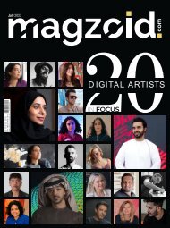
Magzoid Magazine - Luxury Magazine in the Creative Space | February 2024 |
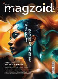
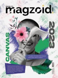
People discuss my art and pretend to understand as if it were necessary to understand, when it’s simply necessary to love. — Claude Monet Dive into the vibrant canvas of Magzoid Magazine's February edition, "The Red Edition," as we usher in the month of love with a celebration of passion, creativity, and design. Redefine your senses with the cover story unveiling the depth and intensity of the color red, a symbolic ode to love and artistic expression. In the realm of art, our exclusive interview features Pouran Jinchi, unraveling her exhibition "Fly like a Dandelion" at Third Line, exploring themes of migration. Kamran Samimi takes center stage with "Before Nature (I Am Both Created and Destroyed)," drawing inspiration from Dubai's natural materials, creating a profound dialogue between creation and destruction.
People discuss my art and pretend to understand as if it were necessary to understand, when it’s simply necessary to love.
— Claude Monet
Dive into the vibrant canvas of Magzoid Magazine's February edition, "The Red Edition," as we usher in the month of love with a celebration of passion, creativity, and design. Redefine your senses with the cover story unveiling the depth and intensity of the color red, a symbolic ode to love and artistic expression.
In the realm of art, our exclusive interview features Pouran Jinchi, unraveling her exhibition "Fly like a Dandelion" at Third Line, exploring themes of migration. Kamran Samimi takes center stage with "Before Nature (I Am Both Created and Destroyed)," drawing inspiration from Dubai's natural materials, creating a profound dialogue between creation and destruction.

Create successful ePaper yourself
Turn your PDF publications into a flip-book with our unique Google optimized e-Paper software.
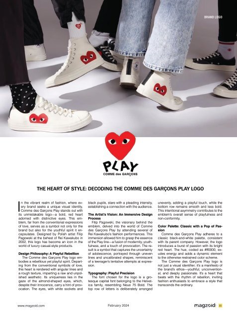
BRAND LOGO<br />
I<br />
THE HEART OF STYLE: DECODING THE COMME DES GARÇONS PLAY LOGO<br />
n <strong>the</strong> vibrant realm of fashion, where every<br />
brand seeks a unique visual identity,<br />
Comme des Garçons Play stands out with<br />
its unmistakable logo—a bold, red heart<br />
adorned with dist<strong>in</strong>ctive eyes. This emblem,<br />
far from <strong>the</strong> conventional expressions<br />
of love, serves as a symbol not only for <strong>the</strong><br />
brand but also for <strong>the</strong> youthful spirit it encapsulates.<br />
Designed by Polish artist Filip<br />
Pagowski at <strong>the</strong> behest of Rei Kawakubo <strong>in</strong><br />
2002, this logo has become an icon <strong>in</strong> <strong>the</strong><br />
world of luxury casual-style products.<br />
Design Philosophy: A Playful Rebellion<br />
The Comme des Garçons Play logo embodies<br />
a rebellious yet playful spirit. Depart<strong>in</strong>g<br />
from <strong>the</strong> conventional symbols of love,<br />
this heart is rendered with angular l<strong>in</strong>es and<br />
a rough texture, impart<strong>in</strong>g a raw and unpolished<br />
aes<strong>the</strong>tic. Its uniqueness lies <strong>in</strong> <strong>the</strong><br />
gaze of <strong>the</strong> almond-shaped eyes, which,<br />
despite <strong>the</strong>ir <strong>in</strong>nocence, carry a h<strong>in</strong>t of provocation.<br />
The eyes, with white sockets and<br />
black pupils, stare with a plead<strong>in</strong>g <strong>in</strong>tensity,<br />
establish<strong>in</strong>g a connection with <strong>the</strong> audience.<br />
The Artist’s Vision: An Immersive Design<br />
Process<br />
Filip Pagowski, <strong>the</strong> visionary beh<strong>in</strong>d <strong>the</strong><br />
emblem, delved <strong>in</strong>to <strong>the</strong> world of Comme<br />
des Garçons Play by attend<strong>in</strong>g several of<br />
Rei Kawakubo’s fashion performances. This<br />
immersion allowed him to grasp <strong>the</strong> essence<br />
of <strong>the</strong> Play l<strong>in</strong>e—a fusion of modernity, youthfulness,<br />
and a touch of provocation. The result<br />
is a symbol that captures <strong>the</strong> uncerta<strong>in</strong>ty<br />
of adolescence, portrayed through uneven<br />
l<strong>in</strong>es and uncalibrated shapes, rem<strong>in</strong>iscent<br />
of a teenager’s tentative attempts at expression.<br />
Typography: Playful Precision<br />
The font chosen for <strong>the</strong> logo is a grotesque<br />
capital font belong<strong>in</strong>g to <strong>the</strong> Helvetica<br />
family, resembl<strong>in</strong>g Neue 75 Bold. The<br />
top row of letters is deliberately arranged<br />
unevenly, add<strong>in</strong>g a playful touch, while <strong>the</strong><br />
bottom row rema<strong>in</strong>s smooth and less bold.<br />
This <strong>in</strong>tentional asymmetry contributes to <strong>the</strong><br />
emblem’s overall sense of playfulness and<br />
non-conformity.<br />
Color Palette: Classic with a Pop of Passion<br />
Comme des Garçons Play adheres to a<br />
classic black-and-white palette, consistent<br />
with its parent company. However, <strong>the</strong> logo<br />
<strong>in</strong>troduces a burst of passion with its bright<br />
red heart. The hue, coded as #ff0000, exudes<br />
energy and adds a dynamic element<br />
to <strong>the</strong> o<strong>the</strong>rwise restra<strong>in</strong>ed color scheme.<br />
The Comme des Garçons Play logo is<br />
not just a visual identifier; it’s a manifesto of<br />
<strong>the</strong> brand’s ethos—youthful, unconventional,<br />
and deeply passionate. It’s a heart that<br />
beats with <strong>the</strong> rhythm of rebellion, <strong>in</strong>vit<strong>in</strong>g<br />
fashion enthusiasts to embrace a style that<br />
transcends <strong>the</strong> ord<strong>in</strong>ary.<br />
www.magzoid.com <strong>February</strong> <strong>2024</strong><br />
85