Quaderni di Cultura e Progetto del Colore - Istituto Del Colore
Quaderni di Cultura e Progetto del Colore - Istituto Del Colore
Quaderni di Cultura e Progetto del Colore - Istituto Del Colore

Create successful ePaper yourself
Turn your PDF publications into a flip-book with our unique Google optimized e-Paper software.
CULTURA / CULTURE [ 1 2 (3 + 4) 5 ]<br />
esperimenti, a parte una contrad<strong>di</strong>ttorietà. Nel secondo esperimento,<br />
che faceva uso <strong>di</strong> una serie <strong>di</strong> venti coppie <strong>di</strong> colori, una me<strong>di</strong>a <strong>di</strong> oltre<br />
l’80% dei partecipanti ha scelto le ruote colori sviluppate dallo stesso<br />
Colour Affects come quelle più armoniose. Tuttavia, in una <strong>di</strong> queste<br />
sessioni, la concordanza con la teoria (ovvero, la scelta <strong>del</strong>la ruota contenente<br />
colori dallo stesso gruppo come più armoniosa) era ancora a<br />
livelli molto alti almeno sino alla nona coppia, in cui la concordanza è<br />
ra<strong>di</strong>calmente venuta meno. Questo andamento è proseguito fino alla<br />
<strong>di</strong>ciassettesima coppia – dopo la quale la concordanza è nuovamente<br />
ripresa. Fu in seguito scoperto che uno degli assistenti <strong>del</strong> Professor<br />
McManus, nel cucire le pezze <strong>di</strong> colore, aveva accidentalmente trasposto<br />
due ver<strong>di</strong> simili all’interno <strong>di</strong> queste nove coppie – così che, nei<br />
termini <strong>del</strong>la teoria, nessuna <strong>del</strong>le ruote colori in queste coppie era armoniosa<br />
4 . Nello stesso anno, il Professor M. R. Luo chiese all’autrice <strong>di</strong><br />
classificare <strong>del</strong>le carte colore entro i quattro gruppi (ad occhio). Quando<br />
vennero analizzate da un computer, si riscontrò che i colori classificati<br />
all’interno <strong>di</strong> ciascun gruppo, in linea con la teoria, si concentrarono<br />
nello stesso spazio. Ciò suggerì che il Sistema fosse algoritmico.<br />
Successivamente, in un progetto <strong>di</strong> ricerca inter-culturale, ripetendo i<br />
test iniziali in con<strong>di</strong>zioni <strong>di</strong> maggior controllo, ed utilizzando la prima<br />
versione informatizzata <strong>del</strong> Colour Affects System (‘Ultracolour’) e la<br />
più aggiornata tecnologia dei <strong>di</strong>splay a colori, la concordanza con la teoria<br />
si attestò in me<strong>di</strong>a intorno al 76.8%. 5<br />
Avendo proseguito a testare la teoria empiricamente, e a sviluppare<br />
il Colour Affects System nell’attività <strong>di</strong> consulenza sia personale che<br />
d’azienda, all’inizio <strong>del</strong> 2008 apparve chiaro che, al fine <strong>di</strong> produrre un<br />
software <strong>di</strong> programma realmente efficace, fosse imperativo chiarire<br />
gli algoritmi al cuore <strong>del</strong> Sistema. A tal fine, era essenziale identificare<br />
esattamente dove si trovassero le linee <strong>di</strong> demarcazione tra i quattro<br />
gruppi. Gli autori, Angela Wright e Deborah Murphy – una collega con<br />
esperienza nella scienza <strong>del</strong> colore ed in informatica – hanno analizzato<br />
i colori in tutto il Sistema NCS, al fine <strong>di</strong> mettere in luce gli schemi<br />
sottostanti ed identificare dove si trovano le linee <strong>di</strong> demarcazione.<br />
the terms of the theory, neither of the colour wheels in these pairs was<br />
harmonious 4 .In the same year, Professor M R Luo asked the author to<br />
classify colour cards into the four groups (by eye). When scanned into<br />
a computer, it was found that the colours classified into each group, in<br />
line with the theory, clustered in the same space.This suggested that<br />
the System was algorithmic.<br />
Subsequently, in a cross-cultural research project, repeating the initial<br />
tests under more controlled con<strong>di</strong>tions, and using the first computerised<br />
version of the Colour Affects System (‘Ultracolour’) and the<br />
latest colour <strong>di</strong>splay technology, agreement with the theory averaged<br />
76.8%.5 Having continued to test the theory empirically, and develop<br />
the Colour Affects System in both personal and corporate consulting,<br />
early in 2008 it became clear that, in order to produce a really effective<br />
software program, it was imperative to clarify the algorithms at<br />
the heart of the System. To that end, it was essential to identify exactly<br />
where the borderlines occur between the four groups. The authors,<br />
Angela Wright and Deborah Murphy - a colleague who has expertise<br />
in colour and in computer science - have analysed every colour in the<br />
full NCS System, in order to clarify the underlying patterns and identify<br />
where the borders occur.<br />
The fin<strong>di</strong>ngs so far suggest:<br />
a. The basic principles of the Colour Affects System hold true. Every<br />
single shade, tone or tint can be classified into one of just four colour<br />
groups; all colours in one group have an extra <strong>di</strong>mension of visual (and<br />
psychological) harmony within each group, which the great majority of<br />
people agree are harmonious.<br />
b. All the basic hues, apart from pure white and black, appear in all four<br />
groups.<br />
c. The borders between the groups occur in <strong>di</strong>fferent places for each<br />
hue angle.<br />
At this point, in order to clarify the term ‘borders’ it should be explained<br />
that each colour is classified in terms of:<br />
Quanto finora scoperto suggerisce che:<br />
a. I principi <strong>di</strong> base <strong>del</strong> Colour Affects System si <strong>di</strong>mostrano veritieri. Ogni<br />
singola sfumatura, tono o tinta può essere classificato in uno tra solo<br />
quattro gruppi <strong>di</strong> colori; tutti i colori in un gruppo posseggono una <strong>di</strong>mensione<br />
ulteriore <strong>di</strong> armonia visiva ( e psicologica) all’interno <strong>di</strong> ciascun<br />
gruppo, che la grande maggioranza <strong>del</strong>le persone riconosce come tale.<br />
b. Tutte le tinte <strong>di</strong> base, ad eccezione <strong>del</strong> bianco e nero, appaiono in<br />
ognuno dei quattro gruppi.<br />
c. I confini tra i quattro gruppi occorrono in spazi <strong>di</strong>fferenti per ciascun<br />
angolo <strong>di</strong> colore.<br />
A questo punto, al fine <strong>di</strong> chiarire la parola ‘confini’ andrebbe spiegato<br />
che ciascun colore è classificato nei termini <strong>di</strong>:<br />
Luminosità/oscurità<br />
Saturazione<br />
Freddezza/Calore<br />
La misurazione <strong>del</strong>le prime due <strong>di</strong>mensioni è abbastanza imme<strong>di</strong>ata; è<br />
la terza – freddezza/calore- che è sempre stata considerata soggettiva.<br />
Tra<strong>di</strong>zionalmente, le caratteristiche freddo/caldo sono legate all’asse<br />
<strong>del</strong>l’Angolo Sfumatura. Questo è naturalmente ancora valido; tuttavia,<br />
vi è molto altro ancora a riguardo.<br />
Vi sono rossi, gialli ed arancione fred<strong>di</strong> – e blu, ver<strong>di</strong> e viola cal<strong>di</strong>. Era necessario<br />
stabilire esattamente a che punto, ad esempio, un rosso freddo<br />
<strong>di</strong>viene un viola caldo, o un verde freddo <strong>di</strong>viene un blu caldo ecc. A<br />
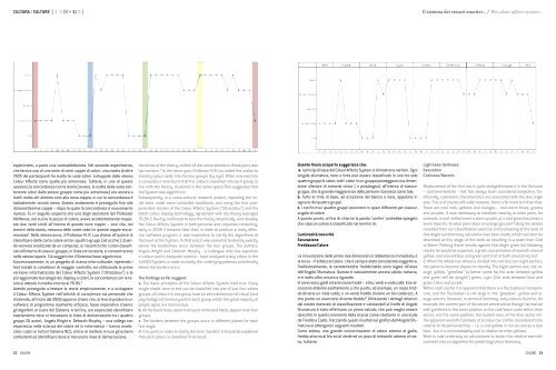
che punto un arancione <strong>di</strong>venta freddo? Utilizzando i dettagli ottenuti<br />
dal nostro esercizio <strong>di</strong> classificazione e valutandoli al livello <strong>di</strong> Angolo<br />
Sfumatura è stato effettuato un primo calcolo, che può meglio essere<br />
descritto in questo momento <strong>del</strong>la ricerca come risultante in una scala<br />
da Freddo a Caldo. Tracciando questi risultati sul grafico <strong>del</strong>l’Angolo Sfumatura<br />
si ottengono i seguenti risultati:<br />
Come atteso, una grande concentrazione <strong>di</strong> calore attorno al giallo,<br />
freddo attorno al blu ed al verde ed un poco <strong>di</strong> entrambi attorno al rosso,<br />
tuttavia:<br />
Il sistema dei vissuti emotivi... / The colour affects system...<br />
Lightness/darkness<br />
Saturation<br />
Coolness/Warmth<br />
Measurement of the first two is quite straightforward; it is the third one<br />
– coolness/warmth - that has always been considered subjective. Tra<strong>di</strong>tionally,<br />
cool/warm characteristics are associated with the Hue angle<br />
axis. This is of course still valid; however, there is far more to it than that.<br />
There are cool reds, yellows and oranges – and warm blues, greens<br />
and purples. It was necessary to establish exactly at what point, for<br />
example, a cool red becomes a warm purple, or a cool green becomes a<br />
warm blue etc. At what point does an orange go cold? Using the details<br />
recorded from our classification exercise and evaluating at the level of<br />
Hue Angle a preliminary calculation has been made, which can best be<br />
described at this stage of the work as resulting in a scale from Cool<br />
to Warm. Plotting these results against Hue Angle gives the following<br />
results As would be expected, a great concentration of warmth around<br />
yellow, cool around blue and green and a bit of both around red, but:<br />
d. When the whole hue wheel is <strong>di</strong>vided into not four, but eight sectors,<br />
the patterns become clearer to identify. The eight sectors are; red, orange,<br />
yellow, “greellow” (a better name for the area between yellow<br />
and green will be sought!) green, cyan (the area between blue and<br />
green) blue and purple.<br />
Within each sector it is apparent that there is a fluctuation in temperature,<br />
and the fluctuation is not large in the “greellow”, yellow and orange<br />
sectors. However, in terms of harmony, only colours found in, for<br />
example, the coolest part of the sector perceived as Orange harmonise<br />
with greellows in the same position on the cool/warm scale within their<br />
sector, and the same position, the coolest area, of the blue sector etc.<br />
The apparent warmth/coolness of a colour can still be considered to be<br />
relative to its perceived hue – i.e. a cool yellow is not as cool as a cool<br />
blue - but it is unmistakeably cool in relation to other yellows.<br />
Work is now underway on calculations to factor this relative warmth/<br />
coolness into an algorithm for pre<strong>di</strong>cting Colour Harmony.<br />
22 COLORE<br />
COLORE 23