Quaderni di Cultura e Progetto del Colore - Istituto Del Colore
Quaderni di Cultura e Progetto del Colore - Istituto Del Colore
Quaderni di Cultura e Progetto del Colore - Istituto Del Colore

Create successful ePaper yourself
Turn your PDF publications into a flip-book with our unique Google optimized e-Paper software.
CULTURA / CULTURE [ 1 2 3 4 5 6 7 8 9 10 (11 + 12) 13 14 15 16 ] Colori <strong>del</strong>le città italiane / Colour of italian cities<br />
“Travertino a vecchio”, “Travertino abbassato”, “Travertino appena <strong>di</strong><br />
mezza tinta più chiaro”, “Travertino appatinato”,“Travertino appatinato<br />
molto più chiaro”, “Travertino in accompagno <strong>del</strong> vecchio”, “Travertino<br />
mezza tinta”, “Travertino mezza tinta più chiara”, “Travertino patinato”,<br />
“Travertino più chiaro”,“Travertino scuro”, “Travertino simile al vecchio”,<br />
“Travertino vecchio”, “Travertino vecchio [(Ad imitazione <strong>del</strong>]”, “Travertino<br />
vecchio scuro” ecc.).<br />
Come si può vedere anche dalle espressioni che sovente accompagnano<br />
il colore travertino (“vecchio”, “vecchio scuro”, “appatinato”, ”abbassato”,<br />
“scuro”, ecc.), è evidente in molti casi la preoccupazione <strong>di</strong> integrazione<br />
<strong>del</strong>la tinta “in accompagno” a colori esistenti, in un contesto<br />
che con<strong>di</strong>ziona, ad esempio, la ritinteggiatura <strong>di</strong> un muro <strong>di</strong> cinta o <strong>di</strong><br />
una parete secondaria dove è stato effettuato un intervento murario,<br />
quando non si tratta <strong>di</strong> semplici “rappezzi” o meri “ritocchi”, magari<br />
sullo stesso travertino, che non si ha timore <strong>di</strong> “verniciare” ai fini <strong>del</strong>la<br />
manutenzione e <strong>del</strong>l’estetica <strong>del</strong>la facciata.<br />
Accanto al travertino, compaiono i colori <strong>del</strong> marmo, sia generico (“Color<br />
<strong>di</strong> marmo”) che bianco (“Color <strong>di</strong> marmo bianco”) e anche in questo<br />
caso, non è raro trovare questo colore applicato su una statua in marmo<br />
vero, inserita in una facciata o persino isolata in un giar<strong>di</strong>no, come<br />
si è potuto leggere nei documenti d’archivio riguardanti i restauri <strong>del</strong>la<br />
Villa Me<strong>di</strong>ci..<br />
Quando i marmi o i colori che li imitano sono specifici, molte volte sono<br />
applicati a particolari decorativi e non certo ad intere facciate come il<br />
“Cipollino” (marmo venato verde chiaro), il “Marmo venato bianco” ecc.<br />
Tra le pietre, compare il tufo, anche in questo caso declinato variamente<br />
per accompagnare coloriture esistenti (“Color <strong>di</strong> tufo antico [composto<br />
con terra d’ombra]”, “Pietra tufo”, “Tufo scuro“, “Tufo vecchio [<strong>Colore</strong><br />
imitante il]” e il peperino (“Color <strong>di</strong> peperino”, “Pietra detta peperino”<br />
ecc.).<br />
Tra i materiali laterizi, domina in modo molto ricorrente il caratteristico<br />
mattone romano, per lo più sotto forma <strong>di</strong> cortina (“Color <strong>di</strong> cortina”,<br />
“Color <strong>di</strong> cortina chiara” , “Color <strong>di</strong> mattone a cortina”, “Color <strong>di</strong> mattoni”,<br />
“Color <strong>di</strong> mezza tinta cortina”, “Color mattone”, “Color <strong>di</strong> cortina imitante<br />
il mattone vecchio”, “Color rosino <strong>di</strong> mattone”, “Color rossino <strong>di</strong> mattone”,<br />
“Color cortina”, “<strong>Colore</strong> cortina patinato”, “<strong>Colore</strong> <strong>di</strong> cortine”, “<strong>Colore</strong><br />
<strong>di</strong> mattoni oscuro”, “Laterizio”, “Mezza tinta color <strong>di</strong> cortina”, “Mattone”,<br />
“Mattone vecchio [Imitante il colore <strong>del</strong>]”.<br />
Anche in questo caso, è evidente la preoccupazione <strong>di</strong> integrazione in<br />
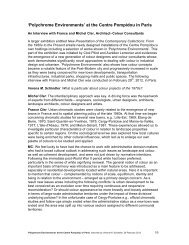
Fig.7 Mappa dei materiali-colori <strong>di</strong> Siena (Dipartimento <strong>di</strong> Scienze Ambientali<br />
<strong>del</strong>l’Università <strong>di</strong> Siena)<br />
Pic.7 Siena materials-colours map (Environmental Sciences Department of Siena<br />
University)<br />
ing colourings.<br />
Also for the wooden materials of doors, windows, shutters etc. there<br />
are several generic imitations (“Wooden colour”) or imitations of specific<br />
woods (“Fir imitating yellow”, “Chestnut wood imitating paint”<br />
etc.) and the same can be said for the iron of gratings, gates, downpipes<br />
and gutters, depen<strong>di</strong>ng on each particular case (“Bronze green”,<br />
“Ver<strong>di</strong>gris”, “Black”, “Gold” etc.).<br />
Generic colour names, based on <strong>di</strong>fferent criterions<br />
Turin and Piedmont<br />
Another series of names that emerged from archive documents for<br />
the denomination of the colours to be used on Turin and Piedmont facades,<br />
at first glance does not seem to be connected to the imitation<br />
of stone, brick or wooden materials, but seems to <strong>di</strong>rectly derive from<br />
the common language, especially that of fashion, such as, for example,<br />
“Nanking”, a fabric of Chinese origins very popular at the time, although<br />
sometimes even generic colours can carry particular functions, whether<br />
being colours proposed by the landlords or colours imposed by the<br />
Builders Council for any particular reason.<br />
In order to make easy the recognition of common colour names of<br />
the period concerning the Colour Plan and the 19 th Century in general,<br />
thanks to the collaboration of the students of the already mentioned<br />
“Decoration” class and to specific graduation thesis, we have made a<br />
systematic research in all the most important Piedmont archives and<br />
documentation centres. Within these researches, we have incidentally<br />
<strong>di</strong>scovered the existence of the principal Italian expert on colours of<br />
the second half of 19 th Century, Giacomo Arnaudon 11 from Turin, author<br />
of “Arnaudon Green” and for 10 years assistant of Chevreul at Gobelins,<br />
that made the Italian translation of the first co<strong>di</strong>fication of colours of<br />
the greatest Italian colour scientist of the 19 th Century.<br />
The list of common colour names that appear in the “Turin Dictionary<br />
of Colours” is quite large (“White”, ”Milk white” (maybe similar to the<br />
white of “Milk of lime”, already cited in the group of colour names deriving<br />
from Piedmont limes), “Light bluish white”, “Greyish”, “Nearly<br />
grey”, “Grey”, “Light grey”, “Dark grey”, “Pale grey ”, “Pearl grey”, “Light<br />
pearl grey”, “Blanrose”, “Blanc azuré”, “Light sky blue” ,“Canary”,<br />
“Strong canary”, “Pale canary”, “Light blue”, “Light ash-grey”, “Ashgreyish”,<br />
“Light brown made with a little red”, “Dead leaf”, “Yellowish<br />
brown”, “Light yellowish brown”, “Light yellow”, “Nearly green light<br />
un contesto esistente (“Mattone vecchio [Imitante il colore <strong>del</strong>]”, “<strong>Colore</strong><br />
cortina patinato”, quando non si tratti <strong>di</strong> meri rappezzi o <strong>di</strong> completamenti<br />
<strong>di</strong> coloriture esistenti.<br />
Anche per i legni <strong>del</strong>le porte, finestre, persiane ecc. non mancano le<br />
imitazioni generiche (“Color legno”) o le imitazioni <strong>di</strong> essenze particolari<br />
(“Giallo imitante il legno d’abete”, “Vernice imitante il legno <strong>di</strong> castagno”<br />
ecc.) e lo stesso si può <strong>di</strong>re per i ferri <strong>del</strong>le inferriate, dei cancelli,<br />
dei pluviali e <strong>del</strong>le gronde, a seconda dei casi (“Verde bronzo”, “Verderame”,<br />
“Nero”, “Oro” ecc.).<br />
Nomi <strong>di</strong> colori generici, motivati con criteri <strong>di</strong>versi<br />
Torino e Piemonte<br />
Un’altra serie <strong>di</strong> nomi emersi dai documenti d’archivio per designare i<br />
colori da impiegare nelle facciate torinesi e piemontesi non sembra a<br />
prima vista essere ascrivibile all’imitazione <strong>di</strong> materiali lapidei, laterizi<br />
o lignei, ma sembra derivare <strong>di</strong>rettamente dal linguaggio comune, specie<br />
dalla moda, come ad esempio il “Nanchino”, all’epoca un tessuto <strong>di</strong><br />
origine cinese molto <strong>di</strong>ffuso, tuttavia qualche volta anche dei colori generici<br />
si possono caricare <strong>di</strong> funzioni particolari, sia che si tratti <strong>di</strong> colori<br />
proposti dai proprietari o sia che si tratti <strong>di</strong> colori imposti dal Consiglio<br />
degli E<strong>di</strong>li per ragioni particolari.<br />
Per facilitare l’identificazione dei nomi <strong>di</strong> colori comuni nel periodo che<br />
interessava il Piano colore ed in generale l’800, con la collaborazione<br />
degli studenti <strong>del</strong> corso <strong>di</strong> “Decorazione” citato e attraverso tesi <strong>di</strong> laurea<br />
specifiche, abbiamo effettuato una ricerca sistematica in tutti i più<br />
importanti archivi e centri <strong>di</strong> documentazione piemontesi. Nell’ambito<br />
<strong>di</strong> queste ricerche, abbiamo scoperto incidentalmente esistenza <strong>del</strong><br />
massimo esperto <strong>di</strong> colori italiano <strong>del</strong>la seconda metà <strong>del</strong>l’800, il torinese<br />
Giacomo Arnaudon 11 , autore <strong>del</strong> “Verde Arnaudon” e assistente per<br />
10 anni <strong>del</strong>lo Chevreul ai Gobelins, che ha tradotto in italiano il primo<br />
sistema <strong>di</strong> co<strong>di</strong>ficazione dei colori <strong>del</strong> più grande scienziato dei colori<br />
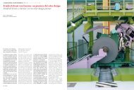
Fig.8 Restauro dei colori originari <strong>di</strong> un tempietto dei giar<strong>di</strong>ni <strong>del</strong>la Villa Me<strong>di</strong>ci a<br />
Roma, in finto travertino e “colore d’aria” o “celestino”, in base ai documenti d’archivio<br />
e alle stratigrafie.A sinistra, i mo<strong>del</strong>li cromatici <strong>di</strong> epoca ottocentesca ancora<br />
esistenti prima dei restauri <strong>del</strong>la fine degli anni ’80, e il progetto <strong>di</strong> restauro.<br />
Pic.8 Restoration of the original colours of a small temple inside Villa Me<strong>di</strong>ci gardens<br />
in Rome, made of fake travertine and “air colour” or “very light blue”, based on archive<br />
documents and stratigraphies. On the left, the chromatic mo<strong>del</strong>s of the Nineteenth<br />
Century still existing before the restoration works at the end of the Eighties,<br />
and the restoration project.<br />
yellow ”, “Yellowish”, “Light yellowish”, “Pale yellowish”, “Nearly red<br />
yellowish”, “Light pale yellow”, “Yellow”, “Light yellow”, “Dark yellow”,<br />
“Not so light yellowish”, “Proper grey”, “Light grey”, “Dark grey”, “Common<br />
grey”, “Pearl grey”, “Grisâtre”, “ Jaune”, “Jaune clair”, “Jaune canarin<br />
clair”, “Straw yellow”, “Lavender”, “Lemon”, “Nanking” or “Nankin”<br />
or “Nankino”, “Light Nanking ” or “Nankin clair“, “Pale Nanking”, “Dark<br />
Nanking”, “Black”, “Straw”, “Paillerine”, “Light straw”, “Very light straw”,<br />
“Petit Jaune”, “Light rose”, “Red<strong>di</strong>sh”, “Light red”, “Umber”, “Earth”, “Yellowish<br />
earth”, “Bluish turquoise”, “Steam”, “Light deep green”, “Green”,<br />
“Light green”, “Mineral earth green”, “Not so strong green with mineral<br />
earth”, “Green (Colour slightly similar to)”, “Light bluish green”, “Cabbage<br />
green”, “ Greenish”, “Light greenish” etc.).<br />
For sure, however, these colours, having a generic name, if put into a<br />
context, sometimes can carry precise meanings and functions and<br />
can be decoded, as we will try to do in the following examples.<br />
One of the most common generic colours of this list, for instance,<br />
“White” with all its variations (obtained from pure milk of lime) was<br />
imposed in courtyards or alleys for hygienic reasons, to lighten and to<br />
<strong>di</strong>sinfect. In the Regulation of Ornato <strong>di</strong> Savigliano of 1842 it is possible<br />
to read that “only a colour very similar to white can be used to<br />
paint those buil<strong>di</strong>ngs that, because of the narrowness of the streets,<br />
are lacking sunlight”, and that white can be used in “those arcades that<br />
are in such a state of filth that is no longer possible to tolerate”. For opposite<br />
reasons, “Clear white” was prohibited in wider streets, because<br />
it could dazzle and <strong>di</strong>sturb the sight of those who live on the other side<br />
of the street. For opposite reasons, it was prohibited the possibility of<br />
using dark colours that could generate obscurity.<br />
Many times, the colours imposed by the Turin Builders Council have<br />
clearly environmental reasons, of integration in the urban surroun<strong>di</strong>ngs,<br />
when facades with colourings considered “complying” with that<br />
environment are already existing, in order to “preserve for that reason<br />
42 COLORE<br />
COLORE 43