Quaderni di Cultura e Progetto del Colore - Istituto Del Colore
Quaderni di Cultura e Progetto del Colore - Istituto Del Colore
Quaderni di Cultura e Progetto del Colore - Istituto Del Colore

You also want an ePaper? Increase the reach of your titles
YUMPU automatically turns print PDFs into web optimized ePapers that Google loves.
CULTURA / CULTURE [ 1 2 (3 + 4) 5 6 7 8 9 10 11 12 13 14 15 16 ] Colori <strong>del</strong>le città italiane / Colour of italian cities<br />
sionata dalla Regione Liguria nel 1991 6 .<br />
Ulteriori ricerche d’archivio sui colori <strong>di</strong> Siena <strong>del</strong>lo stesso periodo 7 , in<br />
cui siamo stati coinvolti, consentivano <strong>di</strong> allargare alla Toscana il <strong>di</strong>zionario<br />
dei colori nelle città italiane.<br />
Grazie alla costituzione <strong>del</strong>la “Banca dati dei restauri <strong>del</strong>la Villa Me<strong>di</strong>ci<br />
a Roma, 1802-1960”, realizzata per conto <strong>del</strong> Ministero <strong>del</strong>la <strong>Cultura</strong><br />
Francese, nel 1985-90 8 , emergevano altre centinaia <strong>di</strong> nomi <strong>di</strong> colori<br />
tipicamente romani, che arricchivano il “Dizionario dei colori”, che nel<br />
frattempo stavamo allestendo in una forma più generale. Questa ricerca<br />
si confrontava con quelle condotte nel frattempo a Roma da altri stu<strong>di</strong>osi<br />
9 , consentendo <strong>di</strong> tentare un <strong>di</strong>scorso sui colori <strong>di</strong> Roma, fondato<br />
su basi documentarie sufficientemente allargate, sia pure tenendo conto<br />
<strong>del</strong>la complessità e a volte contrad<strong>di</strong>ttorietà e ambiguità <strong>del</strong> tema,<br />
se esteso ai <strong>di</strong>versi secoli in cui si articola .<br />
Parallelamente a queste ricerche, basate su esperienze professionali<br />
in cui eravamo stati coinvolti personalmente, veniva effettuata una<br />
ricerca sistematica su <strong>di</strong>zionari, atlanti cromatici e manuali <strong>del</strong> colore<br />
storici e attuali, che arricchivano ulteriormente il “Dizionario generale<br />
dei colori” in corso <strong>di</strong> allestimento fin dal 1980. La ricerca sui colori<br />
veniva poi portata avanti in tutti questi anni attraverso il Corso <strong>di</strong> Decorazione<br />
tenuto presso la Facoltà d’Architettura <strong>di</strong> Torino con tesi <strong>di</strong><br />
laurea specifiche sui colori adottati da vari architetti antichi e moderni<br />
e in varie città in quasi tutte le regioni italiane, sui tessuti , sulla moda,<br />
sull’industria ecc.<br />
Grazie a queste ricerche, durate oltre 30 anni, sono stati finora reperiti<br />
oltre 15.000 nomi <strong>di</strong> colori con le definizioni, i sistemi <strong>di</strong> notazione<br />
scientifica (Munsell-NCS) e <strong>di</strong> denominazione standard (ISCC.NBS), le<br />
ricette, la storia, i sinonimi, le fonti archivistiche o bibliografiche ecc.<br />
Naturalmente, non tutti questi nomi <strong>di</strong> colori (molti dei quali sinonimi,<br />
varianti locali ecc.) riguardano l’architettura e le città, ma certamente<br />
una buona parte <strong>di</strong> essi è riferibile <strong>di</strong>rettamente o in<strong>di</strong>rettamente ai<br />
contesti architettonici e urbani. Non essendo ovviamente possibile,<br />
nell’ambito <strong>del</strong>lo spazio a <strong>di</strong>sposizione, riprodurre tutti i nomi <strong>di</strong> colori<br />
reperiti sulle città italiane, vorremmo almeno cercare <strong>di</strong> in<strong>di</strong>viduare<br />
alcune gran<strong>di</strong> categorie entro cui questi nomi si possono raggruppare<br />
e tentare <strong>di</strong> stabilire sia pure a gran<strong>di</strong> linee, i criteri seguiti nella colorazione<br />
<strong>del</strong>le città italiane, che trovano anche riscontro visualmente nella<br />
realtà percepita.<br />
Come si vedrà, uno dei criteri che sembra governare la colorazione <strong>del</strong>le<br />
città italiane è il loro riferimento ai materiali e<strong>di</strong>lizi locali (materiali<br />
lapidei, laterizi, lignei e metallici): una sorta “geografia dei colori”, per<br />
citare un termine impiegato da John Prizeman, Michael Lancaster e da<br />
Jean Philippe Lenclos o, più precisamente”, come si avrà modo <strong>di</strong> vedere<br />
più avanti, una vera e propria “geologia dei colori” 10 .<br />
Naturalmente, nelle città italiane vengono impiegati anche altri colori<br />
che non sono <strong>di</strong>rettamente riferibili a questo criterio e che hanno <strong>di</strong>ritto<br />
<strong>di</strong> esistere e <strong>di</strong> cui si tenterà <strong>di</strong> dare qualche spiegazione. Per rendere<br />
comprensibile i risultati <strong>del</strong>la presente ricerca, articoleremo la trattazione<br />
sui colori nelle città italiane in due parti:<br />
1. Nomi <strong>di</strong> colori imitativi <strong>di</strong> materiali e<strong>di</strong>lizi<br />
2. Altri nomi <strong>di</strong> colori e altri criteri <strong>di</strong> colorazione.<br />
<strong>di</strong>ctionary of colours used in Italian cities.<br />
Thanks to the constitution of “Restoration Database of Rome’s Villa<br />
Me<strong>di</strong>ci, 1802-1960”, realized for the Minister of French Culture, during<br />
1985-90 8 , hundreds more typically roman colours names emerged,<br />
enriching the “Dictionary of colours”, that meanwhile we were going<br />
to draw up in a more general form. This research was compared with<br />
those carried on in Rome during the same period by other researchers<br />
9 , allowing the possibility of a <strong>di</strong>scourse on Rome’s colours, based<br />
on sufficiently extensive documentations, even considering the complexity<br />
and sometimes the contra<strong>di</strong>ction and ambiguity within the<br />
subject, when stretched over the <strong>di</strong>fferent centuries along which it has<br />
developed .<br />
Alongside these researches, based on professional experiences in<br />
which we personally have been involved, a systematic research was<br />
carried on <strong>di</strong>ctionaries, chromatic atlases and historical as well as<br />
contemporary manuals of colours, that further enriched the “General<br />
Dictionary of Colours” due to be prepared since 1980. The research on<br />
colours was then carried on during all these years by the Decoration<br />
Class within the Faculty of Architecture of Turin with graduation thesis<br />
specifically on the colours used by several ancient as well as modern<br />
architects and in numerous cities of almost all Italian regions, on fabrics,<br />
on fashion, on industry etc.<br />
Thanks to these researches, lasted for more than 30 years, more than<br />
15.000 names of colours have been found together with definitions,<br />
systems of scientific notation (Munsell-NCS) and of standard denomination<br />
(ISCC.NBS), formulas, history, synonyms, archive or bibliographical<br />
sources etc.<br />
Obviously not all these names of colours (some of them are synonyms,<br />
local variations etc.) deal with architecture and cities, but certainly a<br />
fine piece of them can be <strong>di</strong>rectly or in<strong>di</strong>rectly referred to architectural<br />
and urban contexts. As it is clearly impossible, within the space here<br />
available, to tell all the names of colours found in the Italian cities, we<br />
would try at least to outline some general categories in which these<br />
names can be stored and to establish, though just in general terms, the<br />
criteria used when colouring the Italian cities, and that have also visual<br />
evidence in the perceived reality.<br />
As it will be shown, one of the principles that seems to rule the colouring<br />
of Italian cities is the reference to the local buil<strong>di</strong>ng materials (stone,<br />
brick, wood, metal materials): a sort of “geography of colours”, to cite<br />
a term used by John Prizeman, Michael Lancaster and Jean Philippe<br />
Lenclos or, more precisely, as it will be <strong>di</strong>splayed later on, a true “geology<br />
of colours” 10. .<br />
Obviously, some other colours not <strong>di</strong>rectly referred to this criterion are<br />
also used in Italian cities and have the right to exist and we will try to<br />
give some explanation about them. To make the results of these research<br />
more comprehensible, we will <strong>di</strong>vide the treatise on colours in<br />
two parts:<br />
1. Name of colours imitating buil<strong>di</strong>ng materials<br />
2. Other name of colours and other colouring criterions.<br />
Colour names of Italian cities, imitating buil<strong>di</strong>ng materials<br />
Even not preten<strong>di</strong>ng to draw up here a complete <strong>di</strong>ctionary of colours<br />
of Italian cities, anyway we will try to trace at least a rough copy, based<br />
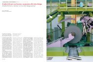
Fig.1. Il mo<strong>del</strong>lo <strong>di</strong> colorazione <strong>del</strong>la Via Po, ricostruito<br />
sulla base dei documenti d’archivio .<br />
Pic.1. Via Po colouring mo<strong>del</strong>, rendered on the<br />
base of archives documents.<br />
1 2<br />
Nomi <strong>di</strong> colori <strong>del</strong>le città itali<br />
ane, imitativi <strong>di</strong> materiali e<strong>di</strong>lizi<br />
Senza pretendere <strong>di</strong> poter compilare in questa sede un <strong>di</strong>zionario completo<br />
dei colori <strong>del</strong>le città italiane, tenteremo tuttavia <strong>di</strong> tracciarne almeno<br />
una prima bozza, sulla base <strong>del</strong>le ricerche effettuate in questi 30<br />
anni da noi e da altri ricercatori in Italia, che si spera possa in seguito<br />
essere completata con il contributo <strong>di</strong> altri stu<strong>di</strong>osi. La compilazione<br />
<strong>del</strong> “Dizionario dei colori <strong>del</strong>le città italiane” inizierà con i dati reperiti,<br />
a partire dagli anni ’70, a Torino e in Piemonte, dall’epoca barocca agli<br />
inizi <strong>del</strong> Novecento, per seguire con Genova e con la Liguria nello stesso<br />
periodo, la Toscana (prendendo come campione Siena, dalla fine <strong>del</strong><br />
‘700 agli inizi <strong>del</strong> ‘900) e il Lazio (con campione Roma). I nomi dei colori<br />
sono presi rigorosamente da ricerche d’archivio e, ove possibile, saranno<br />
illustrati con qualche esempio significativo.<br />
Torino e Regione Piemonte<br />
A Torino, come si è visto nello stu<strong>di</strong>o citato, in epoca barocca si impone<br />
il mo<strong>del</strong>lo <strong>del</strong> Theatrum Sabau<strong>di</strong>ae. Per rendere più ricca l’immagine<br />
<strong>del</strong>la Città, allora capitale <strong>del</strong>lo Stato Sardo, con ambizioni europee, il<br />
“Piano colore” allestito contestualmente col piano urbanistico, riveste<br />
le facciate formate normalmente da fon<strong>di</strong> lisci (con eventuali sfondati)<br />
e rilievi e cornicioni in aggetto, con colori per lo più imitativi dei materiali<br />
e<strong>di</strong>lizi nobili locali (pietre, marmi e graniti), mentre pure i legni e i ferri<br />
si nobilitano cromaticamente, <strong>di</strong>ventando colore “bronzo” e in qualche<br />
particolare decorativo, persino colore “oro”.<br />
Nell’ambito <strong>del</strong> Piano <strong>del</strong> colore <strong>di</strong> Torino, il colore più <strong>di</strong>ffuso in assoluto,<br />
almeno relativamente agli assi viari principali, come si può vedere<br />
dalla ”Mappa cromatica” e dalla “Tavolozza dei colori” <strong>di</strong> Torino (v. Figg.2-<br />
3), è costituito dal colore “Molera” o Mollera, o “Molassa”, imitativo <strong>del</strong>la<br />
“pietra molera“, una pietra dal caratteristico colore giallognolo (“Giallognolo<br />
detto molera”, “Giallognolo-mollera”). Questo colore viene declinato<br />
nelle <strong>di</strong>verse tonalità chiare o scure a volte con inflessioni <strong>di</strong>alettali<br />
(“Molera chiaro” o “Mollera chiaro”, “Molera scuro”, “Mollera scuro” o<br />
“Mollera oscuro”, “Molura oscura”, “Pietra molare chiara”, “Pietra molare<br />
scura”, “Pietra Mollera”, “Pietra Molassa”, “Pietra detta Molassa”, “Pietra<br />
detta Molassa più chiara”).<br />
Questo colore “corre” tutte le vie e piazze principali, combinato variamente<br />
con altri colori, a seconda <strong>del</strong>la località. In realtà, come si vedrà<br />
più avanti, si tratta <strong>del</strong> colore naturale <strong>del</strong>la “calce forte <strong>di</strong> Casale”, che i<br />
Figg.2-3 - “Mappa cromatica” e “Tavolozza dei colori”<br />
degli assi principali <strong>del</strong> Centro Storico <strong>di</strong> Torino<br />
Pics.2-3 - “Chromatic map” and “Colour Palette”<br />
of the main road axes of Turin historical centre<br />
on researches made in these last 30 years by us as well as other researchers<br />
in Italy, that we hope will be at last completed thanks to the<br />
contribution of other researchers. The compilation of the “Dictionary<br />
of colours of Italian cities” will at first begin with the data found starting<br />
from the Seventies, in Turin and in Piedmont, from the Baroque Age<br />
to the first 20 th Century, then with Genoa and Liguria during the same<br />
period, Tuscany (taking as an example Siena, from the end of the 18 th<br />
Century till the first 20 th Century) and Lazio (with Rome as mo<strong>del</strong>). The<br />
names of colours are taken strictly from archive researches and, where<br />
possible, will be pictured by some significant example.<br />
Turin and Piedmont Region<br />
In Turin, as shown in the cited study, during the Baroque Age the mo<strong>del</strong><br />
of Theatrum Sabau<strong>di</strong>ae dominates. In order to enrich the image of the<br />
City, then capital of the Sar<strong>di</strong>nia State, ambitious of playing a lea<strong>di</strong>ng<br />
role in Europe, the “Colour Plan”, conceived at the same time of the urban<br />
development, covers the facades initially constituted by smooth<br />
surfaces (sometimes with rounded backgrounds) and overhang<br />
moul<strong>di</strong>ngs and relieves, with colours that mostly imitate precious local<br />
buil<strong>di</strong>ng materials (stones, marbles and granites), while even wood<br />
and iron become chromatically richer, turning into “bronze” and, in<br />
some decorative detail, even “gold” coloured.<br />
Within the context of Turin colour plan, the most common colour, at<br />
least among those referring to main road axes, as can be seen from<br />
the ”Chromatic Map” and the “Colour Palette” of Turin (see Pics.2-3), is<br />
“Molera” or “Mollera” colour, or “Molassa”, imitating “molera sandstone“,<br />
a stone having typically yellowish colour (“So called molera yellowish”,<br />
“Mollera-yellowish”). This colour is varied into <strong>di</strong>fferent light or dark<br />
hues sometimes with <strong>di</strong>alect inflections (“Light Molera” or “Light Mollera”,<br />
“Dark Molera”, “Dark Mollera”, “Dark Molura”, “Light grin<strong>di</strong>ng stone”,<br />
“Dark grin<strong>di</strong>ng stone”, “Mollera stone”, “Molassa stone”, “So called Molassa<br />
stone”, “So called lighter Molassa stone”).<br />
This colour “crosses” every street and main squares, variously combined<br />
with other colours, depen<strong>di</strong>ng on places. In truth, as it is possible<br />
to see later, it is the natural colour of “Casale strong lime”, that<br />
the railroad transportations of mid 19 th Century made available (along<br />
with its colour too) in Turin and in other Piedmont areas and that will<br />
be called emphatically “Turin Yellow” or “Piedmont Yellow”, ousting all<br />
other colours from the original Colour Plan.<br />
34 COLORE<br />
COLORE 35<br />
3