- Page 1 and 2:
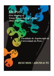
3 rd meeting of young researchers a
- Page 3 and 4:
Comissão Organizadora / Comité Ci
- Page 5 and 6:
Programa Wednesday, February 17 th
- Page 7 and 8:
Parallel Oral Sessions I A1 Biologi
- Page 9 and 10:
Degradation of anthocyanins and ant
- Page 11 and 12:
Bio-guided HPLC-PAD-APCI-MS metabol
- Page 13 and 14:
The effect of temperature on total
- Page 15 and 16:
Parallel Oral Sessions I A2 Economi
- Page 17 and 18:
The third sector social innovation
- Page 19 and 20:
Are the ' entrepreneurs students' e
- Page 21 and 22:
Convergence of Accounting Practice
- Page 23 and 24:
Parallel Oral Sessions I A3 Environ
- Page 25 and 26:
Ecological Assessment of Leça rive
- Page 27 and 28:
Chlorella vulgaris for Wastewater T
- Page 29 and 30:
Decontamination of cork bleaching w
- Page 31 and 32:
Degradation of Sirius ® Blue dye b
- Page 33 and 34:
Parallel Oral Sessions II A1 Biolog
- Page 35 and 36:
ATF-3 expression during inflammator
- Page 37 and 38:
Hemodynamic and morphometric charac
- Page 39 and 40:
Nicotinic modulation of cholinergic
- Page 41 and 42:
Parallel Oral Sessions II A2 Filoso
- Page 43 and 44:
Gender Politics and its relation to
- Page 45 and 46:
“Inclua-me fora disso” Contrapo
- Page 47 and 48:
Parallel Oral Sessions II A3 Numeri
- Page 49 and 50:
Central Pattern Generators in Biped
- Page 51 and 52:
Time-Frequency analysis in Heart Ra
- Page 53 and 54:
Numerical solution of short-term ma
- Page 55 and 56:
Parallel Oral Sessions III A1 Biolo
- Page 57 and 58:
The homeodomain transcription facto
- Page 59 and 60:
Two new aromatase inhibitors: Biolo
- Page 61 and 62:
Crossing between PCR and HACCP: a p
- Page 63 and 64:
Surface modification of chitosan po
- Page 65 and 66:
Parallel Oral Sessions III A2 Histo
- Page 67 and 68:
New Digital Methods on Rock Art Rec
- Page 69 and 70:
Methodologies for a Contextual Inve
- Page 71 and 72:
Treaties and detached decorative pr
- Page 73 and 74:
Parallel Oral Sessions III A3 Commu
- Page 75 and 76:
A Flu and the Agenda-Setting Theory
- Page 77 and 78:
The influence of television on deve
- Page 79 and 80:
A look at Machinima: Machine Animat
- Page 81 and 82:
Parallel Oral Sessions IV A1 Biolog
- Page 83 and 84:
Modulation of angiogenesis and infl
- Page 85 and 86:
Biological activity of caffeic acid
- Page 87 and 88:
Prediction of intestinal absorption
- Page 89 and 90:
The effect of folate status on the
- Page 91 and 92:
Parallel Oral Sessions IV A2 Chemis
- Page 93 and 94:
Synthesis of Silica Particles for T
- Page 95 and 96:
Optimization of a methodology for d
- Page 97 and 98:
Structural, interfacial and rheolog
- Page 99 and 100:
Parallel Oral Sessions IV A3 Renewa
- Page 101 and 102:
Hydrogen generation and storage by
- Page 103 and 104:
Third generation photovoltaic cells
- Page 105 and 106:
Prediction of Raw-Material Characte
- Page 107 and 108:
Parallel Oral Sessions IV A4 Sport
- Page 109 and 110:
Application of critical velocity in
- Page 111 and 112:
Effects of acute endurance exercise
- Page 113 and 114:
Warming-up before sporting activity
- Page 115 and 116:
Parallel Oral Sessions V A1 Biologi
- Page 117 and 118:
Acute Haemodynamic Effects of Tezos
- Page 119 and 120:
Negative inotropic effect of angiot
- Page 121 and 122:
Relaxation of Human Penile Smooth M
- Page 123 and 124:
Parallel Oral Sessions V A2 Agronom
- Page 125 and 126:
Flowering and fruit-set in Vitis vi
- Page 127 and 128:
Evolution of antioxidant activity o
- Page 129 and 130:
Concentration of cadmium by lettuce
- Page 131 and 132:
Discrimination of Port Wine categor
- Page 133 and 134:
Parallel Oral Sessions V A3 Chemica
- Page 135 and 136:
Evaluation of Different Solvents fo
- Page 137 and 138:
Nanocrystalline Zinc-Substituted Hy
- Page 139 and 140:
Study and optimization of a multi-l
- Page 141 and 142:
Parallel Oral Sessions V A4 Sport S
- Page 143 and 144:
Overweight, Obesity, Physical Activ
- Page 145 and 146:
The built environment and participa
- Page 147 and 148:
The Sport Management in the curricu
- Page 149 and 150:
Parallel Oral Sessions VI A1 Biolog
- Page 151 and 152:
Portuguese primary care evaluation
- Page 153 and 154:
Screening and Assessment of Undernu
- Page 155 and 156:
Genetic characterization of Portugu
- Page 157 and 158:
Mutational screening of AXIN2 gene
- Page 159 and 160:
Parallel Oral Sessions VI A2 Chemis
- Page 161 and 162:
Quinolones as Metalloantibiotics: S
- Page 163 and 164:
Towards an “intelligent” contro
- Page 165 and 166:
Substrate recognition in HIV-1 Prot
- Page 167 and 168:
Parallel Oral Sessions VI A3 Electr
- Page 169 and 170:
Polyphase filter with continuous pa
- Page 171 and 172:
Digital Sigma Delta 1 st Order Modu
- Page 173 and 174:
Network based security for academic
- Page 175 and 176:
High-Birefringent Fibre Loop Mirror
- Page 177 and 178:
Parallel Oral Sessions VI A4 Geogra
- Page 179 and 180:
The creation of the European Citize
- Page 181 and 182:
The central status of the domestic
- Page 183 and 184:
Scenarios of urban sprawl using GIS
- Page 185 and 186:
Parallel Oral Sessions VII A1 Psych
- Page 187 and 188:
Patterns of preschool literacy, num
- Page 189 and 190:
I am a writer: A program for writin
- Page 191 and 192:
Understanding the inner-experience
- Page 193 and 194:
Parallel Oral Sessions VII A2 Liter
- Page 195 and 196:
I know It´s only poetry, but I lik
- Page 197 and 198:
The Mirror: a philosophical and the
- Page 199 and 200:
Parallel Oral Sessions VII A3 Engin
- Page 201 and 202:
AllCall : An Automated Call for Pap
- Page 203 and 204:
TraSMAPI - An Application Programmi
- Page 205 and 206:
Heart Sound Segmentation for Digita
- Page 207 and 208:
Capacitated Vehicle Routing Problem
- Page 209 and 210:
Parallel Oral Sessions VIII A1 Arch
- Page 211 and 212:
The epidermal design: From experien
- Page 213 and 214:
The value of memory in project´s p
- Page 215 and 216:
Nairobi: Upgrading the slums A. Coe
- Page 217 and 218:
Parallel Oral Sessions VIII A2 Civi
- Page 219 and 220:
Thermal Refurbishment of Roofs in O
- Page 221 and 222:
Operational control of cutting tree
- Page 223 and 224:
Influence of Socioeconomic status o
- Page 225 and 226:
Parallel Oral Sessions VIII A3 Arts
- Page 227 and 228:
The ‘art’ of entrepreneurship:
- Page 229 and 230:
Porto through the game: a playful c
- Page 231 and 232:
Retrato gráfico das minhas viagens
- Page 233 and 234:
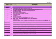
Posters I Wednesday, February 17 th
- Page 235 and 236:
Social Entrepreneurship: An analysi
- Page 237 and 238:
Characterisation of wine management
- Page 239 and 240:
Proximity Analysis among Researcher
- Page 241 and 242:
Awareness and brand equity of “Vi
- Page 243 and 244:
Effect of dimethyldioctadecylammoni
- Page 245 and 246:
Determination of ibuprofen in water
- Page 247 and 248:
Evaluation of the suitability of th
- Page 249 and 250:
Photochemical degradation of trans-
- Page 251 and 252:
Degradation of Metalaxyl by Chemica
- Page 253 and 254:
Characterization of the actual stat
- Page 255 and 256:
Contribution of the Microbial Commu
- Page 257 and 258:
Bioremediation with soils contamina
- Page 259 and 260:
Relevance of Temporal and Spatial V
- Page 261 and 262:
Extended-spectrum beta-lactamase pr
- Page 263 and 264:
Can Solanum nigrum L. be use to phy
- Page 265 and 266:
Study on the changes of soil chemic
- Page 267 and 268:
Toxicity of the pharmaceutical Simv
- Page 269 and 270:
Does macroalgae extracts support Pl
- Page 271 and 272:
Assessment of genetic diversity wit
- Page 273 and 274:
Safety of minimally processed garli
- Page 275 and 276:
Search for selective modulators of
- Page 277 and 278:
Evaluation of the paracrinic mechan
- Page 279 and 280:
Nickel analysis of coffee substitut
- Page 281 and 282:
Tomato (Lycopersicon esculentum) se
- Page 283 and 284:
5 % (Compounds area) Ficus carica l
- Page 285 and 286:
Chemical profile and antioxidant ac
- Page 287 and 288:
Exploiting sea cucumber Holothuria
- Page 289 and 290:
Cytotoxicity effect of a 35% H2O2 b
- Page 291 and 292:
Hydroxyxanthones: Recent Progress i
- Page 293 and 294:
The role of drug-membrane interacti
- Page 295 and 296:
Synthesis of a pyranoxanthone: opti
- Page 297 and 298:
Synthesis, physico-chemical propert
- Page 299 and 300:
Expression and activity evaluation
- Page 301 and 302:
Mutation screening in routine lung
- Page 303 and 304:
Fungal secondary metabolites as pot
- Page 305 and 306:
Thermal and textural analysis of hu
- Page 307 and 308:
Woman in the Politic: An Analyse of
- Page 309 and 310:
Introduction to MAXIMA Software B.
- Page 311 and 312:
Study of ionospheric anomalies usin
- Page 313 and 314:
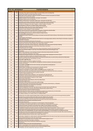
Posters II Thursday, February 18 th
- Page 315 and 316:
Hydration knowledge and behaviour a
- Page 317 and 318:
Bone mineral density and bone miner
- Page 319 and 320:
Behavioural Plasticity in Goalball
- Page 321 and 322:
The contribute of walking to preser
- Page 323 and 324:
Anodic stripping voltammetric analy
- Page 325 and 326:
Synthesis and enzymatic characteriz
- Page 327 and 328:
Utilization of a chromogenic substr
- Page 329 and 330:
Scavenging activities of sulfasalaz
- Page 331 and 332:
Automatic flow methodology for quin
- Page 333 and 334:
Chiral Xanthones with Potencial Ant
- Page 335 and 336:
F lu o rescent In tensity(a.u .)x10
- Page 337 and 338:
Interaction of resveratrol with mod
- Page 339 and 340:
In vitro assessment of meloxicam ef
- Page 341 and 342:
Flow injection amperometric determi
- Page 343 and 344:
Quantification of Chimassorb 944 in
- Page 345 and 346:
Determination of diltiazem by strip
- Page 347 and 348:
Fat uptake by fried foods A. Costa
- Page 349 and 350:
Spinel-Type Ferrite Nanoparticles:
- Page 351 and 352: Near infrared spectroscopy: a tool
- Page 353 and 354: Tropical Disease Research: New Time
- Page 355 and 356: Activity and inhibition of bee veno
- Page 357 and 358: Catalytic synthesis of indigo and i
- Page 359 and 360: Energetic study of fluorene Sónia
- Page 361 and 362: Polyoxometalates: Electrochemical S
- Page 363 and 364: Inhibition of cyclooxygenases by ne
- Page 365 and 366: Computational Parameterization of C
- Page 367 and 368: Gas-diffusion extraction module (GD
- Page 369 and 370: Systematic Development of Molecular
- Page 371 and 372: Chromatographic determination of ri
- Page 373 and 374: Development of a multicommutated fl
- Page 375 and 376: Theoretical and computational studi
- Page 377 and 378: Aza-Diels-Alder reaction between im
- Page 379 and 380: Solvothermal preparation of Ce-base
- Page 381 and 382: Self-assembly of anionic lysine-bas
- Page 383 and 384: Thermotropic liquid crystals from d
- Page 385 and 386: Antioxidant Capacity of Commercial
- Page 387 and 388: Chemical and structural characteriz
- Page 389 and 390: Literary Archetypes in Eduardo Gale
- Page 391 and 392: GIS and Detection of Areas with Arc
- Page 393 and 394: The Spatial Distribution and Travel
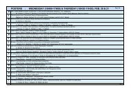
- Page 395 and 396: Posters III Friday, February 19 th
- Page 397 and 398: The potential of Austrian Architect
- Page 399 and 400: Topology and Complex Geometries in
- Page 401: Researching Rapid Prototyping in Ar
- Page 405 and 406: The use of photography in the educa
- Page 407 and 408: Hydraulic characterisation of nonwo
- Page 409 and 410: Incorporation of nanocomposites mat
- Page 411 and 412: Structural evaluation and character
- Page 413 and 414: Development of a biomimetic coating
- Page 415 and 416: VORSat - Measuring a CubeSat Attitu
- Page 417 and 418: Assessing viscous fingering effects
- Page 419 and 420: Integration of Generation onto the
- Page 421 and 422: Resistance of the geosynthetics aga
- Page 423 and 424: Traditional dry cured sausages in M
- Page 425 and 426: Isoflavones composition of Arabica
- Page 427 and 428: Evaluation of DNA extraction protoc
- Page 429 and 430: Host-tailored sensors for Dopamine
- Page 431 and 432: Pesticide residues in grapes for wi
- Page 433 and 434: FIA spectrophotometric system for t
- Page 435 and 436: Gunshot residues analysis on the ha
- Page 437 and 438: Comparison of Etest with the CLSI r
- Page 439 and 440: Structure-activity profiling of coc
- Page 441 and 442: Differences on adenosine modulation
- Page 443 and 444: Conjugated linoleic acid (CLA) cont
- Page 445 and 446: Grids of Hygiene and Sanitary Condi
- Page 447 and 448: New approaches for estimating the p
- Page 449 and 450: Erythrocyte aging/damage in chronic
- Page 451 and 452: Effect of colchicine on p-glycoprot
- Page 453 and 454:
Project - “Colorful world of food
- Page 455 and 456:
Projects Fine Arts 3 rd meeting of
- Page 457 and 458:
Drawing and the Colonial War: a rep
- Page 459 and 460:
Gyotaku; its origins and relationsh
- Page 461 and 462:
The contemporary. Drawing as an inv
- Page 463 and 464:
ATELIER_PROJECTO Eugénia Pequito 1
- Page 465 and 466:
Identidades Metamorfoseadas J. Paul
- Page 467 and 468:
Instruções de Reportagem M. Guede
- Page 469 and 470:
Assembling new relations at canvas
- Page 471 and 472:
Case Studies IJUP 3 rd meeting of y
- Page 473 and 474:
3: IJUP’s 2010 Third Meeting of Y
- Page 475 and 476:
Criação da identidade do IJUP 201
- Page 477 and 478:
IDENTIDADE IJUP 2010 Marta Nestor P
- Page 479 and 480:
Identidade IJUP’10 Lúcia Rocha L
- Page 481 and 482:
IJUP’10 Diana Vila Pouca Faculdad
- Page 483 and 484:
IJUP 2010 - proposta de carta Maria
- Page 485 and 486:
Identidade IJUP’10 Pedro Reis Fac
- Page 487 and 488:
Identidade IJUP’10 Bruno Almeida
- Page 489 and 490:
Proposta de Poster para o evento IJ
- Page 491 and 492:
Post-it Filipa Martins Departamento
- Page 493 and 494:
IJUP 10 poster: “This is not just
- Page 495 and 496:
Chemical profile and antioxidant ac
- Page 497 and 498:
Incorporation of nanocomposites mat
- Page 499:
Technical and morphological study o