Volume 9–2 (Low Res).pdf
Volume 9–2 (Low Res).pdf
Volume 9–2 (Low Res).pdf
Create successful ePaper yourself
Turn your PDF publications into a flip-book with our unique Google optimized e-Paper software.
2<br />
VOLUME NINE. NUMBER TWO, JUNE. 1982<br />
EDITOR: EDWARD GOTTSCHALL<br />
ART DIRECTOR: BOB FARBER<br />
EDITORIAL/DESIGN CONSULTANTS: LOUIS DORFSMAN, ALAN PECKOLICK<br />
EDITORIAL DIRECTORS: AARON BURNS. EDWARD RONDTHALER<br />
ASSOCIATE EDITOR: MARION MULLER<br />
CONTRIBUTING EDITOR: ALLAN HALEY<br />
RESEARCH DIRECTOR: RHODA SPARSER LUBALIN<br />
BUSINESS MANAGER: JOHN PRENTKI<br />
ADVERTISING/PRODUCTION MANAGER: HELENA WALLSCHLAG<br />
ASSISTANT TO THE EDITOR: JULIET TRAVISON<br />
ART/PRODUCTION: ILENE MEHL, ANDREA COSTA. SID TIMM<br />
SUBSCRIPTIONS: ELOISE COLEMAN<br />
©INTERNATIONAL TYPEFACE CORPORATION 1982<br />
PUBLISHED FOUR TIMES A YEAR<br />
IN MARCH. JUNE, SEPTEMBER AND DECEMBER<br />
BY INTERNATIONAL.TYPEFACE CORPORATION<br />
2 HAMMARSKJOLD PLAZA. NEW YORK, NY 10017<br />
A JOINTLY OWNED SUBSIDIARY OF<br />
LUBALIN, BURNS G CO.. INC. AND PHOTO-LETTERING. INC.<br />
CONTROLLED CIRCULATION POSTAGE PAID AT NEW YORK, NY<br />
AND AT FARMINGDALE. NV USTS PURL 073430<br />
ISSN 0362-6245 PUBLISHED IN USA<br />
ITC FOUNDERS:<br />
AARON BURNS. PRESIDENT<br />
EDWARD RONDTHALER, CHAIRMAN EMERITUS<br />
HERB LUBALIN EXECUTIVE VICE PRESIDENT 1970-1981<br />
ITC OFFICERS 1982:<br />
GEORGE SOHN, CHAIRMAN<br />
AARON BURNS. PRESIDENT<br />
EDWARD GOTTSCHALL. EXECUTIVE VICE PRESIDENT<br />
BOB FARBER, SENIOR VICE PRESIDENT<br />
JOHN PRENTKI. VICE PRESIDENT. FINANCE AND GENERAL MANAGER<br />
EDWARD BENGUIAT. VICE PRESIDENT<br />
U.S. SINGLE COPIES 51.50<br />
ELSEWHERE, SINGLE COPIES 52.50<br />
TO QUALIFY FOR FREE SUBSCRIPTION COMPLETE AND RETURN<br />
THE SUBSCRIPTION FORM IN THIS ISSUE TO ITC OR WRITE TO<br />
THE ITC EXECUTIVE OFFICE, 2 HAMMARSKJOLD PLAZA. NEW YORK, NY 10017<br />
MICROFILM COPIES OF U&LC MAY BE OBTAINED FROM MICRO PHOTO DIVISION.<br />
BELLE. HOWELL, OLD MANSFIELD ROAD, WOOSTER, OH 44691<br />
In this issue:<br />
Editorial<br />
Typography needs to be felt. The emotional impact of<br />
the letterforms and the way they are put together<br />
greatly affects the effectiveness of the message they<br />
represent. Page 2.<br />
Thoughts<br />
gb ponder, feed on, muse about or file away for future<br />
contemplation. Page 3.<br />
Chess-People<br />
1500 years of warfare without a casualty! A brief<br />
review of the armies, with special emphasis on the<br />
Knights. Page 4.<br />
Cut...Paste...Pow!<br />
An inspired illustrator and collagist reveals his<br />
sources. Page 10.<br />
Insects<br />
Whatever you may think of them, they are creatures<br />
beloved by their mothers as well as entomologists,<br />
writers, poets, and the illustrator Bernard Darin.<br />
Page 14.<br />
Letters<br />
Pleas, requests, warnings and other expressions of<br />
interest from our readers. Page 16.<br />
Capitalizing on Insects<br />
Another insect fancier presses them into service.<br />
Page 18.<br />
Something for Everybody<br />
Remarkable Words with Astonishing Origins, by<br />
John Train, aptly and amusingly illustrated by<br />
Lionel Kalish. Page 20.<br />
Artists in Wonderland<br />
A visit to a computer graphics research and<br />
development center, where artists use "wands" and<br />
work of days is produced in seconds, Page 22.<br />
Puzzle<br />
Compose yourself and concentrate on finding the<br />
80 composers hidden in the letter grid. Page 26.<br />
Ex Libris<br />
You can't judge books by their covers, but you can<br />
learn a lot about owners if their book plates are<br />
designed by Andrzej Kot. Page 28.<br />
What's New From ITC<br />
ITC Modern No. 216"" is a classical revival, created by<br />
Ed Benguiat, with all the dignity and grace of earlier<br />
"Moderns" plus up-to-date modifications. Page 30.<br />
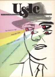
The Saga of Two Mo's<br />
The colossal genius Mozart is the subject of versatile<br />
virtuoso Mo Lebowitz. Cover, concept, copy and<br />
design—all created by our guest art director,<br />
Lebowitz. Page 36.<br />
This issue of U8cic was mailed to 180,000 readers: 148,000 in the<br />
United States and Canada, and 32,000 abroad. It will be read by<br />
over 500,000 people.<br />
TABLE OF CONTENTS AND EDITORIAL SET IN ITC MODERN NO. 216""<br />
MASTHEAD SET IN ITC NEVVTEXT" (REDUCED).<br />
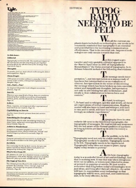
EDITORIAL<br />
TYPOG<br />
RAPITY<br />
NEEDS TO BE<br />
FELT<br />
With all the current emphasis<br />
(ours included) on technologies, one needs to be<br />
constantly reminded that typography is an essential<br />
and powerful force for increasing communication<br />
effectiveness. That is its essential role. Improved technologies<br />
are only means towards that end.<br />
In this regard a pro-<br />
vocative and very quotable editorial appeared in<br />
the March/April issue in 1981 of Typografische<br />
Monatsblatter,' the Swiss journal of typography. In it,<br />
Helmut Schmidt includes the following observations.<br />
he message needs interpretation.“...not<br />
interpretation as a masquerade of<br />
typefaces but interpretation as an evaluation of<br />
content. Interpretation in the sense of discovering<br />
the message which has been broken up into essential,<br />
minor and insignificant thoughts. Interpretation<br />
not only in advertising but also in literature, and<br />
ideally a close collaboration between form and<br />
content:'<br />
T o bawl, to whisper.<br />
"...To bawl and to whisper, quickly and slowly, all these<br />
are expressions of verbal communication. Reading<br />
matter will also have to bawl and whisper, will have<br />
to run and to stroll, will have to emerge quietly and<br />
lovingly as esthetic experiences."<br />
T<br />
44<br />
ypography lives its own<br />
esthetic life next to the functional typography, the<br />
typography of messages. We read words and sentences<br />
but are not aware of the formal qualities of typefaces<br />
as long as letters are lined up in order to convey a<br />
message:'<br />
To be audible, to be felt.<br />
"Typography need not only be visible and legible.<br />
Typography needs to be audible. Typography needs<br />
to be felt. Typography needs to be experienced.<br />
Typography today does not mean to place, typography<br />
today means to portray?'<br />
At its best, typography<br />
today is a wonderful blend of art and technology. And<br />
that is nothing new It was that way when ideograms<br />
were cut in tablets, or letters were chiseled in stone<br />
or penned on papyrus or scrolls. We just need to<br />
remember that long before today's technologies were<br />
just ideas, and long after they are obsolete, the artist<br />
will have to manipulate some technology so that<br />
typography will be seen, and read, and understood,<br />
and, to be truly effective, be felt.


